
Getting Started with Bootstrap Testing
Harish Rajora
Posted On: March 1, 2023
 156545 Views
 25 Min Read
“A small group of developers and I gathered to design and build a new internal tool and saw an opportunity to do more. We saw ourselves building something more substantial than another internal tool through that process. Months later, we ended up with an early version of Bootstrap to document and share common design patterns and assets within the company.”
The above statement was said by Mark Otto, one of the developers of Bootstrap. Jacob Thornton, another developer, and they both worked in the Twitter organization, which is a popular social media website. However, even though we see a beautiful landscape as an end-user, the story differs for the developers responsible for building it. A website accessed by millions of people every day had to be (or needed to be) just perfect for each.
When a website like Twitter is built, many teams contribute in their expert areas so that everything is flawless. But a code by one team can hinder the code of another, or the standard followed by one team might differ from others which can create inconsistencies, increasing maintenance time. This was the problem faced by Mark and Jacob, and they wanted a solution that could quickly sort out these problems without going through heavy protocols. Hence, Bootstrap was born as a standard set of rules for web development.
Its inception makes it an integral part of web development and a compulsory framework for a web developer to learn. This bootstrap testing guide will help you enhance your skills and develop and test websites faster and more efficiently.
TABLE OF CONTENTS
- What is Bootstrap?
- What does Bootstrap contain?
- Why should we use Bootstrap?
- Contents of Bootstrap Library
- How to use Bootstrap on a web page?
- Which way to choose for downloading Bootstrap?
- How to create a web page using Bootstrap?
- Why is Bootstrap testing essential?
- How to perform Bootstrap Testing with LambdaTest?
- Can Bootstrap be used with JavaScript frameworks?
- Things to Remember while Bootstrap Testing & Development
- Wrapping Up!
What is Bootstrap?
Bootstrap is a free, open-source CSS framework among the best CSS frameworks that helps create a mobile-first and responsive website by providing a rich library to the developers. This library contains predefined JavaScript and CSS functions that developers can use directly. Any code developers write according to Bootstrap rules will be automatically responsive. So, you don’t have to put in additional effort to achieve the same.
Bootstrap is easy to learn and free to use, i.e., its code is available on GitHub, which as of December 2022, is the 4th most-starred library and 14th most-starred project.
What does Bootstrap contain?
Bootstrap contains a lot of pre-defined CSS, SCSS, and JavaScript functions in its library. As developers, we only need to extend them to change or do nothing to apply the defined effects using classes (or sometimes directly without a class, such as those rules that work on the body or root).
Let’s write a small piece of code in HTML that uses a Bootstrap class as follows:
|
1 2 3 4 |
<em><center> <br><br> <p class="text-success"> This is to see Bootstrap class </p> <br> </center></em> |
We use the “text-success” class here, and no other CSS is applied. The output of this code is as follows:
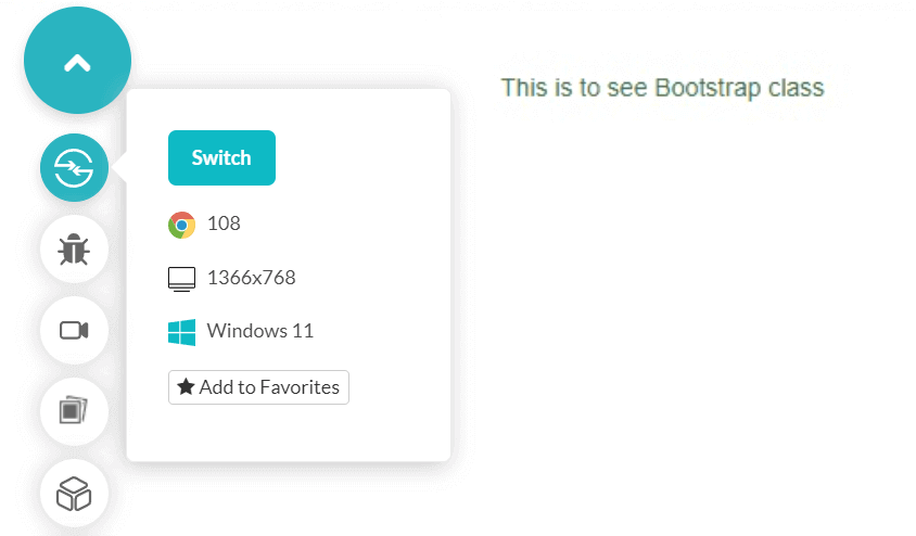
Notice that the text has turned green without using any colors. How it does that can be checked by right click on the page and choosing the option Inspect:
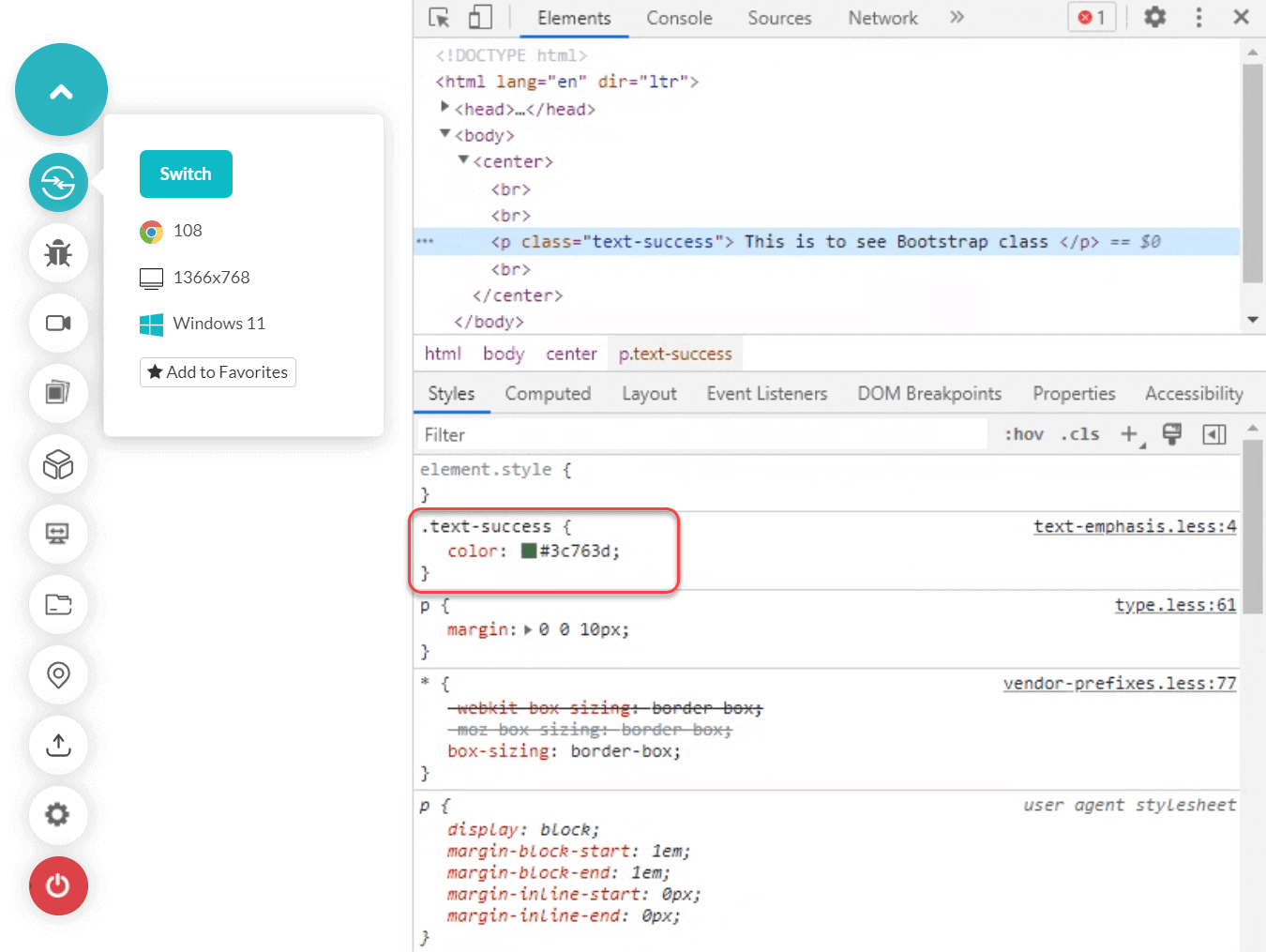
We can see that the “text-success” class was responsible for applying the modern CSS colors, and the color code in hexadecimal is #3c763d. On the right, we see the text written as “text-emphasis.less:4”, which means the code for text-success is written in this file on line number 4. Hover over this text to get the location of the Bootstrap file:
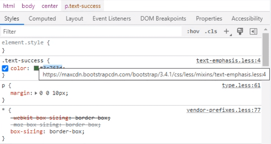
Click on the text to get the complete code of class “text-success”:
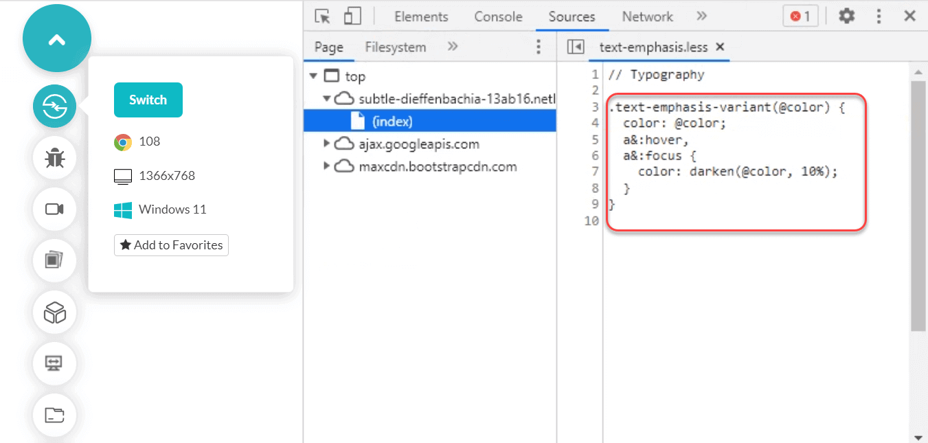
Conversely, we can explore the complete library on their official GitHub page. In these files, you will get the different variables whose values are decided that are then applied on the web page.
A lot of the variables above are initialized using CSS variables. Also, remember that the same effect might not always be actual with the same class as inheritance, and precedence takes power when we implement various elements on the web page.
Perform live Bootstrap testing across 3000+ environments. Try LambdaTest Now!
Life before Bootstrap
In this short section, let me emphasize the importance of Bootstrap by replacing the Bootstrap code with conventional code. In other words, how we achieved the results before the birth of Bootstrap!
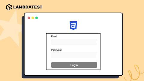
We will make a small login form for the website in this demonstration.
|
1 2 3 4 5 6 7 8 9 10 11 12 13 14 15 16 17 18 19 20 21 22 23 24 25 26 27 28 29 30 31 32 33 34 35 36 37 38 39 40 41 42 43 44 45 46 47 48 49 50 51 52 53 54 55 56 57 58 59 60 61 62 63 64 65 66 67 68 69 70 71 72 73 74 75 76 77 78 79 80 81 82 83 84 85 86 87 88 89 90 91 92 93 94 95 96 97 98 99 100 101 102 103 |
<!DOCTYPE html> <html lang="en" dir="ltr"> <head> <meta charset="utf-8"> <title>The contain style property</title> <style> * { box-sizing: border-box; } body { font-size: 15px; font-family: "Helvetica Neue",Helvetica,Arial,sans-serif; line-height: 1.42857143; } label { display: inline-block; max-width: 70%; margin-bottom: 5px; font-weight: 700; } .muted-text { color: #777; font-size: 13px; } .box-class { padding-right: 275px; padding-left: 275px; margin-right: auto; margin-left: auto; } .inputblock { margin-bottom: 15px; } input { width: 100%; height: 40px; padding: 6px 12px; font-size: 14px; line-height: 1.42857143; color: #555; background-color: #fff; background-image: none; border: 1px solid #ccc; border-radius: 4px; box-shadow: inset 0 1px 1px rgba(0,0,0,.075); } input[type="checkbox"] { margin: 4px 0 0; margin-top: 1px\9; width: 1.5%; line-height: normal; box-sizing: border-box; padding: 0; font-family: inherit; font-size: inherit; vertical-align: middle; } button { color: #fff; background-color: #337ab7; border-color: #2e6da4; display: inline-block; margin-bottom: 0; font-weight: 400; text-align: center; white-space: nowrap; vertical-align: middle; background-image: none; border: 1px solid transparent; padding: 6px 12px; font-size: 14px; line-height: 1.42857143; border-radius: 4px; font: inherit; } </style> </head> <meta name="viewport" content="width=device-width, initial-scale=1"> <body> <center> <br><br> <div class = "box-class"> <form> <div class = "inputblock"> <label for="email">Email:</label><br> <input type="email" class="" id="email" placeholder="Enter Your Email Address"> <small id="emailcation" class="muted-text">We'll never share your email with anyone else.</small> </div> <div class = "inputblock"> <label for="password">Password</label><br> <input type="password" class="form-control" id="password" placeholder="Enter Password"> </div> <div class = "inputcheck"> <input type="checkbox" id="tnccheckbox"> <label for= "tnccheckbox">I agree to terms.</label> </div> <button type="submit">Submit</button> </form> </div> </center> </body> </html> |
Output:

Now let’s change the code a bit and see how the same page can be achieved using Bootstrap:
|
1 2 3 4 5 6 7 8 9 10 11 12 13 14 15 16 17 18 19 20 21 22 23 |
<body> <center> <br><br> <div class="container"> <form> <div class="form-group"> <label for="emaillabel">Email:</label> <input type="email" class="form-control" id="email" placeholder="Enter Your Email Address"> <small id="emailcation" class="form-text text-muted">We'll never share your email with anyone else.</small> </div> <div class="form-group"> <label for="passwordlabel">Password</label> <input type="password" class="form-control" id="password" placeholder="Enter Password"> </div> <div class="form-check"> <input type="checkbox" class="form-check-input" id="tnccheckbox"> <label class="form-check-label" for="tnclabel">I agree to terms.</label> </div> <button type="submit" class="btn btn-primary">Submit</button> </form> </div> </center> </body> |
Output:
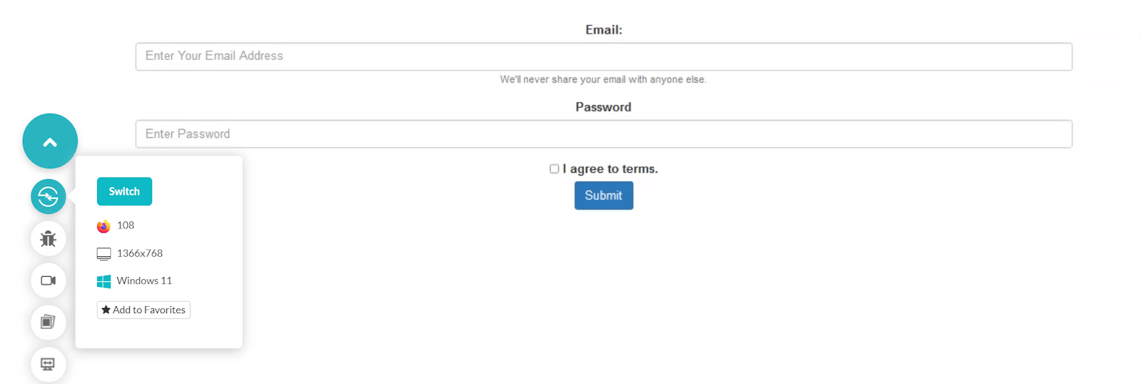
Just take a minute and observe the differences between both codes. You will notice how simple and concise it is to write code in Bootstrap. Conventionally, keeping track of CSS properties affected while constructing the page was also tough. More properties mean more collisions between elements. Bootstrap also solves this; hence, it becomes essential to perform Bootstrap testing, which is visible in the above example.
Why should we use Bootstrap?
The above advantages mentioned in the post are the most attractive ones that encourage you to adopt Bootstrap in your next project. But it doesn’t end at mobile-first design and responsiveness. There are a few more benefits that come with the adoption of this framework, and they are worth considering.
- Faster code writing – Reduces the time to write code by pre-defining classes and functions.
- Mobile-first design – Works mobile-first, so the developers don’t need to worry about mobile devices that much.
- Customizable – None of the Bootstrap code is forced upon. A developer can modify any class and any code on any element. This can be done through explicit CSS styling or JavaScript functions.
- Standardized and accepted rules – It is accepted worldwide as a standard CSS library for customizing web pages that helps collaborate with other community members from different locations.
- Easy integration – Extremely easy to integrate by adding just a single line of code on the web page.
- Open-source – Another advantage of being open-source is that someone will always help you when you get stuck.
- Rich documentation – For someone looking to get started in Bootstrap, loads of rich documentation (including the official ones) are available.
Contents of Bootstrap Library
This section is for developers who wish to study the directory structure and files included in the library. Please note that knowledge of the directory structure is not mandatory to implement Bootstrap and create a web page using it.
The source code of Bootstrap looks as follows:
|
1 2 3 4 5 6 7 8 9 10 11 |
bootstrap/ ├── dist/ │ ├── css/ │ └── JavaScript/ ├── site/ │ └──content/ │ └── docs/ │ └── 5.3/ │ └── examples/ ├── JavaScript/ └── scss/ |
The directory structure has the following folder:
- dist
The “dist” folder contains the compiled files that are used directly in the project. The compiled files look like this (inside css/):
- Bootstrap-grid.css
- Bootstrap.css
- bootstrap.rtl.min.css
And on the JavaScript side (inside JavaScript/):
- Bootstrap.bundle.JavaScript
- bootstrap.JavaScript
Note: These file names are just to familiarize you with the dist folder’s contents. There are many more files with similar nomenclature in this folder.
- site
This folder contains subfolders with documentation to help you write code for the web page.
- JavaScript
The JavaScript folder contains the source code concerning the JavaScript files.
- scss
The scss folder contains the source code for the CSS files.
Everything and anything you wish to do with Bootstrap testing are available in this blog.
How to use Bootstrap on a web page?
To use Bootstrap in our web pages, we need to fetch the above-defined source code either entirely or just the required files so that they can be extended to web elements.
This can be achieved in three ways:
- Downloading Bootstrap manually from the official website.
- Downloading Bootstrap using a package manager.
- Using CDN.
Download from the Official website
To download Bootstrap from its official website, visit the download page. Here, we have two options – either to download only the compiled files that can be used directly on the projects or download source code as well. You can choose to go ahead either way. Although, it is recommended to use compiled files to reduce the size of the project.
Download from GitHub
Bootstrap is an open-source and free project open for contribution on GitHub, its official repository hosting website. Developers can download, fork, or clone the repository directly from GitHub from its official link. Since we focus on downloads, click “Code” and “Download Zip” to download the code to the local system.
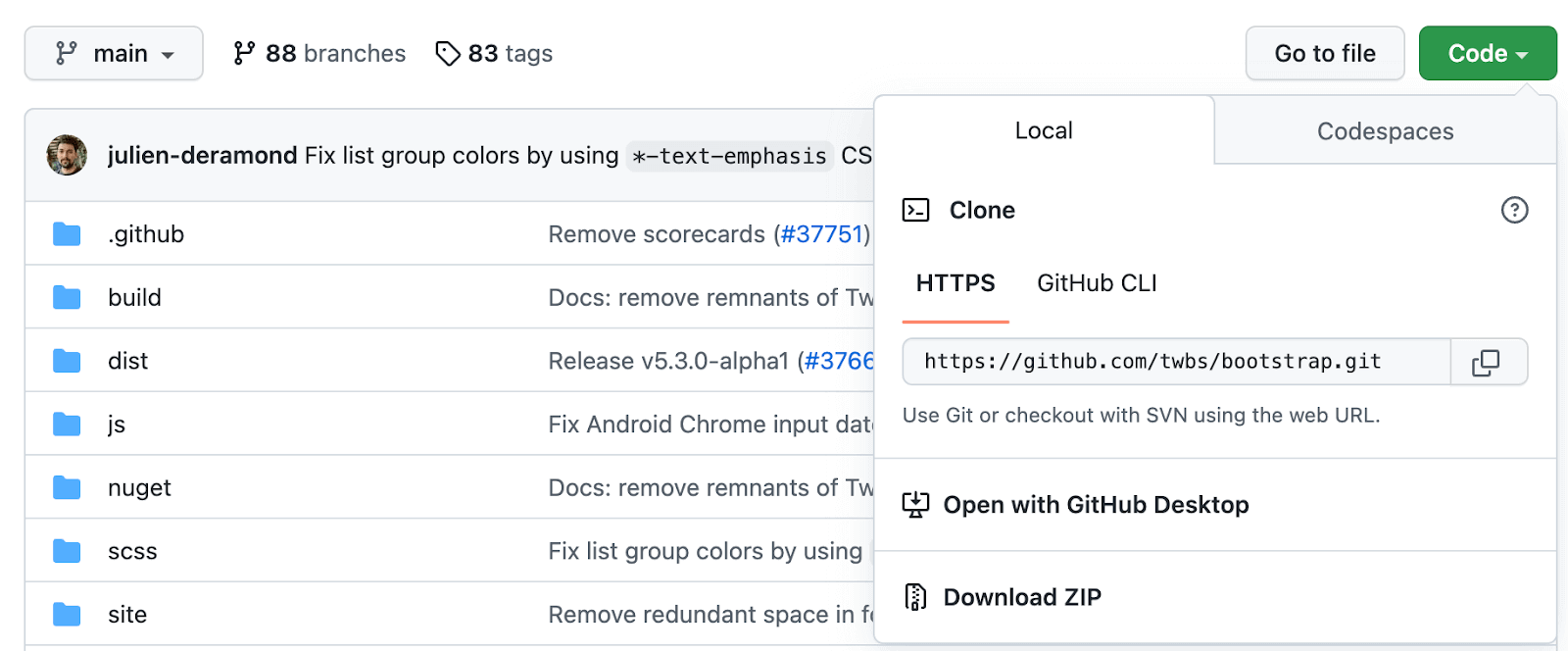
Extract this zip in your project repository to use it on the web pages. However, when Bootstrap is downloaded from GitHub, it will download the source and compiled files (and everything else there is). You will need to delete a few files according to the need.
Using a Package Manager
The next option we have with us is to use a package manager and download Bootstrap by running a single simple command on the shell. By choice, different developers prefer different package managers. We will consider a few of those to get you started.
- Using the npm package manager,
Run the following command to download Bootstrap using npm:
npm install bootstrap
Once the download completes, you need to provide require(‘bootstrap’) to load jQuery objects.
- Using the RubyGems package manager,
Run the following command to download Bootstrap using RubyGems:
gem install bootstrap -v 4.0.0
If you are using Bundler, add the following to your Gemfile:
gem 'bootstrap', '~> 4.0.0'
Among these two, the second method is recommended by Bootstrap’s official documentation.
- Using the Composer package manager,
Run the following command to download Bootstrap using Composer:
composer require twbs/bootstrap:4.0.0
- Using the NuGet package manager,
Run the following command to download Bootstrap using NuGet:
Install-Package bootstrap
If the developer chooses the download option using a package manager, they need to have a Sass compiler and Autoprefixer to run Bootstrap successfully. It should match the Bootstrap setup; otherwise, the source files downloaded cannot be extended to the web elements.
Using CDN
As a developer, the most recommended method I feel to use Bootstrap is through CDN.
CDN refers to Content Delivery (or Distribution) Network that can fetch the data to the client according to need from the closest servers. It is fast (although not as fast as downloaded files), light on project size, vital, and easy to use.
To use Bootstrap using CDN, all we need to do is add these two lines in the < head > tag of the web page:
|
1 2 3 |
<link href="https://cdn.JavaScriptdelivr.net/npm/bootstrap@5.3.0-alpha1/dist/css/bootstrap.min.css" rel="stylesheet" integrity="sha384-GLhlTQ8iRABdZLl6O3oVMWSktQOp6b7In1Zl3/Jr59b6EGGoI1aFkw7cmDA6j6gD" crossorigin="anonymous"> <script src="https://cdn.JavaScriptdelivr.net/npm/bootstrap@5.3.0-alpha1/dist/JavaScript/bootstrap.bundle.min.JavaScript" integrity="sha384-w76AqPfDkMBDXo30JavaScript1Sgez6pr3x5MlQ1ZAGC+nuZB+EYdgRZgiwxhTBTkF7CXvN" crossorigin="anonymous"></script> |
This will include CSS and JavaScript files that can now be used directly with the web elements.
Which way to choose for downloading Bootstrap?
With so many ways to choose from, selecting a method and working on Bootstrap might be confusing and need clarification. So, are there some parameters by which we can judge which way will suit you the best?
First, downloading Bootstrap means increasing the project size, as all the files will now settle under the project directory. This would mean that your server will be loaded with more content, whose impact can be seen in the loading speed and the charges for server rent.
Secondly, an update to Bootstrap means downloading and re-writing all the files. Since it is open-source, more minor updates can be expected regularly, which may increase maintenance overheads.
There are only two reasons to download Bootstrap on the local system. A significant advantage is that it can be used offline, which is great if there is no regular Internet and you are currently just developing or testing. Organizations also download Bootstrap and save it on their servers/data centers from where their internal project picks it up.
Secondly, if you download Bootstrap (which will also download source files), you can modify them according to the standards you follow in projects. Then they can be saved on the server, and people can directly use Bootstrap functions usually, and changes will be reflected on the web page.
If you do not fall into these categories, the best way to use Bootstrap is by using CDN, which is fast and helps optimize SEO. It will also take lesser space which will help in increasing loading speeds and utilizing lesser bandwidth.
How to create a web page using Bootstrap?
Now that we know Bootstrap’s content and usage, we can dissect the login page above to understand how to use Bootstrap to create a web page.
To use Bootstrap, first, we need Bootstrap. In this demonstration, I am using CDN for the same in the head tag:
|
1 2 3 4 5 6 7 8 9 10 11 |
<!DOCTYPE html> <html lang="en" dir="ltr"> <head> <meta charset="utf-8"> <title>The contain style property</title> <meta name="viewport" content="width=device-width, initial-scale=1"> <link rel="stylesheet" href="https://maxcdn.bootstrapcdn.com/bootstrap/3.4.1/css/bootstrap.min.css"> <script src="https://ajax.googleapis.com/ajax/libs/jquery/3.6.1/jquery.min.JavaScript"></script> <script src="https://maxcdn.bootstrapcdn.com/bootstrap/3.4.1/JavaScript/bootstrap.min.JavaScript"></script> </head> |
Next, as a general rule, we use the container class that helps us get good padding and a box structure inside which our web page will be contained:
< div class="container" >
Now we need to create the form. For this, we consider each element as a separate div so that we can control each of them more flexibly and group our elements that make one unit in the form. Bootstrap’s “form-group” class is used exactly for this purpose:
< div class="form-group" >
Inside this div, we need two elements – the label representing the name of the field and the field itself. The label can be used as it is used in HTML directly. We use the form-control class for the input field and Bootstrap’s class for textual fields such as input, textarea, and select.
< input type="email" class="form-control" id="email" placeholder="Enter Your Email Address" >
It helps customize these elements as per need.
We can repeat the same structure for “Password” as well.
After this, we need a checkbox for terms and conditions. For such inputs that are taken through checkboxes and radio buttons, Bootstrap uses the “form-check” class. This class has other similar classes with small modifications to be used according to the tag. For instance, “form-check-input” is used for input tags and label elements, “form-check-label.” This helps in the proper arrangement and spacing of checkboxes and is very important as these small elements are often out of alignment on a web page.
< input type="checkbox" class="form-check-input" id="tnccheckbox" >

< label class="form-check-label" for="tnclabel">I agree to terms.
Finally, we need a button that can be modified using btn class with “btn-lg”, “btn-md”, etc., for sizes and “btn-success”, “button-failure,” etc. for customization.
The final web page you can use directly by copying a .html file and customizing yourself is:
|
1 2 3 4 5 6 7 8 9 10 11 12 13 14 15 16 17 18 19 20 21 22 23 24 25 26 27 28 29 30 31 32 33 34 35 |
<!DOCTYPE html> <html lang="en" dir="ltr"> <head> <meta charset="utf-8"> <title>The contain style property</title> <meta name="viewport" content="width=device-width, initial-scale=1"> <link rel="stylesheet" href="https://maxcdn.bootstrapcdn.com/bootstrap/3.4.1/css/bootstrap.min.css"> <script src="https://ajax.googleapis.com/ajax/libs/jquery/3.6.1/jquery.min.JavaScript"></script> <script src="https://maxcdn.bootstrapcdn.com/bootstrap/3.4.1/JavaScript/bootstrap.min.JavaScript"></script> </head> <body> <center> <br><br> <div class="container"> <form> <div class="form-group"> <label for="emaillabel">Email:</label> <input type="email" class="form-control" id="email" placeholder="Enter Your Email Address"> <small id="emailcation" class="form-text text-muted">We'll never share your email with anyone else.</small> </div> <div class="form-group"> <label for="passwordlabel">Password</label> <input type="password" class="form-control" id="password" placeholder="Enter Password"> </div> <div class="form-check"> <input type="checkbox" class="form-check-input" id="tnccheckbox"> <label class="form-check-label" for="tnclabel">I agree to terms.</label> </div> <button type="submit" class="btn btn-primary">Submit</button> </form> </div> </center> </body> </html> |
Alright! Now we have developed our page using Bootstrap. The next step in this Bootstrap testing tutorial is to test it for anomalies and bugs. Before that, let’s know why Bootstrap testing is important.
Why is Bootstrap testing essential?
From the introduction of Bootstrap until now, we have focused on two important properties of the framework – responsive and mobile-first. This means a developer can do something other than do additional work to make a web page responsive or perfect for a mobile device. In such a case, why bother talking about Bootstrap testing?
- Lesser Coverage
- No support for Internet Explorer.
- No support for alternate browsers.
- Image/Screenshot Responsiveness
- For Peace of Mind
Bootstrap’s official website states, “Bootstrap supports the latest, stable releases of all major browsers and platforms.” But when we consider the latest browser usage just for Google Chrome, we see that only a little over 11% of people use that version.
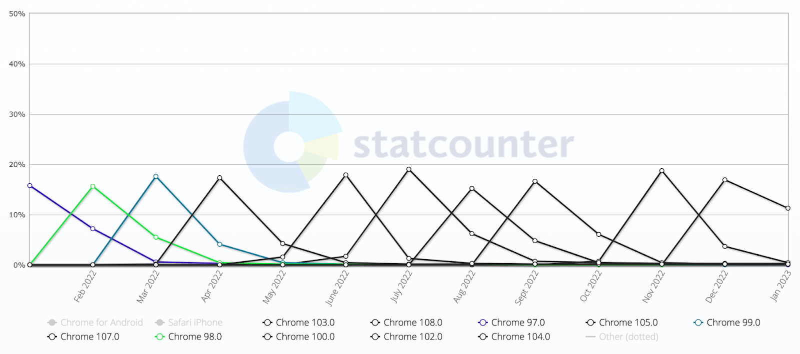
And when we see overall Google Chrome usage, it is almost 39%:
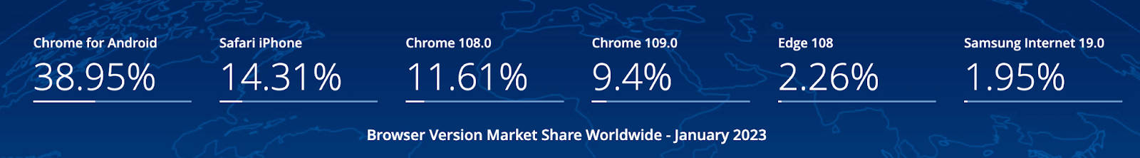
This means we are risking 27% of Google Chrome users, and this is just the story of one browser.
Another essential point is that Bootstrap is not responsive on the Internet Explorer browser. If your target matrix contains Internet Explorer, then not testing the web page would mean ignoring 28 million people still operating this 28-year-old browser. No developer or organization should move on this path.
Bootstrap clearly states that “it supports all the major browsers,” but no “browser engines” is mentioned. Considering browser engines are open-source and used to develop and release alternate browsers, the Bootstrap web page is not guaranteed to be supported. These browsers can be hugely popular and often become the secondary browsers in the local system.
The best example of this is the Brave browser which is not in the list of supported browsers of Bootstrap. The browser has more than 50+ million active monthly users as of August 2022. And it has only increased in the past couple of years. Similarly, there are other browsers developed on Chromium or Gecko engines that the end-user might be using and may face some challenges navigating the website.
The responsiveness of an image is one of the key points to check off the list when releasing a website. As a developer, we face many difficulties with Bootstrap and images.
This goal can be achieved with LambdaTest LT Browser. Considering a web page shown below, if I add one small image shot in landscape, the output would be as follows on a mobile device and desktop:
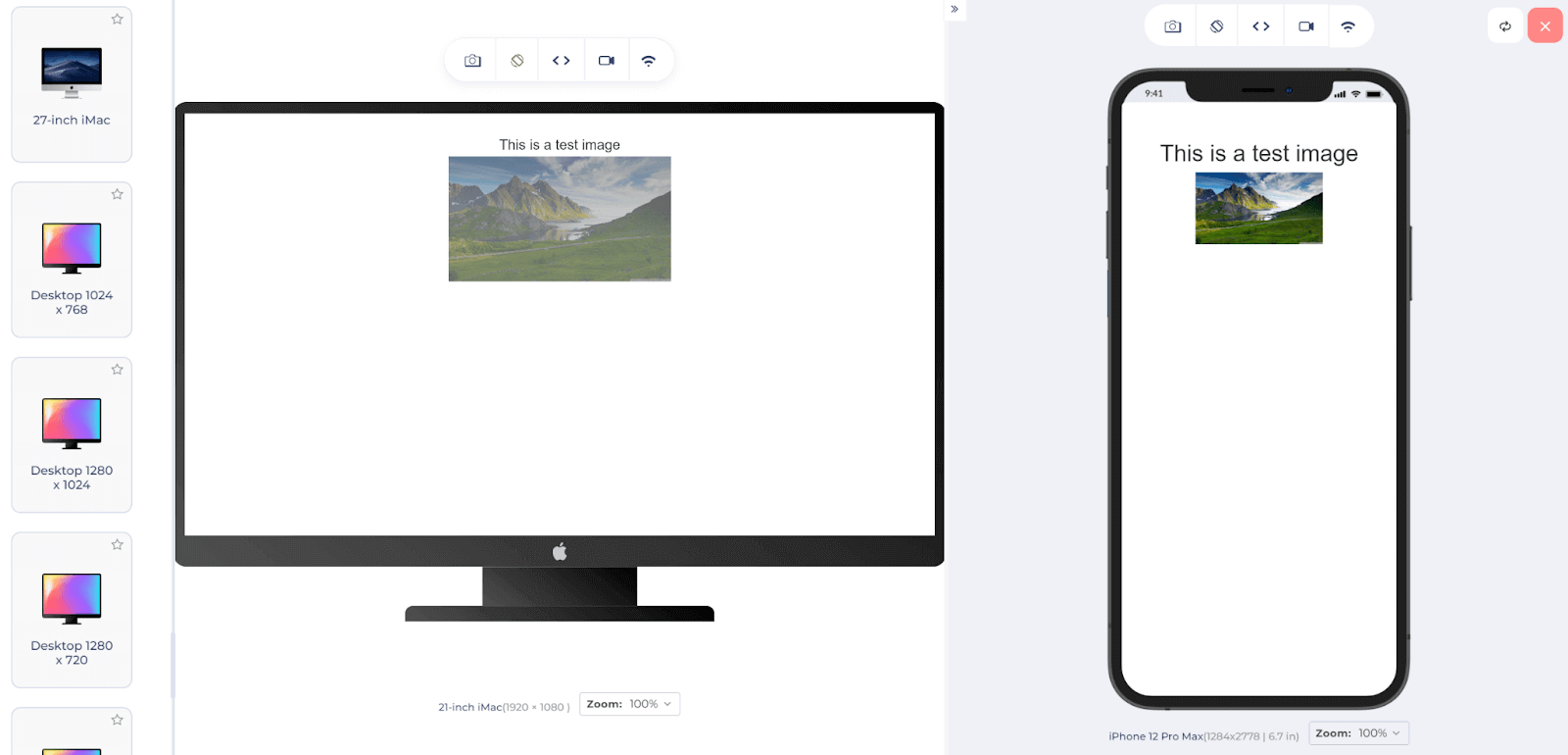
It looks all right on a desktop as intended, but the subject may lose focus on a mobile device. Bootstrap’s concept of responsiveness is only good till the point of rescaling elements according to the viewport. For actual responsiveness, we need responsive testing.
LT Browser provides various viewports on which you can enter the URL like a local browser. You can select multiple devices at a time and view your web application in just a few seconds.
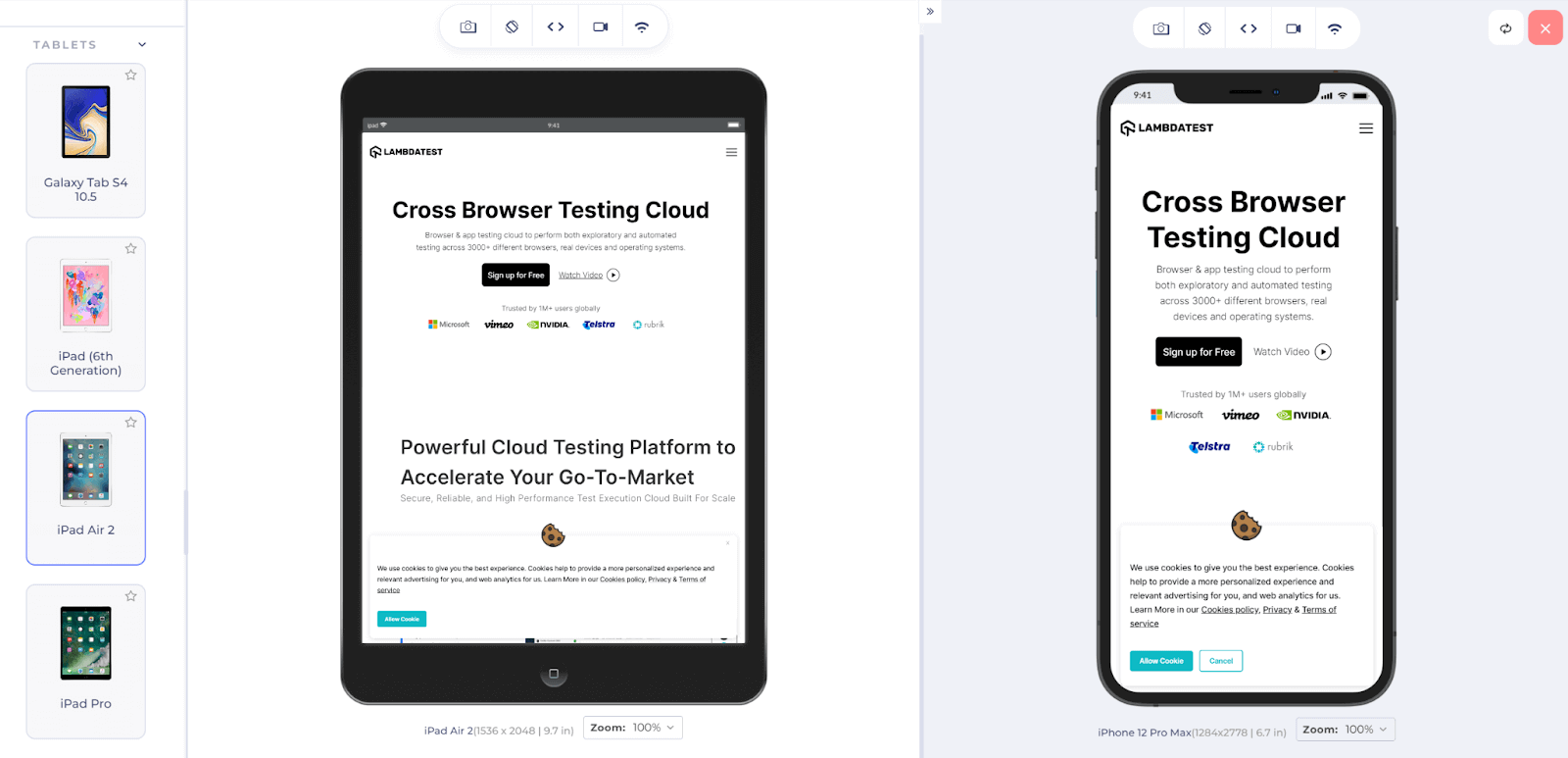
You can also use features that come with the browser, such as network throttling, capturing a screenshot, recording videos, etc. Download our LT Brower 2.0 and check the responsiveness of your web applications.

If you want to know more about image responsiveness, its associated elements, and different methods to deal with it. In that case, we have a dedicated post on how to make responsive images with CSS, HTML, WordPress & more.
Watch our video to learn how to perform responsive Bootstrap testing on the LambdaTest platform.
Subscribe to the LambdaTest YouTube Channel and stay updated with the latest tutorials around test automation, mobile app testing, Selenium testing, Cypress, Playwright, and more.
Finally, when advanced tools can point out various bugs and glitches in a web application from various angles, why not use them? By giving some more time and spending a little more money, organizations can have peace of mind that the web application will always be perfect no matter what the user is operating on. It will also help cut down maintenance time and costs that may come with post-production bugs.
How to perform Bootstrap Testing with LambdaTest?
LambdaTest is an online cross-browser testing platform that provides over 3000+ browsers for testers to test their mobile and web applications. The significant advantage of using LambdaTest is eliminating the high costs of maintaining multiple browsers and devices. In return, the developers and testers can use a robust infrastructure integrated with multiple technologies, which is helpful during Bootstrap testing.
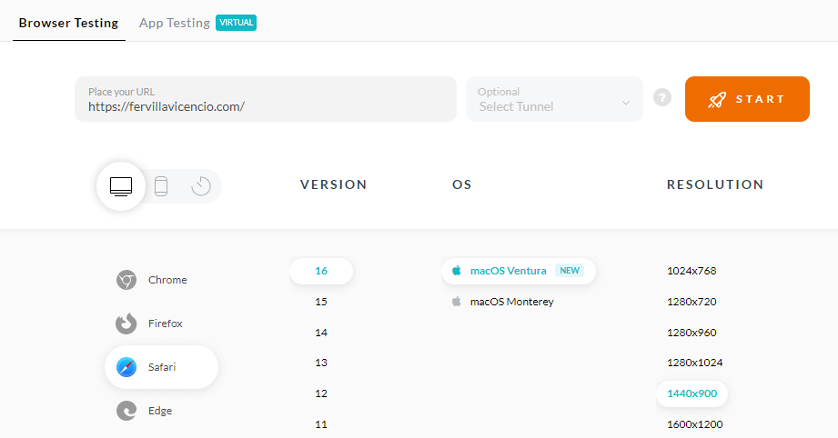
To test your web or mobile application on LambdaTest, all you need to do is follow the below-mentioned steps:
- Sign up for free or login into your dashboard.
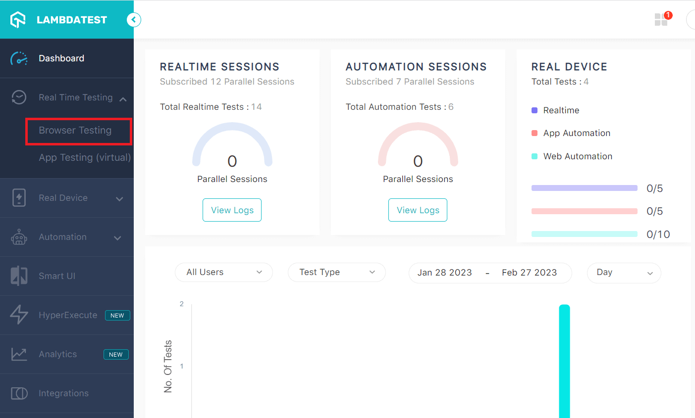
- Click on Real Time Testing -> Browser Testing from the left panel to test for web applications and App Testing to test mobile applications.
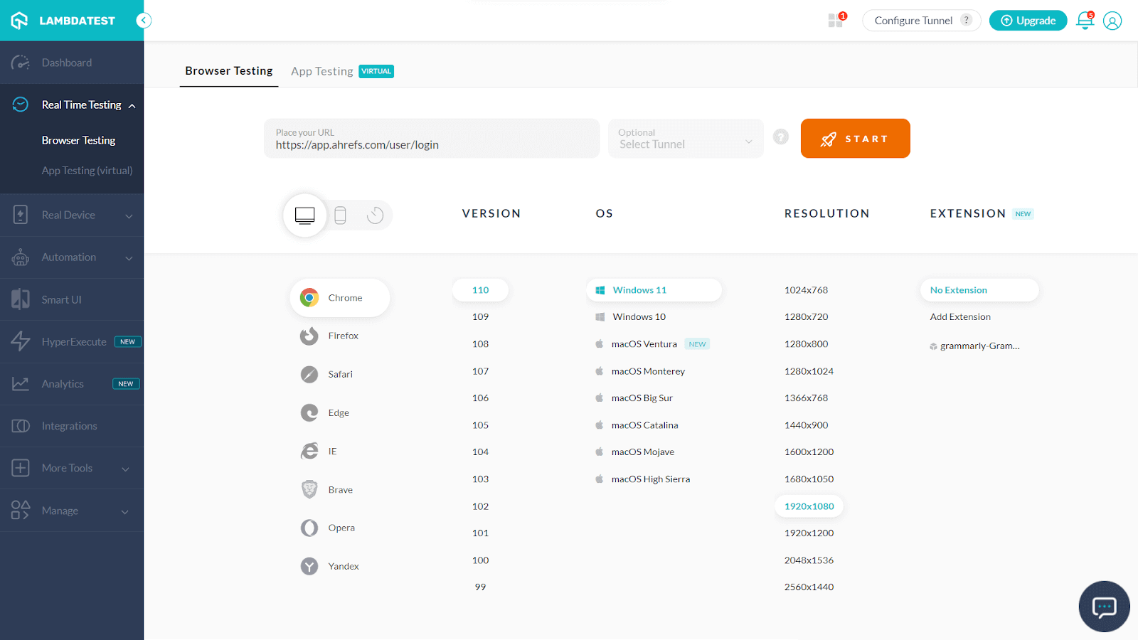
- Select the specifications on which you wish to test your application.
- Enter the URL of your web app and click on “START” to launch.
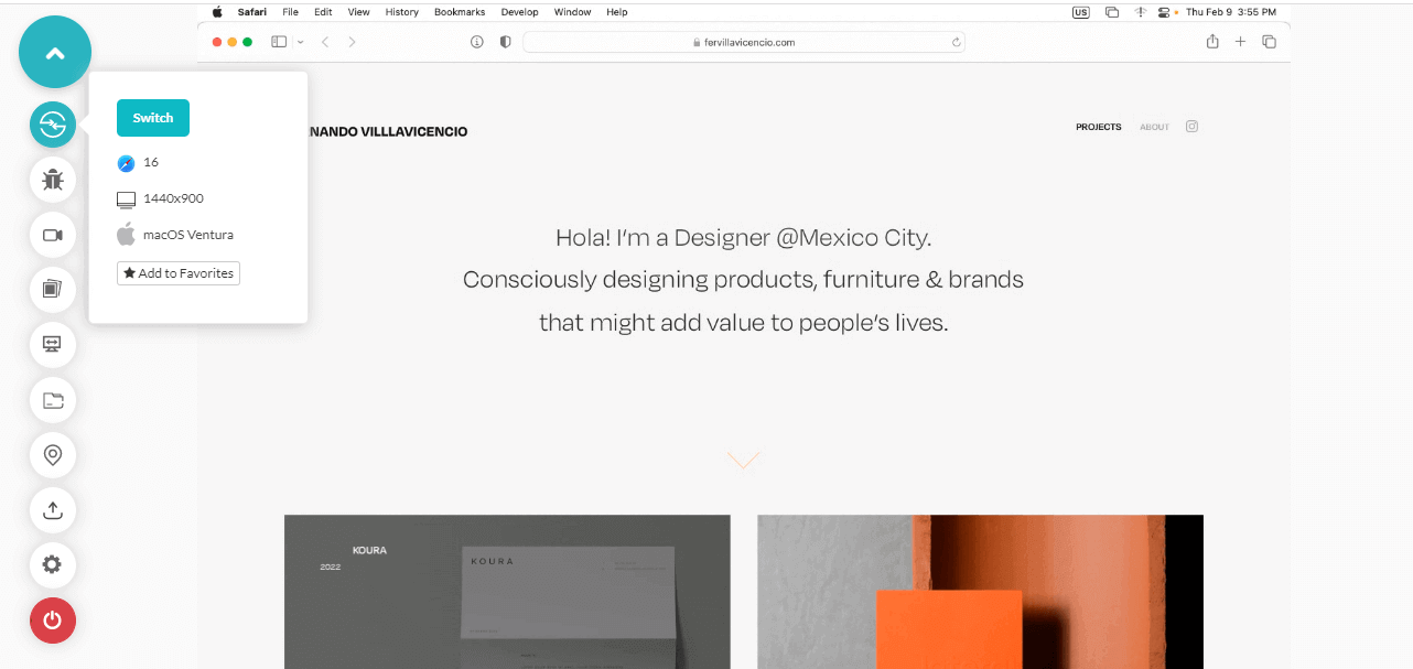
- On this screen, you can interact with the application like on a local browser. Try to resize and check the responsiveness of the website on various browsers.
You can also use the LambdaTest tunnel to test your development thoroughly in a secure shell testing environment hosted on LambdaTest cloud servers. It allows you to test your web applications on more than 3000+ browsers securely and their various versions, running on real OS code for cross-browser and cross-platform compatibility, even before it is deployed to an overproduction environment.
Also, if your only goal is to check responsiveness, LambdaTest offers LT Browser developed just for this purpose, as discussed in the above section. You can also check the mobile view of your website on different screen sizes and resolutions. Whether it’s an iPhone, iPad, Samsung, or MacBook, you get all the resolutions in the LT browser.
Can Bootstrap be used with JavaScript frameworks?
A web application will consume HTML, CSS, and JavaScript code in the majority. Recently in the last decade, various best JavaScript frameworks have popped up in the market because of JavaScript’s ability to provide functionality and dynamism to the application. These include React, Vue, and Angular. By looking at these frameworks’ adoption today, I am sure the question will arise of whether we can use Bootstrap with JavaScript frameworks or not.
The answer to this question is NO; we cannot . Bootstrap itself contains JavaScript functions that it ships in JavaScript files. Using other JavaScript frameworks will affect the complete DOM, including the elements Bootstrap affects. As a result of this collision, bugs may arise in the most visible application in dynamic elements like dropdowns.
As a precautionary note and recommendation from Bootstrap, the entire JavaScript libraries should not be used with JavaScript frameworks like Vue and React.
How to use Bootstrap with JavaScript Frameworks?
A lot of the time, Bootstrap and JavaScript frameworks will be used together to create a web page. In such cases, instead of using Bootstrap JavaScript, the developers should opt for Bootstrap’s framework-specific packages that are compatible with these technologies. For a specific framework, you can find a package online.
For instance, for React developers, React Bootstrap is available. For Vue developers, BootstrapVue is available, and similarly, ng-bootstrap is for Angular developers. Using these packages as an alternative will suit your project well in development and release.
Things to Remember while Bootstrap Testing & Development
Before concluding this post on Bootstrap testing, a few points are a must to discuss that can act as best practices or cautionary things for Bootstrap testing or something that you can put off in a list to verify the Bootstrap testing quality before releasing the application to the user.
- Accessibility – An essential part of Bootstrap testing is to perform accessibility testing. The application should be accessible to people who face challenges interacting with the web application, such as people with special abilities, etc. W3 has published guidelines that should be followed while developing or Bootstrap testing for accessibility. Bootstrap provides an accessible website, but since we use multiple technologies, testing for accessibility is one of the key features that should be checked off in the list.
- Overflow: Hidden – The overflow property is activated when the content overflows outside the element box. The value passed in this property determines the action to take when encountering such a scenario. With Bootstrap applications, overflow: hidden does not seem to work very well on iOS and Android. If this property is present in the code, it should be tested with priority, and workarounds should be applied.
- Hovering on iOS – Many websites provide the hovering effect for desktops where an element can hover over, and action is associated with this effect. For example, hovering to get a pop-up on Wikipedia like this:
- Safari Printing Issue – For developers and testers working on a website that may involve printing the web page (such as ticket booking systems), Bootstrap’s container class (used in the example above) may break on the Safari browser. Due to this, the font size of the web page may become extremely small and sometimes leave large spaces along the border. Start Bootstrap testing for your web pages for this issue, and if this exists, the workaround would be to set the width to “auto” while printing so that Safari can pick it up from there.
- Handling Android Stock Browser – Android operating system-enabled mobile devices (all till 4.1 and some after newer releases) ship with a default browser with many CSS-related bugs. The Bootstrap-based website can easily break with simple elements such as side controls if the user uses it. Although it would be hard to fix them all by workarounds, as many workarounds will depend on screen size or OS, we should always check whether we can resolve the simple elements to make the browsing experience convenient.
Watch our video on how to perform Accessibility testing with Cypress.
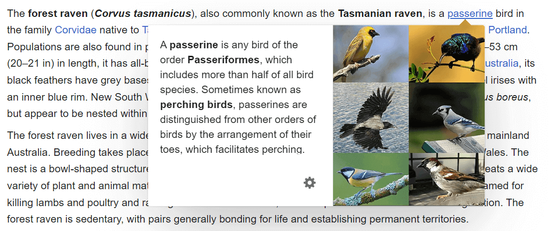
Since mobile devices work on touch-only technology as they do not have a mouse attached, hovering is impossible in the browsers installed on them. However, iOS tries to emulate this behavior for the user and create a hovering effect. Bootstrap websites have faced challenges in dealing with this. As Bootstrap puts it, “This behavior results in “sticky” hover styles that persist after tapping one element.” To remove them, users have to tap another element. If your application has a hovering effect, it should provide validations when opened in an iOS browser.
Check out our comprehensive guide on CSS hover effects to learn more about hovering effects.
|
1 2 3 4 5 |
@media print { .container { width: auto; } } |
The code above uses media queries which are one of the best ways to deal with such problems and create a workaround for different-sized devices as per need. If you wish to explore this further, go through our media query in-depth blog post to learn more.
Wrapping Up!
Bootstrap is an integral part of web development today. And more likely, the terms HTML, CSS, JavaScript, and Bootstrap all go together today. Organizations also use CSS and Bootstrap as a single term and often expect this from the candidate if they have written CSS in their resume. When a framework blends so deep into the web development field, it becomes essential to discuss its complexities, mixes with other frameworks, and bugs you may face in the journey.
In this post on Bootstrap testing, we tried to enlighten the reader with Bootstrap, not as a theoretical subject but as a practical guide with compelling examples. From its inception and the contents shipped along with the framework, we demonstrated how a beginner could develop a web page in Bootstrap. And once the development is complete, the web page needs to be tested using Bootstrap testing and check if it is an imperfect framework, like any other technology.
For this, we can rely on the cloud-based platform LambdaTest which helps us uncover all the hidden glitches on more than 3000+ browsers and devices. Concluding with the best practices to keep in mind while performing Bootstrap testing, I hope this tutorial on Bootstrap testing will serve you well in your web dev endeavors. Thank you for giving this Bootstrap testing tutorial your valuable time.
Happy Testing!
#LambdaTestYourApps


Author’s Profile
Harish Rajora
I am a computer science engineer. I love to keep growing as the technological world grows. I feel there is no powerful tool than a computer to change the world in any way. Apart from my field of study, I like reading books a lot and write sometimes on https://www.themeaninglesslife.com .
Blogs: 88
Got Questions? Drop them on LambdaTest Community. Visit now