
The Complete CSS Animations Tutorial [With Examples]
Ravi Kumar
Posted On: November 28, 2023
 181473 Views
 11 Min Read
Animation can bring creativity, enthusiasm, grab the user’s attention, convey things quickly, and improve usability. Recently, there has been a rise in the use of animation on websites and web apps. CSS Animations are an excellent way to create visual animations that are not restricted to a single motion like CSS Transitions but are far more developed. With that thought in mind, CSS developers considered introducing them to their library as CSS Animations.
Indeed, we can build some stunning animations using JavaScript and jQuery, but this is an expensive approach. For example, processing speed, cross browser compatibility, and code complexity are considered when designing animated UI.
In this CSS Animations tutorial, we will learn the concept of CSS Animations and break the animation into smaller units to understand the underlying concept. Later, we would make CSS Animations and run them on the web page.
Let’s begin with our CSS Animations tutorial!
TABLE OF CONTENTS
What Are CSS Animations?
CSS Animations are an important aspect of modern web design, allowing developers to bring life and interactivity to their web pages. The animation property in CSS has come a long way since its inception, with numerous improvements and optimizations made to make it easier and more efficient to use.
Before the introduction of the CSS animation property, developers used a variety of tools (or languages) like JavaScript, HTML5, GIFs, etc., to create animations on web pages.
These traditional animation methods require the CPU for rendering, making the process slower and more cumbersome. On the other hand, CSS Animations are hardware accelerated and use the GPU instead of the CPU – this makes them much faster and smoother compared to traditional JavaScript and other animation techniques and allows complex Animations to be displayed on web pages.
As web development technology has evolved, CSS Animations has become more popular and provides greater control and flexibility over the animation effects. A real-life example of this is Instagram, which uses the CSS infinite attribute to create a continuous scroll of content that dynamically updates as new posts are added.
Moving the CSS Animations provides better performance than JavaScript as the browser takes control and optimizes the animation for the performance. The properties that come with the CSS Animations can be divided into three major categories:
- Transformation – Transforming the dimensions, rescaling the objects, moving them from point A to B, etc.
- Transitions – Performing the transformations smoothly.
- Keyframes – Changing the animation (property, value, etc.) at a given time or state.
Once we have implemented the above three properties, we complete the CSS Animations. In this CSS Animations tutorial, we look at each one with relevant examples of CSS Animations.
Are Your CSS Animations Responsive?
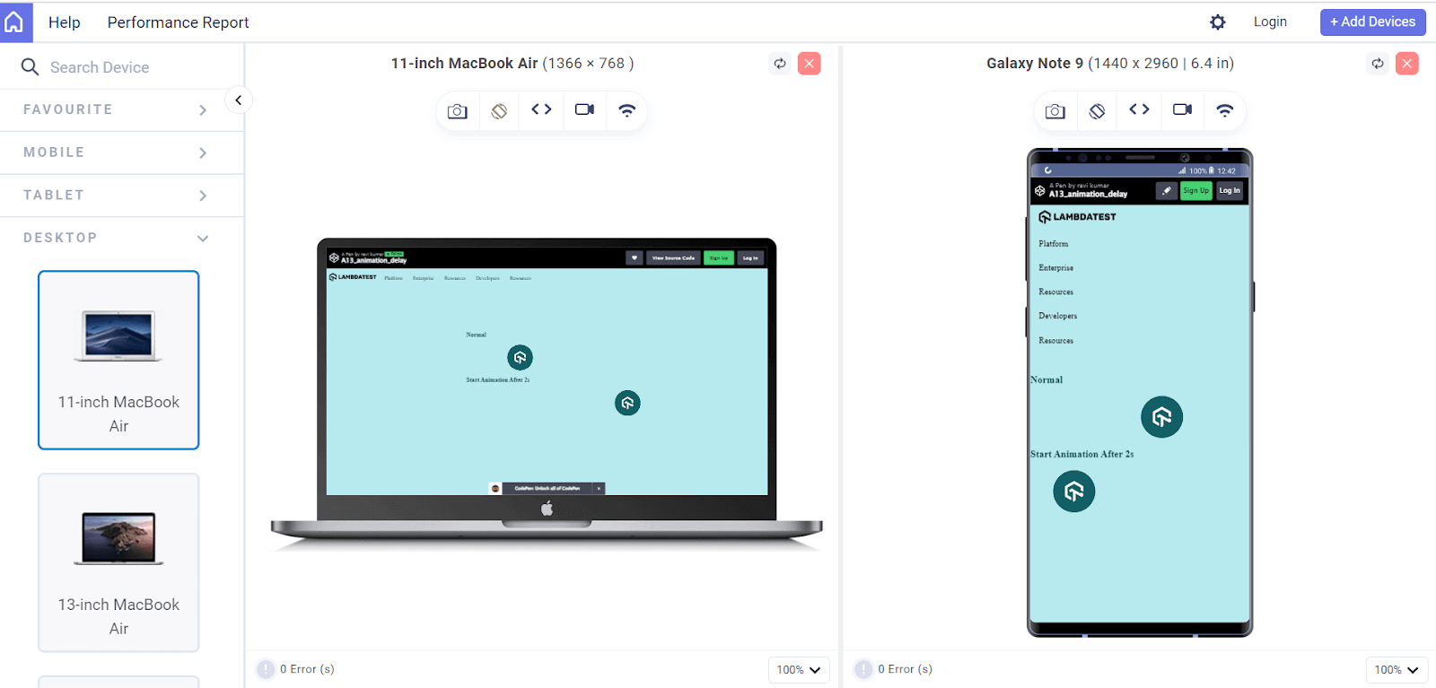
In this CSS Animations tutorial, we will learn how to create CSS Animations and incorporate them into websites and web pages. However, when we create CSS Animations, we want them to be compatible with many screen sizes like smartphones, tablets, desktops, laptops, etc. To build a responsive web design with CSS Animations, we must perform a responsiveness test using a responsive web checker tool.
Frequently testing responsiveness with manual techniques can be cumbersome and expensive. Therefore, you should invest in robust and free responsive web checker tools like LT Browser to save time and quickly test web designs.
With LT Browser, you can perform mobile view debugging across 50+ pre-built device viewports, create custom device resolutions, network simulation, hot reloading, generate performance reports powered by Google Lighthouse, and much more.

Catch up with the latest tutorials on mobile app testing, real device testing, and more — Subscribe to the LambdaTest YouTube Channel.
Let’s access the responsiveness of the animation-delay property in LT Browser on mobile and tablet viewports.
 Note
NoteTest your CSS Animations across 3000+ real environments. Try LambdaTest Today!
Parts of CSS Animations
CSS Animations are achieved using keyframes, which define the styles of elements at different points in time.
The CSS animation property specifies the following:
- animation-name
- animation-duration
- animation-timing-function
- animation-delay
- animation-iteration-count
With keyframes and the animation property, developers can create various CSS Animations, from simple scrolling effects to complex interactive animations.
CSS Animations can be divided into the following categories:
- Transformation: The transform property in CSS is used to apply a 2D or 3D transformation to an element. This property can rotate, scale, skew, or translate the respective element.
- Transition: The transition property in CSS allows the developers to specify the transition between two states of an element. For example, you could define a transition that smoothly changes the background color of an element when it’s hovered over.
- Keyframes: Keyframes are a fundamental aspect of CSS Animations. Keyframes define the start and end points of an animation and specify the styles that the element should have at different points during the animation. Keyframes are defined using the @keyframes rule and are applied to elements using the animation property.
Let’s dive into these CSS Animations in more detail.
CSS Transform
The CSS transform property is a shorthand property used to apply a 2D or 3D transformation to an element. The transform property can scale, rotate, skew, and translate an element in a two-dimensional or three-dimensional.
The transform property can be defined as:
- none: No transformation is applied to the object.
- value: Assign a value such as a scale.
- inherit: Inherit the property from the parent element.
- initial: Set the value as the default value for the property assigned to the object.
The previously defined value portion determines how the object will be used. We can replace it with the below four parameters.
Translate
The CSS translate function allows developers to move an element along the X-axis (horizontally) or Y-axis (vertically) by a specified number of pixels. This can be useful for creating exciting CSS Animations or effects on a website.
Syntax:
|
1 |
transform: translate_option(values); |
Here are the translate options provided by animation in CSS:
- translate(value): Used to translate only along the X-axis.
- translate(value, value): Used to translate along the X and Y axes.
- translateX(value): Used to translate along the X-axis.
- translateY(value): Used to translate along the Y-axis.
HTML:
|
1 2 3 4 5 6 7 8 9 10 11 12 13 14 15 16 17 18 19 20 21 22 23 24 25 26 27 28 29 30 31 32 33 34 35 36 37 38 39 40 41 42 43 44 45 46 47 48 49 50 51 52 53 54 55 56 57 58 59 60 61 62 63 64 65 66 67 68 69 70 71 72 |
<!DOCTYPE html> <html lang="en"> <head> <meta charset="UTF-8" /> <meta http-equiv="X-UA-Compatible" content="IE=edge" /> <meta name="viewport" content="width=device-width, initial-scale=1.0" /> <title>Transform</title> <link rel="stylesheet" href="style.css" /> </head> <body> <div class="navbar"> <a href="https://www.lambdatest.com/?utm_source=urlredirect" target = "_blank"><span><img src="https://user-images.githubusercontent.com/39921508/243080828-b69e0006-87b5-45e6-9462-2d65f7ab8855.svg" ></span></a> <div class="dropdown"> <button class="dropbtn">Platform <i class="fa fa-caret-down"></i> </button> <div class="dropdown-content"> <a href="#">Real Time Testing</a> <a href="#">Real Devices Cloud</a> <a href="#">Test Intelligence</a> <a href="#">Native Mobile App Testing</a> </div> </div> <div class="dropdown"> <button class="dropbtn">Enterprise <i class="fa fa-caret-down"></i> </button> <div class="dropdown-content"> <a href="#">Digital Experience Testing</a> <a href="#">Enterprise Execution Environment</a> </div> </div> <div class="dropdown"> <button class="dropbtn">Resources <i class="fa fa-caret-down"></i> </button> <div class="dropdown-content"> <a href="#">Blog</a> <a href="#">Webinars</a> <a href="#">Videos</a> <a href="#">Documentation</a> </div> </div> <div class="dropdown"> <button class="dropbtn">Developers <i class="fa fa-caret-down"></i> </button> <div class="dropdown-content"> <a href="#">Mobile App Testing</a> <a href="#">Selenium</a> <a href="#">Cypress</a> <a href="#">Real Time Web Testing</a> </div> </div> <div class="dropdown"> <button class="dropbtn">Resources <i class="fa fa-caret-down"></i> </button> <div class="dropdown-content"> <a href="#">Online Browser</a> <a href="#">Selenium Testing</a> <a href="#">Cypress Testing</a> <a href="#">Playwright Testing</a> </div> </div> </div> <div class = "image_box"> <img src ="https://user-images.githubusercontent.com/39921508/243075917-897ba703-a4c9-4665-9fe5-6fbd0860139a.png" class = "image"> </div> </body> </html> |
CSS:
|
1 2 3 4 5 6 7 8 9 10 11 12 13 14 15 16 17 18 19 20 21 22 23 24 25 26 27 28 29 30 31 32 33 34 35 36 37 38 39 40 41 42 43 44 45 46 47 48 49 50 51 52 53 54 55 56 57 58 59 60 61 62 63 64 65 66 67 68 69 70 71 72 73 74 75 76 77 78 79 80 81 82 83 84 85 86 87 88 89 90 91 92 93 94 95 96 97 98 99 100 101 102 103 104 105 106 107 108 109 110 111 112 113 114 115 116 117 118 119 120 121 122 123 124 125 126 127 128 129 130 131 132 133 134 135 136 137 138 |
body { background-color: #b7eaee; font-family: Arial, Helvetica, sans-serif; } .navbar { overflow: hidden; display: flex; align-items: center; } .navbar a { font-size: 16px; color: black; text-align: center; text-decoration: none; padding: 14px 8px; /* Adjusted padding */ } .dropdown { float: left; overflow: hidden; } .dropdown .dropbtn { font-size: 16px; border: none; outline: none; color: black; padding: 14px 16px; background-color: inherit; font-family: inherit; margin: 0; } .navbar a:hover, .dropdown:hover .dropbtn { text-decoration: underline; background-color:#26c1cb; color: #000; font-weight: bold; border-radius: 5px; } .dropdown-content { display: none; position: absolute; min-width: 160px; box-shadow: 0px 8px 16px 0px rgba(0, 0, 0, 0.2); z-index: 1; } .dropdown-content a { float: none; color: black; padding: 12px 16px; text-decoration: none; display: block; text-align: left; } .dropdown-content a:hover { background-color: #7ddae0; transform: scaleY(1.2); } .dropdown:hover .dropdown-content { display: block; } .image_box { /* animation properties */ animation-name: my-animation; animation-duration: 3s; animation-direction: alternate; animation-iteration-count: infinite; animation-timing-function: linear; /* other properties */ width: 250px; height: 250px; border-radius: 10px; position: absolute; left: 0; right: 0; margin-top: 10%; margin-left: auto; margin-right: auto; } .image{ width: 100%; border-radius: 10px; } /* Translate X */ /* @keyframes my-animation { from { background-color: #f09c87; } to { background-color: #8c4432; /* transform: translate(100px); */ /* transform: translateX(100px); */ /* } */ /* Translate Y */ @keyframes my-animation { from { /* background-color: #26c1cb; */ } to { /* background-color: #087076; */ transform: translate(0, 100px); /* transform: translateY(100px); */ } } /* Media query for responsiveness */ @media (max-width: 768px) { .navbar { flex-direction: column; align-items: flex-start; } .navbar a { width: 100%; text-align: left; padding: 10px 16px; } .navbar li { margin: 10px 0; } } |
See the Pen
A1_translate by ravi kumar (@ravikumar7210)
on CodePen.
The animation can either translate along the X-axis, Y-axis or in the both axis by giving both values (100px, 100px), and this can be observed by uncommenting the desired code section.
Scale
The CSS Scale function allows developers to change the size of an element. It takes two parameters: the Scale(x) and Scale(y) scaling factors, respectively. The values can be either positive or negative.
Negative values flip the element along the axis that you are scaling. For example, if you scale an element by -1 along the x-axis, it will flip horizontally. If you scale an element by -1 along the y-axis, it will flip the element vertically.
Unlike the translate function, we can’t use px, %, and em values in the scale function. Instead of changing the current dimensions, we must specify a scaling factor to either increase or decrease the size of an object.
| Scaling value | Scaling |
| 1 | No scaling |
| 2 | Element size is doubled (X & Y axis) |
| 0.5 | Element size is halved (X & Y axis) |
Syntax:
|
1 2 3 4 5 |
/* scale the object along X-axis and Y-axis transform: scale(1); transform: scaleX(1.5, 0.5); transform: scaleY(0.7); transform: scaleY(-0.5); |
The scaling options provide the following values:
- scale(1.5, 0.5): Scale the object 1.5 times along X-axis and half the object along the Y axis
- scale(1): Scale the object in equal proportion in the both X and Y axes
- scaleX(2): Doubled the object in the X-axis.
- scaleY(-0.5): Flip the object vertically and halve the object in the Y axis.
Let’s see an example to see in action.
HTML:
|
1 2 3 4 5 6 7 8 9 10 11 12 13 14 15 16 17 18 19 20 21 22 23 24 25 26 27 28 29 30 31 32 33 34 35 36 37 38 39 40 41 42 43 44 45 46 47 48 49 50 51 52 53 54 55 56 57 58 59 60 61 62 63 64 65 66 67 68 69 70 71 72 73 74 75 76 |
<!DOCTYPE html> <html lang="en"> <head> <meta charset="UTF-8" /> <meta http-equiv="X-UA-Compatible" content="IE=edge" /> <meta name="viewport" content="width=device-width, initial-scale=1.0" /> <title>Scale</title> <link rel="stylesheet" href="style.css" /> </head> <body> <div class="navbar"> <a href="https://www.lambdatest.com/?utm_source=urlredirect" target = "_blank"><span><img src="https://user-images.githubusercontent.com/39921508/243080828-b69e0006-87b5-45e6-9462-2d65f7ab8855.svg" ></span></a> <div class="dropdown"> <button class="dropbtn">Platform <i class="fa fa-caret-down"></i> </button> <div class="dropdown-content"> <a href="#">Real Time Testing</a> <a href="#">Real Devices Cloud</a> <a href="#">Test Intelligence</a> <a href="#">Native Mobile App Testing</a> </div> </div> <div class="dropdown"> <button class="dropbtn">Enterprise <i class="fa fa-caret-down"></i> </button> <div class="dropdown-content"> <a href="#">Digital Experience Testing</a> <a href="#">Enterprise Execution Environment</a> </div> </div> <div class="dropdown"> <button class="dropbtn">Resources <i class="fa fa-caret-down"></i> </button> <div class="dropdown-content"> <a href="#">Blog</a> <a href="#">Webinars</a> <a href="#">Videos</a> <a href="#">Documentation</a> </div> </div> <div class="dropdown"> <button class="dropbtn">Developers <i class="fa fa-caret-down"></i> </button> <div class="dropdown-content"> <a href="#">Mobile App Testing</a> <a href="#">Selenium</a> <a href="#">Cypress</a> <a href="#">Real Time Web Testing</a> </div> </div> <div class="dropdown"> <button class="dropbtn">Resources <i class="fa fa-caret-down"></i> </button> <div class="dropdown-content"> <a href="#">Online Browser</a> <a href="#">Selenium Testing</a> <a href="#">Cypress Testing</a> <a href="#">Playwright Testing</a> </div> </div> </div> <div class = "image_box"> <img src ="https://user-images.githubusercontent.com/39921508/243075917-897ba703-a4c9-4665-9fe5-6fbd0860139a.png" class = "image"> </div> </body> </html> |
CSS:
|
1 2 3 4 5 6 7 8 9 10 11 12 13 14 15 16 17 18 19 20 21 22 23 24 25 26 27 28 29 30 31 32 33 34 35 36 37 38 39 40 41 42 43 44 45 46 47 48 49 50 51 52 53 54 55 56 57 58 59 60 61 62 63 64 65 66 67 68 69 70 71 72 73 74 75 76 77 78 79 80 81 82 83 84 85 86 87 88 89 90 91 92 93 94 95 96 97 98 99 100 101 102 103 104 105 106 107 108 109 110 111 112 113 114 115 116 117 118 119 120 121 122 123 124 125 126 127 128 129 130 131 132 133 134 135 136 137 138 139 140 141 142 143 144 145 146 |
body { background-color: #b7eaee; font-family: Arial, Helvetica, sans-serif; } .navbar { overflow: hidden; display: flex; align-items: center; } .navbar a { font-size: 16px; color: black; text-align: center; text-decoration: none; padding: 14px 8px; /* Adjusted padding */ } .dropdown { float: left; overflow: hidden; } .dropdown .dropbtn { font-size: 16px; border: none; outline: none; color: black; padding: 14px 16px; background-color: inherit; font-family: inherit; margin: 0; } .navbar a:hover, .dropdown:hover .dropbtn { text-decoration: underline; background-color:#26c1cb; color: #000; font-weight: bold; border-radius: 5px; } .dropdown-content { display: none; position: absolute; min-width: 160px; box-shadow: 0px 8px 16px 0px rgba(0, 0, 0, 0.2); z-index: 1; } .dropdown-content a { float: none; color: black; padding: 12px 16px; text-decoration: none; display: block; text-align: left; } .dropdown-content a:hover { background-color: #7ddae0; transform: scaleY(1.2); } .dropdown:hover .dropdown-content { display: block; } .image_box { /* animation properties */ animation-name: my-animation; animation-duration: 3s; animation-direction: alternate; animation-iteration-count: infinite; animation-timing-function: linear; /* other properties */ width: 250px; height: 250px; border-radius: 10px; position: absolute; left: 0; right: 0; margin-top: 13%; margin-left: auto; margin-right: auto; } .image{ width: 100%; border-radius: 10px; } /* Scale X & Y Same for both*/ /* @keyframes my-animation { from { } to { transform: scale(1.5); } } */ /* @keyframes my-animation { from { } to { transform: scale(1.5, 2); } } */ /* Scale X */ @keyframes my-animation { from {} to { transform: scaleX(2); } } /* Scale Y */ /* @keyframes my-animation { from { } to { transform: scaleY(2); } } */ /* Media query for responsiveness */ @media (max-width: 768px) { .navbar { flex-direction: column; align-items: flex-start; } .navbar a { width: 100%; text-align: left; padding: 10px 16px; } .navbar li { margin: 10px 0; } } |
See the Pen
A2_Scale by ravi kumar (@ravikumar7210)
on CodePen.
The different sections of code demonstrate how to apply scaling in different directions such as X, Y, or both. Additionally, there are options to apply scaling in the forward or backward direction and uniform scaling in both X and Y directions.
Rotate
The rotate function allows developers to rotate an element about a fixed point in 2D space. You can use the rotate transformation to change the orientation of an element by a specified number of degrees.
The angle in rotate is specified in either degrees, gradians, radians, or turns. You can also specify the point of rotation using the transform-origin property. In this example, the transform origin is the Center.
Syntax:
|
1 2 3 |
Transform: rotate(30) Transform: rotateX(90) Transform: rotateY(180) |
- rotate(30): Rotate the object at 30 degrees.
- rotateX(90): Rotate the object at 90 degrees along the X-axis.
- rotateY(180): Rotate the object at 180 degrees along the Y-axis.
Let’s see an example to see in action.
HTML:
|
1 2 3 4 5 6 7 8 9 10 11 12 13 14 15 16 17 18 19 20 21 22 23 24 25 26 27 28 29 30 31 32 33 34 35 36 37 38 39 40 41 42 43 44 45 46 47 48 49 50 51 52 53 54 55 56 57 58 59 60 61 62 63 64 65 66 67 68 69 70 71 72 73 74 75 76 |
<!DOCTYPE html> <html lang="en"> <head> <meta charset="UTF-8" /> <meta http-equiv="X-UA-Compatible" content="IE=edge" /> <meta name="viewport" content="width=device-width, initial-scale=1.0" /> <title>Rotate</title> <link rel="stylesheet" href="style.css" /> </head> <body> <div class="navbar"> <a href="https://www.lambdatest.com/?utm_source=urlredirect" target = "_blank"><span><img src="https://user-images.githubusercontent.com/39921508/243080828-b69e0006-87b5-45e6-9462-2d65f7ab8855.svg" ></span></a> <div class="dropdown"> <button class="dropbtn">Platform <i class="fa fa-caret-down"></i> </button> <div class="dropdown-content"> <a href="#">Real Time Testing</a> <a href="#">Real Devices Cloud</a> <a href="#">Test Intelligence</a> <a href="#">Native Mobile App Testing</a> </div> </div> <div class="dropdown"> <button class="dropbtn">Enterprise <i class="fa fa-caret-down"></i> </button> <div class="dropdown-content"> <a href="#">Digital Experience Testing</a> <a href="#">Enterprise Execution Environment</a> </div> </div> <div class="dropdown"> <button class="dropbtn">Resources <i class="fa fa-caret-down"></i> </button> <div class="dropdown-content"> <a href="#">Blog</a> <a href="#">Webinars</a> <a href="#">Videos</a> <a href="#">Documentation</a> </div> </div> <div class="dropdown"> <button class="dropbtn">Developers <i class="fa fa-caret-down"></i> </button> <div class="dropdown-content"> <a href="#">Mobile App Testing</a> <a href="#">Selenium</a> <a href="#">Cypress</a> <a href="#">Real Time Web Testing</a> </div> </div> <div class="dropdown"> <button class="dropbtn">Resources <i class="fa fa-caret-down"></i> </button> <div class="dropdown-content"> <a href="#">Online Browser</a> <a href="#">Selenium Testing</a> <a href="#">Cypress Testing</a> <a href="#">Playwright Testing</a> </div> </div> </div> <div class = "image_box"> <img src ="https://user-images.githubusercontent.com/39921508/243075917-897ba703-a4c9-4665-9fe5-6fbd0860139a.png" class = "image"> </div> </body> </html> |
CSS:
|
1 2 3 4 5 6 7 8 9 10 11 12 13 14 15 16 17 18 19 20 21 22 23 24 25 26 27 28 29 30 31 32 33 34 35 36 37 38 39 40 41 42 43 44 45 46 47 48 49 50 51 52 53 54 55 56 57 58 59 60 61 62 63 64 65 66 67 68 69 70 71 72 73 74 75 76 77 78 79 80 81 82 83 84 85 86 87 88 89 90 91 92 93 94 95 96 97 98 99 100 101 102 103 104 105 106 107 108 109 110 111 112 113 114 115 116 117 118 119 120 121 122 123 124 125 126 127 128 129 130 131 132 133 134 135 136 137 138 139 140 141 142 143 144 145 146 147 148 |
body { background-color: #b7eaee; font-family: Arial, Helvetica, sans-serif; } .navbar { overflow: hidden; display: flex; align-items: center; } .navbar a { font-size: 16px; color: black; text-align: center; text-decoration: none; padding: 14px 8px; /* Adjusted padding */ } .dropdown { float: left; overflow: hidden; } .dropdown .dropbtn { font-size: 16px; border: none; outline: none; color: black; padding: 14px 16px; background-color: inherit; font-family: inherit; margin: 0; } .navbar a:hover, .dropdown:hover .dropbtn { text-decoration: underline; background-color:#26c1cb; color: #000; font-weight: bold; border-radius: 5px; } .dropdown-content { display: none; position: absolute; min-width: 160px; box-shadow: 0px 8px 16px 0px rgba(0, 0, 0, 0.2); z-index: 1; } .dropdown-content a { float: none; color: black; padding: 12px 16px; text-decoration: none; display: block; text-align: left; } .dropdown-content a:hover { background-color: #7ddae0; transform: scaleY(1.2); } .dropdown:hover .dropdown-content { display: block; } img { width: 100%; } .image_box { /* animation properties */ animation-name: my-animation; animation-duration: 3s; animation-direction: alternate; animation-iteration-count: infinite; animation-timing-function: linear; /* other properties */ width: 250px; height: 250px; border-radius: 10px; position: absolute; left: 0; right: 0; margin-top: 13%; margin-left: auto; margin-right: auto; } .image{ width: 100%; border-radius: 10px; } /* Rotate*/ /* @keyframes my-animation { from { } to { transform: rotate(90deg); } } */ /* Rotate along X*/ /* @keyframes my-animation { from { } to { transform: rotateX(90deg); } } */ /* Rotate along Y*/ @keyframes my-animation { from {} to { transform-origin: center; transform: rotateY(90deg); } } /* Media query for responsiveness */ @media (max-width: 768px) { .navbar { flex-direction: column; align-items: flex-start; } .navbar a { width: 100%; text-align: left; padding: 10px 16px; } .navbar li { margin: 10px 0; } } |
See the Pen
A3_Rotate by ravi kumar (@ravikumar7210)
on CodePen.
The different sections of code demonstrate how to apply rotating in different directions such as X, Y, or both. Additionally, the animation is set to alternate between the colors specified in the from and to values of the @keyframes rule.
Skew
The skew function allows developers to skew an element in 2D space. Skew is used to slant an object at a specific angle. It can create various effects, such as tilting an element or creating a 3D effect.
The angle in rotate is specified in either degrees, gradians, radians, or turns.
Syntax:
|
1 2 3 |
transform: skew(30,60); transform: skewX(90); transform: skewY(180); |
- skew(30,60): Skew the object at an angle of 30 degrees on the X-axis and 60 degrees on the Y-axis.
- skewX(90): Skew the object at 90 degrees on the X-axis.
- skewY(180): Skew the object at 180 degrees on the Y-axis.
Let’s see an example to see in action:
HTML:
|
1 2 3 4 5 6 7 8 9 10 11 12 13 14 15 16 17 18 19 20 21 22 23 24 25 26 27 28 29 30 31 32 33 34 35 36 37 38 39 40 41 42 43 44 45 46 47 48 49 50 51 52 53 54 55 56 57 58 59 60 61 62 63 64 65 66 67 68 69 70 71 72 73 74 75 76 |
<!DOCTYPE html> <html lang="en"> <head> <meta charset="UTF-8" /> <meta http-equiv="X-UA-Compatible" content="IE=edge" /> <meta name="viewport" content="width=device-width, initial-scale=1.0" /> <title>Skew</title> <link rel="stylesheet" href="style.css" /> </head> <body> <div class="navbar"> <a href="https://www.lambdatest.com/?utm_source=urlredirect" target = "_blank"><span><img src="https://user-images.githubusercontent.com/39921508/243080828-b69e0006-87b5-45e6-9462-2d65f7ab8855.svg" ></span></a> <div class="dropdown"> <button class="dropbtn">Platform <i class="fa fa-caret-down"></i> </button> <div class="dropdown-content"> <a href="#">Real Time Testing</a> <a href="#">Real Devices Cloud</a> <a href="#">Test Intelligence</a> <a href="#">Native Mobile App Testing</a> </div> </div> <div class="dropdown"> <button class="dropbtn">Enterprise <i class="fa fa-caret-down"></i> </button> <div class="dropdown-content"> <a href="#">Digital Experience Testing</a> <a href="#">Enterprise Execution Environment</a> </div> </div> <div class="dropdown"> <button class="dropbtn">Resources <i class="fa fa-caret-down"></i> </button> <div class="dropdown-content"> <a href="#">Blog</a> <a href="#">Webinars</a> <a href="#">Videos</a> <a href="#">Documentation</a> </div> </div> <div class="dropdown"> <button class="dropbtn">Developers <i class="fa fa-caret-down"></i> </button> <div class="dropdown-content"> <a href="#">Mobile App Testing</a> <a href="#">Selenium</a> <a href="#">Cypress</a> <a href="#">Real Time Web Testing</a> </div> </div> <div class="dropdown"> <button class="dropbtn">Resources <i class="fa fa-caret-down"></i> </button> <div class="dropdown-content"> <a href="#">Online Browser</a> <a href="#">Selenium Testing</a> <a href="#">Cypress Testing</a> <a href="#">Playwright Testing</a> </div> </div> </div> <div class = "image_box"> <img src ="https://user-images.githubusercontent.com/39921508/243075917-897ba703-a4c9-4665-9fe5-6fbd0860139a.png" class = "image"> </div> </body> </html> |
CSS:
|
1 2 3 4 5 6 7 8 9 10 11 12 13 14 15 16 17 18 19 20 21 22 23 24 25 26 27 28 29 30 31 32 33 34 35 36 37 38 39 40 41 42 43 44 45 46 47 48 49 50 51 52 53 54 55 56 57 58 59 60 61 62 63 64 65 66 67 68 69 70 71 72 73 74 75 76 77 78 79 80 81 82 83 84 85 86 87 88 89 90 91 92 93 94 95 96 97 98 99 100 101 102 103 104 105 106 107 108 109 110 111 112 113 114 115 116 117 118 119 120 121 122 123 124 125 126 127 128 129 130 131 132 133 134 135 136 137 138 139 140 141 142 |
body { background-color: #b7eaee; font-family: Arial, Helvetica, sans-serif; } .navbar { overflow: hidden; display: flex; align-items: center; } .navbar a { font-size: 16px; color: black; text-align: center; text-decoration: none; padding: 14px 8px; /* Adjusted padding */ } .dropdown { float: left; overflow: hidden; } .dropdown .dropbtn { font-size: 16px; border: none; outline: none; color: black; padding: 14px 16px; background-color: inherit; font-family: inherit; margin: 0; } .navbar a:hover, .dropdown:hover .dropbtn { text-decoration: underline; background-color:#26c1cb; color: #000; font-weight: bold; border-radius: 5px; } .dropdown-content { display: none; position: absolute; min-width: 160px; box-shadow: 0px 8px 16px 0px rgba(0, 0, 0, 0.2); z-index: 1; } .dropdown-content a { float: none; color: black; padding: 12px 16px; text-decoration: none; display: block; text-align: left; } .dropdown-content a:hover { background-color: #7ddae0; transform: scaleY(1.2); } .dropdown:hover .dropdown-content { display: block; } .image_box { /* animation properties */ animation-name: my-animation; animation-duration: 3s; animation-direction: alternate; animation-iteration-count: infinite; animation-timing-function: linear; /* other properties */ width: 250px; height: 250px; border-radius: 10px; position: absolute; left: 0; right: 0; margin-top: 10%; margin-left: auto; margin-right: auto; } .image{ width: 100%; border-radius: 10px; } /* Rotate along X & Y @keyframes my-animation { from { } to { transform: skew(45deg, 45deg); } } */ /* Rotate along X & Y */ /* @keyframes my-animation { from {} to { transform: skewX(45deg); } } */ /* Rotate along Y */ @keyframes my-animation { from { } to { transform: skewY(45deg); } } /* Media query for responsiveness */ @media (max-width: 768px) { .navbar { flex-direction: column; align-items: flex-start; } .navbar a { width: 100%; text-align: left; padding: 10px 16px; } .navbar li { margin: 10px 0; } } |
See the Pen
A4_Skew by ravi kumar (@ravikumar7210)
on CodePen.
In this, the animation uses the transform property to apply a skew or slant effect to the square. The code includes three different CSS Animations variations, such as skew in the X, Y, and both axes.
Browser Compatibility
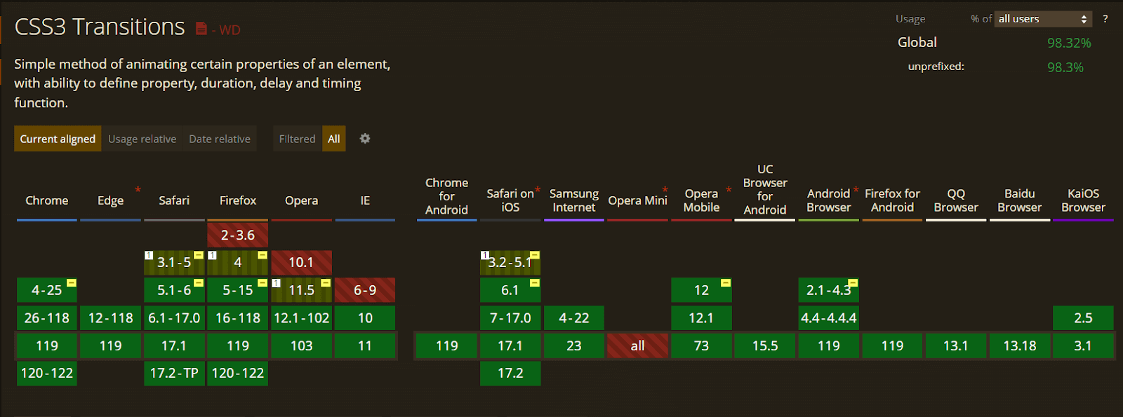
CSS transform enjoys excellent browser compatibility and is supported by all major browsers.
So, you can use it and transform all the objects on the web page without worrying about cross-browser compatibility issues.
CSS Transition
CSS transitions allow developers to animate smoothly changes to an element’s style. This can add a dynamic and polished touch to our web pages and make our website feel more alive.
Transitions are created by specifying two styles for an element, one for its normal state and another for its hover state, and then using the transition property to control how the change from one state to another is animated over time.
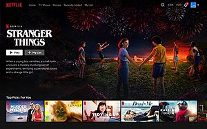
Netflix uses CSS transitions to animate the play button on its website. When you hover over the play button, it changes from a solid color to a transparent color. This animation makes it clear to users that they can interact with the button.
You can use this property by specifying the duration, timing function, and delay of a transition, so that the change in property value occurs gradually over time instead of abruptly.
The transition property takes the following values:
- none: Used to signify that no property should make transitions.
- all: Used to signify all the properties that can transit or should transit.
- property_name: It’s defined as the name of the property where you want the transition to occur.
The transition property consists of four parameters:
- transition-delay
- transition-duration
- transition-property
- transition-timing-function
transition-duration
The transition-duration property specifies the length of time that a transition should take to complete. It works alongside the transition property to animate changes in an element’s property value changes. We can specify the duration in seconds or milliseconds.
It is important to specify the transition-duration property. If this property is not defined, the default value of zero is taken into consideration.
Syntax:
|
1 |
transition-duration: 2s; |
Let’s see an example.
HTML:
|
1 2 3 4 5 6 7 8 9 10 11 12 13 14 15 16 17 18 19 20 21 22 23 24 25 26 27 28 29 30 31 32 33 34 35 36 37 38 39 40 41 42 43 44 45 46 47 48 49 50 51 52 53 54 55 56 57 58 59 60 61 62 63 64 65 66 67 68 69 70 71 72 73 74 75 76 |
<!DOCTYPE html> <html lang="en"> <head> <meta charset="UTF-8" /> <meta http-equiv="X-UA-Compatible" content="IE=edge" /> <meta name="viewport" content="width=device-width, initial-scale=1.0" /> <title>Transition Property</title> <link rel="stylesheet" href="style.css" /> <link rel="preconnect" href="https://fonts.googleapis.com"> <link rel="preconnect" href="https://fonts.gstatic.com" crossorigin> <link href="https://fonts.googleapis.com/css2?family=Roboto+Slab&display=swap" rel="stylesheet"> </head> <body> <div class="navbar"> <a href="https://www.lambdatest.com/?utm_source=urlredirect" target = "_blank"><span><img src="https://user-images.githubusercontent.com/39921508/243080828-b69e0006-87b5-45e6-9462-2d65f7ab8855.svg" ></span></a> <div class="dropdown"> <button class="dropbtn">Platform <i class="fa fa-caret-down"></i> </button> <div class="dropdown-content"> <a href="#">Real Time Testing</a> <a href="#">Real Devices Cloud</a> <a href="#">Test Intelligence</a> <a href="#">Native Mobile App Testing</a> </div> </div> <div class="dropdown"> <button class="dropbtn">Enterprise <i class="fa fa-caret-down"></i> </button> <div class="dropdown-content"> <a href="#">Digital Experience Testing</a> <a href="#">Enterprise Execution Environment</a> </div> </div> <div class="dropdown"> <button class="dropbtn">Resources <i class="fa fa-caret-down"></i> </button> <div class="dropdown-content"> <a href="#">Blog</a> <a href="#">Webinars</a> <a href="#">Videos</a> <a href="#">Documentation</a> </div> </div> <div class="dropdown"> <button class="dropbtn">Developers <i class="fa fa-caret-down"></i> </button> <div class="dropdown-content"> <a href="#">Mobile App Testing</a> <a href="#">Selenium</a> <a href="#">Cypress</a> <a href="#">Real Time Web Testing</a> </div> </div> <div class="dropdown"> <button class="dropbtn">Resources <i class="fa fa-caret-down"></i> </button> <div class="dropdown-content"> <a href="#">Online Browser</a> <a href="#">Selenium Testing</a> <a href="#">Cypress Testing</a> <a href="#">Playwright Testing</a> </div> </div> </div> <div class="container"> <div class="child child-1">Normal</div> <div class="child child-2">Transition-Duration '3s'</div> </div> </body> </html> |
CSS:
|
1 2 3 4 5 6 7 8 9 10 11 12 13 14 15 16 17 18 19 20 21 22 23 24 25 26 27 28 29 30 31 32 33 34 35 36 37 38 39 40 41 42 43 44 45 46 47 48 49 50 51 52 53 54 55 56 57 58 59 60 61 62 63 64 65 66 67 68 69 70 71 72 73 74 75 76 77 78 79 80 81 82 83 84 85 86 87 88 89 90 91 92 93 94 95 96 97 98 99 100 101 102 103 104 105 106 107 108 109 110 111 112 113 114 115 116 117 118 119 120 121 122 123 124 125 126 127 128 129 130 131 132 133 134 135 136 137 138 139 140 141 142 143 144 145 146 147 148 149 150 151 152 153 154 155 156 157 158 159 160 161 162 163 164 165 166 167 168 169 170 171 172 173 |
* { padding: 0; margin: 0; } body { background-color: #b7eaee; font-family: Arial, Helvetica, sans-serif; } .navbar { overflow: hidden; display: flex; align-items: center; } .navbar a { font-size: 16px; color: black; text-align: center; text-decoration: none; padding: 14px 8px; /* Adjusted padding */ } .dropdown { float: left; overflow: hidden; } .dropdown .dropbtn { font-size: 16px; border: none; outline: none; color: black; padding: 14px 16px; background-color: inherit; font-family: inherit; margin: 0; } .navbar a:hover, .dropdown:hover .dropbtn { text-decoration: underline; background-color:#26c1cb; color: #000; font-weight: bold; border-radius: 5px; } .dropdown-content { display: none; position: absolute; min-width: 160px; box-shadow: 0px 8px 16px 0px rgba(0, 0, 0, 0.2); z-index: 1; } .dropdown-content a { float: none; color: black; padding: 12px 16px; text-decoration: none; display: block; text-align: left; } .dropdown-content a:hover { background-color: #7ddae0; transform: scaleY(1.2); } .dropdown:hover .dropdown-content { display: block; } .image_box { /* animation properties */ animation-name: my-animation; animation-duration: 3s; animation-direction: alternate; animation-iteration-count: infinite; animation-timing-function: linear; /* other properties */ width: 250px; height: 250px; border-radius: 10px; position: absolute; left: 0; right: 0; margin-top: 10%; margin-left: auto; margin-right: auto; } body { background-color: #b7eaee; color: #04383b; font-family: 'Roboto Slab', serif; } .container { width: 250px; height: 250px; border-radius: 10px; position: absolute; left: 0; right: 0; margin-top: 10%; margin-left: auto; margin-right: auto; } .child { background-color: #26c1cb; margin-top: 20px; width: 300px; text-align: center; padding: 25px; transition-property: width; } .child:hover { width: 500px; background-color: #087076; } .child-1 { transition-timing-function: linear; } .child-2 { transition-timing-function: ease; transition-duration: 3s; } /* Media query for responsiveness */ @media (max-width: 768px) { .navbar { flex-direction: column; align-items: flex-start; } .navbar a { width: 100%; text-align: left; padding: 10px 16px; } .navbar li { margin: 10px 0; } } |
See the Pen
A5_Transition_duration by ravi kumar (@ravikumar7210)
on CodePen.
In this scenario, two rectangular boxes are generated, and animation is implemented on each of them with specific time durations. Each box has a different time duration to show the difference in animation applied to the box.
The first box has a transition duration of 0, whereas the second box has a transition duration of 3 seconds.
|
1 |
transition-timing-function |
The transition-timing-function property in CSS is used to specify the speed curve of a transition. It defines how the transition will progress over time, determining the rate at which the transition runs from start to finish. Several predefined values can be used with the transition-timing-function property like linear, ease-in, etc.
Syntax:
|
1 2 |
transition-timing-function: linear? ease/ ease-in/ ease-out/ ease-in-out/ cubic bezier(); |
- linear: The transition has a constant speed.
- ease-in: The transition begins at a slow pace and gradually accelerates.
- ease-out: The transition starts quickly and then slows down.
- ease-in-out: The transition starts slowly, speeds up in the middle, and slows down again at the end.
- cubic-bezier(): we can also create custom speed curves using the cubic-bezier() function. The cubic-bezier() function takes four values (x1, x2, y1, y2, four points of the curve) that define a cubic Bézier curve, which can be used to create a custom speed curve for the transition.
By choosing the right value for the transition-timing-function property, you can control the speed and progression of your transitions and create a variety of different CSS Animations effects.
Let’s see an example to see in action:
HTML:
|
1 2 3 4 5 6 7 8 9 10 11 12 13 14 15 16 17 18 19 20 21 22 23 24 25 26 27 28 29 30 31 32 33 34 35 36 37 38 39 40 41 42 43 44 45 46 47 48 49 50 51 52 53 54 55 56 57 58 59 60 61 62 63 64 65 66 67 68 69 70 71 72 73 74 75 76 |
<!DOCTYPE html> <html lang="en"> <head> <meta charset="UTF-8" /> <meta http-equiv="X-UA-Compatible" content="IE=edge" /> <meta name="viewport" content="width=device-width, initial-scale=1.0" /> <title>Transition Property</title> <link rel="stylesheet" href="style.css" /> </head> <body> <div class="navbar"> <a href="https://www.lambdatest.com/?utm_source=urlredirect" target = "_blank"><span><img src="https://user-images.githubusercontent.com/39921508/243080828-b69e0006-87b5-45e6-9462-2d65f7ab8855.svg" ></span></a> <div class="dropdown"> <button class="dropbtn">Platform <i class="fa fa-caret-down"></i> </button> <div class="dropdown-content"> <a href="#">Real Time Testing</a> <a href="#">Real Devices Cloud</a> <a href="#">Test Intelligence</a> <a href="#">Native Mobile App Testing</a> </div> </div> <div class="dropdown"> <button class="dropbtn">Enterprise <i class="fa fa-caret-down"></i> </button> <div class="dropdown-content"> <a href="#">Digital Experience Testing</a> <a href="#">Enterprise Execution Environment</a> </div> </div> <div class="dropdown"> <button class="dropbtn">Resources <i class="fa fa-caret-down"></i> </button> <div class="dropdown-content"> <a href="#">Blog</a> <a href="#">Webinars</a> <a href="#">Videos</a> <a href="#">Documentation</a> </div> </div> <div class="dropdown"> <button class="dropbtn">Developers <i class="fa fa-caret-down"></i> </button> <div class="dropdown-content"> <a href="#">Mobile App Testing</a> <a href="#">Selenium</a> <a href="#">Cypress</a> <a href="#">Real Time Web Testing</a> </div> </div> <div class="dropdown"> <button class="dropbtn">Resources <i class="fa fa-caret-down"></i> </button> <div class="dropdown-content"> <a href="#">Online Browser</a> <a href="#">Selenium Testing</a> <a href="#">Cypress Testing</a> <a href="#">Playwright Testing</a> </div> </div> </div> <div class="container"> <div class="child child-1">Linear</div> <div class="child child-2">Ease</div> <div class="child child-">Ease-In</div> <div class="child child-4">Ease-out</div> <div class="child child-3">Ease-in-out</div> </div> </body> </html> |
CSS:
|
1 2 3 4 5 6 7 8 9 10 11 12 13 14 15 16 17 18 19 20 21 22 23 24 25 26 27 28 29 30 31 32 33 34 35 36 37 38 39 40 41 42 43 44 45 46 47 48 49 50 51 52 53 54 55 56 57 58 59 60 61 62 63 64 65 66 67 68 69 70 71 72 73 74 75 76 77 78 79 80 81 82 83 84 85 86 87 88 89 90 91 92 93 94 95 96 97 98 99 100 101 102 103 104 105 106 107 108 109 110 111 112 113 114 115 116 117 118 119 120 121 122 123 124 125 126 127 128 129 130 131 132 133 134 135 136 137 138 139 140 141 142 143 144 145 146 147 148 149 150 151 152 153 154 155 156 157 |
* { padding: 0; margin: 0; } body { background-color: #b7eaee; font-family: Arial, Helvetica, sans-serif; background-color: #b7eaee; color: #04383b; font-family: 'Roboto Slab', serif; } .navbar { overflow: hidden; display: flex; align-items: center; } .navbar a { font-size: 16px; color: black; text-align: center; text-decoration: none; padding: 14px 8px; /* Adjusted padding */ } .dropdown { float: left; overflow: hidden; } .dropdown .dropbtn { font-size: 16px; border: none; outline: none; color: black; padding: 14px 16px; background-color: inherit; font-family: inherit; margin: 0; } .navbar a:hover, .dropdown:hover .dropbtn { text-decoration: underline; background-color:#26c1cb; color: #000; font-weight: bold; border-radius: 5px; } .dropdown-content { display: none; position: absolute; min-width: 160px; box-shadow: 0px 8px 16px 0px rgba(0, 0, 0, 0.2); z-index: 1; } .dropdown-content a { float: none; color: black; padding: 12px 16px; text-decoration: none; display: block; text-align: left; } .dropdown-content a:hover { background-color: #7ddae0; transform: scaleY(1.2); } .dropdown:hover .dropdown-content { display: block; } .container { width: 250px; height: 250px; border-radius: 10px; position: absolute; left: 0; right: 0; margin-top: 4%; margin-left: auto; margin-right: auto; } .child { background-color:#26c1cb; margin-top: 20px; width: 300px; text-align: center; padding: 25px; transition-property: width; transition-duration: 2s; } .child:hover { width: 500px; background-color: #087076; font-weight: 10px; } .child-1 { transition-timing-function: linear; } .child-2 { transition-timing-function: ease; } .child-3 { transition-timing-function: ease-in; } .child-4 { transition-timing-function: ease-out; } .child-5 { transition-timing-function: ease-in-out; } /* Media query for responsiveness */ @media (max-width: 768px) { .navbar { flex-direction: column; align-items: flex-start; } .navbar a { width: 100%; text-align: left; padding: 10px 16px; } .navbar li { margin: 10px 0; } } |
See the Pen
A6_Transition_timing_function by ravi kumar (@ravikumar7210)
on CodePen.
The div called container is created with five child elements. Each child element has a different timing function set for its transition effect. On hover, the child elements increase their width, change the background color, and font weight. The container has a fixed size and is positioned at the centre of the page.
transition-delay
The transition-delay property in CSS specifies the time that should elapse before a transition starts. The transition-delay property is specified in seconds or milliseconds, and it determines how long to wait before the transition begins after the property being transitioned has changed.
You can also use negative values with the transition-delay property. For example, a transition delay of –0.5s would cause the transition to start immediately and run in reverse for 0.5 seconds. This animation technique can create CSS Animations that begin with a rewind effect.
Syntax:
|
1 |
transition-delay: 0.5s; |
HTML:
|
1 2 3 4 5 6 7 8 9 10 11 12 13 14 15 16 17 18 19 20 21 22 23 24 25 26 27 28 29 30 31 32 33 34 35 36 37 38 39 40 41 42 43 44 45 46 47 48 49 50 51 52 53 54 55 56 57 58 59 60 61 62 63 64 65 66 67 68 69 70 71 72 73 74 75 |
<!DOCTYPE html> <html lang="en"> <head> <meta charset="UTF-8" /> <meta http-equiv="X-UA-Compatible" content="IE=edge" /> <meta name="viewport" content="width=device-width, initial-scale=1.0" /> <title>Transition Property</title> <link rel="stylesheet" href="style.css" /> </head> <body> <div class="navbar"> <a href="https://www.lambdatest.com/?utm_source=urlredirect" target = "_blank"><span><img src="https://user-images.githubusercontent.com/39921508/243080828-b69e0006-87b5-45e6-9462-2d65f7ab8855.svg" ></span></a> <div class="dropdown"> <button class="dropbtn">Platform <i class="fa fa-caret-down"></i> </button> <div class="dropdown-content"> <a href="#">Real Time Testing</a> <a href="#">Real Devices Cloud</a> <a href="#">Test Intelligence</a> <a href="#">Native Mobile App Testing</a> </div> </div> <div class="dropdown"> <button class="dropbtn">Enterprise <i class="fa fa-caret-down"></i> </button> <div class="dropdown-content"> <a href="#">Digital Experience Testing</a> <a href="#">Enterprise Execution Environment</a> </div> </div> <div class="dropdown"> <button class="dropbtn">Resources <i class="fa fa-caret-down"></i> </button> <div class="dropdown-content"> <a href="#">Blog</a> <a href="#">Webinars</a> <a href="#">Videos</a> <a href="#">Documentation</a> </div> </div> <div class="dropdown"> <button class="dropbtn">Developers <i class="fa fa-caret-down"></i> </button> <div class="dropdown-content"> <a href="#">Mobile App Testing</a> <a href="#">Selenium</a> <a href="#">Cypress</a> <a href="#">Real Time Web Testing</a> </div> </div> <div class="dropdown"> <button class="dropbtn">Resources <i class="fa fa-caret-down"></i> </button> <div class="dropdown-content"> <a href="#">Online Browser</a> <a href="#">Selenium Testing</a> <a href="#">Cypress Testing</a> <a href="#">Playwright Testing</a> </div> </div> </div> <div class="container"> <div class="child child-1"><h2>Normal</h2></div> <div class="child child-2"><h2>Delay With 0.5s</h2></div> </div> </body> </html> |
CSS:
|
1 2 3 4 5 6 7 8 9 10 11 12 13 14 15 16 17 18 19 20 21 22 23 24 25 26 27 28 29 30 31 32 33 34 35 36 37 38 39 40 41 42 43 44 45 46 47 48 49 50 51 52 53 54 55 56 57 58 59 60 61 62 63 64 65 66 67 68 69 70 71 72 73 74 75 76 77 78 79 80 81 82 83 84 85 86 87 88 89 90 91 92 93 94 95 96 97 98 99 100 101 102 103 104 105 106 107 108 109 110 111 112 113 114 115 116 117 118 119 120 121 122 123 124 125 126 127 128 129 130 131 132 133 134 135 136 137 138 139 140 141 142 143 144 145 146 147 |
* { padding: 0; margin: 0; box-sizing: border-box; } body { background-color: #b7eaee; font-family: Arial, Helvetica, sans-serif; } .navbar { overflow: hidden; display: flex; align-items: center; } .navbar a { font-size: 16px; color: black; text-align: center; text-decoration: none; padding: 14px 8px; /* Adjusted padding */ } .dropdown { float: left; overflow: hidden; } .dropdown .dropbtn { font-size: 16px; border: none; outline: none; color: black; padding: 14px 16px; background-color: inherit; font-family: inherit; margin: 0; } .navbar a:hover, .dropdown:hover .dropbtn { text-decoration: underline; background-color:#26c1cb; color: #000; font-weight: bold; border-radius: 5px; } .dropdown-content { display: none; position: absolute; min-width: 160px; box-shadow: 0px 8px 16px 0px rgba(0, 0, 0, 0.2); z-index: 1; } .dropdown-content a { float: none; color: black; padding: 12px 16px; text-decoration: none; display: block; text-align: left; } .dropdown-content a:hover { background-color: #7ddae0; transform: scaleY(1.2); } .dropdown:hover .dropdown-content { display: block; } body { background-color: #b7eaee; color: #04383b; } .container { display: grid; justify-items: center; align-items: center; grid-template-columns: 1fr 1fr; gap: 10px; height: 100vh; border-radius: 10px; } .child-1 { background-color:#087076; width: 200px; height: 200px; text-align: center; padding: 25px; border-radius: 50px; transition-property: transform; transition-duration: 2s; } .child-2 { background-color: #087076; width: 200px; height: 200px; text-align: center; padding: 25px; border-radius: 50px; transition-property: transform; transition-duration: 2s; transition-delay: 0.5s; } .child:hover { transform: scale(2); background-color: #087076; } /* Media query for responsiveness */ @media (max-width: 768px) { .navbar { flex-direction: column; align-items: flex-start; } .navbar a { width: 100%; text-align: left; padding: 10px 16px; } .navbar li { margin: 10px 0; } } |
See the Pen
A7_Transition_delay by ravi kumar (@ravikumar7210)
on CodePen.
A simple div is created with two child elements. The first child element has a transition delay of 2 seconds and the second child element has a delay of 0.5s before the transition effect is applied. On hover, both the child elements scale over the value of 2 with the transition delay effect.
Browser Compatibility
CSS transition enjoys excellent browser compatibility and is supported by all major browsers.
CSS Keyframes
CSS keyframes are a property that allows developers to define the state of an element at various points in time during CSS Animations. This is achieved by using keyframes, which are essentially snapshots of the state of an element at a specific moment in time.
By defining these keyframes, one can create an animation that transitions between the start and end points of the animation, effectively animating the element from one state to another.
Keyframes can be utilized to achieve CSS Animations in two distinct methods.
Keyframe using from-to keywords
The from and to keywords are used in CSS keyframe animations to define the starting and ending points of an animation.
In a keyframe animation, the from keyword specifies the initial state of the animated element, while the to keyword specifies the final state. These states can include styles such as position, color, opacity, and more.
Syntax:
|
1 2 3 4 5 6 7 8 9 10 |
@keyframes my-animation { from { transform: scale(1); } to { transform: scale(2) } } |
HTML:
|
1 2 3 4 5 6 7 8 9 10 11 12 13 14 15 16 17 18 19 20 21 22 23 24 25 26 27 28 29 30 31 32 33 34 35 36 37 38 39 40 41 42 43 44 45 46 47 48 49 50 51 52 53 54 55 56 57 58 59 60 61 62 63 64 65 66 67 68 69 70 71 72 73 74 |
<!DOCTYPE html> <html lang="en"> <head> <meta charset="UTF-8" /> <meta http-equiv="X-UA-Compatible" content="IE=edge" /> <meta name="viewport" content="width=device-width, initial-scale=1.0" /> <title>KeyFrames</title> <link rel="stylesheet" href="style.css" /> </head> <body> <div class="navbar"> <a href="https://www.lambdatest.com/?utm_source=urlredirect" target = "_blank"><span><img src="https://user-images.githubusercontent.com/39921508/243080828-b69e0006-87b5-45e6-9462-2d65f7ab8855.svg" ></span></a> <div class="dropdown"> <button class="dropbtn">Platform <i class="fa fa-caret-down"></i> </button> <div class="dropdown-content"> <a href="#">Real Time Testing</a> <a href="#">Real Devices Cloud</a> <a href="#">Test Intelligence</a> <a href="#">Native Mobile App Testing</a> </div> </div> <div class="dropdown"> <button class="dropbtn">Enterprise <i class="fa fa-caret-down"></i> </button> <div class="dropdown-content"> <a href="#">Digital Experience Testing</a> <a href="#">Enterprise Execution Environment</a> </div> </div> <div class="dropdown"> <button class="dropbtn">Resources <i class="fa fa-caret-down"></i> </button> <div class="dropdown-content"> <a href="#">Blog</a> <a href="#">Webinars</a> <a href="#">Videos</a> <a href="#">Documentation</a> </div> </div> <div class="dropdown"> <button class="dropbtn">Developers <i class="fa fa-caret-down"></i> </button> <div class="dropdown-content"> <a href="#">Mobile App Testing</a> <a href="#">Selenium</a> <a href="#">Cypress</a> <a href="#">Real Time Web Testing</a> </div> </div> <div class="dropdown"> <button class="dropbtn">Resources <i class="fa fa-caret-down"></i> </button> <div class="dropdown-content"> <a href="#">Online Browser</a> <a href="#">Selenium Testing</a> <a href="#">Cypress Testing</a> <a href="#">Playwright Testing</a> </div> </div> </div> <div class = "image_box"> <img src ="https://user-images.githubusercontent.com/39921508/243075917-897ba703-a4c9-4665-9fe5-6fbd0860139a.png" class = "image"> </div> </body> </html> |
CSS:
|
1 2 3 4 5 6 7 8 9 10 11 12 13 14 15 16 17 18 19 20 21 22 23 24 25 26 27 28 29 30 31 32 33 34 35 36 37 38 39 40 41 42 43 44 45 46 47 48 49 50 51 52 53 54 55 56 57 58 59 60 61 62 63 64 65 66 67 68 69 70 71 72 73 74 75 76 77 78 79 80 81 82 83 84 85 86 87 88 89 90 91 92 93 94 95 96 97 98 99 100 101 102 103 104 105 106 107 108 109 110 111 112 113 114 115 116 117 118 119 120 121 122 123 124 125 126 127 128 129 130 131 132 133 134 135 136 137 138 139 140 141 |
* { padding: 0; margin: 0; } body { background-color: #b7eaee; font-family: Arial, Helvetica, sans-serif; } .navbar { overflow: hidden; display: flex; align-items: center; } .navbar a { font-size: 16px; color: black; text-align: center; text-decoration: none; padding: 14px 8px; /* Adjusted padding */ } .dropdown { float: left; overflow: hidden; } .dropdown .dropbtn { font-size: 16px; border: none; outline: none; color: black; padding: 14px 16px; background-color: inherit; font-family: inherit; margin: 0; } .navbar a:hover, .dropdown:hover .dropbtn { text-decoration: underline; background-color:#26c1cb; color: #000; font-weight: bold; border-radius: 5px; } .dropdown-content { display: none; position: absolute; min-width: 160px; box-shadow: 0px 8px 16px 0px rgba(0, 0, 0, 0.2); z-index: 1; } .dropdown-content a { float: none; color: black; padding: 12px 16px; text-decoration: none; display: block; text-align: left; } .dropdown-content a:hover { background-color: #7ddae0; transform: scaleY(1.2); } .dropdown:hover .dropdown-content { display: block; } .image_box { /* animation properties */ animation-name: my-animation; animation-duration: 3s; animation-direction: alternate; animation-iteration-count: infinite; animation-timing-function: linear; /* other properties */ width: 250px; height: 250px; border-radius: 10px; position: absolute; left: 0; right: 0; margin-top: 30%; margin-left: auto; margin-right: auto; } .image{ width: 100%; border-radius: 10px; } @keyframes my-animation { from { transform: scale(1); } to { transform: scale(2) } } /* Media query for responsiveness */ @media (max-width: 768px) { .navbar { flex-direction: column; align-items: flex-start; } .navbar a { width: 100%; text-align: left; padding: 10px 16px; } .navbar li { margin: 10px 0; } } |
See the Pen
A8_keyframes_from-to by ravi kumar (@ravikumar7210)
on CodePen.
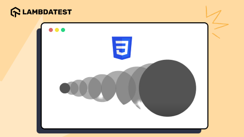
The above code contains a single div element, which is set to animate using the keyframes property. The animation scales the div element from its initial size to double its size over a 3-second period with the help of keyframes from (initial value of scale is 1) to ( final value of scale is 2) property, and then back to its original size, and repeats the animation infinitely.
Keyframe using percentages
In addition to using the from and to keywords, CSS keyframe animations can also use percentages to specify intermediate states in the animation. These percentage assignments represent the progress of the animation and can be used to specify styles at specific points in the animation timeline.
In this example, the 0% assignment specifies the initial position of the element at the start of the animation, the 50% assignment specifies the position of the element halfway through the animation, and the 100% assignment specifies the final position of the element at the end of the animation.
The CSS Animations will smoothly transition from one state to the next over the specified duration of time.
Syntax:
|
1 2 3 4 5 6 7 8 9 10 11 12 13 14 15 16 17 18 19 20 21 22 23 24 25 26 27 28 |
@keyframes my-animation { 0% { top: 0px; left: 0px; } 25% { top: 0px; left: 100px; } 50% { top: 100px; left: 100px; } 75%{ top: 100px; left: 0px; } 100%{ top: 0px; left: 0px; } } |
HTML:
|
1 2 3 4 5 6 7 8 9 10 11 12 13 14 15 16 17 18 19 20 21 22 23 24 25 26 27 28 29 30 31 32 33 34 35 36 37 38 39 40 41 42 43 44 45 46 47 48 49 50 51 52 53 54 55 56 57 58 59 60 61 62 63 64 65 66 67 68 69 70 71 72 73 74 75 76 |
<!DOCTYPE html> <html lang="en"> <head> <meta charset="UTF-8" /> <meta http-equiv="X-UA-Compatible" content="IE=edge" /> <meta name="viewport" content="width=device-width, initial-scale=1.0" /> <title>KeyFrames</title> <link rel="stylesheet" href="style.css" /> </head> <body> <div class="navbar"> <a href="https://www.lambdatest.com/?utm_source=urlredirect" target = "_blank"><span><img src="https://user-images.githubusercontent.com/39921508/243080828-b69e0006-87b5-45e6-9462-2d65f7ab8855.svg" ></span></a> <div class="dropdown"> <button class="dropbtn">Platform <i class="fa fa-caret-down"></i> </button> <div class="dropdown-content"> <a href="#">Real Time Testing</a> <a href="#">Real Devices Cloud</a> <a href="#">Test Intelligence</a> <a href="#">Native Mobile App Testing</a> </div> </div> <div class="dropdown"> <button class="dropbtn">Enterprise <i class="fa fa-caret-down"></i> </button> <div class="dropdown-content"> <a href="#">Digital Experience Testing</a> <a href="#">Enterprise Execution Environment</a> </div> </div> <div class="dropdown"> <button class="dropbtn">Resources <i class="fa fa-caret-down"></i> </button> <div class="dropdown-content"> <a href="#">Blog</a> <a href="#">Webinars</a> <a href="#">Videos</a> <a href="#">Documentation</a> </div> </div> <div class="dropdown"> <button class="dropbtn">Developers <i class="fa fa-caret-down"></i> </button> <div class="dropdown-content"> <a href="#">Mobile App Testing</a> <a href="#">Selenium</a> <a href="#">Cypress</a> <a href="#">Real Time Web Testing</a> </div> </div> <div class="dropdown"> <button class="dropbtn">Resources <i class="fa fa-caret-down"></i> </button> <div class="dropdown-content"> <a href="#">Online Browser</a> <a href="#">Selenium Testing</a> <a href="#">Cypress Testing</a> <a href="#">Playwright Testing</a> </div> </div> </div> <div class = "image_box"> <img src ="https://user-images.githubusercontent.com/39921508/243075917-897ba703-a4c9-4665-9fe5-6fbd0860139a.png" class = "image"> </div> </body> </html> |
CSS:
|
1 2 3 4 5 6 7 8 9 10 11 12 13 14 15 16 17 18 19 20 21 22 23 24 25 26 27 28 29 30 31 32 33 34 35 36 37 38 39 40 41 42 43 44 45 46 47 48 49 50 51 52 53 54 55 56 57 58 59 60 61 62 63 64 65 66 67 68 69 70 71 72 73 74 75 76 77 78 79 80 81 82 83 84 85 86 87 88 89 90 91 92 93 94 95 96 97 98 99 100 101 102 103 104 105 106 107 108 109 110 111 112 113 114 115 116 117 118 119 120 121 122 123 124 125 126 127 128 129 130 131 132 133 134 135 136 137 138 139 140 141 |
body { background-color: #b7eaee; font-family: Arial, Helvetica, sans-serif; } .navbar { overflow: hidden; display: flex; align-items: center; } .navbar a { font-size: 16px; color: black; text-align: center; text-decoration: none; padding: 14px 8px; /* Adjusted padding */ } .dropdown { float: left; overflow: hidden; } .dropdown .dropbtn { font-size: 16px; border: none; outline: none; color: black; padding: 14px 16px; background-color: inherit; font-family: inherit; margin: 0; } .navbar a:hover, .dropdown:hover .dropbtn { text-decoration: underline; background-color:#26c1cb; color: #000; font-weight: bold; border-radius: 5px; } .dropdown-content { display: none; position: absolute; min-width: 160px; box-shadow: 0px 8px 16px 0px rgba(0, 0, 0, 0.2); z-index: 1; } .dropdown-content a { float: none; color: black; padding: 12px 16px; text-decoration: none; display: block; text-align: left; } .dropdown-content a:hover { background-color: #7ddae0; transform: scaleY(1.2); } .dropdown:hover .dropdown-content { display: block; } .image_box { /* animation properties */ animation-name: my-animation; animation-duration: 3s; animation-direction: alternate; animation-iteration-count: infinite; animation-timing-function: linear; /* other properties */ width: 250px; height: 250px; border-radius: 10px; position: absolute; left: 0; right: 0; margin-top: 10%; margin-left: auto; margin-right: auto; } .image{ width: 100%; border-radius: 10px; } @keyframes my-animation { 0% { top: 0px; left: 0px; } 25% { top: 0px; left: 100px; } 50% { top: 100px; left: 100px; } 75%{ top: 100px; left: 0px; } 100%{ top: 0px; left: 0px; } } /* Media query for responsiveness */ @media (max-width: 768px) { .navbar { flex-direction: column; align-items: flex-start; } .navbar a { width: 100%; text-align: left; padding: 10px 16px; } .navbar li { margin: 10px 0; } } |
See the Pen
A9_keyframes_percentage by ravi kumar (@ravikumar7210)
on CodePen.
The image is animated using the keyframes property. The animation makes the div element move in a square path on the screen, returning to its original size, and repeating the animation indefinitely.
To achieve this animation, the keyframes use percentage values that allow setting the animation at different time intervals, such as 25% or 50%. This provides more precise control over how the animation behaves. This level of control is not possible with the simpler keyframes from to to property.
Browser Compatibility
The browser compatibility for CSS keyframes is great, and the function is supported in all browsers.
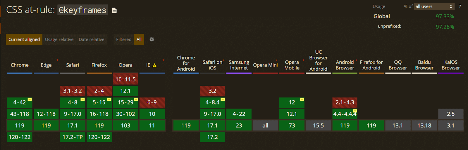
So, you can use it and transform all the objects on the web page without worrying about cross-browser compatibility issues.
CSS Animation Sub Properties
In the above section, we have already discussed the transform, transition, and keyframe properties. All these properties are combined and used to make the animation. But with the evolution of web pages, more than these properties are needed to make CSS Animations, so here is where the CSS animation property comes in.
It makes the work easier and more efficient with the help of the properties mentioned above. So now, we will discuss the CSS Animations and their sub-properties.
Here are the different properties of CSS Animations.
animation-name
The animation-name property is used to specify the name of the @keyframes rule used to animate the element, and comma-separated values can be employed to include multiple CSS Animations. The value of this property is the name of the keyframes rule.
Syntax:
|
1 |
animation-name: myanimation; |
HTML:
|
1 2 3 4 5 6 7 8 9 10 11 12 13 14 15 16 17 18 19 20 21 22 23 24 25 26 27 28 29 30 31 32 33 34 35 36 37 38 39 40 41 42 43 44 45 46 47 48 49 50 51 52 53 54 55 56 57 58 59 60 61 62 63 64 65 66 67 68 69 70 71 72 73 74 75 |
<!DOCTYPE html> <html lang="en"> <head> <meta charset="UTF-8" /> <meta http-equiv="X-UA-Compatible" content="IE=edge" /> <meta name="viewport" content="width=device-width, initial-scale=1.0" /> <title>Document</title> <link rel="stylesheet" href="style.css" /> </head> <body> <div class="navbar"> <a href="https://www.lambdatest.com/?utm_source=urlredirect" target = "_blank"><span><img src="https://user-images.githubusercontent.com/39921508/243080828-b69e0006-87b5-45e6-9462-2d65f7ab8855.svg" ></span></a> <div class="dropdown"> <button class="dropbtn">Platform <i class="fa fa-caret-down"></i> </button> <div class="dropdown-content"> <a href="#">Real Time Testing</a> <a href="#">Real Devices Cloud</a> <a href="#">Test Intelligence</a> <a href="#">Native Mobile App Testing</a> </div> </div> <div class="dropdown"> <button class="dropbtn">Enterprise <i class="fa fa-caret-down"></i> </button> <div class="dropdown-content"> <a href="#">Digital Experience Testing</a> <a href="#">Enterprise Execution Environment</a> </div> </div> <div class="dropdown"> <button class="dropbtn">Resources <i class="fa fa-caret-down"></i> </button> <div class="dropdown-content"> <a href="#">Blog</a> <a href="#">Webinars</a> <a href="#">Videos</a> <a href="#">Documentation</a> </div> </div> <div class="dropdown"> <button class="dropbtn">Developers <i class="fa fa-caret-down"></i> </button> <div class="dropdown-content"> <a href="#">Mobile App Testing</a> <a href="#">Selenium</a> <a href="#">Cypress</a> <a href="#">Real Time Web Testing</a> </div> </div> <div class="dropdown"> <button class="dropbtn">Resources <i class="fa fa-caret-down"></i> </button> <div class="dropdown-content"> <a href="#">Online Browser</a> <a href="#">Selenium Testing</a> <a href="#">Cypress Testing</a> <a href="#">Playwright Testing</a> </div> </div> </div> <div class="container"> <div id="ball1" class="ball"> <img src="https://user-images.githubusercontent.com/39921508/243096581-47dedeef-8858-4370-8d2e-7782af4f76ac.jpg"></div> <div id="ball2" class="ball"><img src="https://user-images.githubusercontent.com/39921508/243096581-47dedeef-8858-4370-8d2e-7782af4f76ac.jpg"> </div> <div id="ball3" class="ball"><img src="https://user-images.githubusercontent.com/39921508/243096581-47dedeef-8858-4370-8d2e-7782af4f76ac.jpg"> </div> </div> </body> </html> |
CSS:
|
1 2 3 4 5 6 7 8 9 10 11 12 13 14 15 16 17 18 19 20 21 22 23 24 25 26 27 28 29 30 31 32 33 34 35 36 37 38 39 40 41 42 43 44 45 46 47 48 49 50 51 52 53 54 55 56 57 58 59 60 61 62 63 64 65 66 67 68 69 70 71 72 73 74 75 76 77 78 79 80 81 82 83 84 85 86 87 88 89 90 91 92 93 94 95 96 97 98 99 100 101 102 103 104 105 106 107 108 109 110 111 112 113 114 115 116 117 118 119 120 121 122 123 124 125 126 127 128 129 130 131 132 133 134 135 136 137 138 139 140 141 142 143 144 145 146 147 148 149 150 151 152 153 154 155 156 157 158 159 160 161 162 163 164 165 166 167 168 169 170 171 172 173 174 175 176 177 178 179 180 181 |
* { padding: 0; margin: 0; } body { background-color: #b7eaee; font-family: Arial, Helvetica, sans-serif; } .navbar { overflow: hidden; display: flex; align-items: center; } .navbar a { font-size: 16px; color: black; text-align: center; text-decoration: none; padding: 14px 8px; /* Adjusted padding */ } .dropdown { float: left; overflow: hidden; } .dropdown .dropbtn { font-size: 16px; border: none; outline: none; color: black; padding: 14px 16px; background-color: inherit; font-family: inherit; margin: 0; } .navbar a:hover, .dropdown:hover .dropbtn { text-decoration: underline; background-color:#26c1cb; color: #000; font-weight: bold; border-radius: 5px; } .dropdown-content { display: none; position: absolute; min-width: 160px; box-shadow: 0px 8px 16px 0px rgba(0, 0, 0, 0.2); z-index: 1; } .dropdown-content a { float: none; color: black; padding: 12px 16px; text-decoration: none; display: block; text-align: left; } .dropdown-content a:hover { background-color: #7ddae0; transform: scaleY(1.2); } .dropdown:hover .dropdown-content { display: block; } .image_box { /* animation properties */ animation-name: my-animation; animation-duration: 3s; animation-direction: alternate; animation-iteration-count: infinite; animation-timing-function: linear; /* other properties */ width: 250px; height: 250px; border-radius: 10px; position: absolute; left: 0; right: 0; margin-top: 10%; margin-left: auto; margin-right: auto; } .container { /* animation properties */ animation-name: my-animation; animation-duration: 3s; animation-direction: alternate; animation-iteration-count: infinite; animation-timing-function: linear; /* other properties */ width: 500px; height: 500px; position: absolute; left: 0; right: 0; margin-top: 100px; margin-left: auto; margin-right: auto; } .container img { width: 100%; border-radius: 50%; } .ball{ width: 70px; height: 70px; border-radius: 50%; display: inline-block; margin: 20px; } #ball1{ background: #26c1cb; } #ball2{ background: #087076; } #ball3{ background: #022729; } @keyframes my-animation { 0% {transform: translateY(10px);} 50% {transform: translateY(150px);} 100% {transform: translateY(2px);} } /* Media query for responsiveness */ @media (max-width: 768px) { .navbar { flex-direction: column; align-items: flex-start; } .navbar a { width: 100%; text-align: left; padding: 10px 16px; } .navbar li { margin: 10px 0; } } |
See the Pen
A10_animation_name by ravi kumar (@ravikumar7210)
on CodePen.
The above code defines a basic div container and three div elements with the class ball inside the container. The animation is achieved by utilizing a keyframe animation named my-animation that employs the transform property to vertically move the balls vertically. The animation is applied to the container div with an infinite iteration count and a duration of 3 seconds.
animation-duration
The animation-duration property specifies the length of time that the animation should take to complete. The animation-duration property can be expressed in seconds (s) or milliseconds (ms). If a negative value is used, it will be treated as zero.
Syntax:
|
1 |
Animation-duration: 2s; |
HTML:
|
1 2 3 4 5 6 7 8 9 10 11 12 13 14 15 16 17 18 19 20 21 22 23 24 25 26 27 28 29 30 31 32 33 34 35 36 37 38 39 40 41 42 43 44 45 46 47 48 49 50 51 52 53 54 55 56 57 58 59 60 61 62 63 64 65 66 67 68 69 70 71 72 73 74 75 76 77 |
<!DOCTYPE html> <html lang="en"> <head> <meta charset="UTF-8" /> <meta http-equiv="X-UA-Compatible" content="IE=edge" /> <meta name="viewport" content="width=device-width, initial-scale=1.0" /> <title>Document</title> <link rel="stylesheet" href="style.css" /> </head> <body> <div class="navbar"> <a href="https://www.lambdatest.com/?utm_source=urlredirect" target = "_blank"><span><img src="https://user-images.githubusercontent.com/39921508/243080828-b69e0006-87b5-45e6-9462-2d65f7ab8855.svg" ></span></a> <div class="dropdown"> <button class="dropbtn">Platform <i class="fa fa-caret-down"></i> </button> <div class="dropdown-content"> <a href="#">Real Time Testing</a> <a href="#">Real Devices Cloud</a> <a href="#">Test Intelligence</a> <a href="#">Native Mobile App Testing</a> </div> </div> <div class="dropdown"> <button class="dropbtn">Enterprise <i class="fa fa-caret-down"></i> </button> <div class="dropdown-content"> <a href="#">Digital Experience Testing</a> <a href="#">Enterprise Execution Environment</a> </div> </div> <div class="dropdown"> <button class="dropbtn">Resources <i class="fa fa-caret-down"></i> </button> <div class="dropdown-content"> <a href="#">Blog</a> <a href="#">Webinars</a> <a href="#">Videos</a> <a href="#">Documentation</a> </div> </div> <div class="dropdown"> <button class="dropbtn">Developers <i class="fa fa-caret-down"></i> </button> <div class="dropdown-content"> <a href="#">Mobile App Testing</a> <a href="#">Selenium</a> <a href="#">Cypress</a> <a href="#">Real Time Web Testing</a> </div> </div> <div class="dropdown"> <button class="dropbtn">Resources <i class="fa fa-caret-down"></i> </button> <div class="dropdown-content"> <a href="#">Online Browser</a> <a href="#">Selenium Testing</a> <a href="#">Cypress Testing</a> <a href="#">Playwright Testing</a> </div> </div> </div> <h3>Hover the Balls to See the effect <div class="container1"> <div id="ball1" class="ball"><h4>2s</h4></div> <div id="ball2" class="ball"><h4>4s</h4></div> <div id="ball3" class="ball"><h4>6s</h4></div> </div> </body> </html> |
CSS:
|
1 2 3 4 5 6 7 8 9 10 11 12 13 14 15 16 17 18 19 20 21 22 23 24 25 26 27 28 29 30 31 32 33 34 35 36 37 38 39 40 41 42 43 44 45 46 47 48 49 50 51 52 53 54 55 56 57 58 59 60 61 62 63 64 65 66 67 68 69 70 71 72 73 74 75 76 77 78 79 80 81 82 83 84 85 86 87 88 89 90 91 92 93 94 95 96 97 98 99 100 101 102 103 104 105 106 107 108 109 110 111 112 113 114 115 116 117 118 119 120 121 122 123 124 125 126 127 128 129 130 131 132 133 134 135 136 137 138 139 140 141 142 143 144 145 146 147 148 149 150 151 152 153 154 155 156 157 158 159 160 161 162 163 164 165 166 167 168 169 170 171 172 173 174 175 176 177 178 179 180 181 182 183 184 185 186 187 188 189 190 191 192 193 194 195 196 |
* { padding: 0; margin: 0; } body { background-color: #b7eaee; font-family: Arial, Helvetica, sans-serif; } .navbar { overflow: hidden; display: flex; align-items: center; } .navbar a { font-size: 16px; color: black; text-align: center; text-decoration: none; padding: 14px 8px; /* Adjusted padding */ } .dropdown { float: left; overflow: hidden; } .dropdown .dropbtn { font-size: 16px; border: none; outline: none; color: black; padding: 14px 16px; background-color: inherit; font-family: inherit; margin: 0; } .navbar a:hover, .dropdown:hover .dropbtn { text-decoration: underline; background-color:#26c1cb; color: #000; font-weight: bold; border-radius: 5px; } .dropdown-content { display: none; position: absolute; min-width: 160px; box-shadow: 0px 8px 16px 0px rgba(0, 0, 0, 0.2); z-index: 1; } .dropdown-content a { float: none; color: black; padding: 12px 16px; text-decoration: none; display: block; text-align: left; } .dropdown-content a:hover { background-color: #7ddae0; transform: scaleY(1.2); } .dropdown:hover .dropdown-content { display: block; } h3{ text-align:center; margin-top: 10%; } .container1 { /* other properties */ width: 500px; height: 500px; position: absolute; left: 0; right: 0; margin-top: 100px; margin-left: auto; margin-right: auto; } .container1:hover .ball { /* CSS animations properties */ animation-name: my-animation; animation-timing-function: linear; } h4 { text-align: center; padding-top: 25px; color: #04383b; } .ball { width: 80px; height: 80px; border-radius: 50%; display: inline-block; margin: 20px; } #ball1 { background: #26c1cb; animation-duration: 2s; } #ball2 { background: #1e9aa2; animation-duration: 4s; } #ball3 { background: #17747a; animation-duration: 6s; } @keyframes my-animation { 0% { transform: translateY(0px); } 10% { transform: translateY(50px); } 20% { transform: translateY(25px); } 30% { transform: translateY(100px); } 40% { transform: translateY(50px); } 50% { transform: translateY(200px); } 60% { transform: translateY(100px); } 70% { transform: translateY(250px); } 80% { transform: translateY(200px); } 90% { transform: translateY(300px); } 100% { transform: translateY(0px); } } /* Media query for responsiveness */ @media (max-width: 768px) { .navbar { flex-direction: column; align-items: flex-start; } .navbar a { width: 100%; text-align: left; padding: 10px 16px; } .navbar li { margin: 10px 0; } } |
See the Pen
A11_animation_duration by ravi kumar (@ravikumar7210)
on CodePen.
In the above code a simple div is created in which three nested div elements have been created which has the class ball. When the user hovers over the container, a keyframe animation called my-animation applies to all the balls with a linear timing function.
The animation consists of multiple steps that translate the balls vertically using the transform property. Each ball has a different animation duration, ranging from 2 to 6 seconds.
animation-timing-function
The animation-timing-function property specifies the speed curve of the animation, determining how the animation should progress over time. There are several predefined timing functions, such as linear, ease, ease-in, ease-out, and ease-in-out.
Syntax:
|
1 |
animation-timing-function: ease-in-out; |
HTML:
|
1 2 3 4 5 6 7 8 9 10 11 12 13 14 15 16 17 18 19 20 21 22 23 24 25 26 27 28 29 30 31 32 33 34 35 36 37 38 39 40 41 42 43 44 45 46 47 48 49 50 51 52 53 54 55 56 57 58 59 60 61 62 63 64 65 66 67 68 69 70 71 72 73 74 75 76 77 78 79 80 81 82 |
<!DOCTYPE html> <html lang="en"> <head> <meta charset="UTF-8" /> <meta http-equiv="X-UA-Compatible" content="IE=edge" /> <meta name="viewport" content="width=device-width, initial-scale=1.0" /> <title>Document</title> <link rel="stylesheet" href="style.css" /> </head> <body> <div class="navbar"> <a href="https://www.lambdatest.com/?utm_source=urlredirect" target = "_blank"><span><img src="https://user-images.githubusercontent.com/39921508/243080828-b69e0006-87b5-45e6-9462-2d65f7ab8855.svg" ></span></a> <div class="dropdown"> <button class="dropbtn">Platform <i class="fa fa-caret-down"></i> </button> <div class="dropdown-content"> <a href="#">Real Time Testing</a> <a href="#">Real Devices Cloud</a> <a href="#">Test Intelligence</a> <a href="#">Native Mobile App Testing</a> </div> </div> <div class="dropdown"> <button class="dropbtn">Enterprise <i class="fa fa-caret-down"></i> </button> <div class="dropdown-content"> <a href="#">Digital Experience Testing</a> <a href="#">Enterprise Execution Environment</a> </div> </div> <div class="dropdown"> <button class="dropbtn">Resources <i class="fa fa-caret-down"></i> </button> <div class="dropdown-content"> <a href="#">Blog</a> <a href="#">Webinars</a> <a href="#">Videos</a> <a href="#">Documentation</a> </div> </div> <div class="dropdown"> <button class="dropbtn">Developers <i class="fa fa-caret-down"></i> </button> <div class="dropdown-content"> <a href="#">Mobile App Testing</a> <a href="#">Selenium</a> <a href="#">Cypress</a> <a href="#">Real Time Web Testing</a> </div> </div> <div class="dropdown"> <button class="dropbtn">Resources <i class="fa fa-caret-down"></i> </button> <div class="dropdown-content"> <a href="#">Online Browser</a> <a href="#">Selenium Testing</a> <a href="#">Cypress Testing</a> <a href="#">Playwright Testing</a> </div> </div> </div> <div class="container"> <h3>animation-timing-function: linear</h3> <div id="ball1" class="ball"><img src="https://user-images.githubusercontent.com/39921508/243096581-47dedeef-8858-4370-8d2e-7782af4f76ac.jpg"></div> <h3>animation-timing-function: ease</h3> <div id="ball2" class="ball"><img src="https://user-images.githubusercontent.com/39921508/243096581-47dedeef-8858-4370-8d2e-7782af4f76ac.jpg"></div> <h3>animation-timing-function: ease-in</h3> <div id="ball3" class="ball"><img src="https://user-images.githubusercontent.com/39921508/243096581-47dedeef-8858-4370-8d2e-7782af4f76ac.jpg"></div> <h3>animation-timing-function: ease-out</h3> <div id="ball4" class="ball"><img src="https://user-images.githubusercontent.com/39921508/243096581-47dedeef-8858-4370-8d2e-7782af4f76ac.jpg"></div> <h3>animation-timing-function: ease-in-out</h3> <div id="ball5" class="ball"><img src="https://user-images.githubusercontent.com/39921508/243096581-47dedeef-8858-4370-8d2e-7782af4f76ac.jpg"></div> </div> </body> </html> |
CSS:
|
1 2 3 4 5 6 7 8 9 10 11 12 13 14 15 16 17 18 19 20 21 22 23 24 25 26 27 28 29 30 31 32 33 34 35 36 37 38 39 40 41 42 43 44 45 46 47 48 49 50 51 52 53 54 55 56 57 58 59 60 61 62 63 64 65 66 67 68 69 70 71 72 73 74 75 76 77 78 79 80 81 82 83 84 85 86 87 88 89 90 91 92 93 94 95 96 97 98 99 100 101 102 103 104 105 106 107 108 109 110 111 112 113 114 115 116 117 118 119 120 121 122 123 124 125 126 127 128 129 130 131 132 133 134 135 136 137 138 139 140 141 142 143 144 145 146 147 148 149 150 151 152 153 154 155 156 157 158 159 160 161 162 163 164 165 166 167 168 169 170 171 172 173 174 175 176 177 178 179 180 181 182 183 184 185 186 187 188 189 190 191 192 193 194 195 196 197 |
* { padding: 0; margin: 0; } body { background-color: #b7eaee; color: #04383b; font-family: "Roboto Slab", serif; } .navbar { overflow: hidden; display: flex; align-items: center; } .navbar a { font-size: 16px; color: black; text-align: center; text-decoration: none; padding: 14px 8px; /* Adjusted padding */ } .dropdown { float: left; overflow: hidden; } .dropdown .dropbtn { font-size: 16px; border: none; outline: none; color: black; padding: 14px 16px; background-color: inherit; font-family: inherit; margin: 0; } .navbar a:hover, .dropdown:hover .dropbtn { text-decoration: underline; background-color:#26c1cb; color: #000; font-weight: bold; border-radius: 5px; } .dropdown-content { display: none; position: absolute; min-width: 160px; box-shadow: 0px 8px 16px 0px rgba(0, 0, 0, 0.2); z-index: 1; } .dropdown-content a { float: none; color: black; padding: 12px 16px; text-decoration: none; display: block; text-align: left; } .dropdown-content a:hover { background-color: #7ddae0; transform: scaleY(1.2); } .dropdown:hover .dropdown-content { display: block; } .image_box { /* animation properties */ animation-name: my-animation; animation-duration: 3s; animation-direction: alternate; animation-iteration-count: infinite; animation-timing-function: linear; /* other properties */ width: 250px; height: 250px; border-radius: 10px; position: absolute; left: 0; right: 0; margin-top: 10%; margin-left: auto; margin-right: auto; } .container { /* other properties */ width: 500px; height: 500px; position: absolute; left: 0; right: 0; margin-top: 2%; margin-left: auto; margin-right: auto; } h4 { text-align: center; color: #04383b; } .container img { width: 100%; border-radius: 50%; } .ball { width: 55px; height: 55px; border-radius: 50%; margin: 20px; animation-name: my-animation; animation-duration: 6s; animation-iteration-count: infinite; animation-timing-function: linear; } #ball1 { background: #26c1cb; animation-timing-function: linear; } #ball2 { background:#26c1cb; animation-timing-function: ease; } #ball3 { background: #26c1cb; animation-timing-function: ease-in; } #ball4 { background: #26c1cb; animation-timing-function: ease-out; } #ball5 { background: #26c1cb; animation-timing-function: ease-in-out; } @keyframes my-animation { from { transform: translateX(0px); } to { transform: translateX(700px); } } /* Media query for responsiveness */ @media (max-width: 768px) { .navbar { flex-direction: column; align-items: flex-start; } .navbar a { width: 100%; text-align: left; padding: 10px 16px; } .navbar li { margin: 10px 0; } } |
See the Pen
A12_animation_timing_function by ravi kumar (@ravikumar7210)
on CodePen.
This code creates a container with five balls that move across the container horizontally with different animation speeds. This CSS animation repeats infinitely.
The balls have different IDs, and each ID has its own animation-timing-function property: linear, ease, ease-in, ease-out, and ease-in-out. You can see the difference in animation between each child element.
animation-delay
The animation-delay property specifies the time that should elapse before the animation starts.
The animation-delay property can accept negative values, but in such cases, the animation will begin instantly instead of waiting for the specified delay duration. This property can be defined in seconds (s) or milliseconds (ms).
Syntax:
|
1 |
animation-delay: 1s; |
HTML:
|
1 2 3 4 5 6 7 8 9 10 11 12 13 14 15 16 17 18 19 20 21 22 23 24 25 26 27 28 29 30 31 32 33 34 35 36 37 38 39 40 41 42 43 44 45 46 47 48 49 50 51 52 53 54 55 56 57 58 59 60 61 62 63 64 65 66 67 68 69 70 71 72 73 74 75 76 77 78 |
<!DOCTYPE html> <html lang="en"> <head> <meta charset="UTF-8" /> <meta http-equiv="X-UA-Compatible" content="IE=edge" /> <meta name="viewport" content="width=device-width, initial-scale=1.0" /> <title>Document</title> <link rel="stylesheet" href="style.css" /> </head> <body> <div class="navbar"> <a href="https://www.lambdatest.com/?utm_source=urlredirect" target = "_blank"><span><img src="https://user-images.githubusercontent.com/39921508/243080828-b69e0006-87b5-45e6-9462-2d65f7ab8855.svg" ></span></a> <div class="dropdown"> <button class="dropbtn">Platform <i class="fa fa-caret-down"></i> </button> <div class="dropdown-content"> <a href="#">Real Time Testing</a> <a href="#">Real Devices Cloud</a> <a href="#">Test Intelligence</a> <a href="#">Native Mobile App Testing</a> </div> </div> <div class="dropdown"> <button class="dropbtn">Enterprise <i class="fa fa-caret-down"></i> </button> <div class="dropdown-content"> <a href="#">Digital Experience Testing</a> <a href="#">Enterprise Execution Environment</a> </div> </div> <div class="dropdown"> <button class="dropbtn">Resources <i class="fa fa-caret-down"></i> </button> <div class="dropdown-content"> <a href="#">Blog</a> <a href="#">Webinars</a> <a href="#">Videos</a> <a href="#">Documentation</a> </div> </div> <div class="dropdown"> <button class="dropbtn">Developers <i class="fa fa-caret-down"></i> </button> <div class="dropdown-content"> <a href="#">Mobile App Testing</a> <a href="#">Selenium</a> <a href="#">Cypress</a> <a href="#">Real Time Web Testing</a> </div> </div> <div class="dropdown"> <button class="dropbtn">Resources <i class="fa fa-caret-down"></i> </button> <div class="dropdown-content"> <a href="#">Online Browser</a> <a href="#">Selenium Testing</a> <a href="#">Cypress Testing</a> <a href="#">Playwright Testing</a> </div> </div> </div> <body> <div class="container"> <h3>Normal</h3> <div id="ball1" class="ball"><img src="https://user-images.githubusercontent.com/39921508/243096581-47dedeef-8858-4370-8d2e-7782af4f76ac.jpg"></div> <h3>Start Animation After 2s</h3> <div id="ball2" class="ball"><img src="https://user-images.githubusercontent.com/39921508/243096581-47dedeef-8858-4370-8d2e-7782af4f76ac.jpg"></div> </div> </body> </body> </html> |
CSS:
|
1 2 3 4 5 6 7 8 9 10 11 12 13 14 15 16 17 18 19 20 21 22 23 24 25 26 27 28 29 30 31 32 33 34 35 36 37 38 39 40 41 42 43 44 45 46 47 48 49 50 51 52 53 54 55 56 57 58 59 60 61 62 63 64 65 66 67 68 69 70 71 72 73 74 75 76 77 78 79 80 81 82 83 84 85 86 87 88 89 90 91 92 93 94 95 96 97 98 99 100 101 102 103 104 105 106 107 108 109 110 111 112 113 114 115 116 117 118 119 120 121 122 123 124 125 126 127 128 129 130 131 132 133 134 135 136 137 138 139 140 141 142 143 144 145 146 147 148 149 150 151 152 153 154 155 156 157 158 159 160 161 162 163 164 165 166 167 168 169 170 171 172 173 174 175 176 177 178 179 180 181 182 183 184 185 186 |
* { padding: 0; margin: 0; } body { background-color: #b7eaee; color: #04383b; font-family: "Roboto Slab", serif; } .navbar { overflow: hidden; display: flex; align-items: center; } .navbar a { font-size: 16px; color: black; text-align: center; text-decoration: none; padding: 14px 8px; /* Adjusted padding */ } .dropdown { float: left; overflow: hidden; } .dropdown .dropbtn { font-size: 16px; border: none; outline: none; color: black; padding: 14px 16px; background-color: inherit; font-family: inherit; margin: 0; } .navbar a:hover, .dropdown:hover .dropbtn { text-decoration: underline; background-color:#26c1cb; color: #000; font-weight: bold; border-radius: 5px; } .dropdown-content { display: none; position: absolute; min-width: 160px; box-shadow: 0px 8px 16px 0px rgba(0, 0, 0, 0.2); z-index: 1; } .dropdown-content a { float: none; color: black; padding: 12px 16px; text-decoration: none; display: block; text-align: left; } .dropdown-content a:hover { background-color: #7ddae0; transform: scaleY(1.2); } .dropdown:hover .dropdown-content { display: block; } .image_box { /* animation properties */ animation-name: my-animation; animation-duration: 3s; animation-direction: alternate; animation-iteration-count: infinite; animation-timing-function: linear; /* other properties */ width: 250px; height: 250px; border-radius: 10px; position: absolute; left: 0; right: 0; margin-top: 10%; margin-left: auto; margin-right: auto; } .container { /* other properties */ width: 500px; height: 500px; position: absolute; left: 0; right: 0; margin-top: 10%; margin-left: auto; margin-right: auto; } h4 { text-align: center; color: #04383b; } .container img { width: 100%; border-radius: 50%; } .ball { width: 80px; height: 80px; border-radius: 50%; margin: 20px; animation-name: my-animation; animation-duration: 6s; animation-iteration-count: infinite; animation-timing-function: linear; } #ball1 { background: #26c1cb; } #ball2 { background: #1e9aa2; animation-delay: 2s; } @keyframes my-animation { from { transform: translateX(0px); } to { transform: translateX(500px); } } /* Media query for responsiveness */ @media (max-width: 768px) { .navbar { flex-direction: column; align-items: flex-start; } .navbar a { width: 100%; text-align: left; padding: 10px 16px; } .navbar li { margin: 10px 0; } } |
See the Pen
A13_animation_delay by ravi kumar (@ravikumar7210)
on CodePen.
This above code has one div called container in which there are two nested divs with a class called ball. The animation is a translation that moves the balls horizontally across the container with an infinite iteration count.
The first ball starts moving immediately, while the second ball starts moving 2 seconds after the page is loaded because on the second ball animation-delay property is applied.
animation-iteration-count
The animation-iteration-count property specifies the number of times the animation should be repeated. The value of this property can be a number, such as 2, or the keyword infinite to indicate that the animation should repeat indefinitely.
Positive decimal values, such as 0.5, can also specify that only half of the animation should be played. Negative numbers, however, are not considered valid.
Syntax:
|
1 |
animation-iteration-count: 2; |
HTML:
|
1 2 3 4 5 6 7 8 9 10 11 12 13 14 15 16 17 18 19 20 21 22 23 24 25 26 27 28 29 30 31 32 33 34 35 36 37 38 39 40 41 42 43 44 45 46 47 48 49 50 51 52 53 54 55 56 57 58 59 60 61 62 63 64 65 66 67 68 69 70 71 72 73 |
<!DOCTYPE html> <html lang="en"> <head> <meta charset="UTF-8" /> <meta http-equiv="X-UA-Compatible" content="IE=edge" /> <meta name="viewport" content="width=device-width, initial-scale=1.0" /> <title>Document</title> <link rel="stylesheet" href="style.css" /> </head> <div class="navbar"> <a href="https://www.lambdatest.com/?utm_source=urlredirect" target = "_blank"><span><img src="https://user-images.githubusercontent.com/39921508/243080828-b69e0006-87b5-45e6-9462-2d65f7ab8855.svg" ></span></a> <div class="dropdown"> <button class="dropbtn">Platform <i class="fa fa-caret-down"></i> </button> <div class="dropdown-content"> <a href="#">Real Time Testing</a> <a href="#">Real Devices Cloud</a> <a href="#">Test Intelligence</a> <a href="#">Native Mobile App Testing</a> </div> </div> <div class="dropdown"> <button class="dropbtn">Enterprise <i class="fa fa-caret-down"></i> </button> <div class="dropdown-content"> <a href="#">Digital Experience Testing</a> <a href="#">Enterprise Execution Environment</a> </div> </div> <div class="dropdown"> <button class="dropbtn">Resources <i class="fa fa-caret-down"></i> </button> <div class="dropdown-content"> <a href="#">Blog</a> <a href="#">Webinars</a> <a href="#">Videos</a> <a href="#">Documentation</a> </div> </div> <div class="dropdown"> <button class="dropbtn">Developers <i class="fa fa-caret-down"></i> </button> <div class="dropdown-content"> <a href="#">Mobile App Testing</a> <a href="#">Selenium</a> <a href="#">Cypress</a> <a href="#">Real Time Web Testing</a> </div> </div> <div class="dropdown"> <button class="dropbtn">Resources <i class="fa fa-caret-down"></i> </button> <div class="dropdown-content"> <a href="#">Online Browser</a> <a href="#">Selenium Testing</a> <a href="#">Cypress Testing</a> <a href="#">Playwright Testing</a> </div> </div> </div> <div class="container"> <div id="ball1" class="ball"><h5>Count-1</h5></div> <div id="ball2" class="ball"><h5>Count-2</h5></div> <div id="ball3" class="ball"><h5>Count-3</h5></div> </div> </html> |
CSS:
|
1 2 3 4 5 6 7 8 9 10 11 12 13 14 15 16 17 18 19 20 21 22 23 24 25 26 27 28 29 30 31 32 33 34 35 36 37 38 39 40 41 42 43 44 45 46 47 48 49 50 51 52 53 54 55 56 57 58 59 60 61 62 63 64 65 66 67 68 69 70 71 72 73 74 75 76 77 78 79 80 81 82 83 84 85 86 87 88 89 90 91 92 93 94 95 96 97 98 99 100 101 102 103 104 105 106 107 108 109 110 111 112 113 114 115 116 117 118 119 120 121 122 123 124 125 126 127 128 129 130 131 132 133 134 135 136 137 138 139 140 141 142 143 144 145 146 147 148 149 150 151 152 153 154 155 156 157 158 159 160 161 162 163 164 165 166 167 168 169 170 171 172 173 174 175 176 177 178 179 180 181 182 183 184 185 186 187 188 189 190 191 192 193 194 195 196 197 198 199 200 201 202 203 204 205 206 207 208 209 210 211 212 213 214 215 216 217 218 219 220 221 |
* { padding: 0; margin: 0; } body { background-color: #b7eaee; font-family: Arial, Helvetica, sans-serif; } .navbar { overflow: hidden; display: flex; align-items: center; } .navbar a { font-size: 16px; color: black; text-align: center; text-decoration: none; padding: 14px 8px; /* Adjusted padding */ } .dropdown { float: left; overflow: hidden; } .dropdown .dropbtn { font-size: 16px; border: none; outline: none; color: black; padding: 14px 16px; background-color: inherit; font-family: inherit; margin: 0; } .navbar a:hover, .dropdown:hover .dropbtn { text-decoration: underline; background-color:#26c1cb; color: #000; font-weight: bold; border-radius: 5px; } .dropdown-content { display: none; position: absolute; min-width: 160px; box-shadow: 0px 8px 16px 0px rgba(0, 0, 0, 0.2); z-index: 1; } .dropdown-content a { float: none; color: black; padding: 12px 16px; text-decoration: none; display: block; text-align: left; } .dropdown-content a:hover { background-color: #7ddae0; transform: scaleY(1.2); } .dropdown:hover .dropdown-content { display: block; } .image_box { /* animation properties */ animation-name: my-animation; animation-duration: 3s; animation-direction: alternate; animation-iteration-count: infinite; animation-timing-function: linear; /* other properties */ width: 250px; height: 250px; border-radius: 10px; position: absolute; left: 0; right: 0; margin-top: 10%; margin-left: auto; margin-right: auto; } .container { /* other properties */ width: 500px; height: 500px; position: absolute; left: 0; right: 0; margin-top: 170px; margin-left: auto; margin-right: auto; } .container:hover .ball { /* CSS animations properties */ animation-name: my-animation; animation-duration: 2s; animation-timing-function: linear; } .container:hover #ball1 { animation-iteration-count: 1; } .container:hover #ball2 { animation-iteration-count: 2; } .container:hover #ball3 { animation-iteration-count: 3; } h5 { text-align: center; color: #04383b; padding-top: 30px; } .ball { width: 80px; height: 80px; border-radius: 50%; display: inline-block; margin: 20px; } #ball1 { background: #26c1cb; } #ball2 { background: #1e9aa2; } #ball3 { background: #17747a; } @keyframes my-animation { 0% { transform: translateY(0px); } 10% { transform: translateY(50px); } 20% { transform: translateY(25px); } 30% { transform: translateY(100px); } 40% { transform: translateY(50px); } 50% { transform: translateY(200px); } 60% { transform: translateY(100px); } 70% { transform: translateY(250px); } 80% { transform: translateY(200px); } 90% { transform: translateY(300px); } 100% { transform: translateY(0px); } } /* Media query for responsiveness */ @media (max-width: 768px) { .navbar { flex-direction: column; align-items: flex-start; } .navbar a { width: 100%; text-align: left; padding: 10px 16px; } .navbar li { margin: 10px 0; } } |
See the Pen
A14_animation_iteration_count by ravi kumar (@ravikumar7210)
on CodePen.
This above code has one div called container in which there are three nested divs with a class called ball. The balls have a hover translate animation that moves the balls vertically according to a keyframe animation defined.
The first ball moves once, the second ball moves twice, and the third ball moves thrice, as defined by the animation iteration count property.
animation-direction
The animation-direction property specifies the direction in which the animation should be played. The possible values for this property include normal, reverse, alternate, and alternate-reverse .
Syntax:
|
1 |
animation-direction: alternate |
- normal: The animation progresses forward from the beginning to the end.
- reverse: The animation plays backward, starting from the end and going back to the start.
- alternate: The animation plays forward, then backward, then forward again, and so on.
- alternate-reverse: The animation plays backward, then forward, then backward again, and so on.
HTML:
|
1 2 3 4 5 6 7 8 9 10 11 12 13 14 15 16 17 18 19 20 21 22 23 24 25 26 27 28 29 30 31 32 33 34 35 36 37 38 39 40 41 42 43 44 45 46 47 48 49 50 51 52 53 54 55 56 57 58 59 60 61 62 63 64 65 66 67 68 69 70 71 72 73 74 75 76 77 78 79 80 |
<!DOCTYPE html> <html lang="en"> <head> <meta charset="UTF-8" /> <meta http-equiv="X-UA-Compatible" content="IE=edge" /> <meta name="viewport" content="width=device-width, initial-scale=1.0" /> <title>Document</title> <link rel="stylesheet" href="style.css" /> </head> <body> <div class="navbar"> <a href="https://www.lambdatest.com/?utm_source=urlredirect" target = "_blank"><span><img src="https://user-images.githubusercontent.com/39921508/243080828-b69e0006-87b5-45e6-9462-2d65f7ab8855.svg" ></span></a> <div class="dropdown"> <button class="dropbtn">Platform <i class="fa fa-caret-down"></i> </button> <div class="dropdown-content"> <a href="#">Real Time Testing</a> <a href="#">Real Devices Cloud</a> <a href="#">Test Intelligence</a> <a href="#">Native Mobile App Testing</a> </div> </div> <div class="dropdown"> <button class="dropbtn">Enterprise <i class="fa fa-caret-down"></i> </button> <div class="dropdown-content"> <a href="#">Digital Experience Testing</a> <a href="#">Enterprise Execution Environment</a> </div> </div> <div class="dropdown"> <button class="dropbtn">Resources <i class="fa fa-caret-down"></i> </button> <div class="dropdown-content"> <a href="#">Blog</a> <a href="#">Webinars</a> <a href="#">Videos</a> <a href="#">Documentation</a> </div> </div> <div class="dropdown"> <button class="dropbtn">Developers <i class="fa fa-caret-down"></i> </button> <div class="dropdown-content"> <a href="#">Mobile App Testing</a> <a href="#">Selenium</a> <a href="#">Cypress</a> <a href="#">Real Time Web Testing</a> </div> </div> <div class="dropdown"> <button class="dropbtn">Resources <i class="fa fa-caret-down"></i> </button> <div class="dropdown-content"> <a href="#">Online Browser</a> <a href="#">Selenium Testing</a> <a href="#">Cypress Testing</a> <a href="#">Playwright Testing</a> </div> </div> </div> <div class="container"> <h3>animation-direction: normal;</h3> <div id="ball1" class="ball"><img src="https://user-images.githubusercontent.com/39921508/243096581-47dedeef-8858-4370-8d2e-7782af4f76ac.jpg"></div> <h3>animation-direction: reverse;</h3> <div id="ball2" class="ball"><img src="https://user-images.githubusercontent.com/39921508/243096581-47dedeef-8858-4370-8d2e-7782af4f76ac.jpg"></div> <h3>animation-direction: alternate;</h3> <div id="ball3" class="ball"><img src="https://user-images.githubusercontent.com/39921508/243096581-47dedeef-8858-4370-8d2e-7782af4f76ac.jpg"></div> <h3>animation-direction: alternate-reverse;</h3> <div id="ball4" class="ball"><img src="https://user-images.githubusercontent.com/39921508/243096581-47dedeef-8858-4370-8d2e-7782af4f76ac.jpg"></div> </div> </body> </html> |
CSS:
|
1 2 3 4 5 6 7 8 9 10 11 12 13 14 15 16 17 18 19 20 21 22 23 24 25 26 27 28 29 30 31 32 33 34 35 36 37 38 39 40 41 42 43 44 45 46 47 48 49 50 51 52 53 54 55 56 57 58 59 60 61 62 63 64 65 66 67 68 69 70 71 72 73 74 75 76 77 78 79 80 81 82 83 84 85 86 87 88 89 90 91 92 93 94 95 96 97 98 99 100 101 102 103 104 105 106 107 108 109 110 111 112 113 114 115 116 117 118 119 120 121 122 123 124 125 126 127 128 129 130 131 132 133 134 135 136 137 138 139 140 141 142 143 144 145 146 147 148 149 150 151 152 153 154 155 156 157 158 159 160 161 162 163 164 165 166 167 168 169 170 171 172 173 174 175 176 177 178 179 180 181 182 183 184 185 186 187 188 189 190 191 192 193 194 195 196 197 198 199 200 201 202 203 204 205 206 207 208 209 210 211 212 213 214 215 216 217 218 219 220 221 222 223 224 225 226 227 228 229 230 231 232 233 234 235 236 237 |
* { padding: 0; margin: 0; } body { background-color: #b7eaee; font-family: Arial, Helvetica, sans-serif; } .navbar { overflow: hidden; display: flex; align-items: center; } .navbar a { font-size: 16px; color: black; text-align: center; text-decoration: none; padding: 14px 8px; /* Adjusted padding */ } .dropdown { float: left; overflow: hidden; } .dropdown .dropbtn { font-size: 16px; border: none; outline: none; color: black; padding: 14px 16px; background-color: inherit; font-family: inherit; margin: 0; } .navbar a:hover, .dropdown:hover .dropbtn { text-decoration: underline; background-color:#26c1cb; color: #000; font-weight: bold; border-radius: 5px; } .dropdown-content { display: none; position: absolute; min-width: 160px; box-shadow: 0px 8px 16px 0px rgba(0, 0, 0, 0.2); z-index: 1; } .dropdown-content a { float: none; color: black; padding: 12px 16px; text-decoration: none; display: block; text-align: left; } .dropdown-content a:hover { background-color: #7ddae0; transform: scaleY(1.2); } .dropdown:hover .dropdown-content { display: block; } .image_box { /* animation properties */ animation-name: my-animation; animation-duration: 3s; animation-direction: alternate; animation-iteration-count: infinite; animation-timing-function: linear; /* other properties */ width: 250px; height: 250px; border-radius: 10px; position: absolute; left: 0; right: 0; margin-top: 10%; margin-left: auto; margin-right: auto; } .container { /* other properties */ width: 500px; height: 500px; position: absolute; left: 0; right: 0; margin-top: 10%; margin-left: auto; margin-right: auto; } .container img { width: 100%; border-radius: 50%; } .container #ball1 { animation-direction: normal; } .container #ball2 { animation-direction: reverse; } .container #ball3 { animation-direction: alternate; } .container #ball4 { animation-direction: alternate-reverse; } h4 { text-align: center; color: #04383b; } .ball { width: 55px; height: 55px; border-radius: 50%; /* display: inline-block; */ margin: 20px; animation-name: my-animation; animation-duration: 6s; animation-iteration-count: infinite; animation-timing-function: linear; } #ball1 { background: #26c1cb; } #ball2 { background: #1e9aa2; } #ball3 { background: #17747a; } #ball4 { background: #17747a; } @keyframes my-animation { 0% { transform: translateX(0px); background-color: #b7eaee; } 10% { transform: translateX(25px); } 20% { transform: translateX(50px); } 30% { transform: translateX(75px); } 40% { transform: translateX(100px); } 50% { transform: translateX(150px); /* background-color: #1b878e; */ } 60% { transform: translateX(200px); } 70% { transform: translateX(250px); } 80% { transform: translateX(300px); } 90% { transform: translateX(350px); } 100% { transform: translateX(400px); background-color: #0f4d51; } } /* Media query for responsiveness */ @media (max-width: 768px) { .navbar { flex-direction: column; align-items: flex-start; } .navbar a { width: 100%; text-align: left; padding: 10px 16px; } .navbar li { margin: 10px 0; } } |
See the Pen
A15_animation_direction by ravi kumar (@ravikumar7210)
on CodePen.
This above code has one div called container in which there are four nested divs, each with a unique ID and the class ball. The animation is a translation that moves the balls horizontally across the container with an infinite iteration count. Each ball is animated using the keyframes named “my-animation”.
Each ball div has a unique ID and is assigned a different animation-direction value, such as normal, reverse, alternate, and alternate-reverse values.
animation-fill-mode
The animation-fill-mode property specifies the values that should be applied to the element when the animation is not running. The possible values for this property include none, forwards, backwards, and both.
Syntax:
|
1 |
animation-fill-mode: forwards; |
- none: The default value. There are no styles applied before or after the animation in this case.
- forwards: The final styles of the animation are applied to the element after the animation has been completed.
- backwards: The starting styles of the animation are applied to the element before the animation starts.
- both: Both the starting and final styles of the animation are applied to the element, before and after the animation, respectively.
HTML:
|
1 2 3 4 5 6 7 8 9 10 11 12 13 14 15 16 17 18 19 20 21 22 23 24 25 26 27 28 29 30 31 32 33 34 35 36 37 38 39 40 41 42 43 44 45 46 47 48 49 50 51 52 53 54 55 56 57 58 59 60 61 62 63 64 65 66 67 68 69 70 71 72 73 74 75 76 77 78 79 80 81 82 83 84 85 86 87 88 89 90 91 |
<!DOCTYPE html> <html lang="en"> <head> <meta charset="UTF-8" /> <meta http-equiv="X-UA-Compatible" content="IE=edge" /> <meta name="viewport" content="width=device-width, initial-scale=1.0" /> <title>Document</title> <link rel="stylesheet" href="style.css" /> </head> <div class="navbar"> <a href="https://www.lambdatest.com/?utm_source=urlredirect" target = "_blank"><span><img src="https://user-images.githubusercontent.com/39921508/243080828-b69e0006-87b5-45e6-9462-2d65f7ab8855.svg" ></span></a> <div class="dropdown"> <button class="dropbtn">Platform <i class="fa fa-caret-down"></i> </button> <div class="dropdown-content"> <a href="#">Real Time Testing</a> <a href="#">Real Devices Cloud</a> <a href="#">Test Intelligence</a> <a href="#">Native Mobile App Testing</a> </div> </div> <div class="dropdown"> <button class="dropbtn">Enterprise <i class="fa fa-caret-down"></i> </button> <div class="dropdown-content"> <a href="#">Digital Experience Testing</a> <a href="#">Enterprise Execution Environment</a> </div> </div> <div class="dropdown"> <button class="dropbtn">Resources <i class="fa fa-caret-down"></i> </button> <div class="dropdown-content"> <a href="#">Blog</a> <a href="#">Webinars</a> <a href="#">Videos</a> <a href="#">Documentation</a> </div> </div> <div class="dropdown"> <button class="dropbtn">Developers <i class="fa fa-caret-down"></i> </button> <div class="dropdown-content"> <a href="#">Mobile App Testing</a> <a href="#">Selenium</a> <a href="#">Cypress</a> <a href="#">Real Time Web Testing</a> </div> </div> <div class="dropdown"> <button class="dropbtn">Resources <i class="fa fa-caret-down"></i> </button> <div class="dropdown-content"> <a href="#">Online Browser</a> <a href="#">Selenium Testing</a> <a href="#">Cypress Testing</a> <a href="#">Playwright Testing</a> </div> </div> </div> <body> <div class="container"> <div class="card card-1"> <h3>Normal Flow</h3> <div id="ball1" class="ball"><img src="https://user-images.githubusercontent.com/39921508/243096581-47dedeef-8858-4370-8d2e-7782af4f76ac.jpg"></div> <h3>Animation-fill-mode: forwards</h3> <div id="ball2" class="ball"><img src="https://user-images.githubusercontent.com/39921508/243096581-47dedeef-8858-4370-8d2e-7782af4f76ac.jpg"></div> </div> <div class="card card-2"> <h3>Normal Flow</h3> <div id="ball1" class="ball"><img src="https://user-images.githubusercontent.com/39921508/243096581-47dedeef-8858-4370-8d2e-7782af4f76ac.jpg"></div> <h3>Animation-fill-mode: backwards</h3> <div id="ball3" class="ball"><img src="https://user-images.githubusercontent.com/39921508/243096581-47dedeef-8858-4370-8d2e-7782af4f76ac.jpg"></div> </div> <div class="card card-3"> <h3>Normal Flow</h3> <div id="ball1" class="ball"><img src="https://user-images.githubusercontent.com/39921508/243096581-47dedeef-8858-4370-8d2e-7782af4f76ac.jpg"></div> <h3>Animation-fill-mode: both</h3> <div id="ball4" class="ball"><img src="https://user-images.githubusercontent.com/39921508/243096581-47dedeef-8858-4370-8d2e-7782af4f76ac.jpg"></div> </div> </div> </body> </html> |
CSS:
|
1 2 3 4 5 6 7 8 9 10 11 12 13 14 15 16 17 18 19 20 21 22 23 24 25 26 27 28 29 30 31 32 33 34 35 36 37 38 39 40 41 42 43 44 45 46 47 48 49 50 51 52 53 54 55 56 57 58 59 60 61 62 63 64 65 66 67 68 69 70 71 72 73 74 75 76 77 78 79 80 81 82 83 84 85 86 87 88 89 90 91 92 93 94 95 96 97 98 99 100 101 102 103 104 105 106 107 108 109 110 111 112 113 114 115 116 117 118 119 120 121 122 123 124 125 126 127 128 129 130 131 132 133 134 135 136 137 138 139 140 141 142 143 144 145 146 147 148 149 150 151 152 153 154 155 156 157 158 159 160 161 162 163 164 165 166 167 168 169 170 171 172 173 174 175 176 177 178 179 180 181 182 183 184 185 186 187 188 189 190 191 192 193 194 195 |
* { padding: 0; margin: 0; } body { background-color: #b7eaee; font-family: Arial, Helvetica, sans-serif; } .navbar { overflow: hidden; display: flex; align-items: center; } .navbar a { font-size: 16px; color: black; text-align: center; text-decoration: none; padding: 14px 8px; /* Adjusted padding */ } .dropdown { float: left; overflow: hidden; } .dropdown .dropbtn { font-size: 16px; border: none; outline: none; color: black; padding: 14px 16px; background-color: inherit; font-family: inherit; margin: 0; } .navbar a:hover, .dropdown:hover .dropbtn { text-decoration: underline; background-color:#26c1cb; color: #000; font-weight: bold; border-radius: 5px; } .dropdown-content { display: none; position: absolute; min-width: 160px; box-shadow: 0px 8px 16px 0px rgba(0, 0, 0, 0.2); z-index: 1; } .dropdown-content a { float: none; color: black; padding: 12px 16px; text-decoration: none; display: block; text-align: left; } .dropdown-content a:hover { background-color: #7ddae0; transform: scaleY(1.2); } .dropdown:hover .dropdown-content { display: block; } .image_box { /* animation properties */ animation-name: my-animation; animation-duration: 3s; animation-direction: alternate; animation-iteration-count: infinite; animation-timing-function: linear; /* other properties */ width: 250px; height: 250px; border-radius: 10px; position: absolute; left: 0; right: 0; margin-top: 10%; margin-left: auto; margin-right: auto; } .container { /* other properties */ display: grid; grid-template-columns: auto auto auto; width: 1200px; height: auto; position: absolute; left: 0; right: 0; margin-top: 20%; margin-left: auto; margin-right: auto; } .card { padding: 10px; margin-left: 10px; } h4 { text-align: center; color: #04383b; } .container img{ width: 100%; border-radius: 50%; } .ball { width: 80px; height: 80px; border-radius: 50%; margin: 20px; animation-name: my-animation; animation-duration: 3s; animation-iteration-count: 3; animation-timing-function: linear; } #ball1 { background: #26c1cb; } #ball2 { background: #1e9aa2; animation-fill-mode: forwards; } #ball3 { background: #1e9aa2; animation-fill-mode: backwards; } #ball4 { background: #1e9aa2; animation-fill-mode: both; } @keyframes my-animation { from { transform: translateX(0px); } to { transform: translateX(250px); } } /* Media query for responsiveness */ @media (max-width: 768px) { .navbar { flex-direction: column; align-items: flex-start; } .navbar a { width: 100%; text-align: left; padding: 10px 16px; } .navbar li { margin: 10px 0; } } |
See the Pen
A16_animation_fill_mode by ravi kumar (@ravikumar7210)
on CodePen.
The above code includes a container with three cards, each of which has a title, a ball element, and an animation-fill-mode property with a different value. The animation-fill-mode property controls what happens before and after the animation runs. The three cards demonstrate the three different values of animation-fill-mode: forwards, backwards, and both.
animation-play-state
The animation-play-state property in CSS is used to specify whether an animation is running or paused. It can accept any of the following values:
animation-play-state running
running: Animation state is running (default)
Syntax:
|
1 |
animation-play-state: running/ paused; |
HTML:
|
1 2 3 4 5 6 7 8 9 10 11 12 13 14 15 16 17 18 19 20 21 22 23 24 25 26 27 28 29 30 31 32 33 34 35 36 37 38 39 40 41 42 43 44 45 46 47 48 49 50 51 52 53 54 55 56 57 58 59 60 61 62 63 64 65 66 67 68 69 70 71 72 73 74 75 76 77 78 79 |
<!DOCTYPE html> <html lang="en"> <head> <meta charset="UTF-8" /> <meta http-equiv="X-UA-Compatible" content="IE=edge" /> <meta name="viewport" content="width=device-width, initial-scale=1.0" /> <title>Document</title> <link rel="stylesheet" href="style.css" /> </head> <div class="navbar"> <a href="https://www.lambdatest.com/?utm_source=urlredirect" target = "_blank"><span><img src="https://user-images.githubusercontent.com/39921508/243080828-b69e0006-87b5-45e6-9462-2d65f7ab8855.svg" ></span></a> <div class="dropdown"> <button class="dropbtn">Platform <i class="fa fa-caret-down"></i> </button> <div class="dropdown-content"> <a href="#">Real Time Testing</a> <a href="#">Real Devices Cloud</a> <a href="#">Test Intelligence</a> <a href="#">Native Mobile App Testing</a> </div> </div> <div class="dropdown"> <button class="dropbtn">Enterprise <i class="fa fa-caret-down"></i> </button> <div class="dropdown-content"> <a href="#">Digital Experience Testing</a> <a href="#">Enterprise Execution Environment</a> </div> </div> <div class="dropdown"> <button class="dropbtn">Resources <i class="fa fa-caret-down"></i> </button> <div class="dropdown-content"> <a href="#">Blog</a> <a href="#">Webinars</a> <a href="#">Videos</a> <a href="#">Documentation</a> </div> </div> <div class="dropdown"> <button class="dropbtn">Developers <i class="fa fa-caret-down"></i> </button> <div class="dropdown-content"> <a href="#">Mobile App Testing</a> <a href="#">Selenium</a> <a href="#">Cypress</a> <a href="#">Real Time Web Testing</a> </div> </div> <div class="dropdown"> <button class="dropbtn">Resources <i class="fa fa-caret-down"></i> </button> <div class="dropdown-content"> <a href="#">Online Browser</a> <a href="#">Selenium Testing</a> <a href="#">Cypress Testing</a> <a href="#">Playwright Testing</a> </div> </div> </div> <body> <body> <div class="container"> <h4>Hover to pause "animation-play-state: <span>running</span> ";</h4> <div class="ball"><img src="https://user-images.githubusercontent.com/39921508/243096581-47dedeef-8858-4370-8d2e-7782af4f76ac.jpg"></div> </div> </body> </body> </html> |
CSS:
|
1 2 3 4 5 6 7 8 9 10 11 12 13 14 15 16 17 18 19 20 21 22 23 24 25 26 27 28 29 30 31 32 33 34 35 36 37 38 39 40 41 42 43 44 45 46 47 48 49 50 51 52 53 54 55 56 57 58 59 60 61 62 63 64 65 66 67 68 69 70 71 72 73 74 75 76 77 78 79 80 81 82 83 84 85 86 87 88 89 90 91 92 93 94 95 96 97 98 99 100 101 102 103 104 105 106 107 108 109 110 111 112 113 114 115 116 117 118 119 120 121 122 123 124 125 126 127 128 129 130 131 132 133 134 135 136 137 138 139 140 141 142 143 144 145 146 147 148 149 150 151 152 153 154 155 156 157 158 159 160 161 162 163 164 165 166 167 168 169 170 171 172 173 174 175 176 177 178 179 180 181 182 183 184 185 186 187 188 189 190 191 192 193 194 195 196 197 198 199 200 201 202 203 204 205 206 207 |
* { padding: 0; margin: 0; } body { background-color: #b7eaee; font-family: Arial, Helvetica, sans-serif; } .navbar { overflow: hidden; display: flex; align-items: center; } .navbar a { font-size: 16px; color: black; text-align: center; text-decoration: none; padding: 14px 8px; /* Adjusted padding */ } .dropdown { float: left; overflow: hidden; } .dropdown .dropbtn { font-size: 16px; border: none; outline: none; color: black; padding: 14px 16px; background-color: inherit; font-family: inherit; margin: 0; } .navbar a:hover, .dropdown:hover .dropbtn { text-decoration: underline; background-color:#26c1cb; color: #000; font-weight: bold; border-radius: 5px; } .dropdown-content { display: none; position: absolute; min-width: 160px; box-shadow: 0px 8px 16px 0px rgba(0, 0, 0, 0.2); z-index: 1; } .dropdown-content a { float: none; color: black; padding: 12px 16px; text-decoration: none; display: block; text-align: left; } .dropdown-content a:hover { background-color: #7ddae0; transform: scaleY(1.2); } .dropdown:hover .dropdown-content { display: block; } .image_box { /* animation properties */ animation-name: my-animation; animation-duration: 3s; animation-direction: alternate; animation-iteration-count: infinite; animation-timing-function: linear; /* other properties */ width: 250px; height: 250px; border-radius: 10px; position: absolute; left: 0; right: 0; margin-top: 10%; margin-left: auto; margin-right: auto; } .container { /* other properties */ width: 500px; height: 500px; position: absolute; border: 2px solid #1b878e; border-radius: 20px; left: 0; right: 0; margin-top: 100px; margin-left: auto; margin-right: auto; } h4 { text-align: center; color: #04383b; } span { color: red; } .container img { width: 100%; border-radius: 50%; } .container .ball { /* CSS animations properties */ animation-name: my-animation; animation-duration: 2s; animation-timing-function: linear; animation-iteration-count: infinite; animation-play-state: running; } .container:hover .ball { animation-play-state: paused; } .ball { width: 80px; height: 80px; border-radius: 50%; display: inline-block; background: #26c1cb; margin-left: 40%; } @keyframes my-animation { 0% { transform: translateY(0px); } 10% { transform: translateY(50px); } 20% { transform: translateY(25px); } 30% { transform: translateY(100px); } 40% { transform: translateY(50px); } 50% { transform: translateY(200px); } 60% { transform: translateY(100px); } 70% { transform: translateY(250px); } 80% { transform: translateY(200px); } 90% { transform: translateY(300px); } 100% { transform: translateY(0px); } } /* Media query for responsiveness */ @media (max-width: 768px) { .navbar { flex-direction: column; align-items: flex-start; } .navbar a { width: 100%; text-align: left; padding: 10px 16px; } .navbar li { margin: 10px 0; } } |
See the Pen
A17-play _state_running by ravi kumar (@ravikumar7210)
on CodePen.
The provided code is a demonstration of a basic animation that generates a hover effect on a ball. As soon as the container div is hovered over, the ball shifts based on a predefined set of animation properties through keyframes. The initial animation state is set to running, and it halts when the container is hovered over, then resumes again once the hovering ceases.
animation-play-state paused
paused: The animation state is paused. It will resume only when the pause is removed
HTML:
|
1 2 3 4 5 6 7 8 9 10 11 12 13 14 15 16 17 18 19 20 21 22 23 24 25 26 27 28 29 30 31 32 33 34 35 36 37 38 39 40 41 42 43 44 45 46 47 48 49 50 51 52 53 54 55 56 57 58 59 60 61 62 63 64 65 66 67 68 69 70 71 72 73 74 75 76 |
<!DOCTYPE html> <html lang="en"> <head> <meta charset="UTF-8" /> <meta http-equiv="X-UA-Compatible" content="IE=edge" /> <meta name="viewport" content="width=device-width, initial-scale=1.0" /> <title>Document</title> <link rel="stylesheet" href="style.css" /> </head> <div class="navbar"> <a href="https://www.lambdatest.com/?utm_source=urlredirect" target = "_blank"><span><img src="https://user-images.githubusercontent.com/39921508/243080828-b69e0006-87b5-45e6-9462-2d65f7ab8855.svg" ></span></a> <div class="dropdown"> <button class="dropbtn">Platform <i class="fa fa-caret-down"></i> </button> <div class="dropdown-content"> <a href="#">Real Time Testing</a> <a href="#">Real Devices Cloud</a> <a href="#">Test Intelligence</a> <a href="#">Native Mobile App Testing</a> </div> </div> <div class="dropdown"> <button class="dropbtn">Enterprise <i class="fa fa-caret-down"></i> </button> <div class="dropdown-content"> <a href="#">Digital Experience Testing</a> <a href="#">Enterprise Execution Environment</a> </div> </div> <div class="dropdown"> <button class="dropbtn">Resources <i class="fa fa-caret-down"></i> </button> <div class="dropdown-content"> <a href="#">Blog</a> <a href="#">Webinars</a> <a href="#">Videos</a> <a href="#">Documentation</a> </div> </div> <div class="dropdown"> <button class="dropbtn">Developers <i class="fa fa-caret-down"></i> </button> <div class="dropdown-content"> <a href="#">Mobile App Testing</a> <a href="#">Selenium</a> <a href="#">Cypress</a> <a href="#">Real Time Web Testing</a> </div> </div> <div class="dropdown"> <button class="dropbtn">Resources <i class="fa fa-caret-down"></i> </button> <div class="dropdown-content"> <a href="#">Online Browser</a> <a href="#">Selenium Testing</a> <a href="#">Cypress Testing</a> <a href="#">Playwright Testing</a> </div> </div> </div> <body> <body> <div class="container"> <h4>Hover to run "animation-play-state: <span>paused</span> ";</h4> <div class="ball"><img src="https://user-images.githubusercontent.com/39921508/243096581-47dedeef-8858-4370-8d2e-7782af4f76ac.jpg"></div> </div> </body> </body> </html> |
CSS:
|
1 2 3 4 5 6 7 8 9 10 11 12 13 14 15 16 17 18 19 20 21 22 23 24 25 26 27 28 29 30 31 32 33 34 35 36 37 38 39 40 41 42 43 44 45 46 47 48 49 50 51 52 53 54 55 56 57 58 59 60 61 62 63 64 65 66 67 68 69 70 71 72 73 74 75 76 77 78 79 80 81 82 83 84 85 86 87 88 89 90 91 92 93 94 95 96 97 98 99 100 101 102 103 104 105 106 107 108 109 110 111 112 113 114 115 116 117 118 119 120 121 122 123 124 125 126 127 128 129 130 131 132 133 134 135 136 137 138 139 140 141 142 143 144 145 146 147 148 149 150 151 152 153 154 155 156 157 158 159 160 161 162 163 164 165 166 167 168 169 170 171 172 173 174 175 176 177 178 179 180 181 182 183 184 185 186 187 188 189 190 191 192 193 194 195 196 197 198 199 200 201 202 203 204 205 206 207 208 209 210 211 212 213 214 215 216 217 218 219 |
* { padding: 0; margin: 0; } body { background-color: #b7eaee; font-family: Arial, Helvetica, sans-serif; } .navbar { overflow: hidden; /* background-color: white; */ display: flex; align-items: center; } .navbar a { font-size: 16px; color: black; text-align: center; text-decoration: none; padding: 14px 8px; /* Adjusted padding */ } .dropdown { float: left; overflow: hidden; } .dropdown .dropbtn { font-size: 16px; border: none; outline: none; color: black; padding: 14px 16px; background-color: inherit; font-family: inherit; margin: 0; } .navbar a:hover, .dropdown:hover .dropbtn { text-decoration: underline; background-color:#26c1cb; color: #000; font-weight: bold; border-radius: 5px; } .dropdown-content { display: none; position: absolute; min-width: 160px; box-shadow: 0px 8px 16px 0px rgba(0, 0, 0, 0.2); z-index: 1; } .dropdown-content a { float: none; color: black; padding: 12px 16px; text-decoration: none; display: block; text-align: left; } .dropdown-content a:hover { background-color: #7ddae0; transform: scaleY(1.2); } .dropdown:hover .dropdown-content { display: block; } .image_box { /* animation properties */ animation-name: my-animation; animation-duration: 3s; animation-direction: alternate; animation-iteration-count: infinite; animation-timing-function: linear; /* other properties */ width: 250px; height: 250px; border-radius: 10px; position: absolute; left: 0; right: 0; margin-top: 10%; margin-left: auto; margin-right: auto; } body { background-color: #b7eaee; } .container { /* other properties */ width: 500px; height: 500px; position: absolute; border: 2px solid #1b878e; border-radius: 20px; left: 0; right: 0; margin-top: 100px; margin-left: auto; margin-right: auto; } h4 { text-align: center; color: #04383b; } span { color: red; } .container img { width: 100%; border-radius: 50%; } .container .ball { /* CSS animations properties */ animation-name: my-animation; animation-duration: 2s; animation-timing-function: linear; animation-iteration-count: infinite; animation-play-state: paused; } .container:hover .ball { animation-play-state: running; } .ball { width: 80px; height: 80px; border-radius: 50%; display: inline-block; background: #26c1cb; margin-left: 40%; } @keyframes my-animation { 0% { transform: translateY(0px); } 10% { transform: translateY(50px); } 20% { transform: translateY(25px); } 30% { transform: translateY(100px); } 40% { transform: translateY(50px); } 50% { transform: translateY(200px); } 60% { transform: translateY(100px); } 70% { transform: translateY(250px); } 80% { transform: translateY(200px); } 90% { transform: translateY(300px); } 100% { transform: translateY(0px); } } /* Media query for responsiveness */ @media (max-width: 768px) { .navbar { flex-direction: column; align-items: flex-start; } .navbar a { width: 100%; text-align: left; padding: 10px 16px; } .navbar li { margin: 10px 0; } } |
See the Pen
A18-play_state_paused by ravi kumar (@ravikumar7210)
on CodePen.
The provided code is a demonstration of a basic CSS Animation that generates a hover effect on a ball. As soon as the container div is hovered over, the ball shifts based on a predefined set of animation properties through keyframes. The initial animation state is set to paused and it starts running when the container is hovered over and then paused again once the hovering ceases.
That’s All!
CSS Animations are a great way to embed attractive elements onto your web page and improve the user experience. This CSS Animations tutorial highlighted the building blocks of CSS Animations with examples. These are all the things that are required to build an animated browser compatible website and web apps. To perform cross browser compatibility testing of CSS animated websites and web apps, you can try out LambdaTest – an AI-powered test orchestration and execution platform that offers 3000+ browsers and OS combinations to test your websites and web applications for browser compatibility.
The possibilities are endless when working with CSS Animations. But more ideas give birth to more attractive designs, and we welcome all those suggestions from our readers. Comment your CSS animation designs below and help the developer community enhance their skills.
Happy Animation!
Frequently Asked Questions (FAQs)
What is CSS Animation property?
The Animation property in CSS is used to animate different properties like background-color, color, height, and width. It is a shorthand property for animation-name, animation-delay, animation-duration, etc.
When are CSS Animations triggered?
CSS animations allow web components to change between CSS style configurations. The browser can start specified animations on load, but event-triggered CSS animations rely on class addition and removal.


Author’s Profile
Ravi Kumar
Ravi has been working as a System Engineer at Infosys for the past six months. In addition to his full-time job, Ravi also does freelance projects in frontend development and technical writing. For more than six months, Ravi has been sharing technical content about web development and helping people become professional developers. He has built a community of more than 7000 developers on Twitter. Ravi is passionate about meeting new people in the tech community and learning from them. He also enjoys traveling and hopes to visit every part of India one day.
Blogs: 3
Got Questions? Drop them on LambdaTest Community. Visit now