
A Complete Guide To CSS Overflow
Tahera Alam
Posted On: July 14, 2022
 30527 Views
 15 Min Read
You know content positioning in web design is important, right? Centering a div is literally the most famous topic in the web developer community. Yes, I am not lying : (
CSS has a concept named the “box model,” which says every element has a box of its own. You might be wondering why we are talking about this box model concept.
So here’s your answer – When designing a modern website, you’ll likely run into issues where your content won’t fit within an element as intended. For example, an element may be a div or a paragraph tag, and content may be the text within it. So when content doesn’t fit in the element’s box and spills out, that is known as CSS overflow.
If we try putting it more simply, CSS overflow is any content that is too large for an element’s box.
Now comes the question of why you should know it? The short answer is responsive web design.
Your users could use any device to view your website, right? What if they come across usability or any responsive web design challenges when accessing the website. Being a freelancer, I can vouch that usability issues can turn out to be a big turn-off for the users : (
That is why it becomes important to design a website that is responsive on all devices.
You need to know when to shrink the content and when to avoid doing so. When content overflows and doesn’t fit in a given area, it causes issues with page layout and interferes with the visibility of other elements.
This is where CSS overflow comes in, with all of its abilities to help us fantastically manage content positioning.
By the end of this blog on CSS overflow, you will understand everything you need to know to handle your content proficiently. So, let’s get started!
TABLE OF CONTENTS
What is CSS Overflow?
CSS overflow is when the content overflows from its specified container. This property controls what happens to the content that does not fit in a given area.
The overflow property has the following values:
- visible
- hidden
- scroll
- auto
Let’s see overflow in action with the help of an example.
HTML:
|
1 2 |
<h1>overflow not set</h1> <p class="box">Lorem Ipsum is simply dummy text of the printing and typesetting industry. Lorem Ipsum has been the industry's standard dummy text ever since the 1500s, when an unknown printer took a galley of type and scrambled it to make a type specimen book.It has survived only five centuries.</p> |
CSS:
|
1 2 3 4 5 6 7 8 9 10 11 12 13 14 15 16 |
body { font: 15px Georgia, serif; } h1{ font: 28px Georgia, Serif; text-align: center; } .box{ width: 200px; height: 180px; padding: 8px; border: 1px solid #000; line-height:21px; background-color: #EEEEEE; margin: 0 auto; } |
Output:
See the Pen
CSS Overflow not set by Tahera Alam (@alam_tahera)
on CodePen.
In the above example, the box has a fixed width and height. However, the text that was placed inside the box is so long that it cannot fit within the box as intended. The extra text you see dropping past the black border is the overflow.
Test CSS Overflow compatibility across 3000+ browser environments. Try LambdaTest Now!
CSS overflow visible
Visible is the default value of CSS overflow. It means that not setting the CSS overflow property is the same as setting it to “visible”.
When overflow is visible, the overflowing content will not be clipped. Instead, it will display outside the element’s box and might overlap other elements on the page.
Let’s see a quick example of overflow visible.
HTML:
|
1 2 |
<h1>overflow:visible;</h1> <p class="box">Lorem Ipsum is simply dummy text of the printing and typesetting industry. Lorem Ipsum has been the industry's standard dummy text ever since the 1500s, when an unknown printer took a galley of type and scrambled it to make a type specimen book.It has survived five centuries.</p> |
CSS:
|
1 2 3 4 5 6 7 8 9 10 11 12 13 14 15 16 17 |
body { font: 15px Georgia, serif; } h1{ font: 28px Georgia, Serif; text-align: center; } .box{ width: 200px; height: 180px; padding: 8px; border: 1px solid #000; line-height:21px; background-color: #EEEEEE; margin: 0 auto; overflow:visible; } |
Output:
See the Pen
CSS Overflow Visible by Tahera Alam (@alam_tahera)
on CodePen.
In the above example, the p element with the class name “box” has an overflow property set to visible.
As you can notice, there is no difference between the box from the previous example, which doesn’t have any overflow property, and this box which has an overflow property. This is because the overflow property is set to visible by default.
CSS overflow hidden
Overflow hidden means the overflowing content will be hidden and will not be displayed on the page.
Once a web browser comes across the CSS overflow hidden property, it hides the extra content beyond the element’s box.
Let’s look at an example of overflow hidden.
HTML:
|
1 2 |
<h1>overflow:hidden;</h1> <p class="box">Lorem Ipsum is simply dummy text of the printing and typesetting industry. Lorem Ipsum has been the industry's standard dummy text ever since the 1500s, when an unknown printer took a galley of type and scrambled it to make a type specimen book.It has survived five centuries.</p> |
CSS:
|
1 2 3 4 5 6 7 8 9 10 11 12 13 14 15 16 17 |
body { font: 15px Georgia, serif; } h1{ font: 28px Georgia, Serif; text-align: center; } .box{ width: 200px; height: 180px; padding: 8px; border: 1px solid #000; line-height:21px; background-color: #EEEEEE; margin: 0 auto; overflow: hidden; } |
Output:
See the Pen
CSS Overflow hidden by Tahera Alam (@alam_tahera)
on CodePen.
As you can see in the example above, the p element with the class name “box” has an overflow property set to hidden. Because of this value, overflowing content is not visible on the page.
CSS overflow scroll
Setting the overflow value to scroll will hide the overflowing content from rendering outside the element’s box, along with providing scrollbars to view the content.
Note that with setting overflow to scroll, you always get both the horizontal and vertical scrollbars even if the content only requires one or the other.
CSS tip: if you use
overflow: scroll, it’s likely you actually wantoverflow: auto.“overflow: scroll” means “*always* show scrollbars”. You won’t see the difference on a Mac because it autohides all scrollbars. But on Windows, it’d look like this:https://t.co/U3HrDOGR3Z pic.twitter.com/uJ8sUAwx1Z
— Ivan Akulov (@iamakulov) June 6, 2020
Let’s look at an example of overflow scroll.
HTML:
|
1 2 |
<h1>overflow:scroll;</h1> <p class="box">Lorem Ipsum is simply dummy text of the printing and typesetting industry. Lorem Ipsum has been the industry's standard dummy text ever since the 1500s, when an unknown printer took a galley of type and scrambled it to make a type specimen book.It has survived five centuries.</p> |
CSS:
|
1 2 3 4 5 6 7 8 9 10 11 12 13 14 15 16 17 |
body { font: 15px Georgia, serif; } h1{ font: 28px Georgia, Serif; text-align: center; } .box{ width: 200px; height: 180px; padding: 8px; border: 1px solid #000; line-height:21px; background-color: #EEEEEE; margin: 0 auto; overflow: scroll; } |
Output:
See the Pen
CSS Overflow scroll by Tahera Alam (@alam_tahera)
on CodePen.
As you can see in the example above, the box has the overflow property set to scroll which gives us the scrollbar in the output.
CSS overflow auto
The overflow auto value is almost similar to overflow scroll, in addition it also solves the problem of getting scrollbars even when we don’t need them.
As discussed above, with overflow scroll we get both the horizontal and vertical scrollbar even if we don’t need them. But in case of overflow auto, we get the scrollbar only when the content actually goes outside the element’s box.
Let’s look at an example of overflow auto.
HTML:
|
1 2 |
<h1>overflow:auto;</h1> <p class="box">Lorem Ipsum is simply dummy text of the printing and typesetting industry. Lorem Ipsum has been the industry's standard dummy text ever since the 1500s, when an unknown printer took a galley of type and scrambled it to make a type specimen book.It has survived five centuries.</p> |
CSS:
|
1 2 3 4 5 6 7 8 9 10 11 12 13 14 15 16 17 |
body { font: 15px Georgia, serif; } h1{ font: 28px Georgia, Serif; text-align: center; } .box{ width: 200px; height: 180px; padding: 8px; border: 1px solid #000; line-height:21px; background-color: #EEEEEE; margin: 0 auto; overflow: auto; } |
Output:
See the Pen
CSS Overflow auto by Tahera Alam (@alam_tahera)
on CodePen.
As we can see in the example above, the p element with the class name “box” has the overflow attribute set to auto. Because of that, we only get the horizontal scrollbar since our content only overflows horizontally.
X and Y property of CSS overflow
Till this point, we used the overflow shorthand property to set overflow. Instead, we can also use overflow-x and overflow-y to control the overflow horizontally or vertically.
Overflow-x is used to control the horizontal overflow of an element. In simple terms, it specifies what to do with the right or left edges of the content.
Overflow-y is used to control the vertical overflow of an element. In simple terms, it specifies what to do with the top or bottom edges of the content.
Below is an example of overflow-x and overflow-y properties.
HTML:
|
1 2 |
<h1>overflow x and y</h1> <p class="box">Lorem Ipsum is simply dummy text of the printing and typesetting industry. Lorem Ipsum has been the industry's standard dummy text ever since the 1500s, when an unknown printer took a galley of type and scrambled it to make a type specimen book.It has survived five centuries.</p> |
CSS:
|
1 2 3 4 5 6 7 8 9 10 11 12 13 14 15 16 17 18 19 20 21 |
body { font: 15px Georgia, serif; } h1{ font: 28px Georgia, Serif; text-align: center; } .box{ width: 200px; height: 180px; padding: 8px; border: 1px solid #000; line-height:21px; background-color: #EEEEEE; margin: 0 auto; overflow-x:scroll; /*add horizontal scrollbar*/ overflow-y: hidden; /*hide vertical scrollbar */ white-space: nowrap; } |
Output:
See the Pen
CSS Overflow X and Y properties by Tahera Alam (@alam_tahera)
on CodePen.
In the example above, we set overflow-x to scroll, because of which, we can scroll right and left. Next, we also set overflow-y to hidden, because of which we can not scroll up and down.
We used a property named “white-space with the value “no-wrap”. This is used to specify how whitespace inside elements is handled. White-space set to no-wrap means the element’s content will not be wrapped to a new line.
CSS overflow wrap
With the use of the overflow-wrap property in CSS, we can tell the browser to break lines of long words in case the content overflows from the element’s box. This helps prevent layout issues caused by overflow from an unusually long string of text.
This property has three values which are:
- normal: this is the default value where the browser will break lines according to its line-breaking rules. Long strings will not break even if they overflow the element’s box.
- break-word: with this value, words or strings of characters too long to fit inside their container will split at random points, causing a line break.
- inherit: this will inherit the value of the overflow-wrap attribute, which was set on the targeted element’s immediate parent.
Below is an example of overflow-wrap.
HTML:
|
1 2 |
<h1>overflow-wrap</h1> <p class="box">This element contains a very long word: thisisaveryveryveryveryveryverylongword. By default, the long word will not break and wrap to the next line. With break-word, the long word will break.</p> |
CSS:
|
1 2 3 4 5 6 7 8 9 10 11 12 13 14 15 16 17 |
body { font: 15px Georgia, serif; } h1{ font: 28px Georgia, Serif; text-align: center; } .box{ width: 200px; height: 180px; padding: 8px; border: 1px solid #000; line-height:21px; margin: 0 auto; background-color:yellow; overflow-wrap: break-word;/*try removing the overflow-wrap to see the difference*/ } |
Output:
See the Pen
CSS Overflow wrap by Tahera Alam (@alam_tahera)
on CodePen.
In the above example, we can see that the box has the overflow-property set to break-word, which breaks the long string of characters and wraps them to the next line, ensuring that our content does not overflow from the container. However, if we do not specify the property, the long words will not break, and it will overflow the container.
CSS Overflow browser compatibility
Now, let’s talk about cross browser compatibility. To be cross-browser compatible, an app must function across different browsers and degrade gracefully when certain browser features are unavailable or disabled.
As web developers, we need to keep browser compatibility in mind because our end users can access our website from browsers of their choice. So, every website needs to function flawlessly across various OS platforms and browsers.
However, while using CSS properties, you could get into a situation where the majority of browsers do not support a particular CSS feature.
So you must perform cross browser testing to ensure it works flawlessly across various browsers, devices, and operating systems.
For doing that, you can use a cloud-based testing platform like LambdaTest that offers an online browser farm of 3000+ real browsers and operating systems combinations to test your websites (and web apps). It lets you perform tests at scale for detecting cross browser compatibility issues in HTML/CSS and fixing them so that your website (or web app) works seamlessly across different browsers & OS combinations.
An example of testing browser support for CSS overflow is shown below:
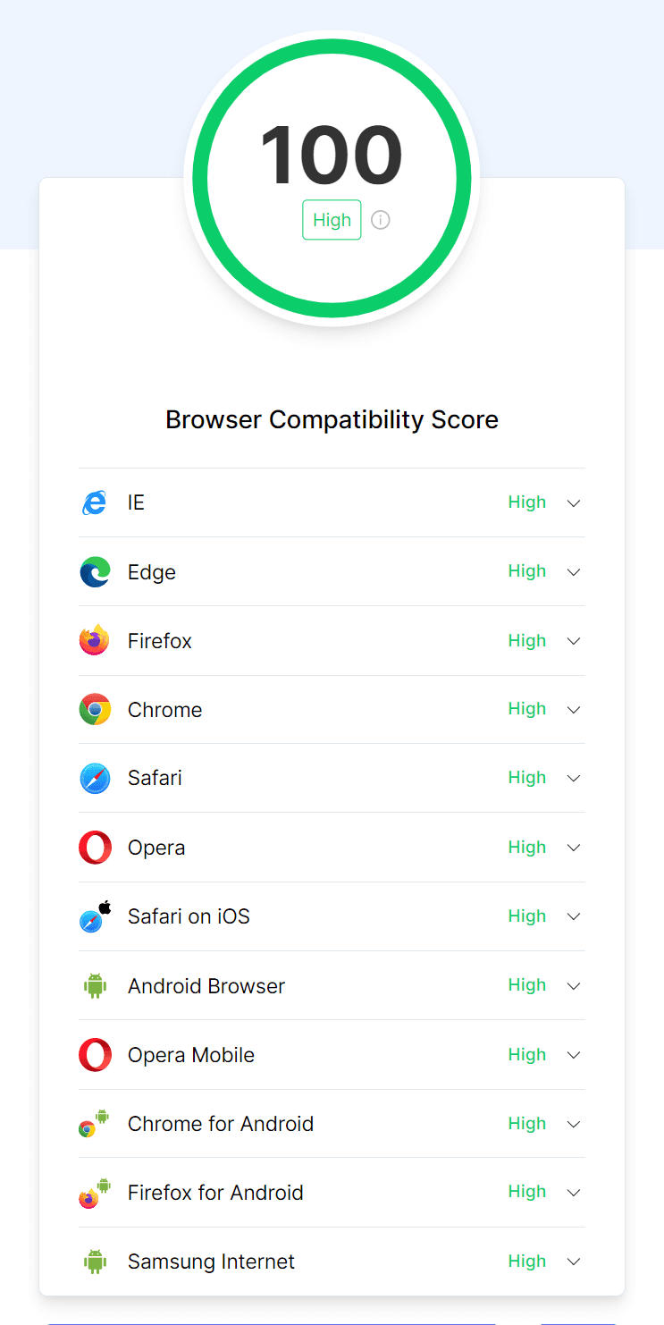
CSS overflow property reports a browser compatibility score of 100. This collective score from 100 represents browser support of the CSS overflow property. The higher this score, the greater the browser support for this property.
Responsiveness test of a website
A website must be designed to be responsive for a strong online presence. Since responsive websites tend to boost user satisfaction, Google prefers them for SEO. Therefore, responsiveness testing of the website components is crucial.
However, performing tests to check responsiveness can be time-consuming. Moreover, it’s impossible to own devices of all sizes.
There are multiple web development tools that make up a Front-End Developer’s essential toolchain. The usability of these tools allows flexibility while increasing the difficulty in the overall structure. However, there is a need for a tool like LT Browser to help a web developer analyze mistakes and view multiple devices from a real-time view.
LambdaTest’s mobile-friendly test tool, LT Browser, comes with 50+ pre-installed viewports with multiple standard resolutions. Additionally, LT Browser offers sophisticated developer tools for testing.
You can also Subscribe to the LambdaTest YouTube Channel and stay updated with the latest tutorials around automated browser testing, Selenium testing, Cypress E2E testing, CI/CD, and more.
Below are some of the top-notch features of LT Browser that any developer would love to have:
- Device sync feature to scroll on two devices simultaneously.
- Network throttling feature to test websites on different network conditions.
- Capture full-page screenshots of the web page.
- Generates performance reports powered by Google Lighthouse.
- Video recording of a running test session, and much more.
Need more reasons to love LT Browser? Here are more reasons why developers should use LT Browser.
Conclusion
Congratulations on reaching this far! You’re a fantastic reader!!
So in this blog, we discussed CSS overflow in detail, including how we can use the CSS overflow, different values of CSS overflow, browser compatibility, its importance, and finally, responsive testing of our websites using tools like LT Browser.
I hope this blog has given you a thorough understanding of CSS overflow. It’s time to apply CSS overflow to your website like a pro! Again, feel free to refer back to this anytime; it is solely for your use.
Happy styling!
Frequently Asked Questions (FAQs)
What is an overflow in CSS?
Overflow is a property of the CSS box model used to control content wrapping in various parts of a web document, such as inside elements with a specified height but is too small to contain all their content.
How do I fix overflowing in CSS?
The text-overflow property does not permit the content of the flex element to shrink below its minimum content size. To fix this, you must set the overflow value to something other than visible. One solution is to override the default CSS with your own styles.
Why we use overflow hidden in CSS?
Margin automatically centers an element, and overflow: hidden prevents scrollbars from showing up.
What does overflow do in CSS?
The CSS “overflow” property manages content that doesn’t fit within its container. If the content is too long for a container with a fixed height, like 100 pixels, a scrollbar is added. This allows users to scroll and read the entire content without it being cut off.
What does overflow hidden mean in CSS?
The CSS property “overflow: hidden” hides content that exceeds its container’s size. It clips the overflowing content and makes it invisible without showing scrollbars or enabling scrolling to view the hidden content.
How do you show overflow in CSS?
To show overflow in CSS, apply a specific height or max-height to the block-level element and set the overflow property to “auto” or “scroll.” You can also use “white-space: nowrap” to prevent content wrapping and ensure the overflow is visible within the specified height.
What is overflow overlay in CSS?
The “overflow: overlay” CSS value, although deprecated, allows scrollbars to appear on top of content without taking up additional space. However, this value is non-standard, and the related functionality is being standardized under the “scrollbar-gutter” property.
What causes overflow in CSS?
Overflow in CSS occurs when there is excessive content that cannot fit within a given container or box. It can result from oversized images, lengthy text, or improper sizing and positioning of elements within the layout.
Why is overflow a problem?
Overflow can be a problem in CSS when the content exceeds its container’s size. It can lead to unintended layout issues, overlapping elements, or the content being cut off. Managing overflow is important to ensure proper display and user experience, avoiding content being hidden or causing unwanted visual disruptions.


Author’s Profile
Tahera Alam
Tahera is a front-end developer who loves developing seamless frontends and efficient backends. She has skills in React, JavaScript, Nextjs, Tailwind, MongoDB, Solidity, and more. She loves to learn new technologies and finds writing about them to be a great way to share knowledge with others. In her free time, she enjoys reading thrillers and engaging with the tech community on Twitter.
Blogs: 11
Got Questions? Drop them on LambdaTest Community. Visit now


