
How to Make CSS Position Sticky: Tutorial With Examples
Aakash Rao
Posted On: January 18, 2024
 371657 Views
 24 Min Read
Have you ever come across the famous saying, The journey is just as important as the destination? This saying holds a profound truth in the world of web development. As the digital world evolves, it becomes crucial to ensure that the website is not merely a destination but also a delightful journey, emphasizing the importance of the entire user experience.
Crafting an engaging and dynamic interface is not just a matter of choice but a fundamental necessity. In this evolving landscape, where every scroll and click weaves a narrative, the significance of CSS position: sticky, emerges as a crucial property.
This feature can significantly enhance user experience and engagement from a business standpoint, contributing to the website’s more polished and professional appearance. Additionally, it keeps important information on the screen at all times, increasing the click-through rate (CTR) on those links.
In this blog about CSS position: sticky, we will explore the potential of sticky positioning in modern web design, step-by-step, with real-world examples.
We will also learn about accessibility with WCAG guidelines and best practices when implementing sticky elements to make sticky elements accessible, ensuring that the website remains inclusive and user-friendly for all.
TABLE OF CONTENTS
- Understanding the Role of CSS position: sticky
- Why Use CSS position: sticky?
- Is CSS position: sticky Frequently Used?
- Differences: CSS position: sticky vs position: fixed
- When to Use CSS position: sticky over position: fixed?
- Practical Examples With CSS position: sticky
- Precedence in CSS position: sticky
- How to Fix the CSS position: sticky Issue?
- Browser Compatibility Support for CSS position: sticky
- Why Does overflow:hidden Prevent position:sticky From Working?
- Best Practices for Sticky Navigation Menu Element
- Frequently Asked Questions
Understanding the Role of CSS position: sticky
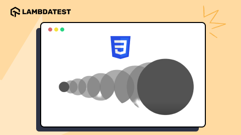
CSS position: sticky is a property that gives a simple way to control the position of an element as we scroll down a page.
It allows developers to set the rules for stickiness by defining a point – it could be the top or bottom. When the user scrolls to that point, the element becomes sticky and stays fixed in that position until we scroll past it. This is particularly useful when we want things to move with the flow of the page but also stick around when needed.
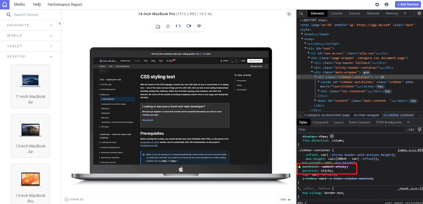
The above output is shown on the LT Browser.
LT Browser is a dev-friendly browser built on Chromium that helps developers and testers test websites for responsiveness across various device viewports. It offers a comprehensive, responsive testing environment with over 50 pre-installed viewports, including mobile, tablet, desktop, and laptop.
We will also use LT Browser to render outputs for other examples in upcoming sections.
Some real-world use cases of position sticky include navigation menu bars, sticky sidebars, table headers, and advertisement or alert banner components that must remain visible as users scroll through content. Let’s explore the behavior of position: sticky with an example.
HTML:
|
1 2 3 4 5 6 7 8 9 10 11 12 13 14 15 16 |
<section> <div class="tile"></div> <div class="tile sticky">I am going to be sticky when you scroll</div> <div class="tile"></div> <div class="tile"></div> <div class="tile"></div> <div class="tile"></div> <div class="tile"></div> <div class="tile"></div> <div class="tile"></div> <div class="tile"></div> <div class="tile"></div> <div class="tile"></div> <div class="tile"></div> <div class="tile"></div> </section> |
CSS:
|
1 2 3 4 5 6 7 8 9 10 11 12 13 14 15 16 17 18 19 20 21 22 23 24 25 26 27 28 29 30 31 32 33 34 35 |
* { margin: 0; padding: 0; font-family: 'Open Sans', sans-serif; } .tile { background: #adf0f5; height: 200px; margin: 20px; border-radius: 10px; } @media (width < 600px) { .tile { height: 150px; } } .sticky { position: sticky; top: 0; background-color: #0ebac5; color: white; text-transform: capitalize; text-align: center; font-size: 1.2rem; display: grid; place-content: center; } |
Preview:
This example shows the default behavior of CSS position: sticky. The top: 0 sets the sticky element to stick to the top edge of its containing block (which is the nearest scrolling ancestor).
See the Pen
Sticky Element Example with position: sticky by Aakash Rao (@aakash_codes)
on CodePen.
Why Use CSS position: sticky?
CSS position: sticky is a powerful way to create sticky element behavior on a webpage. It has become the standard approach due to its simplicity and efficiency, while JavaScript offers an alternative method for developers to achieve the same sticky element effect.
CSS native solution is often preferred for several reasons. Firstly, using CSS for sticky positioning is more straightforward and requires less code than the JavaScript alternative.
Using JavaScript, we leverage scroll event handlers to track the page’s offset. By dynamically calculating these offsets, we can implement logic that triggers the element to become sticky once a specific threshold is reached by the user. Let’s try to implement this and explore the behavior in action.
HTML:
|
1 2 3 4 5 6 7 8 9 10 11 12 13 14 15 16 |
<section> <div class="tile"></div> <div class="tile sticky">I am going to be sticky when you scroll</div> <div class="tile"></div> <div class="tile"></div> <div class="tile"></div> <div class="tile"></div> <div class="tile"></div> <div class="tile"></div> <div class="tile"></div> <div class="tile"></div> <div class="tile"></div> <div class="tile"></div> <div class="tile"></div> <div class="tile"></div> </section> |
CSS:
|
1 2 3 4 5 6 7 8 9 10 11 12 13 14 15 16 17 18 19 20 21 22 23 24 25 26 27 28 29 30 31 32 33 34 35 |
* { margin: 0; padding: 0; font-family: 'Open Sans', sans-serif; } .tile { background: #adf0f5; height: 200px; margin: 20px; border-radius: 10px; } @media (width < 600px) { .tile { height: 150px; } } .tile.sticky { position: relative; top: 0; background-color: #0ebac5; color: white; text-transform: capitalize; text-align: center; font-size: 1.2rem; display: grid; place-content: center; } |
JavaScript:
|
1 2 3 4 5 6 7 8 9 10 11 12 13 14 15 16 17 18 19 |
document.addEventListener('DOMContentLoaded', function () { let stickyElement = document.querySelector('.tile.sticky'); let initialOffset = stickyElement.offsetTop; function handleScroll() { let scrollY = window.scrollY || window.pageYOffset; if (scrollY >= initialOffset) { stickyElement.style.top = scrollY - initialOffset + 'px'; } else { stickyElement.style.top = '0'; } } window.addEventListener('scroll', handleScroll); }); |
Preview:
See the Pen
Sticky Element Example with position: sticky by Aakash Rao (@aakash_codes)
on CodePen.
The disadvantage of using JavaScript scroll handling is it leads to performance issues, especially on mobile devices. Another problem it brings is scroll jank, which is noticeable from the above example and refers to a disjointed or stuttered scrolling experience. This can be especially noticeable during rapid scrolling on less powerful mobile devices.
Additionally, if any user has JavaScript disabled or has errors in the JavaScript code, the sticky behavior will not work. Meanwhile, relying on CSS brings more efficiency. This is why websites implementing a sticky element through JavaScript may experience quicker UI degradation than those using CSS.
Is CSS position: sticky Frequently Used?
Yes, the CSS position: sticky is commonly used when we want to set an element to stick at a particular position for a while and then acts like a normal element in most cases, flowing with the document’s layout.
Talking about its usage—it depends on what the website needs. If you have a long page with lots of content, having a sticky navigation bar can make it easy for users to access important links without scrolling all the way back up. It’s also handy for elements like headers or sidebars you want to keep visible while users explore the content.
However, not every website needs a sticky element. Some designs may work better without sticking elements, and that’s perfectly fine. It’s about finding the balance between functionality and aesthetics, tailoring the use of CSS position: sticky to enhance the user experience without unnecessary additions.
So, in a nutshell, CSS position: sticky is a useful property, but its frequency of use depends on each website’s specific needs and style.
Differences: CSS position: sticky vs position: fixed
Both the position: sticky and position: fixed are CSS positioning properties commonly used in web development for creating layouts and UI designs for making elements stick on the webpage.
While they may appear similar initially, a closer look reveals important differences in how they operate, each serving a distinct role in creating visually appealing and functional websites.
Let’s dive into the details of each with an example, discussing their roles, use cases, and how CSS position: sticky can be considered a better option in certain scenarios.
HTML:
|
1 2 3 4 5 6 7 8 9 10 11 12 13 14 15 16 17 18 19 20 21 22 23 24 |
<div class="container"> <div class="content one"></div> <div class="content"> <div class="box fixed">I'm Fixed</div> </div> <div class="content"></div> <div class="content"></div> <div class="content"></div> <div class="content"></div> <div class="content"></div> </div> <div class="container"> <div class="content one"></div> <div class="content"> <div class="box sticky">I'm Sticky</div> </div> <div class="content"></div> <div class="content"></div> <div class="content"></div> <div class="content"></div> <div class="content"></div> </div> |
CSS:
|
1 2 3 4 5 6 7 8 9 10 11 12 13 14 15 16 17 18 19 20 21 22 23 24 25 26 27 28 29 30 31 32 33 34 35 36 37 38 39 40 41 42 43 44 45 46 47 48 49 50 |
* { margin: 0; padding: 0; box-sizing: border-box; } body { display: flex; font-family: 'Open Sans', sans-serif; background-color: #eef5ff; } .container { width: 50%; } .content { background: #adf0f5; height: 400px; margin: 1em; } .content.one { height: 100px; } .box { width: 180px; height: 100px; font-size: clamp(16px, 4vw, 32px); background-color: #0ebac5; display: grid; place-content: center; } .fixed { position: fixed; } .sticky { position: sticky; top: 0; } |
Preview:
In the first container, we have a fixed element with the .fixed class. The CSS rule .fixed applies for position: fixed to this box, meaning it stays fixed in its position regardless of scrolling. While in the second container, we’ve got a sticky element with the .sticky class. The CSS rule .sticky applies for the position: sticky and sets top: 0.
From the above example, we can highlight some key differences:
| CSS position: sticky | CSS position: fixed |
| Initially part of the normal viewport flow. | Remains fixed relative to the viewport. |
| Sticks when it reaches the top of its container during scrolling. | Overlaps other content in the container. |
| Interacts with the flow of other elements until it becomes sticky. | It doesn't interact with the flow of other elements. |
These behaviors showcase the fundamental differences between position: fixed and position: sticky and demonstrate how each can be applied to create distinct effects in a web page layout.
When to Use CSS position: sticky over position: fixed?
CSS position: sticky is ideal when you want an element to be temporarily fixed within a container but still be part of the document flow. It’s useful when you want a header, sidebar, or other call-to-action (CTA) element to stay visible during scrolling but not necessarily fixed to the entire viewport.
CSS position: fixed can be used in scenarios such as when an element needs to be fixed relative to the viewport, regardless of its parent container’s scrolling. It’s ideal for things like navigation bars you want visible at all times, no matter how much the user scrolls. And when the element shouldn’t be affected by the scrolling of its parent container.
The only disadvantage with CSS position: fixed is that it can lead to issues on smaller screens or in responsive designs, as the fixed position covers the content area of the viewport.
Practical Examples With CSS position: sticky
Now that we’ve understood the fundamentals of CSS position: sticky, let’s dive into some real-world examples to see it in action and explore its applications.
Sticky Navigation Bar
A sticky navigation bar, sometimes also called a sticky header, is a common web design feature where the navigation menu remains visible at the top of the page, even as the user scrolls down.
This helps to enhance the user experience by providing easy access to navigation options without the need to scroll back to the top of the page. To create a sticky navigation bar, we can use the CSS position: sticky property, along with defining the top value.
HTML:
|
1 2 3 4 5 6 7 8 9 10 11 12 13 14 15 16 17 18 19 20 21 22 23 24 25 26 27 28 29 30 31 32 33 34 35 36 37 38 39 40 41 42 43 44 45 46 47 48 49 50 51 52 53 54 55 56 57 58 59 60 61 62 63 64 65 66 67 68 69 70 71 72 |
<head> <link rel="stylesheet" href="https://cdnjs.cloudflare.com/ajax/libs/font-awesome/4.7.0/css/font-awesome.css" /> </head> <body> <!-- HEADER SECTION | NAVIGATION --> <header class="header"> <nav class="navigation-container"> <div class="navigation"> <div class="logo"> <a href="https://www.lambdatest.com/"> <img src="https://www.lambdatest.com/resources/images/logos/logo.svg" alt="lambdatest logo" /> </a> </div> <ul class="navigation-list"> <li><a href="https://www.lambdatest.com/feature">Platform</a></li> <li> <a href="https://www.lambdatest.com/enterprise-execution-environment" >Enterprise</a > </li> <li><a href="https://www.lambdatest.com/blog/">Resources</a></li> <li> <a href="https://www.lambdatest.com/support/docs/real-time-browser-testing/" >Developers</a > </li> <li><a href="https://www.lambdatest.com/pricing">Pricing</a></li> </ul> </div> <div class="navigation-buttons"> <a class="btn login">Login</a> <a class="btn demo border">Book a Demo</a> <a class="btn signup solid">Sign Up</a> </div> <div class="burger-menu"> <i class="fa fa-bars"></i> </div> </nav> </header> <!-- MAIN | HERO SECTION --> <main class="hero"> <div class="info"> <h1>Accelerate Delivery With Mobile App Testing Cloud</h1> <p> Test your native mobile applications using LambdaTest’s online real device cloud and virtual testing platform of emulators and simulators. Reduce costs by completely eliminating your in-house device lab. </p> <div class="cta-buttons"> <a href="https://accounts.lambdatest.com/register" class="btn solid" >Start Free Testing</a> <a class="btn border">Book a Demo</a> </div> </div> </main> </body> |
CSS:
|
1 2 3 4 5 6 7 8 9 10 11 12 13 14 15 16 17 18 19 20 21 22 23 24 25 26 27 28 29 30 31 32 33 34 35 36 37 38 39 40 41 42 43 44 45 46 47 48 49 50 51 52 53 54 55 56 57 58 59 60 61 62 63 64 65 66 67 68 69 70 71 72 73 74 75 76 77 78 79 80 81 82 83 84 85 86 87 88 89 90 91 92 93 94 95 96 97 98 99 100 101 102 103 104 105 106 107 108 109 110 111 112 113 114 115 116 117 118 119 120 121 122 123 124 125 126 127 128 129 130 131 132 133 134 135 136 137 138 139 140 141 142 143 144 145 146 147 148 149 150 151 152 153 154 155 156 157 158 159 160 161 162 163 164 165 166 167 168 169 170 171 172 173 174 175 176 177 178 179 180 181 182 183 184 185 186 187 188 |
/* BASIC STYLES */ * { margin: 0; padding: 0; box-sizing: border-box; } body { min-height: 300vh; font-family: Inter, Arial, sans-serif; background-color: #eef5ff; color: #4a4a4a; font-size: 16px; display: grid; grid-template-rows: auto 1fr auto; } /* HEADER SECTION | NAVIGATION */ .header { /* To make the header sticky */ position: sticky; top: 0; background-color: #ffffff; padding: 0 20px; height: 60px; /* To center the navigation container */ display: flex; justify-content: center; align-items: center; } .navigation-container { width: 100%; display: grid; grid-template-columns: 1fr 1fr; padding: 0 40px; justify-content: space-between; align-items: center; } .navigation, .navigation-list { display: flex; } .navigation { align-items: center; gap: 3rem; } .navigation-list li { list-style: none; } .navigation-list > li > a { padding: 10px; text-decoration: none; color: inherit; } .navigation-buttons { justify-self: end; font-size: 14px; font-weight: 500; display: flex; gap: 1.5rem; } .btn { display: inline-block; padding: 10px 26px; text-decoration: none; transition: all 0.3s ease-in-out; cursor: pointer; border-radius: 0.25rem; color: inherit; outline: none; } .btn.border { border: 1.5px solid #111; } .btn.solid { background-color: #111; border: 1.5px solid #111; color: #ffffff; } .btn.border:hover { background-color: #e2e2e2; } .btn.solid:hover { background-color: transparent; color: #111; } .burger-menu { display: none; } /* MAIN | HERO SECTION */ .hero { padding: 3rem; text-align: center; } .info { max-width: 900px; margin: 2rem auto; } .info h1 { font-size: clamp(28px, 6vw, 52px); color: #333333; font-weight: 800; margin-bottom: 1rem; } .info p { font-size: 1rem; max-width: 600px; margin: auto; margin-bottom: 2rem; line-height: 1.6; } .info .cta-buttons .btn { padding: 14px 26px; } /* MEDIA QUERIES */ @media (max-width: 1034px) { .navigation-buttons { display: none; } .burger-menu { display: block; justify-self: end; font-size: 22px; cursor: pointer; } } @media (max-width: 700px) { .navigation-list { display: none; } .hero { padding: 2rem; } .cta-buttons { display: grid; gap: 1rem; } } |
Preview:
See the Pen
Sticky Navigation Bar Example by Aakash Rao (@aakash_codes)
on CodePen.
A very good use-case of a sticky navigation bar is to display the progress of the scroll as users navigate through a webpage. Using a progress bar beneath the sticky navigation gives the user a visual indicator of their position within the content.
This feature can be used in blogs to enhance the overall user experience of readers by offering real-time feedback on how much content has been scrolled through and how much remains, facilitating easier navigation and providing a sense of context within the webpage.
We can implement this by adding a few lines of code to our sticky navigation bar example.
HTML:
|
1 2 3 4 5 |
<!-- ... existing tags --> <div class="progress-bar-container"> <div class="progress-bar"></div> </div> </header> |
CSS:
|
1 2 3 4 5 6 7 8 9 10 11 12 13 14 15 16 17 18 |
/* To Show Progress of Scroll */ .progress-bar-container { width: 100%; height: 5px; background-color: #e2e2e2; position: fixed; top: 60px; /* Adjust this value based on your header height */ left: 0; z-index: 1000; } .progress-bar { height: 100%; width: 0; background-color: tomato; /* Change the color as needed */ transition: width 0.3s ease-in-out; } |
JavaScript:
|
1 2 3 4 5 6 7 8 9 10 11 12 13 14 15 16 17 18 19 20 21 22 |
document.addEventListener('DOMContentLoaded', function () { const progressBar = document.querySelector('.progress-bar'); function updateProgressBar() { const scrollPosition = window.scrollY; const windowHeight = window.innerHeight; const documentHeight = document.documentElement.scrollHeight; const progress = (scrollPosition / (documentHeight - windowHeight)) * 100; progressBar.style.width = `${progress}%`; // If the user has reached the end, fill the progress bar if (progress >= 100) { progressBar.style.width = '100%'; } } console.log('Working'); window.addEventListener('scroll', updateProgressBar); }); |
Preview:
We can notice as users scroll, the progress bar dynamically updates, offering a clear and intuitive representation of the user journey through the content and helps in navigation efficiency.
See the Pen
Sticky Navigation Bar with Scroll Progress by Aakash Rao (@aakash_codes)
on CodePen.
Sticky Sidebar
A sticky sidebar is another common web design feature where a sidebar on a webpage remains fixed or “sticky” as the user scrolls down the page. This is particularly useful for long pages where the sidebar contains important navigation links or information that should remain easily accessible.
To create a sticky sidebar, we can use the CSS position: sticky property along with defining the top, similar to the approach used for a sticky navigation bar.
HTML:
|
1 2 3 4 5 6 7 8 9 10 11 12 13 14 15 16 17 18 19 20 21 22 23 24 25 26 27 28 29 30 31 32 33 34 35 36 37 38 39 40 41 42 43 44 45 46 47 48 49 50 51 52 53 54 55 56 57 58 59 60 61 62 63 64 65 66 67 68 69 70 71 72 73 74 75 76 77 78 79 80 81 82 83 84 85 86 87 88 89 90 91 92 93 94 95 96 97 98 99 100 101 102 103 104 105 106 107 108 |
<main> <!-- HEADER SECTION --> <section class="blog-head"> <div class="info"> <h1>Lambdatest Blog</h1> <p> Our blog on Selenium automation testing, browser compatibility testing, web development, and updates </p> </div> <nav class="navigation"> <div class="nav-links"> <a href="https://www.lambdatest.com/blog/" class="nav-link" >Recent Posts</a > <a href="https://www.lambdatest.com/infographics" class="nav-link" >Infographics</a > <a href="https://www.lambdatest.com/blog/category/lambdatest-updates/" class="nav-link" >Product Updates</a > <a href="https://www.lambdatest.com/webinar/" class="nav-link" >Webinars</a > <a href="https://community.lambdatest.com/" class="nav-link" >Community</a > </div> <div class="search-box"> <i class="fa fa-search" aria-hidden="true"></i> <input type="search" name="search" id="search" placeholder="Search ..." /> </div> </nav> </section> <!-- CONTENT SECTION --> <section class="blog-sec"> <div class="content" id="post-container"></div> <!-- SIDEBAR SECTION --> <div class="sidebar"> <h3>Categories</h3> <ul class="category-menu"> <li> <a href="https://www.lambdatest.com/blog/category/automation/" >Automation</a > </li> <li> <a href="https://www.lambdatest.com/blog/category/hyperexecute/" >HyperExecute</a > </li> <li> <a href="https://www.lambdatest.com/blog/category/cross-browser-testing/" >Cross Browser Testing</a > </li> <li> <a href="https://www.lambdatest.com/blog/category/selenium-python/" >Selenium Python</a > </li> <li> <a href="https://www.lambdatest.com/blog/category/selenium-java/" >Selenium Java</a > </li> <li> <a href="https://www.lambdatest.com/blog/category/selenium-javascript/" >Selenium JavaScript</a > </li> <li> <a href="https://www.lambdatest.com/blog/category/cypress-testing/" >Cypress Testing</a > </li> <li> <a href="https://www.lambdatest.com/blog/category/playwright-testing/" >Playwright Testing</a > </li> <li> <a href="https://www.lambdatest.com/blog/category/playwright-testing/" >Mobile App Testing</a > </li> <li> <a href="https://www.lambdatest.com/blog/category/web-development/" >Web Development</a > </li> </ul> </div> </section> </main> |
CSS:
|
1 2 3 4 5 6 7 8 9 10 11 12 13 14 15 16 17 18 19 20 21 22 23 24 25 26 27 28 29 30 31 32 33 34 35 36 37 38 39 40 41 42 43 44 45 46 47 48 49 50 51 52 53 54 55 56 57 58 59 60 61 62 63 64 65 66 67 68 69 70 71 72 73 74 75 76 77 78 79 80 81 82 83 84 85 86 87 88 89 90 91 92 93 94 95 96 97 98 99 100 101 102 103 104 105 106 107 108 109 110 111 112 113 114 115 116 117 118 119 120 121 122 123 124 125 126 127 128 129 130 131 132 133 134 135 136 137 138 139 140 141 142 143 144 145 146 147 148 149 150 151 152 153 154 155 156 157 158 159 160 161 162 163 164 165 166 167 168 169 170 171 172 173 174 175 176 177 178 179 180 181 182 183 184 185 186 187 188 189 190 191 192 193 194 195 196 197 198 199 200 201 202 203 204 205 206 207 208 209 210 211 212 213 214 215 216 217 218 219 220 221 222 223 224 225 226 227 228 229 230 231 232 233 234 235 236 237 238 239 240 241 242 243 244 245 246 247 248 249 250 251 252 253 254 255 256 257 258 259 260 261 262 263 264 265 |
@import url('https://fonts.googleapis.com/css2?family=Inter:wght@400;700&display=swap'); :root { --color-text-primary: #2c3e50; --color-text-secondary: #808080; --color-gray-light: #f4f4f4; --color-background: #ecf0f1; --color-container: #fdfdfd; --color-primary: #0ebac5; --font-family: 'Inter', sans-serif; --font-size: 16px; } /* BASIC STYLES */ * { margin: 0; padding: 0; box-sizing: border-box; } img { display: block; width: 100%; } /* To apply focus styles */ :is(a, button, input, textarea, summary) { /* Add more selectors if needed */ --outline-size: max(2px, 0.08em); --outline-style: solid; --outline-color: var(--color-text-primary); } :is(a, button, input, textarea, summary):focus { outline: var(--outline-size) var(--outline-style) var(--outline-color); outline-offset: var(--outline-offset, --outline-size); } body { background-color: var(--color-background); font-family: var(--font-family); font-size: var(--font-size); line-height: 1.5; display: grid; place-content: center; min-height: 100vh; padding: 3rem 2rem; } main { background-color: var(--color-container); max-width: 1000px; padding: 2rem; border-radius: 20px; } a { text-decoration: none; } /* HEADER SECTION */ .blog-head { margin-bottom: 3rem; } .blog-head .info { width: 100%; max-width: 650px; text-align: center; margin: 0 auto 1rem; } .blog-head h1 { text-align: center; font-size: clamp(28px, 3vw, 52px); text-transform: uppercase; margin-bottom: 0.6rem; color: var(--color-text-primary); } .blog-head p { color: var(--color-text-secondary); } .navigation { max-width: 650px; margin: auto; } .nav-links { display: flex; flex-wrap: wrap; justify-content: center; align-items: center; margin-bottom: 1.4rem; } .nav-link { padding: 0.4rem 0.6rem; border-radius: 50px; color: var(--color-text-primary); } .nav-link:focus { outline: 2px solid var(--color-text-primary); } .search-box { background-color: #f4f4f4; padding: 0.8rem 1rem; border-radius: 50px; display: flex; align-items: center; gap: 1rem; position: relative; transition: outline 0.3s ease; } .search-box:focus-within { outline: 2px solid var(--color-text-secondary); } .search-box > input { width: 100%; height: 100%; display: block; border: none; background: none; outline: none; } /* CONTENT SECTION */ .blog-sec { display: grid; grid-template-columns: 1fr 0.3fr; justify-content: space-between; align-items: start; gap: 4rem; } .content > *:not(:last-child) { margin-bottom: 3rem; } .post { display: grid; grid-template-columns: 0.5fr 1fr; gap: 1rem; } .post-title > a { color: inherit; } .post-category { color: var(--color-primary); } .post-category, .post-description { font-size: 14px; } .post-title { font-size: clamp(18px, 1.4vw, 28px); margin-bottom: 0.4rem; color: var(--color-text-primary); } /* STICKY SIDEBAR */ .sidebar { position: sticky; top: 2rem; } .sidebar > h3 { margin-bottom: 1rem; padding-left: 1rem; } .sidebar > .category-menu { list-style: none; display: flex; flex-direction: column; gap: 1rem; font-size: 0.98rem; } .sidebar a { display: block; padding-left: 1rem; padding-block: 0.2rem; border-top-left-radius: 20px; border-bottom-left-radius: 20px; } .sidebar a:hover, .sidebar a:focus { border-left: 4px solid var(--color-primary); background: var(--color-gray-light); } .sidebar a { color: var(--color-text-primary); } @media (max-width: 900px) { .blog-sec { grid-template-columns: 1fr 0.7fr; gap: 2rem; } .post { grid-template-columns: 1fr; } } @media (max-width: 500px) { .blog-sec { grid-template-columns: 1fr; gap: 2rem; } .sidebar { display: none; } } |
JavaScript:
|
1 2 3 4 5 6 7 8 9 10 11 12 13 14 15 16 17 18 19 20 21 22 23 24 25 26 27 28 29 30 31 32 33 34 35 36 37 38 39 40 41 42 43 44 |
// To create a post element function createPost(postData) { const postElement = document.createElement('div'); postElement.className = 'post'; postElement.innerHTML = ` <div class="img-container"> <a href="${postData.url}"> <img src="${postData.image}" alt="${postData.title} Image" /> </a> </div> <div class="info-container"> <a href="${postData.url}" class="post-category">${postData.category}</a> <h2 class="post-title"> <a href="${postData.url}">${postData.title}</a> </h2> <p class="post-description">${postData.description}</p> </div> `; return postElement; } // To render posts function renderPosts(posts) { const container = document.getElementById('post-container'); // Loop through the JSON data and create posts for (const postId in posts) { const post = createPost(posts[postId]); container.appendChild(post); } } // To fetch JSON data from the local file fetch('posts.json') .then(response => response.json()) .then(data => renderPosts(data)) .catch(error => console.error('Error fetching data:', error)); |
Preview:
See the Pen
Sticky Sidebar Example by Aakash Rao (@aakash_codes)
on CodePen.
In this example, we can notice that the sidebar of categories for blogs is positioned with sticky to be accessible to readers as they scroll to the bottom of the page. This is a very common use-case of CSS position: sticky, and you will find it in almost all the content-rich websites for a sidebar for showing ad banners, advertisements, or CTAs.
As for the sticky navigation bar example, feel free to customize the styles and structure to fit the specific design needs. The key is to use the CSS position: sticky property to make the sidebar stick to a specified point on the page.
To access the code for the posts example, refer to this GitHub Repository.
Sticky Footers
A sticky footer is a design feature where the footer of a webpage remains fixed at the bottom of the viewport, regardless of the content’s height.
This is useful for creating a consistent layout, especially on web pages with dynamic content. Creating a sticky footer involves combining CSS properties to achieve the desired effect. Let’s learn how to build a sticky footer in CSS with an example.
HTML:
|
1 2 3 4 5 6 7 8 9 10 11 12 13 14 15 16 17 18 19 20 21 22 23 24 25 26 27 28 29 30 31 32 33 34 35 36 37 38 39 40 41 42 43 44 45 46 47 48 49 50 51 52 |
<main class="container"> <h1 id="main-content" tabindex="-1">Real Time Browser Testing</h1> <p> Ensure your website is compatible across all browsers and devices. With LambdaTest, you can perform Real time Cross Browser compatibility testing of your website. </p> <p> You can choose from a wide range of updated Android and iOS mobile devices from the latest to oldest versions of Chrome, Firefox, Safari, Edge, Internet Explorer, Opera, and Yandex. </p> <p> This live-interactive testing will help you deliver error free software as you perform your test to check the intended functionality of features on your website as an end user in real-time. Design your test cases, and feel free to run them through LambdaTest’s Real Time Testing. </p> <h2> How To Capture Screenshots & Annotate Them With The Help Of An Image Editor? </h2> <p> <b>Step 1:</b> Once the desired VM is launched and operable, you will notice controller buttons on the screen's left side. Click the button with the Bug icon to generate a screenshot for the visible part of the screen you are currently on inside the VM. </p> <img src="https://www.lambdatest.com/support/assets/images/real-time-3-1041db35c9722d4bf9503b44a9991642.webp" alt="image-1" /> <p> <b>Step 2:</b> As you click on the Bug icon, the image editor will pop up with various buttons to help you highlight and annotate your UI observation before sharing the screenshot with your colleagues. </p> <img src="https://www.lambdatest.com/support/assets/images/real-time-4-dcce75d92bf5059fef212400ca6c38b0.webp" alt="image-2" /> </main> <footer> <h3>I'm a Sticky Footer!</h3> <p> Checkout the <a href="https://www.lambdatest.com/online-browser-testing" >Lambdatest Real Time Browser Testing</a > </p> </footer> |
CSS:
|
1 2 3 4 5 6 7 8 9 10 11 12 13 14 15 16 17 18 19 20 21 22 23 24 25 26 27 28 29 30 31 32 33 34 35 36 37 38 39 40 41 42 43 44 45 46 47 48 49 50 51 52 53 54 55 56 57 58 59 60 61 62 63 64 65 66 67 68 69 70 71 |
footer { position: sticky; bottom: 0; padding: 15px 0; background: #1d1d1d; color: #f7f7f7; display: grid; place-content: center; text-align: center; gap: 0.4rem; } footer a { text-decoration: none; font-weight: bold; color: #0ebac5; } /* OTHER STYLES */ * { margin: 0; padding: 0; box-sizing: border-box; } body { font-size: 16px; line-height: 1.5; font-family: 'Open Sans', sans-serif; background-color: #0ebac5; min-height: 100vh; color: #111111; } .container { max-width: 600px; margin: 4rem auto 0; padding: 1em; background-color: #eef5ff; border-radius: 10px; } .container > *:not(:last-child) { margin-bottom: 1rem; } h1 { font-size: clamp(28px, 4vw, 42px); text-align: center; margin-top: 1rem; } h2 { font-size: clamp(20px, 2vw, 32px); } img { display: block; max-width: 100%; border: 2px solid #999999; } |
This example ensures that the footer remains at the bottom of the viewport, and the main content pushes it down if it extends beyond the viewport height.
See the Pen
Sticky Footer Example by Aakash Rao (@aakash_codes)
on CodePen.
Although this is a standard way of making a sticky footer, we can create a cool effect with a revealing footer by just adding z-index: -1, which will make the footer reveal as we reach the bottom. Let’s see this in action.
|
1 2 3 4 5 6 7 |
footer { /* ... existing styles */ max-width: 600px; margin-inline: auto; z-index: -1; } |
For this example, we’ve added max-width and margin-inline: auto to center it and adjusted it with the main container.
Sticky Table Headers
A sticky table header is a design technique that keeps the header of a table fixed at the top of the viewport while the rest of the table content can be scrolled.
This is particularly useful when dealing with tables that have a large number of rows, allowing users to view column headers even as they scroll through the data.
Let’s create a sticky table header and see how CSS position: sticky works with an example.
HTML:
|
1 2 3 4 5 6 7 8 9 10 11 12 13 14 15 16 17 18 19 20 21 22 23 24 25 26 27 28 29 30 31 32 33 34 35 36 37 38 39 40 41 42 43 44 45 46 47 48 49 50 51 52 53 54 55 56 57 58 59 60 61 62 63 64 65 66 67 68 69 70 71 72 73 74 75 76 77 78 79 80 81 82 83 84 85 86 87 88 89 90 91 92 93 94 95 96 97 98 99 100 101 102 103 104 105 106 107 108 109 110 111 112 113 114 115 116 117 118 119 120 121 122 123 124 125 126 127 128 129 130 131 132 133 134 135 136 137 138 139 140 141 142 143 144 145 146 147 148 149 150 151 152 153 154 155 156 157 158 159 160 161 162 163 164 165 166 167 168 169 170 171 172 173 174 175 176 177 178 179 180 181 182 183 184 185 186 187 188 189 190 191 192 193 194 195 196 197 198 199 200 201 202 203 204 205 206 207 208 209 210 211 212 213 214 215 216 217 218 219 220 221 222 223 224 225 226 227 228 229 230 231 232 233 234 235 236 237 238 239 240 241 242 243 244 245 246 247 248 249 250 251 252 253 254 255 256 257 258 259 260 261 262 263 264 265 266 267 268 269 270 271 272 273 274 275 276 277 278 279 280 281 282 283 284 285 286 287 288 289 290 291 292 293 294 295 296 297 298 299 300 301 302 303 304 305 306 307 308 309 310 311 312 313 314 315 316 317 318 319 320 321 |
<body> <h1>Sticky Table Header Example</h1> <table class="table"> <thead class="table-header table-header-sticky"> <tr class="table-row"> <th class="table-cell" scope="col"> <p class="title">Compare All Features</p> </th> <th class="table-cell" scope="col"> <p class="title">Live</p> <h2 class="pricing">₹499</h2> <p class="info">Per month billed annually</p> <select title="concurrency dropdown" class="custom-select"> <option>1 Parallel Test</option> <option>2 Parallel Test</option> <option>3 Parallel Test</option> <option>4 Parallel Test</option> <option>5 Parallel Test</option> <option>6 Parallel Test</option> <option>7 Parallel Test</option> <option>8 Parallel Test</option> <option>9 Parallel Test</option> <option>10 Parallel Test</option> <option>15 Parallel Test</option> <option>20 Parallel Test</option> <option>25 Parallel Test</option> <option>> 25 Parallel Test</option> </select> <button> <a href="https://billing.lambdatest.com/billing/plans">Buy Now</a> </button> </th> <th class="table-cell" scope="col"> <p class="title">Real Device</p> <h2 class="pricing">₹2,000</h2> <p class="info">Per month billed annually</p> <select title="concurrency dropdown" class="custom-select"> <option>1 Parallel Test</option> <option>2 Parallel Test</option> <option>3 Parallel Test</option> <option>4 Parallel Test</option> <option>5 Parallel Test</option> <option>6 Parallel Test</option> <option>7 Parallel Test</option> <option>8 Parallel Test</option> <option>9 Parallel Test</option> <option>10 Parallel Test</option> <option>15 Parallel Test</option> <option>20 Parallel Test</option> <option>25 Parallel Test</option> <option>> 25 Parallel Test</option> </select> <button> <a href="https://billing.lambdatest.com/billing/plans">Buy Now</a> </button> </th> <th class="table-cell" scope="col"> <p class="title">Enterprise</p> <span class="special-info" >With LambdaTest Enterprise, your organization has access to solutions built on Enterprise Grade Security, Privacy, and Compliances</span > <p>ㅤ</p> <span>25+ Parallel Tests</span> <button> <a href="https://billing.lambdatest.com/billing/plans" >Contact Sales</a > </button> </th> </tr> </thead> <tbody class="table-body"> <tr class="table-row"> <td class="table-cell">Live Interactive testing time</td> <td class="table-cell">Unlimited</td> <td class="table-cell">Unlimited</td> <td class="table-cell">Unlimited</td> </tr> <tr class="table-row"> <td class="table-cell">Screenshot testing time</td> <td class="table-cell">Unlimited</td> <td class="table-cell">Unlimited</td> <td class="table-cell">Unlimited</td> </tr> <tr class="table-row"> <td class="table-cell">Responsive testing time</td> <td class="table-cell">Unlimited</td> <td class="table-cell">Unlimited</td> <td class="table-cell">Unlimited</td> </tr> <tr class="table-row"> <td class="table-cell">Emulators and Simulators</td> <td class="table-cell">Unlimited</td> <td class="table-cell">Unlimited</td> <td class="table-cell">Unlimited</td> </tr> <tr class="table-row"> <td class="table-cell">Access to 3000+ browsers & OS</td> <td class="table-cell">Unlimited</td> <td class="table-cell">Unlimited</td> <td class="table-cell">Unlimited</td> </tr> <tr class="table-row"> <td class="table-cell">Real mobile devices</td> <td class="table-cell">✖️</td> <td class="table-cell">Unlimited</td> <td class="table-cell">Unlimited</td> </tr> <tr class="table-row"> <td class="table-cell">WCAG Compliant Accessibility Testing</td> <td class="table-cell"> <i class="fa fa-check" aria-hidden="true"></i> </td> <td class="table-cell"> <i class="fa fa-check" aria-hidden="true"></i> </td> <td class="table-cell"> <i class="fa fa-check" aria-hidden="true"></i> </td> </tr> <tr class="table-row"> <td class="table-cell"> Network Throttling For Real World Test Scenarios </td> <td class="table-cell"> <i class="fa fa-check" aria-hidden="true"></i> </td> <td class="table-cell"> <i class="fa fa-check" aria-hidden="true"></i> </td> <td class="table-cell"> <i class="fa fa-check" aria-hidden="true"></i> </td> </tr> <tr class="table-row"> <td class="table-cell">IP-based Geolocation Testing</td> <td class="table-cell"> <i class="fa fa-check" aria-hidden="true"></i> </td> <td class="table-cell"> <i class="fa fa-check" aria-hidden="true"></i> </td> <td class="table-cell"> <i class="fa fa-check" aria-hidden="true"></i> </td> </tr> <tr class="table-row"> <td class="table-cell">GPS-based Geolocation Testing</td> <td class="table-cell"> <i class="fa fa-check" aria-hidden="true"></i> </td> <td class="table-cell"> <i class="fa fa-check" aria-hidden="true"></i> </td> <td class="table-cell"> <i class="fa fa-check" aria-hidden="true"></i> </td> </tr> <tr class="table-row"> <td class="table-cell">Automated Screenshot Testing</td> <td class="table-cell"> <i class="fa fa-check" aria-hidden="true"></i> </td> <td class="table-cell"> <i class="fa fa-check" aria-hidden="true"></i> </td> <td class="table-cell"> <i class="fa fa-check" aria-hidden="true"></i> </td> </tr> <tr class="table-row"> <td class="table-cell">24x7 Support</td> <td class="table-cell"> <i class="fa fa-check" aria-hidden="true"></i> </td> <td class="table-cell"> <i class="fa fa-check" aria-hidden="true"></i> </td> <td class="table-cell"> <i class="fa fa-check" aria-hidden="true"></i> </td> </tr> <tr class="table-row"> <td class="table-cell">Premium support options</td> <td class="table-cell">✖️</td> <td class="table-cell">✖️</td> <td class="table-cell"> <i class="fa fa-check" aria-hidden="true"></i> </td> </tr> <tr class="table-row"> <td class="table-cell">Dedicated Solutions Engineer</td> <td class="table-cell">✖️</td> <td class="table-cell">✖️</td> <td class="table-cell"> <i class="fa fa-check" aria-hidden="true"></i> </td> </tr> <tr class="table-row"> <td class="table-cell">Dedicated Customer Success Manager</td> <td class="table-cell">✖️</td> <td class="table-cell">✖️</td> <td class="table-cell"> <i class="fa fa-check" aria-hidden="true"></i> </td> </tr> <tr class="table-row"> <td class="table-cell">Private Slack Channel</td> <td class="table-cell">✖️</td> <td class="table-cell">✖️</td> <td class="table-cell"> <i class="fa fa-check" aria-hidden="true"></i> </td> </tr> <tr class="table-row"> <td class="table-cell">Dedicated Training and Onboarding</td> <td class="table-cell">✖️</td> <td class="table-cell">✖️</td> <td class="table-cell"> <i class="fa fa-check" aria-hidden="true"></i> </td> </tr> <tr class="table-row"> <td class="table-cell"> Localhost, Staging, and Private website testing </td> <td class="table-cell"> <i class="fa fa-check" aria-hidden="true"></i> </td> <td class="table-cell"> <i class="fa fa-check" aria-hidden="true"></i> </td> <td class="table-cell"> <i class="fa fa-check" aria-hidden="true"></i> </td> </tr> <tr class="table-row"> <td class="table-cell">Advanced Local Testing</td> <td class="table-cell">✖️</td> <td class="table-cell">✖️</td> <td class="table-cell"> <i class="fa fa-check" aria-hidden="true"></i> </td> </tr> <tr class="table-row"> <td class="table-cell">Browser’s Native Developer Tools</td> <td class="table-cell"> <i class="fa fa-check" aria-hidden="true"></i> </td> <td class="table-cell"> <i class="fa fa-check" aria-hidden="true"></i> </td> <td class="table-cell"> <i class="fa fa-check" aria-hidden="true"></i> </td> </tr> <tr class="table-row"> <td class="table-cell">Proprietary Mobile DevTools</td> <td class="table-cell"> <i class="fa fa-check" aria-hidden="true"></i> </td> <td class="table-cell"> <i class="fa fa-check" aria-hidden="true"></i> </td> <td class="table-cell"> <i class="fa fa-check" aria-hidden="true"></i> </td> </tr> </tbody> </table> </body> |
CSS:
|
1 2 3 4 5 6 7 8 9 10 11 12 13 14 15 16 17 18 19 20 21 22 23 24 25 26 27 28 29 30 31 32 33 34 35 36 37 38 39 40 41 42 43 44 45 46 47 48 49 50 51 52 53 54 55 56 57 58 59 60 61 62 63 64 65 66 67 68 69 70 71 72 73 74 75 76 77 78 79 80 81 82 83 84 85 86 87 88 89 90 91 92 93 94 95 96 97 98 99 100 101 102 103 104 105 106 107 108 109 110 111 112 113 114 115 116 117 118 |
/* STICKY TABLE HEADER */ .table-header-sticky { position: sticky; top: 0; } /* RESETS */ select, button { display: block; width: 100%; font-family: inherit; } /* OTHER STYLES */ body { font-family: 'Inter', sans-serif; padding: 2rem; display: grid; place-content: center; background-color: #c9c9c9; } h1 { text-align: center; font-size: clamp(32px, 3vw, 52px); margin: 0 0 2rem 0; } .table { width: 100%; max-width: 1200px; border-collapse: collapse; margin-bottom: 20px; font-weight: 400; background-color: #fdfdfd; } th, tr { font-weight: inherit; } .table-header .table-row { display: grid; grid-template-columns: repeat(4, 1fr); width: 100%; } .table-header button { background-color: #bd4c00; border: none; outline: none; color: #f2f2f2; cursor: pointer; border-radius: 6px; margin-top: 0.5rem; } .table-header a { color: inherit; text-decoration: none; } .table-header a:visited, .table-header a:active { color: #f2f2f2; } .table-header button:focus { outline: 2px solid #1d1d1d; } .table-header .table-row .table-cell { padding: 1rem; border: 1px solid #dddddd; display: grid; grid-template-rows: repeat(5, minmax(50px, auto)); gap: 5px; background-color: #f2f2f2; } .table-body .table-row { display: grid; grid-template-columns: repeat(4, 1fr); } .table-body .table-row .table-cell { border: 1px solid #dddddd; padding: 1.2rem; font-size: 14px; } .fa-check { color: #0ab40a; font-size: 1.3rem; } select { padding: 5px; border-radius: 6px; margin-top: 0.5rem; } |
In this example, the .form-header-sticky class represents the styling for the form header to make it sticky. The position: sticky property is applied, and top: 0 ensures that the header remains at the top of the table.
See the Pen
Sticky Table Header Example by Aakash Rao (@aakash_codes)
on CodePen.
Scrollytelling With CSS position: sticky
We’ve already covered some basic yet important use cases of CSS position: sticky. However, the position: sticky property can also be used creatively for storytelling with modern CSS.
This involves creating an engaging and interactive narrative on a webpage. We can use earlier techniques, such as revealing hidden elements and sticky images with sidebars. Let’s understand how we can build this with an example.
HTML:
|
1 2 3 4 5 6 7 8 9 10 11 12 13 14 15 16 17 18 19 20 21 22 23 24 25 26 27 28 29 30 31 32 33 34 35 36 37 38 39 40 41 42 43 44 45 46 47 48 49 50 51 52 53 54 55 56 57 58 59 60 61 62 63 64 65 66 67 68 69 70 71 72 73 74 75 76 77 78 79 80 81 82 83 84 85 86 87 88 89 90 91 92 93 94 95 96 97 98 99 100 101 102 103 104 105 106 107 108 109 110 111 112 113 114 115 116 117 118 119 120 121 122 123 124 125 126 127 128 129 130 131 132 133 134 135 136 137 138 139 140 141 142 143 144 145 146 147 148 |
<body> <div class="intro"> <p class="intro-1">Under the morning sun,</p> <p class="intro-2">A cup of warmth awaits,</p> <p class="intro-3">Brewed to perfection!</p> </div> <div class="coffee-story"> <p class="brewing-method">Brewing creativity with CSS</p> <div class="story-content"> <p>Join me on a journey where code becomes a canvas!</p> <div class="coffee-images"> <img src="https://raw.githubusercontent.com/AakashRao-dev/css-position-sticky-tuts-with-examples/main/7--storytelling/images/trail-1.avif" /> <img src="https://raw.githubusercontent.com/AakashRao-dev/css-position-sticky-tuts-with-examples/main/7--storytelling/images/trail-2.avif" /> <img src="https://raw.githubusercontent.com/AakashRao-dev/css-position-sticky-tuts-with-examples/main/7--storytelling/images/trail-3.avif" /> <img src="https://raw.githubusercontent.com/AakashRao-dev/css-position-sticky-tuts-with-examples/main/7--storytelling/images/trail-4.avif" /> <img src="https://raw.githubusercontent.com/AakashRao-dev/css-position-sticky-tuts-with-examples/main/7--storytelling/images/trail-5.avif" /> <img src="https://raw.githubusercontent.com/AakashRao-dev/css-position-sticky-tuts-with-examples/main/7--storytelling/images/trail-6.avif" /> <p class="surprise-text"> Just like the perfect blend, coding can be a delightful surprise! </p> </div> </div> </div> <div class="types-of-coffee"> <div class="coffee coffee-1"> <div class="img-container"> <img src="https://github.com/AakashRao-dev/css-position-sticky-tuts-with-examples/blob/main/7--storytelling/images/Latte.png?raw=true" alt="" /> </div> <div class="content-text"> <h2>Latte</h2> <p> <!-- Some Text --> </p> <p> <!-- Some Text --> </p> <p> <!-- Some Text --> </p> <p> <!-- Some Text --> </p> <p> <!-- Some Text --> </p> <p> <!-- Some Text --> </p> <p> <!-- Some Text --> </p> </div> </div> <div class="coffee coffee-2"> <div class="img-container"> <img src="https://github.com/AakashRao-dev/css-position-sticky-tuts-with-examples/blob/main/7--storytelling/images/Americano.png?raw=true" /> </div> <div class="content-text"> <h2>Americano</h2> <p> <!-- Some Text --> </p> <p> <!-- Some Text --> </p> <p> <!-- Some Text --> </p> <p> <!-- Some Text --> </p> <p> <!-- Some Text --> </p> <p> <!-- Some Text --> </p> </div> </div> <div class="coffee coffee-3"> <div class="img-container"> <img src="https://github.com/AakashRao-dev/css-position-sticky-tuts-with-examples/blob/main/7--storytelling/images/Cappuccino.png?raw=true" /> </div> <div class="content-text"> <h2>Cappuccino</h2> <p> <!-- Some Text --> </p> <p> <!-- Some Text --> </p> <p> <!-- Some Text --> </p> <p> <!-- Some Text --> </p> <p> <!-- Some Text --> </p> <p> <!-- Some Text --> </p> <p> <!-- Some Text --> </p> </div> </div> </div> <div class="more-info"> <p> Comfort in the presence of a mug of coffee, where each sip is a journey into a world of imagination, steeped in rich and aromatic blends. </p> </div> <div class="the-end">The End</div> </body> |
CSS:
|
1 2 3 4 5 6 7 8 9 10 11 12 13 14 15 16 17 18 19 20 21 22 23 24 25 26 27 28 29 30 31 32 33 34 35 36 37 38 39 40 41 42 43 44 45 46 47 48 49 50 51 52 53 54 55 56 57 58 59 60 61 62 63 64 65 66 67 68 69 70 71 72 73 74 75 76 77 78 79 80 81 82 83 84 85 86 87 88 89 90 91 92 93 94 95 96 97 98 99 100 101 102 103 104 105 106 107 108 109 110 111 112 113 114 115 116 117 118 119 120 121 122 123 124 125 126 127 128 129 130 131 132 133 134 135 136 137 138 139 140 141 142 143 144 145 146 147 148 149 150 151 152 153 154 155 156 157 158 159 160 161 162 163 164 165 166 167 168 169 170 171 172 173 174 175 176 177 178 179 180 181 182 183 184 185 186 187 188 189 190 191 192 193 194 195 196 197 198 199 200 201 202 203 204 205 206 207 208 209 210 211 212 213 214 215 216 217 218 219 220 221 222 223 224 225 226 227 228 229 230 |
:root { --clr-1: #4b3826; --clr-2: #2c1e18; --clr-3: #9a7c5b; --clr-4: #f5e0d3; --clr-5: #554639; } *, *::before, *::after { box-sizing: border-box; } body { font-family: 'Inter', sans-serif; font-weight: 300; background: linear-gradient(var(--clr-1), var(--clr-2)); min-height: 100vh; color: rgba(0, 0, 0, 0.7); margin: 0; font-size: 24px; } p { margin: 0; } img { max-width: 100%; } .intro { font-size: 3.5rem; display: grid; grid: 'hello hello' 75vh 'hope-you having-fun' 125vh / max-content 1fr; gap: 15px; margin-bottom: 60vh; color: var(--clr-4); } .intro-1 { grid-area: hello; align-self: center; position: sticky; top: 2em; margin-bottom: 1.5em; } .intro-2 { grid-area: hope-you; font-weight: 900; font-style: italic; position: sticky; align-self: center; top: 3.5em; } .intro-3 { grid-area: having-fun; align-self: end; font-weight: 900; font-style: italic; } .brewing-method { text-align: center; margin-bottom: 60vh; } .story-content { width: 80%; margin: 0 auto; display: grid; gap: 1em; grid: 'text thumbnails' 1fr / 1fr 1fr; margin-bottom: 100vh; } .story-content p { position: sticky; top: 20vh; grid-area: text; align-self: start; font-size: 2rem; color: var(--clr-4); } .brewing-method { font-size: 5rem; color: var(--clr-3); } .coffee-images { grid-area: thumbnails; margin-top: 60vh; background: var(--clr-5); padding: 0.3em; position: relative; } .coffee-images img { position: relative; z-index: 3; } .coffee-images::after { content: ''; position: absolute; background: linear-gradient(var(--clr-5) calc(100% - 5em), transparent 95%); inset: 0; z-index: 2; } .surprise-text { position: sticky; bottom: 100px; margin-top: 4em; text-align: center; line-height: 1.6; font-weight: 900; color: white; font-size: 1.5rem !important; } .types-of-coffee { max-width: 1200px; background-color: var(--clr-2); border-radius: 40px; padding: 4rem 2rem; margin: auto; } .coffee { position: relative; height: auto; display: grid; grid-template-columns: 1fr 1fr; } .coffee:not(:last-child) { margin-bottom: 20vh; } .coffee h2 { font-size: 4rem; color: var(--clr-4); } .coffee p { color: var(--clr-3); font-size: 18px !important; } .coffee p:not(:last-child) { margin-bottom: 1rem; } .coffee .img-container { position: sticky; top: 0; align-self: start; } .coffee-2 .img-container { order: 2; } .more-info { background: url('https://github.com/AakashRao-dev/css-position-sticky-tuts-with-examples/blob/main/7--storytelling/images/More-Info.png?raw=true'); padding: 2em; background-size: cover; height: 200vh; font-size: 2rem; position: relative; margin-top: 100vh; } .more-info p { position: relative; z-index: 2; color: white; position: sticky; top: 2em; } .more-info::before { content: ''; position: absolute; inset: 0; z-index: 1; background: linear-gradient(var(--clr-3) 20%, transparent, white 85%); } .the-end { background: white; text-align: center; padding: 25vh 0; font-size: 5rem; } |
This example shows how creatively we can apply position: sticky to create an engaging and dynamic storytelling experience, guiding users through the narrative with visual and navigational elements that respond to their scrolling behavior.
Precedence in CSS position: sticky
As we built different real-world examples from the previous section, we saw that we could apply position: sticky for either top or bottom property. But now the question arises: what will happen if both top and bottom values are defined for a sticky element? Which one will take precedence for CSS position: sticky?
When CSS sticky encounters conflicting threshold values, it adheres to a precedence rule to prioritize one over the other. The rule works as follows:
- If the developer sets both top and bottom values, the top value takes precedence.
- When the developer specifies both left and right values:
- If the specified direction is left to right (LTR), the left value wins.
- If the specified direction is right to left (RTL), the right value wins.
These guidelines ensure that conflicting values are resolved in a consistent manner, giving preference to specific directions based on the developer’s specifications. Note that the direction mentioned above refers to writing direction. For example, Arabic is RTL (right to left), while English is LTR (left to right).
You can check out an article on CSS Writing Modes to learn more about the details of different writing directions and how it works.
When working with CSS position: sticky, developers often face a few issues. We will discuss these issues and their fixes in the next section.
How to Fix Issues With CSS position: sticky Not Working
CSS position: sticky is undoubtedly a valuable property to make any element stick. However, many beginners made mistakes while implementing it into CSS, leading to issues with CSS position: sticky not working properly.
A common issue is when a child element has the same height and width as its parent element. This gives the child element no room, keeping it in the same position.
See the Pen
Common Issue with CSS Position Sticky by Aakash Rao (@aakash_codes)
on CodePen.
As we can notice, the < div > element with class .sticky is wrapped inside an < div > element, which by default tries to take the same height and weight of its child to wrap, meanwhile making the sticky position not work as we want.
See the Pen
[Fixed]: Common Issue with CSS Position Sticky by Aakash Rao (@aakash_codes)
on CodePen.
To fix this, we need to make the child element have a width and height less than its immediate parent to make it stick to move within the parent container. Another way to solve this issue can be by defining a fixed width and height (greater than the child) to the parent < div > of the sticky element. Doing so gives room for sticky elements to stick to their position inside the parent.
Browser Compatibility Support for CSS position: sticky
The adoption of position: sticky is not just a matter of trend; it’s about enhancing functionality and accessibility.
Sticky elements offer a smoother navigation experience, reducing the need for users to scroll back to access critical information instantly. This improves user satisfaction and can positively impact business metrics such as reduced bounce rates, longer session durations, and increased click-through rates.
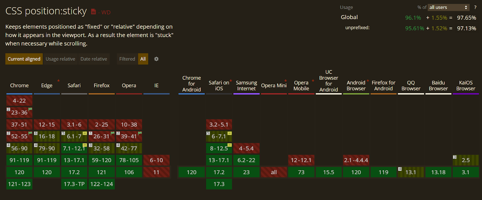
And for the browser support of CSS position: sticky, it is supported by all major browsers as per CanIUse, allowing developers to use its power whenever they want.
 Note
NoteTest your websites for CSS position: sticky across 3000+ environments. Try LambdaTest Today!
Why Does overflow: hidden Prevent position: sticky From Working?
Another big issue many developers encounter when implementing CSS position: sticky is when overflow: hidden is set to the parent element of the sticky element.
When we use position: sticky on an element, we tell the browser to make an element stick to a specific position on the page when the user scrolls. However, for this to work, the browser needs to know where to stick it, and it usually looks for the nearest ancestor (parent) with a scrolling ability (like a scrollbar).
The position: sticky property relies on the scroll behavior of the document to trigger its sticky behavior. If an ancestor element of a sticky element has overflow: hidden, it can interfere with the scroll behavior and cause the sticky element not to stick properly.
This is because the ancestor element with overflow: hidden effectively hides the overflow content, and this can disrupt the normal scroll flow that position: sticky relies on.
See the Pen
The overflow:hidden preventing position:sticky from working by Aakash Rao (@aakash_codes)
on CodePen.
In the example, the sidebar contains a sticky element. The overflow: hidden on the sidebar, is used to limit its height. However, this can interfere with the sticky positioning of the element inside. As you scroll down, you may notice that the sticky element logo doesn’t stay in its intended position due to the overflow: hidden property on the sidebar.
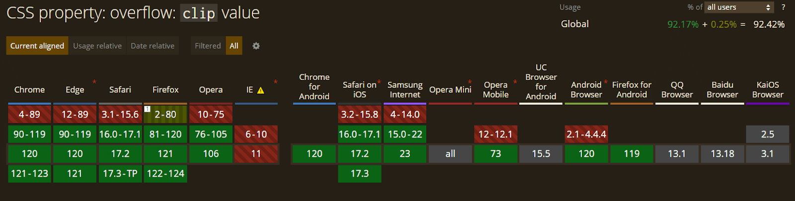
To fix this problem, we can use the overflow: clip property. This property is similar to overflow: hidden, which hides extra content but with a slight difference. The hidden value allows programmatic scrolling and creates a new block formatting context (BFC). At the same time, the clip completely disables any kind of scrolling and doesn’t establish a new block formatting context.
See the Pen
[Fixed]: overflow:hidden preventing position:sticky from working by Aakash Rao (@aakash_codes)
on CodePen.
For an element with position: sticky to work correctly, it must be within a BFC. Setting overflow: hidden on a parent element creates a BFC, but it also prevents any elements inside from sticking to it, as they’re confined to that BFC.
So, when you use overflow: clip, it hides overflowing content just like hidden, but it doesn’t turn the element into a scroll container. In other words, it doesn’t allow the element to scroll programmatically. The window, or viewport, remains the default scroll container.
To put it simply, if you want to hide extra content without allowing any scrolling, use overflow: clip. This ensures that the window remains the main scroll area, and the element won’t become a scroll container.
Best Practices for Sticky Navigation Menu Element
Sticky positioned elements, such as sticky navigation menus, can enhance the user experience by providing persistent navigation or content that remains visible as the user scrolls.
However, they can also introduce potential accessibility challenges. Let’s learn about some accessibility issues associated with sticky navigation menus or headers and how we can tackle them using simple best practices.
- Browser Compatibility and Accessibility Testing: Performing cross browser and accessibility testing of CSS position: sticky is important for ensuring a consistent and user-friendly experience across different browsers and for users with various accessibility needs.
- Considering Content-to-Chrome Ratio: Sticky headers take up screen space that could be used for content. It’s crucial to use that space wisely. This is especially important on smaller screens like mobile devices.
- Ensuring Good Contrast Ratio: Another big issue arises when there is not enough contrast between the sticky navigation menu and the page’s content area.
- Building Partially Persistent Headers: Partially persistent headers, often found on mobile sites, strike a balance between accessibility and non-intrusiveness during scrolling. When you scroll up, the header usually appears, thinking you want to use it. It gets hidden as you start scrolling towards the bottom.
- Consider Whether a Sticky Element is Needed at All: As mentioned earlier, sacrificing some screen space on every page may not be beneficial. If the sticky header doesn’t add user value, design improvements are pointless.
So make sure to test your elements for accessibility and perform cross browser testing. For scalability and reliability, you can leverage cloud-based testing like LambdaTest. It is an AI-powered test orchestration and execution platform that lets you test websites for CSS position: sticky on an online browser farm on over 3000+ browsers and operating systems.
Looking to get started with LambdaTest? Check out the tutorial below on performing real-time testing on LambdaTest.
Subscribe to the LambdaTest YouTube Channel for the latest tutorials on mobile app testing, real device cloud, and more.
Aim for a good balance between content and the header size, ensuring text is readable, and tap targets are at least 1cm × 1cm on touchscreens. While there’s more space for desktops, avoid unnecessary header height and prioritize readable text sizes over excessive empty pixels, even for logos.
For touchscreens, it’s a good idea to make buttons or things you tap on as big as a small coin, like a quarter. The words should be the size you see on your phone, not too tiny. Also, try to keep everything a good size so it looks nice but not too tall. This way, it’s easier for people to use it on their phones.
This example demonstrates a problem – the navigation submenu doesn’t stand out well from the content area. This leads to failure to meet the requirements of Success Criterion 2.4.11 Focus Appearance, which suggests having a contrast ratio of at least 3:1 between the focused and unfocused states, ensuring better visibility and user experience.
We must also ensure that focusable elements remain visible with a sticky menu. This also goes for internal page anchors that need to account for the sticky bar using the scroll-padding property in CSS to unobscure content adhering to the W3C technique.
The above examples show a good contrast difference with the content area using box-shadow on the bottom.
While deciding the color for a sticky header on a website, we can ensure it looks different from the rest of the page. This can be done either with a different contrasting color or by applying a box shadow that highlights the current active state of the user.
The above example shows the partially persistent header example for mobile screens on the Lenskart website.
To enhance the user experience, developers can opt for subtle animation. Implementing a gradual reveal as the user scrolls up slightly ensures a smooth transition. Aim for a 300–400 milliseconds slide animation, balancing user-friendly functionality and minimal disruption.
For example, will users log in on different pages if the header has a login button? Will users switch between categories or stay in one if it includes main navigation? The answers depend on the website type, tasks, and content.
Wrapping Up
To wrap it up, diving into CSS position: sticky allows developers to create awesome, user-friendly websites. We started by understanding the basics and seeing how CSS position: sticky is special and handy compared to its buddy CSS position fixed.
We explored some real-world examples and tried to build them from scratch. We also discussed the accessibility of the sticky navigation menu, sharing the best ways to handle it. We also learned about its browser support and compatibility across different browsers.
Frequently Asked Questions (FAQs)
Are there any performance considerations with CSS position: sticky?
While CSS position: sticky is generally performant, excessive use of sticky elements may impact the performance of web pages. Always try to test the design across various devices to monitor performance.
Can I use the CSS position: sticky on mobile devices?
Yes, CSS position: sticky works on mobile devices. However, it’s crucial to test and optimize the design for responsiveness on various screen sizes to ensure a consistent user experience.
Are there any alternatives to CSS position: sticky?
Yes, alternatives include using JavaScript or APIs like Intersection Observer for sticky behavior. However, the CSS position: sticky is preferred for its simplicity and performance.
Can I use the CSS position: sticky on table elements?
Yes, CSS position: sticky can be applied to table elements such as table headers, making headers stick while scrolling through a large table.


Author’s Profile
Aakash Rao
I am a Frontend Developer and Technical Writer based out of India who loves to create and share knowledge on Twitter with the community. I am a community guy who loves to connect and interact with fellow developers and enthusiasts. Alongside, I love to listen to podcasts and read books with a keen passion to explore other fields such as Graphic design & VFX.
Blogs: 4
Got Questions? Drop them on LambdaTest Community. Visit now