
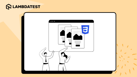
A Complete Guide To CSS Transforms And Transitions Property
Nimritee
Posted On: June 29, 2021
 85496 Views
 9 Min Read
Have you ever wondered how those three dots on a website blink so quickly? CSS Transforms and Transitions property can do the trick! CSS Transform property applies movement, rotation, skewing, and scaling to the HTML elements in 2D or 3D. The transition property helps the change to take place smoothly and swiftly.
If you are trying to make your project interactive, you should know about this power couple to keep your animations consistent and elusive. It’s best to avoid cross browser compatibility issues that might complicate your design.
So, what’s the difference between CSS Transform and CSS Transition? The Transform property in CSS moves or modifies the appearance of an element, whereas the Transition property seamlessly and gently transitions the element from one state to another.
In this blog, we will deep dive into the CSS Transform and Transition properties that will help you in creating simple and cool animations with fewer lines of code.
New to CSS Selectors? Check out this Ultimate CSS Selector cheat sheet to boost your web designing career.
TABLE OF CONTENT
Let’s begin with the CSS Transform and Transition!
CSS Transform Property
Transform property in CSS is invoked when there is a change in the state of the HTML element. You can rotate, skew, move and scale elements. It occurs when the state of an element is modified, like when you hover the mouse over a button or perform a mouse-click. We will see how this works in further sections of this blog.
There are three variations of CSS Transform properties in 2D.
- transform: TpropertyX(x);
- transform: TpropertyY(y);
- transform : Tproperty(x,y);
Here Tproperty refers to the element property you want to change, x and y can be negative or positive values. CSS Transform property in 3D includes the Z-axis. X is the width, Y is the height, and Z gives the depth of the screen.
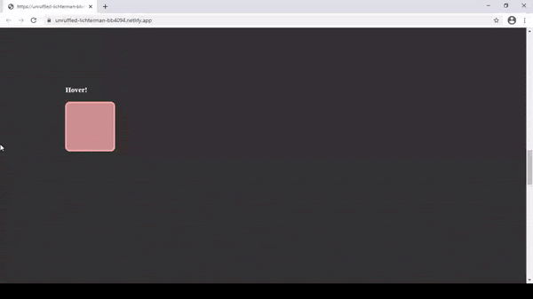
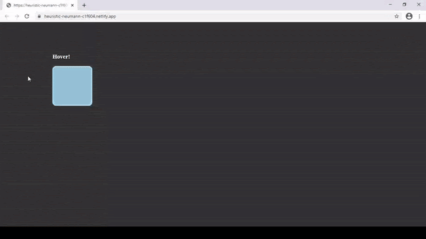
Translate
Translate property changes the position left/right and up/down of the element on the page based on the given X (horizontal) and Y (vertical) axes parameters. The positive X-axis parameter moves the element to the right, and the negative will do so to the left. The positive Y-axis parameter moves the element down, and the positive does so towards up.
HTML
|
1 2 3 4 |
<div class="container"> <h3>Hover!</h3> <div id="box"></div> </div> |
CSS
|
1 2 3 4 5 6 7 8 9 10 |
#box { width: 120px; height: 120px; background-color: rgba(55, 255, 5, 0.582); border-radius: 12px; border: solid rgb(110, 235, 110) 4px; } #box :hover{ transform: translate(100%,60%);} |
On hovering:
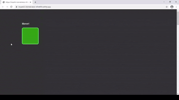
In the above example, the box will move from its original position to 100% right and 60% down as both are positive parameters.
Read: 12 Modern CSS Techniques For Older CSS Problems
Skew
Skew tilts the element towards a direction based on the provided parameters to its X and Y axes. The Positive X parameter tilts it towards the right, and the negative tilts it towards the left. At the same time, the positive Y tilts it towards down, and the negative tilts it upwards.
HTML
|
1 2 3 4 |
<div class="container"> <h3>Hover!</h3> <div id="box"></div> </div> |
CSS
|
1 2 3 4 5 6 7 8 9 10 |
#box { width: 120px; height: 120px; background-color: rgba(246, 200, 250, 0.932); border-radius: 12px; border: solid rgb(246, 169, 253) 4px; } #box :hover{ transform: skew(30deg,30deg); |
On hovering:
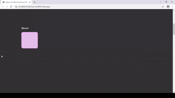
In the above example, the box has been tilted to the right and upwards as both are positive parameters.
If you skew an element, it will also skew all the children existing inside the element. If we need to maintain the original angle of a child element, we will have to use the opposite value of skew to keep it original.
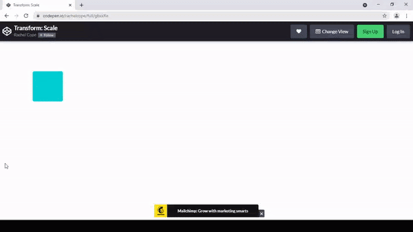
Scale
Scale can increase or decrease the size of an HTML element based on the given parameters. The positive value increases the size in the X or Y direction, while the negative value decreases the size in X or Y direction.
Simply put, new_size = parameter * original_size;
HTML
|
1 2 3 4 |
<div class="container"> <h3>Hover!</h3> <div id="box"></div> </div> |
CSS
|
1 2 3 4 5 6 7 8 9 10 |
#box { width: 120px; height: 120px; background-color: rgba(172, 221, 243, 0.842); border-radius: 12px; border: solid rgb(172, 221, 243) 4px; } #box :hover{ transform: scale(0.5);} |
On hovering:
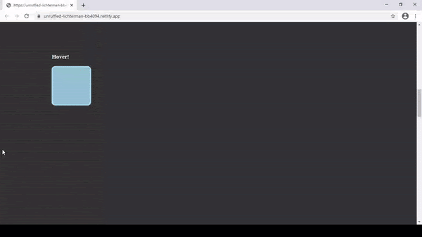
In the above example, the box size has been shrunk to half of its original size.
Rotate
Rotate property can rotate an element in the clockwise or anticlockwise direction based on a specified number of degrees. The positive degree rotates the element in the anticlockwise direction and the negative parameter rotates the element in the clockwise direction.
HTML
|
1 2 3 4 |
<div class="container"> <h3>Hover!</h3> <div id="box4"></div> </div> |
CSS
|
1 2 3 4 5 6 7 8 9 |
#box4{ width: 120px; height: 120px; background-color: rgba(247, 169, 169, 0.788); border-radius: 12px; border: solid rgb(247, 169, 169) 4px; } #box4:hover{ transform: rotate(25deg);} |
On hovering:
In the above example, the box is rotated by 25 degrees anti-clockwise as the parameter is positive.
Apart from these, we can combine multiple CSS transform properties for an element. You will need to specify the properties that you want to change.
For example: transform: prop1(parameters) prop2(parameters);
Let us take a look at an example. I have added the transition property here. We will get to know more about it in the upcoming sections.
HTML
|
1 2 3 4 |
<div class="container"> <h3>Hover!</h3> <div id="box"></div> </div> |
CSS
|
1 2 3 4 5 6 7 8 9 10 11 12 |
#box{ width: 120px; height: 120px; background-color: rgba(247, 169, 169, 0.788); border-radius: 12px; border: solid rgb(247, 169, 169) 4px; transition: all 0.7s ease; } #box:hover { transform: rotate(120deg) scale(1.5) translateY(-100px); } |
On hovering:
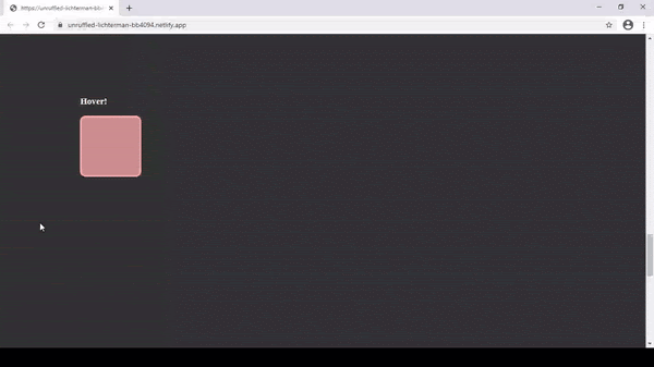
The transformations without adding transitions happen quickly in a fraction of a second. We will fix this in the next section by adding some transitions to the same.
Read: 15 Advanced CSS Techniques To Master In 2021
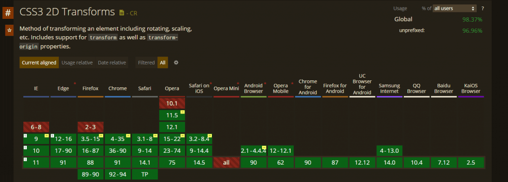
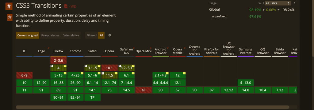
Browser Compatibility Of CSS Transforms
Let us take a look at the compatibility of the CSS Transform property across different browsers.
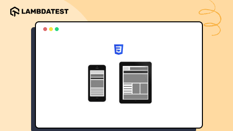
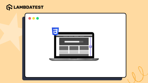
Use LT Browser For Responsive Testing Of Websites Built Using CSS Transforms And Transition
After implementing the CSS Transforms and Before Transitions property in your website, you will need to perform a responsiveness test to check how these properties render in different screen sizes and resolutions. You can leverage LT Browser to test CSS Transform and Transition for your websites and web apps across different viewports like mobiles, tablets, desktops, and laptops. To get started, you can refer to the below LT Browser video tutorial.
Here are some of the awesome features offered by LT Browser:
- Network throttling to test websites on different network conditions.
- Sync devices to synchronize scrolls across multiple device viewports so that scrolling on one viewport will scroll the same amount on another viewport.
- Performance reports to optimize the overall website performance.
- Simulation of mouse pointer to mimic touch behaviour of real devices, and more.
Here are some of compelling reasons Why Developers Should Use LT Browser

LT Browser excels at providing all the essential features when it comes to mobile web testing and responsive testing. Developers can leverage the essential features offered by LT Browser to test and debug their websites and web apps on different device viewports.
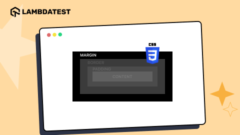
CSS Transition Property
We saw how different CSS Transform properties change the state of the element in a visual manner. Now, the Transition property adds a graduality to that changed state. The transformation will become smooth over a given period.
Three main properties are required for the transition to take effect:
- transition-property
- transition-duration
- transition-timing
You have to specify the property of the element you want to change and the duration in which that change should take place. Timing function and delay properties are optional.
|
1 2 3 |
div { transition: [property] [duration] [timing-function] [delay]; } |
transition-property
The transition-property defines the CSS property where the transition over the element will be applied. We can also apply a transition to a single property (e.g., background-color or transform) or to all the properties in the rule-set.
|
1 2 3 4 |
div { transition-property: all; transition-property: transform; } |
transition-duration
The transition-duration property defines the time span of the transition over the element. We can specify in seconds or milliseconds.
|
1 |
div { transition-duration: 4s; } |
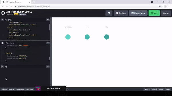
Below is the code example of the CSS Transition property.
HTML
|
1 2 3 4 5 6 7 8 9 10 11 12 13 14 |
<div class="wrap"> <div class="container"> <h1>300ms</p> <div class="box1 box"></div> </div> <div class="container"> <h1>1s</p> <div class="box2 box"></div> </div> <div class="container"> <h1>3s</p> <div class="box3 box"></div> </div> </div> |
CSS
|
1 2 3 4 5 6 7 8 9 10 11 12 13 14 15 16 17 18 19 20 21 22 23 24 25 26 27 28 29 30 31 32 33 34 35 36 37 38 39 40 41 42 43 |
.wrap { margin: 50px; } .container { display: inline-block; width: 150px; } h1 { color: lightgray; font-family: lato; font-size: 20px; font-weight: 200; padding: 20px; text-align: center; } .box { border-radius: 50%; height: 40px; margin: 50px auto; width: 40px; .wrap:hover & { transform: scale(2); } } .box1 { background: #60D4C8; transition: all 300ms; } .box2 { background: #46BAAF; transition: all 1s; } .box3 { background: #3EA69B; transition: all 3s; } |
Output:
Let’s consider the scale Transform example with added Transition property.
HTML
.square
CSS
|
1 2 3 4 5 6 7 8 9 10 11 12 |
.square { background: darkturquoise; border-radius: 5px; height: 100px; margin: 100px; transition: transform 1s; width: 100px; &:hover { transform: scale(2); } } |
Output:
transition-timing
The transition-timing-function property specifies the speed of the transition throughout the element’s duration. The default timing is easy, which begins slowly, immediately speeds up, and then gradually decreases at the end.
Other timing options include ease, ease-in, ease-out, ease-in-out, and linear.
Below is an example of the different timing options (used with the transform: translate property.
HTML
|
1 2 3 4 5 6 7 8 |
<div class="container"> <div class="circle0"></div> <div class="circle1"></div> <div class="circle2"></div> <div class="circle3"></div> <div class="circle4"></div> <div class="circle5"></div> </div> |
CSS
|
1 2 3 4 5 6 7 8 9 10 11 12 13 14 15 16 17 18 19 20 21 22 23 24 25 26 27 28 29 30 31 32 33 34 35 36 37 38 39 40 41 42 43 44 45 46 47 48 49 50 |
.container { margin: 100px; } .circle { border-radius: 50%; height: 30px; width: 30px; margin: 10px; .container:hover & { transform: translateX(200px); } } .circle0 { @extend .circle; background: PaleTurquoise; transition: all 1.5s linear; } .circle1 { @extend .circle; background: salmon; transition: all 1.5s ease; } .circle2 { @extend .circle; background: lightskyblue; transition: all 1.5s ease-in; } .circle3 { @extend .circle; background: khaki; transition: all 1.5s ease-out; } .circle4 { @extend .circle; background: mediumturquoise; transition: all 1.5s ease-in-out; } .circle5 { @extend .circle; background: thistle; transition: all 1.5s cubic-bezier(0,1,.98,0); } |
Output:
As we can see, the box scales down progressively under a second.
You can specify a single type of transition to all the property as shown in the example, or you can specify different transitions for each one of them as follows:
transition: p1 d1, p2 d2, …, pn dn;
Where pn specifies property name and dn specifies the duration.
Now let’s see how we can try and make the transition work across all the browsers. We will use vendor prefixes for the same.
Consider the above example, this is how it looks like for vendor prefixes:
Here -webkit for Chrome, Safari; -moz for Firefox, -o for Opera.
|
1 2 3 4 5 6 7 8 9 10 11 12 13 |
#box { width: 120px; height: 120px; background-color: rgb(140, 212, 245); -webkit-transition: all 1s; -moz-transition: all 1s ; -o-transition: all 1s ; transition: all 1s; } #box :hover{ transform: scale(0.5);} |
Specifying the vendor prefixes makes sure that the transitions work instantly across the browsers that are normally used by the target audience.
Also Read: The Ultimate CSS Selectors Cheat Sheet You Must Know
Browser Compatibility Of CSS Transition property
Let’s take a look at CSS Transition compatibility across the browsers.
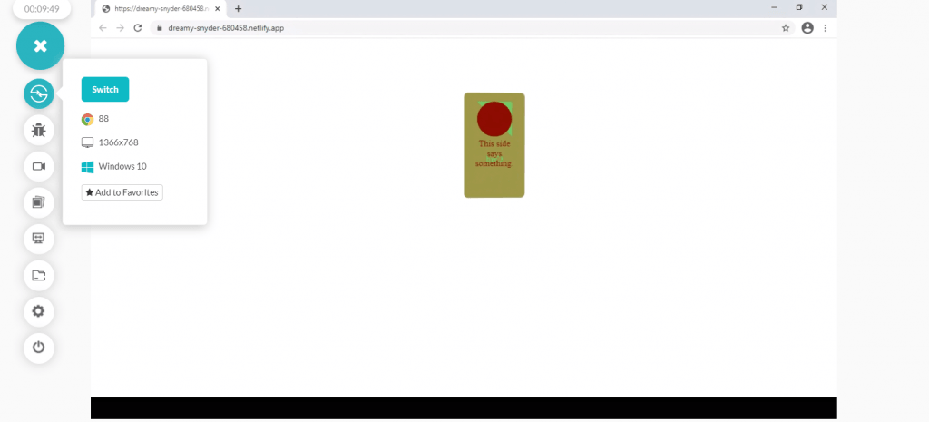
Let’s see an example of a flip card.
HTML
|
1 2 3 4 5 6 7 8 9 10 11 12 13 |
<div id="card"> <div id="front"> <div class="circle"></div> This side<br>says something. </div> <div id="back"> <div> <div class="triangle"></div> </div> <div>Card</div> </div> </div> |
CSS
|
1 2 3 4 5 6 7 8 9 10 11 12 13 14 15 16 17 18 19 20 21 22 23 24 25 26 27 28 29 30 31 32 33 34 35 36 37 38 39 40 41 42 43 44 45 46 47 48 49 50 51 52 53 54 55 56 57 58 59 60 61 62 63 64 65 66 67 68 69 70 71 72 73 74 75 76 77 78 79 80 81 82 83 84 85 86 87 88 89 90 91 92 93 94 95 96 97 98 99 |
@keyframes card-flip { 0% { transform: rotateY(0deg); animation-timing-function: ease-in; } 50% { transform: rotateY(90deg) rotateX(-15deg); animation-timing-function: ease-out; } 100% { transform: rotateY(180deg); } } body { perspective: 1000px; margin: 100px; } #card, #back { width: 7em; height: 12em; } #front { width: 5em; height: 10em; } #back > div { width: 5em; height: 4em; } #card { animation: card-flip 3s 1s infinite alternate; position: relative; transform-style: preserve-3d; } #front, #back { position: absolute; top: 0; left: 0; } /* different, to show different bugs */ #front, #back > div { border-radius: 0.5em; padding: 1em; text-align: center; backface-visibility: hidden; } #back > div { transform: translateX(0); background: rgba(0, 0, 128, 0.6); color: aqua; } #back > div:nth-child(1) { border-bottom-left-radius: 0; border-bottom-right-radius: 0; } #back > div:nth-child(2) { border-top-left-radius: 0; border-top-right-radius: 0; transform-style: preserve-3d; } #front { background: rgba(192, 192, 0, 0.6); color: maroon; } #back { transform: rotateY(180deg); } .circle { display: inline-block; width: 0; height: 0; border: 2em solid; border-radius: 50%; } .triangle { display: inline-block; width: 0; height: 0; border: 2em solid; border-right-color: transparent; border-bottom-color: transparent; } |
Checking the cross browser compatibility of your website rather than hosting it on each web browser can be cumbersome. It is impossible to download and install a range of browsers and browser versions for the target device or operating system.
This is where Cross browser testing tools like LambdaTest can help test your website and web apps for browser compatibility across different browsers and platform combinations.
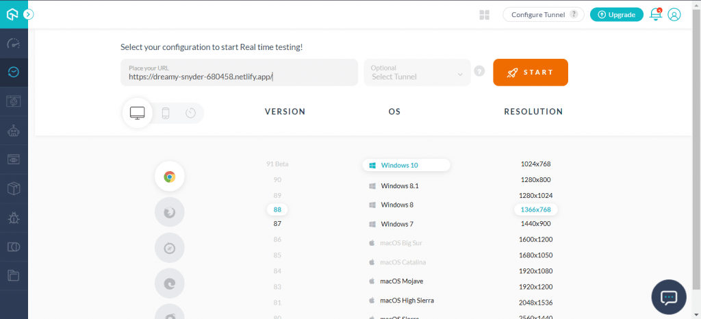
To test the cross-browser compatibility, just select the configurations and hit Start.

Wrapping It Up!
Front-end developers can now easily create dynamic and alluring browser compatible websites loaded with visual effects without utilizing JavaScript, thanks to CSS3 Transform and Transition properties. In this post, we have learned how the Transform and Transition properties in CSS can together add smooth interactive animations to your website.
We hope you found this post helpful. Also, if you have any intriguing CSS Transitions or transformations to share, we’d love to hear from you in the comment section.
Happy Designing!


Author’s Profile
Nimritee
Nimritee works as a Technical Writer at LambdaTest. Passionate about various technologies and tech trends, she is always keen to explore unique aspects of web development & web testing.
Blogs: 5
Got Questions? Drop them on LambdaTest Community. Visit now