
A Comprehensive Checklist For Front-End Testing
Harish Rajora
Posted On: May 25, 2021
 61884 Views
 24 Min Read
A website comprises two main components: a front-end and a back-end (along with several more). Though few websites (e.g. NGO’s website) may not have a back-end, it definitely has a front-end. The front-end of a website is the user’s view of how (s)he will see it and how the website will behave to his actions. Nobody wants their user to see that their input validations aren’t working. The front-end testing of a website plays a vital role in ensuring cross browser compatibility so that users do not witness hiccups when opening the website on their preferred browser (and platform). . Therefore we perform testing on the front-end and back-end components to ensure that they function as per the desired expectations.
Front-end testing is not like testing a code block or a separate functionality like unit testing. Front-end testing is a heavy job with a lot of components of its own. For example, the front-end needs to ensure that the website is usable by specially-abled people. Accessibility testing tools can be of help to check if the website is user-friendly for people with disabilities like color-blindness, old age, etc. ; This is the primary reason we also do contrast testing. It should function well on major browsers in the market; making cross browser testing extremely important.
In this post, I have tried to summarize all the major elements required in front-end web development testing – testing types, image optimizations, etc., to deliver a smooth and high-quality front-end of a website.
Let’s begin with the front-end testing checklist!
TABLE OF CONTENTS
- Front-End Testing Tools And Techniques
- Cross-Browser Testing For Front-End Testing
- Linter And Its Effects On Front-End Testing
- Optimizing Headings On The Web Page
- Why Cross-Browser Testing?
- Types Of Cross-Browser Testing Methods
- Optimizing Images For A Better Front-End
- Contrast Testing For Front-End Web Development
- Optimizing The Data Transfer To The Front-End
- Continuous Integration and Continuous Deployment
- Conclusion
Front-End Testing Tools And Techniques
First things first, we would start with the type of testing required during the front-end testing phase. The assembly of these testing types is called front-end testing as a whole. There is a front-end testing tool associated with each type of testing that best suits the testing paradigm. To the best of my knowledge, these front-end testing tools are written considering many other factors, open-source being one of them. It depends entirely on the tester, though and comfort level with the tool. But, I would be happy to see alternative tools in the comments section so that the entire community can make the most out of those tools for realizing front-end testing.
1. Visual Regression Testing
Visual regression testing refers to comparing the newer version of the website to the original / older version and checking for the inconsistencies in the newer one. It is similar to the regression testing but the visual part is added to the screenshots.
Tool For Visual Regression Testing
The best tool for front-end testing, in my experience, is BackstopJS. BackstopJS is a visual regression testing framework written in Javascript and wraps CasperJS, PhantomJS, and ResembleJS with their functionalities inbuilt into it. The best part about BackstopJS is that it works even though your website is not written in Javascript,as the website is considered like a black box. BackstopJS also generates the HTML reports stating the differences between the screenshots.
You could also leverage smart visual UI testing on LambdaTest that lets you perform regression testing in a few clicks. It also identifies the visual deviations related to padding, color, icon size, layout, etc.
Introducing LambdaTest Smart UI — your go-to smart visual regression testing platform that provides pixel-to-pixel comparison combined with high-performance infrastructure and deep analytics.
2. Automated Accessibility Testing
Accessibility testing is a front-end testing type which ensures that people with impairments do not face any challenges in accessing the website. The impairments can be anything such as visual, auditory, or cognitive challenges, etc. Fortunately, this field has gained prominence in recent times and an increasing number of websites are meeting accessibility standards. Automated accessibility testing is performed using automation tools.
Tool for Automated accessibility testing
Paypal developed an automated accessibility testing tool to perform the automated accessibility testing within the browser. The best thing about this tool is that it is a browser-based accessibility tool. Testers can integrate the Automated accessibility testing tool into their automation testing suite and run them in parallel mode.
The automated accessibility testing tool also provides accessibility APIs and custom web applications for other tools such as Chrome developer tool, Axe, and HTML_CodeSniffer. The automated accessibility testing tool is open-source and free for use. Another alternative for accessibility testing is the A11Y Machine tool.
Read: Curated Tools For Accessibility Testing Of Websites
Watch this video to learn how Cypress can be used to automate accessibility testing.
3. End-To-End Testing
End-To-End testing is a form of front-end testing that is required for checking and confirming whether the flow of the application (concerning front-end here) is working as expected from start to finish. End-to-end testing is mainly done by mimicking the actions of a real user with real-world scenarios.
Tool for end-to-end testing
Cypress is one of the best front-end testing tools available in the market today. It is open source and rich with features to perform end-to-end testing at scale. On top of Mocha, Cypress is built in JavaScript to perform end-to-end testing without any help from Selenium.
Read – Selenium vs Cypress – Which Is Better in 2021?
Cypress tests are straightforward to write, read, and understand. The criteria for us choosing the Cypress tool is because of its speed. Cypress executes test cases as soon as rendering of the web page is complete.
4. Image Analysis Testing
A majority of the websites are filled with images. From logo to stats to banners, a website lives on images.
The size of the web page increases exponentially with the number of images present on the site. This is because more data has to be fetched from the server. On the whole, it degrades the website’s reputation. Hence, there comes the need for front-end testing to analyze images that need to be optimized. Choosing the right front-end testing tool is critical since images can be optimized from all fronts.
Tool For Image Analysis Testing
Web Speed Test is an excellent tool for testing the images on the website and grading them according to their performance as per different parameters. These parameters include image format, fit, compression rate, color space, and color depth. The tool then grades each image on a scale from A to F and provides information about how this grading can be improved and how the images can be optimized.
5. Cascading Style Sheets Testing
As the name suggests CSS, it is a style sheet language used to style the components on a website. I am sure you all must be familiar with it. When a website is too complex in its structure, it is impossible to read the style sheet manually and find out what went wrong.
A simple typographical error of “x-index” instead of “z-index” will change the element’s display. Therefore performing front-end testing of CSS elements is necessary.
CSS needs to be checked up in two categories:
- Syntax
- Display
There are different front-end testing tools available for complete CSS testing, and you can use a combination of both to perform CSS testing.
Tool For CSS Testing
BackstopJS can be used for comparing the elements visually and checking for any inconsistencies in the elements. Resemble.JS can also be used for the same purposes depending on the tester’s preference. For syntactical errors, CSSLint is a great tool that can identify the errors and apply pre-defined rules or are defined by the tester explicitly.
Read – The Ultimate CSS Selectors Cheat Sheet
6. Performance Testing
Performance testing is a significant type of front-end testing that tests whether the website performs well considering various performance parameters. Performance testing of the website is important since it directly affects the revenue and reputation of the website.
Performance testing analyzes a website’s performance on specific parameters such as scalability, stability, responsiveness, speed, interoperability, etc. Performance testing in the front-end is required to check whether the website sustains the quality when the load is increased, and it is working fine in terms of speed or not.
Read: Performance Testing: The Basics – Infographic
Tool For Performance Testing
GTmetrix is a good performance testing tool for your web application. GTmetrix gives the performance statistics of your web page relative to other websites. It comes in a free version and a paid “pro” version. However, the free version is good enough for the job (except for heavy business-related work). Another good tool for performance testing is Calibre. But it is not free software but comes with a free trial.
7. Functional Testing
Functional testing is performed to verify the working of the functional requirements of the software. A good example of functional testing from a front-end testing perspective is the functionality of logging into the system, checking other user interface functions, API workings, etc.
Tool For Functional Testing
Selenium performs functional testing for the front-end. Selenium is a top-rated test automation framework and has a robust community among the testers. Selenium can be used with many languages, so you do not need to worry about learning Java (for example) and can just start writing your Python tests. Selenium is also very easy to learn, open-source, and comes with a lot of features.
Read – How to automate functional testing with Selenium
8. Syntax Testing
Syntax testing identifies the syntactic errors made during writing the code and checks for any illegal expressions that do not adhere to the guidelines. For this purpose, we use linters during the testing phase. Linters are available for all the major programming languages, and since we are just concerned about the front-end here, we just need CSS and JavaScript linters with us. In the previous section about CSS front-end testing, I discussed CSS Linters, so here I will mention a tool for Javascript.
Read – How to fix cross browser compatibility issues in JavaScript
Tool For Syntax Testing
ESLint is a great open-source tool for Javascript linting which is available since 2013.. ESLint does not follow a fixed rule strategy. Apart from ESLint, Javascript has many alternatives to help testers write efficient codes such as JSLint, JSHint, etc.
9. Color Combination Testing
Colour combination testing refers to limiting the colors used in your website so that they do not interfere with the vision of the color blind audience. Front end testing for Color combination also helps adjust the correct contrast of a particular color, which is helpful for color blind and other visually challenged people.
Tool For Color Combination Testing
According to my experience in web development, I find WhoCanUse an excellent tool for verifying and adjusting the color contrast of my text and other elements with the listing of various vision-related diseases. WhoCanUse works according to the web content accessibility guidelines (WCAG) so that the website’s content is accessible to a larger audience.
10. Browser Developer Tools
Every browser comes with built-in developer tools for front-end testing. Although these developer tools describe the same features with different names, they more or less do the same work. Developer tools are essentially necessary when the user is concerned with the front-end of the website.
Developer tools provide efficient means to generate errors, print logs, apply breakpoints, and do many other jobs. For more details on features embedded in Google Developer tools, you can visit Tips To Use Google Chrome Developer Tools.
You can also refer to the below tutorial on how to perform responsive testing using chrome dev tools protocol In Selenium 4.
11. Automated Testing
Automated testing is a broader area in the front-end testing process, focussing on automating the process of testing. It contains other smaller types of tests, such as end-to-end testing, unit testing, etc.
Tool For Automated Testing
Protractor is a good tool to perform automated tests on your web application. It is easy to learn and has an awesome community. Protractor is best used with Angular JS, although it can also be used with non-Angular applications. If your website is built on Angular (or any component of it), it is better to go for Protractor. Another tool for the same process is Selenium and Jasmine.
Read: Protractor Tutorial: End To End Testing For AngularJS
12. Continuous Delivery
Continuous delivery has become a widespread practice and is a logical extension of Agile methodology.. Continuous Delivery is a better approach to follow, even on smaller projects in which different teams work (front-end and back-end) for the betterment of the project. Continuous Delivery helps in faster deployment of the software, along with producing better-quality software by working on the feedback provided by the client/users.
Tool For Continuous Delivery
Jenkins is a superior quality open-source tool used for continuous delivery purposes. Jenkins extracts its power from plugins and thriving community. You can think of Jenkins as a machine whose parts are decided by the tester himself. If a tester needs functionality, he just needs to download and install the plugin, and Jenkins will work accordingly.
Read – What is Jenkins and how to use it?
This was a short brief about the types of testing we need to perform on a website (front-end) to make it suitable for a vast audience and provide a superior quality product. This type of testing cannot be explained in detail in a single post, but I will emphasize on some other aspects of front-end testing.
Cross-Browser Testing For Front-End Testing
Cross-browser testing is a testing paradigm in which we test the website across different browsers (along with their different versions),operating systems, and different resolutions. Cross-browser testing has evolved a lot in the past decade and the parameters have increased significantly over a period of time. This change can be largely attributed to the increasing proliferation of mobile phones and mobile internet.
Since the browsers are different and work differently, they render the web page differently. This is why we need to assure ourselves that no matter how the browser or operating system the user is, he sees exactly what we want him to see.
Cross browser testing can be done in three methods:
- Device Labs: Device labs means setting up the devices physically with OS and browsers pre-installed. But device labs are costly to operate and therefore expensive to subscribe for.
- Cloud-based: Cloud-based cross-browser testing works with the machine on the cloud and creates a virtual environment. Cloud-based cross-browser testing is cheaper, faster, and contains a lot more functionalities. Although it depends on the tester which way he would like to go.
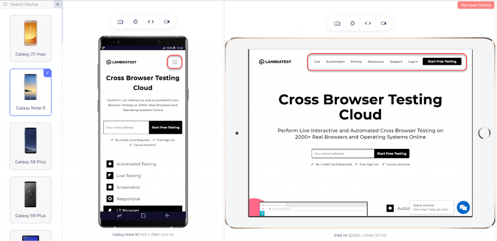
- Dedicated Browsers: There are dedicated browsers built solely for cross-browser testing and responsive testing. The browsers give more flexibility and provide more features to the user. It is up to the liking of the tester to which browser he prefers. I have worked on LT Browser by LambdaTest, and I like displaying two devices on one screen to perform testing. Below is the screenshot for the same:
Check out how LT browser can be leveraged by developers for checking the website from different perspectives:

Intrigued to know more about LT browser, check out our blog on How developers can use LT Browser for building awesome web products
Linter And Its Effects On Front-End Testing
In the above section, I briefly introduced the term linting or linters while mentioning the tools CSS Lint and ESLint used for CSS and JS. But linting is a vital aspect of front-end testing and deserves a separate explanation of its own.
As per Wikipedia, a linter is a code that is run on top of the source code to analyze it for any errors and bugs. Linters have come a long way since their birth. Today, linters are too smart and efficient in their analysis. Today, linters are available for all major programming languages.
Linters are most popular with the developers coding in the dynamically typed languages. They point out errors during runtime and not during compile time like JavaScript and Python.
For example, in python, I can declare my name as
name = “Harish” (It is a string)
And my age as
name = 23 (It is an int with the same variable name)
Therefore linters come in handy in such types of programming. Linters provide the following advantages:
- Linters make the code more consistent.
- The use of linters generates fewer errors during the production phase.
- Linters make the code more readable.
- Linters make the code more maintainable.
- Since we can apply our own rules in linters, there is no conflict or confusion as the complete code has been written following the same guidelines irrespective of the person who is writing the code.
- Linters help in improving the code quality.
- Linters make the code more secure, adhering to the inbuilt and defined rules.
Apart from this, you would discover many advantages personal to you when you start using linters.
In this post, we are just concerned about the front-end part of the website, so our main focus here is Javascript linters, and a good tool for it is ESLint.
ESLint is used for pointing out errors statically in your JavaScript code. It takes care of the coding rules and code quality. Linters are available with all the major text editors. So you do not have to worry about working on a new text editor just for the sake of a linter. ESLint also provides a feature to write your own rules and built-in rules so that ESLint works exactly like your project demands.
To start working in ESLint, install it using a package manager such as npm or yarn.
|
1 2 3 |
npm install eslint --save-dev //for npm yarn add eslint --dev //for yarn |
Then set up the configuration file for ESLint.
npx eslint --init
Your ESLint will be ready to run. Now you can go ahead and specify parser options, parser, processors, environment, globals, plugins, rules, and other configurable stuff. In this post, I will write a small snippet to specify the rules for ESLint.
Rules in ESLint can be specified as follows:
|
1 2 3 4 5 6 7 |
{ “rules”: { “eqeqeq”: “off”, “curly”: “error”, “quotes” : [“error”, “double”] } } |
Optimizing Headings On The Web Page
Headings are an important part of a web page, especially the pages with a lot of written content. In HTML, you have six levels of headings starting from <h1> up to <h6>. Heading plays an important role in a lot of things.
- Web crawlers rely on headings to extract content for what the user has been looking for.
- A lot of the readers are not interested in reading the entire post but want specific information only. Applying heading on the webpage helps the user navigate to the content he is searching for quickly.
- Headings help a user remember the content on the website. For example, a post on Death of Internet Explorer has the following heading:
- Birth of IE
- IE during the start of the 21st century
- After 2014
Such a division helps a user recall most of the content later in the future.
Atop-level heading has a lot of importance in a web page than the lower level headings as the search engines focus on the top-level heading more often. So, what are the things that you, as a developer and a tester, should keep in mind while applying the headings on your website?
- Always divide your content through appropriate headings. Search engines look up for higher-level heading does not mean you put all the headings as h1 or h3 to be selected by the engine. It penalizes the web page.
- Do not overuse the headings. Only apply wherever they are required.
- Do not use similar phrases in all the headings. Try to paraphrase the headings or target other phrases.
- Always put the headings in hierarchical order. Do not go for <h1> and then <h4> and then <h2>. It breaks the content consistency and deviates the user’s attention.
Below I have written a small HTML code with just the headings. You can run this code on your browser to see the effects.
|
1 2 3 4 5 6 7 8 9 10 11 12 13 14 15 16 17 18 19 20 21 22 23 24 |
<!DOCTYPE html> <html> <head> <title>Page Title</title> </head> <body> <h1>What is Cross-Browser Testing?</h1> <p>Cross-browser testing is a testing method to verify that the website is rendered as expected in all the browsers available......... <h2 id=E>Why Cross-Browser Testing?</h2> <p>The advantages of cross-browser testing are....</p> <h2 id=F>Types Of Cross-Browser Testing Methods </h2> <p>There are a various types of methods by which cross-browser testing can be performed </p> <h3>Cloud-Based</h3> <p> ...... </p> <h3> Device Labs </h3> <p> ...... </p> </body> </html> |
Optimizing Images For A Better Front-End
Images are an integral part of a website’s front-end. They not only attract the user and keep him glued to the site but also deliver the meaning of a long and tedious text without actually writing one. If you have observed while browsing the internet, you will find images everywhere. From blog post banner images to a video’s thumbnail image, they are everywhere.
Even if we informally categorize these images, we may understand that the images are either for decorative purposes or informative purposes. As for decorative purposes, we might think for a second about not placing them on the website. But for informative purposes, they are essential.
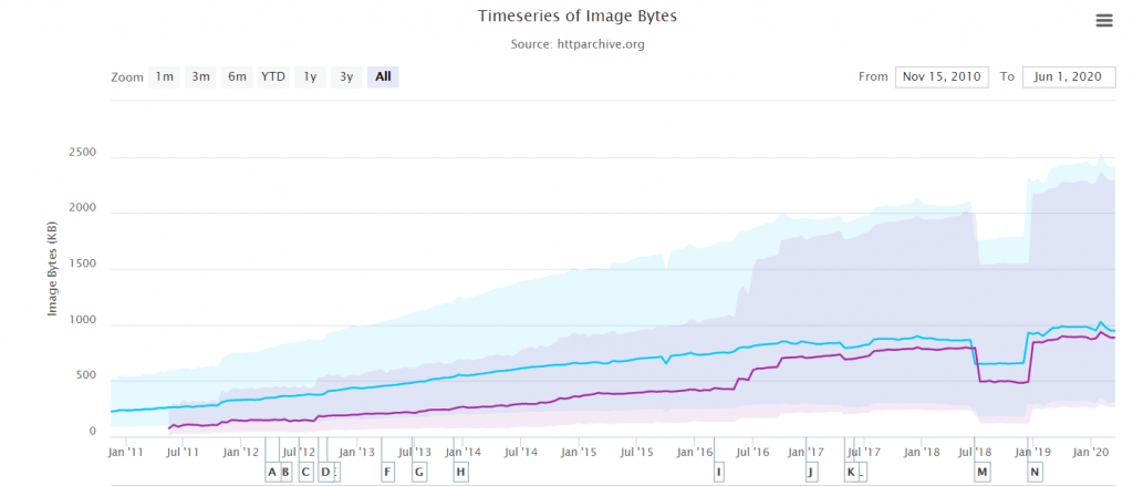
If I could draw the problem with images, I would simply say, “Images come with a cost.” They are heavier than the text and, in turn, slow down the page loading time. Although the world has started to work on higher bandwidth than it used to do a decade ago, we still cannot ignore a large population of developing nations with strict bandwidth constraints. In the past decade, we have also increased the number of images on a single page and the quality of the images. As per a report today, images account for 50% of the total transfer size.
Bottom line: images need to be optimized for improved performance. Below I have briefed how images can be optimized on a website, but I highly recommend going through my post about How To Create Responsive Images, a detailed guide on the same topic with full code snippets.
Images can be optimized on a website by one of the following two methods:
SRCSET Attribute
The srcset attribute is used to choose an appropriate image to display according to the screen size. While using srcset, the developer describes multiple images in the attribute and the size for which he would want that particular image to be displayed. These are the same images but with different resolutions and hence with different sizes.
|
1 |
<img srcset="boat-320w.jpg, boat-480w.jpg 1.5x, boat-640w.jpg 2x" src="boat-640w.jpg" alt="Boat Landscape"> |
Picture Element
Another method to optimize the image is to use different cropped images for selecting an appropriate image for the screen size. Unlike the srcset, here we use a different image altogether, which is the cropped version of the original image. The main aim is to keep the subject in focus, even on a smaller screen. For example, you can see the below image in which the subject is out of focus when the screen size changes.

To achieve this goal, we make use of the picture element. The picture element is a separate tag, unlike srcset, which is an attribute. In the picture tag, we define the image and the screen size appropriate for that image.
|
1 2 3 4 5 |
<picture> <source media = “(max-width: 799px)” srcset = “kutch-480.jpg”> <source media= “(min-width: 800px)” srcset = “kutch-800.jpg”> <img src= “kutch.jpg” alt= “Rann Of Kutch Landscape” /> </picture> |
There are two other methods to render the correct image on the webpage, but they lack optimization. For example, media queries used in CSS may provide the correct resolution images, but it fetches the same quality image with the original size from the server. The work is done after that. Hence, for the front-end testing, it is somewhat irrelevant.
Contrast Testing For Front-End Web Development
Contrast testing has become an important aspect of front-end web development. Contrast testing refers to providing correct contrast to the element you are placing on the website. This process helps in a couple of ways:
- People with visual impairments do not face any difficulties while visiting the website.
- The elements look appealing to the user.
- It helps in presenting an element in focus than other elements.
WCAG (The Web Content Accessibility Guidelines) tells us that the content on our web page should be distinguishable. But, how can we check if we are applying the correct contrast or not?
The WCAG publishes rules so that the developer and testers can implement the elements with correct color contrasts. These are as follows:
- For the non-decorative text, the color contrast ratio should be 3:1. This refers to a text whose size is greater than 18 points or greater than 14 points if the text is bold.
- For the text smaller than the above-given points, the text should have a contrast ratio of at least 4:5:1.
You can use any tool for this purpose, such as WhoCanUse. But, I would recommend going through the developer tools on your browser as they contain this check built into their systems.
Optimizing The Data Transfer To The Front-End
While developing a website, I have often encountered slower loading times, even if all the elements were appropriately optimized; the reason for this slow load time: I was fetching the data synchronously as soon as the web page was fetched. This was the data that the user did not even require.
For example, suppose on Facebook you load your home page, and there are ten photos. All of them have 100 comments on average. Now fetching these comments and populating them onto the webpage takes considerable time. Therefore facebook just shows the most popular comment, and the rest are loaded only after the user taps the comments on purpose.
As a developer, you will find a lot of elements like this which takes time unnecessarily. Always use asynchronous transfer methods from the server, and the loading time will decrease considerably.
Continuous Integration and Continuous Deployment
The last phase to remember in the overall testing process is continuous integration and deployment. The continuous integration helps in testing the code as soon as it is pushed to the codebase. In other words, continuous integration is a practice to test the new code as soon as it is pushed. This helps track the defects in the code as early as possible, which would have proved fatal later in the production.
Another practice in testing is the continuous deployment of the code pushed and tested during the continuous integration phase. Continuous deployment means pushing this code to the staging or the production area as soon as possible. For example, merging into the production branch and deploying it onto the server.
These phases are automated during the testing phase so that the work is done faster. Moving from codebase to production is called a deployment pipeline, and it is essential to try to automate the pipeline to save time. Although the complete pipeline is difficult to automate, we should achieve automation as much as possible.
Conclusion
The front-end is the first impression of the website to the user. There is no point in applying the greatest of the algorithm to your back-end if your login button is just out of the viewport. The website’s front-end should be appealing to glue the customer to your website and make him come back often. The development work is limited to applying the code, creating the elements, and improving functionalities. But, this is just half of the job. Front-end testing is as essential as development because there are hundreds of bugs on a web application when it is created.
Front-end testing is a vast field that requires different methods and divisions, which constituently create the overall front-end tests. In this post, I have collected all the necessary ingredients to perform efficient testing and ensure the cross browser compatibility of your websites and bring out the best product. It involves testing methods, image optimizations, heading optimizations, and cross-browser testing. It is a quite straightforward but yet time-consuming practice. But, for a seamless user experience, this is the most important job. So the next time you hit enter and see the front-end of a website, remember the hard word it hides behind it.


Author’s Profile
Harish Rajora
I am a computer science engineer. I love to keep growing as the technological world grows. I feel there is no powerful tool than a computer to change the world in any way. Apart from my field of study, I like reading books a lot and write sometimes on https://www.themeaninglesslife.com .
Blogs: 88
Got Questions? Drop them on LambdaTest Community. Visit now