
Your One-Stop Guide To Mobile Website Testing
Mehul Gadhiya
Posted On: May 5, 2023
 172716 Views
 32 Min Read

While the usage of mobile devices is booming, mobile-friendly design has become essential. Mobile website testing helps you test your website or web application across multiple browsers, OS, and devices to check its functionality, compatibility, and user-friendliness. A website must be optimized for mobile devices for a better user experience, resulting in higher engagement and bounce rates. Even Google considers mobile-friendly websites as a ranking factor.
Every organization must be updated with rapidly growing technology as the mobile website continuously grows. In this blog, you will get detailed insight into mobile responsiveness, a step-by-step guide for different methods to perform mobile website testing, and some of the best practices.
TABLE OF CONTENTS
- Importance of a Mobile-friendly Website for Business
- Responsive Web Design and Key Principles to Follow
- Introduction to Mobile Website Testing
- Why is Mobile Website Testing so Important?
- Challenges with Mobile Website Testing
- 4 Methods for Mobile Website Testing
- Testing on Chrome DevTool
- Testing on Emulators & Simulators
- Testing on Real Devices
- Using Test Automation Tools
- How to build Mobile Website Testing Strategy?
- Best Practices for Mobile Website Testing
- Frequently Asked Questions (FAQs)
Importance of a Mobile-friendly Website for Business
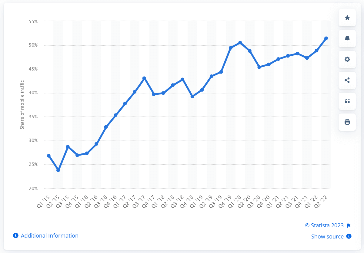
The growth of smartphones has fueled the comfort for users to replicate actions like shopping, payments, media consumption, etc., that were earlier done on a desktop or laptop. Even if you still wish see desktop site on android you can do it in you mobile today. As per a Statista survey in the US, mobile makes up 51% of online traffic from 2015 to 2022, and users love the smartphone’s convenience.
Digital devices have become a part of our daily lives, and we have become more reliant on them. According to the Business Insider survey, smartphones will be the most preferred channel for shopping in the next five years.
This could be happening in real life as, despite the smaller screens; organizations are innovating and developing one-click checkout processes or optimizing their mobile websites to make it much easier to transact on smartphones. According to Adobe Retail Shopping Insights, in the 2022 holiday season, revenue from mobile websites is 124 billion or 44.88%. Thanks to mobile payment apps, they have acted as a catalyst for online shopping.
With the emergence of 5G connectivity, users can leverage the potential of a smartphone and mobile data that would be phenomenal. As per one Ericsson report, the average data usage per month in 2023 is anticipated to be 19 GB and will reach 45 GB by the end of 2028. This clearly states that businesses need to up their game and innovate, ensuring a mobile-first design that’s easy to navigate and transact.
Having a responsive design that’s faster and more efficient to function across many devices is a challenge many organizations face. What’s important here is to ensure through rigorous testing that your website provides a unified experience.
However, continuous testing on such a wide array of devices is complex! In this blog, we will learn more about the approach to mobile website testing, its different testing strategies, and tools that can ease the complexity of your testing process.
Responsive Web Design and Key Principles to Follow
Responsive web design is an approach to ensure the website or content on your website is adaptive on varied screen sizes and resolutions. No matter how large or small the devices are, responsive web design is here to provide an intuitive user experience.
Why does responsive web design matter?
As mobile users have dominated Internet usage, there is no better time to know why responsive web design matters! eMarkter predicts that 2024 mobile ad spending in the US will hit 167.25 billion. If your landing pages or websites are not optimized, now is the time to ensure you have a responsive web design.

The key principles behind responsive web design are as follows:
- Fluid Grid: It is a Grid system that allows website layout to be flexible and adapt to different screen sizes. Designers utilize percentages or ems instead of providing fixed pixel values for layout elements, allowing the layout to scale according to the screen size.
- Mobile first approach: This design philosophy prioritizes developing for mobile devices before scaling up to larger screens. This method prioritizes the user experience on smaller displays and guarantees that the website is optimized for mobile devices before adapting to larger screens.
- Flexible image and media: The Fluid grid has specific challenges, such as managing CSS media queries. Images and media assets like videos and music should also be scalable to accommodate different screen widths. This may be accomplished by using media queries and making the maximum width of pictures 100% of their container.

Here is an example of a media query:
This code snippet will command the browser not to show the .foobar class when the viewport is less than 1200 px.
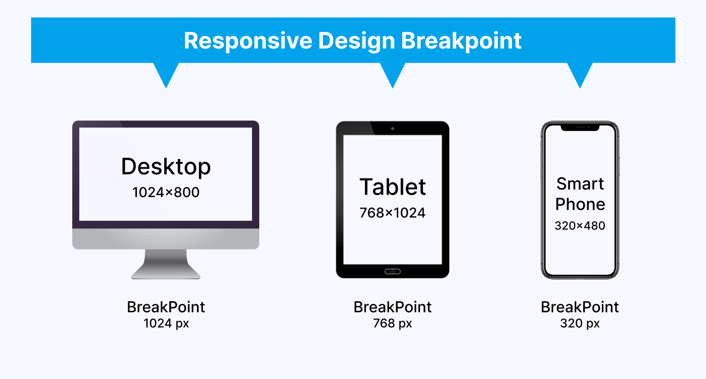
- Breakpoint: It allows designers to specify specified screen sizes at which the layout and content of a website will change. A designer, for example, may decide to set a breakpoint at 768 pixels, the width of a standard tablet screen, and then alter the layout and content accordingly.
Those were some key principles on which designers build responsive web design. However, here comes the complexity of making responsive web design. Designers must create websites using these principles that work across all our devices. Developers might need help to ensure the quality of their responsive websites. And that’s the reason why mobile website testing plays an unrivaled role in making sure the output is matching to your expectations.
Introduction to Mobile Website Testing
Mobile website testing examines a website’s functionality, usability, compatibility, and performance on different mobile devices. In today’s digital age, using mobile devices to access the internet has overtaken desktop computers. Because of this shift in user behavior, organizations must ensure that their websites are mobile-friendly.
The primary goal of mobile website testing is to discover and resolve any issues that may impact the website’s performance and user experience. A website not adequately optimized for mobile devices might result in a bad user experience, forcing visitors to abandon the site and look for alternatives. This can eventually result in losing potential clients and money for the company.
Here are some major types of testing needed to test a website during the mobile website testing process:
- Functional testing: It guarantees that the features and functionalities of the website function correctly and as intended. This involves inspecting the website’s links, forms, buttons, and other interactive features.
- Performance testing: measures a website’s loading time, speed, and responsiveness on mobile devices. This is significant since mobile consumers want websites to load quickly. High bounce rates and lost visitors can come from slow loading times.
- Security testing: In mobile website testing, it checks for potential vulnerabilities in the website’s code, such as SQL injection and cross-site scripting. This is critical since mobile devices are more vulnerable to security threats than desktop computers.
- Accessibility testing: It guarantees that the website is usable by people with disabilities, such as vision or hearing loss. This involves testing for suitable text size, color contrast, and assistive technology support.
- User experience testing: It evaluates the whole user experience of a website, including ease of use, navigation, and layout. This is significant because people are more inclined to interact with a website with a good user experience.
Run Screen Reader compatibility tests. Try LambdaTest Now!
Why is Mobile Website Testing so Important?
Mobile website testing is critical for ensuring a website is mobile-friendly and provides a great user experience. Because mobile devices are increasingly being used to access the Internet, it is more vital than ever to guarantee that a website is user-friendly, accessible, and loads quickly on mobile devices.
Here are some benefits of mobile website testing:
- Improve user experience: As per one HubSpot survey, 88% of the users do not revisit the website if they have a poor user experience. Developers may discover and fix flaws affecting the user experience by testing a mobile website on numerous devices, operating systems, and networks.
- Increase performance: Testing a mobile website can identify performance concerns such as poor load times or unresponsive user interfaces.
- Better security: Mobile website testing can assist in identifying security flaws that may jeopardize user data. By resolving these weaknesses, the website’s security can be strengthened, and consumers can have confidence that their data is secure.
- Compatibility: Mobile devices, unlike desktop computers, have varied screen widths and resolutions, which might alter how a website is shown. A website that is not mobile-friendly may not appear properly on smaller displays, resulting in a bad user experience. Mobile website testing guarantees that a website is built to adapt to various screen sizes and resolutions, resulting in a consistent user experience.
This can result in a more positive user experience and enhance the likelihood of users returning to the website.
An image shows the result between page load time and conversion rate.

Addressing these issues will improve the website’s performance, increasing user engagement and satisfaction.
Challenges with Mobile Website Testing
Mobile website testing brings specific problems that must be addressed to verify that mobile applications are functioning and deliver the most outstanding user experience possible.
Some of the difficulties encountered by testers during mobile website testing are as follows:
- Fragmentation: There are a variety of mobile devices on the market, each having a unique screen size, operating system, and hardware architecture. As a result, testers find it difficult to test the program on all devices, resulting in limited test coverage.
- Compatibility: Mobile applications must work with various devices, operating systems, and web browsers. The application’s compatibility is a great difficulty in mobile website testing. The application may run great on one device or browser but not perform appropriately on another.
- Network Variability: Mobile devices can connect to the internet via various networks, including cellular data, Wi-Fi, and Bluetooth. The application’s performance can be impacted by network variability, resulting in slower loading times, connectivity issues, or even crashes.
- User Interface: User interface concerns such as font size, color contrast, and navigation can all impact the user experience and should be extensively examined.
- Continuous Integration: To address bugs, add new features, and improve performance, mobile applications require frequent updates. Continuous integration presents a problem in mobile website testing since it demands testers to confirm that the application continues to function properly after each update.
- Automation: Manual testing is a huge challenge in mobile website testing because many distinct mobile devices have varied setups and operating systems. Automation testing helps automate the testing process and run your test scripts over multiple devices and platforms.
4 Methods for Mobile Website Testing
Now, understandably, mobile website testing is a complex task with many challenges, as discussed above. However, the right approach, strategy, and tool can resolve all major bugs and challenges and decrease efforts. Here is a list of different methods for mobile website testing with detailed steps and practical examples.
Testing on Chrome DevTool
Google Chrome DevTool offers some most powerful tools for web development and debugging. You can use Chrome DevTool to test your website on multiple mobile devices. You can emulate various mobile devices to test your mobile’s responsiveness and functionality across different sizes and screen resolutions.
Follow the steps below for mobile website testing using Chrome DevTool for a seamless user experience:
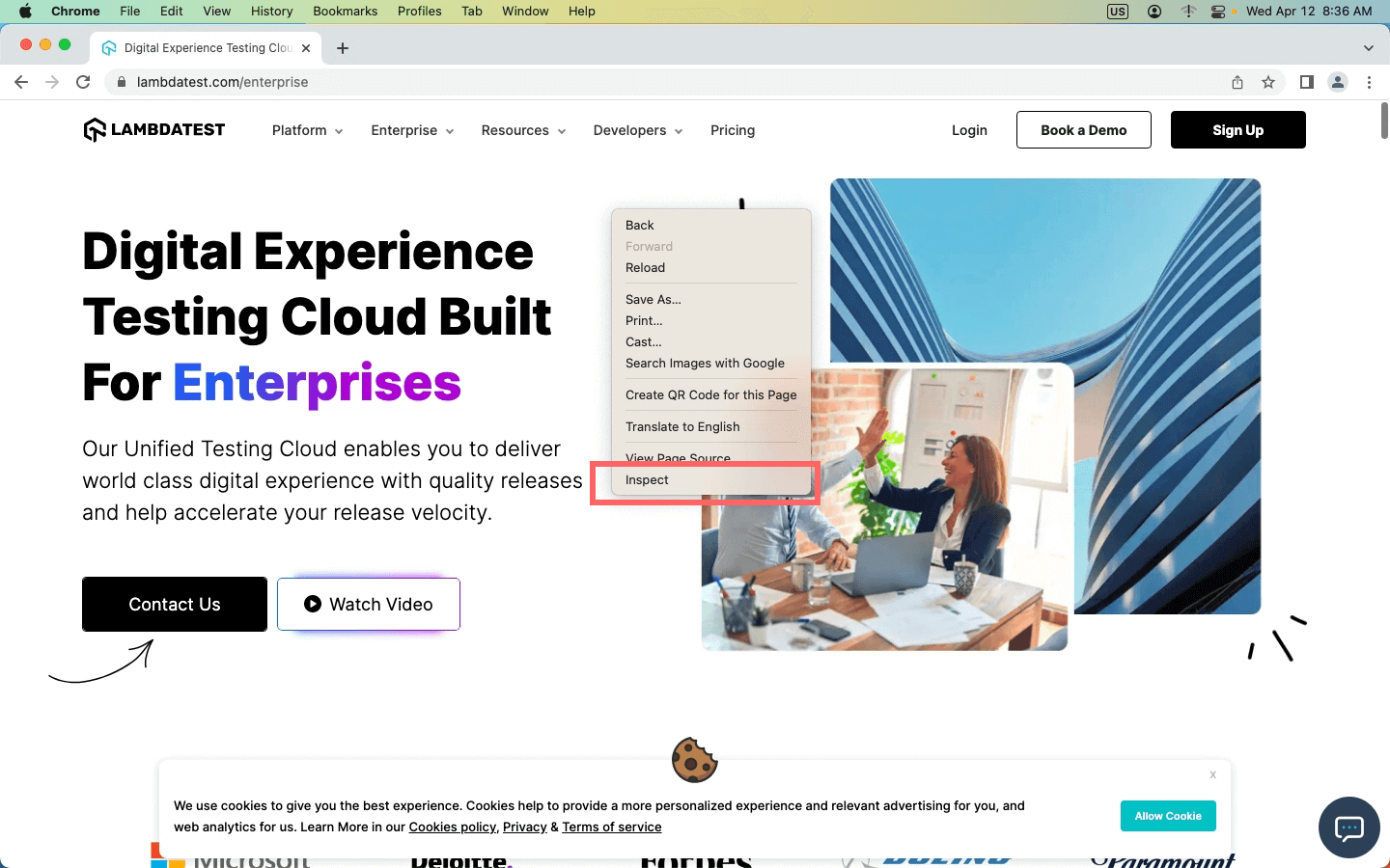
- Open Google Chrome on your desktop and open the website for mobile website testing.
- Press F12 to open the Chrome DevTool; another way to open Chrome DevTool is to right-click on the mouse and select “Inspect.”
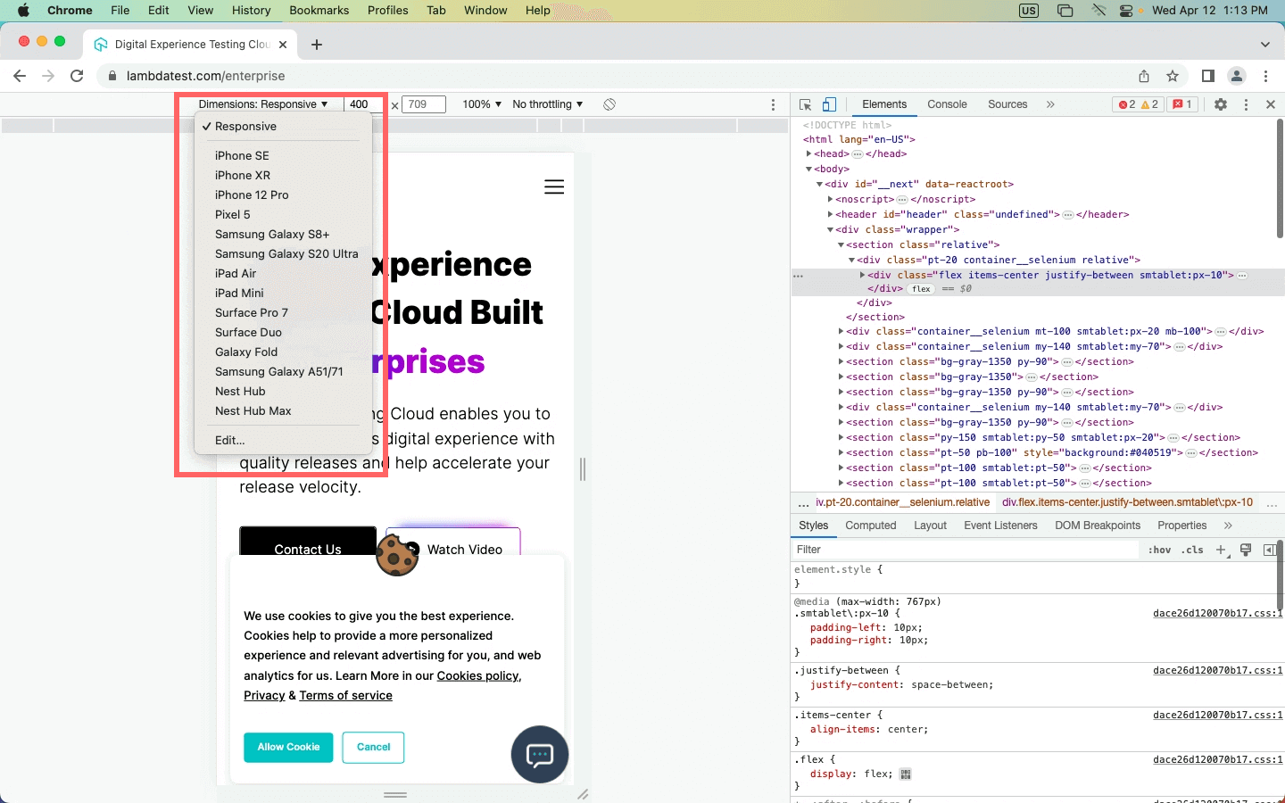
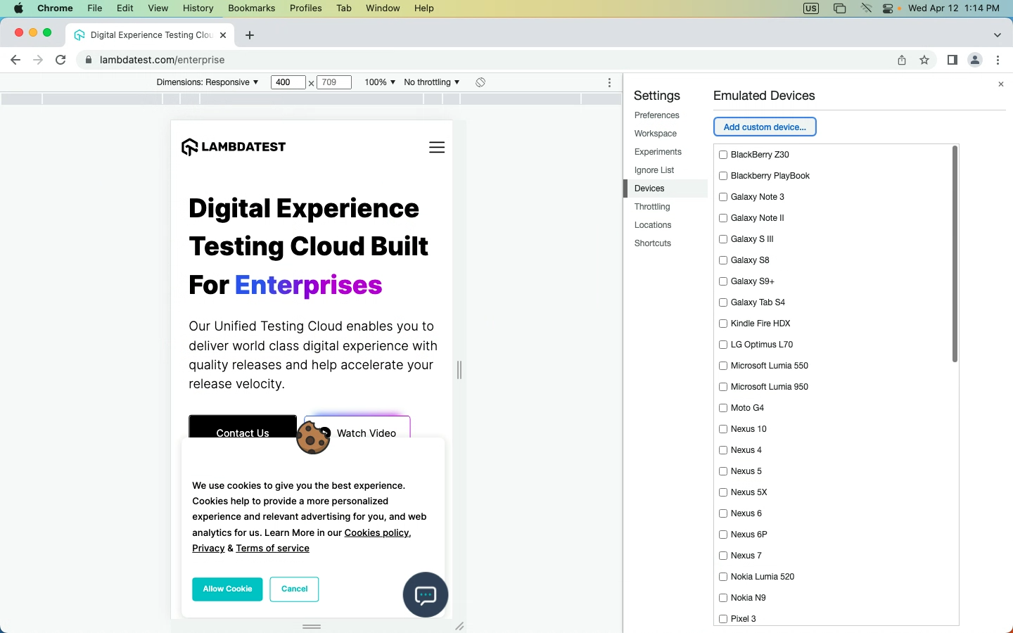
- Select the Device toggle bar in the image below. The shortcut for it is Ctrl + Shift + M.
- You will receive a panel on Chrome DevTool where you will get options such as
- Dimensions
- Inbox for putting dimensions manually
- Zooming options
- Network throttling
- Rotate option
- Click on the first option, “Dimensions,” to get the dropdown menu for different emulated devices. You will get the entire list of devices if you click the “Edit” option.
- From there, you can select the mobile website testing devices and analyze your website behavior on different devices.

LT Browser 2.0 For Responsive Testing
Mobile website testing with Chrome DevTool can be leveraged with LT Browser 2.0. LT Browser 2.0 is a dev-friendly Chromium-based browser offered by LambdaTest, a unified intelligent digital experience testing cloud platform that enables developers and testers to test their website or web applications over a wide range of more than 3000+ different browsers, OS, and device resolutions.
LT Browser 2.0 provides 50+ pre-installed device viewports for mobile, tablet, desktop, and laptop to perform responsive testing on your website or web applications.
Using this browser, developers can also get additional features like side-by-side view, scroll sync, instant debugging, network throttling, hot reloading, etc., and generate your websites’ performance reports powered by Google Lighthouse.
LT Browser 2.0 has the following features:
- Replay or retest user flows with the help of the Chrome recorder panel.
- You can select any HTML element on a web page and access its CSS properties using the CSS Inspector.
- You can get the color of any pixel on the screen with a click of a button using the Color Picker feature.
- You can tweak the network speed and validate the website behavior on different network conditions.
- Run a performance report for your mobile website that helps you identify issues affecting your website’s overall performance and rankings.
- One-click bug-logging, integrate with your favorite project management tools and collaborate with your team to fix the bugs faster.
- Native developer tools to quickly fix the issue and validate your changes on the go.
- Enable touch mode, generate full-page screenshots, record videos, and capture screenshots.
Our in-detail LT Browser 2.0 tutorial video will help you start with test your website with LT Browser 2.0 and how to use each feature to test responsiveness. Ensure your website’s mobile responsiveness with Mobile-Friendly Test, a handy tool to optimize your user experience.
Subscribe to the LambdaTest YouTube Channel, where you will find a comprehensive list of tutorials around Selenium testing, Cypress testing, and Playwright testing.
Testing on Emulators & Simulators
Other than Chrome DevTools, you can use an Android emulator and iOS simulator. These help you identify UI and UX bugs and give you an end-user experience. Although they aren’t the best options to perform mobile website testing as emulators are built to test native apps, having other options like mobile emulators for browser testing is still helpful.
Here are some benefits of emulators and simulators:
- Cost-Effective: Because they do not require physical devices, which can be expensive to acquire and maintain, they are cost-effective alternatives to test mobile websites.
- Accessibility: Provides accessibility benefits by allowing developers to test mobile websites on various screen sizes, resolutions, and operating systems. This contributes to the accessibility of websites to a broader audience.
- Debugging: Advanced debugging capabilities are provided by emulators and simulators, allowing engineers to identify and resolve difficulties early in the development cycle.
- Scalability: Allow developers to test websites on a wide scale by simultaneously simulating hundreds or thousands of virtual devices with varied configurations, guaranteeing that the website works correctly across all devices.
To know more about emulators and simulators, check out our comprehensive blog on Emulator Vs. Simulator to understand it better.
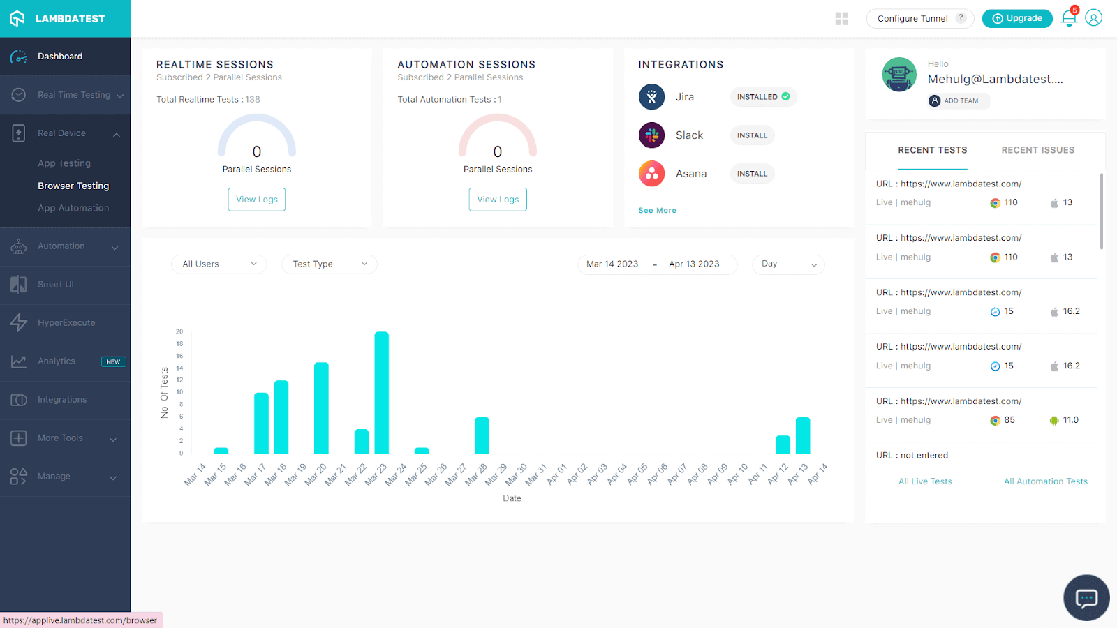
You can perform mobile website testing with the help of an Android emulator and an iOS Simulator on LambdaTest. Here are steps you can follow:
- Sign up for free or login to the LambdaTest account.
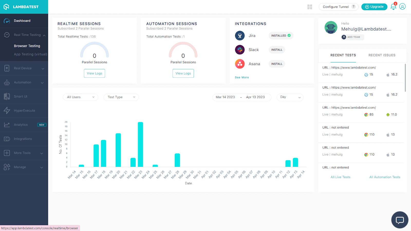
- In the Dashboard, you will get an option for Real Time Testing.
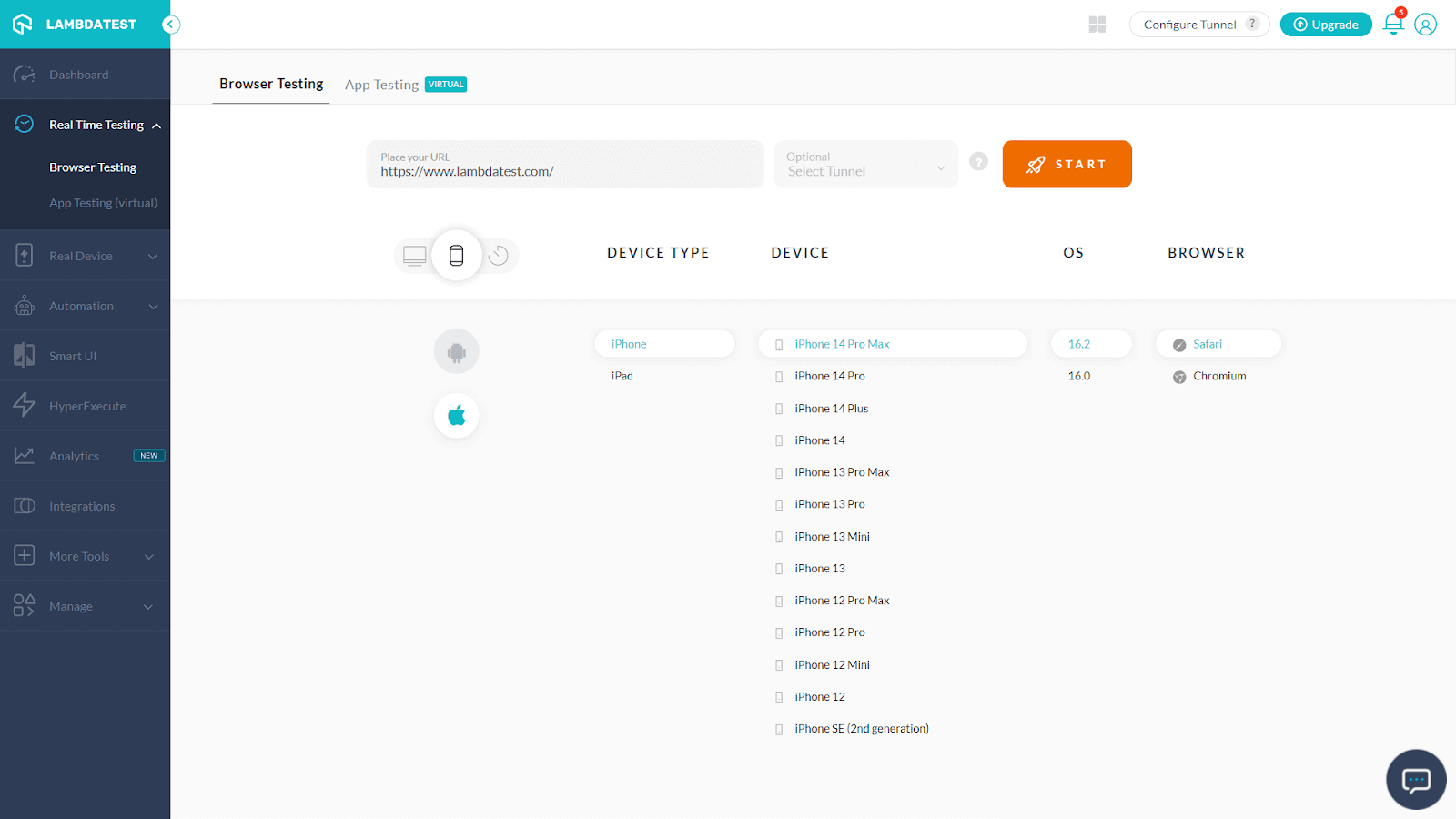
- Now select Browser testing, where you will get the entire list of Mobile Brands, Devices and OS, and Browsers.
- Enter the URL of the website, and select your specifications like browser, OS, and device type. And press “START.”
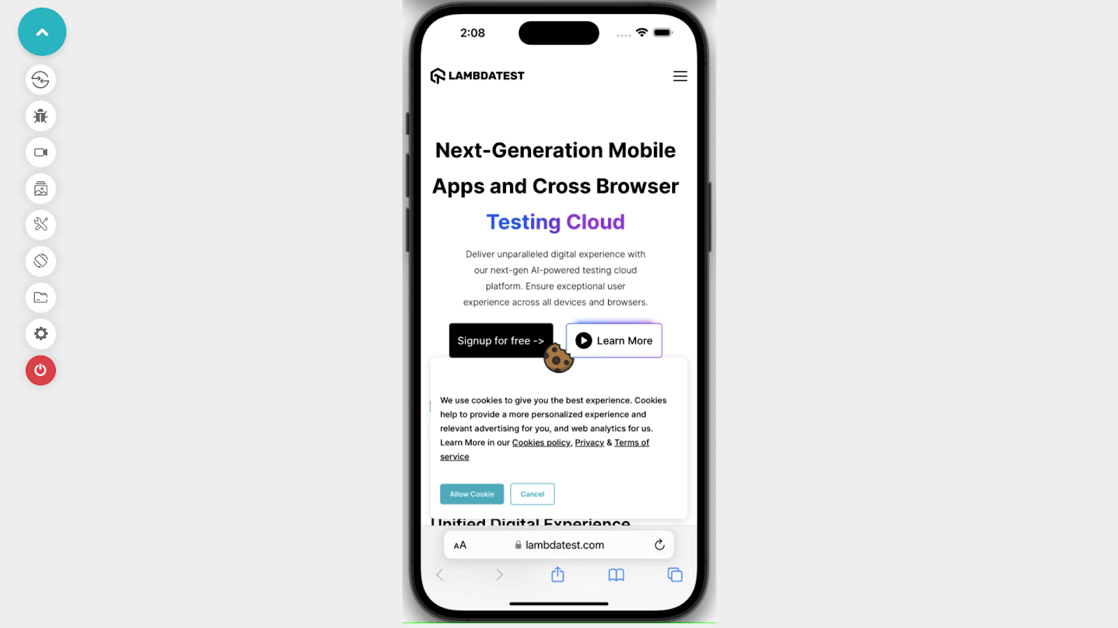
It will launch a cloud-based emulator/simulator where you can test mobile websites.
Emulators and simulators have many advantages, such as easy access, zero inventory and maintenance, and lower cost. However, there are many limitations regarding accuracy and reliability, and they may not be able to deal with a complex real-world scenario; for that, mobile website testing on a real device is essential.
Testing on Real Device Cloud
Testing your website on real devices gives you a clear picture of how the website looks and acts. For developers, browser tools might be appealing to test on the go rather than testing on real devices. But real devices might help you explore avenues in testing that a browser tool cannot. For example, you don’t get the screen’s realistic view because of distractions like the URL bar and other toolbars.
Other advantages of mobile website testing on real devices include
- Stability: One of the most important aspects of testing the responsiveness of your mobile website on real devices is network stability. As internet access through mobile data is rising steadily, testing your website on different network conditions should be part of your testing process.
- Real-world scenarios: Real devices enable testing in real-world situations such as fluctuating illumination, network conditions, and physical barriers, resulting in a more accurate portrayal of the user experience. This enables developers to identify and resolve issues that may happen in real-world circumstances before deploying the website.
- Access to device hardware: Real devices enable access to the device’s hardware functions, such as GPS, camera, accelerometer, and touch screen, allowing testing of device-specific aspects crucial for the website’s functionality.
- More extensive testing: Using real devices allows for more thorough testing, ensuring the website works as intended across a wide range of devices, operating systems, and browser versions. This decreases the possibility of problems emerging when the website is made public.
Perform website testing over a wide range of real devices on the cloud. Try LambdaTest Now!
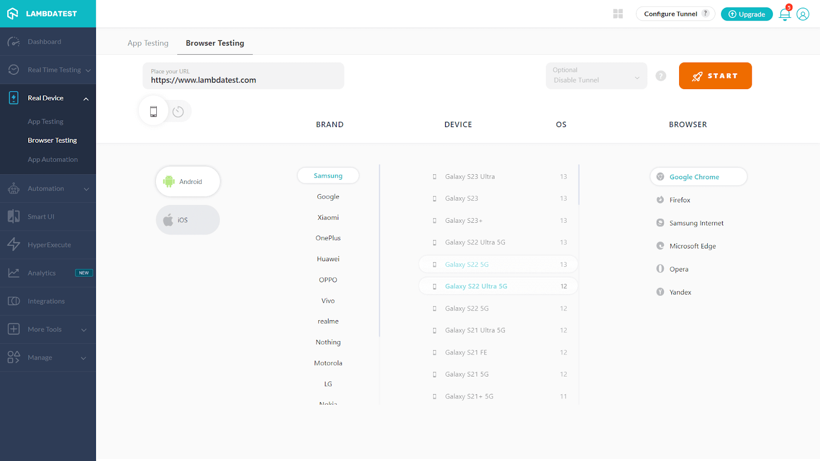
Many organizations have their in-house real device infrastructure with all mobile devices on which they want to perform tests. Another option for mobile website testing on a real device is to use an online real device cloud such as LambdaTest, where you will get a wide range of real devices for mobile website testing. Here are the steps you need to follow for testing on real devices:
- Open LambdaTest Dashboard, where you will get an option for Real Device, as shown below.
- When you click on Real Device, you will get an option for “Browser Testing”
- Click on “Browser Testing”. Place the URL of the website on which you want to perform mobile website testing and select the Brand, Device, OS, and Browser.
- Click the “START” button to begin mobile website testing on real devices.
Some unique and practical features of LambdaTest Real Device Cloud are
- LambdaTest has a huge list of real mobile devices. It will eliminate the requirement for an in-house device library.
- Run large numbers of tests with your preferred automation testing frameworks, such as Appium, XCUITest, Espresso, and others.
- Connect the testing to your CI/CD pipeline or share the bug in the team chat app with a single click to eliminate slow feedback loops and accelerate delivery.
- Perform geolocation testing to ensure your application is compatible with regional preferences before going live. Before releasing your website and apps to the target market, test them on actual devices to ensure they operate as planned.
Here is a quick video tutorial on real-time browser testing on Real Devices.
Using Test Automation Tools
All the methods mentioned above to start mobile website testing are terrific to begin your testing process. However, what if you want to scale your product faster or complete the project for clients without bugs? If you take the manual approach, this involves a lot of effort and is not scalable.
To ensure faster test execution or reduced go-to-market time, it’s important to form a process that can be automated for your mobile website testing. Automation testing tools can be beneficial here to get the work done faster. What you need to get started with automation is coding skills and a tool that suits your requirement.
Automation of mobile website testing may vary from website to website; however, here are the general steps you need to follow to perform mobile website testing with automation tools.
- Set up Mobile Website Testing Goal:
- Can I save time by automating these test cases?
- Automating these test cases will improve the quality and performance of mobile website testing.
- Select the Right Framework
- Linear Automation Framework: It is linear and gradual, making it ideal for unit testing or straightforward applications. This framework is also known as the “record and playback model.”
- Modular-Driven Automation Framework: We write short tests for scenarios in this framework. For testing, you can mix Modules to create more significant scenarios. By utilizing an abstraction layer, a module is stated to conceal information so that modifications made to the application’s other components have no impact on it.
- Library Architecture Testing Framework: This framework shares similarities to the modular testing framework in that you split ordinary tasks into functions and then sort functions in a library. It is pretty simple to develop reusable test cases using this library, which is referenced for creating new test cases.
- Keyword-Driven Framework: Also known as table-driven, this framework combines keywords (actions) that are kept in a table (such as Excel) with external test data, much like the data-driven framework. Many test scripts can access the precise keywords, but setting up these frameworks takes time.
- Data-Driven frameworks: A data-driven framework acknowledges that while the test may remain the same, the data may change. When testing a functionality, like a login, this framework retrieves data from an external system (or systems, if we compare input against expected data).
- Hybrid Testing Framework: By referencing two or more frameworks mentioned above, hybrid frameworks enable teams to design the appropriate test environment.
- Select an Automation Tool for Mobile Website Testing.
- Appium: Appium is a well-known and favored mobile test automation tool that capitalizes on Selenium’s success. Appium enables customers to test native, hybrid, and mobile web apps using the WebDriver protocol.
- Espresso: Espresso, by Google, provides a versatile and simple API to build this platform-specific solution; however, it executes Android UI tests and facilitates the expansion of the functionalities.
- XCUITest: Apple offers XCUITest as a tool for iOS developers to script and execute UI tests using the Xcode IDE. This automation framework does not support Android operating systems; it is only for iOS devices.
- Robotium: Robotium manages native and hybrid mobile testing for Android v1.6+ applications. Android SDK, Eclipse, Android Development Kit, and JDK must be prepared for the setup.
- Selendroid: This tool may test native and hybrid Android apps and mobile web. Integrating Selenium and the powerful WebDriver API removes most of the current challenges.
- Run a Test on Virtual and Real Devices.
- Choose your devices depending on the most crucial elements for your target audience or location. QA and software development teams can work with marketing to comprehend your target audience’s user personas and usage habits.
- Another good practice is including high-end, low-end, and tablets into your device pool for mobile website testing.
- Considering forthcoming releases and existing market conditions is crucial when designing your testing coverage. To add new devices as they become popular and to deprioritize (or altogether remove) devices whose popularity is waning, you should reevaluate your testing strategy every quarter or every two years.
These rules apply for mobile website testing and any testing. To set up the goal for mobile website testing, decide your target audience and their expectations, and then describe the website’s purpose and user journey. It will help you prioritize mobile devices, OS and browsers, and test cases requiring bug-free website deployment.
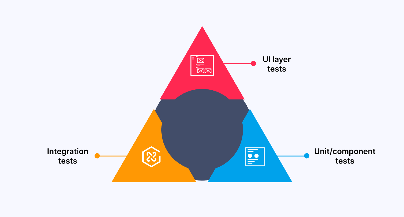
As you can see in the above image, mobile website testing starts with unit testing and integration testing, and the user experience is at the top of the pyramid, where testing takes the form of more detailed user input. Testing becomes more challenging the closer you go to the end user because automation aims to increase the speed and quality of mobile website testing.
So while deciding on test automation, you must have these two goals:
Now you can have a sorted list of test cases, mobile devices, OS, and browsers to automate mobile website testing.
The next step is to choose the right automation testing framework, an integrated system that establishes the automation rules for your test. Using a framework for test automation is the best method for writing and assessing your tests.
Here are six major framework types for mobile website testing:

You can write test scripts using one or more test automation frameworks. A basic awareness of the frameworks will ensure you acquire the proper tool for the project. Here are some best automation tools for mobile website testing:
Robust automation testing will include every possible combination of browsers, OS, and devices. However, device fragmentation is a nightmare for every tester. Best practices would be testing on the most recent iOS device, the best Android phone, etc.; other practices for choosing the right mobile devices are
Testing mobile websites with automation tools is a crucial step in the software development process. While real devices, emulators/simulators, multiple network configurations, and user interactions can assist in guaranteeing that the website runs smoothly under different circumstances, the right test automation framework can help increase the quality and efficiency of testing.
Overall, automation tools can automate repetitive tasks, minimize human errors, and deploy high-quality mobile websites that meet user expectations and give optimal user experience.
How to build Mobile Website Testing Strategy?
Mobile websites are made for the ease of accessibility of users. Any mobile website aims to provide a seamless experience while the user switches or needs quicker access.
However, you must devise a clear strategy to ensure your website performs pixel-perfect on all devices. Whatever decisions you make regarding your mobile website’s functionality, aesthetics, or compatibility with browsers must be well-planned before you start developing it. For best results, create a guide that flows to your testing process. Let’s dive deep into key tips for your mobile website testing strategy to succeed.
Information Gathering
Gathering information from the product team, users, or design team should be the key part of your strategy. It helps you create a roadmap, set testing milestones, and prioritize features that should be rigorously tested.
Understand the challenges
Mobile website testing is more complex than desktop testing; however, knowing those challenges and complexity aids you in creating a concrete testing strategy. Some of the common challenges related to mobile website testing are:
- Device fragmentation
- Screen size and OS fragmentation
- Manufacturer fragmentation
- Localization
- Mobile network operators and user mobility.
Defining the use case
When you gather all the information, the next step is to define the use case of your mobile website testing. Defining the use case comprises the real-world scenarios that would help write better test scripts to yield quality results. For example, what target market will you test first, or what devices or networks should you test your mobile website?
Identifying these factors would help you orchestrate your testing process better.
- Prioritizations
- Deciding on the tools
- Ensuring Cross-Browser Compatibility
- Performance Testing
- Mobile Beta Testing
- UI and UX improvements
- Validate The HTML and CSS Code
Setting up prioritization at all levels of the testing process is crucial to any successful testing strategy. Understanding what needs to be done first and how it needs to be done helps you scale up your testing. For example, setting up prioritizations will help you identify if you need to implement automation testing and at what level.
There are many tools to help you get started with mobile website testing. However, selecting the right tools or a combination of tools that would solve your problem is more complex here. This is where prioritization helps. As you identify key factors of your product, you can then decide on the right set of tools.
You need to identify popular browsers with your target audience and devise a plan to scale your testing efforts. Not only browsers but a combination of operating systems and different screen resolutions. A cross browser compatibility testing plan will help deliver the best user experience for your mobile website across different browsers and platforms.
Perform cross-browser compatibility testing over a wide range of browsers. Try LambdaTest Now!
Identifying performance bottlenecks is one of the essential aspects of your testing strategy. A slow-loading website might cost you revenue, and you might not even be aware that it’s because of the leak in customer experience. However, a faster-loading website increases conversions and can help you rank better to reach the target audience.
Mobile development teams can employ beta testing to evaluate their applications with “real users” in real-world settings. It assists teams in gathering input from end users who represent an app’s user base. Teams obtain a deeper level of validation that the program fulfills end-user needs by evaluating application performance and functionality with a beta group before general release.
They also considerably lower the possibility that an unforeseen application problem post-deployment will demand rolling back the application release or the team swiftly sending out an update to resolve a fault with the production release.
Building a solid design strategy is essential because it directly impacts how users behave. According to the UserGuiding website statistics trends survey, 90% of the users shift to the competitor’s website because of poor website experience. This is critical in your mobile website testing plan because items must be shrunk to reduce device requirements.
Every element should be usable and consume less bandwidth, resulting in faster load times. Furthermore, the parts should be compatible with the device’s most recent software update.
Validating your website’s HTML and CSS code is advised if you want to examine a web app’s functionality across all platforms. You may now use free, open-source tools like the W3C MobileOK Checker to check your HTML and CSS. You can check the compatibility of your website across mobile devices using our web-based automated validation tool. It gives you access to various test scenarios that confirm your website’s user-friendliness.
Google announced that core web vitals would be part of ranking signals starting in May 2021. Core Web Vitals focuses on three key factors of the user experience – page loading time, interactivity, and visual stability. Ensure performance testing is a part of your strategy to test mobile websites.
You can also use LambdaTest’s free online tools to quickly validate your HTML or CSS code with any coding efforts.
Best Practices for Mobile Website Testing
Now you understand a different way to perform mobile website testing and strategies; however, with certain regular practices, you can make mobile website testing efficient and productive, which saves overall time, money, and human effort. Here are some best practices you should follow while mobile website testing:
- To get the most out of the testing process, ensure all the predefined business requirements and stakeholder expectations are set.
- Decide which mobile browsers and devices to test your website’s responsiveness. Real-world testing makes the website function as intended on various hardware and operating system combinations.
- Testing a website under multiple network settings, such as 2G, 3G, 4G, and Wi-Fi, can assist in identifying performance issues and ensuring the website is accessible.
- Since touch displays are a common feature of mobile devices, testing every touch motion, including swipe, pinch, and zoom, is crucial. Also, follow “ The Thumb Zone” rule to place CTA for getting the best interaction.
- Make sure that everyone, including people with impairments, may access your website. Verify the accessibility of screen readers and other aids. You can find any problems with color contrast, keyboard navigation, text alternatives for images, and other accessibility elements by conducting this testing.
- Determine what to anticipate during the execution of a test scenario while keeping in mind all the changes made during the sprint so that you can rapidly update the test cases.
- Set your breakpoints by expanding or contracting the browser window following the web application’s content and design.
Note: Discover the secrets to flawless Mobile UI Testing in latest post! Dive into a comprehensive guide filled with expert insights and best practices.
Conclusion
Mobile devices have been an integral part of our lives now. For businesses, having a mobile-friendly, functional website with a smooth user experience is extremely important. In this blog, You learned some crucial elements of mobile website testing, why it matters, and an ideal approach to help you attain quality output.
Whether you are a tester or a developer having the right knowledge about mobile website testing, tools, and methods saves time and effort, can emphasize the user experience through the right approach, and gives the best results. In the digital era, web technology is continuously evolving; making mobile website testing an integral part of website development can aid in ensuring that your website experience meets the user’s needs.
Frequently Asked Questions (FAQs)
What is mobile website testing?
Mobile website testing tests a website or application on mobile devices such as smartphones or tablets to ensure that it is fully functional and provides the best user experience. It involves checking for compatibility, performance, user interface, and security issues on mobile devices and operating systems.
How do I test a website on mobile view?
You can use the developer tools in your web browser to test a website on mobile. To access the developer tools in Google Chrome, press F12, click the device toolbar icon, and choose a mobile device from the drop-down menu. By interacting with the website, you can check how it appears on a mobile device and how well it functions.
How can I test my mobile website for responsiveness?
You can use online tools such as Google’s Mobile-Friendly Test or Responsinator to test your mobile website for responsiveness. These tools will show you how your website looks on different mobile devices and screen sizes, and you can test its functionality and user experience.
What is a mobile-friendly website?
A mobile-friendly website is easily viewed and compatible with all devices like smartphones and tablets, i.e., responsive to different screen sizes and resolutions, and offers a user-friendly interface. To offer a seamless user experience, a mobile-friendly website loads quickly and is optimized for different network conditions.
what are the two biggest factors in the mobile user experience of your website?
Site speed and responsive design are the two biggest factors in the mobile user experience of a website. Fast loading times are crucial as slow speeds can frustrate users and lead to high bounce rates. Responsive design ensures that the website adapts and displays correctly on different screen sizes, providing an optimal viewing experience.


Author’s Profile
Mehul Gadhiya
Mehul works as a content writer and executive in digital marketing for LambdaTest. He has a Mechanical Engineering degree and a keen interest in emerging technology. He enjoys writing about a variety of subjects, including the latest technological advances.
Blogs: 7
Got Questions? Drop them on LambdaTest Community. Visit now