
How To Use Aspect-Ratio CSS Property In Responsive Web Designs?
Harish Rajora
Posted On: March 16, 2021
 116952 Views
 14 Min Read
Being web developers, we are hardly satisfied by the dimensions of our elements on the web page. What if I could increase that image width to 30px more? Or maybe 20%? Deciding the final width at the end now requires us to adjust the height as well! What if multiple elements were to be adjusted according to the new values like in a CSS-grid or subgrid structure? This is where the CSS aspect ratio comes into play.
The aspect-ratio is extremely important given the effect a UI has on the end-user. The aspect-ratio is always a measured property that needs adjustments and careful scrutiny. It had become frustrating to waste a lot of time just to adjust an element to look perfectly on multiple devices with time. With the recent trends in web development, there has been an increase in the complexities of the project. A small change in a single element’s dimensions can cause a ripple effect on the complete web page.
Thankfully, CSS developers have introduced a new property called aspect-ratio that can take care of a lot of such stuff. This post will guide you along with this new property and introduce various implementations in different scenarios and how aspect-ratio reacts in those situations.
TABLE OF CONTENT
What is aspect ratio ?
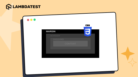
The aspect ratio of an image is the ratio of its width to its height. Represented by a colon (as A: B), the aspect ratio determines how your image (or any other shape) would appear on the web page.
For an aspect ratio of 1:1, the image would appear as a square:
Note: The above image is viewed on LambdaTest.
While the same image with a 16:9 ratio would look as follows:

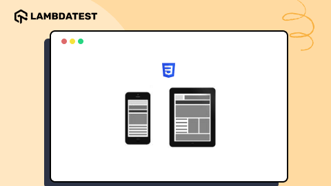
Not only in desktops, but the aspect ratio is also extremely important in mobile devices because an image can move past the viewport making the web page to be more than its actual dimensions.
Apart from resizing different images on the web page, the aspect-ratio selection is required when we are:
- Creating a uniform and responsive SVG design on the web page.
- Working with the full viewport width on the webpage and want it to be responsive.
- Working in resonance with multiple elements on the webpage or with multiple images.
- Want an iframe to embed content such as videos and make them responsive.
So, how does CSS aspect-ratio solve our problems?
CSS aspect-ratio Property
The CSS4 specification introduced a new property to eliminate all the calculative and makeshift adjustment problems in web development. CSS responsive aspect-ratio can directly take an aspect-ratio as input and automatically resize the image accordingly. For a video element, this property works perfectly as the developers can now fix an aspect-ratio for the outer element according to the screen size for a better user experience and maintain responsive design across devices. CSS responsive aspect ratio works great with grid structure too, when there are multiple grids on both the axes, and a slight readjustment can lead to overflows and inappropriate visuals.
To implement the aspect-ratio in CSS, the ratio can be written as a fraction (which is the same thing!) as follows:
|
1 2 3 4 5 6 7 8 9 10 11 12 13 14 15 16 17 18 19 20 |
<!DOCTYPE html> <html lang="en" dir="ltr"> <head> <meta charset="utf-8"> <title>Image Aspect Ratio</title> <style> img { aspect-ratio: 1/1 } body { background-color: #abcdef; } </style> </head> <body style = "margin-top: 10%; margin: 5%"> <img loading="lazy" src= "cat.jpg" /> </body> </html> |
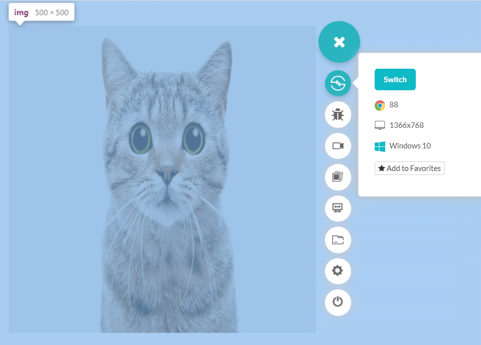
The above code implements an aspect-ratio of 1:1 which means we should get a square image. But notice the scroll bars on both the axes. The image has blown out of proportion (like literally!!).
The cause of the proportional imbalance in the image is defining the aspect-ratio property without any support. Aspect-ratio takes care of the dimensions relative to each other, but the dimension itself will remain in its original form if not defined explicitly. This is due to the “width” element.
The image shown in the above screen has a dimension of 4106×2720 pixels, whereas the pixel ratio of the screen is 1366×768. When we do not define the image width explicitly, the original dimensions are picked up by the browser. To achieve responsiveness, relying on the image pixel width is a bad idea. Changing the image resolution to a minimum would work better.
The problem seems to resolve when a 640×480 image is rendered.

To bring down the dimensions of the first image (cat), using the “width” as “auto” would yield no fruitful result because of the browser calculation of auto value. The result would be different in different browsers taking the “natural” proportions by the browser. A mistake that even cross browser testing cannot save you from. To get the full image on the device and achieve responsiveness on the web application, 100% width would respond to the mobile device in a much better way visually. Anything responding to its environment is one step ahead in responsive transformation.
|
1 2 3 4 5 6 7 8 9 10 11 12 13 14 15 16 17 |
<style> img { aspect-ratio: 1/1; width: 100%; } body { background-color: #abcdef; } </style> </head> <body style = "margin-top: 10%; margin: 5%"> <img loading="lazy" src= "cat.jpg" /> </body> |

This is some progress! Or actually, half the progress. We are all set to the image’s width, but since the aspect-ratio is 1:1, a square image is created on the web page. In case you are wondering about the placement of the image, that is the magic of padding and margin defined in the body tag.
For a responsive web design, using original high-quality images is not worth the consequences. High-quality images not only put a load on the server and consumes more bandwidth, but they are unnecessary for a user on a mobile device. A mobile user rarely cares about the image quality except for the product images on an eCommerce website. To manage your images according to the norms of responsive design, a guide to making responsive images in HTML, CSS, WordPress, and more will help you ahead.
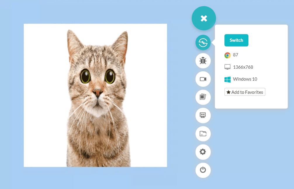
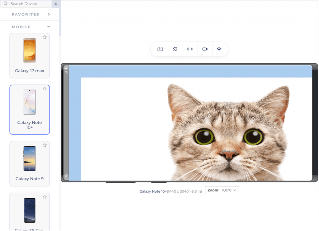
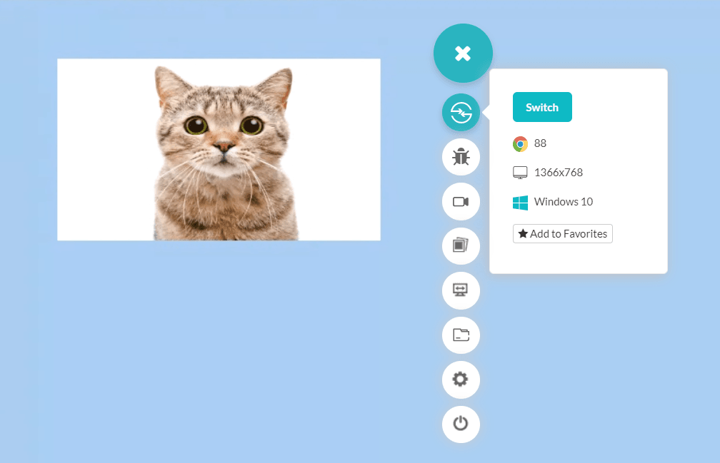
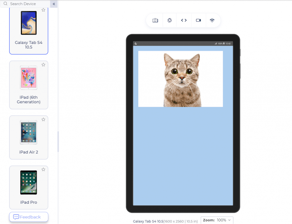
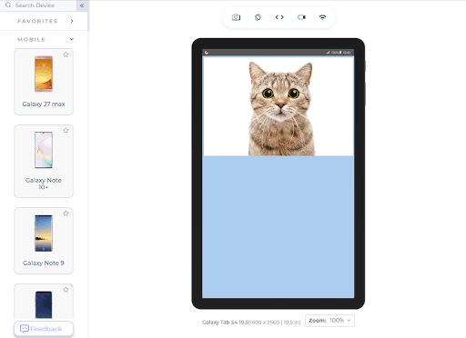
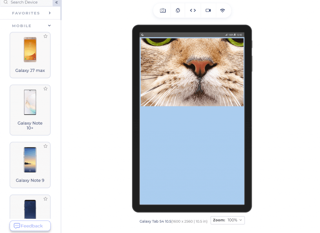
After the development and satisfactory testing on your device, the use of a responsive browser such as the LT Browser can speed things up quickly. LT Browser comes with 50+ pre-installed devices and a custom device builds feature to build your device with the required viewport. Features such as network throttling can help a developer test website performance on various network bandwidth. This is especially necessary when you are risking high-quality images on the web page.

From where we stand at the scrollable image, we can either reduce the width or hit-and-try various aspects to achieve better results. The latter being a bad choice given that the image will always pick up full width, excluding the margins and padding.
A width of 30% and 16/9 aspect-ratio is a better choice on bigger screens:
|
1 2 3 4 |
img { aspect-ratio: 16/9; width: 30%; } |
Similarly, we can skip the width element and implement just the height of the element.
CSS Aspect Ratio with Predefined Height
Implementing the height attribute in the element will adjust the width according to the aspect-ratio given. This works similar to the opposite process as explained in the above section.
|
1 2 3 4 |
img { aspect-ratio: 1/1; height: 500px; } |
Inspect the image to check the width of the image that the aspect-ratio set automatically.
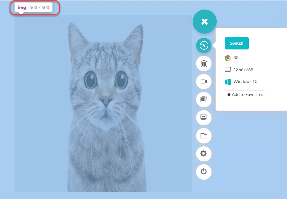
The image width is set equal to image height automatically since the CSS aspect ratio was set to 1/1, i.e., equal height and width.
As a web developer, I do not recommend using a 1/1 aspect-ratio for the images on your web pages. There are very fewer images that are made of equal height-width, and a box image would look weird on a different mobile device even though it looks perfect on your testing device. As a precautionary step, go for responsive web design testing as soon as you can. On the other hand, various web elements such as grid and other design divs look perfect on a square dimension.
CSS Aspect Ratio with Width and Height Attributes
Our experiments into this post have implemented the CSS aspect-ratio property without width and height, with width only and with height only. The only use case as a logical next step is to use aspect-ratio with both width and height attributes defined.
|
1 2 3 4 5 |
img { aspect-ratio: 1/1; height: 500px; width: 700px; } |

As seen in the image, the dimensions are 700×500 rather 1/1, i.e., equal. When the developer defines the width and the height of the image, the aspect-ratio property is ignored in such cases.
CSS Aspect Ratio Values
The CSS aspect ratio takes two types of values as input:
- Ratio
- Auto
The ratio is the ratio of the dimension of the element we are looking to adjust. In the case of a rectangle, the ratio is width: height. In this post until now, we have used the ratio property all along.
The “auto” value is the default value of the CSS aspect-ratio property. The value “auto” is used as “replaced elements with an intrinsic aspect ratio use that aspect ratio; otherwise, the box has no preferred aspect ratio.” The “auto” value applies to all elements except inline boxes.
Browser Support for CSS Aspect Ratio
The aspect-ratio property in CSS is fairly new, with the specification documentation being released in the October of 2020. Therefore, the browser support is not that great till the point of writing this article:
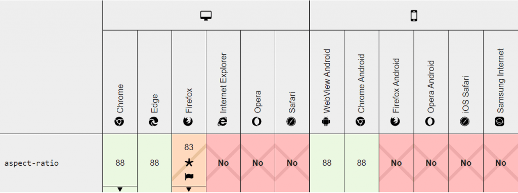
Firefox is providing partial support to the aspect-ratio property. Partial support signifies that the property is available but only for experimentation and development purposes. To check the aspect-ratio property, you can go through the configuration page (about: config) and search for the property name.
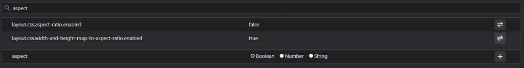
The property is disabled by default which can be enabled by the toggle button or double-click. If Firefox is listed in your browser-matrix, it is not recommended to use the aspect-ratio property simply without any checks. However, a few exceptions can be mixed to calculate the viewport and then implement the property as expected.
Exceptions in Aspect-Ratio
Working with CSS is always a tricky business. There are so many CSS properties and elements mixed up in the canvas of the web page that sometimes these elements behave inappropriately, and we do not understand the reason behind it. This section is dedicated to one such exception in the aspect-ratio property, which can make you scratch your heads.
While using aspect-ratio in web development, a property that you should closely examine is the min-* and max-* property. The reason is that there is no fixed rule about which property would be ignored when used collectively as there are in other situations (discussed in CSS aspect-ratio with width and height). The min-* and max-* with an aspect ratio depends on their values, to be honest.
For example, in the following code, aspect-ratio is ignored:
|
1 2 3 4 5 |
img { aspect-ratio: 1/1; height: 500px; min-width: 700px; } |
While a small change in the above code ignore the min-width:
|
1 2 3 4 5 |
img { aspect-ratio: 1/1; height: 500px; min-width: 400px; } |
The simple reason is that in snippet 1, we are specifying a minimum width of 700px. A 1/1 aspect-ratio would make the width 500, which is lesser than the minimum. In snippet 2, the minimum width of 400px is greater than 500px which the aspect-ratio will set. Hence, min-width is ignored.
A contrasting effect is seen while using the max-* property along with the aspect-ratio.
For example, in the following code, aspect-ratio is ignored:
|
1 2 3 4 5 |
img { aspect-ratio: 1/1; height: 500px; max-width: 400px; } |
While a small change in the above code ignore the max-width property:
|
1 2 3 4 5 |
img { aspect-ratio: 1/1; height: 500px; max-width: 700px; } |
The reason is similar to the previous comparison. A max-width of 400px is lesser than the aspect-ratio adjusted width of 500px, and therefore, the browser ignores the aspect-ratio property. In snippet 2, the aspect-ratio width (500px) is lesser than the max-width (700px) and therefore, max-width is ignored.
Alright! I have seen this cat for too long now, and I am guessing you have too! But, before wrapping up this post, a small thought is sprinting in my mind. If aspect-ratio is still not supported by all the browsers, an alternative is a must to implement the aspect-ratio property. Let’s see how we can implement the aspect-ratio without using “aspect-ratio” in CSS.
Alternatives to CSS Aspect Ratio
For someone who is looking to target multiple browsers and devices to achieve responsiveness and a happy user, knowing how to implement elements without aspect-ratio is necessary.
Manual Calculations
The most naive but a little tedious and math-y way is calculating the ratios manually and implementing them in percentages for responsiveness. However, the results may not be 100% accurate but will be somewhere in the ballpark.
CSS object-fit Property
Another property in CSS which can be used in lieu of aspect-ratio is the object-fit property. The object-fit property provides various values to select from and implement on our element. These values are initial, cover, contain, none, and fill. Since these CSS properties are not dependent on values, they will provide an absolute change on the page rather than a relative one. Although, the work behind the scene resembles a percentage system and therefore helps us in achieving responsiveness.
The object-fit: initial and object: fill values are used to fill the space on the screen. These options lower the pixel values for low-quality images, and the image looks pixelated on the screen.
Using object-fit: cover, the image will maintain its CSS responsive aspect ratio and will fill the dimensions given to it. The smallest dimension of the image is used while maintaining the CSS aspect ratio, the other part of the image is cropped out.
|
1 2 3 4 5 |
img { object-fit:cover; width: 100%; height: 100%; } |
The object-fit: contain is similar to “cover” in maintaining the CSS responsive aspect ratio of the image, but the image is not clipped out with this option. Instead, the full image is shown after resizing it to maintain the CSS aspect ratio.
In object-fit: none, the default object position is considered at the center, and the image is cropped-out while maintaining the ratio. However, the image is not resized to meet the requirements. Brace yourself for some scary cat time!
|
1 2 3 4 5 |
img { object-fit:none; width: 100%; height: 100%; } |
The object-fit property reminds us that we can use aspect-ratio with a little independence, but achieving results similar to CSS responsive aspect-ratio is not possible. Most of the time, the element tries to maintain its aspect-ratio while using the object-fit property. To provide an aspect-ratio of our choice, we need to resize the image with the intended aspect-ratio in another software such as Microsoft Paint and then implement it in the code.
With this Responsive testing tutorial for beginners, you will learn how to perform Responsive Testing of your website on the LambdaTest platform.
Wrapping Up
This brings us to the end of this post about CSS aspect-ratio. The aspect-ratio property is extremely helpful in web design inclined towards achieving responsiveness. A control on the dimension of the image can help web developers implement fluid designs for a very wide range of users. Also, experimenting with aspect-ratio is a lot of fun. There are a couple of things to keep in mind though, such as image quality and browser support. Since it is a new property, developers are working to implement it in the browsers, and I am optimistic about this property being included within the next three months. After all, the high demand for aspect-ratio led to its inclusion in the CSS specifications and has a promising future.
With that being said, we would love to see your experiments with the aspect-ratio property code-wise on Imgur or Codepen in the comments section. Hope aspect-ratio gives you a bit of relief in your next project. Have a nice bug-free development!!


Author’s Profile
Harish Rajora
I am a computer science engineer. I love to keep growing as the technological world grows. I feel there is no powerful tool than a computer to change the world in any way. Apart from my field of study, I like reading books a lot and write sometimes on https://www.themeaninglesslife.com .
Blogs: 88
Got Questions? Drop them on LambdaTest Community. Visit now