
Making A Mobile-Friendly Website: The Why And How?
Akshay Pai
Posted On: October 26, 2018
 20066 Views
 11 Min Read
We are in the era of the ‘Heads down’ generation. Ever wondered how much time you spend on your smartphone? Well, let us give you an estimate. With over 2.5 billion smartphone users, an average human spends approximately 2 Hours 51 minutes on their phone every day as per ComScore’s 2017 report. The number increases by an hour if we include the tab users as well!
That’s a lot of on-screen time considering you have an average of 18 functional hours, leaving the six out for sleep. With everything available at a ‘Hey Siri’ or ‘OK Google’, smartphones are our go-to companion for almost everything these days. And with the internet’s speedy takeover, it would be a shame not to have a mobile-friendly website. Without an optimized website, you are missing out a major chunk of your audience and their most attentive time spans. So today we provide you with some insights on how to make a mobile-friendly website.
But first, why do we need to create a mobile-friendly website? There are several reasons, let’s have a look at them.
Reasons To Create A Mobile Friendly Website
1. Easy Accessibility
As mentioned earlier, the number of mobile users is on the rise. This means the chances of accessing your website on the phone is higher than that on a computer. But, if you do not create a mobile-friendly website, you will lose out on your users.
Moreover, everyone is busy these days, so offering a quick peek through the mobile phones without compromising on the experience enables brands to leave a lasting impact. Thus, a mobile-friendly website is a necessity.
2. Integrating Social Media
Even the biggest of brands are paying more attention to social media. And Facebook, Instagram, Twitter, and LinkedIn, to name a few, are easily accessible through the phone. External links are more likely to be accessed over a phone.
In addition, it affects your social media reputation as well. Imagine reading a negative review for not having a responsive website. Disappointing, isn’t it? These are major motivators for any brand to make a mobile-friendly website.
3. User Experience
Gone are the days when computers were the only means of accessing a website. With the integration of the devices and easy accessibility, brands create a mobile-friendly website to offer unhindered User Experience irrespective of the device being used to access it.
Presence on each platform contributes towards a brand’s reputation. This is another reason to offer the ultimate UI and branding to your business.
4. The SEO Race
Debates have started on the credibility of SEO with the advent of Social Media, but Google still remains undefeated. SEO is as important as ever. A mobile-friendly and responsive website increases your SEO ranking. Your online reputation affects your ranking.
And what’s more important is the algorithm specifically designed by Google for mobile devices. This enables a better analysis of your product and thus your SEO ranking.
Make Sure Your Website Is Mobile Friendly By Testing On 25+ Mobile Views With LT Browser
Building a mobile-friendly website
Now let us dive into the process of building a mobile-friendly website.
1. Website Architecture
The very first thing that needs to be addressed is the type of website that is being built. Building a mobile-friendly website requires a few considerations based on its intended use.
A website can be one of these three types. Evaluate each of these architectures to determine what fits you the best.
Web Application
These types of websites are usually the front-end applications for a web application. Most of the processes for these types of web applications happen on the back-end and this makes the website a visual interaction medium for the enterprise application.
Examples: Facebook, Twitter, and LambdaTest are some of the examples where the websites are applications.
Blogs
Blogs are web applications too but they have fewer features. The blogs have a single purpose of sharing content for readers. There are standard, trusted, free solutions that will help interested writers to build a mobile-friendly blog.
Examples: Huffpost Blogs, Sourcedexter are some examples of blogs that share various types of textual, and video content.
Static Website
A static website has content that changes very rarely. Static Websites are built to provide some information that hardly changes. For example, companies will have static websites to share information about the services offered by the company, to share their vision and their team.
Examples: MySQL database, and Deep Kapha are some examples of static websites where the content changes are rare.
2. Designing a Mobile Friendly Website
Once the architecture of the website is clear, we need ensure that our mobile view of website works seamlessly on all types of mobile devices and also is extendable to larger screen devices.
Let’s look into some of the most important design concepts that will help you build a mobile-friendly website.
Material Design
When it comes to designing the components for your website, there are many ways you can create it. However, Material Design provides an in-depth framework on how to build components that look great on mobile devices and how you can scale the same components that fit perfectly on larger screens.
Material Design forms a guide to developing websites that have predictable outcomes on various devices. It talks about layouts, color schemes, pixel density, transition and more.
Following image shows a website that follows material design. It uses design principle such as contrasting navigation bars, shadows, cards, and more.
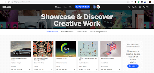
This same website uses mobile design principles such as wrapping up of components, collapsing of menu items to the hamburger button, and horizontal scrolling of the second nav bar items. This gives the components a cosy fit on the website with each on-screen navigation.
The image below represents how the material design for Android was followed to make the same website mobile-friendly.

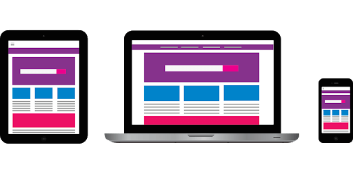
Responsive Website Design
It’s seldom the case where a website needs to be built only for a mobile screen. A webpage should work right from a wide-screen monitor to the much smaller smartphone screens fluidly.
Today’s web pages have a single codebase for all types of screen. This is possible due to a concept called responsiveness. Responsive web pages are designed to adapt to the screen size by automatically shrinking or expanding, hiding or displaying the various components present on the page.
Depending on the type of website architecture, we will be able to choose the right strategy for responsiveness.
⇒ Web Application
If you are trying to build web applications, you have two options while considering responsive websites.
- Build each component such that it can shrink or expand based on the screen size. This includes the component and text within it and other styling code. You can use a responsive framework like bootstrap for this purpose.
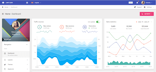
- Use Responsive themes which also provide responsive and pluggable dashboards. An example of this is the Limitless Dashboard themes. The image below shows how Limitless can be used which comes prepared with both Responsive web interface and adheres to the material design standard.
⇒ Blogs
If you are trying to build a mobile-friendly blog, the design would compress two major parts.
First part is the CMS or the Content Management System. This is the engine that will provide the services that would allow you to write articles, maintain all the blog posts, maintain the media, and more. WordPress, and Joomla are some of the most popular CMS in the world. A CMS has no direct part in building a mobile-friendly website, however, choosing the right CMS like WordPress gives access to easier integration with websites.
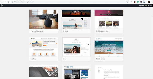
The CMS leads to the second component of the blog which is the website. If you use WordPress, you will get access to hundreds of responsive themes to chose from. The responsiveness comes inbuilt with most themes. Here some examples for the responsive WordPress themes:
⇒ Static Websites
For Static websites, the responsiveness can be easily achieved by starting with a theme. There are thousands of free and paid themes which can be adopted straight to a static website.
Here is an example of a static HTML theme. As content barely changes in a static website, a theme that matches the vision of the website, the theme can easily be hosted on a platform and you will have a mobile-friendly design.

Content and Font Strategy
Mobile screens as we know are very small. This implies that that content needs to be well structured and must have the right font so that it’s easy for a mobile user to read the text.
When it comes to content strategy, you must aim for shorter paragraphs. Having long paragraphs will appear as a long wall of text that might seem unattractive to the readers. Shorter paragraphs will allow for a more comfortable look and feel on the website.
Because of the small screen size, it is important to have a font that can be read clearly without the letter overlapping or smudging due to thickness. Open Sans is one of the most preferred fonts for both mobile phones and web pages.
A comparison below with these strategies applied and not applied will make you realize the impact it has on the mobile phone reader.

3. Website Development
Irrespective of the website architecture, there might be some amount of development required from your end. Thanks to the advancement in technology, static websites and blogs can be set up without any development efforts. However, in events where you need to develop, here are a few things to keep in mind while developing a mobile-friendly website.
Development Frameworks for Web Applications
Advanced web application frameworks such as Angular JS, or React JS have been built to provide a mobile-friendly website right from the start. They offer a wide variety of out of the box features that will make your development much faster and much easier.
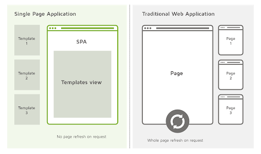
These frameworks also provide a method of development called the Single Page Applications (SPA). SPAs are concepts where an application does not change the entire web page when a user navigates from one page to the other. Only the content which needs to change is dynamically changed. This is highly recommended for developing websites that are mobile friendly as they save a lot of components from being re-rendered.
The image below shows how in an SPA website, only the templates are swapped. In non-SPA websites, the whole page is refreshed each time.
Responsive Component Development
When it comes to developing various web components such as the navigation bars, the image views, the content holders, etc: It is important to keep in mind the various screen sizes that your website should cater to.
Depending on the browser size, you might have to replace some of the components such that it fits perfectly within that screen size. An article by website designs shows the breakpoints (image below) that are followed by some of the most popular websites in the world. Each breakpoint is a resolution at which the page changes properties to suit that resolution.

This shows that 768px and 1280px are the most commonly used breakpoints. However, each website has its own strategy of placing more breakpoints based on their user data.
4. Testing the website
Once the development of the website is complete, it is extremely important to test if it is indeed mobile friendly. This means that you would have to test the look of the website on as many mobile browsers as possible. We call this the cross-browser compatibility.
In the testing phase, you will be verifying if the websites adhere to the design that has been implemented on multiple devices and on multiple mobile devices.
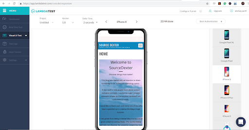
Following image shows our tool being used to test in real-time how a website looks on various devices.
Conclusion
Having a mobile-friendly website will enable you to tap into a whole new market of users. By providing a simple to use and easy to navigate interface, you are making your website mobile friendly and boosting the traffic to your website.
Building a mobile-friendly website requires a lot of effort. Each and every point that we discussed is crucial in giving a wholesome experience to a mobile user. Testing is as important as building a website. It is highly recommended to spend a good amount of time testing your website on various mobile browsers to ensure no one faces a bad experience.


Author’s Profile
Akshay Pai
Akshay is a machine learning engineer with 3 years of experience in building AI-powered applications.
Blogs: 10
Got Questions? Drop them on LambdaTest Community. Visit now