
A Complete Guide To Mobile First Design
Misba Kagad
Posted On: November 30, 2023
 285362 Views
 25 Min Read
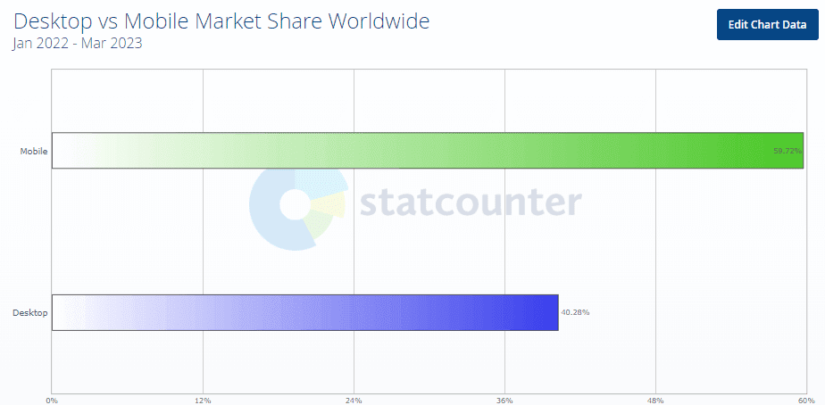
The number of people using smartphones to access the internet is growing exponentially. Having a mobile first design isn’t a luxury, rather a necessity for any online business. As per Statista, mobile devices make up 57% of all internet traffic worldwide in 2023, and Fortune Business Insights state that the global smartphone market is expected to rise 7.3% CAGR from $484.81 billion in 2022 to $792.51 billion in 2029.
With mobile market share growing year on year, businesses are continuously striving to deliver better digital experience through web and app by making mobile first design a priority for them to stay ahead in the game.
What is Mobile First Design?
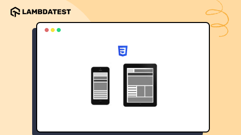
Mobile-first design is a website development philosophy that prioritizes addressing the needs of mobile users by creating a layout tailored for smaller screens from the beginning. This approach aims to enhance the mobile user experience by considering device constraints. In contrast to graceful degradation, which starts design with larger screens and adjusts downward, mobile-first design embraces progressive enhancement. It recognizes that device dimensions limit user access to content, focusing on optimizing crucial features for mobile users and streamlining the overall user experience.
“Progressive Advancement” and “Graceful Degradation” are design concepts predating responsive web design. In Progressive Advancement, a basic version is designed for lower-end browsers, like mobile phones, with subsequent creation of an advanced version for tablets or PCs. This involves adding interactions and complex features for an improved user experience. On the other hand, “Graceful Degradation” begins design from an advanced end, like desktop, and adapts the product for mobile compatibility by removing some functions or content.
Myntra was the first company to adopt app-only strategy which reportedly backfired. Closing its desktop site in favor of a mobile app, Myntra claimed 95% of its internet traffic and 70% of sales were mobile-driven. However, approximately six months later, facing a decline in traffic and sales, Myntra reintroduced their website on mobile browser and desktop. Proving that companies should focus on mobile first design websites that are compatible with desktop and not just the apps.
Currently, Progressive Advancement is favored, as starting with a desktop version may lead to challenges in adapting advanced features to mobile devices, resulting in a diluted mobile version. Initiating design with a focus on the mobile end allows designers to prioritize key features under constraints, and as the platform expands, they can enhance the product gradually by leveraging the unique features of advanced ends. This makes Progressive Advancement a widely adopted strategy.
Why Mobile First Design Matters
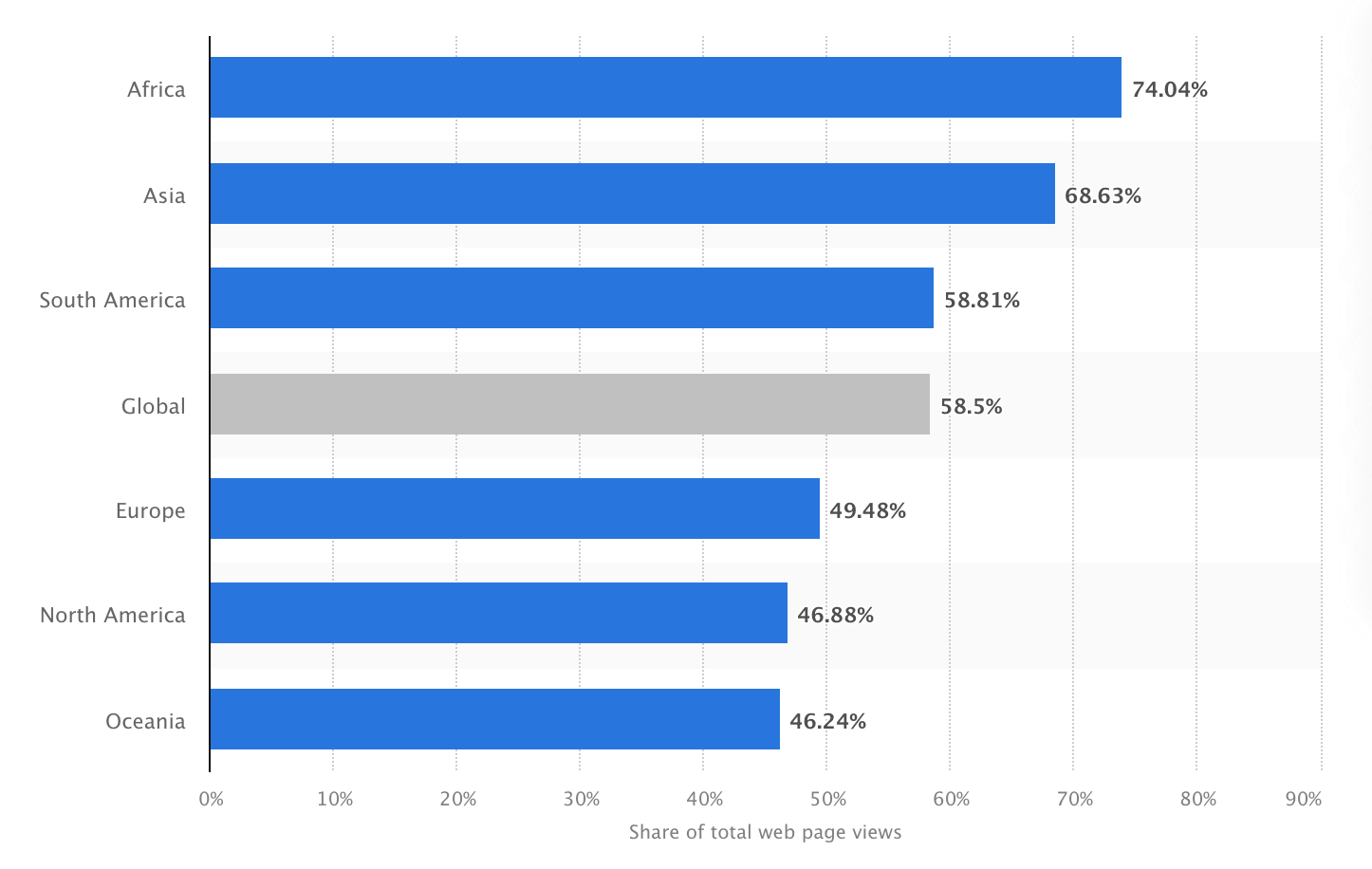
As per survey by Statista in 2022, the number of unique mobile internet users reached five billion, suggesting that more than 60% of the worldwide internet population accesses the internet via a mobile device. Therefore, consumers are more inclined to shop and return to firms with mobile-friendly websites.
Here are some prominent reasons to give mobile first web design:
- Because Google’s algorithm favors mobile-friendly websites, focusing on mobile first design has many advantages, such as improving product discoverability on SERPs, which is critical for any business success.
- Mobile first web design has been an effective method for businesses seeking to reach more clients and improve their online presence.
- Approximately 56% of all sales are made via smartphones, and more than 50% of all traffic currently derives from mobile devices, according to Statista. These numbers will certainly continue rising.
- Businesses now spend more on smartphone advertising than TV commercials, making mobile friendly websites critical for reaching customers. The most popular approach for companies to reach consumers is through social media-sponsored adverts with attractive animations, underlining the necessity of mobile first web design.
Responsive Design and SEO
Responsive design, in which a website’s appearance and content adapt to various screen sizes and resolutions automatically, is intimately correlated with mobile-first design. This helps with search engine optimization along with improving user experience (SEO). Google gives mobile-friendly websites top priority in its search results. Implementing a mobile-first design will help you rank higher in search engines and gain more organic traffic. As Hubspot reports, 61% of marketers consider improving SEO and expanding their organic presence as a top priority.
User Experience and Engagement
When it comes to expectations and behavior, mobile users differ from desktop users. They frequently browse for shorter periods of time, have shorter attention spans, and require more quick access to information. With a focus on mobile-first design, content is provided in a clear, readable way that makes important information easily accessible. Focusing on user experience can result in higher engagement, lower bounce rates, and eventually increased conversion rates. A study by Adobe found that 38% of users will only engage with a website if the content is easy to read at a glance and the layout is pleasing.
Google’s Mobile-First Indexing
With the introduction of mobile-first indexing, Google gives priority to mobile versions of websites when determining search engine rankings. Websites optimized for mobile devices are more likely to rank higher in search results, leading to increased visibility and organic traffic.
Google considers user experience signals as a crucial factor in determining search rankings. Mobile-friendly websites, which are part of a mobile-first design strategy, tend to offer a better user experience on smartphones and tablets. Positive user experiences contribute to improved SEO performance.
Reduced Bounce Rates
Mobile-friendly websites often have lower bounce rates, as users are more likely to stay and engage with content when it is easily accessible and readable on their mobile devices. Lower bounce rates are viewed favorably by search engines and can positively impact search rankings.
A website’s first impression is 94% design related. The website in such a manner that it grabs customers attention for a longer period of time because around 88% of users or customers are less prone to visit the website after a negative experience. These numbers demonstrate how important it is to build using a mobile-first approach, considering the preferences and experience of mobile users.
Mobile Page Performance
Page speed is a significant ranking factor for mobile searches. Mobile-first design emphasizes the importance of optimizing pages for faster loading times on mobile devices. This not only improves user experience but also aligns with Google’s criteria for ranking mobile pages.
Accelerated Mobile Pages (AMP) are now available. Google’s AMP project was publicly launched in 2015, and it is gaining traction. AMP is an open-source initiative that allows pages to load extremely quickly. AMP reduces down web pages to their essentials, removing scripts that slow them down. In a word, AMP enhances the entire user experience and the visibility of a website in search results.
A typical web page takes roughly three seconds to load, whereas an AMP page takes about half a second. Faster loading enhances the overall user experience. Websites who have switched to AMP have seen incredible results in terms of lower bounce rates and greater conversions. Walmart, for example, revealed that AMP improved mobile load time by one second and resulted in a 2% boost in conversions.
With AMP AliExpress reduced their load time by 36%, leading to a 10.5% increase in orders and a 27% increase in conversion rate. AMP leads to a positive impact on mobile results due to faster load times and increased convenience.
Enhancing Progressive Web Apps
A progressive web app (PWA) works similarly to a native app but does not require users to download it from the app store; it is built on mobile first design strategy. A PWA is a web-based mobile application that is always available and loads quickly.
This technology is made up of three major components:
- Application shell architecture (for quick loading with server workers)
- Server workers (for offline support and background tasks)
- Web app manifest (for native-like features)
Let’s take a closer look at the benefits of PWAs:
- PWAs are efficient since they operate on demand and do not require much storage space.
- PWAs can function without internet connection.
- PWAs adhere to the mobile-first strategy; they work flawlessly on mobile devices.
- A PWA eliminates the need for a separate native app, saving a company up to 75% on development and maintenance expenditures.
- A PWA loads two to three times faster than a standard app, reducing server strain.
PWAs sound intriguing, but are there any examples of this technology being used successfully? Sure! Consider the following statistics from large corporations that have already deployed PWAs.
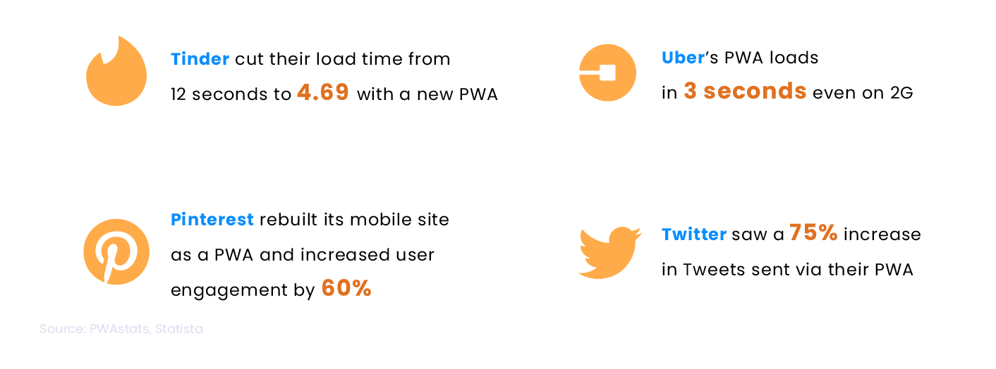
The statistical evidence showcases a significant improvement in user experience and engagement when utilizing PWAs and will continue to gain traction in the future.
Mobile-First Design Principles
If you choose a mobile first design strategy, you should consider whether you will eventually migrate to a comprehensive desktop platform. This information will tremendously aid you in developing and implementing design strategies.
If your organization utilizes the DevOps methodology, you know the importance of early and frequent monitoring. But, if your business is not yet DevOps-enabled and you intend to design and develop your applications using a mobile first strategy, early monitoring can help to streamline the deployment process for both mobile and desktop versions of your platform.
Here are the steps of mobile first design development:
- List out content
- Begin with the tiniest breakpoints and work your way up
- Start by creating a wireframe for the smallest breakpoint, which is often mobile displays. Your wireframe should cover your design’s main aspects, including content, pictures, and navigation.
- Once you are done with a well designed mobile wireframe, leverage this practice for larger breakpoints by increasing size.
- When you increase the screen size, watch for the quantity of white space on the screen. You should strive to expand the design until there is too much white space, indicating it is ready for the next breakpoint.
- Once you find out the next breakpoint, You should pause and begin adjusting the design for the next breakpoint.
- Make elements thumb-friendly
- Avoid relying on hover
- Design the interface like a mobile application
- Off-screen navigation: A navigation menu concealed off-screen until the user presses a button to display it is called off-canvas navigation. This navigation style is popular in mobile apps because it allows users to access the navigation menu without taking up too much screen space.
- Expandable widgets: Widgets, such as an accordion menu, are interactive features allowing users to expand or compress content. This widget type is often used in mobile interfaces to save space and allow users to get information quickly without scrolling through a long page.
- AJAX calls: Asynchronous server requests allow users to interact with the interface without reloading the entire page. This type of interaction is frequently utilized in mobile devices to give a more fluid and responsive user experience.
- Avoid bigger visuals
- Test on a real device before deployment
- Use sizing to get users’ focus on essential elements of web pages. You can simply increase the size of some elements to get users’ focus. However, too many significant elements can congest your webpage, which is not good practice.
- Use color and contrast to increase the importance of any particular element. Color with higher contrast creates a sense of uniqueness and grabs users’ attention.
- The appropriate typeface pairing can offer your website individuality and draw attention to specific sections. Typefaces of varying widths and weights can also increase hierarchy and highlight more essential text parts.
- Use whitespace to navigate users. The negative distance between elements in a design is referred to as whitespace. It can be used to gather or separate elements to emphasize their significance.
- Concentrate on the web page’s content and make sure it is properly presented.
- Simplify navigation by using an easy-to-use and precise navigation system.
- Adopt a limited color palette to ensure the design is visually appealing without overpowering the consumer.
- Implement a clear and legible typeface to ensure the text is easily read on tiny displays.
- Utilize responsive images and videos that adjust to the size of the device’s screen.
- Text CTA should be intriguing, with terms that compel the user to act.
- CTA should be built to contrast with the background and other items on the page.
- Put the CTA on the page in a visible and strategic location, such as above the fold or at the end of a section.
- Experiment with several CTA options, such as text, color, positioning, and design components.
Create a spreadsheet that includes all the elements you want in your website. To begin, it is recommended that you construct a spreadsheet to list all the content items you intend to include in your design. After compiling this list, you will have a clear perspective of all the content that needs to be included in the design.
The goal of this phase is to prevent leaving out any essential aspects and to verify that your design is complete and covers all relevant content. Furthermore, having a detailed content list lets you prioritize and dedicate resources to the most crucial design aspects. Overall, inventorying your material is a vital phase in the design process that can assist you in creating a well-organized and successful design.
This step will also help in managing the visual hierarchy of content. You can prioritize the items in the content inventory spreadsheet and decide how to highlight the most significant ones.
For a mobile first design strategy, create a wireframe for the smallest breakpoint, such as mobile displays, and then scale it up for higher breakpoints, such as tablets and desktops, to begin your design process. This technique aims to guarantee that your design works well on tiny devices first and then adjusts it for larger screens.
Here is how you can apply this method:
The advantage of this method is that it assures that your design is optimized for smaller screens, which are becoming increasingly crucial in today’s mobile device era. It also helps you create a scalable and adaptive design, saving you time and effort in the long run. Overall, designing with minor breakpoints and scaling up is a successful strategy for building a responsive and adaptive design.
The next step of the mobile first design strategy is website thumb-friendliness. Clickable components like hyperlinks, buttons, and icons should be large enough to be readily tapped with a thumb (sometimes fingers!). Because thumbs are significantly more enormous than pixel-precise mouse cursors, users may mistakenly tap on the wrong element if the clickable elements are too small. The minimum recommendation is a clickable element should be at least 44 pixels in height and width.
To increase the size of touch targets, ensure that clickable items are not too close together. Also, to make buttons and other interactive components simpler to tap, slightly increase them. Finally, you should leave enough space around all interactive elements to avoid accidental tapping.
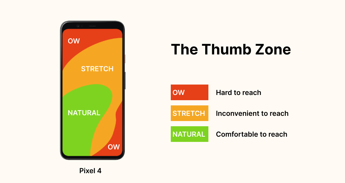
Another point that should be kept in mind is the “thumb zone.” Physically, users do not have easy access to the whole screen; it has a zone that is easy to reach, and some are harder to get. So ensure your CTA comes in the “easy thumb zone” to increase overall CTR. Here is the illustration for understanding the thumb zone in mobile devices.
For the mobile first design strategy, mouseover and CSS hover effects should be avoided because they are not supported on mobile devices. Hover and mouseover effects are interactive design components that change as the mouse is moved over them, and they are often employed in desktop interfaces.
Instead, for a mobile first web design, concentrate on creating intuitive and simple-to-use interfaces that use touch-based actions like tapping, swiping, and pinching. You can also include interactive design components built expressly for mobile devices, such as buttons and menus.
Instead of a typical desktop website, consider creating the UI as a mobile app. Off-canvas navigation, expandable widgets, AJAX calls, and other interactive elements are all things that mobile users are accustomed to having more control over.
By incorporating these features into mobile interface design, you can provide consumers with a more engaging and dynamic experience. Furthermore, building mobile interfaces such as apps can make it easier for consumers to explore and quickly access the required information.
For the mobile first design, you should avoid utilizing large graphics that do not display well on small devices, such as landscape photos or complicated graphics. You should instead cater to mobile consumers by using graphics that are readable and clear on portable screens.
Because mobile devices have smaller screens than desktop computers, massive visuals can take up too much space and make navigating the UI difficult. Furthermore, huge images can take longer to load, slowing the interface and frustrating users.
Furthermore, Consider the context in which the photographs will also be used. For example, if you’re creating an interface for a news website, you should utilize graphics related to the content and assist the user in understanding the material. Similarly, when building an interface for an eCommerce website, utilize images that highlight the products and help the consumer purchase.
The most crucial step for a mobile first design approach is to test it on a real device before release to ensure it is user-friendly and functioning well on different devices. Testing your mobile interface on a real device will help you evaluate its performance. You can test how quickly sites load, how easy it is to navigate the interface, and whether text and pictures are readable on a small screen. You can also see if the interface responds effectively to touch inputs and if there are any problems with buttons or links.
Testing on an actual device might also assist you in identifying flaws that may be hidden on a desktop computer. For example, you may discover that the font size on a mobile device is too small or that the buttons are too close together and difficult to tap.
If you are looking for a real device cloud, LambdaTest could be the best option to test your website or native mobile application on a real device cloud, eliminating the need for in-house Android and iOS device labs. Ensure your website’s mobile responsiveness with LambdaTest’s Mobile-Friendly Test, a handy tool to optimize your user experience.
Mobile-First Design Strategy
Mobile first design philosophy recognizes that mobile devices are the primary source of internet access for most users and that a mobile-friendly design is essential for providing a seamless user experience. Here are some key concepts that will help designers to create mobile first web designs, give users a seamless experience, and stay relevant in today’s mobile first digital landscape.
Prioritize user’s needs
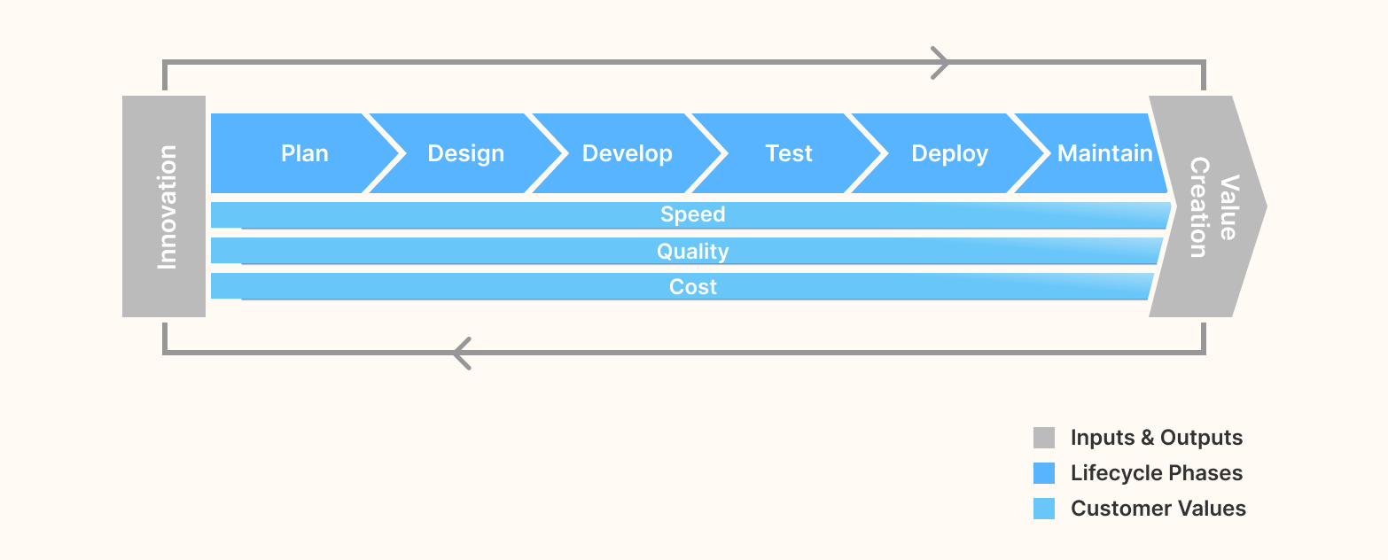
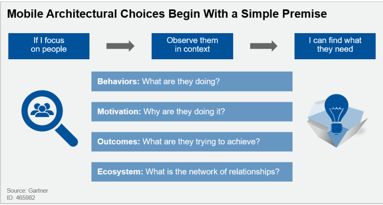
Generally, many organizations’ application leaders have picked a mobile first design before defining use cases – this is the other way around. Application leaders must adjust their perspective from gathering requirements to studying usage patterns in a “design thinking” approach (as shown in the figure below). Requirements do not identify tasks for innovation and productivity. To find the user stories that compose an app’s functions are best determined by evaluating a varied collection of work practices for patterns in how employees interact, access content, collaborate, and produce content.
Clear visual hierarchy of mobile content
The arrangement of design elements in a way that prioritizes their relevance and guides the viewer’s eye through the design is known as a visual hierarchy. This is accomplished by altering the design elements’ size, color, contrast, proximity, and other visual features to establish a clear hierarchy. And in mobile first web design, it has significant importance.
Here are some principles that can leverage the visual hierarchy of content:
Keep your web design simple
Simple web design improves content clarity and is easier to navigate. Therefore it’s best practice to keep the content necessary for users so they don’t get distracted by extra elements.
Mobile devices have small screen sizes, and users frequently browse the internet while on the go, so they have less time to interact with the design. A straightforward design that focuses on the main content and functionality helps to ensure that consumers can locate what they are looking for fast and effortlessly.
Here are some methods to simplify web design:
Effective CTAs
Call-To-Action (CTA) should be created to stand out and contrast with the background and other elements on the page. This helps to guarantee that they are immediately visible and capture the user’s attention. Furthermore, it is critical to employ a consistent layout for CTAs throughout the website, ensuring they look and perform the same way on all pages.
Here is some point to improve the effectiveness of CTAs:
Mobile-First Design Examples
YouTube
Design Highlight: Night mode & blank for button and text display
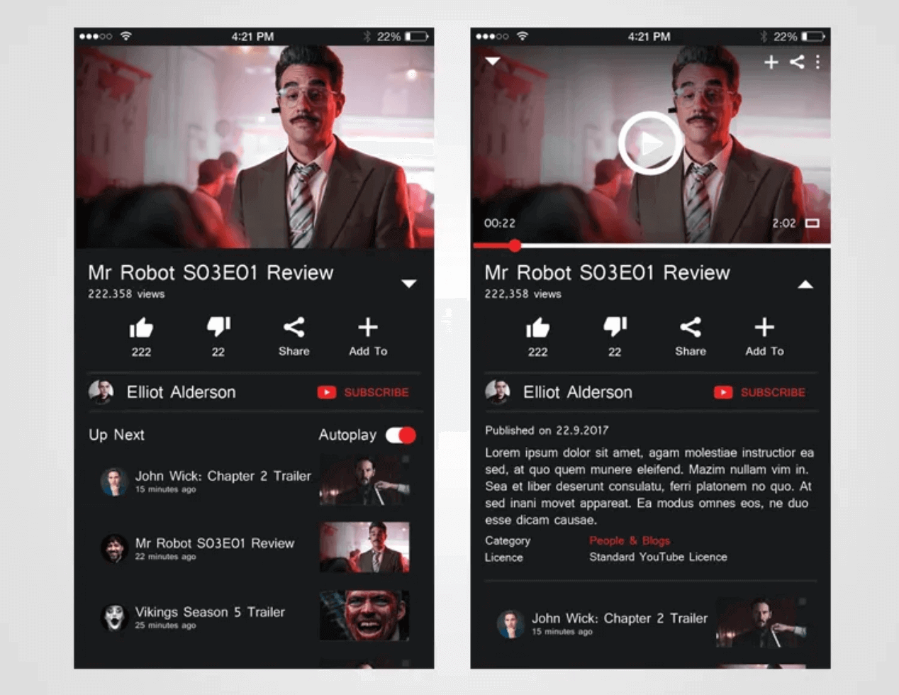
The design of YouTube’s Desktop Web Edition is somewhat influenced by the preference for mobile devices, making it sensible to use mobile first design strategy. This is evident in the layout adjustments, like button and text display spacing, which cater to users accustomed to small-screen touch mobile devices. The introduction of night mode also reflects a consideration for mobile users, opting for a yellow screen in night-light mode on mobile devices instead of the traditional black and white background. This adjustment aims to reduce brightness for the comfort of users’ eyes on smaller screens.
Apple
Design Highlight: Convenient scroll navigation

According to a survey by the Nielson/Norman Group, hiding navigation, like the hamburger menu, makes it 21% harder for users to find content and adds an average of 2 seconds to navigation time. Apple’s mobile website has a great layout, making it easy for users to access information by scrolling instead of using the navigation button. The shopping bag icon is clear and helpful for quick shopping. If you can’t find what you need on the page, you can easily search for it in the bottom navigation.
Airbnb
Design Highlight: Card Design
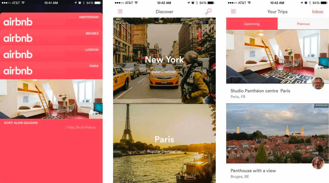
Card design is like digital flashcards that help users quickly connect with information. Companies like Google and Airbnb use this card design because it’s user-friendly and efficient. Each digital card contains a concise message with elements like a title, image, graphic, or text. These cards provide enough information at a glance, making it easy for users to quickly decide whether they want to explore further details. It’s a design approach that simplifies the user experience by presenting information in bite-sized, visually appealing chunks, promoting quick understanding and decision-making.
Design Highlight: Attractive Animation
Animations on web pages do more than entertain; they make the user experience lively and human. Consider MailChimp’s Hi-five animation celebrating a successful email campaign or the subtle animations on Twitter indicating actions like forwarding or liking. Additionally, platforms like Facebook incorporate vivid and expressive emojis through animation. However, it’s crucial to exercise caution when incorporating animations on your page. They should be elegant and appropriate, seamlessly integrating into the user interface to avoid distraction or disruption to the overall user experience. In essence, animations, when used thoughtfully, contribute to a more engaging and user-friendly online environment.
Slack
Design Highlight: Easy navigation, Responsive design
Slack’s mobile-first design is centered around enhancing collaboration for users on the move. The interface is intuitively crafted for touch interactions, ensuring a seamless experience on smartphones. Notably, the app maintains consistency across devices, allowing users to effortlessly transition from mobile to desktop. Offline functionality enables access to recent messages even without the internet, and push notifications keep users promptly informed. The emphasis on core collaboration features makes Slack’s mobile design a practical and efficient solution for users relying on smartphones for work-related communication and productivity.
Wrapping Up!
We are well aware that mobile devices are currently dominating the market. Therefore, a mobile first design strategy is not an option but a priority. In 2023, businesses that wish to improve their online presence and give an optimal user experience to their audience must prioritize mobile first web design.
In this highly competitive and continuously evolving digital market, businesses must stay caught up. For any business, user experience is of utmost importance. With a mobile first design strategy, you make your website easy to access for your users and use, ultimately resulting in higher engagement, better conversion rate, and increased customer satisfaction. Hence, prioritize mobile first design if you want to stay ahead of the digital curve. Good luck with your mobile first web design journey!
Frequently Asked Questions (FAQs)
What is mobile first web design?
Mobile First design is an approach where web designers prioritize designing and developing for mobile devices first, before moving on to larger screens. It involves starting the design process with the mobile screen size as the primary focus, ensuring a user-friendly experience on mobile devices.
Should I design my website from mobile first?
Mobile first design is an essential component of effective product design. Designers can focus on the critical functionality of their product by designing for the smallest screens first and then working their way up.
Why is mobile first important?
Quick page load speeds are critical for usability and SEO optimization. Furthermore, because most internet users now access Google Search through a mobile device, Google crawls and indexes content with a mobile first approach.
Is Mobile First design good?
Yes, Mobile First design is good. It prioritizes designing for mobile devices first, ensuring a seamless user experience on smaller screens and allowing for easier adaptation to larger screens. It promotes a user-centric approach and supports the increasing mobile usage trend.
What is Mobile First design in Bootstrap?
Mobile First design in Bootstrap is a responsive design approach where the layout and styling of a website or application is initially designed for mobile devices. It focuses on designing for smaller screens first and then progressively enhances the design for larger screens, providing a better user experience across different devices.
How does it relate to the Mobile First design approach?
Yes, mobile-first design is generally considered better than desktop-first because it prioritizes the most important features and ensures a seamless experience on mobile devices, which have become increasingly popular for accessing the internet.
Is mobile first better than desktop first?
The principle of Mobile First design is to prioritize designing and developing for mobile devices before considering larger screens, ensuring a seamless user experience on mobile platforms.
Why is mobile first design important?
Mobile-first design is important because it focuses on creating websites and applications specifically for mobile devices. It ensures a better user experience on smartphones and tablets by considering their limitations and unique features.
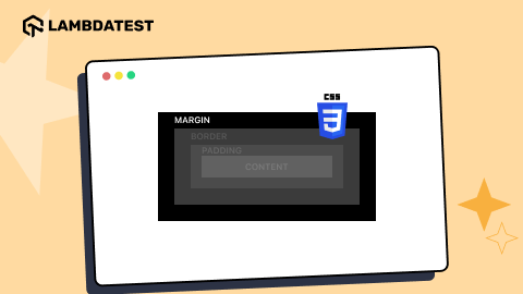
What is Mobile First design CSS?
Mobile First design in CSS refers to the approach of designing and developing a website by prioritizing the styling and layout for mobile devices first, and then using CSS media queries to adapt the design for larger screen sizes.


Author’s Profile
Misba Kagad
Misba Kagad is a dynamic Content Marketing Strategist, B2B Expert, and Tech-Writer. Currently working as a Content Marketing Manager at LambdaTest, with a keen focus on integrated marketing and account-based marketing, excels in transforming complex tech concepts into engaging content & driving brand success.
Blogs: 6
Got Questions? Drop them on LambdaTest Community. Visit now