
Modern CSS Techniques For Older CSS Problems
Arnab Roy Chowdhury
Posted On: June 3, 2021
 71072 Views
 16 Min Read
Discovering modern CSS techniques is one of the best ways to spruce up the overall web design process. If you’ve been working with CSS, you might have encountered a few layouts or cross browser compatibility issues. For example, CSS3 styles do not work with legacy versions of Internet Explorer. Still, there are many instances where we want to use a feature and discover it is not supported or behaves differently among browsers. Therefore while working on web development technologies, browser compatibility testing of websites and web apps is also important.
However, as web technologies evolve, developers are striving to figure out how to cope with other issues as well. For example, leverage other libraries to optimize the loading time of a heavily loaded website or make the div tags more responsive without relying much on Bootstrap. With the evolving and increasing challenges, CSS has evolved as well.
In this advanced CSS tutorial, we will discuss 12 modern CSS techniques to overcome older problems that came with CSS.
Let’s begin with modern CSS techniques!
New to CSS Selectors? Check out this Ultimate CSS Selector cheat sheet to boost your web designing career.
TABLE OF CONTENT
- CSS Font Rules And Creating A Fluid Typography Scale
- Advanced CSS Selectors
- Replacing The Older Grid System
- Keeping Height Of The Elements Uniform
- Enhancing The User Experience Of Smooth Scrolls
- Improving Your Site’s Accessibility By Adding Alternate: focus
- Styling Radio Buttons
- Maintaining Bottom Position Of Footer
- Animated Images
- Advanced Usage Of Border Radius And Box Shadow
- Keeping Your Elements Centered
- Drawing Shapes Using CSS
1. CSS Font Rules And Creating A Fluid Typography Scale
Typography is the best way to enhance the look and feel of any simplistic web page. CSS helps us to develop a foundation of essential type scales. Let’s find out how.
Recommended font-unit
Getting confused about what to use? %, rem, em, or px? The first thing you need to do while defining typography is – forget about px. It doesn’t scale to proportion when the user zooms in or out in the browser. The recommended unit is rem.
The default value of 1 rem is 16 px, and font sizes defined in rem remain consistent when users zoom in the browser.
em is proportional to the font-size rule of the nearest ancestor of an element. It can only be used when you want the child’s behaviour of spacing relative to the parent element.
% have almost similar behaviour like em. However, when you need relative sizing, em is more preferable.
Prevent Text Overflow
Preventing text-overflow is a good way of future-proofing your site. It ensures that if some text in a container increases in the future, the text does not move beyond the container or its border.
|
1 2 3 4 5 6 7 8 9 |
p, li, h1, h2, h3, h4 { // Help prevent overflow of long words/names/URLs word-break: break-word; } |
Responsive Typography
If you selected a large font size globally, you might experience overflow issues on small devices. To solve this issue, we have a fluid type. It means defining a font-size value that adjusts according to the viewport, just like responsive images. You can use a code to calculate the minimum and base size.
|
1 |
font-size: unquote("min(max(#{$fluid-min}rem, #{$fluid-scaler}), #{$level-size})"); |
Or, you can use vw (viewport width) as the font unit.
Apart from responsive typography, you can test web design for responsiveness using LT Browser.
Using LT Browser, a responsive testing tool, that lets you test websites for responsive test across 50+ pre-built device viewports.
LT Browser comes with amazing features like Sync devices in parallel across multiple device viewports to get a better view of media content and objects. Network throttling feature can help you test websites on different network conditions from low to high parameters like online, slow 3G, fast 3G and even offline.
LT Browser is equipped with all the essential tools and features that developers and designers need in their daily workflow. To know more about the LT Browser features, you can refer to our blog: 11 Reasons Why Developers Should Use LT Browser.

The below video walkthrough will help you get started with LT Browser!
2. Advanced CSS Selectors
Understanding how CSS selectors work is essential if you plan to develop a reusable CSS file that you can use for other pages or UI components. In case you are on the lookout for a valuable resource that gives insightful information on CSS Selectors, do check out The Ultimate CSS Selectors Cheat Sheet.
You might be already familiar with selectors based on classes, ID, and elements. Let’s take a look at some advanced selectors.
Universal Selector
Universal selectors can be used on all elements of a website. For example, if you want to have a specific margin to all elements in your page, you have to write –
|
1 2 3 |
* { margin: 1.5rem; } |
Attribute Selector
What if you want to apply a specific style to certain elements having similar attributes but different class names? You can use attribute selectors.
|
1 2 3 |
[class*="component_"] { border: 2px solid blue; } |
Attribute selector will apply a border to elements having class names “component_title” and “component_label.”
Child Combinator
What if you want to make the font-size of a menu in the navigation bar bold but nav content is dynamically generated? They don’t have any specific class. You can use a child combinator.
|
1 2 3 |
.navigation-menu > ul > li > a { font-weight: bold; } |
Pseudo Classes
Have you seen a table with alternate rows having a different colour? Wonder how we can do that with just a few lines of CSS? The answer is Pseudo-classes. Let’s take a look at the code.
|
1 2 3 |
tbody tr:nth-child(odd) { background-color: green; } |
It will apply a green background to the odd rows in the table.

Instead of “odd” or “even,” you can also use properties like “n+1” or “3n+1” to apply different properties to different rows.
Also Read: 15 Advanced CSS Techniques To Master In 2021
3. Replacing The Older Grid System
When it first came to developers, the bootstrap grid was beneficial. It solved the purpose of having uniformly distributed responsive containers in devices of different resolutions. But with time, developers needed an alternate solution. We are no longer required to use a heavy library only for grids.
Read More: CSS Subgrid: What Is It and Why You Need It?
Modern CSS techniques like grid gave us a simplified solution. Let’s find out how.
|
1 2 3 4 5 6 7 8 9 10 |
$minColumnWidth: 10rem; .grid { display: grid; grid-template-columns: repeat(auto-fit, minmax($minColWidth, 1fr)); grid-gap: 2rem; & + .grid { margin-top: $gridGap; } } |
So, what we did here?
First, we defined a minimum width for grid elements.
In grid-template-columns, we used the repeat function so that CSS applies the same parameters to each and every column. Also, we used auto-fit instead of a number. The reason is columns will now have equal width regardless of how many columns you use, they will stretch and fill the available space.
We also used the minmax() function to set maximum width for each column and kept 1fr as the max value. This ensures that the content fills a column up to the total available space.
Lastly, we added a gap and an optional rule to apply the same value among consecutive containers.
The result?
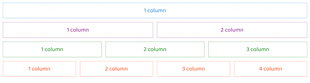
There is only one drawback. For more than three columns, in some viewports, you may find an orphan column.
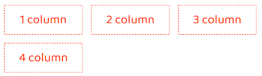
You can solve the issue with media queries, but you have to write a lot of codes for multiple breakpoints.
4. Keeping Height Of The Elements Uniform
There was a time when we used jQuery to calculate to ensure that the height of containers is equal. This was when the content of the two containers was not equal, but we wanted to make their height equal for the UX.
But how did modern CSS techniques made the process simpler? Well, by using the grid system.
|
1 2 3 4 5 6 7 8 9 |
/*Parent container*/ .parent { display: grid; grid-auto-flow: column; } /*Child elements*/ .child { height: 100%; } |
By switching the grid-auto-flow to row or column, we can have containers of uniform width or height.
We can also use the same functionality with simpler code using CSS flexbox.
|
1 2 3 4 5 6 7 8 9 |
/*Parent elements*/ .parent { display: flex; /* Child elements */ .child { height: 100%; } } |
So, which one is better? The answer is, both have their equal share of usage advantages. If you want a solution for just solving the problem of elements with equal height, the flexbox is the best option. However, in flexbox, elements may not be of equal width.
Grid, however, can handle elements with equal width if that is what you need. Additionally, if you want to have a maximum number of columns in each row, the grid can handle the math. But if you use flexbox, you need to define a calculation for that purpose.
5. Enhancing The User Experience Of Smooth Scrolls
With sticky headers, “back to top” links are not that much used nowadays, but there was a time when it was trendy. The idea was to create a link that allowed the user to scroll back at the top of the website. Let’s find out how to develop back-to-top links using modern CSS techniques.
Let’s create the content first.
|
1 2 3 4 5 6 7 8 9 10 |
<header id="header">Title</header> <main> <article> <!-- content goes here --> </article> <!-- Back to Top link --> <div class="back-to-top-wrapper"> <a href="#header" class="back-to-top-link" aria-label="Go Back to Top">Top</a> </div> </main> |
Firstly, we’ll add smooth scrolling to our page.
|
1 2 3 |
html { scroll-behavior: smooth; } |
Then, we’ll style the back-to-top link as per our preference. You can also add a nice SVG icon instead of manual styling.
Now, it’s time to choose how your scroll will behave. Define a scroll length.
$scrollLength: 100vh;
Next, in the wrapper, set the scroll value to the predefined scroll length.
|
1 2 3 4 |
.back-to-top-wrapper { position: absolute; top: $scrollLength; } |
Add the necessary styles to the back to top link. Do remember to use position-sticky to keep it at a specific position.
|
1 2 3 4 5 6 7 8 9 |
.back-to-top-link { // using 'fixed' as fallback when `sticky` not supported position: fixed; position: sticky; // achieves desired positioning within the viewport // relative to the top of the viewport once `sticky` takes over, or always if `fixed` fallback is used top: calc(100vh - 5rem); // ... other styles } |
Done, we have the desired result.
Read: Browser Compatible Smooth Scrolling with CSS, JS & JQuery
6. Improving Your Site’s Accessibility By Adding Alternate: focus
Accessibility is a must-have feature for any website since it is mandatory to follow WCAG guidelines. But what does accessibility mean? It means your websites should be accessible to all, especially by differently-abled people.
Read – Unboxing the Concept of Cross Browser Accessibility
Often, we remove: focus outlines on buttons or links to get rid of the native style. However, while doing so, we fail to provide an alternate focused stage. As a result, people who use the keyboard for navigating a site fail to detect the currently focused element. It is a direct accessibility violation.
We may feel that the browser’s default: focus style doesn’t look good on the attractive elements that you kept on your page. However, it is ideal for adding a few lines of code for an alternate focus style. For example, suppose we have a button.
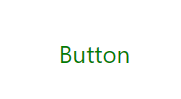
You can add –
|
1 2 3 4 |
button:focus { outline: max(1px, 0.1em) solid currentColor; outline-offset: 0.25em; } |
Here, we are considering currentColor to be the theme colour of your page. In your case, it’s green.
Using outline-offset, we can adjust the spacing of the outline from the element.
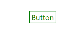
There, doesn’t the focused stage match the colour of the button? You should also check the top tools for accessibility testing.
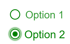
7. Styling Radio Buttons
Developers need a custom-styled radio button as the default HTML radio button appears differently in different browsers. The following is how radio buttons look in Firefox running on Mac.
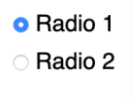
And this is how they look in Safari.
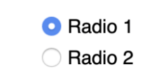
Not only that, native radio buttons can’t scale with font-size.
Let’s check out the solution to create a uniform radio button that appears the same on all browsers and scales consistently with the label’s font-size.
Let’s start with the HTML first.
|
1 2 3 4 5 6 7 8 9 10 11 12 13 14 |
<label class="radio radio-gradient"> <span class="radio-input"> <input type="radio" name="radio"> <span class="radio-control"></span> </span> <span class="radio-label">Option 1</span> </label> <label class="radio radio-before"> <span class="radio-input"> <input type="radio" name="radio"> <span class="radio-control"></span> </span> <span class="radio-label">Option 2</span> </label> |
Now, let’s come to the CSS. We are using SCSS for easily theming the radio buttons.
First, we will create a custom color variable.
|
1 2 3 |
:root { --color: green; } |
Next, we are using a universal selector for resetting the box-sizing method. It will include border and padding in calculating the final size of any element.
|
1 2 3 4 5 |
*, *:before, *:after { box-sizing: border-box; } |
We have added a class .radio to the labels. We are using grid-gap to add some spacing between the button and the labels. We will also be using :focus-within and transform so that the size of the label scales up when that particular option is in focus.
|
1 2 3 4 5 6 7 8 9 10 11 12 13 14 |
.radio { display: grid; grid-template-columns: min-content auto; grid-gap: 0.5em; font-size: 2.25rem; color: var(--color); &:focus-within { .radio-label { transform: scale(1.05); opacity: 1; } } } |
We will adjust the line-height, add a transition and also reduce the opacity of the label when the option is not in focus.
|
1 2 3 4 5 |
.radio-label { line-height: 1; transition: 180ms all ease-in-out; opacity: 0.8; } |
We will add a display-flex to the button that wraps the custom control and the native input.
We will also use a double box-shadow on the focused stage and ensure a difference between the base button and the focused stage.
|
1 2 3 4 5 6 7 8 9 10 11 12 13 |
.radio-input { display: flex; input { opacity: 0; width: 0; height: 0; &:focus + .radio-control { box-shadow: 0 0 0 0.05em #fff, 0 0 0.15em 0.1em currentColor; } } } |
Adding a style when the button is in the checked stage.
|
1 2 3 |
.radio-gradient input:checked + .radio-control { background: radial-gradient(currentcolor 50%, rgba(255, 0, 0, 0) 51%); } |
Creating the :before element, to animate the button when it is unchecked.
|
1 2 3 4 5 6 7 8 9 10 11 12 13 14 15 16 17 18 19 |
.radio-before { .radio-control { display: grid; place-items: center; } input + .radio-control::before { content: ""; width: 0.5em; height: 0.5em; box-shadow: inset 0.5em 0.5em currentColor; border-radius: 50%; transition: 180ms transform ease-in-out; transform: scale(0); } input:checked + .radio-control::before { transform: scale(1); } } |
Finally, adding the style to the radio button and the body.
|
1 2 3 4 5 6 7 8 9 10 11 12 13 14 15 |
.radio-control { display: block; width: 1em; height: 1em; border-radius: 50%; border: 0.1em solid currentColor; transform: translateY(-0.05em); } body { min-height: 100vh; display: grid; place-content: center; grid-gap: 2rem; padding: 1rem; } |
Here is the output.
8. Maintaining Bottom Position Of Footer
Although with Single page applications, this problem does not arise that much, if you are creating a static web page, you may often find your footer floating up.
We can get rid of this problem with two methods.
Grid
Let’s take a look at the code.
|
1 2 3 4 5 |
body { min-height: 100vh; display: grid; grid-template-rows: auto 1fr auto; } |
Here, we kept a minimum height of the body. After that, we used grid-template-rows to space the content correctly. The method uses a fractional unit that computes the space available and distributes it to several rows. Thus, it will fill all the available space between the header and footer.
Flexbox
Using flexbox, the method is more simple.
|
1 2 3 4 5 |
body { min-height: 100vh; display: flex; flex-direction: column; } |
First of all, with min-height, we ensure that the body stretches to the screen’s full height. Then, setting a flex-direction retains stacked block elements and keeps the document behaviour normal.
9. Animated Images
When CSS was not much modernized, users struggled to animate image captions and image size using jQuery and position:absolute.
However, nowadays, with a few lines of code, we can animate captions and trigger the animations on hovering an image. Let’s take a look at the code.
|
1 2 3 4 5 6 7 8 9 10 11 |
.image-caption { // ... existing styles transition: transform 500ms ease-in; will-change: transform; } The transition property helps to animate the caption. We can trigger the animation on hover using - .image:hover { .image-caption { transform: translateY(0); } } |
It solves the issue with the mouse hovering. But what if someone uses a keyboard for navigating a web page. In that case, we can use focus instead of hover.
|
1 2 3 4 5 6 7 8 |
.image:focus { outline: none; } .image:hover, .image:focus { .image-caption { transform: translateY(0); } |
10. Advanced Usage Of Border Radius And Box Shadow
Developers nowadays don’t have to deal with the hassle of creating rounded cornered boxes for containers that they want to make rounded. Thanks to the border-radius property that CSS3 gave us. For example –
>border-radius: 20% 50%;
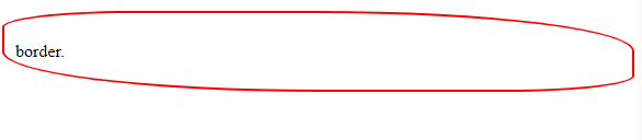
I know, that’s an odd-looking shape. But this was meant to demonstrate the use of border-radius; if you apply calculated values, you can give a container any shape you want. For example –
border-radius: 3vw 4vw 8vw 2vw;
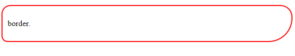
We can use percentage values that are relative to the element’s size. Relative units like vw (viewport units) are helpful if you want to maintain consistency. They appear to be smaller on mobile and larger on desktop but maintain a consistent round shape.
Another interesting property that helps us to add a nice and soothing user experience to our page’s elements is box-shadow. Usually we use box shadow to add a hint of elevation to elements like cards or buttons. For example –
box-shadow:3px 4px 5px 0px rgba(0, 0, 0, 0.38);
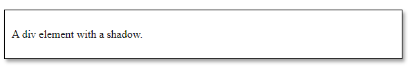
Here, we have a horizontal offset of 3px and a vertical offset of 4px. We also have a blur radius of 5px, no spread radius, and greyish color shadow. You can adjust the values as per your choice to enhance the appearance of the box.
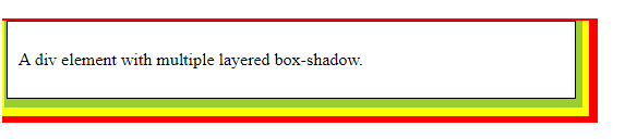
A unique feature of box-shadow is, you can add multiple layers. For example –
box-shadow: 2px 4px 0 4px yellowgreen, 4px 8px 0 8px yellow, 8px 10px 0 12px red;
We also have an interesting image-hack. Wonder how to add vignette effect to an image using box-shadow? The answer is, using inset shadows.
|
1 2 3 4 5 |
.image-container { width: 30vmin; height: 30vmin; box-shadow: inset 0 0 4vmin 3vmin rgba(0, 0, 0, 0.5); } |

11. Keeping Your Elements Centered
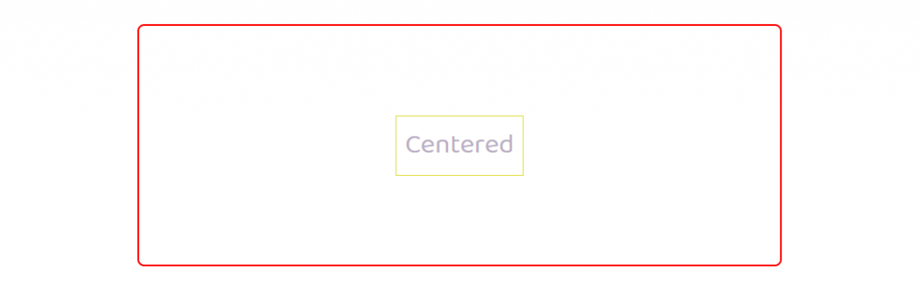
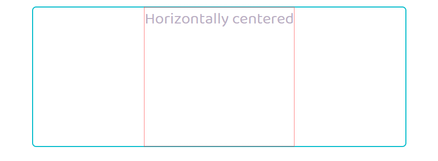
Earlier if we needed to keep an element in the center of a page, we had to use absolute positions and define left, right, top, and bottom values. Well, those days are gone. Modern CSS techniques provide us with a straightforward solution that helps to maintain a centered position in multiple resolutions.
To keep an element horizontally and vertically centered, we have to add just two properties to the element.
|
1 2 |
display: grid; place-content: center; |
If you want to use flexbox to maintain consistency among the other flexbox elements on the page, you will need an extra line.
|
1 2 3 |
display: flex; align-items: center; justify-content: center; |
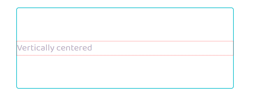
Now, what if you want to place an element aligned centrally at any particular axis. Well, in that case, you have to remove the display property. For vertically center aligned, you have to write
|
1 |
align-content:center; |
Here is the result.
On the other hand, for keeping an element horizontally centered, instead of align-content, you have to use justify-content.
|
1 |
justify-content:center; |
The solution mentioned above was for grid items. For flex items, the code changes a bit.
For vertical alignment, you have to write –
|
1 2 3 4 |
justify-content: center; flex-direction: column; For horizontal alignment, you will need - justify-content: center; |
12. Drawing Shapes Using CSS
Modern CSS techniques save us from the trouble of using scripts for drawing objects. We now have quite a few useful methods to create basic CSS shapes. Let’s find out how to create CSS triangles.
Using Borders
Using the border property can help us create triangles. Let’s start with the container first.
|
1 2 3 4 |
.triangle { border-style: solid; border-color: transparent; } |
Now, let’s use the border-width property and give a color to the left side of the border.
|
1 2 3 4 5 6 7 |
.triangle { border-style: solid; border-color: transparent; /* top | right | bottom | left */ border-width: 7px 0 7px 10px; border-left-color: blue; } |
The result is shown below.
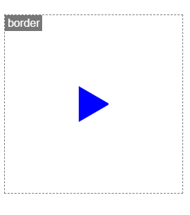
We can shuffle the top, right, bottom, and left values of border-width to change the triangle’s orientation.
Using linear-gradient
We can use this along with the background-image property.
First of all, let’s create a container, give dimensions and prevent background-repeat.
|
1 2 3 4 5 |
.triangle { width: 8em; height: 10em; background-repeat: no-repeat; } |
Now, let’s add our gradients. It will give a blue color to half of the container.
After adding the two gradients, the shape becomes like a mirrored triangle in the container.
background-image: linear-gradient(32deg, blue 50%, rgba(255, 255, 255, 0) 50%), linear-gradient(148deg, blue 50%, rgba(255, 255, 255, 0) 50%);
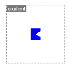
Now, let’s try making the box look like a triangle. We will change the background-size. Our triangle will have 100% width but only half the height.
background-size: 100% 50%;
Finally, to prevent overlapping, we have to add a background position since the default position of both gradients is 0 0.
background-position: top left, bottom left;
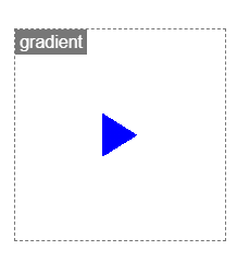
So, our shape finally looks like a triangle. There is, however, a downside of this method. The shape is not responsive. If the aspect ratio changes, we might need to recalculate the degrees.
Wrapping It Up!
CSS is evolving at a rapid pace. Developers are creating CSS-only libraries to depend less on scripting and reducing the size of a site, making it more SEO-friendly. We hope this advanced CSS tutorial will be helpful for you to explore how modern CSS techniques help us solve some common issues that developers often face and depend on scripting to resolve. Let us know if you know about or used any other modern CSS techniques for solving design-related issues.


Author’s Profile
Arnab Roy Chowdhury
Arnab Roy Chowdhury is a UI developer by profession and a blogging enthusiast. He has been writing content for about 5 years and has strong expertise in technical blogs, travelogues, and content in the latest programming languages.
Blogs: 79
Got Questions? Drop them on LambdaTest Community. Visit now