Responsive Web Design Testing Checklist: All You Need to Know
Harish Rajora
Posted On: November 13, 2020
![]() 262974 Views
262974 Views
![]() 12 Min Read
12 Min Read
This article is a part of our Content Hub. For more in-depth resources, check out our content hub on Responsive Testing Tutorial.
We live in an era of smartphones, and we spend a lot of our time on these devices. Do you know an average smartphone user currently spends 4 hours and 30 minutes per day on their device? The chances are high that you are reading this article on your smartphone too.
These smartphones come in all shapes and screen sizes. And your prospects and customers can use any of them to access your website. This means your website must look good and be easy to use, no matter what device people view it on. And that’s where responsive design testing comes into the picture. It ensures that your website looks good and works well across devices, no matter whether it is a desktop, laptop, tablet, or smartphone.
The best way to make sure that you do responsive design testing successfully is to follow a checklist. That’s why we created this responsive web design testing checklist. Let’s get to it, shall we?
What Is Responsive Web Design?
Before we dive into our responsive web design checklist, it’s essential to understand responsive web design.
Responsive web design automatically adjusts the website onto different screen sizes, resolutions, and orientation, etc. So if I am on a 7.1-inch device, the elements should scale up automatically from what they would be on a 5.5-inch device. Today, this practice has become more critical than ever as more and more people are viewing your websites on different screens and devices.
We understand that you must be familiar with responsive design concepts and practices for good testing. But in case you want to dive deeper, you can visit our post Responsive Web Design: All You Need To Know, and for developing trendy and attractive website designs, you can take a look at Recent Trends In Web Designs.
Checklist For Responsive Design Testing
We all want our websites to look good across devices, and this responsive design testing checklist will help you do that. In case you are keen to explore more about developing a mobile-friendly and responsive website. You can visit Guide To Build A Mobile Friendly Website and build a website for every mobile device out there, including the responsive design methodologies in detail.
- Test For Navigation On Website
- Test Fonts On Multiple Devices
- Test On Device-Browser Combinations
- Test On Small Screen Devices
- Test The Speed Of Your Website
- Test For Element Alignments
- Test For Content Placement
- Test For Cross Browser Compatibility Issues
- Test For Interactive Experience
- Test Website Popups Mobile-Friendliness
- Test The Website As A User
With this Responsive testing tutorial for beginners, you will learn how to perform Responsive Testing of your website on the LambdaTest platform.
1. Test For Navigation On Website
As the device changes, the navigation bar should change with it too. A navigation bar is meant for quick navigation to different sections or different pages on your website. A navigation bar typically contains five or more elements. If we use the @media queries with a meta tag and try to scale down the navigation bar on the mobile screen, they would neither be visible nor be of enough size to be clicked. Thus, we opt for a hamburger menu strategy on smaller screens and are very popular. It is so popular that a user will intentionally look for it if he cannot find any option.
The following image shows how LambdaTest changes the navigation bar according to the size.
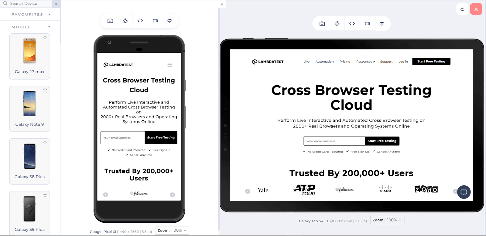
As a checklist item, it is necessary to test for the navigation designs on different screens and verify that it’s not facilitating a bad user experience.
2. Test Fonts On Multiple Devices
To visually appeal to the users, developers use various fonts and design methods to write text on their website. These fonts may or may not be supported universally and may transform into random characters or codes in devices that depend on the encoding format. Therefore, it is crucial to test the fonts on multiple devices before pushing it for real website mobile responsive testing.

The above image shows how the font-face method is supported across various browsers.
3. Test On Device-Browser Combinations

Analyze the web and mobile traffic from Google Analytics and include the browsers and devices used to visit the websites. You can consider including the beta versions to test the responsive web design of the website. This activity should be carried out every quarter with the new operating system and device being added and eliminating the old ones.
4. Test For Small Screen Devices

5. Test The Speed Of Your Website
Responsive design measures the efficiency of your elements in terms of scaling up or down according to devices. But when we look at heavy elements such as images, videos, etc., they are the main concerns for effecting the website’s loading speed on smaller devices such as mobile, which usually works on lower bandwidth. If we continue to use the same images that we were rendering on the bigger screens such as laptops, the loading time will increase proportionally, which can frustrate your end-users.
A study conducted by Forrester Consulting revealed that the threshold waiting time is just two seconds. If your loader is still rotating after 2 seconds, the user will probably hit the back button. Therefore, test your website’s speed, and if the speed is a little slower than what you expected, use alternate methods to render the same images on these smaller devices. We have a fully-dedicated post on methods to render the images on websites. You can give it a read for better development practices and optimizing your heavy elements.
GTMetrix is a popular website for testing speed. You can go ahead and take a look at it.
6. Test For Element Alignments

7. Test For Content Placement
On a bigger screen such as a desktop or a laptop, it is very easy to locate an element because the viewing area is more prominent. Moreover, due to the distance between the screen and the user, we can focus on every corner. But this is not the case with mobile devices. In mobile devices, we need to take care that the size is small, and if we try to display everything as it is, it will be too congested. The following image demonstrates the important focussed areas of a mobile screen:
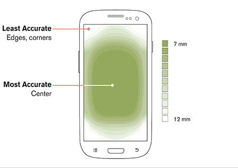
Test for the crucial elements if they are within this area or not, and the elements are not too congested.
8. Test For Cross Browser Compatibility Issues

The first and foremost step in responsive design testing is to perform cross browser testing on the device and verify if the website is cross browser compatible or not. Cross browser compatibility testing allows you to view and explore your website on any browser, operating system, or resolution. Cross browser testing is a more profound concept, and covering it here will divert us from this post theme. The larger umbrella includes manual cross browser testing and automated cross browser testing with multiple ways under them to go through. For more in-depth learning into the same concept, you can visit Remote Testing of The Websites.
As per my experience, I find cloud-based online cross browser testing tools quite efficient. Cloud-based tools are quick to use, are cheaper, and don’t need to set up any testing infrastructure. It is a personal choice, and if you are getting the best results from your methods, it is equally well and good!
9. Test For Interactive Experience
As discussed above in this post – mobile devices are available with many different screen sizes in the market. Another parameter to consider is that the interactive experience had changed since when Steve Jobs announced the first iPhone. Today, some people use a stylus for regular and precise touch while some people interact with the device with only one hand most of the time. This responsive website testing checklist’s main aim is that no matter what or how interactions occur, the interactive experience should not change. The button should not be so small that you can click two at a time from your hand. The UI should try to encapsulate most of the options through multiple models etc. This is an essential item to keep in our checklist as it directly affects how the user perceives our website.
10. Test Website Popups Mobile-Friendliness
We all are using popups as they are a great way to convert our website visitors into subscribers and sales. But do you know that website pop-up can be both your friend and your foe? If not appropriately displayed, it can annoy your visitors and seriously hurt your website’s reputation with search engines.
With a responsive design test, you can ensure that the popups being displayed should also be responsive so that their purpose can be served on any device.
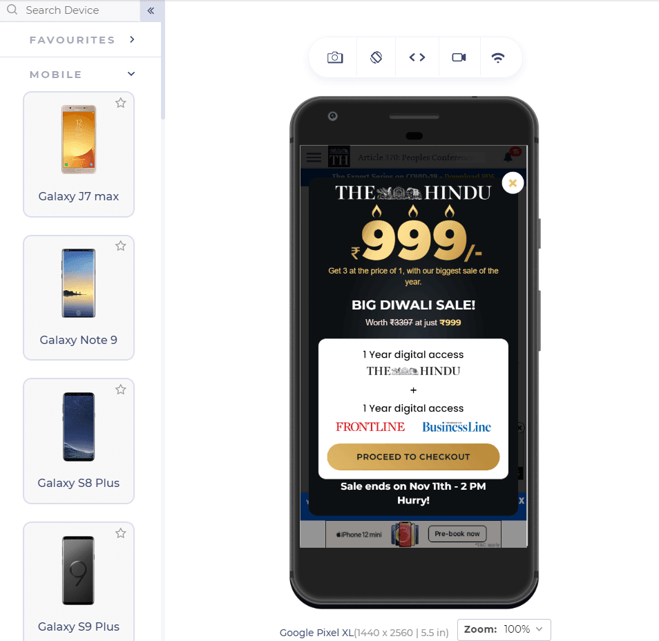
A non-responsive popup can trouble the user as the close button might land out of the boundary, whereas a responsive popup can always entice the user to avail that offer you are displaying. So, always remember to tick mark this item on your checklist.
11. Test The Website As A User
Our checklist’s last item is to test the website, not as a tester but as visiting this website as an end-user. As a tester, you are always thinking like a technical person, and you may miss some of the trivial bugs just thinking that they won’t be noticeable to the user. In reality, that is never the case. Among millions of people visiting your website, there is a good chance that at least 1% of them will be bugged by that left out bug.
Therefore, as the last task, always test your website as an end-user. Explore different areas of the website and take an interest in the concept. If it is an eCommerce website, explore the items as if you want to buy them. Add them to the cart, explore every option provided by the website, and complete the transaction phase. You never know where your responsiveness might ditch you. If you test like an end-user, you will think like an end-user and deliver them a bug-free responsive website.
To know more about responsive testing from LambdaTest, please have a look at the detailed video below:
Tools For Responsive Design Testing
To check your website’s behavior on different devices, browsers, and OS, you need to have a comprehensive testing approach. Considering all mobile device testing checklist mentioned above, like checking for user-interaction, page loading, fonts, images, navigations, alignments, etc., it would be a daunting task to carry all these activities manually.
However, various tools are available in the market to cover responsive website testing checklists without any hassle. One such tool is LT Browser – a responsive website emulator which allows web developers to design and develop responsive and high-performance web applications in the fastest manner. All you need to do is enter your site’s URL to test its responsive design. Some of the prominent features of the tool include the following:
- Mobile debugging on 40+ device resolutions
- Website testing on different devices
- Create custom devices
- Side by side mobile view of the website for comparison
- Inbuilt DevTools for mobile website test
- Test local website without any extension or tunnel
- One-click bug logging
- Smooth testing with Scroll Sync
- Hot reloading to help you see your changes instantly in real-time
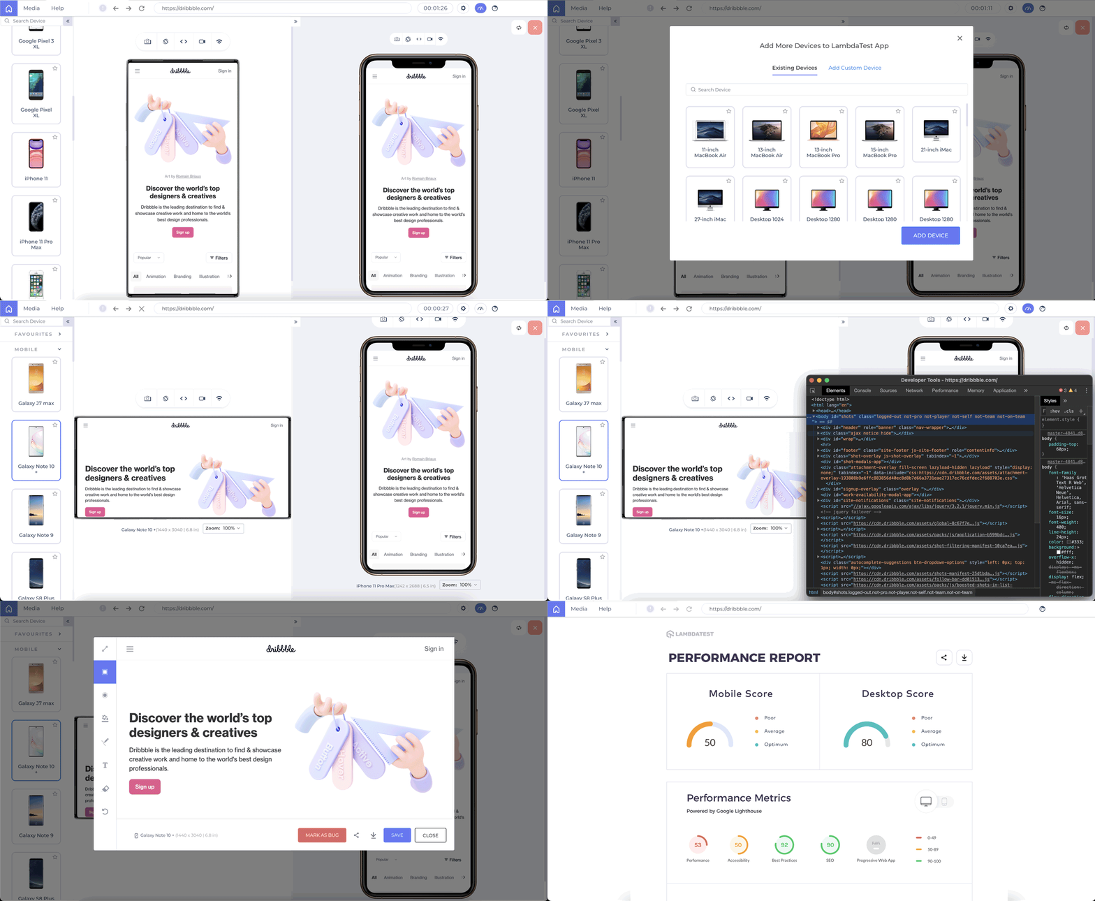
Introducing LT Browser – A Dev-Friendly Browser For Mobile View Debugging
Key Learnings
We all know that user experience is everything. And it’s crucial for our business success that we provide a great experience to all users — no matter what device they use to view our website. A responsive web design testing checklist can help us do that.
However, do keep in mind that responsive design testing is not a one-time activity; it is a continuous process. We have to keep doing it as new devices come out in the market every other day.
Got Questions? Drop them on LambdaTest Community. Visit now


