
23 Best CSS Frameworks For Responsive And Lightweight Websites [2024]
Nimritee
Posted On: March 15, 2024
 126352 Views
 15 Min Read
If you know how to create a responsive website you should also know Using lightweight CSS frameworks to create responsive websites and web applications can significantly reduce delivery time. CSS frameworks have been around for a long time and are now widely used by front-end developers. These frameworks include code snippets that just need to be incorporated into the source code to create the entire layout. Since we target multiple screen sizes and resolutions, it is critical to perform a responsiveness test of websites and web apps to check how the CSS framework’s implementation performs over different browsers and operating systems.
New to CSS Selectors? Check out this the CSS Selector cheat sheet to boost your web designing career.
Following is a list of a few responsive and lightweight CSS frameworks that can be used to create excellent user interfaces and improve the overall user experience.
To learn more on the best CSS frameworks follow this guide on best CSS frameworks and get valuable insights.
Let’s begin with the lightweight CSS frameworks!
1. Bulma CSS
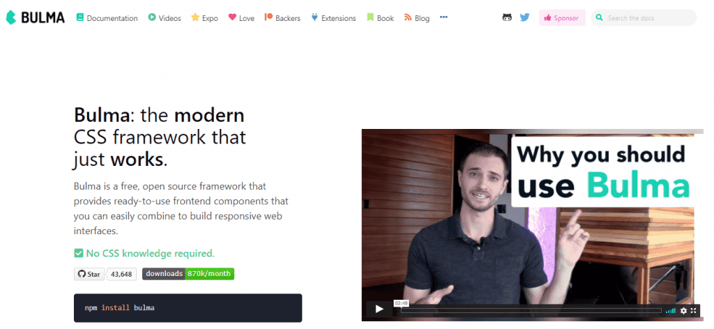
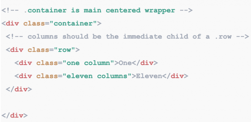
Bulma is a free, open-source framework based on Flexbox that comes up with ready-to-use front-end components and can easily be integrated to create beautiful and responsive web pages. It is one of the top lightweight CSS frameworks with the simplest grid system implementation, where adding and removing the columns can be done seamlessly.
With the help of Bulma, the implementation and the customization becomes easy. It is created using pure CSS and does not require JavaScript. It has more than 93K users and therefore has a large community.
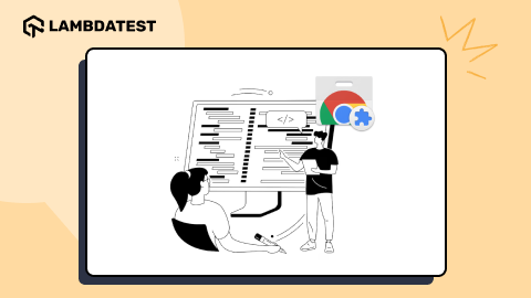
Now perform live interactive Bulma testing of your Bulma websites on LambdaTest.
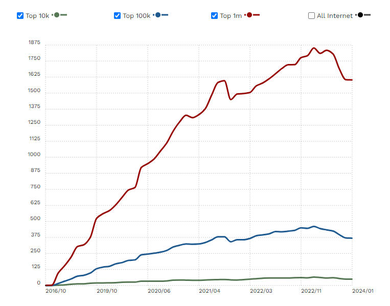
According to a recent survey by trends builwith, there are 58,326 live and historical websites that are using Bulma. It’s most popularly used in the USA. The websites that are a part of the top 1M websites, out of which 0.17% of them use Bulma.
2. UIKIT
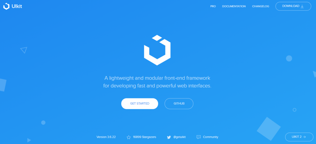
UIKIT is not only lightweight but also a modular front-end CSS framework used for creating lively and impactful web interfaces. It gives the developer an entire collection of HTML, CSS, and JS components that are easy to use, customizable, and flexible.
UIKIT has different pre-installed modules such as Accordion, Iconnav, Animations, etc., showing usage patterns, component options, and methods. UIKIT is a must-try if you need a new, well-maintained CSS framework with a slew of module options. It’s available in Less and Sass and contains a stylesheet to serve right-to-left languages.
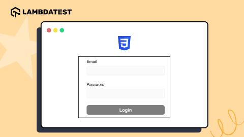
3. Mini.css
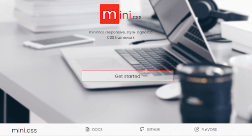
Mini.css is cleaner’s lightweight CSS frameworks for creating websites that look beautiful on every device and load faster. It has a smaller size (under 10KB gzipped), along with the responsive grid and modern components that make sure all your users are satisfied and can access the website anytime, anywhere.
Mini.css bridges the gap between fully-featured frameworks and micro-frameworks. Mini.css contains many features in a small package, while it depends solely on CSS, meaning we do not have to worry about any difference from other JavaScript libraries that we might be using.
Mini.css is mobile-friendly and used to solve the problem with responsive grids, cards, and navigation that will entirely change the website’s layout on mobile to create a better content-centered experience. At the same time, the UI doesn’t get in the user’s way.
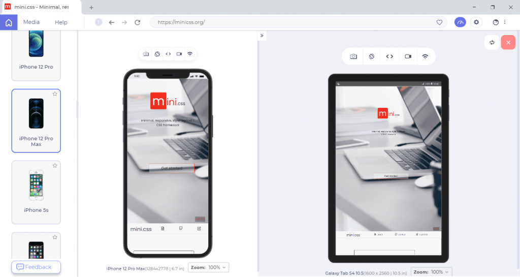
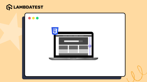
To validate the responsiveness of your mobile website on various browsers and operating systems, you can utilize a cloud-based platform like LambdaTest. LambdaTest is an AI-powered test orchestration and execution platform that allows you to run manual and automated tests at scale, offering over 3000+ real devices, browsers, and OS combinations.
One of the features offered by LambdaTest is LT Browser, which helps you maintain the consistency of your design and functionality across various viewports.
The Above image is from LT Browser – a developer-oriented tool, can be a go-to option. LT Browser comes with 50+ pre-installed device viewports for mobile, tablets, desktops, and laptops that let you create, analyze, & debug the mobile view of websites. Check the below video in order to get started with LT Browser:
You don’t even need to switch devices; with LT Browser’s smart frame, you can run the mobile web test on two different devices simultaneously.

LT Browser also has some other lucrative features like network throttling, performance reports, device synchronization, and mouse touch mode for experiencing real device touch behavior, etc.
4. Skeleton
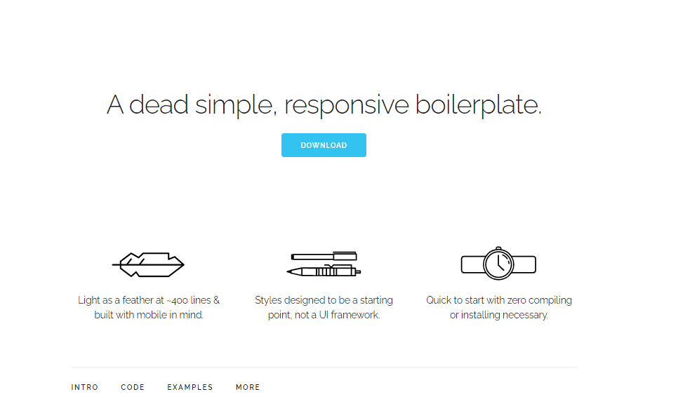
Skeleton is one of the ideal lightest CSS frameworks, which has only about 400 lines of code. Still, it manages the features of the grid, typography, forms, media queries, and many more.
Skeleton’s successful result lies in taking the attributes from other CSS frameworks and providing a framework that helps make it very simple to use. The browser’s layout stays fluid by using the grid system, and it adjusts automatically to window size.
To learn more about the difference between CSS grid and CSS framework follow this guide on CSS Grid Layout vs. CSS Frameworks and understand when to use what.
5. HiQ
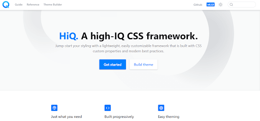
HiQ (A high-IQ CSS framework) is a lightweight and customizable CSS framework developed using various custom CSS properties keeping in mind all the latest CSS best practices.
It is created using PostCSS and comprises all the powerful new CSS features like custom properties. If we use the source version HiQ, we can benefit by using the custom selectors and mixins smooth styling. It allows easy use of themes just by dropping HiQ into our project, adjusting some CSS variables, and we’re good to go. HiQ manages the features like input, primary button, and other parts of HTML styling to focus on essential elements.
The HiQ framework will work across browsers that support custom properties.
6. Pure.css
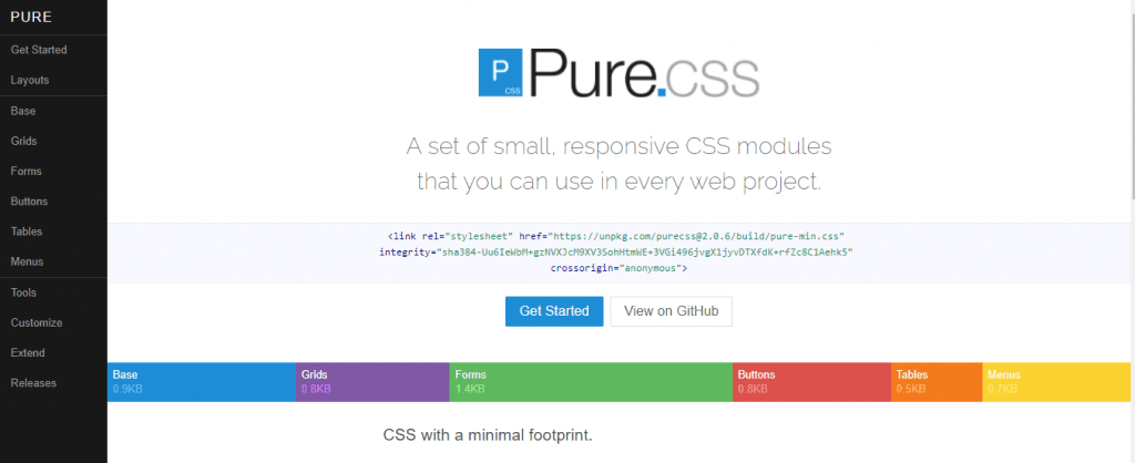
Pure.css is one of the best lightweight CSS frameworks. All the modules are packed in at 3.7KB minified and gzipped, equipped with different features. Pure.css is developed keeping mobile devices in mind. If you plan only to use one subset of these modules, you will end up saving even more bytes.
It is built over Normalize.css, which gives layout and styling for native HTML elements and often uses UI components. It is a responsive grid framework, so elements look perfect on all screen sizes. By keeping minimal styles, Pure.css motivates you to write your own application styles on top of it. It’s crafted such that you can get out of your way and easily override styles.
Companies using Pure.css are Yahoo, LastPass, Flickr, CanYouSeeMe.org, etc.
Unlike other lightweight CSS frameworks, Pure’s design is unopinionated, minimal, and flat. You can add new CSS rules instead of overwriting existing rules. By incorporating a few lines of CSS, you can customize Pure.css to work with your website.
7. Milligram
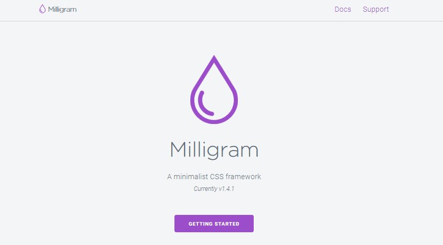
Milligram is also one of the best lightweight CSS frameworks. It provides a nominal setup of styles for a fast and clean starting point. All sets of modules are packed in 2KB gzipped. It is specially created for better performance and higher efficiency with fewer properties to re-initialize resulting in cleaner code. It uses FlexBox, a grid system, and follows a mobile-first approach.
Milligram officially supports the latest versions of Chrome, Firefox, IE, Safari, and Opera.
8. Fictoan
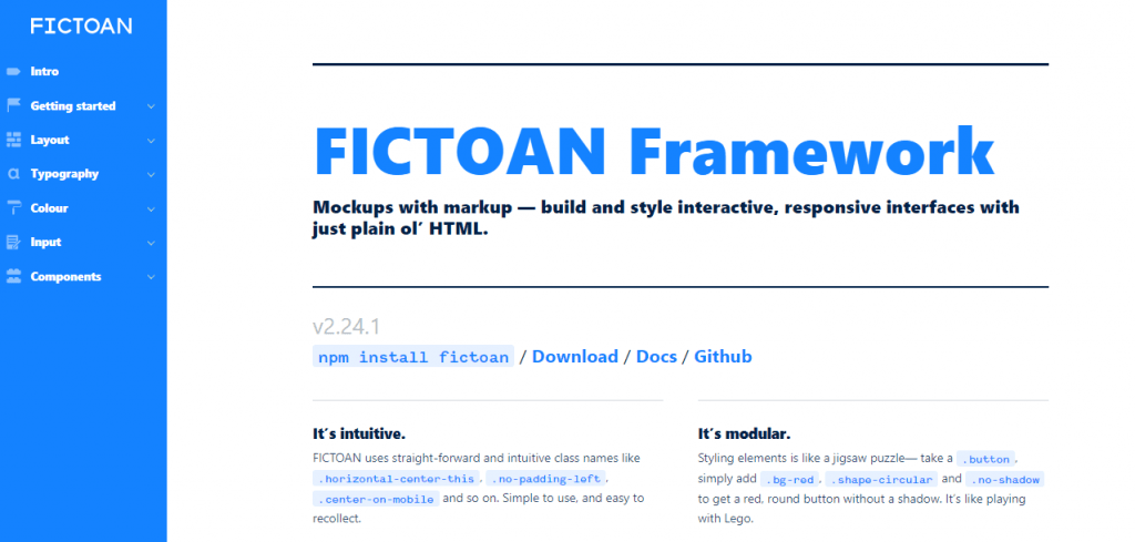
Fictoan is an open-source, interactive, and responsive CSS framework that is modular and customizable. Fictoan makes use of easy and intuitive class names like .horizontal-center-this, .no-padding-left, and .center-on-mobile. They are simple to use and easy to recall. It’s similar to styling elements in a jigsaw puzzle by taking a .button and simply adding .bg-red, .shape-circular, and .no-shadow to get a red, round button without a shadow.
You can change layouts across devices with ultra-ease using Fictoan. Fictoan runs on SCSS, which means it needs to be transpiled into CSS before the browser can read it.
9. Spectre.css
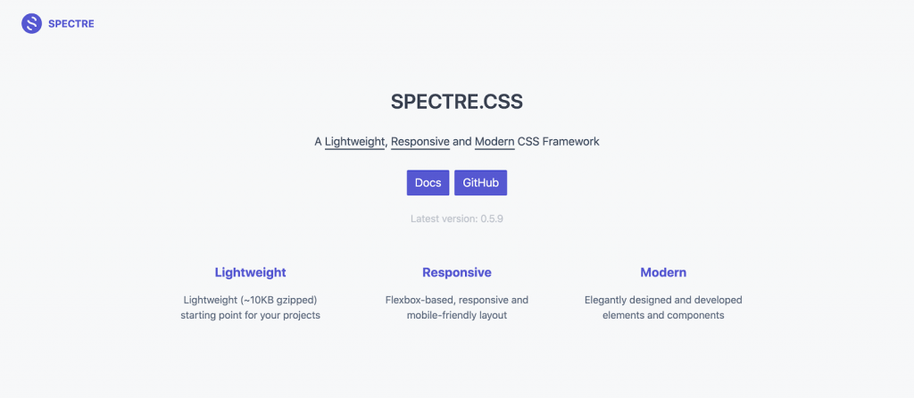
Spectre.css is among the best lightweight CSS frameworks for the rapid and extensible development of websites. It is not only lightweight but also a responsive framework. All sets of modules are packed in 10kb gzipped. It is flexbox-based, gracefully designed, and has advanced elements and components.
The major benefits of Spectre.css are basic styling, formatting for typography and elements, flexbox-based responsive layout, and utilities; along with following the best coding practices and maintaining a consistent design language.
10. Wing
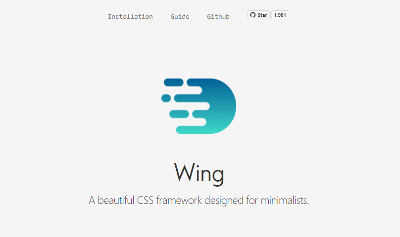
Wing is one of the most incredible, lightweight CSS frameworks created for minimalists. It is intuitive; therefore, we need to add the same in our project and everything is styled automatically. It is packed with many features, including styling for most elements, a grid, and few components, all in just 5KB. Wing has a modern style, and therefore it will give a quick start to your project.
11. Chota
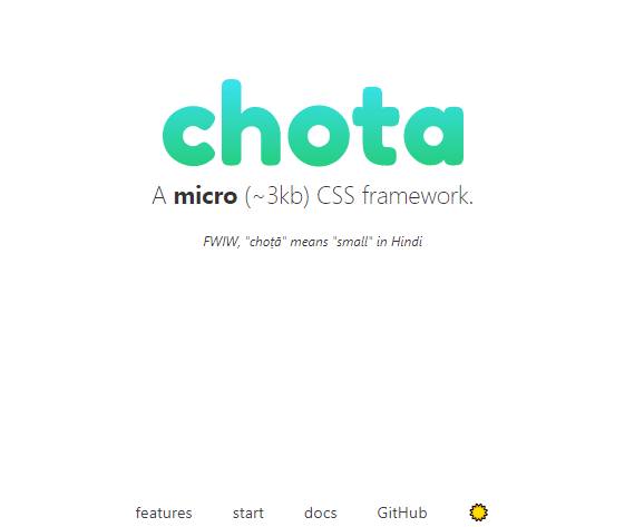
Chota is a tiny super lightweight, simple to use, lightweight CSS framework where all sets of modules are packed in about 3Kb. It does not require any preprocessors, just add it within your project and start using it. It is very simple to extend due to CSS variables. It comes with plenty of components and utilities, like a magic 12 column grid. It has good semantics, can be switched easily to dark mode, and supports icons out-of-the-box as well. Similar to other lightweight CSS frameworks, remembering different class names is no longer necessary.
12. Turretcss
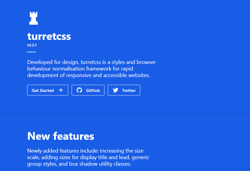
Turretcss is another lightweight CSS framework designed to make responsive, accessible, and scalable CSS development easy. It is utilized for the rapid development of responsive websites.
Here are the major advantages of Turretcss:
- It is simple, clean, and modern CSS with no requirement of JavaScript.
- It is responsive and has mobile-first block element styles, full viewport breakpoint coverage that makes responsive web interface development easier.
- It has easy customization styles with selected simple theme variables and can customize the look of the elements with 100% control on the visual variables.
13. Tachyons
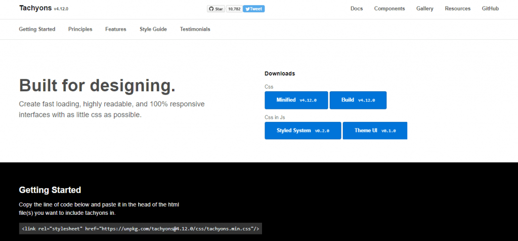
Tachyons is also considered the best lightweight CSS framework which is crafted for web designing. It is readable, loads faster, and creates a fully responsive interface with almost negligible CSS. It has a set of different small modules which you can use together or separately.
It follows the principle – uses what you need and omits the rest. It has several methods and workflows for optimization. It is even modular, accessible, performant, and reusable.
14. InvisCSS
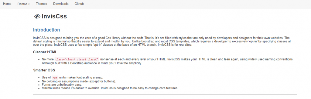
InvisCSS is developed to create a good CSS library with minimal styling complications. By default, the styling is kept simple so that it’s easier to apply alteration and extend. It is not similar to the other CSS templates, where a programmer is exclusively needed to ‘opt-in’ by specifying classes all over the place.
InvisCSS uses few simple ‘opt-in’ classes, which are at the bottom of the HTML branch. InvisCSS is for real sites. It is built by keeping the Bootstrap audience in mind. Nonetheless, you will love the simplicity.
15. Spark
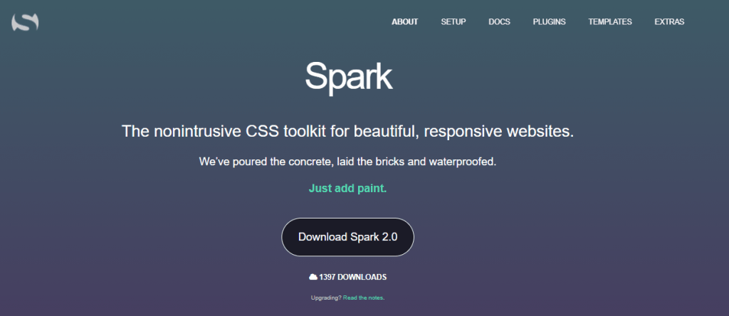
Spark is among the best lightweight CSS frameworks that is primarily used for developing responsive websites. It is built keeping the mobile-first approach in mind, thereby making it ideal for creating responsive web design using media queries to power a responsive grid. With the help of Spark, we can develop professional-looking pages in minutes.
It’s easy to use because of the intuitive class names and simple to customize with a non-intrusive approach. There are a few exceptions to some basic styling and resets; we only need to add Spark classes to the elements we require for our styling. The framework comes with pre-built different color themes that are interchangeable, consisting of shiny and flat styles. Currently, the primary colors used are silver as the default one, blue, green, purple, lime, and dragonfruit.
16. Tailwind CSS
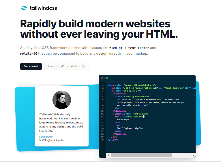
Tailwind CSS is a utility-first framework; it can be used to build a website quickly for UI’s. It’s a utility-based CSS library that prioritizes practicality and speed above semantic and lean markup. We need to find out the use case of the project. Based on that, it’s straightforward to develop a website without writing your own style for it.
Tailwind does have a default theme, nor does it have any built-in UI components. It has a pre-built widgets menu that is used for developing websites.
Here are the major advantages of Tailwind CSS:
- Site Unaffected By Individual Changes: If changes are made in any one of the elements, we need not worry about the other tangentially related elements.
- Ease Of Use: Once we are familiar with the syntax, Tailwind is very easy to use. We also don’t need to move back and forth between the stylesheets and HTML.
- Highly Customizable: Tailwind has enormous customization options.
17. Materialize CSS
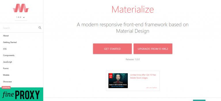
Built-in 2014 by Google, Materialize CSS is the best lightweight CSS framework to design websites and Android web apps. Several Google products like YouTube, Gmail, Google Drive, and Google Docs are based on this framework.
Materialize comes with plenty of ready-to-use modules and classes, which eases the developer’s work. The framework uses a 12-column grid-based layout developed by Bootstrap, responsive animations and transitions, padding, and depth effects. A website can be created easily using its pre-built starter template.
Major Advantages of Materialize CSS are:
- Material Design
- Bootstrap Grid
- Large selection of components
- Easy customization
- Compatible with Sass
18. Avalanche
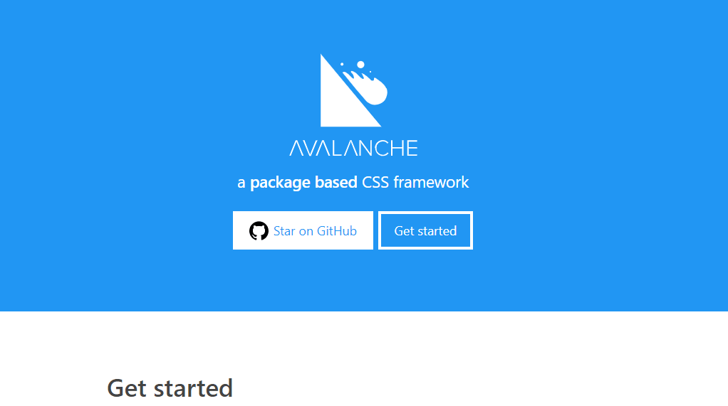
Avalanche is regarded as one of the best lightweight CSS frameworks that create the foundation for a package-based CSS workflow. It is used to customize to meet your requirements for building websites. There are available packages to enable offset classes, fluid grid system, containers, vertical spacing.
19. Beauter
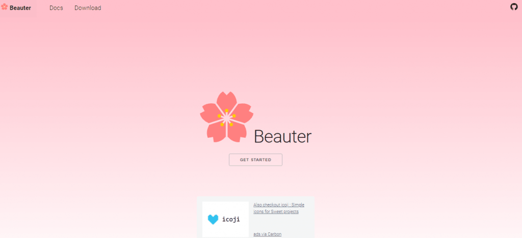
Beauter is an open-source lightweight CSS Framework. All module sets are packed within 6KB. Beauter provides a unique set of attractive elements and styles in pure vanilla CSS, making it easier to get started with smoother and quicker development. It is a cross-browser responsive framework and modifies most of the default styles to ensure the same behavior everywhere. Beauter is based on BOL, an experimental design methodology that makes Beauter easy to mix and match.
20. Vanilla Framework
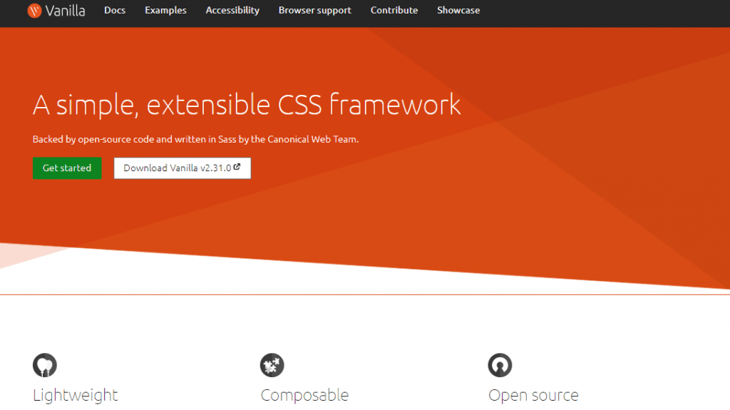
Vanilla framework is a lightweight and Sass-based extensible CSS framework. It is designed to be utilized directly or by using themes to enhance or support its patterns. Vanilla includes a responsive CSS grid, basic HTML element styling, and a set of helpful core patterns and extensible utility classes. You can include the entire framework to access all styles or utilize it as per your project requirement. Vanilla is open source, which means you can contribute to it, upgrade it, and extend it. The entire source code is available on GitHub.
21. Vital
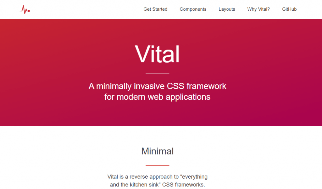
Vital is an open-source, lightweight CSS framework used for modern web applications. It is readable, no extra buried code, and scalable. Written mostly in em values, allowing for easy and consistent scaling. It is extremely lightweight and has a size of just 23 KB minified.
Vital is built-in CSS with zero JavaScript libraries or dependencies. Vital framework is developed with Sass for CSS and Slim for HTML and can be used for development. However, you can export pure CSS directly if you want to utilize Vital for production. You can use a CSS class to recreate any element from the components page. These classes can be partially automated if you use Slim; therefore, Sass/Slim users have a minor advantage.
22. Fluidity
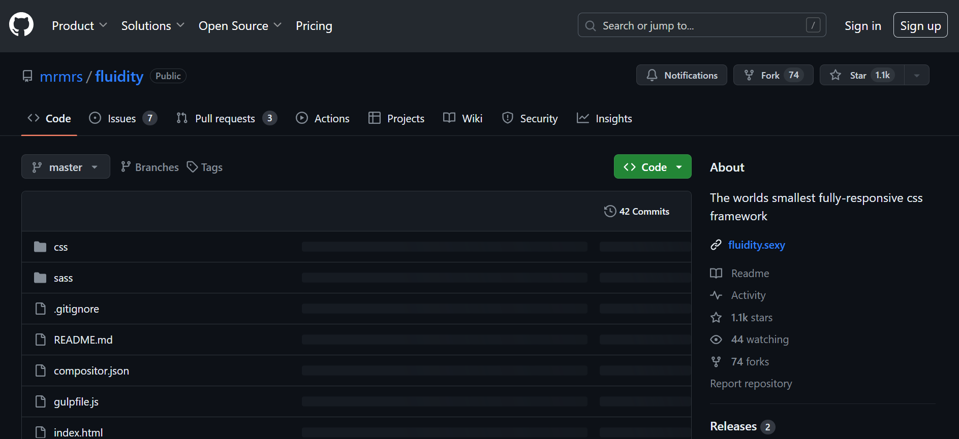
Fluidityis a fully responsive CSS framework crafted for web designers who require an easy framework to express their ideas quickly. It is architectured using one of the best stylesheet language styluses. It now encompasses normalize.css, little typography, a grid system that can be used semantically or with in-line classes to create fluid-width and fixed-width designs. It is focused on developers who know css and want to use CSS3 features and write clean, reusable, and maintainable code.
23. Typebase.css
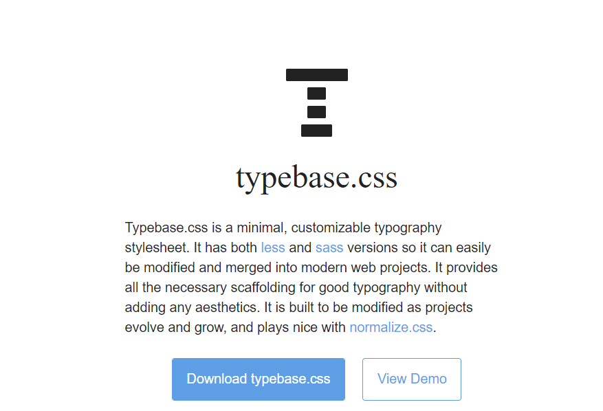
Typebase.css is a lightweight and customizable CSS framework and comes with two versions -Less and Sass. It can be easily changed and blended into modern web projects and offers all of the framework required for excellent typography without incorporating aesthetics.
Typebase.css is designed to be easily updated as projects expand and develop, and it works well with Normalize.css. Typebase.css supports a vertical rhythm across many different device screens, ensuring that text across columns and long copy does not become skewed.
Wrapping Up!
And that’s a wrap for our responsive and lightweight CSS frameworks. Among these 23 frameworks, we can’t say which one is the best lightweight CSS framework. By selecting the right framework, you can handle the tedious and time-consuming styling and create full-fledged responsive websites and web pages. To perform efficient, responsive design, check out the blog on responsive testing.
Got any questions about the lightweight CSS frameworks? Let us know in the comments box below.
Happy Testing!


Author’s Profile
Nimritee
Nimritee works as a Technical Writer at LambdaTest. Passionate about various technologies and tech trends, she is always keen to explore unique aspects of web development & web testing.
Blogs: 5
Got Questions? Drop them on LambdaTest Community. Visit now