17 Top UI Design Mistakes [2024]
Arnab Roy Chowdhury
Posted On: March 5, 2024
![]() 48754 Views
48754 Views
![]() 10 Min Read
10 Min Read
Well-designed user interface can mean a lot for a website. Having all the latest features and a responsive design that is compatible across browsers improves the search engine ranking of a website, resulting in growth of audience. However, when the project is huge, developers often fail to adhere to the best UI testing practices. Thereby resulting in a website where some important functionality is not working or one where cross browser testing is not entirely performed. Here, we shall discuss the top 17 UI design mistakes that leads the failure for your website and certain UI design tips to avoid those setbacks.
1. Non Responsive Web Design
Today, all organizations are following the mobile first approach. It is ideal that you must think alike your competitors and develop a website that adheres to the best UI practices related to responsive design, works properly on all devices without any horizontal scrolling and has passed all cross browser testing strategies for mobile as well as desktop browsers.
There are various tools that can help you take care of your website responsiveness, It’s of utmost importance that your images are responsive to different resolutions. In such cases, relying on products like LT Browser can help you fix inconsistencies with various viewports of your application on desktop, Android, and iOS resolutions. To get started with LT Browser download the .exe file by clicking the download button below.

To learn more about LT Browser, watch the complete video tutorial give below and avoid the UI design mistake when it comes to responsiveness.
To learn more about various automation testing tutorial and various other tools by LambdaTest, you can Subscribe to the LambdaTest YouTube channel for details guidance on Selenium testing, Cypress testing, Responsive testing, LT Debug, and more.
2. Subtle Sale Is An Artform – One That Is Difficult To Master
Persuasive design is the latest trend in the UX world, which intrigues the end user in thinking what is next and compels him to navigate further in the website. We will give you an important UI design tip. Never overuse this strategy. If the end user gets annoyed, they will not think twice before moving on to a different site.
3. Color Scheme Makes All The Difference
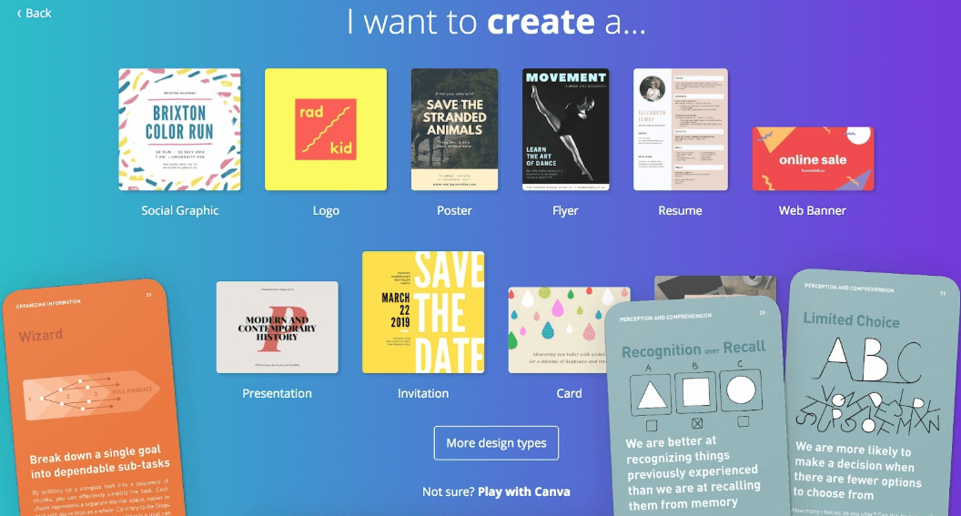
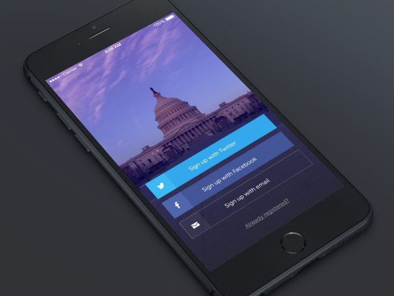
While planning the design of your website, use a proper color code for fonts, headings as well as backgrounds. Study the color theory properly to find out which color looks good on which background. UI design tips provided by experts state that a well-coordinated color planning will work better in attracting a client rather than using animations. Here is one of the examples of a great color choice. You can refer to source for more trendy web color palettes.
4. Eye-Catching Flash Elements
The recent UI design tips states that simplified elements attracts a user more rather than using eye-catching color and buttons. Especially, usage of flash elements must be avoided since they are not supported in many browsers, resulting in failure in cross browser testing.

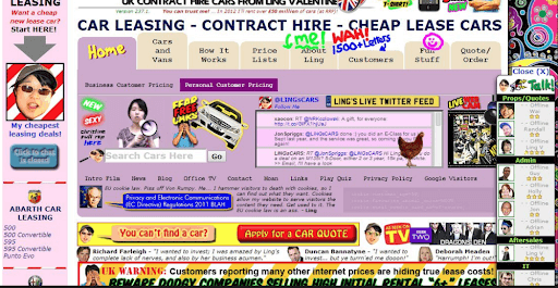
5. Website Not Being Cross Browser Compatible
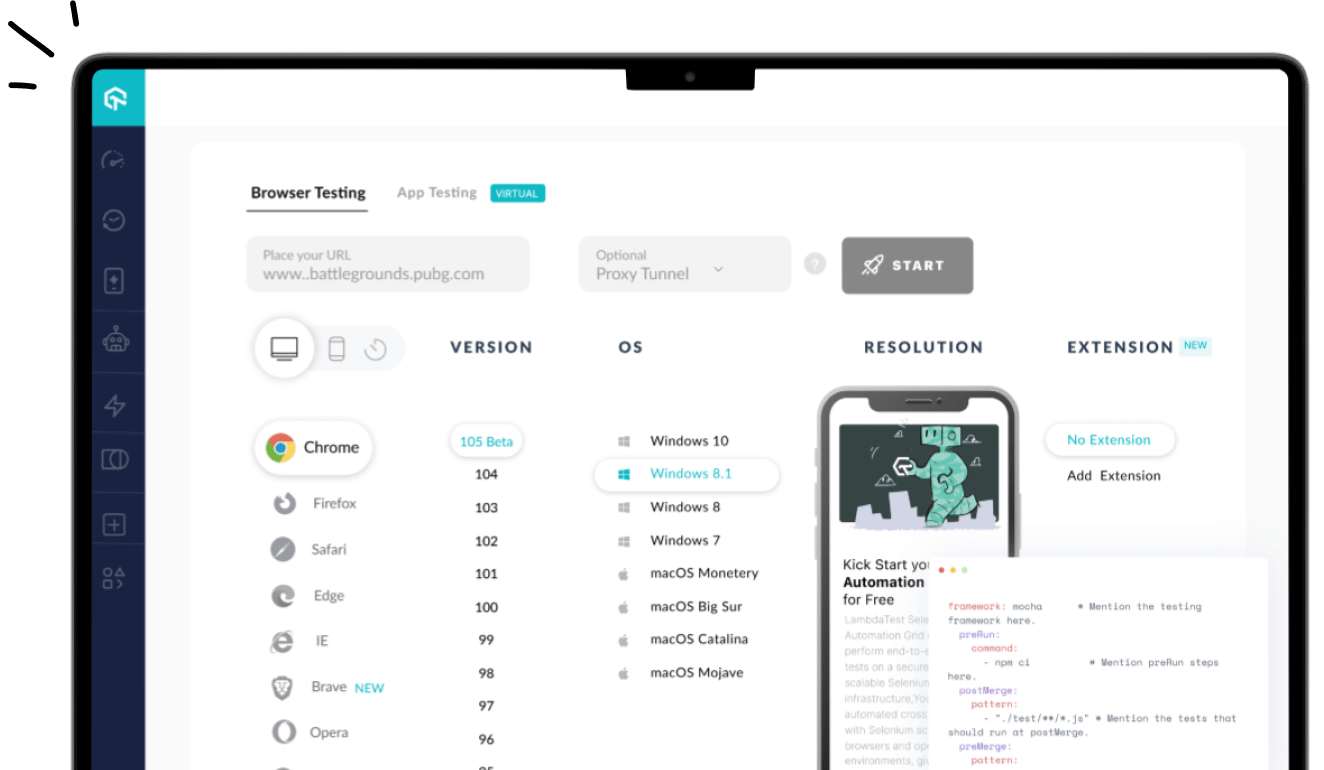
Today, with so many browsers available on the internet, with their usage share varying across different demographics and devices, we shall give you one of the best UI design tips before you release your website. Perform proper cross browser testing and make sure that your website runs properly on all the targeted browsers. Here is an example of on how the looks different in every browser.
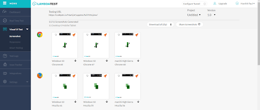
The image above demonstrates a cloud-based platform, LambdaTest, showing the precise differences between various browsers, browser versions, and OS combinations. LambdaTest is an AI-powered test orchestration and execution platform that allows you to run manual and automated tests at scale with over 3000+ real devices, browsers, and OS combinations.
You can notice the differences in appearance between Google Chrome and Mozilla Firefox.
Maintain consistency over various browser and OS combination and improvise your responsive testing processTry LambdaTest Now!
6. Improper Font-Size
Keeping a consistent font-size and font-family is very important when you are following the best UI practices. Bold and big typographies are accepted, but it is improper if there is a 4:1 ratio between the font size of a heading and a paragraph.
7. Designing A Complicated Prototype
A complicated prototype with too many elements and not proper indexing not at all falls among the best UI practices. It will lead to the developer getting confused and may result in a site that is full of bugs and not at all fulfilling the customer requirements.
8. Why So Fixated Towards Outdated & Clustered Design?
A clustered design containing haphazardly arranged contents and images will not only look disturbing to the end user but will also make him confused regarding where to move next or how to carry out the purpose for which he opened the site.
9. Content Is The King, Ads Aren’t!
Ads are a good way of generating revenue for your site. But using too many ads is not at all among the best UI practices. The users get annoyed when they find more ads than useful contents.

10. Complicated Navigation Confuses The User
One of the best UI practices for designing a unique user experience is to create a simplified navigation. This will help the user to navigate to the content which he requires without any complication. A complex navigation bar with too many links and buttons will not only confuse the user but will also make the layout clustered which our objective is to avoid.
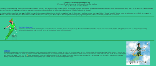
11. Having A Plagiarized Design
Before designing, make sure that your design is completely unique. Taking inspiration from the design of another site is acceptable. But when the entire design of another site is used, it creates a bad reputation for the site and based on user reviews, Google automatically reduces the search engine ranking.

Here is another example of plagiarism.

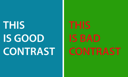
12. Website Lacking Contrast
If the design has proper color contrasts, it makes the content readable and an ease to the eye of a user. If the design has a bad color contrast among the fonts, images, and background, the user will easily get frustrated and move to another site.
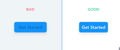
13. Badly Designed CTAs
CTAs hold the power to command a user to take an action. From color to the font, everything about them should ask a user to “click”. CTAs that are too attention-grabbing compels a user to move away, while CTAs that are too simple, is simply ignored. Keep a balance of color, shadows and a nice font in your CTAs to make them noticeable and clickable.
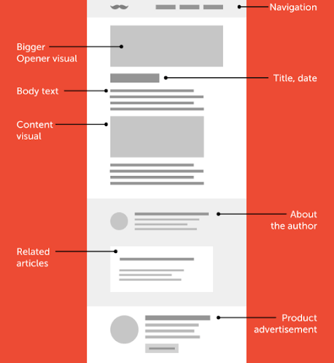
14. Text, Typography And Presentation
Nowadays, most website users do not go through the content entirely. If you want to express your idea in terms of content, you should keep a good balance of text content along with images and rich media elements like audio or video. Too much text content will only compel the user to ignore them and in that way, ignoring some important information that you are trying to convey.
15. Having Large Media Elements
Often it is observed that the speed of a site gets highly reduced or does not work at all when the traffic increases all of a sudden. This is mostly because of the use of large images or animations. One of the best UI design practices is to have limited sized images and as per recent trends, scalable vector images that occupy very small size and ensures that your site is performing properly under any scenarios.
16. Designing Mandatory And Lengthy Forms
Forms are an important part of your website, especially in one that requires the user to register. Having a lengthy form with lots of data will only complicate the user and he may miss some important information while filling it up, especially on mobile. One of the best UI design practices is to keep a simple form that is easier to fill up and has as little information as possible. Also, keep a note that you don’t put too many mandatory fields for a user. The more mandatory fields you keep, the higher bounce rate you will experience.
17. Not having A Good Information Architect
Just like development, planning the design of a website also requires a proper strategy for which you will need the help of a UX architect. We will give u a UI design tip. Having a good information architect will provide you with a good design strategy. Not having one or having one whose way of approach in designing a site is outdated will result in a poorly designed site that is supposed to fail when it comes to user review.
To learn more about the UX trends and various tools, follow the guide on UX testing and tools with examples and get valuable insights.
Design Mindset That Needs To Be Changed
1. Not Involving The Client
Currently, there is a reason for which DevOps and Agile methodology have gained so much popularity. It is ideal to involve the client in every step, starting from design to development so that they can check if the application is developed while adhering to the best UI practices and also if their UX architect can provide additional UI design tips if required.
2. Not Understanding The Requirement
Designers often start working without fully going through the requirement specification. This is not at all according to the best UI practices. Doing this may lead to complete or partial rework even after a fully functional site is developed.
3. Designing After You Put On Your Customer Shoes
While you are designing or developing, you must think from the perspective of an end user. Remember that you are designing for a fictitious personality. There may be a specific color or gradient pattern that you may prefer but it is not necessary that the end user will like the same. Research on the latest UX trends and what majority of the users like before implementing the design.
4. Not Including Usability Testing
Usability testing is another thing to include in your testing strategy. It requires the end users testing your website and informing you about the stuff that felt wrong or can be improved. Not including it in your testing plan is not at all a best UI design practice.
5. Not including Accessibility testing
One of the best UI design tips that will help in increasing the search engine ranking of your site is to adhere to the W3C standards for accessibility. Section 508 of W3C states that a website must be accessible to all, especially people with disabilities. If your aim is to follow the best UI design practices, you must include proper accessibility testing.
That’s all from us. Let us know if you can think about any other mistake or design scenario that does not adhere to the best UI practices. We hope the above-stated UI design tips will help you in creating a fully functional site offering robust user experience.


Author’s Profile
Arnab Roy Chowdhury
Arnab Roy Chowdhury is a UI developer by profession and a blogging enthusiast. He has been writing content for about 5 years and has strong expertise in technical blogs, travelogues, and content in the latest programming languages.
Blogs: 79
Got Questions? Drop them on LambdaTest Community. Visit now