
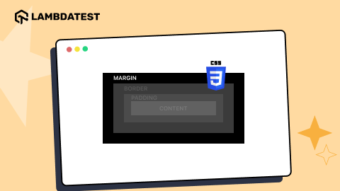
12 Common CSS Browser Compatibility Issues To Avoid In 2024
Mythili Raju
Posted On: March 3, 2024
 189843 Views
 21 Min Read
Browser compatibility has always been an issue for web developers, specifically recently. This may be due to the ever-increasing size of the CSS library with newer frequent additions. Or because of the browser rules that prohibit specific properties from flourishing to their maximum extent.
According to the State of CSS Survey 2024, browser incompatibilities remain a significant issue for web developers and browser developers. The survey revealed that most respondents encountered CSS browser compatibility issues while developing web applications. In particular, Internet Explorer (IE) was identified as the most problematic browser, with nearly all respondents citing it as the primary source of incompatibility.

This made it necessary to use cutting-edge web development tools and techniques to ensure compatibility across different browsers and platforms, which is why cross browser compatibility testing is so important. Browser compatibility will remain an ongoing concern for developers and designers as web technologies evolve.
TABLE OF CONTENTS
- What is Browser Compatibility?
- CSS Browser Compatibility Issues
- CSS Flexbox
- CSS Grid
- CSS position: sticky
- CSS aspect-ratio
- CSS Transforms
- HTML/ CSS Validation
- Missing CSS Resets
- CSS Filters
- CSS Animation and Transitions
- CSS Selectors
- CSS Colors
- CSS Namespaces
- How to Solve CSS Browser Compatibility Issues?
- How to perform Browser Compatibility Testing of CSS using LambdaTest?
- Frequently Asked Questions (FAQs)
What is Browser Compatibility?
Browser Compatibility refers to the ability of a website or web application to operate and display effectively across various web browsers and devices. Web designers and developers must ensure that their websites or web apps are compatible with popular browsers like Google Chrome, Mozilla Firefox, Microsoft Edge, and Safari.
Various browsers may also have varying degrees of support for specific features and interpret HTML, CSS, and JavaScript code differently. This could result in issues with functionality, layout, and design, which can impact the user experience. To guarantee that their websites and online applications function effectively for all users, developers should test their websites and web apps across various browsers and devices.
Cross-browser compatibility issues arise when websites don’t work seamlessly across different browsers. Common issues include layout problems, JavaScript errors, and CSS discrepancies. Solutions involve code validation, CSS resets, and testing with tools like LambdaTest.
CSS Browser Compatibility Issues
Browser compatibility issues arise when a website or web application performs inconsistently or doesn’t work on particular web browsers, giving the user an inconsistent experience. Differences in HTML, CSS, JavaScript, and other web technologies supported by different browsers may cause these problems.
It is imperative to address CSS browser compatibility issues to ensure that your website or web application reaches the largest audience possible and offers a seamless user experience. This may entail employing cross browser testing tools, locating and resolving particular compatibility problems, and suggesting changes to be made in CSS code to web standards.
Without taking a long, let’s jump straight and discuss 12 common CSS browser compatibility issues that developers must be aware of before they start their journey in website designing or web application development.
CSS Flexbox
The first in the list of common CSS browser compatibility issues is Flexbox. CSS Flexbox is known for playing a significant part in small to large projects because of the versatility and ease by which it creates a container and fills the items inside it.
The major problem in CSS Flexbox has been the height and width problem (or aspect ratio, to be precise) while dealing with the images inside a Flexbox. Therefore, if you are unaware of the concept, development, and basics of CSS Flexbox, it is recommended to learn them before understanding the code in this section.
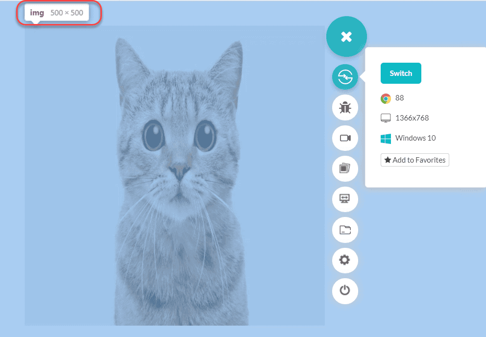
One of the primary problems in focus is the auto-height adjustment in the CSS Flexbox when dealing with images as items inside the containers. Consider the following code defining a height for the Flexbox:
|
1 2 3 4 5 6 7 8 9 10 11 12 13 14 15 16 17 18 19 20 21 22 23 24 25 26 27 |
<html lang="en" dir="ltr"> <head> <meta charset="utf-8"> <title>Flexbox auto-height</title> <style> .item > * { display: flex; padding: 10px; height: 300px; flex-direction: column; align-items: flex-start; justify-content: flex-start; } </style> </head> <body> <div class = "flexbox"> <div class = "item"> <img src = "cat.jpg" /> </div> </div> </body> </html> |
This would bring the output like this:

Declining any adjustments to the aspect ratio based on the height we defined! However, this has been resolved now, but it has been a critical pain point for developers.
Apart from images, CSS Flexbox has raised issues with the alignment of the items on various scales and elements. One of the unresolved issues has been visibility: collapse needs to be fixed for the Blink engine. But the central pain point with CSS Flexbox remains the aspect-ratio of the flex items.
CSS Grid
Like Flexbox, CSS Grid is another prevalent CSS browser compatibility issue while designing a website. CSS Grid uses a grid structure to fit elements inside them and apply various properties according to the requirement. With their flexible nature and the purpose of their existence, they have become the building blocks of modern web design.
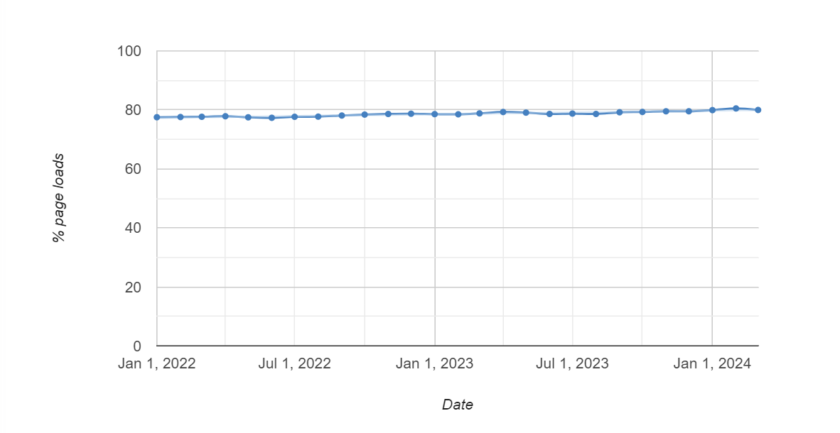
CSS Grids are detected in more than 75% of all page loads, which is exceptionally high.
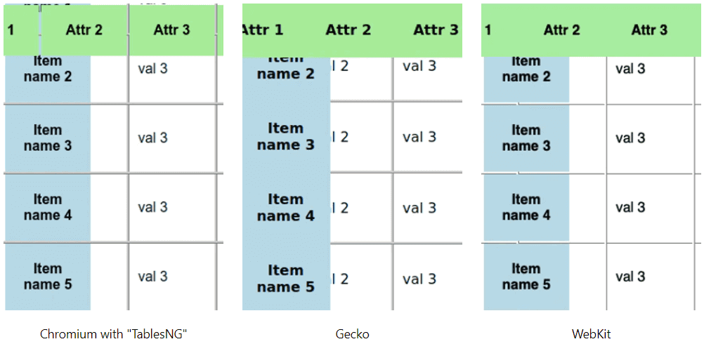
With increased web design trends, CSS Grids have become popular. The Microsoft Edge team has taken CSS Grid responsibility and worked to reduce the gaps between features that CSS Grids can perform in some browsers but not others. One such feature is animated grids which work perfectly in the Gecko engine of Mozilla but not on Chromium and Webkit.
Animation Grid example:

Microsoft Edge is working on rearchitecting the engine to support CSS Subgrids, a controversial part of web design that will hopefully be resolved for Chromium by the end of this year.
The Microsoft team has worked on the LayoutNG engine that clears out all the issues in CSS Grids (including the animating grids) and the subgrids. Apart from this, a few bugs have been logged in CSS Grids but have been rectified, and no severe issue persists. The rest we will know once more engine updates roll out!
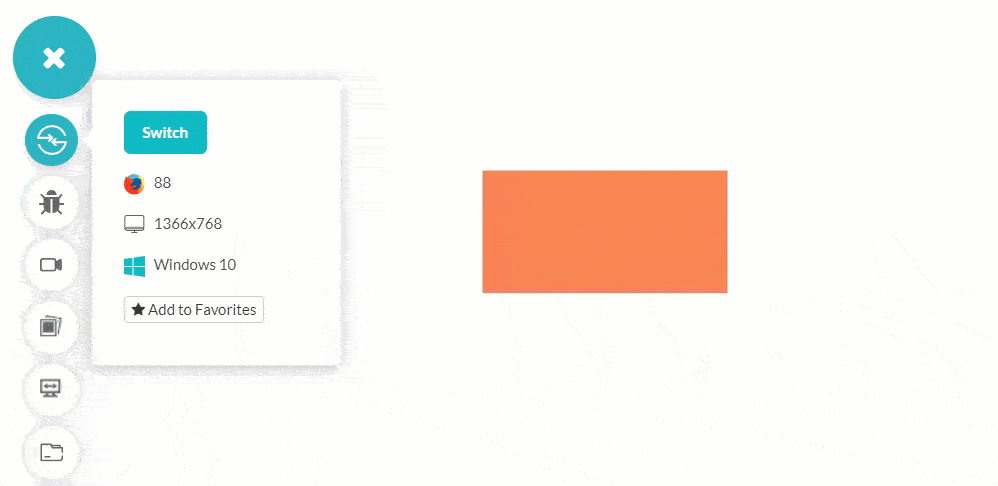
CSS position: sticky
Another most common CSS browser compatibility issue is CSS Position Sticky, which is used to fix the element to the viewport even if we are scrolling. The most popular use case is to use it for the navigation bar on the top of the screen, even if we are scrolling.

The above picture fixes the image to the viewport even if the scroll event is in place. This might not bring out the best in the web page, but it still serves its purpose.
CSS position: sticky for usual elements such as headers and navigation bars that load up with the web page works fine with Chromium and other browsers. The output is consistent across various browsers, and CSS browser compatibility issues are rare.
However, position: sticky, CSS browser compatibility issue occurs when used within other elements such as table headers. This does not work in Chromium. While you can enable this with the flag option, it still shows inconsistencies across the browsers.
The Chromium bug 702927 details that the sticky position worked fine with the “td” tag. The real problem persists with the “thead” (table head) and the “tr” (table row). A similar bug was filed for the Gecko engine as 975644 and with Microsoft Edge. There can be any use case in CSS position: sticky value that raises a CSS browser compatibility issue.
Overall, CSS position: sticky performs great with Chromium and Gecko, whereas some issues are still unresolved with Safari.
CSS aspect-ratio
The CSS aspect-ratio property is a big reliever when dealing with content with high dimensions, such as high-quality images. CSS “aspect-ratio” sheds off the load from the web developer for calculating the perfect combination of height and width for the idea.
If you are new to the concept of CSS aspect-ratio property, learning about the idea before moving ahead in this section is recommended.
|
1 2 3 4 |
img { aspect-ratio: 1/1; height: 500px; } |
For a new property like CSS aspect-ratio, which has become quite popular, browser compatibility issues are bound to happen. However, the browser developers are keen to quickly clean all the mess before it piles up a couple of years later.
 Note
NoteTest your websites on 53+ device viewports Try LT Browser 2.0 now!
CSS Transforms
CSS Transforms help in animating different elements on the web page. These animations are achieved through four properties, viz. skew, scale, translate and rotate. These have been used for quite some time in CSS, and if you are unaware of its implementations, you must learn before using them.
As per Google’s concerns, they have mentioned the card flip effect as one of the CSS transforms problems that need quick attention.
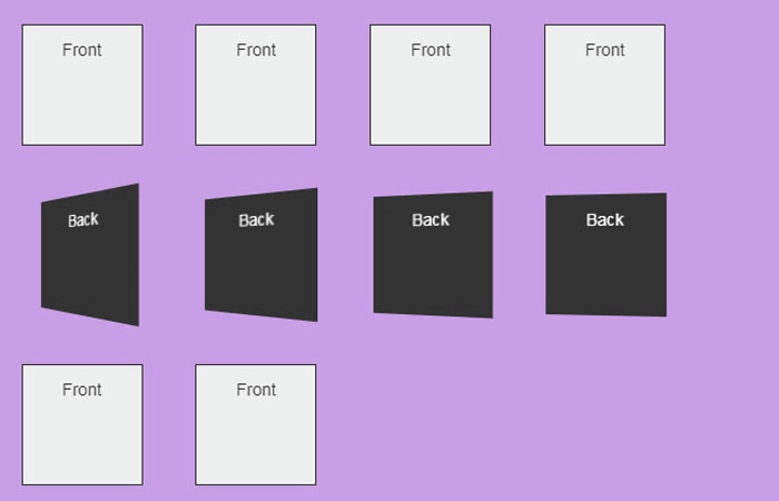
The card flip effect shows inconsistencies in three different browsers.
Lately, 3D transformation issues have been a huge concern, and most of them don’t work on any of the browsers. So, while developing a transform, you might think this is not a feature, but browsers do not support it. The latest bugs are issues with SVG transformations and their rotations as well. For example, bug issue 1175179 concerns the SVG transforms and the CSS browser compatibility issues it raises.
HTML/ CSS Validation
CSS browser compatibility issues can create extreme challenges for developers. One of the primary sources of these problems is CSS validation mistakes, which can result in inconsistent browser rendering. If your HTML or CSS code is wrong, some browsers may interpret it differently than others, resulting in rendering problems that may negatively impact the user experience.
The incorrect use of HTML and CSS features, such as wrong syntax, missing or inaccurate DOCTYPE declarations, and other problems, are some of the most typical HTML/CSS validation mistakes that can affect browser compatibility. These mistakes can render your CSS differently on various browsers, negatively affecting how users interact with your website or application.
Developers should be mindful of these challenges and take measures to prevent them. You can help ensure that your CSS renders consistently across many platforms by frequently validating your HTML and CSS code and testing your CSS on various browsers and devices.
To learn more on how to create browser compactible websites withHTML and CSS and build a website that is consistent over various browsers.
Missing CSS Resets
Missing CSS resets are the most severe CSS browser compatibility issue, which occurs when working with complex layouts or designs. Different browsers apply various default styles to HTML elements, such as margins, padding, font sizes, and line heights, which causes a problem. Therefore, the same CSS styles may be displayed differently in other browsers, resulting in inconsistent layouts and aesthetic design.
Consider a simple example where a developer wants to design a basic layout with a header, footer, and two content columns. The default styles used by various browsers can provide inconsistencies, such as varying font sizes or padding for the header and footer, without a CSS reset. This might result in an uneven or poorly structured layout, which would be undesirable for the user experience.
CSS Filters
CSS filter is another browser compatibility issue web developers need to consider when creating websites. All browsers may not support specific filter effects or may be interpreted differently by different browsers. As a result, the page may display differently on various devices and browsers.
Some older browsers might not support filter effects like blur or grayscale. The same filter effect may also be applied differently by different browsers, resulting in changes in how the page appears to users.
CSS filters are a vital tool for web designers and can help them create visually stunning and engaging web pages despite these compatibility issues. Developers may use this tool efficiently while still keeping a consistent user experience across many devices and browsers by understanding how various browsers handle filter properties.
CSS Animation and Transitions
CSS Animations and Transitions can deliver dynamic and engaging effects to web pages. Various web browsers may interpret CSS animations and transitions differently, resulting in variations in how they appear and work on multiple platforms.
Differences in how various CSS features and syntax are supported by different browsers might need fixing with browser compatibility. For instance, some older browsers might not support animations in CSS3 or transitions, while others may have specific restrictions or flaws that designers must work around. Developers may occasionally require vendor prefixes or fallbacks to guarantee the compatibility of their animations and transitions with all browsers.
Performance is another factor to take into account. Older or less powerful devices might need help to handle animations and transitions well since they can demand a large amount of processing power. To ensure their animations and transitions don’t adversely affect performance or usability, developers must keep this in mind and test their work across various devices.
To ensure that your animations and transitions work correctly across all devices, developers can also follow best practices for web development, such as using semantic HTML, optimizing images and code, and using contemporary CSS syntax. CSS animations and transitions can improve the user experience on websites.
CSS Selectors
With the help of CSS Selectors, developers can target particular elements on a web page depending on those elements’ properties, connections to other elements, or locations within the HTML document. Nevertheless, employing CSS3 selectors can cause problems with browser compatibility.
Various platforms may display web pages differently because different web browsers support CSS3 selectors differently or not at all. The user experience may become inconsistent as a result, and it may be challenging for developers to guarantee that their code runs correctly across all browsers.
Some CSS3 selectors can be slow to process and may have a negative effect on performance on older or less powerful devices, such as those that depend on complex attribute values or relationships between elements. To avoid having their code have a detrimental effect on performance or usability, developers must be aware of this and utilize selectors wisely.
CSS Colors
CSS3 includes a wide range of new colors and color-related features, including RGBA, HSLA, and the ability to specify colors using hexadecimal notation with an alpha channel. However, using CSS Colors may cause problems with browser compatibility.
Various platforms may display web pages differently depending on the degree of CSS3 color support each web browser provides. The user experience may become inconsistent as a result, and it may be challenging for developers to guarantee that their code runs correctly across all browsers.
The performance of several CSS3 color capabilities, including gradient backgrounds, may need to improve on older or less capable devices because of how slowly they must be processed.
To avoid having their code adversely affect performance or usability, developers must be conscious of this and use color features. They can follow best practices for web development, such as using modern CSS syntax, optimizing images and code, and using semantic HTML.
CSS Namespaces
CSS3 Namespaces is a feature that makes it simpler to manage and organize CSS code by allowing developers to arrange CSS selectors into a namespace. However, using CSS3 Namespaces may cause problems with browser compatibility.
Websites can display differently on various platforms depending on the degree to which CSS3 Namespaces are supported. The user experience may become inconsistent as a result, and it may be challenging for developers to guarantee that their code runs correctly across all browsers.
Using Namespaces can result in processing overhead, which could have an adverse effect on how well older or less powerful devices perform. To avoid having their code have a detrimental effect on performance or usability, developers must be aware of this and use Namespaces wisely.
How to Solve CSS Browser Compatibility Issues?
CSS Browser compatibility issues are not a new thing! They may have gained some special attention in the past few years but have been in the system long back when Internet Explorer and Netscape were there.
They will always exist in the system as long as CSS is growing and web developers are experimenting and creating beautiful solutions on the web. However, today, they need special attention to CSS browser compatibility issues as something we cannot ignore.
If something is working on your system does not mean it works on all of them. Therefore, rendering your website on significant browsers will help your business and the community find those hidden flaws.
You don’t need to install multiple browsers to test your web applications or websites. Making use of cloud-based platform like LambdaTest.
LambdaTest is an AI-powered test orchestration and execution platform that lets you run manual and automated tests at scale with over 3000+ real devices , browsers and OS combinations. he platform enables you to perform multiple tests parallelly on different environments to reduce time-to-market and release high-quality products.
How to perform Browser Compatibility Testing of CSS using LambdaTest?
Being an intelligent unified digital experience testing cloud platform, LambdaTest allows web developers and testers to easily test their websites and web applications across multiple browsers and devices.
LambdaTest offers various features, including
- Developers can scale their browser compatibility testing efforts and ensure that their websites and web applications work seamlessly across a wide range of browsers, such as Google Chrome, Mozilla Firefox, Microsoft Edge, and Safari.
- Provides a comprehensive set of features that allow developers to test their websites for compatibility issues related to CSS, JavaScript, and HTML. With its powerful testing infrastructure, developers can run automated tests, perform live interactive testing, and even debug issues in real-time.
- It also offers integration with popular development and collaboration tools, such as Jira, Slack, and GitHub, allowing developers to streamline their testing workflows and collaborate more effectively with their team members.
All you have to do is follow these simple steps to get started with the LambdaTest platform:
Use LambdaTest for Manual Testing
- Create a free account and sign in to your LambdaTest account.
- Click on Real Time option from the left menu.
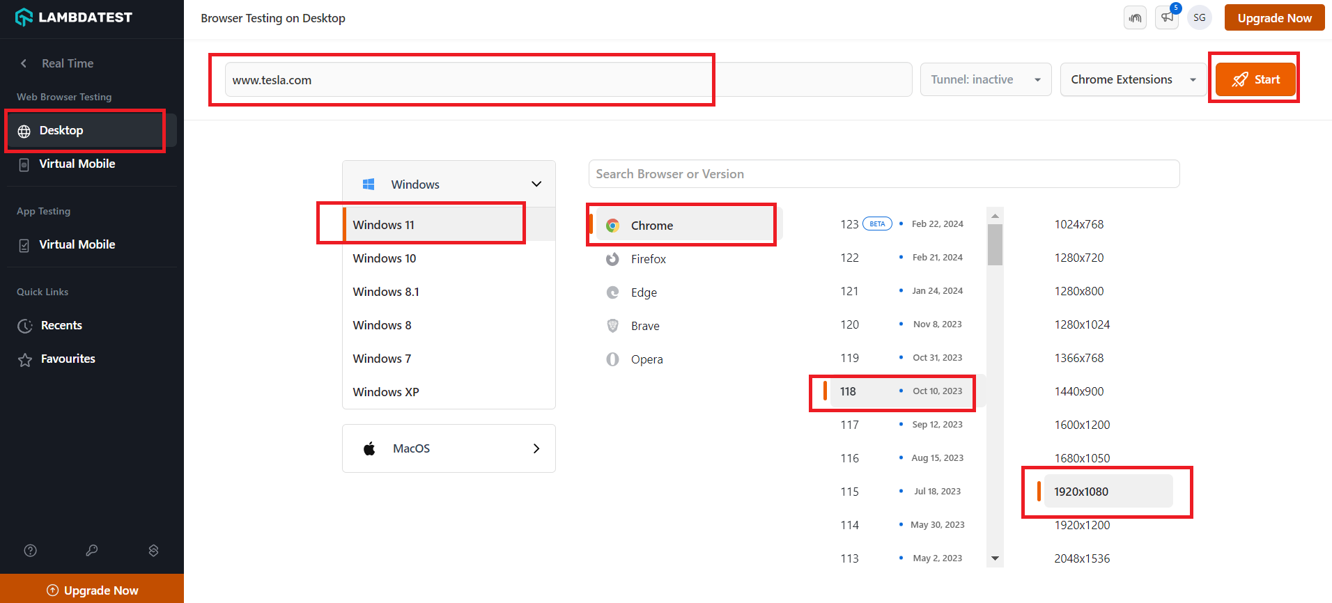
- Click on Desktop option under Web Browser Testing option form the left menu, then enter your URL, and choose your preferred configurations like browser’s version, OS, and resolution. Then click Start button,
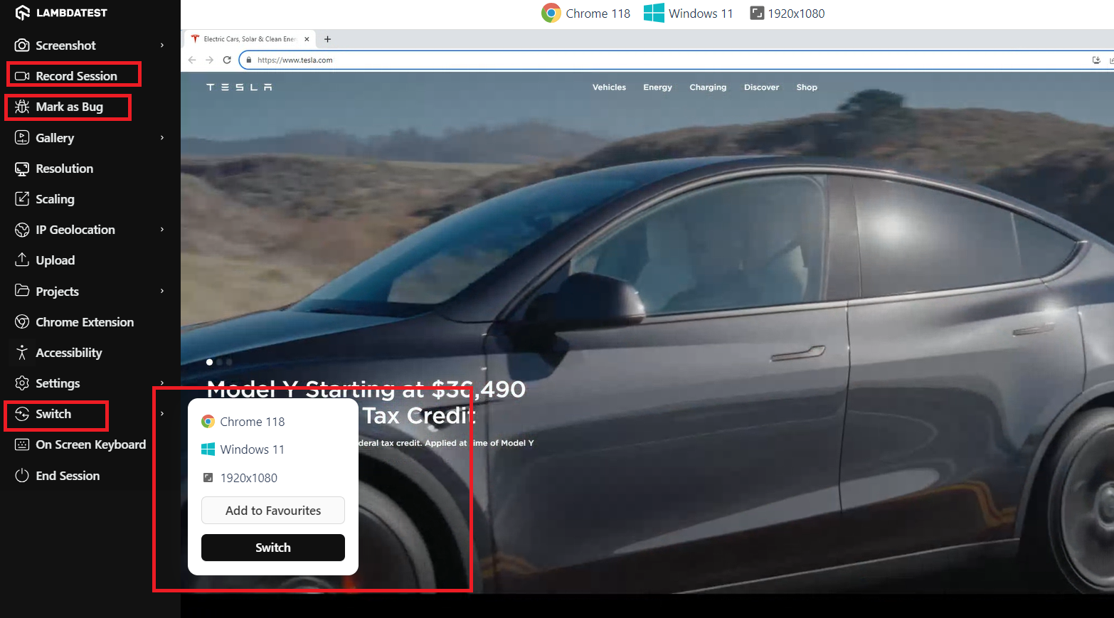
- You can mark a bug when preforming testing by using Mark As Bug feature from the left menu, you can also record all the activates performed on the website testing by click on Record Session option , to change the resolution you can click on Switch option from the menu where you can change the operating system the resolution, the browser and browser version.
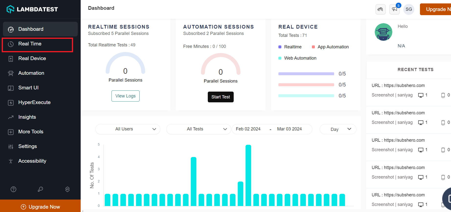
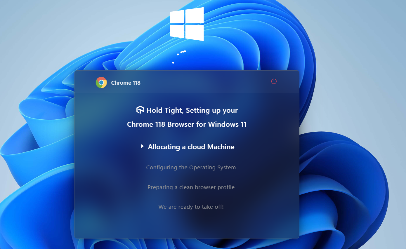
You will get a cloud-based machine launched which runs on a selected OS and behaves as a real browser.
Using LambdaTest for Automation Testing
LambdaTest provides an online browser farm of mobile browsers and desktop environments to run automation tests using different test automation frameworks like Selenium, Playwright, Appium, etc.
You just need to follow these simple steps to get started for automation testing:
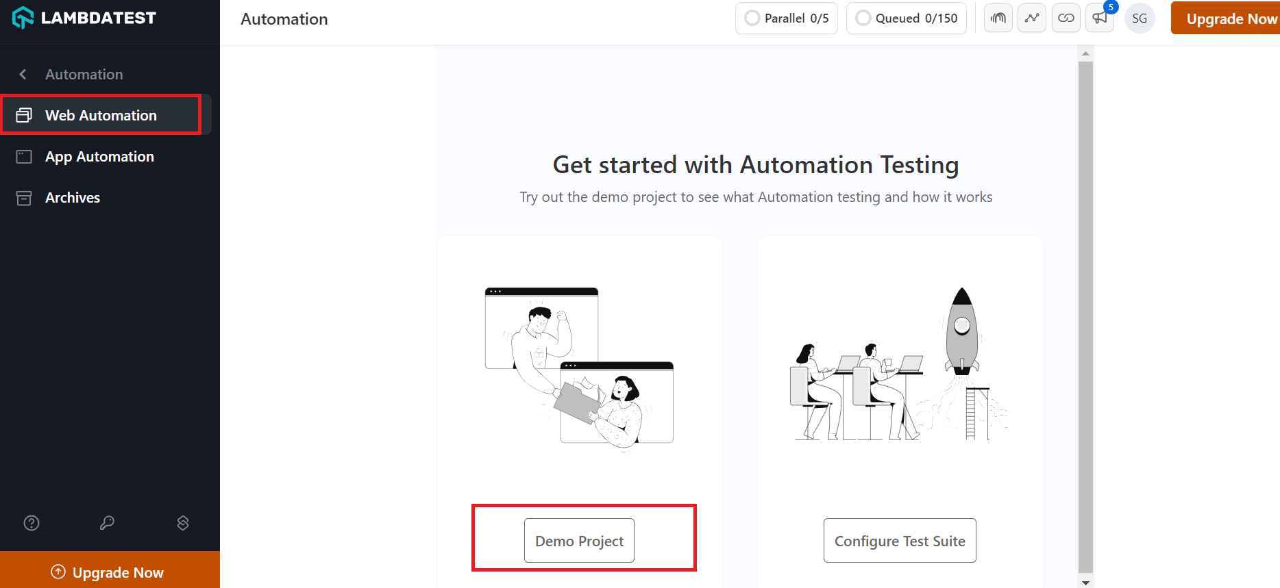
- Log in to your LambdaTest account.
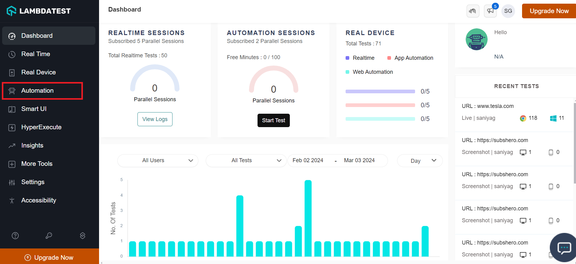
- Navigate to Automation from the left sidebar menu.
- Select Web Automation from the left menu and select Demo Project.
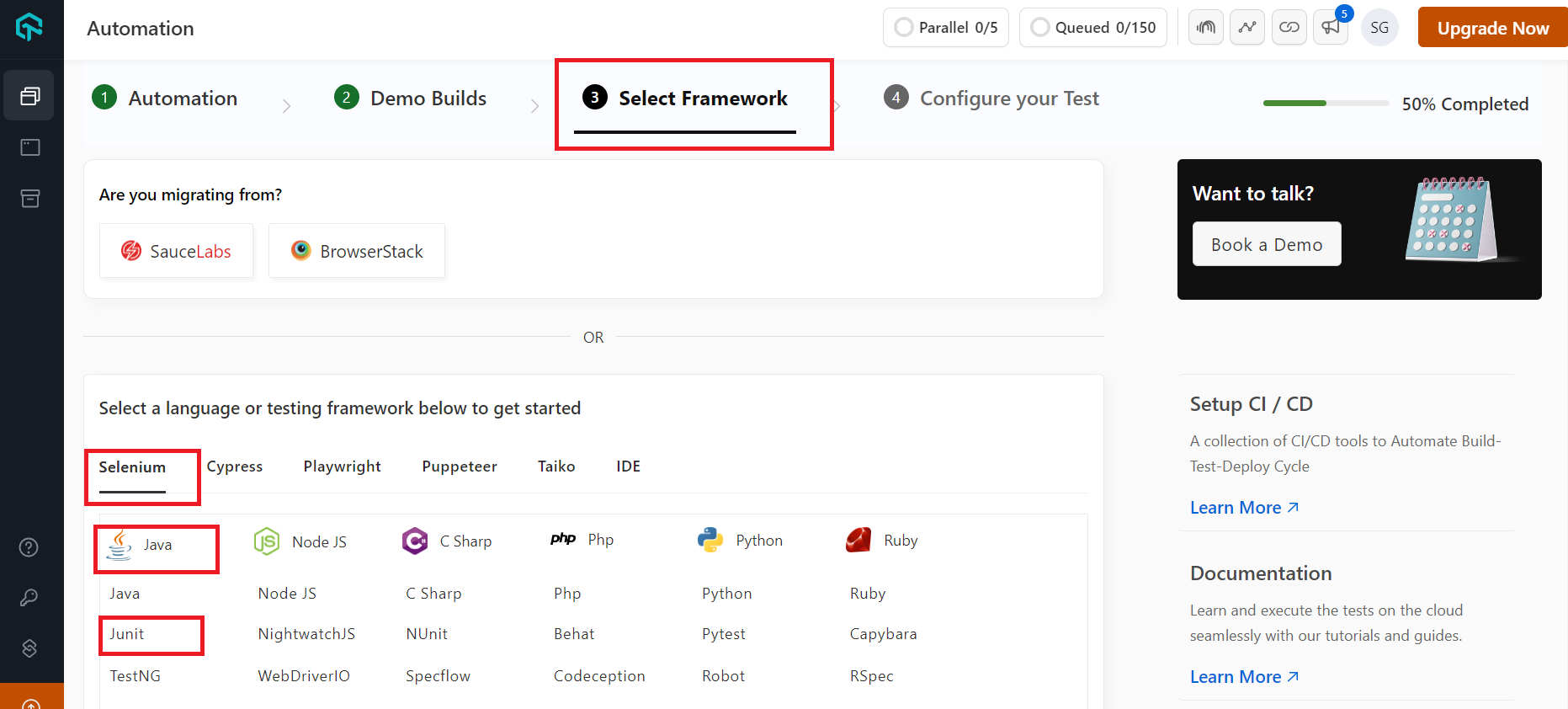
- Choose Framework Tab, then choose the preferred automation framework to test your website or web app for browser compatibility.
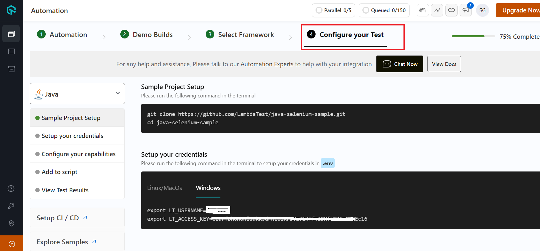
- Now, you can configure your required tests and start testing your application.
Also, watch our complete video on how to perform automation testing on the LambdaTest cloud.
You can also subscribe to our LambdaTest YouTube Channel to get the latest updates and learn about software testing topics like Selenium testing, Cypress testing, mobile app testing, and more.
In addition, LambdaTest also enables you to perform browser compatibility testing on locally hosted web applications for unpublished or under-development websites. We can create a CSS Grid and focus on that specific Grid on various browsers rather than analyzing the completed website, as more elements can distract us from minor bugs.
Wrapping Up!
CSS browser compatibility issues are an ongoing challenge for web developers working with CSS. There are many different browsers and versions in use, so it’s crucial to be aware of any such CSS browser compatibility issues and take action to fix them before release. These problems can be reduced by utilizing cross-browser-compatible CSS frameworks, using different CSS tips and tricks, and maintaining coding best practices. Moreover, identifying and fixing CSS browser compatibility issues before they impact end users can be accomplished by testing and debugging across various browsers and devices.
Developers can help ensure that their web interfaces are usable and accessible for all users, regardless of their preferred browser or device, by being aware of CSS browser compatibility issues and taking proactive measures to address them. This article helps you tackle CSS browser compatibility issues and will help you stay informed before you begin your app development journey! I hope you find this article helpful. For any questions, please drop a comment.
Happy Testing!
Frequently Asked Questions (FAQs)
When do CSS browser compatibility issues occur?
CSS Browser compatibility issues occur when the same CSS code is interpreted differently across various devices and browsers. Differences in rendering, layout, and functioning may be among these issues.
How can I prevent CSS browser compatibility issues?
The use of CSS frameworks that support cross-browser compatibility, adherence to best practices for writing CSS code, testing, and debugging across several browsers and devices are a few measures developers may take to prevent CSS browser compatibility issues.
How do I address CSS browser compatibility issues on my website?
The conventional approach to resolving CSS browser compatibility issues is to pinpoint the specific problem and apply a focused remedy, such as utilizing CSS workarounds or hacks, using polyfills for unsupported capabilities, or using feature detection to give an alternative interface for older browsers.
Why does CSS behave differently on different browsers?
CSS behaves differently on different browsers because each browser has its implementation of the CSS specifications. This can result in variations in how the browser interprets the CSS code and renders the web page. Additionally, different browsers may also support different CSS features or versions.
How do I make my CSS compatible with all browsers?
To make CSS compatible with all browsers, use standard CSS code that adheres to the latest CSS specifications, test your website on different browsers, and use vendor prefixes to ensure compatibility with specific browser versions. Additionally, you can use CSS reset or normalize.css to ensure consistent styling across browsers.


Author’s Profile
Mythili Raju
Mythili R works as a content writer and digital marketing executive at LambdaTest. Having been previously trained in Content and Social Media Marketing, she loves delving into the latest tech trends and sharing her insights.
Blogs: 15
Got Questions? Drop them on LambdaTest Community. Visit now