
15 Best CSS Trends To Watch For 2024
Mehul Gadhiya
Posted On: March 1, 2024
 52158 Views
 14 Min Read
The days are long gone when a viewer’s attention is quickly captured by a simple and plain HTML website. The trend has changed and moved more towards animation and graphics with several upgrades to technology and design. When you develop a website, it requires both creative and technical skills. Things like layouts, animations, and graphics can greatly overhaul your website’s look and feel.
As you already know, Cascading Style Sheets, or CSS, is an ideal way to spice up your web design. It is a fundamental technology that allows developers to control their websites’ or web apps’ layout and visual appearance.
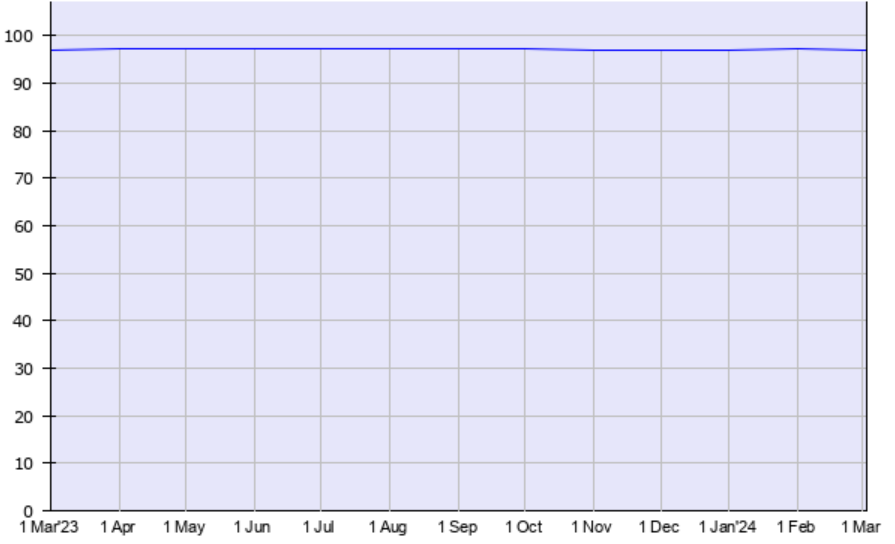
According to W3Techs, as of March 2024, approximately 97% of websites use CSS, which itself shows it is an integral part of modern web design.
As web development evolves, new CSS trends are emerging to help developers create more visually stunning websites. From responsive design and animation to new techniques and styling, CSS trends are constantly changing and adapting to meet the needs of modern web design. Since CSS trends are cyclical, it’s reasonable to assume that by 2024 there will be some new CSS trends in web development.
In this article, discover the best 15 CSS trends to look for in 2024. These trends will help you create visually stunning responsive designs by unleashing the power of CSS.
TABLE OF CONTENTS
How does CSS help your website?
CSS stands for Cascading Style Sheet. It is a language for creating a Style Sheet that describes the layout and formatting of a document written in a markup language. It works with HTML to modify the look and feel of online pages and user interfaces. Any XML document type, including plain XML, SVG, and XUL, can be used with it.
With the help of CSS, you can make changes to old HTML-written documents or create a new style with the CSS codes. Here are some benefits CSS offers to your website.
- Before, tags, such as font, color, background, etc., were repetitive in websites, and CSS was developed to solve this problem.
- Help you create a consistent design across multiple web pages and offers reusability to use styling on different elements and websites.
- CSS offers more specific attributes than plain HTML to define the website’s look and feel.
- Provide visual cues to improve the website’s accessibility.
- Boost website SEO by presenting the digital content clearly and concisely.
2024 CSS Trends to Follow
Now you have got a gist of CSS and its benefits, let’s start with our list of best CSS trends for 2024.
Note: The browser compatibility data herein have been taken from CanIUse.
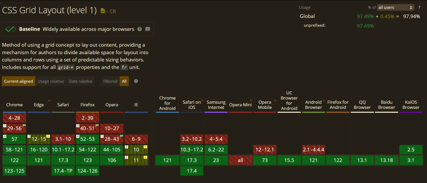
1. CSS Grid
CSS Grid is a powerful layout module that allows you to create sophisticated responsive grid layouts. It’s fully supported by modern browsers and is gaining popularity among web developers. This amazing CSS trend can handle both rows or columns easily.
Subgrid is a handy feature that has been added to the Grid Layout. You can create a Subgrid using the Subgrid feature that will mimic the layout of its parent grid. The child grid chooses its dimensions and gaps when nested inside another grid display. The layout of the parent grid is applied to the Subgrid, although the Subgrid can still override certain parts if necessary.
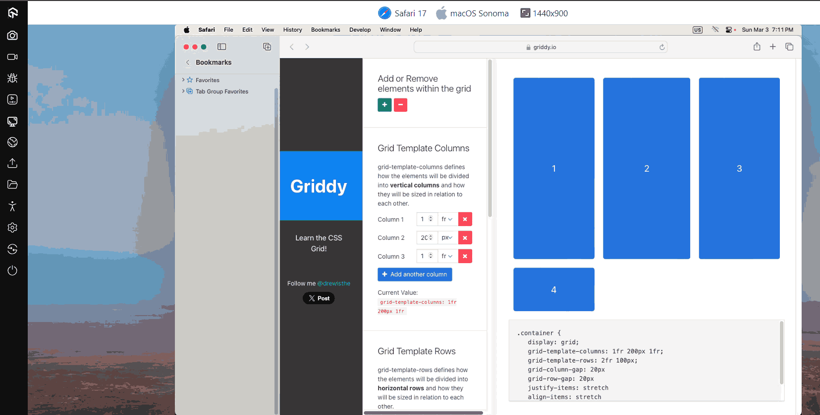
Browser Support: 97.94%
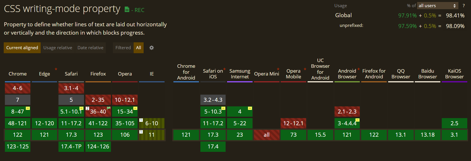
2. CSS Writing Mode
Depending on the language, the CSS Writing Mode property adjusts the text’s alignment so that it can be read either from top to bottom or from left to right. Say, for instance, that we wish to add some text that is read from left to right and from top to bottom.
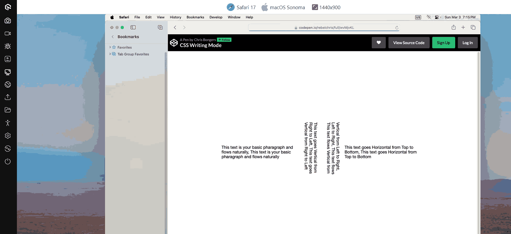
This is helpful for languages where the text is frequently positioned vertically, like Chinese, Japanese, or Korean. You’ll likely want to employ this quality in English for aesthetic reasons with the help of this CSS trend.
Browser Support: 97.90%
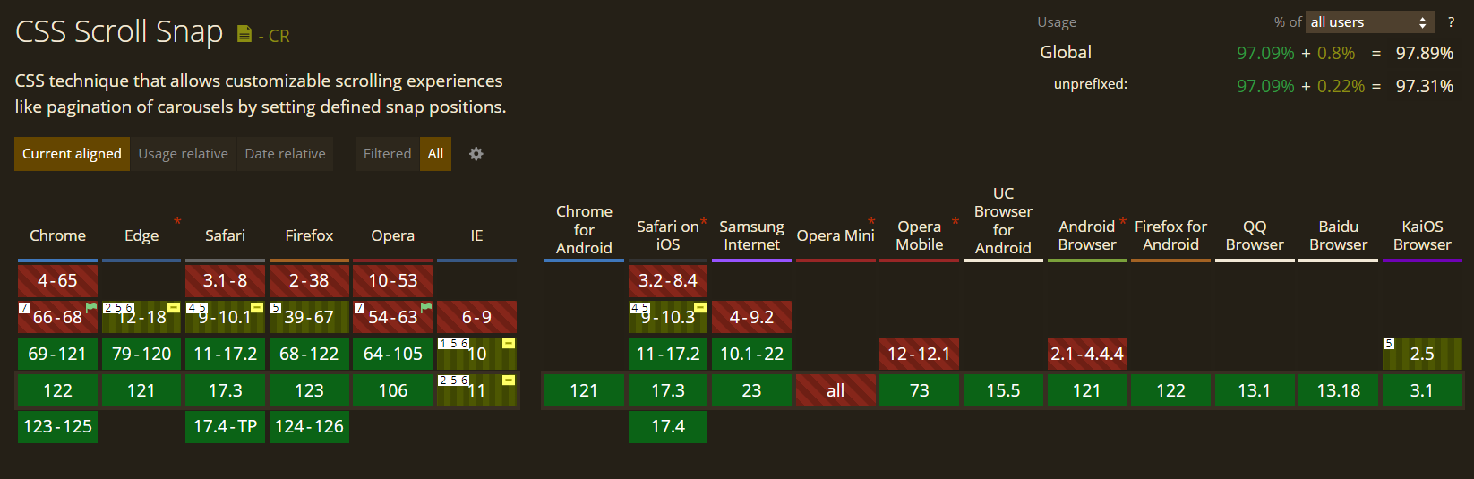
3. Scroll Snap Behavior
To control a web browser’s CSS scroll snap behavior, CSS offers a valuable collection of attributes. Some of this functionality has been there for extended, but more recent browser versions are just now getting access to others. The best thing about this CSS trend is that just one-third of CSS users know about it.
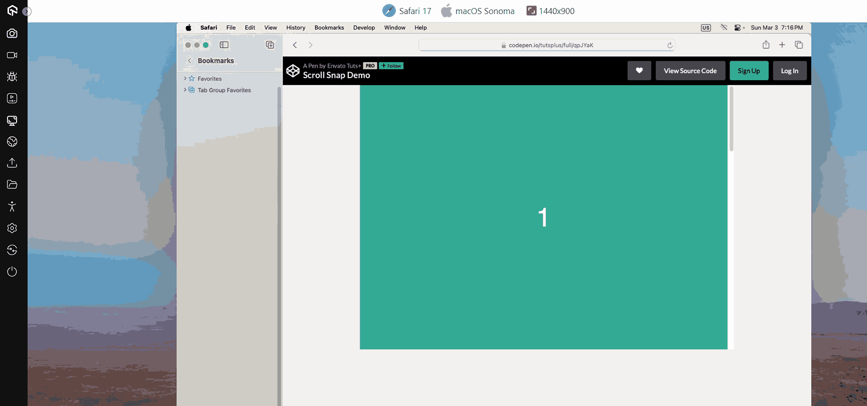
Using the scroll-snap-type property, you can modify the scroll position on a container in various ways. Developers gain greater precision while end users enjoy a smoother, more controllable user experience.
Browser Support: 97.89%
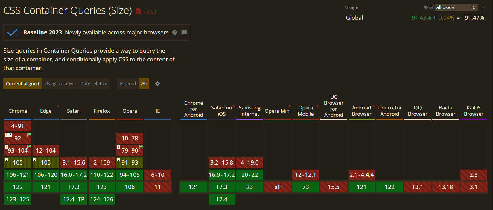
4. Container Queries
CSS has not yet fully established container queries, though they will. They’ll have a significant influence on how we perceive responsive design. The fundamental notion is that you can specify a breakpoint depending on the size of a parent container in addition to the viewport and media.
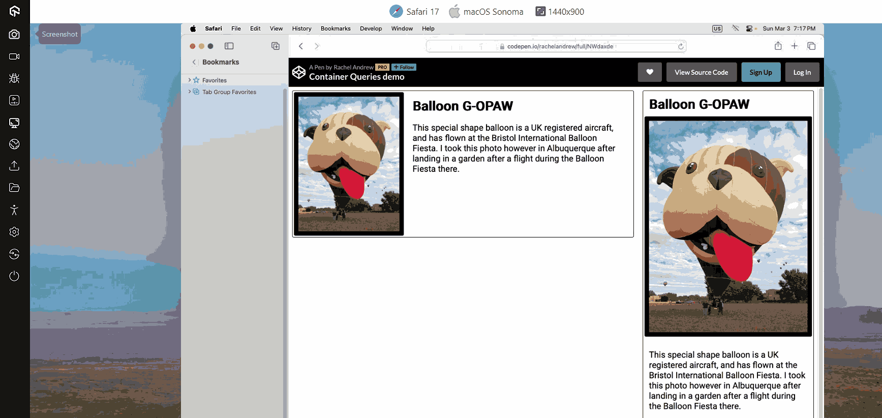
It will include adjusting a layout based on the dimensions of various containers that appear throughout the nested layers of a user interface. Rather than a CSS trend, CSS Container Queries is a significant move that will probably spark a wave of UI enhancements.
Browser Support: 91.47%
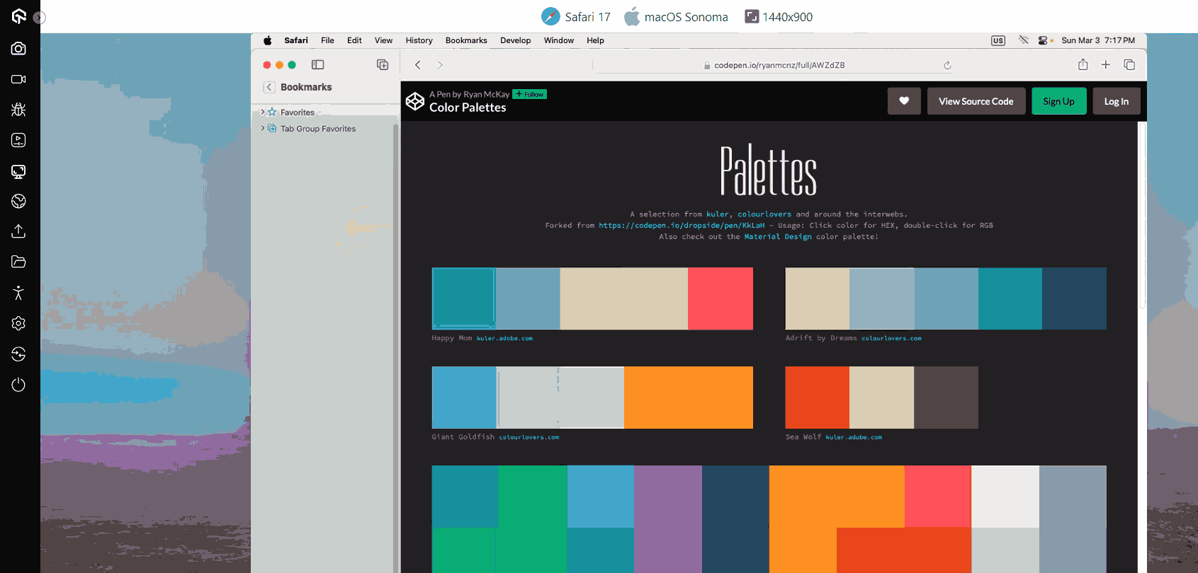
5. New Color Palettes
CSS practitioners are already using RGB to beautify web pages. Recently CSS introduced three new color pallets HWB, LAB, and LCH.
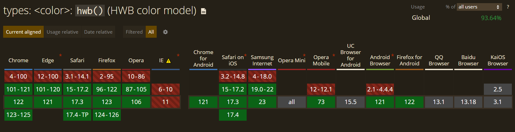
HWB: It is an acronym for Hue, Whiteness, and Blackness. It’s an easy feature for people to read: you choose a color and then add white and black. Recent releases of Chrome, Firefox, and Safari all support it.
Browser Support: 93.64%
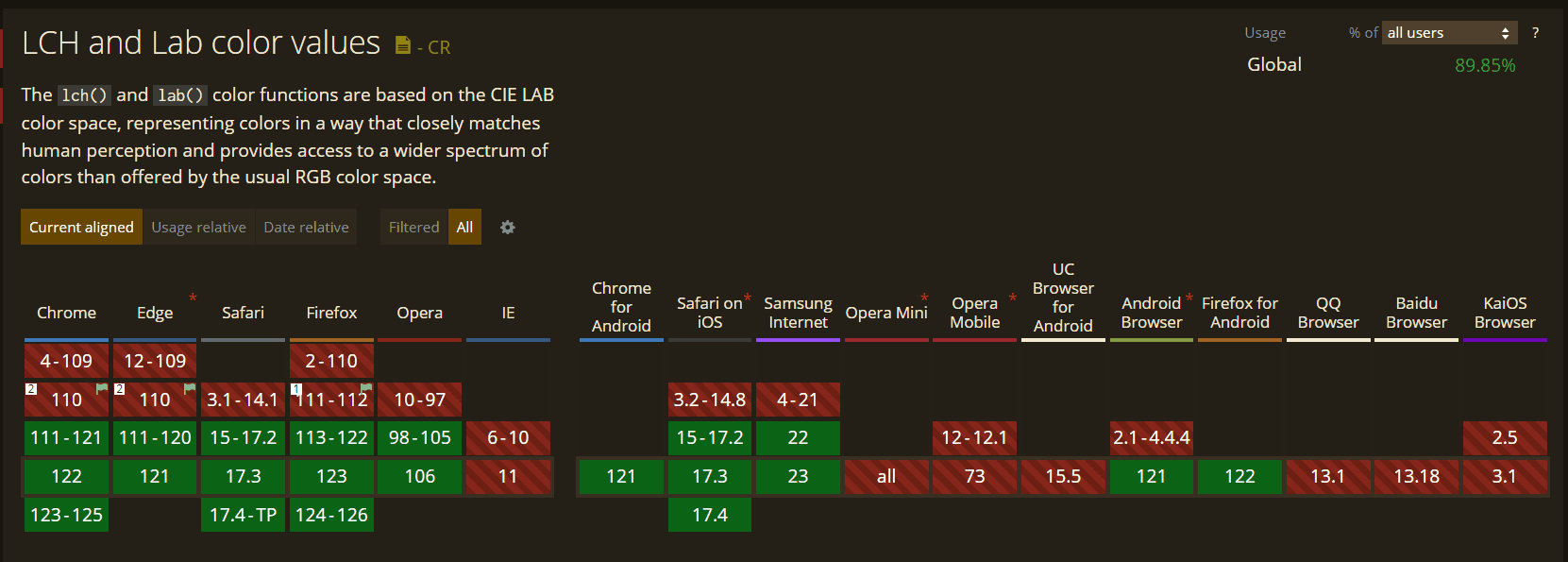
LAB: It is created from CIA LAB color theory and is considered the most theoretically complex of new color spaces. It is a bold claim that the LAB color descriptor includes all colors humans can perceive. Only Safari is now compatible with this CSS trend, just like LCH.
LCH: It stands for Lightness, Chroma, and Hue and is renowned for broadening the palette of colors that are accessible. Safari only supports LCH.
Browser Support: 89.85%
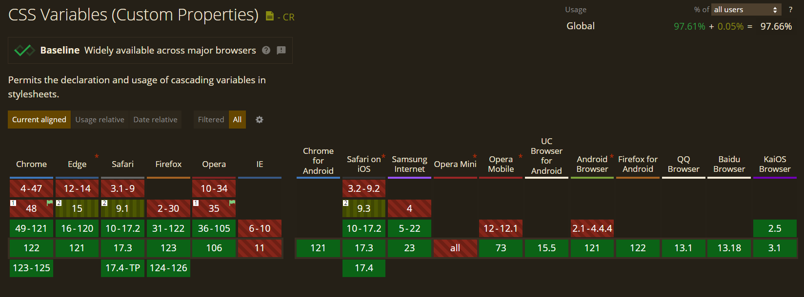
6. CSS Variables
CSS Variables, also known as CSS Custom Properties, has been a popular CSS trend in the market since 2015 and are now getting more and more attention from CSS users. CSS Variables allow you to store and use a value elsewhere in the HTML code. It helps to remove redundancy in codes, flexibility, and improve the readability of codes.
Browser Support: 97.66%
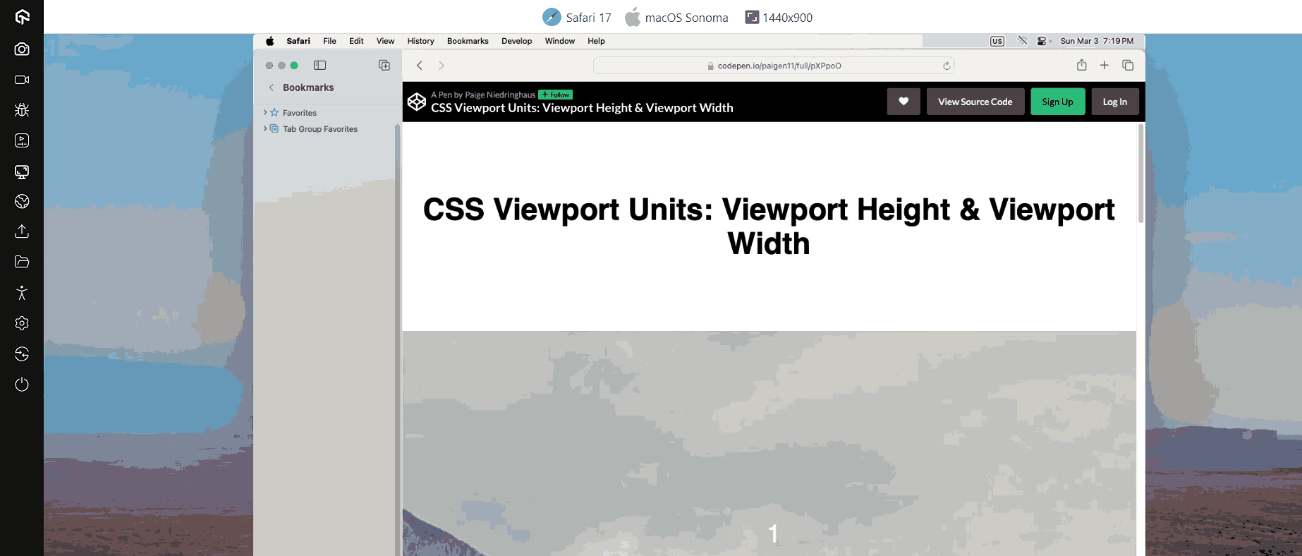
7. Viewport Units
Setting viewport units is a hassle for everyone who has attempted to code a website for Safari on iOS. The mobile browser shows containers set to a size in the unit vh as being smaller than they should be.
You need to use a script that automatically resizes the container to get around this bug. Other than the inconvenience of loading a new script, some workarounds harm Chrome users.
Thank goodness CSS now supports new relative lengths and viewport specifications. A few of these are “vw”, “svw”, “lvw”, and “dvw”. These measurements are 1% of the width of the small, large, and dynamic viewport sizes and the UA-default viewport size.
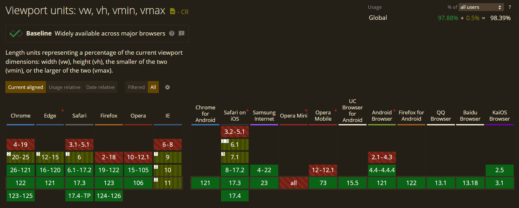
Browser Support: 98.39%
8. Cascade Layers
If the next element in the cascade has a greater level of specificity, CSS overrides style changes to the first element. Due to the vast codebase, this problem is always present in large projects. Here CSS Cascade Layers come in.
Cascade Layers give developers better flexibility over themes, frameworks, and designs to utilize the cascading system fully. Cascade Layers provide direct manipulation and administration of the underlying cascade logic, in contrast to the original cascading centered around heuristics.
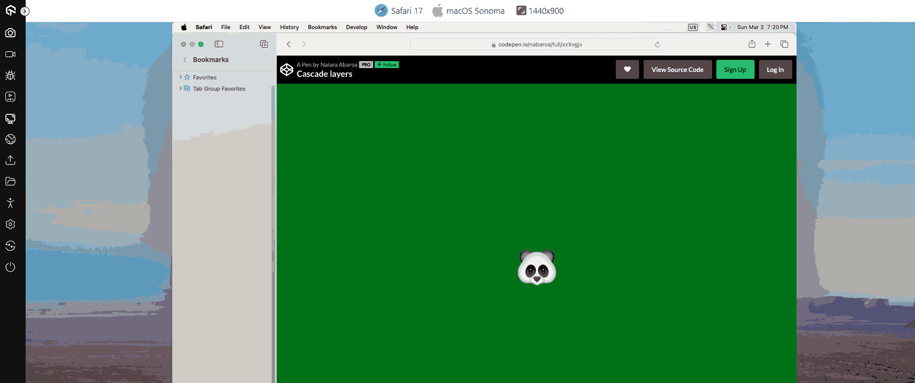
This CSS trend will ensure that the components won’t always adhere to the base styles by adding a second layer to the cascade to define style variants. Instead, components are produced in accordance with the rules written on the layer and the established hierarchy of the layers.
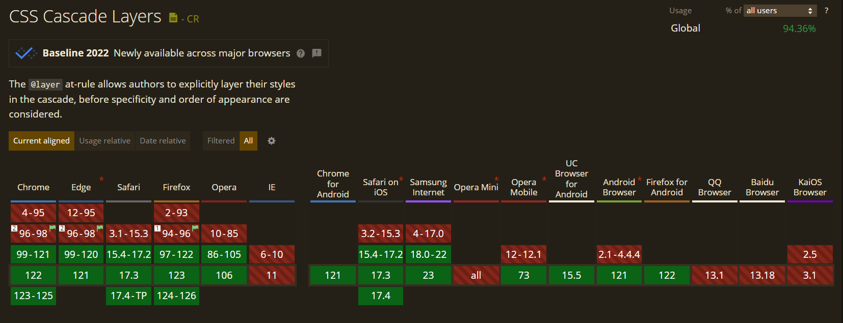
Browser Support: 94.36%
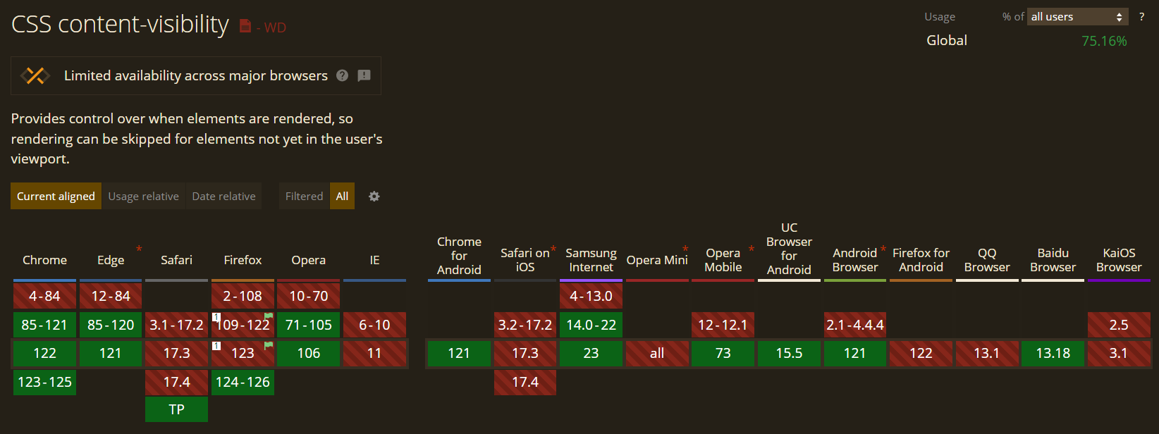
9. Content Visibility
Content Visibility property in CSS helps to speed up the rendering of content on the web page so users can interact with the content while the rest of the page is loading. With the help of this property, developers can command browsers which part of the page has isolated content. In return, it helps browsers to optimize web page content with delayed calculation.
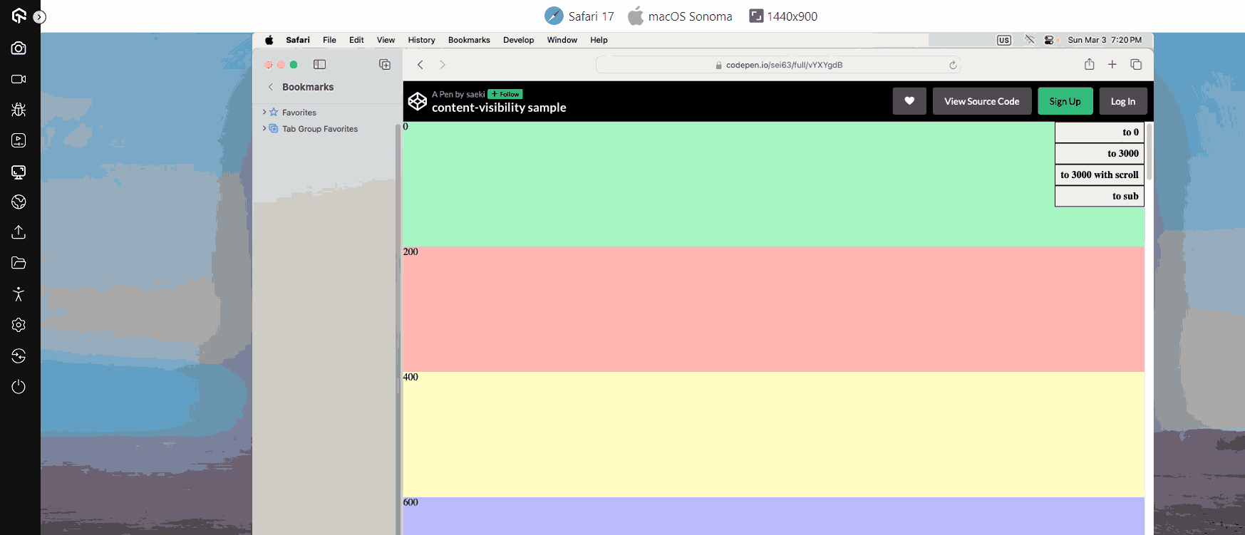
Content Visibility is dependent on the CSS Containment Spec’s primitives. So far, only Chromium 85 supports content-visibility property; however, the CSS Containment Spec is supported on all major browsers.
Browser Support: 75.16%
10.Gap
Gap property is an emerging CSS trend that helps to define a gap between a row and a column, formally known as a grid gap. It serves as an alternative for the following characteristics.
- Row-gap
- Column-gap
We utilize the gap attribute with a single value to indicate the same space between rows and columns. If there is a difference in the distance between the rows and the columns, we utilize the gap function with two values, first defining the distance between the rows and then the columns. You can utilize two properties, row-gap, and column-gap, to make the code more transparent and understandable.
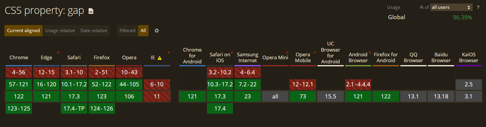
Before the gap property, the designer needs to use the margin property with certain limitations, such as adding an indent between the element and the edge of the container. In contrast, the gap attribute allows you to specify the indentation between items without using such hacks and gimmicks and instead merely relying on the language’s fundamental constructs.
Browser Support: 96.39%

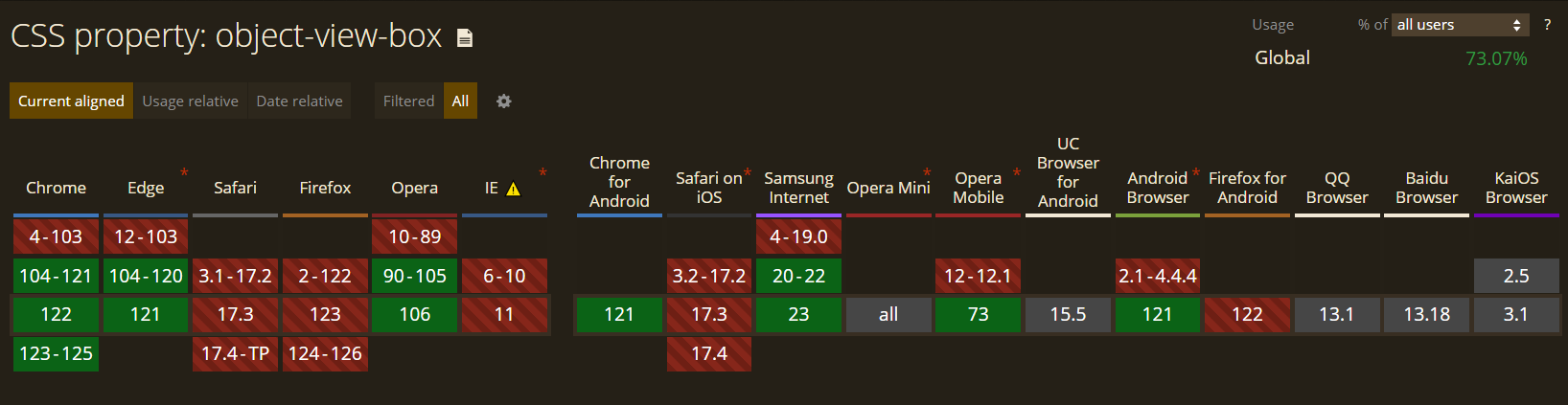
11. Object View Box
Another CSS trend in our list is the object-view-box property. It enables a web page only to show the designated area of an image or video. It has a result that is roughly comparable to the viewBox SVG attribute. The object-view-box property will come in handy when you only show a piece of an image or video for distinct elements or at different resolutions. Additionally, it can be used to pan and zoom pictures and movies.
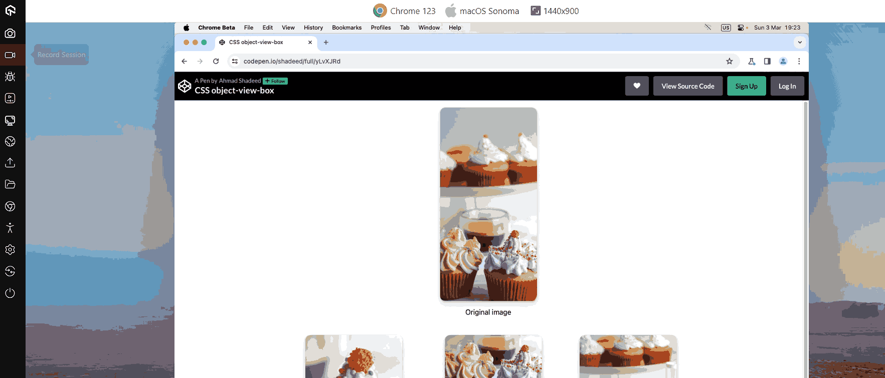
Before the object-view-box property, cropping problems with images or videos had to be solved by placing and resizing the content inside a wrapper element with the “overflow: hidden;” attribute. It can be done by adding the top, bottom, left, and right values within the code.
Browser Support: 73.07%
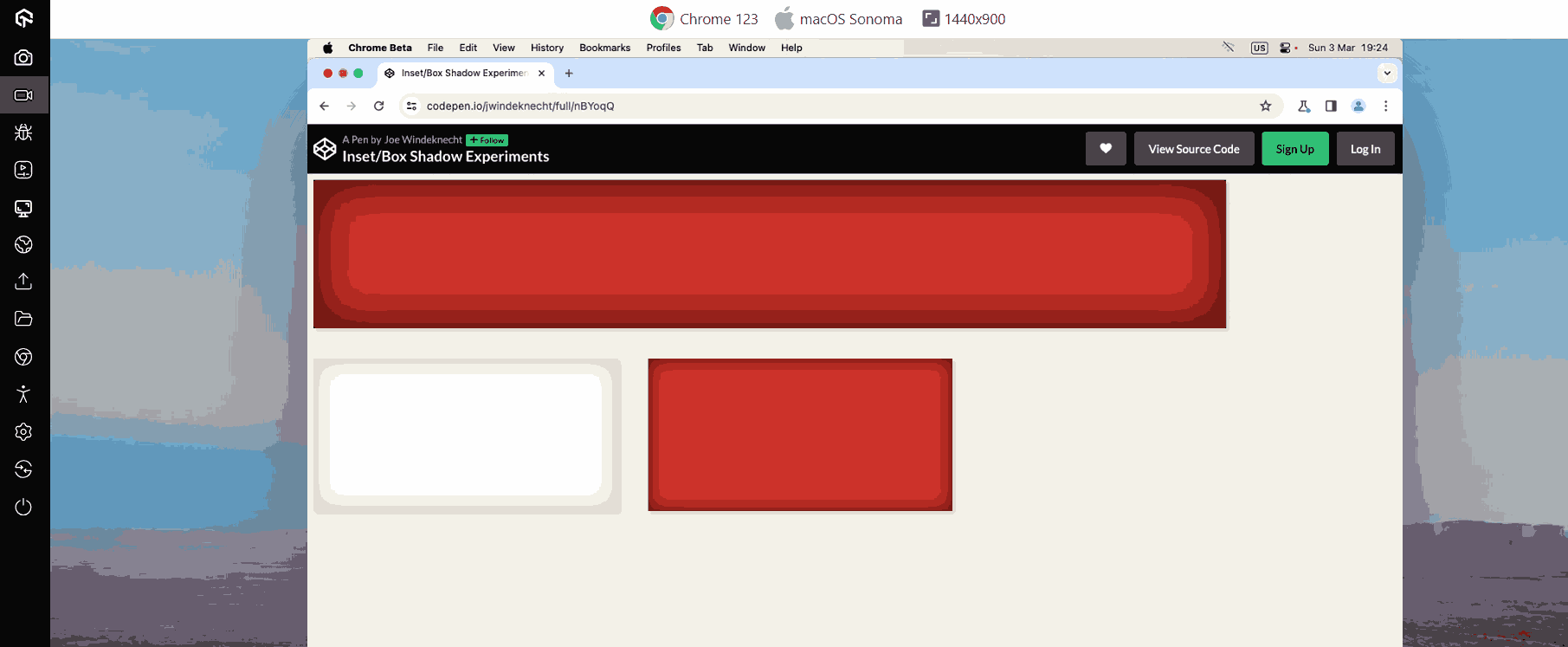
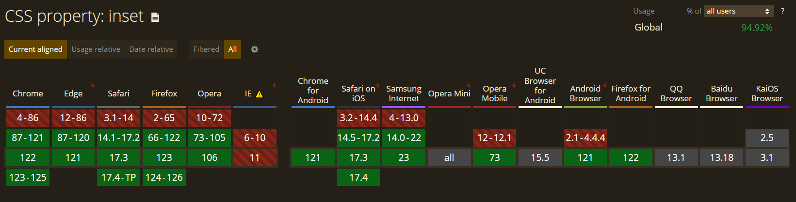
12.Inset
The Inset property helps to set the distance between the element and the parent element. It replaces the four properties: Top, Right, Left, and Bottom, and allows you to see the inset of the elements from all four sides in a single command. CSS Inset property requires adding all four commands for positioning.
Browser Support: 94.92%
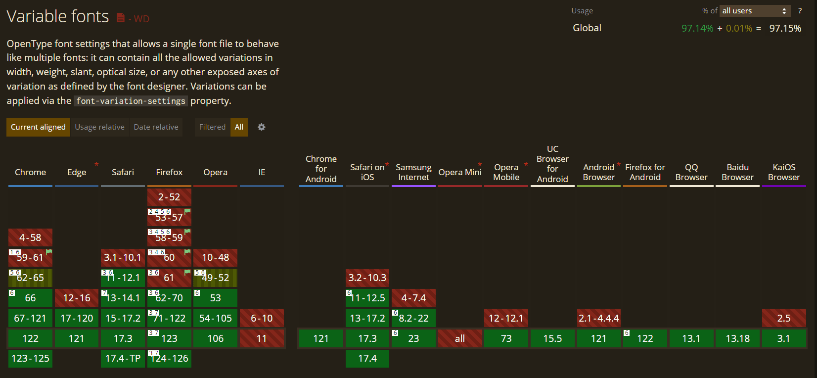
13. Variable Fonts
Variable Fonts allow many variations of a typeface to be integrated into a single file Instead of having a separate font file for each width, weight, or style. It is an evolved version of the OpenType font specification.
Although Variable Fonts can be used just like regular ones, they have much more to offer. The font-weight property for standard fonts accepts values from 100 to 900, while for Variable Fonts, it accepts any integer between 1 and 999.
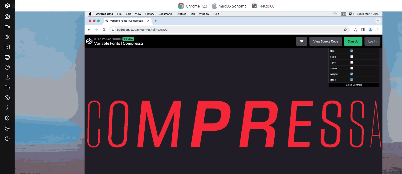
While the font-style property for regular fonts accepts two values for normal and italic, for variable fonts, you can specify an oblique angle ranging from -90 degrees to 90 degrees for variable fonts. Variable Fonts have a font-stretch feature that ranges from 50% (for narrow typefaces) to 200% (for broad typefaces), where the standard proportion is 100%. The font-optical-sizing attribute, which alters a font’s appearance based on size, is another.
Browser Support: 97.15%
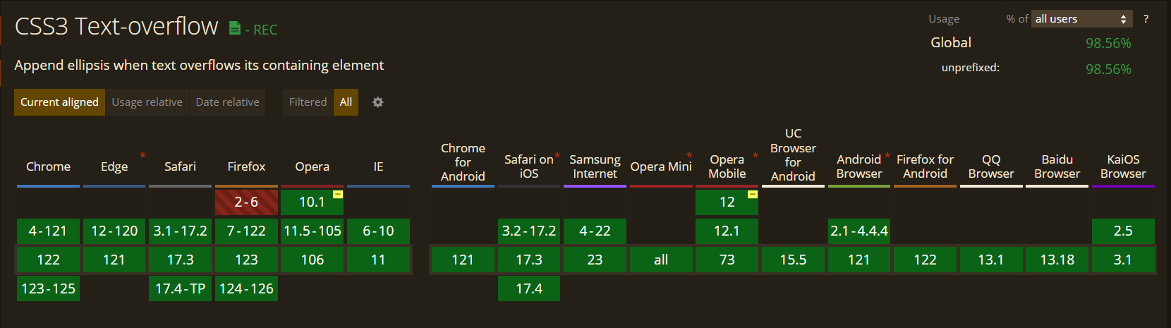
14. Text Overflow
In CSS, the text-overflow property is used to indicate that specific text has overflowed and is now hidden. When you add this property, overflowed content will be trimmed, and a custom string or ellipsis will get visible on display.
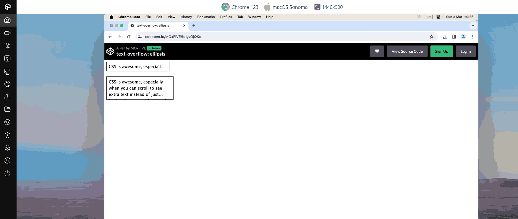
One thing to keep in mind while using the text-overflow property is white space property must be nowrap and the overflow property set for hidden.
Browser Support: 98.56%
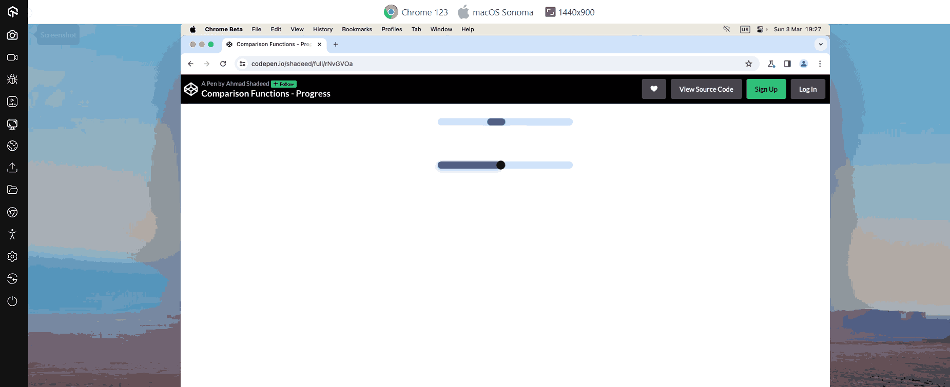
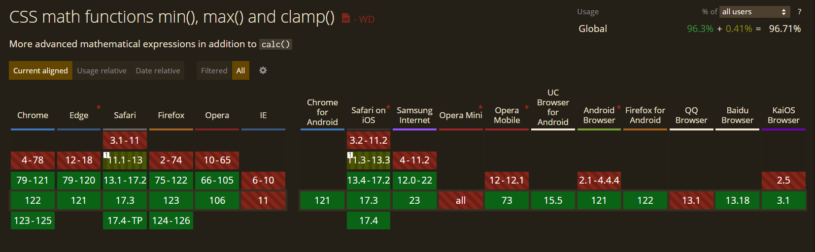
15. Comparison Functions
Comparison functions are used to build a responsive website with fewer codes. It has functions such as “clamp(),” “min(),” and “max()” used to define upper- and lower-bound values, compute and compare the values of the inputs supplied to the function, and then apply the calculated value to the property.
- clamp() function: This function requires three parameters: a central, preferred, and maximum value. clamp() compute the value of a property based on central value.
- min() and max() function: The min() determines and applies the value from the range that is the smallest. Similarly, The max() function determines and applies the greatest value from the range of values given.
The central value will be applied to the element if the calculated value is between the lowest and maximum. The minimum or maximum will be used if the estimated value is below the minimum or exceeds the maximum.
Browser Support: 96.71%
Test your CSS Container Queries across 3000+ real browsers and OS. Try LambdaTest Now!
How to test CSS properties for browser compatibility?
As the CSS library is launching new features and properties, it brings new daily challenges for web developers to make website browsers compatible. It is essential to check that every CSS property you use for your website is working and supported in every browser.
AI-powered test orchestration and execution platform like LambdaTest allows you to test your website and mobile apps and their associated CSS properties for cross browser compatibility on over 3000+ real browsers, devices, and OS.
Subscribe to the LambdaTest YouTube Channel and stay updated with the latest tutorials around Selenium testing, Cypress testing, and more.
With the LambdaTest platform, you can:
- Perform an automated browser testing for your website on the LambdaTest cloud that supports all major automation testing frameworks such as Selenium, Cypress, Playwright, and many more
- Run your test in parallel to cut down test execution time by multiple folds.
- Integrate with the most popular CI/CD tools such as Jenkins, CircleCI, Travis CI, and many more.
If you are keen to learn about different CSS properties, check out this CSS Cheat Sheet.
Conclusion
These are just a few CSS trends we will likely see in 2024. While other trends may also arise, following these should help newcomers. The transition to multi-column layouts is already in full swing, and the move toward responsive interfaces will speed up rapidly as we move into 2024 and beyond.
We’ve only highlighted the best of the top CSS trends here, but don’t be surprised if others emerge as we get further into the next decade. No matter what happens, one thing is certain: CSS will never go out of style. Designers may change their opinions, but they will never disappear entirely—and that’s a good thing!
Frequently Asked Questions (FAQs)
Is CSS still used today?
Yes! HTML and CSS are coding languages that are somewhat “old.” However, in 2024, they will still be quite important for programmers. Professional programmers can benefit from having a basic understanding of HTML and CSS, but people in a wide range of professions can also benefit from having this expertise.
What are the three types of CSS3?
The following list of three CSS types includes CSS inline. Embedded or internal CSS and External CSS


Author’s Profile
Mehul Gadhiya
Mehul works as a content writer and executive in digital marketing for LambdaTest. He has a Mechanical Engineering degree and a keen interest in emerging technology. He enjoys writing about a variety of subjects, including the latest technological advances.
Blogs: 7
Got Questions? Drop them on LambdaTest Community. Visit now