
An Ultimate Mobile Experience Drives 73% Of E-Commerce Sales
Micheal Kelley
Posted On: May 28, 2021
 21029 Views
 9 Min Read
If you think your users primarily use desktop computers to do their online shopping, it is time to rethink the importance of mobile experience for e-commerce websites.
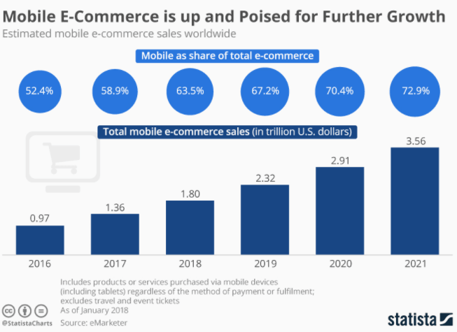
First, let’s talk about e-commerce growth! As per a survey conducted by LambdaTest, the COVID-19 pandemic has resulted in a 223 percent increase in online shopping. Though the survey was conducted for the UK market, the e-commerce growth story is largely a global one. That’s not all, the portable and handy mobile phone is now becoming the primary mode of online shopping.
Mobile e-commerce, popularly called m-commerce, encourages mobile user trends such as buy now, pay later. In the total scope of e-commerce revenues in 2021, mobile has surpassed the desktop, making 79% of all traffic. Mobile e-commerce is poised for further growth, especially after the COVID-19 pandemic struck the world. It’s not surprising that 73% of e-commerce sales in 2021 would happen over mobile phones and that number will continue to rise with each passing year.
Smartphones are not only easily accessible but also provide versatile options to engage users in ways impossible on desktops and tablets.
Your task is to improve the mobile experience for e-commerce websites by reshaping the user journey, maximizing the power of better-designed stores, and completing analytics research to see how the site performs before reworking it for optimal mobile user experience.
Developing a mobile app for your brand gives additional opportunities to increase revenues. As they say, numbers don’t lie! Mobile optimized web experience not only enhances the experience but also drives increased sales & conversions.
Recreating The User Journey For M-Commerce Experience
Mobile users don’t use smartphones in the same way desktop users do.
Think of the size of the device: it is smaller, and thus it limits visuals that can be better viewed on a larger screen.
A key principle of mobile app design is not to overwhelm the user with stuffing data on the mobile screen but still keep them engaged. The mobile store should give the impression that it was designed with mobile-first in mind, even if that weren’t the case.
Adapt the mobile e-commerce journey by improving product presentation. Don’t skip on image quality but think of how users navigate to the product description.
Use pop-up screens for incorporating seamless product categories, product carousels, image galleries, and related products. 3D images can compensate for the lack of space – users love them.
Add smart search for products. Help the users find what they need, choosing search filters carefully. Shopify has excellent examples of search filter features that will help you attract customers and analyze their buyer’s behavior to boost conversions.
There is only so much space on mobile. Therefore, think hard about placing extra buying incentives and links to other pages.
If initial impressions count for all websites, for mobile e-commerce experience, they matter more. Even if your products rock, a poorly designed customer journey map can increase churn rates.
Why Mobile Experience For E-commerce Sites Matters?
The downside of limited space that restricts creativity requires more skills and time to develop a smooth m-commerce site. However, the advantages by far outweigh it — mobile-first design has significant benefits for e-commerce:
- Designing and prototyping your website for the mobile user will appeal to the majority of users.
- Responsive testing will help you fix bugs down the line when you expand to a desktop browser.
- Faster loading times boost SEO, especially if you keep the code dense and the site lightweight.
- Mobile-first design helps with integrating the best from virtual marketplaces (Amazon, eBay) and their many attractive selling points.
Tip: Minimize redirects for seamless navigation.
Best Practices For Mobile ECommerce UX
First impressions are usually long-lasting and can either make or break your customer journey. From our research, 32% of respondents stop shopping with a retailer after a poor online shopping experience with that retailer. Now, this is a huge number that can affect your online e-commerce sales in the long run. However, you need to mitigate the chances of bad customer experience on your mobile websites by focussing on these essential tips! Let’s go.
Read More: 12 Mistakes In An E-commerce Website That Affect Online Sales
Here are the few of the best practices for Ecommerce mobile UX:
1. Seamless Navigation
Shopping on mobile websites is on the rise as 76% of the shoppers use mobile phones to shop as it saves time. However only 12% of users find shopping on the mobile web convenient! This is where mobile experience plays a crucial part, as you need to ensure that the overall shopping experience for the user is smooth and fast.
The best way is to create friction-free navigation, right from the product search to checkout. Improve search by adding contextual search filtering or auto-fill search to make a difference in the user experience. Disable unnecessary distractions like non-adaptive pop-ups, multiple form fields, non-responsive payment gateways, and infinite scrolling! Faster the navigation, faster the checkout!
2. Optimizing Images & Fonts
Shoppers use mobile devices for convenience and you need to make the most out of that time! You need to ensure that mobile websites are not a strain on users. Optimize images and fonts for the smaller real-estate. Using larger fonts that are easier to read, keeping them short and more engaging can lead to better conversions.
For images, use high-quality images that are responsive so that the user doesn’t have to pinch in every time to understand the product details. Use image formats that are faster to load, like WebP, or use lazy loading techniques for images that help to reduce the load time. In the end, it’s all about convenience!
3. Improving The Core Web Vitals
Users can get frustrated if your page loading time is higher or pages are loading when scrolling down! This creates a barrier in the overall user experience while browsing on the mobile e-commerce website.
It’s highly recommended to improve core web vitals score by reducing the Cumulative Layout Shift (CLS) for your e-commerce website. Reducing CLS loading time will help improve SEO and provide an enhanced user experience. The users no longer need to scroll down on the product page.
4. One-Tap Payment Methods
Bernard Institute research states that 18% of the users abandon due to a lengthy checkout process while 17% leave the website due to lack of payment security. A hassle-free transaction can create a long-lasting impression for mobile users as ultimately it leads to a better user experience.
The idea is to make payments and checkout easier by giving multiple options right from Debit to Credit cards, wallets, and tap payments like Apple Pay or Samsung Pay. Offering various payment options has tangible benefits!
Offering multiple #mobile payment options has tangible benefits:
🔹 lower checkout abandonment
🔹 happier customers
🔹 higher levels of securityNo time to wait then – improve your #mobilepayment game!
👉https://t.co/03M8OPaUOk pic.twitter.com/pDbxrfDf6n— Pawel Ogonowski (@p_ogonowski) November 4, 2020
5. Testing for Mobile view of websites
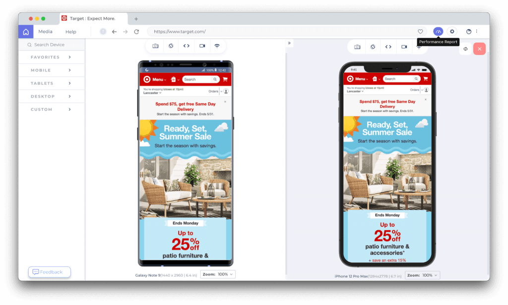
Mobile-first design is no longer an alien term for e-commerce providers. Over the years, there has been a rapid rise in mobile users across the globe. Thus mobile website testing is a critical approach while building your website. Andiphone emulator online is a non negotiable part of website building
The complexity lies in providing a seamless user experience across the wide range of browsers and mobile devices. This can be a bottleneck for your time to market (TTM) and can further lead to a sub-standard user experience. You can be a notch above the competition by testing mobile view of website across the plethora of mobile screen sizes.
Developer-friendly browser like LT Browser can help you develop mobile friendly websites at a faster pace. You can perform screen resolution tests of your websites and web apps across 50+ resolutions.

With LT Browser, you can:
- Streamline UI UX development, test content placement and alignments.
- Assess visually heavy websites on different device viewports like mobiles, tablets, desktops, and laptops.
- Generate performance reports of your websites.
- Test on different network conditions.
- Debug on the go, collaborate with your team for faster fixes.
Watch out for this video to know how LT Browser works!
Impact of Mobile-First Design UX On Sales
Because of varied user experience during mobile shopping, you need to pay heed to additional phone metrics, including:
- Total mobile traffic – To gain insights about the impact of mobile experience on e-commerce sales. If you see that this metric goes up, it means you have done well and should continue to improve the mobile UX.
- Total amount of traffic on the application – Shows the portion of mobile app traffic compared to website traffic. (Check mobile app testing on LambdaTest)
- Average Order Value (AOV) – To get the average generated revenue per order to understand your customer purchasing habits. It is usually cheaper to increase AOV with cross-selling, upselling, coupons, and volume discounts than using other nurturing techniques.
- Value of orders over time – In the context of the previous metric, you need this to check the outcome you have taken to impact AOV.
Smartphones have added features such as in-app purchasing, mobile banking, and digital wallets. Multiple payment options improve the checkout experience.
Read: Mobile App-Only Approach Causing 10% Loss In Sales
Recapping Insights
Investing in the mobile experience for e-commerce websites is a smart move, no two ways about it. The challenge is to roll out successfully. The complexity grows further for large e-stores with thousands of products in the inventory. Keeping UX at the top of your mind and performing frequent testing and deep diving into the analytics reports helps gain an upper-edge in the highly competitive mobile shopping landscape.


Author’s Profile
Micheal Kelley
A professional tech writer and content strategist with an app development background. Likes to explore and write about captivating new technologies to introduce to the people.
Blogs: 1
Got Questions? Drop them on LambdaTest Community. Visit now