
Responsive Testing: With Examples and Best Practices
- Learning Hub
- Responsive Testing: With Examples and Best Practices
CHAPTERS
- Overview
- Responsive Web Design
- Challenges In Responsive Testing
- Build Mobile-Friendly Websites
- Responsive Images With HTML, CSS & More
- Checklist For Responsive Website
- Test Responsive Testing On Local Host
- Faster Responsive Testing With LT Browser 2.0
- Cross Browser Testing And Responsive Testing
- Frequently Asked Questions (FAQs)
OVERVIEW
Responsive website testing ensures that users have the best experience with your site, regardless of their device. The goal of testing responsive websites is to ensure a seamless experience across different digital devices. In this day and age, we live in a world where technology has enabled convenience, and we are now dependent on our devices to function.
Because of the growing market for mobile devices, businesses are developing strategies to create user-friendly websites. They use mobile-first design, progressive web apps, single-page applications, and more. However, for a unified user experience across devices and platforms, we need to consider screen resolutions and device capabilities.
To create highly responsive websites, you must understand the importance of testing your websites' responsiveness and develop a strategy to implement website responsive testing. This guide will teach you how to create responsive websites, and understand their significance, best practices, and more.

What is Responsive Testing?
Responsive website testing is a process that ensures your website works well on multiple devices by using CSS media queries based on the user's device where the website is accessed.
In simpler terms, responsive testing is a process that enables you to check how well a website works on various types of devices, including desktops and smartphones. A website that responds well to all screen sizes and resolutions gives your business a competitive edge over other companies.
Responsive design incorporates many elements, including media queries, flexible grids, and responsive typography. It makes it easy to build websites that adjust automatically to any screen size. While a responsive design may seem simple, incorporating it into ongoing projects is tricky; it's best to follow its principles before starting a new project.
Website responsive testing is part of the final stage of responsive web design testing. It can be performed using the same toolset as cross-browser testing, which is responsible for improving a website's UI/UX. Responsive testing ensures that your website is not only cross-browser compatible but also adjusts to screen resolution changes.
What is Responsive Design?
Responsive design aims to create websites and web applications that provide an optimal viewing experience across a wide range of devices and screen sizes. A site that is designed responsively will adjust its layout and content to fit the specific device and screen size on which it is being viewed, providing an easy-to-use and seamless experience for the user.
To create a responsive design, designers and developers use a combination of HTML, CSS, and JavaScript. Responsive design often involves using flexible layouts, grids, and images and using media queries in CSS to apply different styles based on the screen size.
Read More - Everything you need to know about Responsive Web Design.
Why is Responsive Website Testing Important?
Responsive testing of web apps is crucial at every stage of development to ensure that the end-user requirements are met. Here are the following reasons highlighting the importance to test responsive websites:
- Plethora of Devices, OS & Browsers: To ensure that your site's content is available to all visitors, verification of the content needs to be done for different screen-sized mobiles, operating systems, and browsers. While a site designed in one browser may appear as intended in another browser, it should not be assumed that this is necessarily the case.
- Need for Robustness: It is crucial to ensure that the website is loading at the same speed on different devices and browsers so that users do not become frustrated by lagging or timed-out content. If a website loads slowly or doesn't display correctly on mobile devices, users will have a poor experience. Therefore, testing a website's performance is essential for ensuring users have a positive experience on mobile-responsive websites.
- Website Navigation: When testing a mobile website, one of the most common defects found is that pages don't load as expected when navigated among the site's links. It also happens that links are missing, images are not loaded, or timed out while playing with navigation.
- Multiple Images and Videos: When creating a responsive website, it is essential to test whether all types of images and videos are displayed as expected on different phones, browsers, etc. Sometimes some videos play well on Android, but they don’t even load on iOS, or some images appear broken on some versions of a mobile operating system while they are perfect on others. Such issues will give a terrible impression if testing is not done correctly.
Advantages of Responsive Website Testing
Responsive web test is an integral part while delivering high-quality products. There are several advantages to performing website responsive testing:
- Improved User Experience: It is important to ensure that a website is fully responsive to ensure that all users, regardless of their device, have a positive and seamless experience when interacting with the website.
- Increased Accessibility: A responsive website can be accessed and used by a broader range of devices and screen sizes, which can help to expand its reach and accessibility.
- Enhanced Search Engine Optimization: Google's search algorithms give higher rankings to mobile-friendly websites, so having a responsive website can help to improve a website's search engine ranking.
- Cost Saving: Developing and maintaining a separate mobile website can be time-consuming and costly. A responsive website can save time and money by eliminating the need to create and maintain a different mobile version.
- Improved Conversion Rates: A responsive website can improve conversion rates by providing a consistent user experience across all devices, which helps to build trust and credibility with users.
Types of Responsive Website Testing
There are several types of responsiveness testing types that can be performed to ensure that a website is responsive and functions correctly on a variety of devices and screen sizes:
- Visual Regression Testing Visual regression testing is a part of regression testing that involves taking screenshots of a website on different devices and comparing them to ensure that the layout and design are consistent across all screens.
- Visual Layout Testing: Visual layout testing tools allow users to check that the website's layout adjusts correctly to different screen sizes and orientations and that all content is displayed correctly and is easily readable and navigable.
- Cross browser testing: Cross browser compatibility testing is the most significant kind of front end testing. Testers can determine if a website functions as intended when viewed using various browsers/devices/OS combinations. In addition, cross browser testing makes it possible for people to experience the same thing across multiple browsers.
- Functional Testing: This involves testing the website's functionality on different devices to ensure that all features and interactions work as expected. Functional testing evaluates the various functions of the application. It checks the user interface, database, APIs, client/server communication, security, and other components.
- Performance Testing: Performance testing assesses a product's quality and capability under varying workloads. Performance testing ensures that the system performs adequately, reliably, and with stability. This involves testing the website's performance on different devices and networks to ensure that it loads quickly and runs smoothly.
- Usability Testing: Usability testing is a technique for evaluating the user experience of a web product or service by testing it with users. This involves testing the website's usability on different devices to ensure it is easy for users to navigate and use.
Common Use Cases of Website Responsive Testing
Website responsive testing is a type of testing performed to ensure that a website or application is fully functional and provides a good user experience on a wide range of devices, including desktop computers, laptops, tablets, and smartphones. Here are some common use cases for responsive website testing:
- Verifying that a website or application is easy to use and navigate on devices with different screen sizes and resolutions.
- Ensuring that the layout of a website or application is visually appealing and easy to read on all devices.
- Testing all features and functionality of a website or application is fully operational on all devices.
- Verifying that a website or application loads quickly and performs well on all devices.
- Testing that a website or application is accessible and user-friendly for users with disabilities on all devices.
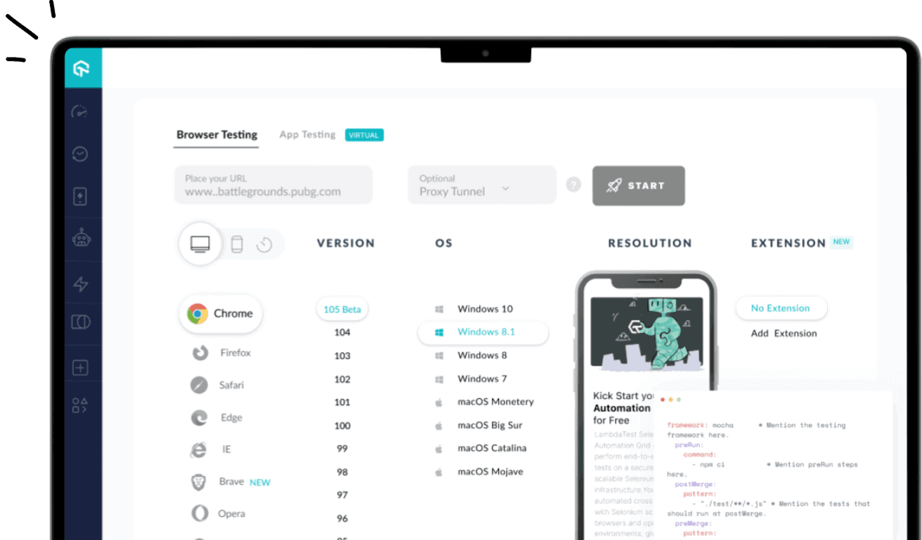
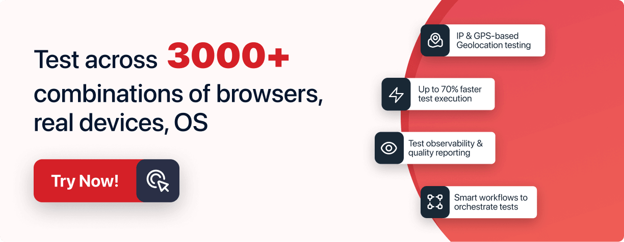
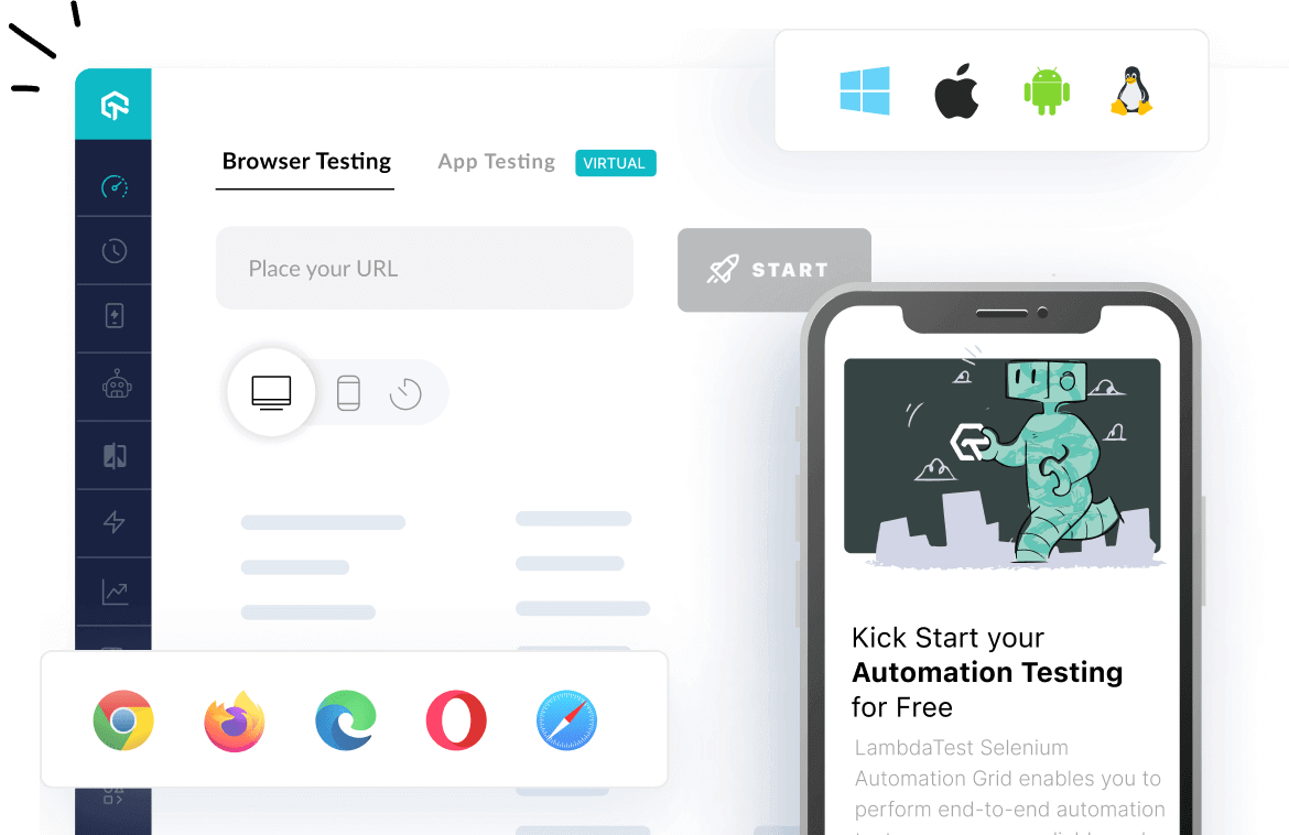
Responsive website testing tools such as LambdaTest help you test the responsiveness of your websites and web apps across 3000+ real browsers, devices, and OS combinations. You can utilize its test automation frameworks like Selenium, Cypress, TestCafe, and Appium. It also provides mobile app testing capabilities with cloud-based Android Emulators and iOS Simulators. Learn how to perform website responsiveness testing on the LambdaTest platform.
Subscribe to the LambdaTest YouTube Channel and stay updated with the latest tutorials around Selenium testing, Cypress testing, and more.
Different Types Of Responsive Testing Tools
There are many different types of responsiveness testing tools available to test a website or web application:
- Device farms and emulators: Device farms and emulators can be useful tools for responsive testing because they allow you to test your site on a variety of different devices and screen sizes without physically accessing the devices. Online device farms such as LambdaTest provide you with access to real devices and emulators that emulate the experience of using actual mobile phones on your site. This can be particularly useful for testing devices you need access to or are unavailable in your location.
- Browser extensions: Several browser extensions, such as Window Resizer for Chrome and Responsive Design Mode for Firefox, allow you to test your site on different screen sizes within your browser. These extensions can be particularly useful for quickly testing small changes or for testing on a large number of screen sizes without having to access multiple devices physically.
- Responsive design frameworks: Responsive design frameworks provide a set of standardized styles and layout elements to help you create a responsive website. These frameworks often include tools for testing and debugging responsive layouts.
- Debugging tools: There are also several debugging tools available such as the dev-friendly LT Browser 2.0, that can help you identify and fix issues with your site's responsive design across a plethora of device viewports.
It is essential to use various tools and techniques to ensure that your site is thoroughly tested and functions properly on all devices.
How To Do Responsive Website Testing?
After knowing how to create a responsive website the proliferation of different devices and screen sizes, website responsive testing is essential so that websites and applications can adapt to different environments to provide a seamless user experience.
To successfully perform responsive testing of your website, LambdaTest has just the right solution for you. Introducing the all-new Chromium-based FREE-to-use LT Browser 2.0. The LT Browser 2.0 is a website responsive testing tool designed to help developers and testers interact with the mobile view of their websites across multiple sizes of mobiles and tablets. It enables you to perform live-interactive testing of your responsive designs and check whether they work as they should across various devices. You can record videos, capture screenshots, debug responsive bugs with developer tools, and much more.
With this browser for developers, you'll be able to test your responsive website across over 50+ mobile screen resolutions. It even allows you to add custom devices with various screen resolutions to test your locally hosted site as per your requirements.
Moreover, it lets you compare your site's mobile versions across multiple devices with a side-by-side view. It is integrated with minor action features, which help to replicate the actions on other devices so that users can test how the site behaves on different devices.

The all-new LT Browser 2.0 is based on the native Chromium rendering engine (Blink), offering faster performance and many other features, catering to all your testing needs. Check them out:
- Make use of Chrome settings and APIs.
- You can also install your preferred Chrome extensions to help you ease your responsive testing process.
- LT Browser 2.0 allows faster debugging by offering separate dev tools for each device viewport simultaneously.
- You can now generate and share multiple bug reports through their favorite project management tool.
- Interact, test and develop with more four device viewports simultaneously.
- A clear and intuitive UI with the option to switch to dark mode.
- Record your responsive tests with the entire screen or a particular tab to later review elusive bugs with your team.
- You can now also view your test history and have an option to clear cookies from the settings.
Along with this, LT Browser 2.0 is constantly being updated with new features allowing developers to test the responsiveness more effectively.
Want to know more about LT Browser 2.0 and its features? Check out our detailed blog!

Best Practices For Website Responsive Testing
We’ve looked at why responsive testing is important and its advantages. Now let’s check out some best practices for performing website responsive testing effectively.
- Test on various devices: It is essential to test on a wide range of devices, including different models of smartphones, tablets, and desktop computers. This will help ensure that your website or application is fully functional and user-friendly on all devices.
- Test on real devices: It is essential to test on real devices rather than just using emulators or simulators. This is because emulators and simulators may not accurately reflect the performance and behavior of a website or application on a real device.
- Test on multiple browsers: It is essential to test on multiple browsers, as different browsers may render websites and applications differently. Some popular browsers to test include Google Chrome, Mozilla Firefox, Safari, and Microsoft Edge.
- Test with different screen sizes and resolutions: It is essential to test with different screen sizes and resolutions to ensure that the layout and design of your website or application are visually appealing and easy to read on all devices.
- Test with different network speeds:It is essential to test with varying network speeds to ensure that your website or application performs well and loads quickly on all devices.
- Test for accessibility: It is essential to test for accessibility to ensure that your website or application is user-friendly for users with disabilities. This includes testing for keyboard accessibility, screen reader compatibility, and using alternative text for images.
- Use automation: Automation testing can help perform repetitive tasks, such as testing the same functionality on multiple devices. However, it is also essential to perform manual testing to ensure that all aspects of the user experience are thoroughly tested.
Wrapping up
The web is a vast, ever-changing environment. To keep pace with the ever-changing web and to ensure your website provides a seamless user experience, it’s essential to test responsiveness of your website on all popular browsers. Using automated responsiveness testing tools can save you time and resources and give you a competitive edge over similar websites.
Responsive web test involves testing a website or web application to ensure that it performs well and looks good on various devices with different screen sizes and resolutions. Responsive testing aims to provide users with a positive experience regardless of the device they use to access the site.
Frequently Asked Questions (FAQs)
What is responsive testing?
Responsive testing involves how a website or web application looks and behaves on different devices, screen sizes, and resolutions. The goal of responsive testing is to ensure that the website or web application can be used effectively on various devices, including desktops, laptops, tablets, and smartphones.
What is responsive testing in mobile?
Mobile responsive testing is the process of ensuring that your website or app functions appropriately on all types of devices. If you want your users to be able to access your site or app anytime and anywhere, you need to make sure it functions properly on all devices.
What is responsive QA?
Responsive web design is an essential part of quality assurance (QA) testing, as it ensures that your website works as well on a desktop computer as it does on a mobile device. It aims to create an intuitive and enjoyable user experience no matter what device is used.
How to automate responsive testing?
Automating responsive testing involves writing test scripts that simulate user interactions with a website or web application on different devices and screen sizes and then asserting that the layout and functionality of the website or web application are correct for each configuration.
Try LambdaTest Now !!
Get 100 minutes of automation test minutes FREE!!


Did you find this page helpful?