


You are about to download LT Browser for Linux
×Download Deb
64-bit version for Debian/Ubuntu
Download RPM
64-bit version for Fedora/openSUSE
By downloading and using LT Browser, I agree to the Privacy Policy and Terms.
Next-gen browser to build, test & debug
mobile websites.
Windows 7+, OS X 10.10+ & Ubuntu 12.04+
By downloading and using LT Browser, I agree to the
Privacy Policy and Terms.


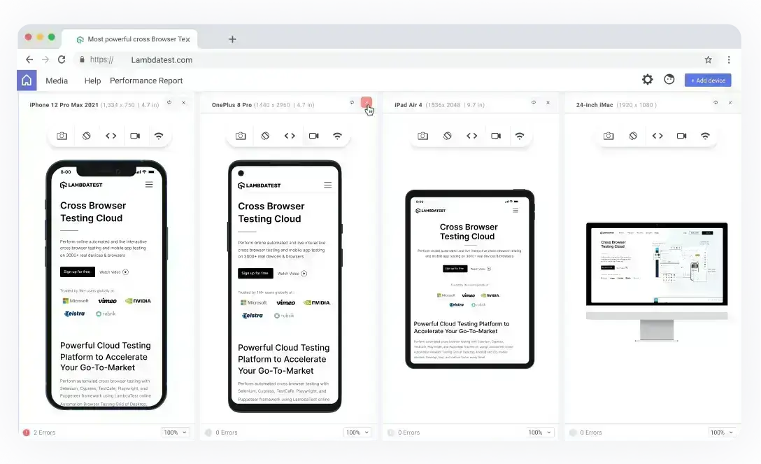
With LT Browser , you get access to a plethora of devices to choose from. Unlike its predecessor, the latest version helps you step up your responsive development game by allowing you to interact and test with up to six devices simultaneously.
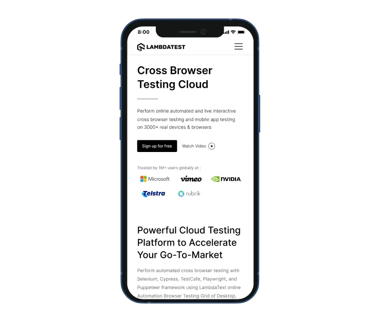
Test the mobile view of your website across 50+ device viewports with LT Browser . Check the responsiveness on pre-installed Android and iOS viewports or custom mobile resolutions.
Ensure your website or web application's design on pre-installed iPad and Galaxy tablet viewports or custom tablet resolutions. You can also check the responsiveness in landscape and portrait modes with this developer-friendly browser.

Check your website's responsiveness on a plethora of pre-installed laptop viewports. You can also create custom laptop resolutions by mimicking your laptop's resolution.

Ensure that your website or web application renders as desired across a plethora of pre-installed desktop viewports. You can also check the responsiveness by creating custom desktop resolutions on LT Browser .


Next-gen browser to build, test & debug mobile websites.

Now fasten your debugging process with multiple dev tools. LT Browser offers you separate dev tools for every device to debug them simultaneously.


To help you see the changes in real-time, LT Browser also offers supports hot reloading. Like your regular Chrome browser, you can use navigation arrows, refresh the web page and more. Whenever you hit save in your react code in your code editor or IDE, the local URL automatically reloads in the device viewports.
LT Browser comes with an inbuilt network simulation feature that allows you to test your website on low to high network profiles. Now deliver high-qualiy mobile websites and web apps by ensuring seamless user experience on multiple network scenarios.

Get 100 minutes of automation test minutes FREE!! Run Selenium automation tests in parallel on the fastest online Selenium Grid

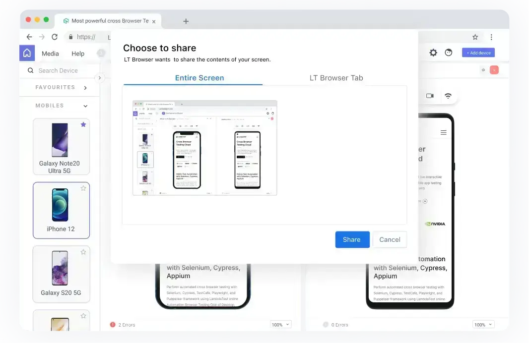
The LT Browser offers multiple recording options. Now fight bugs by recording the entire screen or a particular LT Browser tab over a tablet or mobile view and share it with your team through your favorite project management tool.


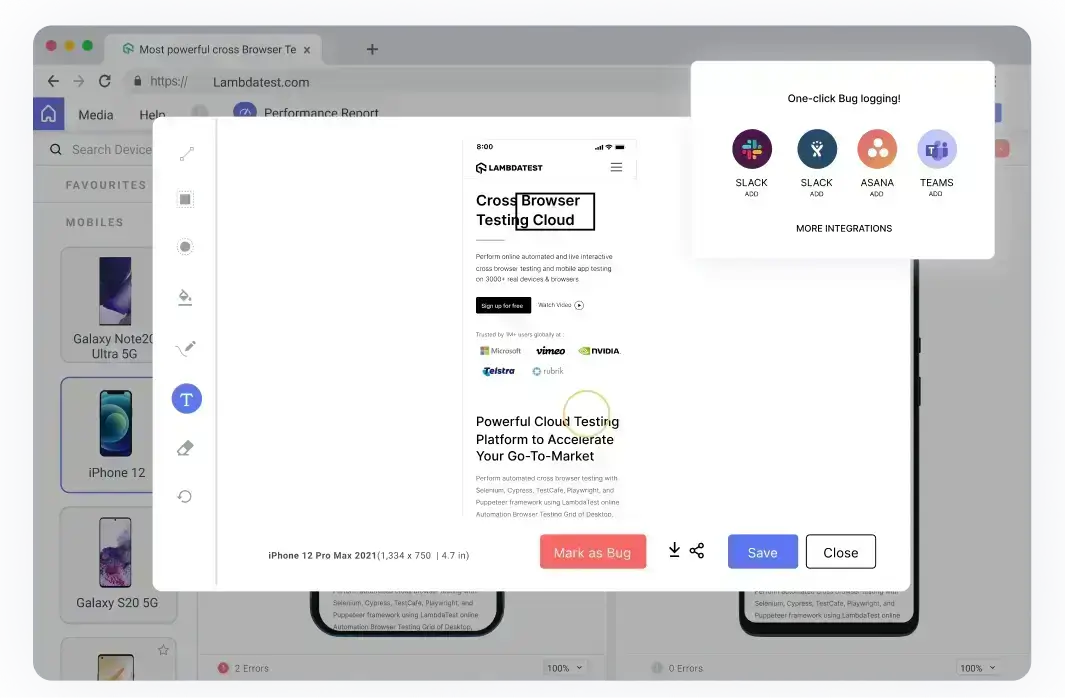
Save time by generating multiple bugs and errors reports with many available combinations. Share responsive bug reports faster with your team by integrating your favorite project management, bug tracking or instant messaging tool.
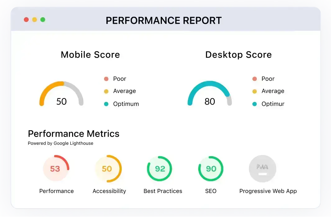
Generate a detailed performance report of your website in a single click with LT Browser . Powered by Google Lighthouse, these detailed performance reports allow you to make informed decisions with the statistics to analyze key performance metrics, accessibility score, SEO, and scope to improve overall performance.
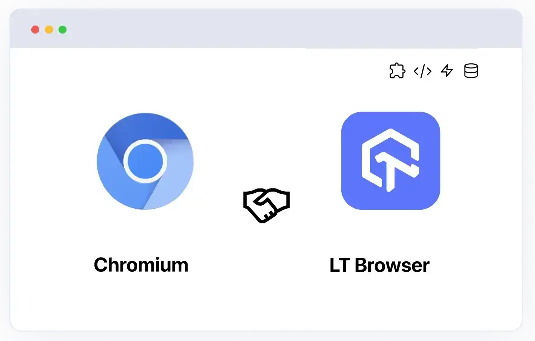
The new LT Browser is built on the Chromium engine, performing faster than ever. Now take advantage of all the Chrome features directly on the LT Browser , such as using Chrome settings and APIs, having better OS integration, accessing faster and latest Chrome devtools, experiencing better memory management, having Chrome extension support, and more.
Follow our step-by-step guide to performing Visual Regression tests to deliver a better user experience.
Know more

You are about to download LT Browser for Linux
×64-bit version for Debian/Ubuntu
64-bit version for Fedora/openSUSE
By downloading and using LT Browser, I agree to the Privacy Policy and Terms.