Responsive Testing
This feature is deprecated and as a result, no further support will be provided for this feature by the TestMu AI Organization.
As the word responsive suggests, this type of testing is used to check the appearance of a website with RWD(Responsive Web Design). This design helps a website render the content in a flexible yet appropriate manner based on the devices & OS on which it gets summoned. At TestMu AI, you can check RWD through 50+ different devices in a single go!
How To Do Responsive Testing?
Step 1: Click ‘Responsive’ sub menu under Visual UI Testing menu in menu box.
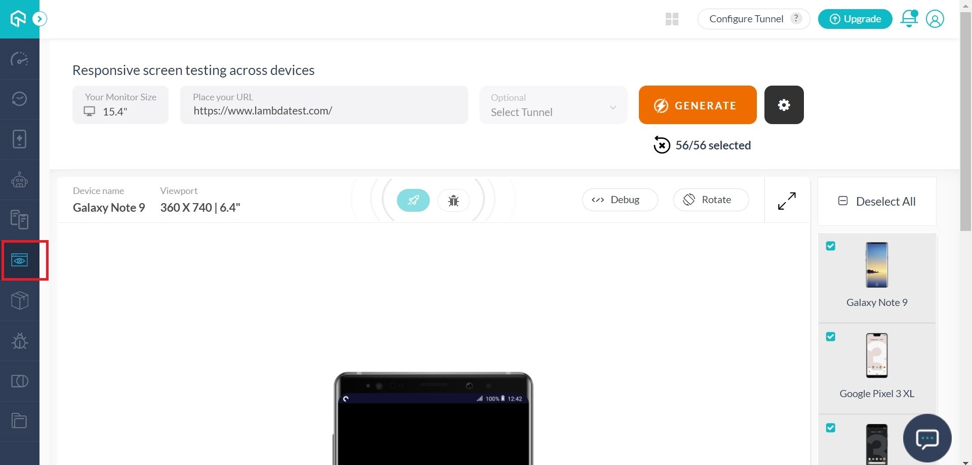
Step 2: Input the URL for which you wish to test responsiveness. Select your monitor size (diagonal length in inches). Click ‘Generate’ to generate screenshots.
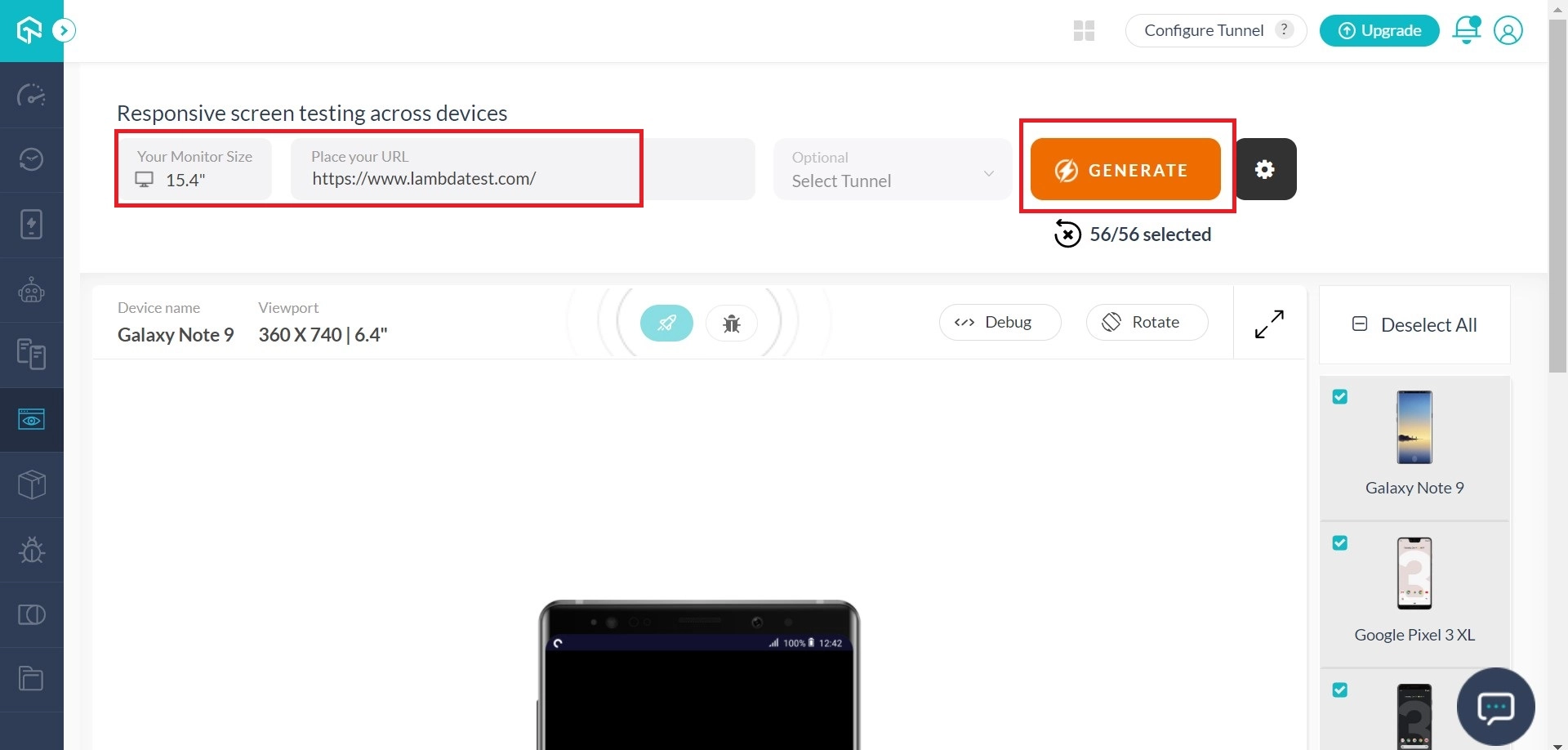
Step 3: On the right side of the page, you will find various mobile and desktop combinations. On clicking them, you can test the responsiveness for those particular devices.

How to record issues?
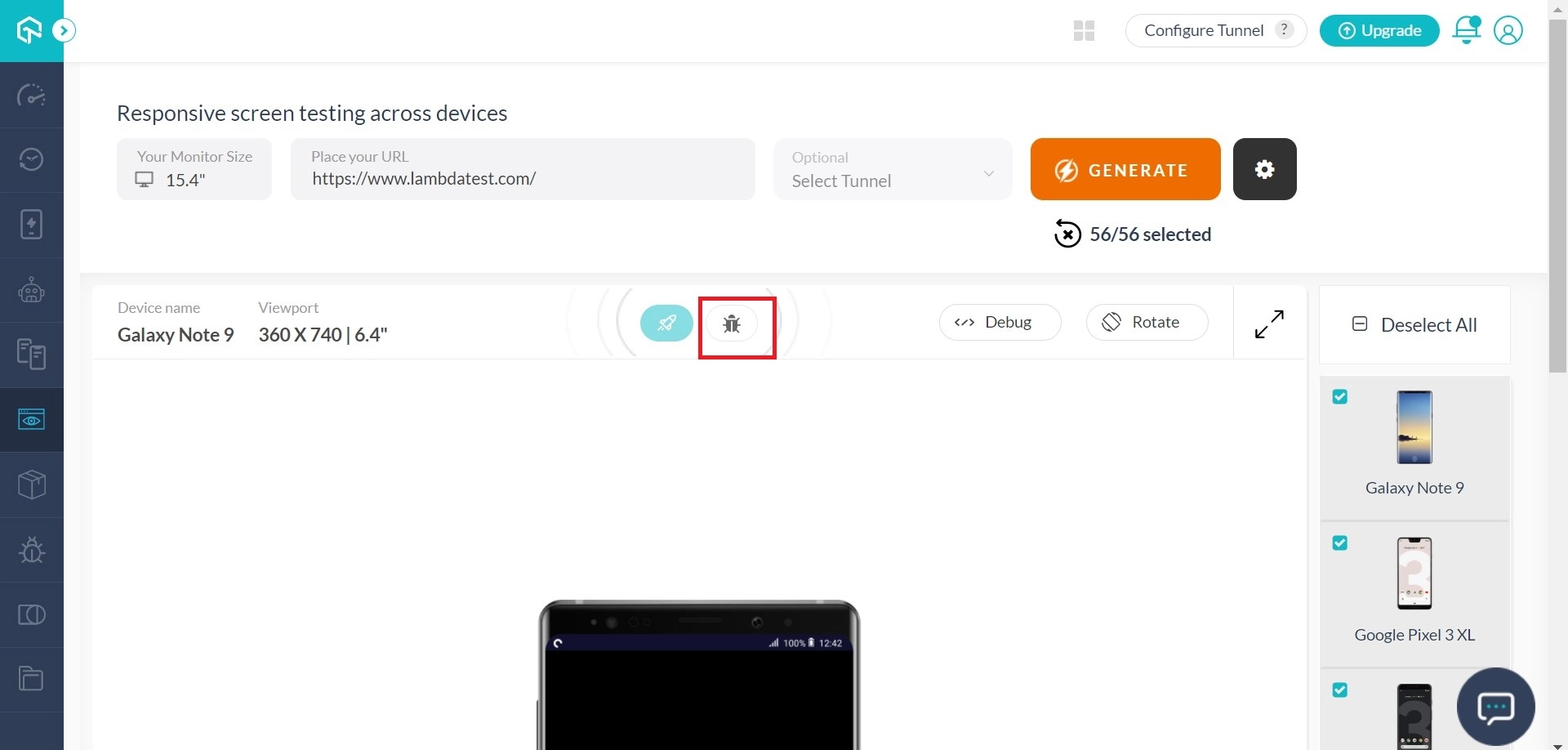
Step 1: On the ‘Responsive’ page, under the menu ‘Visual UI Testing’, you will find a camera icon; click that icon.
Step 2: The image editor will pop up where you can comment about the screenshot and check the mark as an issue check box.
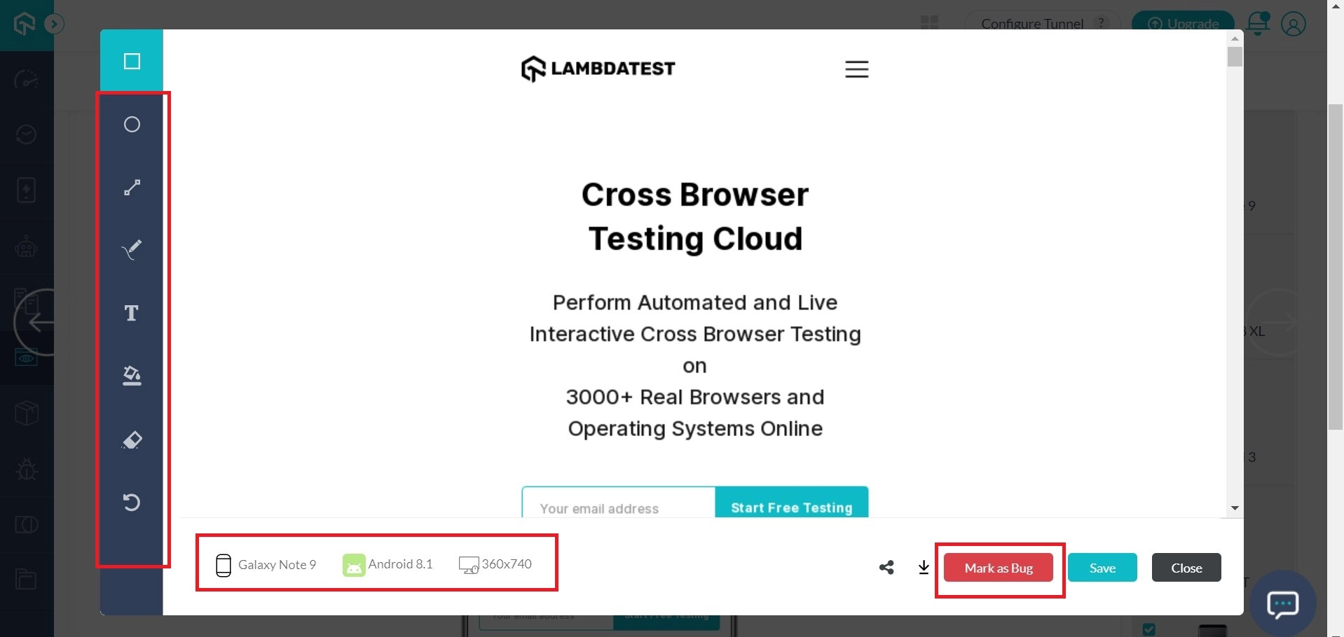
Step 3: Finally, click save and done on the pop up to record the issue. Enter the required details and share the bug with your favorite project management tool.

Let us know if you have any questions, drop us an email at support@testmuai.com, or simply give us a shout. We are here to help you speed your test suites 24/7. Happy testing! 🙂

 Chat with Us
 Ask the Community