Scale Your Automation Testing with AI
Run end-to-end parallel tests & reduce test execution time by 5x
Generate tests scripts using natural language with KaneAI
Accelerate your testing process with Autoheal, SmartWait & RCA

- Automation
- Home
- /
- Learning Hub
- /
- Storybook for Angular
Storybook for Angular: A Complete Tutorial
Learn what Storybook for Angular is, how to set it up, test UI components, use addons, fix common issues, and best practices.
Last Modified on: November 24, 2025
- Share:
Storybook gives you an isolated environment to build and inspect Angular components without loading the entire web application. Storybook for Angular gives you that environment by loading a single component, applying inputs and showing the rendered output instantly. This makes it easy to identify layout issues and test different states.
Overview
What Is Storybook in Angular?
Storybook in Angular lets developers build, view, and document UI components separately. It improves clarity, speeds development, supports testing, and ensures consistent design without launching applications.
How to Use Storybook With Angular?
Storybook with Angular lets you build, preview, and document UI components in isolation. The steps below outline how to set it up, create a component, and showcase it using stories for real-time testing and visualization.
- Project Setup: Install Angular CLI, create a new project, then initialize Storybook using npx storybook init to automatically configure essential files, scripts, and development environment settings properly.
- Run Storybook: Run npm run storybook to start the local server, then open localhost:6006 in your browser to view the Storybook interface and default examples clearly available.
- Create Component: Generate an Alert component using Angular CLI, define inputs for type, message, and dismissible behavior, and implement logic to manage visibility states during interaction scenarios.
- Write Stories: Create a stories file, configure meta, title, component, tags, and argTypes to control how properties appear within the Controls panel dynamically for user testing convenience.
- Multiple Variants: Define multiple stories representing different component states, including success, error, warning, info, and dismissible variations for comprehensive visual coverage testing across realistic usage scenarios effectively.
- Interactive Controls: Use the Controls tab to instantly modify props and observe real-time changes in the component preview without writing additional code, improving development speed and clarity.
- Live Preview: Select stories from the sidebar to validate component appearance, behavior, and responsiveness within an isolated, focused development environment for reliability during iterative design processes consistently.
What Storybook Tabs Are Used for Angular Component Testing?
Storybook makes it easy to test Angular components by interacting with them in real time using built-in tabs that help control properties, track events, validate behavior, and improve accessibility.
- Controls Tab: Modify component properties like type, message, and dismissible state using interactive inputs, allowing instant visual feedback and easy testing of different component states.
- Actions Tab: Monitor and log user-triggered events such as button clicks to verify event handlers and ensure component interactions behave correctly during development.
- Interactions Tab: Simulate advanced user actions like typing, clicking, and form submissions, then run assertions using Testing Library for accurate behavior validation.
- Accessibility Tab: Leverage the Accessibility tab powered by axe-core to detect issues like contrast errors, missing ARIA roles, and keyboard navigation problems.
What Is Storybook for Angular?
Storybook is an open-source tool for building Angular components in isolation. It runs its own server with Vite or Webpack, letting you render and test components without loading the entire web application.
It opens in a separate workspace, usually at http://localhost:6006, while your Angular app runs on another port. You create stories to show each state of a component, which makes it easy to view variations, test behavior and document how the component should look and act.
Features of Storybook:
- Isolated Component Development: Develop and preview Angular components outside the main app, making it easier to perform Storybook visual testing for validating UI changes in isolation.
- Interactive Playground: Visualize and interact with different variations of the component in real time by adjusting props and states.
- Hot Module Reloading: Unlike Angular, where Hot Module Reloading is not enabled by default, Storybook automatically updates stories whenever component code changes. You can instantly see updates without full-page refreshes.
- Documentation Hub: Automatically generates UI documentation as you build components and stories. For this, ensure that the Docs addon is installed and configured. You can also build custom documentation using Markdown.
- Seamless Integrations: Storybook can be integrated with many industry-standard tools like GitHub, Figma, Jest, Apollo Client, etc, to fit perfectly into your team’s existing workflow.
- Cross-Framework Support: Works not just with Angular, but also React, Vue, Svelte, and others. In Angular projects, Storybook integration is enabled via the @storybook/angular package.
How to Get Started With Storybook in Angular?
To get started with Storybook with Angular, install Angular CLI, create a project, run npx storybook init, then npm run storybook. Build a component and add stories with Meta and args to preview and tweak props in real time.
Prerequisites
Before getting started, ensure you have the following:
- Node.js and npm installed on your system.
- Basic knowledge of Angular components and how they work.
- Angular CLI is installed globally. If you haven't installed it yet, run:
npm install -g @angular/cliInstalling Storybook in an Angular Project
To install Storybook in your Angular project, follow these steps:
Step 1: If you don't already have an Angular project, create one by running:
ng new my-angular-storybook-appThen, navigate to your project directory:
cd my-angular-storybook-appStep 2: Install Storybook in your Angular project with the following command:
npx storybook initAfter successful installation, you’ll notice that Storybook has automatically added new scripts to the package.json file. You can also see that the .storybook folder is created in the project root folder.
Step 3: Start your Storybook development server:
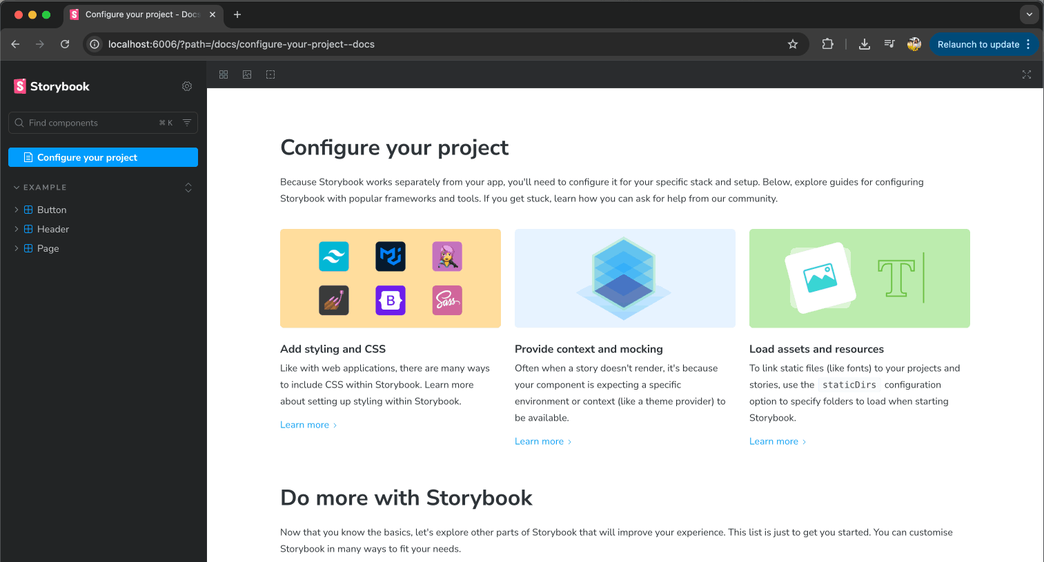
npm run storybookOnce the server is running, open your browser and navigate to http://localhost:6006. You should see your Storybook instance up and running with some default example stories, as shown below.
Note: Run Storybook tests at scale with LambdaTest SmartUI. Try LambdaTest Now!
Creating a Story for Your Component
Now that Storybook is set up, let's create a custom component and write your first story for it. For this tutorial, we'll build an Alert component that displays different types of notifications.
Run the following command to generate the component files:
ng generate component components/alertNext, let's add the functionality. The Alert component will display different types of notifications with customizable properties.
Update alert.component.ts
The Alert component will accept three input properties:
- type: Defines the alert style. Can be success, error, warning, or info.
- message: The text content to display in the alert.
- dismissable: A boolean that determines whether the alert can be closed by the user.
Open alert.component.ts (or alert.ts) and replace the default code with the following code.
This component displays a styled alert message with a specific type. It can optionally show a dismiss button. The alert can be hidden by clicking the button.
// alert.ts
import { Component, Input } from '@angular/core';
import { CommonModule } from '@angular/common';

@Component({
  selector: 'app-alert',
  standalone: true,
  imports: [CommonModule],
  templateUrl: './alert.html',
  styleUrl: './alert.css',
})
export class AlertComponent {
  @Input() type: 'success' | 'error' | 'warning' | 'info' = 'info';
  @Input() message: string = '';
  @Input() dismissible: boolean = false;

  isVisible: boolean = true;

  onDismiss(): void {
    this.isVisible = false;
  }
}
Update alert.component.html
Next, open alert.component.html (or alert.html) and add the template structure:
This template displays an alert box only when isVisible is true. It applies a type-specific class, shows the message, and conditionally includes a dismiss button.
<!-- alert.html -->
<div *ngIf="isVisible" class="alert alert-{{ type }}" role="alert">
  <span class="alert-message">{{ message }}</span>
  <button *ngIf="dismissible" class="alert-close" (click)="onDismiss()" aria-label="Close">
    ×
  </button>
</div>
Update alert.component.css
Finally, open alert.component.css (or alert.css) and add the styling.
This CSS styles the alert component, defining layout, spacing, and typography. It sets type-specific colors for success, error, warning, and info alerts, and styles the close button with hover effects.
/* alert.css */

.alert {
  display: flex;
  align-items: center;
  padding: 12px 16px;
  border-radius: 6px;
  border-left: 4px solid;
  font-family: -apple-system, BlinkMacSystemFont, 'Segoe UI', Roboto, Oxygen, Ubuntu, Cantarell,
    sans-serif;
  font-size: 14px;
  margin-bottom: 16px;
  position: relative;
}

.alert-message {
  flex: 1;
}

.alert-close {
  background: none;
  border: none;
  font-size: 24px;
  cursor: pointer;
  padding: 0;
  margin-left: 12px;
  opacity: 0.6;
  transition: opacity 0.2s;
}

.alert-close:hover {
  opacity: 1;
}

/* Success Alert */
.alert-success {
  background-color: #d4edda;
  color: #155724;
  border-left-color: #28a745;
}

/* Error Alert */
.alert-error {
  background-color: #f8d7da;
  color: #721c24;
  border-left-color: #dc3545;
}

/* Warning Alert */
.alert-warning {
  background-color: #fff3cd;
  color: #856404;
  border-left-color: #ffc107;
}

/* Info Alert */
.alert-info {
  background-color: #d1ecf1;
  color: #0c5460;
  border-left-color: #17a2b8;
}
Creating a Story for the Alert Component
Let’s create a story for the Alert component. Create a new file named alert.stories.ts inside the component folder.
Inside the story file, first of all, let’s make all the necessary imports.
import type { Meta, StoryObj } from '@storybook/angular';
import { AlertComponent } from '../alert';
Also import the Angular component that you want to document and showcase, in this case, AlertComponent.
The next step is meta configuration:
const meta: Meta<AlertComponent> = {
  title: 'Components/Alert',
  component: AlertComponent,
  tags: ['autodocs'],
  argTypes: {...},
};
The meta object defines the configuration for your component stories:
- title: Determines where your component appears in Storybook's sidebar navigation (in this case, under "Components/Alert").
- component: References the Angular component for which you're creating stories.
- tags: Pass value as ['autodocs'] to automatically generate documentation for your component based on its props and stories.
- argTypes: Configures the interactive controls that appear in Storybook's Controls panel.
Since the Alert component has 3 input props, the argTypes can be written as:
- type: Displays as a dropdown selector with predefined options.
- message: Displays as a text input field for entering custom messages.
- dismissible: Displays as a toggle switch for boolean values.
argTypes: {
  type: {
    control: 'select',
    options: ['success', 'error', 'warning', 'info'],
    description: 'The type of alert to display',
  },
  message: {
    control: 'text',
    description: 'The message to display in the alert',
  },
  dismissible: {
    control: 'boolean',
    description: 'Whether the alert can be dismissed',
  },
},
These controls allow you to dynamically change prop values and see the component update in real-time. Now, let us export the meta object. Also, let us create a TypeScript type named Story for individual stories.
export default meta;
type Story = StoryObj<AlertComponent>;
Now it's time to create individual stories for our Alert component. Each story represents a specific state or variant of the component, allowing us to showcase different use cases.
Since the Alert component has four types (success, error, warning, and info) and a dismissible option, we'll create five stories to demonstrate these variations.
// Default story
export const Default: Story = {
  args: {
    type: 'info',
    message: 'This is an info alert.',
    dismissible: false,
  },
};

// Success alert
export const Success: Story = {
  args: {
    type: 'success',
    message: 'This is a success alert!',
    dismissible: false,
  },
};

// Error alert
export const Error: Story = {
  args: {
    type: 'error',
    message: 'This is an error alert!',
    dismissible: false,
  },
};

// Warning alert
export const Warning: Story = {
  args: {
    type: 'warning',
    message: 'This is a warning alert!',
    dismissible: false,
  },
};

// Dismissible alert
export const Dismissible: Story = {
  args: {
    type: 'info',
    message: 'This is a dismissible alert.',
    dismissible: true,
  },
};
Running Storybook
Now that we've created the Alert component and its stories, let's run Storybook to see them in action.
Start the Storybook development server by running:
npm run storybookOnce the server is running, open your browser and navigate to http://localhost:6006/.
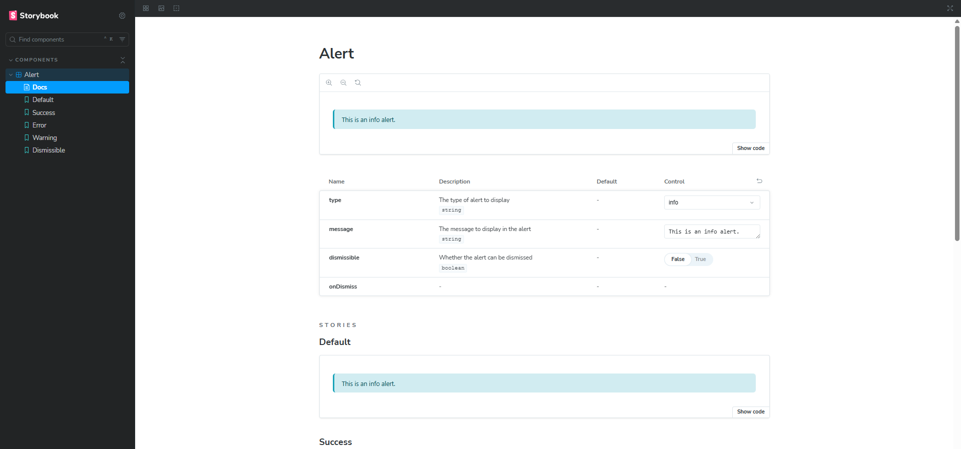
You should see your Storybook instance with the Alert component listed in the sidebar under Components/Alert. Click on any of the five stories (Default, Success, Error, Warning, or Dismissible) to view the different variations of your Alert component.
How to Test Angular Components Using Storybook Tabs?
You can test Angular components in Storybook using tabs like Controls to change props, Actions to track events, Interactions for user flow testing, and Accessibility to detect and fix UI issues instantly.
Let's explore the four main tabs available in Storybook:
Controls Tab
The Controls tab provides interactive widgets to dynamically modify your component's props without writing any code.
For our Alert component, you'll see three controls:
- type: A dropdown selector to switch between success, error, warning, and info
- message: A text input field to change the alert message
- dismissible: A toggle switch to enable or disable the close button
Try changing these values and watch your Alert component update instantly in the preview panel above. This makes it easy to test different combinations of props and see how your component behaves.
Actions Tab
The Actions tab logs all events or outputs that occur within your component, making it perfect for debugging user interactions.
For example, in the Alert component, when you click the close button on a dismissible alert, you can see the click event logged in this tab. This helps you verify that event handlers are working correctly and track user interactions during development.
Interactions Tab
The Interactions tab is useful for testing more complex component behaviors and user interactions like clicking, typing, and submitting a form, and then performing assertions on the result. You can write interaction tests using Testing Library.
While our simple Alert component doesn't require complex interactions, this tab becomes invaluable when working with:
- Forms with validation.
- Multi-step processes.
- Components with intricate state management.
- User workflows that require multiple sequential actions.
Storybook lets you preview and interact with each UI component in isolation, making it easy to spot visual issues early. With LambdaTest SmartUI, you can take this further by performing online Storybook visual testing.
You can automatically capture and compare screenshots to catch UI changes before they reach users. It saves time, reduces manual checks, and helps you deliver a consistent, polished experience across browsers and devices. You can start quickly and see your components tested at scale, without setting up complex test infrastructure.
To get started, check out this guide on Storybook testing with LambdaTest SmartUI.
You can also go a step further and test your Storybook-based websites across different desktop and mobile environments on the Storybook testing cloud offered by LambdaTest. This helps you catch functional issues before they reach users.
Accessibility Tab
The Accessibility tab in Storybook helps you identify and fix accessibility issues in your UI components. It uses **axe-core** to scan components for issues like color contrast, missing ARIA roles, and keyboard navigation issues. The tab categorizes results into violations, incomplete checks, and passes, giving clear guidance on what needs attention.
It updates in real-time as you interact with or modify components, allowing developers to catch accessibility problems early. You can run the checks manually or configure them to run automatically, making it easier to ensure your components are usable for everyone.
Pro-tip: To enhance your accessibility testing process, you can also leverage LambdaTest Accessibility DevTools to test Angular UI components. It is a Chrome extension that supports full-page, partial, multi-page, workflow, and keyboard scans.
It runs on the same axe-core engine, lets you configure WCAG versions, and gives detailed reports to help you test Angular (or any) UI components more thoroughly.
What Are the Different Addons in Storybook?
Storybook addons include Docs for auto docs, Toolbar for quick controls, Viewport for responsive testing, Backgrounds for preview colors, and Measure & Outline for layout inspection.
Let's explore a few essential addons and how they can improve your component development experience.
Docs Addon
The Docs addon automatically generates comprehensive documentation for your components based on your stories and code. It helps teams maintain accurate, up-to-date documentation without manual effort.
You can view the generated documentation under the Docs within your component folder in Storybook.
Toolbar Addon
The Toolbar addon provides a customizable toolbar with quick access to common features and settings. Key features include:
- Zoom controls
- Full-screen mode toggle
- Quick access to viewport and background controls
- Grid and measurement tools

You can also create custom decorators and global controls to extend the toolbar with new features or tailor it to your workflow.
Viewport Addon
The Viewport addon allows you to test your components at different screen sizes and device dimensions, making it easy to check responsiveness. You can use it to simulate various device viewports (mobile, tablet, desktop) and even supports custom viewport configurations.
Backgrounds Addon
The Backgrounds addon lets you change the background color of the preview area to test component visibility in different contexts. By default, this feature allows you to switch between light and dark backgrounds, but you can customize the background colors.
Measure & Outline Addons
These addons help with visual debugging and layout inspection.
- Measure Addons: Display element dimensions (width, height), spacing, and margins, helping identify layout issues quickly.
- Outline Addons: Draw borders around elements to visualize component structure and make nested elements easier to see.
Troubleshooting Issues When Using Storybook for Angular
Let’s look at some common issues faced by developers while working with Storybook in Angular and how to effectively troubleshoot them.
Storybook Fails to Start or “Webpack Compilation Error”
Solution: If Storybook fails to start or throws build errors, try the following:
- Run the Doctor Command: It helps to detect common issues like incompatible add-ons, duplicate dependencies, or mismatched versions, and suggest fixes.
npx storybook@latest doctor- Reinstall Dependencies: Delete existing modules and reinstall cleanly.
rm -rf node_modules package-lock.json
npm install- Check Build Logs: If the development server fails silently, try running the build command. It can provide more descriptive errors.
npm run build-storybook- Switch Builder if Needed: Angular 17+ works the best with Vite. If you are using Webpack 5, which is the default builder in Storybook, try switching to Vite.
Components Not Rendering or Showing Blank Screen
Solution: The component might not be rendering in Storybook for several reasons. Here are a few things you can try:
- Check the Browser Console: It will show any runtime or rendering error messages that may point to missing props, syntax issues, or broken imports.
- Remove Cache: Clear the stale cache using the command below and rerun Storybook.
rm -rf node_modules/.cache/storybook- Verify Your Imports: Check for any missing modules, styles, or dependencies in the story.
CSS or Global Styles Not Applied
Solution: The global styles or CSS are not being applied to your component. Here are a few common solutions you can try:
- Import Global Styles Into Storybook Preview Setup: To apply global styles across all stories, import your global stylesheet file into the .storybook/preview.js file.
Ensure that the path is correct:
// .storybook/preview.js
import '../src/styles/globals.css'; // Adjust path to your global styles- Configure Webpack for CSS Modules or SCSS: If your project uses CSS modules or SCSS, ensure your Storybook configuration supports these loaders in the .storybook/main.js file.
- Remove Cache: Clear the stale cache using the command below and rerun Storybook.
rm -rf node_modules/.cache/storybookDocumentation Not Generating
Solution: If documentation is not generating in Storybook, it’s often due to incorrect or missing configuration of the @storybook/addon-docs package.
Try the following steps:
- Verify it’s listed in .storybook/main.ts under addons.
- Install it if missing.
npm install @storybook/addon-docsBest Practices for Using Storybook for Angular
As your component library grows, maintaining a well-organized Storybook becomes crucial. Here are some best practices you can follow to make your Storybook easier to navigate and more valuable to your team.
- File Structure and Organization: You can either keep your story files alongside your component files for better maintainability.
src/
└── app/
    └── components/
         └── alert/
           ├── alert.component.ts
           ├── alert.component.html
           ├── alert.component.css
           ├── alert.component.spec.ts
           └── alert.stories.ts          ← Story file next to component
Or organize all stories in a dedicated folder.
src/
├── app/
│   └── components/
│       ├── alert/
│       ├── button/
│       └── card/
└── stories/
    ├── alert.stories.ts
    ├── button.stories.ts
└── card.stories.ts- Naming Conventions: Follow a consistent naming pattern for the story name.
// ✅ Good
alert.stories.ts
button.stories.ts
input-field.stories.ts

// ❌ Avoid
AlertStories.ts
alert-story.ts
alertStorybook.ts
Use a hierarchical structure to organize components in Storybook's sidebar. You can either group by category or by feature.
// Group by category
export default {
  title: 'Components/Alert',        // Basic components
  title: 'Forms/Input',             // Form elements
  title: 'Layout/Card',             // Layout components
  title: 'Navigation/Navbar',       // Navigation components
};

// Or by feature
export default {
  title: 'Authentication/LoginForm',
  title: 'Dashboard/StatsCard',
  title: 'Profile/UserAvatar',
};- Establish a Style Guide: Create a design system with reusable components, styles, and guidelines, and document naming conventions, file structure, and story patterns to ensure consistent design and usage across your Angular application.
- Document Your Components: Clear documentation is crucial for effective collaboration among developers. Add descriptions, examples, and usage guidelines to your stories so your team can easily understand and use your components.
- Regular Cleanup and Update: Regularly remove outdated or unused stories to keep Storybook lean and easy to navigate. Additionally, keep your Storybook instance up to date to benefit from the latest features, performance improvements, and bug fixes.
Conclusion
Storybook is a powerful tool that transforms how developers build, test, document, and share UI components. For component-driven frameworks like Angular, it provides an isolated development environment that streamlines your workflow and improves code quality.
While the initial setup requires some time and configuration, the long-term benefits are substantial. By integrating Storybook into your Angular projects, you're investing in a more organized, maintainable, and collaborative development process.
When combined with structured Storybook testing, Storybook becomes not just a development tool but a reliable layer of UI quality assurance.
Citations
- Storybook Documentation: https://storybook.js.org/
- Angular CLI Documentation: https://angular.dev/tools/cli
Frequently Asked Questions (FAQs)
Did you find this page helpful?
More Related Hubs

Start your journey with LambdaTest
Get 100 minutes of automation test minutes FREE!!


