 Test your AI Agents with the all-new Agent to Agent Testing
Platform.
Test your AI Agents with the all-new Agent to Agent Testing
Platform. 
ARIA-Label: Improve Web Accessibility with Smart Labeling
Saniya Gazala
Posted On: August 4, 2025
22 Min


ARIA-labels are essential for making web content accessible to users who rely on screen readers or assistive technologies. They add clear, descriptive context to interactive elements that might not be obvious visually. The aria-label attribute ensures that non-text elements, like buttons, icons, or custom widgets, are properly announced to users for better accessibility.
Overview
aria-labels improve accessibility by assigning descriptive text to elements that lack visible cues. They help assistive technologies interpret and convey content more accurately to users.
Real World Examples
Use aria-label is used across interactive elements such as:
- Navigation drawer icon labeled as “Shop by Category” using aria-label.
- Carousel slides are labeled with positions like aria-label=”1 / 8″.
- Form inputs and textareas labeled with aria-label=”Your Name” and aria-label=”Your Review”.
Testing Techniques
Ensure your ARIA-labels work across assistive tech, devices, and browsers using these methods:
- Screen readers:Test aria-labels with NVDA, VoiceOver, or TalkBack.
- Keyboard access:Ensure full navigation without a mouse.
- Cross-browser: Use LambdaTest to check label behavior across setups.
- CI/CD: Automate ARIA checks with Selenium, Cypress, or Playwright.
- Extensions: Catch ARIA issues using the LambdaTest browser add-on.
- Compliance: Meet WCAG, ADA, and Section 508 standards.
Table of Contents
- What Are ARIA-Labels?
- When and How to Use ARIA-Labels in Web Development?
- Examples of the ARIA-Labels in Action
- How Screen Readers Announce ARIA-Labels?
- Difference Between ARIA-Labels, ARIA-Labelledby, and ARIA-Describedby
- Testing ARIA-Labels Across Browsers and Screen Readers
- Common Mistakes With ARIA-Lables and How to Avoid Them
- Best Practices for Seamless ARIA-Labels Implementation
- Frequently Asked Questions (FAQs)
What Are ARIA-Labels?
ARIA-labels (Accessible Rich Internet Applications) are attributes used in web development to improve accessibility for users who rely on assistive tools like screen readers. They give a readable name to elements that don’t have visible labels, like icon-only buttons or input fields without captions.
The aria-label attribute is added directly to an HTML element to define this hidden description.
Syntax:
|
1 |
<element aria-label="Meaningful description"></element> |
When and How to Use ARIA-Labels in Web Development?
Use the aria-label attribute when an element lacks a visible label that screen readers can detect and announce. This is especially important in accessible web development when:
When to Use aria-label:
- An icon is used without any visible text (like a cart or search icon).
- An element looks decorative but actually performs an action (like a clickable logo or SVG button).
- You want to give extra information for screen reader users without adding visible text to the page.
The aria-label attribute is mostly useful when the element doesn’t have a visible label that screen readers can announce.
How to use it:
- Add aria-label=”…” to the element.
- Write a short, clear label that describes the element’s action or purpose.
- Make sure the label matches what the element actually does.
Example:
|
1 2 3 |
<a href="https://x.com/Lambdatesting" target="_blank" rel="noopener noreferrer" aria-label="Follow LambdaTest on Twitter"> <img src="twitter-icon.png" alt="LambdaTest Twitter" width="16" height="16"> </a> |
In the example, the anchor tag links to LambdaTest’s Twitter profile using just an icon. Since there’s no visible text, the aria-label attribute provides a clear description, “Follow LambdaTest on Twitter”, so screen readers can announce the purpose of the link. This ensures the link is accessible, even though it only displays an image visually.
You can use aria-label on many HTML elements, such as:
- Use <button aria-label=”…”> to describe the button’s action if there’s no visible text.
- For <a> tags with only icons or no visible text, add aria-label to describe the link’s destination.
- Use aria-label on form elements like <input>, <textarea>, or <select> when there’s no visible <label>.
- Apply aria-label to <img> when the image acts like a button or link and has no descriptive alt text.
- Use aria-label on <iframe> elements to describe the embedded content for screen readers.
- Add aria-label to elements with ARIA roles like role=”dialog”, role=”tooltip”, or role=”navigation” when a descriptive label is not visible.
- Structural elements like <nav>, <header>, <section>, or <form> can use aria-label to provide a clear label when it’s not provided visually.
 Note
NoteUse aria-label wisely and test accessibility with real screen readers. Try LambdaTest Today!
Examples of the ARIA-Labels in Action
aria-label enhances accessibility in modern web designs by providing descriptive text for elements without visible labels. It helps screen readers convey the purpose of buttons, icons, and input fields to users with visual impairments.
With respect to the LambdaTest eCommerce Playground, some examples of ARIA-labels are:
Example 1: Navigation Drawer Trigger
A collapsible sidebar menu like “Shop by Category” may use only an icon or limited text.
Using aria-label=”Shop by Category” helps assistive tech describe the purpose of the link clearly.
|
1 2 3 4 5 |
<a href="#mz-component-1626147655" data-toggle="mz-pure-drawer" role="button" aria-expanded="false" aria-controls="mz-component-1626147655" class="icon-left both text-reset" target="_self" aria-label="Shop by Category"> <span class="icon svg-icon"> <svg><use xlink:href="#svgf8a4dfb1ab8457fdb62787ae3db4c92b"></use></svg> </span> </a> |
Example 2: Category Carousel Slides
In a product carousel with multiple categories, each slide uses aria-label=”1 / 8″, aria-label=”2 / 8″, and so on, to indicate its position.
This helps screen reader users understand where they are within the list of options.
|
1 2 3 4 5 6 7 8 9 10 11 12 |
<div class="swiper-slide swiper-slide-active" role="group" aria-label="1 / 8"> <a href="https://ecommerce-playground.lambdatest.io/index.php?route=product/category&path=20"> <figure class="figure img-top"> <div class="figure-img-wrapper"> <img src="category-image.webp" alt="Desktops" width="150" height="150"> </div> <div class="figure-caption"> <h4>Desktops</h4> </div> </figure> </a> </div> |
Example 3: Review Form Input Fields
In review forms, input fields often rely on placeholders for context, which aren’t always read by screen readers. The use of aria-label ensures that users with assistive technologies understand the purpose of each field.
|
1 |
<input type="text" name="name" placeholder="Your Name" aria-label="Your Name"> |
This input allows users to enter their name. The aria-label=”Your Name” ensures that screen readers can convey its purpose even if the placeholder is not visible.
|
1 |
<textarea name="text" rows="5" placeholder="Your Review" aria-label="Your Review"></textarea> |
This textarea is for writing the review content. The aria-label=”Your Review” gives screen reader users a clear understanding of what they should enter.
These examples highlight how aria-label enhances web accessibility by providing clear, descriptive context for assistive technologies, especially screen readers, without affecting the visual design.
How Screen Readers Announce ARIA-Labels?
You’ve already seen how aria-label is used in examples. Now, let’s look at how screen readers interpret ARIA attributes to convey the purpose and context of UI elements, especially when visual cues are missing.
The way these attributes are announced depends on the specific ARIA property used, and each behaves a bit differently.
aria-label : Direct Label Announcement
When an element has an aria-label, the screen reader announces exactly what’s written in that label. It overrides any inner text or placeholder.
|
1 |
<button aria-label="Submit Search">🔍</button> |
Even though the button only shows an icon, a screen reader will say: “Submit Search, button.”
This method is ideal when there’s no visible text, like in icon-only buttons. But in situations where you need to provide more context or associate the label with existing visible content, aria-label may not be enough.
That’s where aria-labelledby and aria-describedby become more effective, both attributes give screen readers more to work with, either by referencing existing visible content (aria-labelledby) or adding supplemental information (aria-describedby).
Let’s see how each is interpreted by assistive technologies and when to use them.
aria-labelledby : Reuses Visible Content as the Label
When an element uses aria-labelledby, the screen reader announces the text from another element it references by ID. This allows you to assign a label based on visible content elsewhere in the DOM.
|
1 2 3 4 |
<h2 id="form-title">Feedback Form</h2> <form aria-labelledby="form-title"> ... </form> |
Even though the form has no inner text, a screen reader will say: “Feedback Form, form.”
This is helpful when you want to provide a meaningful label by reusing existing on-page text instead of writing a new one.
aria-describedby : Adds Extra Context or Instructions
When you use aria-describedby, the screen reader reads out additional information from another element’s ID, usually to provide guidance, hints, or supporting text beyond just the label.
|
1 2 |
<input type="text" aria-label="Email" aria-describedby="email-hint" /> <p id="email-hint">We’ll never share your email with anyone else.</p> |
A screen reader will say: “Email, edit text. We’ll never share your email with anyone else.”
This is useful when you want to add supporting context, such as instructions or warnings, without cluttering the label itself.
Difference Between ARIA-Labels, ARIA-Labelledby, and ARIA-Describedby
These three ARIA attributes serve similar purposes, helping screen readers describe elements, but they work in different ways.
Understanding when to use each ensures more meaningful and accessible experiences for all users.
| Feature | aria-label | aria-labelledby | aria-describedby |
|---|---|---|---|
| Main Purpose | Provides an accessible name directly using a string value inside the attribute. <button aria-label=”Close”>X</button> |
Uses the content of another element to assign an accessible name. <button aria-labelledby=”btnLabel”><span id=”btnLabel”>Download</span></button> |
Adds extra descriptive information, typically read after the main label. <input aria-describedby=”pwdHelp”><div id=”pwdHelp”>Use at least 8 characters</div> |
| Screen Reader Behavior | Screen readers announce the value of the aria-label as the element’s name. Example: “Close” is read instead of “X”. |
Screen readers announce the text content of the referenced element as the name. Example: “Download” is read from the span. |
Screen readers first announce the label, then the additional description. Example: “Password, Use at least 8 characters.” |
| When to Use | Ideal when no visible label is present, such as icon-only buttons. Example: Search icon without text. |
Best when a visible label already exists and should be linked to the control. Example: Label text shown on screen and reused by ID. |
Use when additional non-essential info like hints, tooltips, or error messages is needed. Example: Tooltip for form guidance. |
| Code Example | <button aria-label=”Search”><img src=”search.svg”></button> | <button aria-labelledby=”lbl”><span id=”lbl”>Submit</span></button> | <input aria-describedby=”hint”><div id=”hint”>Min 8 characters</div> |
| Source of Label | Text provided directly in the attribute itself. Example: aria-label=”Close” directly adds the name. |
Text comes from another element’s content referenced by its ID. Example: Span with ID used as label text. |
Text comes from another element’s content referenced by its ID. Example: Help text div provides description. |
| Can Replace Visible Label? | Yes, it can serve as the only label when no visible text is present. Example: No visual “Close”, only icon. |
No, it relies on a visible element already being present in the DOM. Example: Requires <span id=”lbl”> on the page. |
No, it is intended to add detail, not to serve as the primary label. Example: Works with <label> already defined. |
| Supports Reuse of Text? | No, the text must be written uniquely for each element. Example: Every button needs its own aria-label. |
Yes, multiple elements can reference the same visible label element using IDs. Example: Many inputs use aria-labelledby=”commonLabel”. |
Yes, a single hint or description element can be reused across multiple inputs. Example: aria-describedby=”sharedHint” used on many inputs. |
| Requires Visible Text Nearby? | No, it works independently of anything shown visually. Example: Icon button with no on-screen label. |
Yes, it depends on referencing an existing visible label element. Example: Needs <span id=”lbl”>Label</span> to function. |
Optional. It works with or without nearby visible text, depending on context. Example: Can describe a field even if the label is hidden. |
| Affects Page Layout? | No, it does not affect the visual rendering or spacing of the page. Example: Text in aria-label is not visible. |
No, the label source is external and does not change the layout. Example: Text exists in another element, the layout stays the same. |
No, descriptions are not rendered differently and do not impact layout. Example: Help text is read but not styled specially. |
Each ARIA labeling method works unquinly, and understanding these differences helps you choose the right attribute based on context, ensuring your interfaces remain both accessible and semantically accurate.
Testing ARIA-Labels Across Browsers and Screen Readers
ARIA attributes like aria-label, aria-labelledby, and aria-describedby help you make interactive elements more accessible. They provide descriptions that screen readers and other assistive technologies can pick up and announce to users who can’t see the page.
But just adding these attributes isn’t enough. You still need to test how they behave across different browsers, screen readers, and devices. Accessibility isn’t about ticking off attributes; it’s about making sure users actually experience them the way you intended.
If you skip validation, here’s what can happen:
- Screen readers may behave differently across browsers.
- Buttons and form fields might be present, but silent.
- You could miss WCAG checks and face compliance risks.
- Users who rely on assistive tech may lose trust in your product.
To avoid all that, you need to follow a reliable web accessibility checklist based on WCAG 2.1, and make testing a core part of your development process.
Even with a checklist, a key challenge is replicating how assistive technologies behave across different browsers and devices. What works in one setup may fail in another, so thorough testing is essential. Using a platform to validate ARIA-labels in real-world conditions across environments can greatly improve accessibility. LambdaTest is one such platform.
LambdaTest is a GenAI-native test execution platform that lets you run accessibility automation tests at scale across 3000+ browser and OS combinations. It allows you to validate your ARIA-labels under real-world conditions and test across various environments, without having to set up any test infrastructure from scratch.
This platform offers manual screen readers accessibility testing that launches real browser sessions and enables screen readers like NVDA, VoiceOver, or TalkBack to manually validate how ARIA-labels are read aloud:
- Start a real-time session on your desired browser/OS combination.
- Activate screen reader settings.
- Navigate your web application and verify the spoken feedback for aria-label, aria-labelledby, and aria-describedby.
To get started with screen readers, follow the support documentation on LambdaTest Screen Reader.
This simulates real-world experiences, helping you fix gaps that automated scans may miss.
You can also install the LambdaTest Accessibility Extension to scan pages right from your browser. It detects:
- Missing ARIA attributes.
- Broken references (e.g., aria-labelledby pointing to a missing ID).
- Redundant or empty labels.
- Improper role-label combinations.
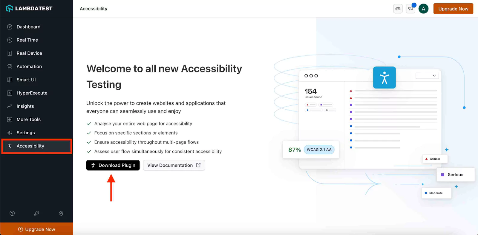
You can choose between full-page scans, partial scans, or workflow-based testing, all without leaving your DevTools.
You can also make it easy to automate accessibility testing with frameworks like Selenium, Cypress, and Playwright. It also integrates ARIA validation into your CI/CD pipeline, runs WCAG-compliant scans using a simple JSON configuration, and displays detailed results in the Automation Dashboard, helping you catch accessibility issues early and avoid last-minute surprises.
This platform helps you confidently meet legal standards such as WCAG, ADA, and Section 508 compliance.
To get started with automated accessibility testing, follow this support documentation on Accessibility Automation.
Common Mistakes With ARIA-Lables and How to Avoid Them
aria-labels can help bridge accessibility gaps, but only when used with precision. Misapplied ARIA roles and attributes often interfere with native HTML semantics, creating confusing or broken experiences for assistive technologies.
Let’s look at some lesser-known but critical mistakes developers often make with aria-label and how to avoid them effectively.
Using ARIA Instead of Fixing HTML Semantics
Many developers treat ARIA like a shortcut to bypass native HTML semantics. They add role=”button” to a <div> instead of using the native <button> element, or override native elements’ behavior to “fix” things that weren’t broken.
Why It Fails: Native elements already come with built-in accessibility and keyboard behavior. Replacing them with ARIA-based alternatives adds unnecessary complexity and often fails to replicate the original behavior 100%.
Avoid It:
- Use semantic HTML first. Only apply ARIA when absolutely necessary.
- Before adding a role, ask yourself: “Can this be done with a native HTML element?”
- For example, use <button> instead of <div role=”button”>.
Applying ARIA to Non-Interactive Content
ARIA roles and attributes are sometimes slapped onto elements that aren’t interactive, like assigning aria-pressed to a <p> tag.
Why It Fails: ARIA states like aria-pressed, aria-checked, and aria-expanded are meaningful only in the context of interactive elements (like buttons, checkboxes, or toggles). When used on static elements, they confuse assistive tech and violate WCAG guidelines.
Avoid It:
- Only use ARIA states on elements that support interaction via keyboard.
- Never try to mimic button behavior on a paragraph or div unless absolutely necessary (and only with full keyboard support).
Static ARIA States in Dynamic Interfaces
Developers manually set aria-expanded=”true” or aria-hidden=”false” in markup, but forget to update them dynamically through JavaScript when the UI changes.
Why It Fails: ARIA is meant to reflect the current state. If your accordion starts closed but the markup says aria-expanded=”true”, screen readers announce the opposite of what’s on screen.
Avoid It:
- Always pair ARIA state attributes with JavaScript logic that updates their values in real-time.
- Keep your ARIA values in sync with the visible UI at all times.
Using aria-hidden to Hide Content That’s Still Focusable
Hiding elements from assistive technologies using aria-hidden=”true”, but leaving them in the tab order.
Why It Fails: A screen reader might skip the content, but a keyboard-only user can still tab into it, causing an invisible focus trap. This leads to a frustrating and disorienting experience.
Avoid It:
- If you hide an element with aria-hidden, also remove it from the tab order using tabindex=”-1″ or dynamically disable it.
- Better yet, control visibility via CSS or use JavaScript to fully remove the element when not needed.
Descriptive aria-labels That Over-Explain
Over-communicating through aria-labels, like aria-label=”Click this button to submit your form now” on a submit button.
Why It Fails: Screen readers already announce the element type and often the action. Overly descriptive or redundant labels confuse users or create noisy output.
Avoid It:
- Keep aria-label short and precise. Avoid words like “click,” “tap,” or “press.”
- Use aria-labelledby when you want to tie an element’s name to visible text.
- Let screen readers do their job, they already announce that it’s a “button.”
Broken ID References
Using aria-labelledby, aria-describedby, or aria-errormessage with references to elements that don’t exist.
Why It Fails: Screen readers can’t announce what they can’t find. Broken ID references are invisible to visual users but completely break the experience for screen reader users.
Avoid It:
- Always validate that the referenced id exists in the DOM.
- Automate this check during your accessibility audits using linters or testing libraries.
Assuming ARIA Fixes Keyboard Access
Developers believe that using ARIA roles like role=”dialog” or role=”button” automatically makes an element keyboard-accessible.
Why It Fails: ARIA only describes what something is; it doesn’t add behavior. A <div role=”button”> won’t respond to keyboard events unless you explicitly implement them.
Avoid It:
- For custom components, always implement keyboard interactions (e.g., keydown, focus, blur).
- Test with a keyboard: Can you navigate and activate it without using a mouse?
Using ARIA Where CSS or HTML Would Work Better
Using attributes like aria-hidden, aria-label, or role to manage visual styling or layout behaviors, such as hiding elements.
Why It Fails: ARIA is meant for accessibility, not visual presentation. Misusing it for styling leads to misleading semantics and broken accessibility.
Avoid It:
- Use CSS for visibility, layout, and spacing.
- Reserve ARIA for conveying meaning to assistive technologies, never use it as a substitute for styling or structure.
Best Practices for Seamless ARIA-Labels Implementation
Implementing aria-label effectively requires more than just adding attributes; it’s about integrating them meaningfully into the user experience.
Here are refined best practices that help you make ARIA-labels work with your interface, not against it:
- Prioritize Native HTML First: Use semantic HTML elements like button, label, and fieldset tags before reaching for ARIA. Native elements come with built-in accessibility support that ARIA can’t fully replicate. Only add ARIA when HTML alone can’t communicate the necessary context.
- Use aria-labelledby over aria-label Where Possible: aria-labelledby references visible, on-screen elements. This makes your labels easier to update and maintain, especially for dynamic UIs. Use aria-label only when there’s no appropriate visible text to reference.
- Be Clear: Keep label text concise and relevant. Over-descriptive ARIA-labels can clutter screen readers, making interactions more difficult instead of easier. Focus on what users need to know to take action.
- Avoid Redundancy with Visible Content: Don’t use ARIA-labels to repeat what’s already visible and properly associated. For example, if a button already has clear text, adding aria-label with the same wording is unnecessary and can even confuse assistive tech.
- Test With Multiple Screen Readers: DA label that works in NVDA may behave differently in VoiceOver or JAWS. Use cross-testing to catch compatibility quirks and ensure a consistent experience for all users.
- Update ARIA-Labels Dynamically When Content Changes: For live regions or dynamic elements, don’t forget to update or regenerate ARIA-labels when the UI updates. Stale labels can lead to miscommunication or outdated information being read aloud.
- Avoid ARIA on Hidden or Non-Interactive Elements: ARIA-labels should enhance interactive or perceivable content. Applying them to purely visual or decorative elements (especially those hidden from assistive tech) adds noise rather than value.
Ensuring your ARIA-labels are properly implemented and tested isn’t just about passing audits; it’s about delivering inclusive user experiences. Misused or untested ARIA attributes can result in silent buttons, inaccessible form fields, and inconsistent screen reader behavior across browsers and devices. That directly affects users who rely on assistive technologies.
By making accessibility testing a part of your development workflow and using reliable tools to validate ARIA-labels under real-world conditions, you reduce compliance risks, build user trust, and increase usability across the board.
Platforms like LambdaTest simplify this process, letting you automate accessibility checks at scale, run tests across multiple environments, and even catch issues like missing labels or broken references right from your browser.
Frequently Asked Questions (FAQs)
Can aria-label be dynamic?
Yes, aria-label can be updated dynamically using JavaScript when its value changes, screen readers will typically announce the new label. This is useful for updating accessibility text in response to UI changes.
Do all elements support aria-label?
No, not all elements support aria-label effectively. It works best on interactive and landmark elements like buttons, links, and form inputs. For non-interactive elements, use it cautiously and test for screen reader support.
Can I use aria-label with SVGs?
Yes, aria-label can be used with SVGs, especially inline SVG elements. This helps screen readers announce their purpose or description. Ensure the SVG has a role=”img” or a relevant role to be picked up correctly.
How do I test if screen readers recognize my label?
Use screen readers like NVDA (Windows) or VoiceOver (macOS) to navigate and verify if your label is announced. You can also inspect elements using browser DevTools. Automated tools like axe or Lighthouse can highlight missing or broken ARIA usage.
What’s the difference between aria-label and aria-labelledby?
aria-label provides a custom, direct label for an element. aria-labelledby references another element’s ID to provide the label content. Use aria-labelledby when you want to reuse visible text for screen readers.
Should aria-label be visible on the screen?
No, content in aria-label is not visible to sighted users. It is intended solely for assistive technologies. If visible labeling is required, use standard HTML labels or headings.
Can aria-label be used on a <div>?
Yes, but only if the div tag has a meaningful role like role=”button” or role=”region”. Without a role, screen readers might ignore the label. Always test behavior with actual assistive tech.
Is it okay to use both aria-label and visible text together?
Yes, but be careful not to duplicate information. If the element already has visible text, prefer aria-labelledby. Using both incorrectly can lead to redundant announcements.
Can aria-label include dynamic values like prices or statuses?
Yes, you can include dynamic values inside aria-label using JavaScript. Just make sure changes are communicated clearly and promptly. For live updates, consider using aria-live tag.
Are aria-labels translated automatically for localization?
No, aria-label values must be manually localized like any other UI string. Hardcoded labels won’t adjust based on the user’s language. Always include them in your translation workflow.
Citations
- Using ARIA: https://www.w3.org/TR/using-aria/
- ARIA in HTML: https://w3c.github.io/html-aria/
- Apply Aria-Labels and Roles to Buttons and Icons: https://viterbiit.usc.edu/services/digital-communication-services/wordpress/viterbi-wordpress-platform/digital-accessibility-guidelines-for-content-creators/aria-labels-to-buttons-and-icons/
Author
Saniya Gazala is a Product Marketing Manager and Community Evangelist at LambdaTest with 2+ years of experience in software QA, manual testing, and automation adoption. She holds a B.Tech in Computer Science Engineering. At LambdaTest, she leads content strategy, community growth, and test automation initiatives, having managed a 5-member team and contributed to certification programs using Selenium, Cypress, Playwright, Appium, and KaneAI. Saniya has authored 15+ articles on QA and holds certifications in Automation Testing, Six Sigma Yellow Belt, Microsoft Power BI, and multiple automation tools. She also crafted hands-on problem statements for Appium and Espresso. Her work blends detailed execution with a strategic focus on impact, learning, and long-term community value.
Blogs: 26


