 Test your AI Agents with the all-new Agent to Agent Testing Platform.Learn More
Test Mobile View Website on LT Browser
Build, Test & Debug World Class Mobile View Websites.
 Watch in Action


Device 1
- 1

iPhone 12 Pro
- 1

iPad Pro
×
Device 2
- 2
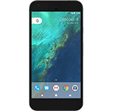
Google Pixel
- 2

1024X768
×
iPhone 12 pro(1170x2532)

Ipad pro(2048 x 2732)

Google Pixel (1080 x 1920)
Desktop 1024 x 768
Why my mobile view website refused to connect? : Your mobile view website may not be supporting iframe. Don't worry LT Browser has it covered.
You are about to download LT Browser for Linux
×Download Deb
64-bit version for Debian/Ubuntu
Download RPM
64-bit version for Fedora/openSUSE
By downloading and using LT Browser, I agree to the Privacy Policy and Terms.
Test Site On Mobile For Free
- 50+ Device Viewports on local machine
- Chromium-Based Engine
- Side by Side viewport comparison
Test on Real Device Cloud
- Test on latest iOS and Android real devices
- IP Geolocation, GPS location and Network Throttling Testing in a single click
- Streamline mobile app testing with Intelligent UI Inspector


Test Website On Mobile View
Test site on mobile view across different pre-installed mobile device viewports or custom mobile resolutions. LT Browser, a developer-friendly mobile view website tester, offers testing Android and iOS device viewports to help you ensure a seamless user experience.
Check Responsive Design On Your Tablets
Check out LT Browser, a free-to-use tablet and mobile view website tester to ensure responsiveness across 50+ device viewports.

Test On Different Laptop Viewports
Test your website's responsiveness on pre-installed laptop viewports or create custom laptop resolutions with this responsive website checker.

Test On Different Desktop Sizes
Test the responsiveness of your website and web apps across multiple pre-installed desktop resolutions with LT Browser . You can also create your custom desktop resolutions with this developer-friendly browser.

100% Accuracy is Essential - Switch to Real Device
Mobile emulators and simulators offer a glimpse, but they fall short in mimicking real-world scenarios. Don't settle for emulations/simulations; choose real device.
 Natural gestures - pinch to zoom in, 2 fingure scroll etc
- Detailed device and app/crash logs
- Integrate with TestFlight, AppStore

How to Check Mobile View of Website With LT Browser

Native Chromium Engine
Use all Chrome browser features like settings and APIs, having better OS integration, accessing latest Chrome DevTools.

Multiple Device Viewports
Choose from a wide range of devices and effortlessly interact and test responsiveness across multiple device viewports.

Dedicated Chrome DevTools
Enhance your mobile view debugging with built-in Chrome dev tools for each device viewport, enabling faster debugging.

Multiple Recording Options
LT Browser lets you record the entire screen or a specific tab in tablet or mobile view and easily share it with your team.

Google Lighthouse Report
Get access to concise lighthouse report for viewing your website's key performance metrics, including accessibility score and SEO.

Hot Reloading Feature
LT Browser's user-friendly interface, quick documentation, and hot reloading ensure seamless code updates in device viewports.

Network Throttling
Ensure seamless user experience by checking your mobile view website's responsiveness on various network profiles.

Multiple Bug Reports
Create and share responsive bug reports seamlessly across preferred project management or messaging tools.

Test History
Developers using LT Browser access their test history for informed decisions and clear site cookies via Chrome settings.


FAQs
What is the mobile view of website?
You can get the mobile view of website for free with LT Browser. Simply select your preferred device or create a custom device viewport and check the responsiveness of your website.
How do I get mobile view of website?
The view of website we get while visiting it from a smartphone or a tablet is called mobile view of the website. You can emulate the mobile view from LT Browser without the need of purchasing a new mobile device.
Why mobile website test is important?
Testing your mobile website ensures that users have a good experience when visiting the site with their mobile devices. It also helps you avoid ranking poorly when people are searching through Google using a mobile device.
How to perform mobile website test?
LT Browser gives you the freedom to test your website on any mobile view. With its Custom Resolution feature, you can use LT Browser to test your mobile website on multiple devices.
What are the popular devices I should test my website on?
It depends on the devices used by your website visitors. Following are the most common device one should consider.
Mobile- iPhones, Samsung Galaxy series, OnePlus phones of past 2 to 3 years.
Tablets- iPads and Samsung Tablets launched in past 3 to 4 years
PCs- Laptops from Lenovo, Dell, Apple for past 5 years
Mobile- iPhones, Samsung Galaxy series, OnePlus phones of past 2 to 3 years.
Tablets- iPads and Samsung Tablets launched in past 3 to 4 years
PCs- Laptops from Lenovo, Dell, Apple for past 5 years
How to build the best mobile view of website?
There are a few checkpoints everyone should consider for building a mobile wesite.
- 1. Choose a mobile friendly theme for website
- 2. Use light images , videos and CSS
- 3. Use easy to read font and font size 4. Check for responsive button design, size and placement
- 5. Avoid un-necessary pop-ups 6. Avoid un-necessary links on webpage
- 7. Regular mobile website test
What is the difference between responsive and adaptive design?
Responsive website is fluidic enough to adapt to any shape or size of the viewing device. Adaptive website first detect a predefined resolution and shows pre decided static elements of the website. Fun Fact: Google ranks mobile friendly websites higher compared to any other form of website.
How do I create a mobile view website?
This is how you can create a mobile view wesite.
- 1. Responsive Design
- 2. Flexible Layouts
- 3. Touch-friendly Navigation 4. Optimize Images
- 5. Minimize Text Input 6. Speed Optimization
- 7. Test on Multiple Devices
- 8. Viewport Meta Tag
How do I turn my website into a mobile view?
To turn your website into a mobile view, you need to ensure that your website is responsive, meaning it adapts its layout and design based on the screen size of the device. You can achieve this by using responsive web design techniques, such as using fluid grids and flexible images, and by testing your website on various devices to ensure it looks and functions correctly on mobile devices.
How do I view the mobile version of a website?
To view the mobile version of a website, you can use the developer tools available in most web browsers. In Google Chrome, for example, you can open the developer tools by right-clicking on the web page and selecting 'Inspect'. Then, click on the 'Toggle device toolbar' icon to simulate a mobile device. This will allow you to view the mobile version of the website.

1.2B+
Tests

2M+
Users

10000+
Enterprises

132
Countries
Elevate Your Mobile View Of Website
Experience firsthand how our platform can empower you to reach your Responsive testing objectives and bring innovation in your testing procedures. Try LambdaTest today.
 Talk to us
You are about to download LT Browser for Linux
×Download Deb
64-bit version for Debian/Ubuntu
Download RPM
64-bit version for Fedora/openSUSE
By downloading and using LT Browser, I agree to the Privacy Policy and Terms.