 KaneAI - World’s First E2E Software Testing Agent.


Reduce Customer Churn & Drive Engagement With Intuitive Mobile UX
Kritika Murari
Posted On: March 12, 2021
 26988 Views
 9 Min Read
“More than 88% of online shoppers say they are unlikely to return to a website after a bad user experience.”
User experience is the guiding principle for consumer-first businesses. Many business leaders would concur with the famous quote by Frank Chimero, “People ignore design that ignores people.” This statement holds relatively true for UX.

Given the importance of UX, it is essential to think hard and plan ahead of time about your website’s look and feel. The challenge is that your users can view your website from ‘any’ device. And the complexity of design grows manifold considering the plethora of devices available in the market, especially mobile.
The ubiquity of mobiles has revolutionized the way we access the web.
A website’s mobile UX is the first source of impression around a brand to most of its users. As a business leader, you would want to capitalize on the first touchpoint to leave an everlasting impression.
Here we talk about the key elements to create an intuitive mobile UX – a secret weapon to create a ‘WOWsome’ user experience.
What Makes A Good Mobile Experience?
Mobiles have become such an integral part of our lives that users expect every business to offer a tailored & personalized user experience. From smooth scrolling, responsive images, contrasting CTAs to page load speed, browser compatibility, accessibility, etc., there are lots of boxes to tick from your responsive web design checklist.
“89% of people are likely to recommend a brand after a positive brand experience on mobile.”
The million-dollar question is – What makes a winning mobile UX?
- Speed
- Navigation
- Reachability
- Usability
- Responsiveness
- Visual Appeal
- Personalization
- Progressive Web Apps (PWA)
Findability Precedes Usability
“88% of online shoppers say they wouldn’t return to a website after having a bad user experience.
70% of online businesses that fail do so because of bad usability.”
The user journey must be as seamless and as effortless as it can be! It is recommended that your website should have a minimum number of taps for any user journey.
Divide your website’s feature interactions into smaller & meaningful user stories. Test usability for each interaction and minimize the steps wherever possible.
Need for Speed!
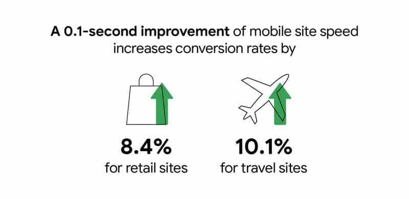
How quickly your website loads directly impacts the number of deals you’re able to close. A 3 second loading time leads to a bounce rate of 32%, while a 5 second load time leads to 90%. Incorporating a CDN (Content Delivery Network) for all your web content can help you drive your site in the fast lane.
Today’s users expect mobility and excellent mobile UX. You gotta test everything!
Intrigued to know how your website would load on slower mobile networks? With LT Browser, you can do network throttling to check your website’s performance under different network conditions.
Visual Appeal akin to WYSIWYG
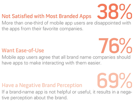
“38% will stop engaging with a website if they find it unattractive.”
What you see is what sells. 😄 A visually appealing UI helps lower bounce rate, drives better engagement, and increases your website’s stickiness quotient. It goes without saying that selling something that doesn’t look appealing will be an arduous task.
Here are the elements that help in creating an eye-catching visual experience for the mobile web.
Responsive Web Design
The way your website is rendered on a desktop device is entirely different from how it appears on a mobile device (Check how to test on mobile devices?). The screen size, resolution, viewports, and operating systems might lead to a UI anomaly.

The one-size-fits-all approach is not applicable, as the nuances of engagement, context, and intention vary from one device to another.
It is essential to have a responsive web design to make the mobile experience worthwhile for your mobile users.
Less Is More
A study from Microsoft indicated that online businesses have around 8 seconds (no longer than a goldfish can concentrate on something) to retain their user’s attention. This was way back in 2015!
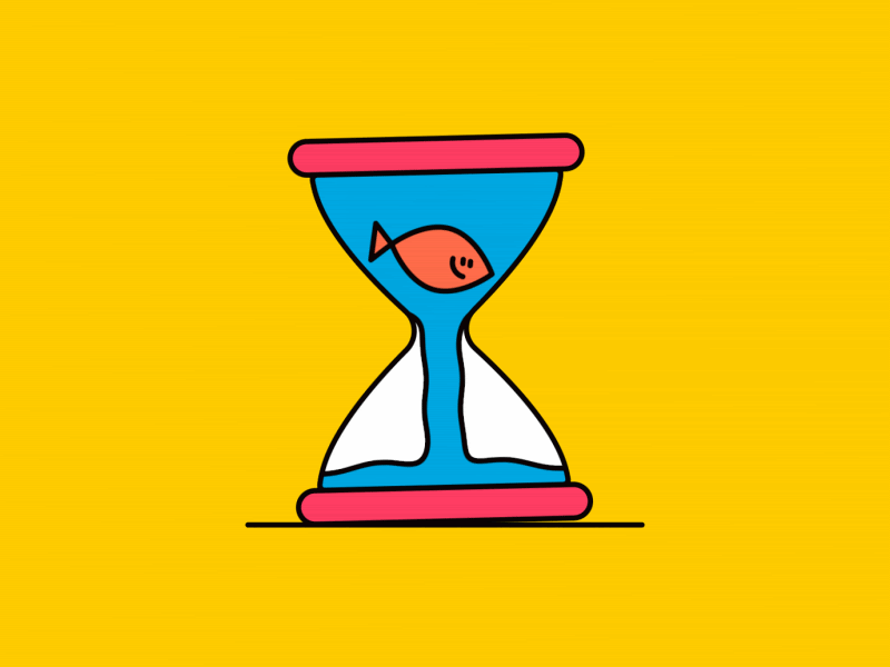
Imagine if Microsoft were to reconduct the study today, it wouldn’t be surprising to find a shorter time span for user’s attention. So you have an extremely narrow window to convey a lot about your product. The best way to do so is to embrace minimalism in design & content — and relay the things that matter the most.
Inclusion of too many elements on the web page can lead to cognitive overload, which can be a damper to the user experience. The idea is to embrace minimalism for delivering a delightful experience to the audience. Using white spaces removes unnecessary complications and unnecessary hurdles in the user journey.
The catch about whitespaces is they need not be white in color. The design team can experiment with different color palettes, grid layouts, and typography to make the design more catchy without sacrificing the core principles of minimalism in mobile UX design.
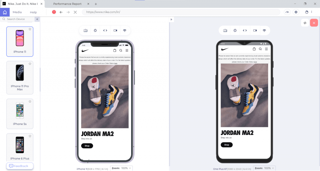
Here is how Nike is bossing it!
Hat Tip – To clear out the clutter, take the Squint Test. If you squint your eyes while looking at your site, the most important things should stand out first, and the least important things should stand out last.
Mind The Thumb Zone
On mobile UX, you don’t get a mouse pointer; instead, you work with your fingers and mostly the thumb, which covers a lot of real estate. As per Steven Hoober’s research, close to 49% of smartphone users rely exclusively on their thumbs to do things on their phones.
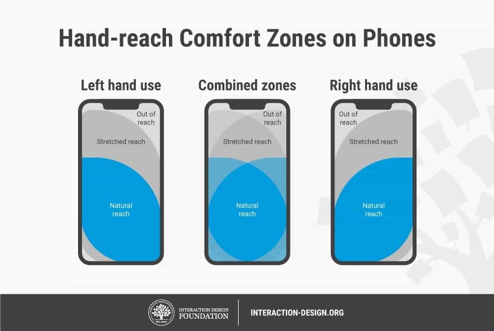
Your design team may need to re-evaluate the size of buttons on mobile UX.
Go Easy With The Navigation
“It’s really clear that the most precious resource we all have is Time.”
Your users are looking out for a potential solution on your website; it is for you to ensure that they get the answers as quickly as possible — and the website’s navigation plays a crucial role in shortening the route to their destination.
An intuitive mobile UX makes use of a hamburger menu and relatable home icons. Intuitiveness simplifies the user journey, thereby enabling them to perform subsequent actions in the shortest possible time.
Placement of elements like the navigation bar, search bar, hamburger menus, etc., lays the foundation of the user journey. Focus on breezy onboarding and ease of navigation so that the user finds the relevant information in the least possible clicks!
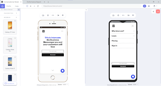
Let us take a look at how Intercom does it.
Deliver A Cross Browser Compatible Mobile Experience!
Website Navigation is working in Safari but not in Chrome https://t.co/K0HC77yAAy #css #nav #html pic.twitter.com/HFDPlAR9L0
— Meme Overflow (@overflow_meme) February 22, 2021
Even though your website renders seamless across various mobile resolutions, screen sizes, operating systems, it doesn’t guarantee its browser compatibility!
You can leverage LambdaTest to validate your website across 3000+ desktop and mobile browsers on cloud, for live and automated browser testing.
Who’s Up For Some Bonus Tips?
Prim up your mobile website’s UX, but why stop there? Here are some bonus tips for a head-to-toe inspiration to help you maximize retention from mobile-first customers.
Personalization Goes a Long Way

Personalization can be considered as the cornerstone of providing an awesome customer experience. As per Gartner, though personalization holds greater relevance when it comes to B2C businesses, personalization in B2B businesses is also gaining pace.
B2B businesses can close deals faster by connecting with users at different stages of the buyer journey, predicting their actions and delivering them ultra-relevant offers.
Hyper-personalization can help you build brand loyalty, decrease customer churn and increase the LTV(Lifetime Value).
Also Read: Mobile UI Testing Tutorial: A Comprehensive Guide With Best Practices
Accelerate User Engagement with PWAs
App-only strategy has been a debatable topic since the time it was implemented by a few online enterprises. It wouldn’t be fair to assume that a mobile app is the only way you could serve your customers.
“57% of mobile app users churn and no longer use the app one month after they downloaded it”
A significant chunk of your customers might be browsing your website on a mobile browser, you are sure to lose this traffic by going the ‘app-only route’. It is no brainer that Mobile app-only approach is causing 10% loss in sales and your business can go downhill by deploying this strategy.
Instead, it’s better to build a mobile-optimized website or better yet – a Progressive Web App (PWA).
Progressive Web Apps are all set to lead the app-less revolution.
As per Applify:
- Ride-hailing giant Uber reaped immense benefits from PWA as its PWA could load in 3 seconds flat on 2G connectivity.
- Online dating giant Tinder created a PWA that was 90 percent smaller in size than its native equivalent. This resulted in a decrease in the load time from 11.91 seconds to 4.69 seconds. Increased user-engagement was a given with Tinder’s PWA strategy!
With PWA, OTA Trivago’s click-out rate increased by 97%, along with a rise in user engagement by 150 percent.
Long story short, if you wish to increase user engagement and decrease user churn, PWA is the way to go!
Wrapping Up!
Blogpost in a tweet:
1. Mobile was the first real "Internet of Things"
2. The rise of "front of frontend" & "back of frontend" devs is result of insatiable demand for better UX and the need to scale distributed apps
3. Startups specializing in serving them can beat incumbents.
— shawn swyx wang (@swyx) February 21, 2021
It’s essential to understand the critical elements of an excellent mobile UX before you can provide your users with relevant and frictionless mobile experience.
Finally, you are at the last mile to tick all the items in the responsive web design checklist! Consistency across the plethora of mobile devices will help you transit from a good user-experience to a WOWsome user experience.
Take the first step to build a mobile friendly experience for your users with the LT Browser — a browser for developers to build, test & debug mobile websites.
Happy testing!


Author’s Profile
Kritika Murari
A technophile and bibliophile at heart, Kritika loves to experiment with different aspects of Digital Marketing. When not working, you will either find her sketching or backpacking.
Blogs: 30
Got Questions? Drop them on LambdaTest Community. Visit now