 Test your AI Agents with the all-new Agent to Agent Testing Platform.Learn More
Mimic Real World Scenarios with Real Device Cloud
Test Your Native, Hybrid & Web Apps on 10,000+ real devices.
- Web Development
- Home
- /
- Learning Hub
- /
- How to Enable Safari Mobile View [6 Quick Methods]
How to Enable Safari Mobile View [6 Quick Methods]
Learn how to enable Safari mobile view with multiple methods, tips, and troubleshooting to test and optimize your site on mobile devices.
Last Modified on: November 24, 2025
- Share:
Whether for development, testing, or accessing a feature only available on mobile, you might come across scenarios in which you might need to use the Safari mobile view of a website. Knowing the different methods to achieve this and understanding which approach fits a particular scenario can save both time and effort.
Overview
On a desktop, Safari mobile view typically refers to emulating or simulating how a website would appear on iOS Safari without using an actual iPhone or iPad.
Importance of Safari Mobile View
- Large Market Share: Safari holds 14.98% of the mobile browser market, making mobile view testing crucial for compatibility.
- Faster Debugging: Simulate mobile devices instantly to identify layout and functionality issues, like button sizing on smaller screens.
- Leverage Developer Tools: Use Safari’s developer tools to tweak network settings and debug websites with precision.
- Access Mobile-Only Features: Test features exclusive to mobile view without needing a physical device or app installation.
- Accelerate Development and Testing: Open any device view instantly, speeding up development and QA workflows.
Different Methods to Enable Safari Mobile View
- Custom Size: Enter Responsive Design Mode and drag the browser window to test how your site adapts to different screen widths.
- Fixed Size Devices: Select a specific device from the top menu in Responsive Design Mode to test exact iPhone or iPad screen dimensions.
- Simulators: Use built-in device simulators (or install via Xcode) for accurate previews of mobile layouts and behavior.
- Developer Tools: Open Web Inspector to manually adjust viewport and debug layout issues at the code level.
- User Agent: Change Safari’s User Agent to mimic a mobile device and load the mobile version of a website without using an actual device.
Why Use Safari Mobile View?
When you test on Safari browsers, there are many reasons where using the mobile view on a desktop becomes useful, each serving different testing, development, or browsing purposes.
- Large Market Share: According to Statcounter, Safari holds a significant mobile browser market share of 14.98%. Hence, during development, testing, and debugging, the Safari mobile view becomes highly essential.
- Faster Debugging: Knowing how to open the mobile view for different devices using Safari on a desktop is the quickest method for instant debugging and analyzing device-specific issues on a higher level, such as button resize capability on smaller screens.
- Leverage Developer Tools: Using Safari developer tools to debug websites is crucial in the scenarios where you need to tweak network bandwidth so that you can test the web application on a granular level.
- Access Features Without App Installation: If a feature is available only for the mobile view, you can leverage these methods to access it through the desktop Safari without opening the app on their mobile.
- Accelerate Development and Testing: Since Safari mobile view can be opened up in seconds for any device of choice, it speeds up the development and testing process.
Different Methods to Enable Safari Mobile View
Before you can access Safari’s mobile view options, you need to enable the Develop menu if it’s not already visible. This Safari developer menu appears in the macOS menu bar alongside options like File, Edit, and Bookmarks.
To enable it:
1. Open Safari > Settings > Advanced.
2. Check the Show Develop menu in menu bar. (On the latest macOS versions, this may appear as Show features for web developers.)
Once enabled, the Develop menu will appear in the menu bar, giving you access to tools for responsive design, simulators, user agents, and other developer features.
Note: Test your websites across 3000+ Safari desktop and mobile browsers. Try LambdaTest Now!
Enable Safari Mobile View With Custom Size
One of the simplest ways to view a site in mobile layout is by adjusting Safari’s window to a custom size. This is useful for quick checks where you just need to see how a design responds at different breakpoints.
To do this:
1. Go to Develop > Enter Responsive Design Mode.
2. Once the mode is active, drag the edges of the window to resize it manually.
As you resize, the viewport adjusts dynamically, letting you test how your website behaves across a range of screen widths without being tied to a specific device preset.
Enable Safari Mobile View With Fixed Size
Custom resizing is a quick way to check responsiveness, but it only gives a rough idea of how a site adapts.
For deeper testing, you often need to replicate specific device dimensions. Safari makes this easier by providing a set of fixed sizes so you don’t waste time dragging the viewport to match exact breakpoints.
To use this option:
1. Go to Develop > Enter Responsive Design Mode.
2. At the top of the window, select a device from the list. Safari will automatically adjust the viewport to match that device’s specifications.
Note: On macOS versions released after Ventura, such as Sonoma, the device list may not appear by default. In that case, you’ll need to install Xcode and add target simulators, which will then show up in Responsive Design Mode.
New to Xcode? Check out this complete tutorial to learn what is Xcode and how it works.
For developers and testers, Safari Web Inspector works seamlessly in this mode. After selecting a device, you can right-click any element to inspect and debug it just as you would in desktop Safari.
This method is one of the fastest ways to test layouts across multiple devices without switching hardware, making it a go-to for debugging elements at scale.
Enable Safari Mobile View With Simulators
In the latest versions of macOS, Safari goes beyond simple viewport resizing by offering simulators. Unlike basic size adjustments, simulators provide a much more accurate rendering of how a website appears and behaves on specific devices, such as an iPhone or iPad.
To use this feature:
1. Go to Develop > Enter Responsive Design Mode.
2. On the right side, you’ll see a list of available simulators.
3. Select a device to render the website as it would appear on that hardware.
If no simulators are listed, you’ll need to install Xcode and download the required simulators through it. Once installed, they’ll automatically appear in Safari’s Responsive Design Mode.
This approach is especially useful when you need a realistic preview of smaller devices where layout nuances, text scaling, and touch-friendly design become critical.
Enable Safari Mobile View With Developer Tools
A more conventional and technical method to achieve Safari mobile view on a desktop is through the developer tools.
Developer tools, or often known as the web inspector, an built-in browser tools used primarily for debugging. It shows the current page's code with element attributes, network parameters, files associated with the current request, web page design with dimensions, and other critical metrics such as storage and time to paint.
To open it, simply right-click on the webpage > Inspect Element. From there, you can work within the Elements tab to manually adjust the viewport and mimic mobile dimensions.
This essentially lets you see how the page would behave at different sizes, though it requires knowing the exact specifications of the devices you want to emulate.
While this method offers the most technical control, it is also the most time-consuming. It’s best suited for developers who need to debug issues at the code level rather than quickly preview layouts.
Enable Safari Mobile View With User Agent
Every browser identifies itself to a server using a User Agent string, which contains details about the device, operating system, and browser version. For example, Safari on macOS might send something like:
Mozilla/5.0 (Macintosh; Intel macOS X 15<i>6</i>1) AppleWebKit/605.1.15 (KHTML, like Gecko) Version/18.5 Safari/605.1.15 This information is included in the request headers and helps the server decide what version of a website to deliver. By changing the User Agent, you can make the server believe your browser is running on a different device, such as an iPhone or iPad, thereby loading the mobile version of the site.
Safari makes this process straightforward:
1. Enable the Develop menu in Safari’s settings.
2. From the menu bar, go to Develop > User Agent.
3. Choose the device profile you want Safari to mimic.
The page reloads automatically, adjusting layout and elements to match the mobile view. Selecting a device makes the browser resend requests, letting you test server-side behavior and mobile-specific features in Safari without using a physical device.
Important: Testing Safari mobile view is essential because Safari on macOS and iOS behaves differently from other browsers, and ignoring it can cause usability and functionality issues. The above discussed methods work for small projects but are inefficient at scale, making in-house testing time-consuming and costly. Here the best option is to leverage cloud platforms like LambdaTest which provide a faster, scalable solution.
How to Test Safari Mobile View With LambdaTest?
LambdaTest allows you test on macOS browsers hosted on the cloud infrastructure, which you can launch directly from your browser instead of setting up and maintaining multiple machines in-house.
From there, you can test Safari’s mobile view across different macOS versions. This makes it a scalable, cost-effective option for teams handling frequent or large-scale testing.
Features:
- Cross Browser Testing: Perform cross browser testing on real Safari browsers to quickly isolate browser-specific anomalies and ensure uniform experiences.
- Real iOS Devices: Test your websites on real iPhones and iPads, ensuring Safari-specific rendering and interaction issues are accurately captured.
- Extensive Device and OS Coverage: Test across a wide range of iOS versions and device models, from legacy iPhones to the latest iPads, to uncover compatibility gaps early. LambdaTest also provides access to Safari browsers for Windows and Safari browsers for Linux, eliminating the need to switch operating systems.
- Geolocation Testing: Perform geolocation testing to simulate test sessions from different regions to validate localized content, compliance banners, and currency formats in Safari.
- Network Throttling: Recreate real-world bandwidth conditions such as 4G, 5G, or custom speeds to ensure smooth performance for users on slower or unstable networks.
- Advanced Debugging Tools: Access console logs, network requests, screenshots, and video recordings to identify issues with precision and provide reproducible bug reports.

Best Methods to Enable Safari Mobile View
Multiple methods were discussed in this post, and there exist so many methods because they all serve different purposes.
Practically, you will find the need for the Safari mobile view in three scenarios: during development, testing, and general browser usage. All three will require three different approaches.
- A Developer’s Perspective: If you are developing a web application, most of your need suffice towards verification of the feature’s deployment on the page. This means that a quick rescaling of the viewport is all you need when checking for mobile web view. Hence, Responsive Design Mode is the best option for them.
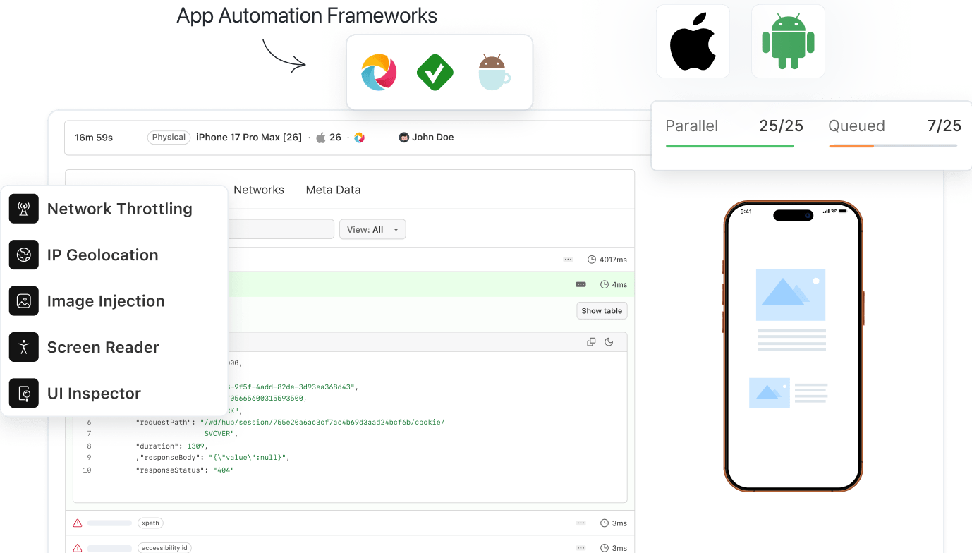
- A Tester’s Perspective: If you need to test the web application inside out for all the anomalies, small or big. Hence, a perfect choice here would be to go for a real device cloud like LambdaTest, as it not only provides a mobile view on real devices but also supports automation to run scripts on multiple frameworks like Appium.
- A User’s Perspective: Finally, a user browsing the Internet would just need to use a iOS simulator built into the Safari browser. Going through the Develop menu and using User Agent will be sufficient, and if needed, a simulator can be downloaded along with Xcode so that it is accessible from within the browser.
Troubleshooting Common Issues in Safari Mobile View
Users working with Safari on desktop and analyzing mobile view through it can witness certain issues.
- Loading Mobile Websites by Default: Sometimes, users may see mobile websites loading all the time on desktop, even after restarting the browser. This can be switched back to the original state by enabling the “Develop” option on the menu bar.
- Desktop Website Loaded in Responsive Mode: While viewing the web application in responsive mode, users may see the desktop website loading instead of the mobile website. This can be because the server is still considering the source as a desktop.
Generally, this is due to the absence of specific tags in the code, for example, user-agent or meta tags. When such issues arise, always use the “User Agent” method described above.
- Metrics Showing Extraordinary Values: While analyzing performance metrics, a tester may see extraordinarily low values through Safari mobile web view that might not make any sense. This is because a desktop’s local resource is used when the responsive mode or user agent method is selected.
In such a case, it is always good to use platforms like LambdaTest that provide simulators and real devices with log values of parameters and testing-specific tools for in-depth analysis.
- Touch and Hover Issues: Safari mobile web can present issues related to touch and hover over elements because adjusting the viewport doesn’t provide any special assistance for mobile-specific features.
When touch and hover-related actions are required to be performed, the best option is to ditch simulators and perform the same actions on a simulator or cloud-based real devices.
One might face other issues, apart from the above-listed ones, while working with Safari web view. However, consider that all of these issues can be managed by switching between simulators, viewport rescaling, and real devices. The underlying causes are not about the method we use, but the hardware we choose.
Conclusion
There are many scenarios where opening a website in Safari’s mobile view becomes necessary. Sometimes it’s to access a feature available only on mobile, other times it’s for developers verifying layouts on smaller screens, or testers running early-stage checks before deeper QA cycles. Whatever the case, Safari offers several ways to simulate mobile environments, each with its own trade-offs in terms of accuracy, resource usage, time, and cost.
The key is to match the method to your specific need. For quick layout checks, Safari’s built-in tools are more than enough. For thorough testing or business-critical projects, cloud-based platforms like LambdaTest deliver the accuracy and scalability required. Once you understand the strengths and limitations of each approach, choosing the right solution becomes straightforward.
Citations
- Apple Safari: https://www.apple.com/in/safari/
Frequently Asked Questions (FAQs)
Did you find this page helpful?

More Related Hubs

Start your journey with LambdaTest
Get 100 minutes of automation test minutes FREE!!