Power Your Software Testing with AI and Cloud
Supercharge QA with AI for Faster & Smarter Software Testing

- Automation
- Home
- /
- Learning Hub
- /
- What Is User Interface Design
What Is User Interface Design: A Complete Guide
Learn what user interface design is, its key principles, best practices, and how to create interfaces that are intuitive, visually clear, and easy to use.
Last Modified on: November 5, 2025
- Share:
The user interface shows buttons, menus, forms, icons, sliders, and layouts that users interact with directly. It organizes controls and information to help users complete tasks efficiently. It keeps colors, fonts, spacing, and elements consistent across screens. The UI gives immediate responses when users take actions. It works with keyboard, mouse, and touch navigation and adapts to different devices and screen sizes.
Overview
A user interface is the screen layout and controls that let users interact with software, access functions, and perform actions efficiently.
What Are User Interface Components?
User interface components are the essential elements that make interaction between users and software possible. Core UI components include:
- Visual Structure: Defines how interface elements are positioned and related on the screen. It includes layout grids, color schemes, typography, spacing rules, and consistent alignment across views.
- Input Controls: Allow users to enter data or trigger actions directly. Common controls include buttons, text fields, dropdowns, checkboxes, radio buttons, sliders, and toggle switches.
- Navigation Components: Help users move between sections and understand their location. Menus, tabs, breadcrumbs, pagination, and search bars ensure smooth navigation across the application.
- Information Elements: Display software updates, progress, and status feedback. Progress bars, notifications, alerts, tooltips, and error messages inform users about ongoing actions or required responses.
- Content Organization: Manages how information is grouped and displayed for clarity. Cards, tables, lists, accordions, and modals present data in structured, readable, and easily scannable layouts.
- Visual Indicators: Use symbols and images to convey meaning quickly. Icons, illustrations, brand graphics, and status indicators communicate states or actions without relying heavily on text.
How to Create a User Interface?
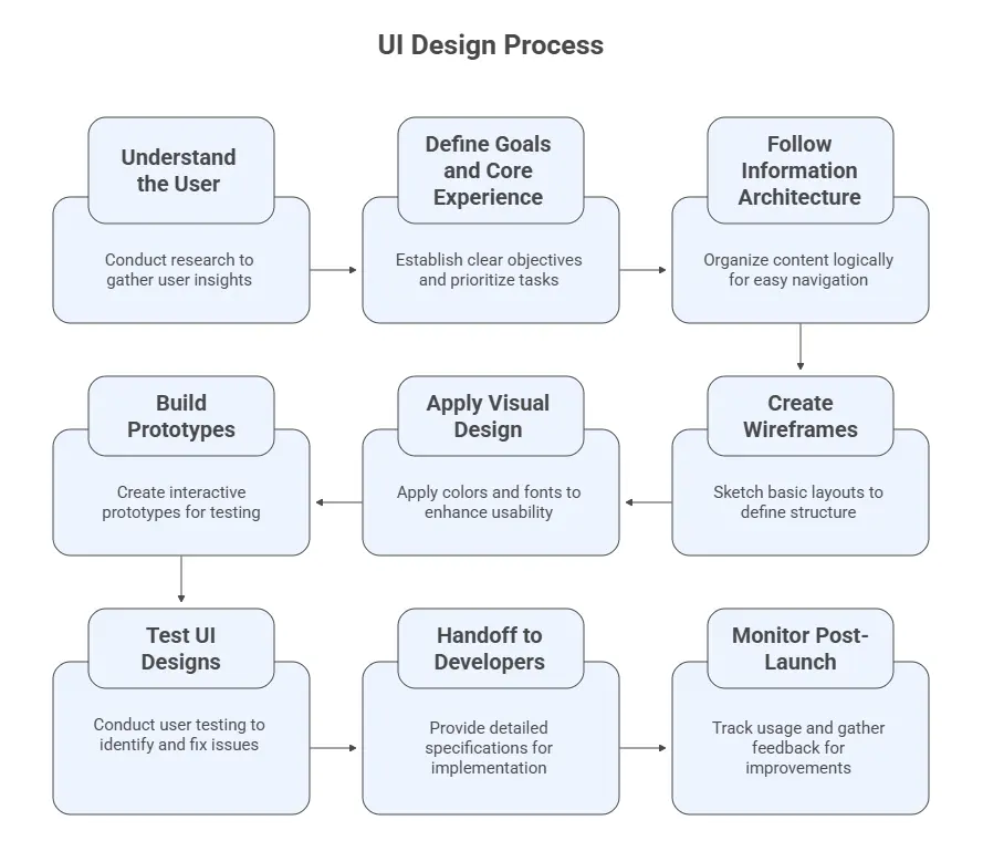
Creating a user interface is the process of designing screens and interactions so users can complete tasks efficiently. Key steps include:
- Understand the User: Start with research using interviews, surveys, and analytics. Define user personas and key scenarios to reveal needs, pain points, and real opportunities for improvement.
- Define Goals and Core Experience: Translate research into measurable objectives. Identify essential user tasks, set performance targets, and prioritize features that directly support efficiency, usability, and business outcomes.
- Follow Information Architecture: Organize content logically with a clear hierarchy. Map navigation paths and group related functions so users can locate information and complete actions with minimal cognitive load.
- Create Wireframes: Design low-fidelity layouts showing structure and flow. Focus on functionality, not visuals. Validate navigation logic early to ensure usability before committing to detailed design.
- Apply Visual Design: Use color, typography, and spacing that match the brand identity. Maintain consistent hierarchy, visual balance, and accessibility to support readability and guide user attention effectively.
- Build Prototypes: Develop interactive mockups simulating real interactions. Validate task flows, transitions, and responsiveness before development. Refine designs iteratively using user feedback from usability testing sessions.
- Test UI Designs: Conduct usability tests with target users. Observe navigation behavior, identify usability issues, and fix inconsistencies. Re-test revised designs until interactions meet user expectations.
- Handoff to Developers: Deliver organized design specs detailing spacing, typography, colors, and behaviors. Collaborate actively during implementation to clarify edge cases and maintain design accuracy throughout development.
- Monitor Post-Launch: Track metrics, collect feedback, and analyze real usage. Identify recurring pain points, optimize flows, and refine components continuously to keep the interface effective and relevant.
What Is User Interface (UI)?
User Interface (UI) is the point of interaction where users engage with a software, such as a website or a mobile app. It’s designed to guide users naturally through tasks, helping them find what they need and complete actions without confusion or extra effort.
In a well-designed UI, users can complete tasks efficiently because the interface clearly shows what each action does, guides them through every step, and provides immediate feedback so they always know the response to their actions.
What Are the Components of a User Interface?
User interface components include layout grids, color schemes, typography, and spacing, defining structure. Buttons, input fields, menus, icons, and cards enable interaction, navigation, and feedback across devices.
Below are the core components of the user interface:
- Visual Structure: This defines how interface elements are arranged and how they relate to each other on screen. It includes layout grids, color schemes, typography choices, and spacing rules.
- Input Controls: These are used for input or trigger actions. Examples include buttons, text fields, dropdowns, checkboxes, radio buttons, sliders, and toggles.
- Navigation Components: Navigation helps users move between sections, locate features, and understand their position within the application. It includes menus, tabs, breadcrumbs, pagination, and search functions.
- Information Elements: These components communicate updates, progress, and feedback. Progress bars, notifications, alerts, error messages, and tooltips show users what is happening and what they need to do next.
- Content Organization: This covers how information is grouped and displayed. Card layouts, tables, lists, accordions, and modals help present content in a structured and readable format.
- Visual Indicators: These are graphical symbols that represent actions, states, or content. Icons, images, brand graphics, and status indicators provide quick visual cues that guide users without needing extra text.
Note: Run manual and automated UI tests across 3000+ real environments. Try LambdaTest Now!
What Are the Different Types of User Interface?
User interfaces include GUI with windows and icons, touchscreen with taps and swipes, and CLI using text commands. They also include menu-driven lists, conversational voice or text, NUIs with gestures, and immersive VR/AR environments.
The following are the different types of user interface:
- Graphical User Interface (GUI): A GUI uses visual elements like windows, icons, menus, and pointers. Users interact via mouse, touchpad, or touchscreen. GUIs are common in desktop software like Windows and macOS, and in most mobile applications. They simplify tasks by allowing users to select actions visually rather than typing commands.
- Touchscreen Interface: Touchscreen interfaces rely on direct finger input. Users tap, swipe, pinch, or hold on the screen to perform actions. Buttons and interactive areas must be large enough to prevent errors. This type is standard in smartphones, tablets, and kiosks.
- Command Line Interface (CLI): A CLI requires text commands to perform actions. It is mainly used by developers, administrators, and technical users who need precise control. Examples include Unix shells, Windows PowerShell, and terminal emulators. CLIs are fast and efficient, but require command knowledge.
- Menu-Driven Interface: Menu-driven interfaces display options in lists or hierarchies. Users select commands step by step. They are common in ATMs, POS devices, and embedded applications. This approach reduces complexity for beginners by guiding navigation and limiting choices.
- Conversational Interface (CUI): CUIs let users communicate through voice or text in natural language. Examples include Siri, Alexa, and Google Assistant. The interface interprets intent rather than fixed commands, making it suitable for hands-free tasks and quick operations.
- Natural User Interface (NUI): NUIs allow control through gestures, facial expressions, or body movements. They use sensors, cameras, and biometric systems. This interface is used in gaming, accessibility tools, and interactive installations for intuitive interaction.
- Immersive Interfaces (VR/AR): Immersive interfaces include Virtual Reality (VR) and Augmented Reality (AR). VR creates a full digital environment, while AR overlays digital objects on the real world. Input methods include motion controllers, hand tracking, and eye tracking. These are used in training, simulation, and interactive experiences.
What Are the Principles of UI Design?
The principles of UI design include consistency, familiarity, feedback, flexibility, efficiency, and accessibility. They ensure interfaces are clear, predictable, responsive, adaptable, and usable for all.
Here are the principles of UI design:
- Consistency: Keep buttons, colors, and menus uniform across all screens. Make a blue button perform the same action in every location. Let users use the same controls on each screen to avoid confusion and complete tasks faster.
- Familiarity and Predictability: Use design elements and layouts that users already recognize. Place search bars in conventional locations, like the upper right corner, and use standard icons, such as magnifying glasses for search. Familiar design reduces cognitive load and prevents users from misinterpreting interface elements.
- Feedback: Provide immediate and clear responses to user actions. Button clicks should trigger visual changes or confirmations, while form submissions require success or error messages. Users rely on feedback to know their input has been registered and processed correctly.
- Flexibility: Support multiple interaction methods and skill levels. Some users prefer keyboard shortcuts, others rely on mouse or touch navigation. Novices need simple, guided workflows, while experienced users benefit from shortcuts and faster paths. Avoid forcing a single interaction style on all users.
- Efficiency: Streamline workflows by removing unnecessary steps. Frequently used functions should remain easily accessible, and critical features should not be buried in menus. Each extra action increases time spent and user frustration, so optimize layouts for quick task execution.
- Accessibility: Design for users with varying physical abilities. Provide scalable text, high-contrast visuals, full keyboard navigation, and properly labeled elements for screen readers. Accessibility ensures software can be used effectively by everyone, reducing barriers and improving overall usability.
Learn about different UI design mistakes you must avoid to create a bug-free user interface.
What Are Some Good UI Design Examples?
Good UI examples show Apple using clean layouts and fluid navigation, and Notion guiding users with focused features. Another is Spotify Wrapped, which turns data points into clear, engaging, shareable visuals.
Let’s look at some good examples of user interface design:
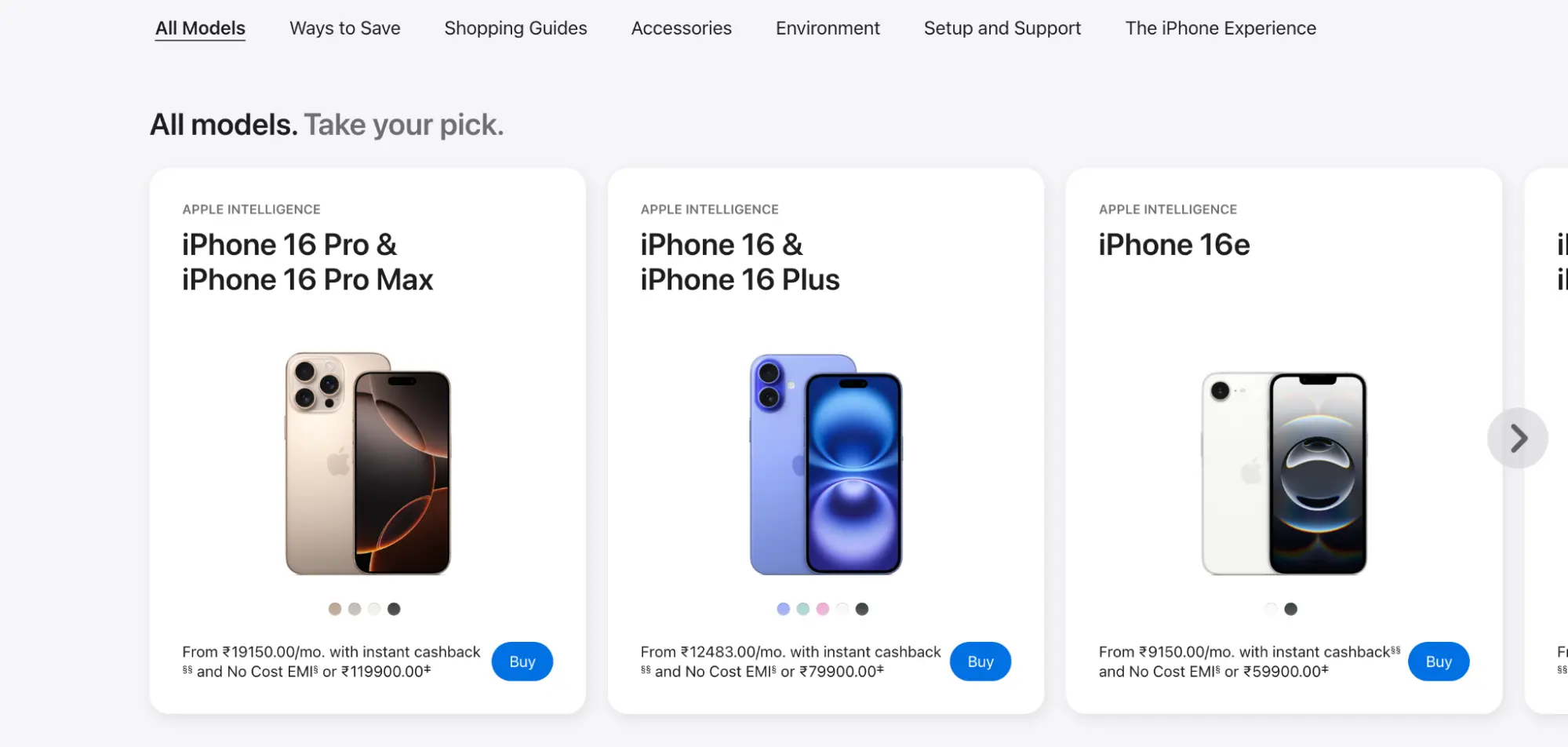
Apple

Apple’s website demonstrates how white space and clean layout elevate product presentation. Products are given room to stand out, enhancing perceived quality. Scrolling is fluid across devices, and menus are organized for easy navigation. The design eliminates clutter, ensuring users can access product details quickly without unnecessary effort.
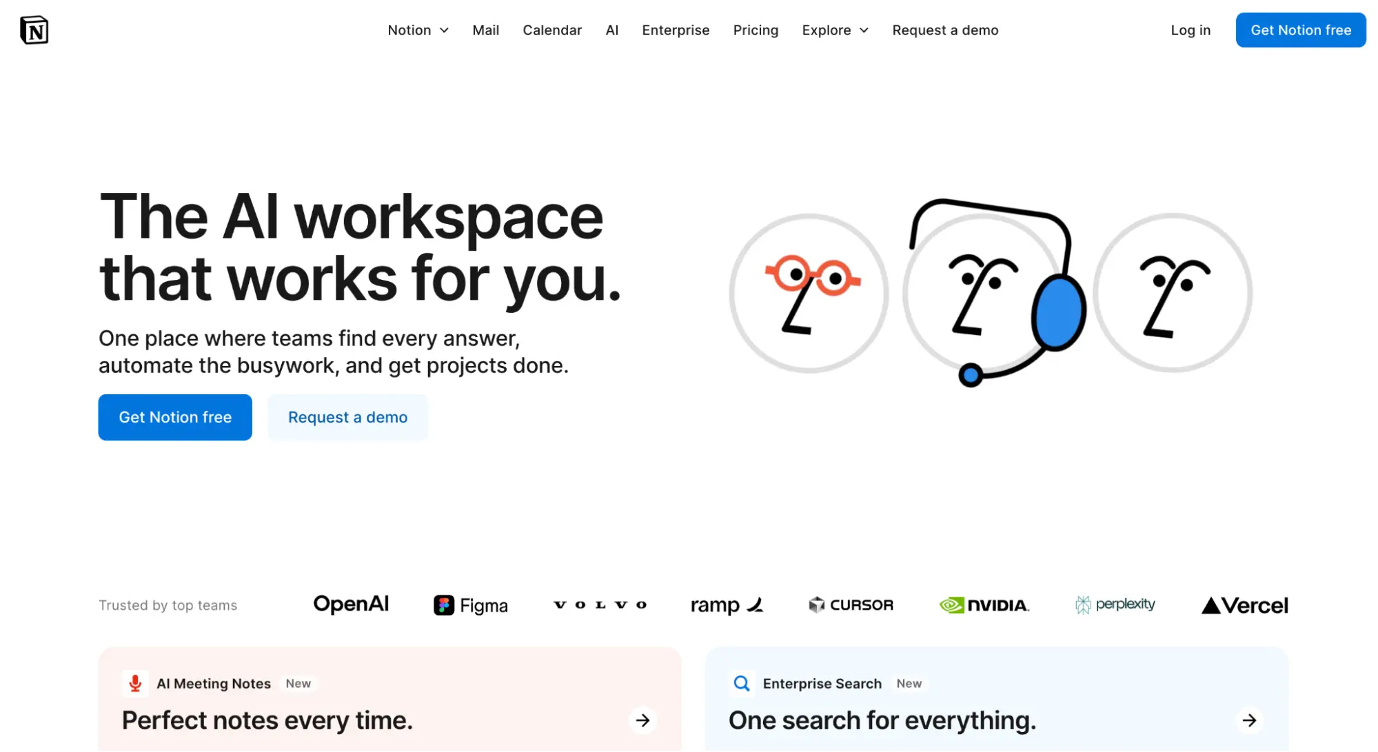
Notion

Notion prioritizes a smooth onboarding experience for new users. The interface is clean with selective color highlights to draw attention to important elements. New users see only essential features initially, avoiding overwhelm from advanced options. This step-by-step exposure helps users gradually understand the platform, improving retention and reducing friction in the learning process.
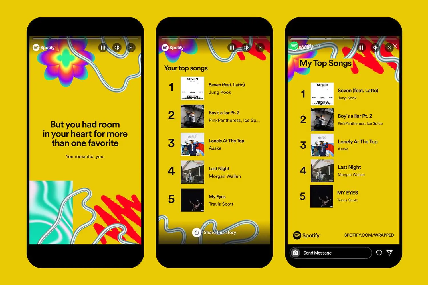
Spotify Wrapped

Spotify Wrapped transforms user data into a visually engaging experience. Bold graphics and dynamic animations make reviewing listening habits enjoyable and shareable. Information is presented sequentially, showing top songs, artists, and genres in a clear order. The design keeps users engaged while simplifying social sharing. Raw data is turned into an interactive story without requiring technical knowledge.
Explore more SaaS website design inspirations.
How to Build a User Interface Design?
To build a user interface, research users, define goals, organize content, and create wireframes. Apply visual design, build prototypes, test and iterate, collaborate with developers, and monitor post-launch.
Shown below are the steps to build a user interface design:
1. Understand the User: Start with research. Use interviews, surveys, and analytics to learn what users need, how they behave, and where they struggle. Define clear user personas and scenarios. Include market and competitor analysis to identify opportunities. Solid research prevents assumptions and aligns design decisions with real user problems.
2. Define Goals and Core Experience: Convert research into clear objectives. Identify key user tasks and prioritize them. Set measurable goals such as “checkout completed in under two minutes.” Clear priorities help teams stay focused and avoid unnecessary features.
3. Follow Information Architecture: Organize content logically. Group related features and map how screens connect. A clear structure helps users predict where to find things and complete tasks with minimal effort.
4. Create Wireframes: Sketch basic layouts to define structure and flow. Ignore colors and visuals at this stage. Wireframes let teams align on functionality before investing in full design. They are quick to revise and ideal for early feedback.
5. Apply Visual Design: Apply colors, fonts, and spacing that reflect the brand while supporting usability. Every visual element should have a clear purpose, clear hierarchy, easy readability, and consistent styling. Use a style guide to maintain uniformity across screens.
6. Build Prototypes: Create interactive prototypes that mimic real user interactions. Test navigation, flows, and behavior before development starts. Adjust based on feedback. The detail level depends on what you need to validate.
7. Test UI Designs: Perform UI testing of prototypes with real users. Observe how they navigate and where they struggle. Identify patterns and fix UI bugs. Re-test to test enhancements. Iteration ensures the design truly works for its audience.
8. Handoff to Developers: Provide detailed specs, colors, spacing, fonts, and behavior. Stay involved during development to resolve questions quickly. Strong communication prevents design drift and ensures accurate implementation.
9. Monitor Post-Launch: Track usage and collect feedback after release. Analyze data to find friction points and opportunities for improvement. Continue refining based on real-world behavior. A good interface evolves with its users.
When it comes to automated web UI testing or mobile, it's important to make sure your UI designs work as intended across devices, browsers, and resolutions to deliver a uniform user experience. For that, consider using cloud testing platforms like LambdaTest that come with visual testing features like SmartUI.
Why Use LambdaTest SmartUI to Test User Interface Designs?
LambdaTest SmartUI is an AI-native platform for visual regression testing that automates UI testing across multiple browsers, devices, and screen resolutions. It helps developers and testers to perform automated testing and detect layout issues, functional errors, and visual mismatches early, without maintaining local infrastructure.
Features:- Support for Different Frameworks: Supports various test automation frameworks like Selenium, Playwright, Appium, and more for visual regression testing across multiple browsers, devices, and screen resolutions.
- Smart Ignore: Leverages AI algorithms to filter out layout shifts, displacements, and visual noise for cleaner and more accurate visual testing results.
- PDF UI Testing: Performs visual testing on PDFs, detecting differences in layout, text, and graphics to ensure consistent PDF UI quality across various platforms.
- Figma CLI: Supports direct comparisons of Figma designs with live webpages, URLs, and app screens (web and mobile), ensuring perfect design alignment for consistent, collaborative workflows.
- Smart Baseline Branching: Simplifies the management and comparison of visual test baselines across builds, facilitating easier updates and maintenance.
- Reports and Insights: Provides detailed test reports, real-time notifications, and analytics for custom reports, aiding in the identification and resolution of UI issues.
To get started, visit this LambdaTest SmartUI documentation.
Common Pitfalls in UI Design
Even skilled designers can create interfaces that confuse users. Issues like hard-to-use navigation, unclear visual priorities, ignoring mobile layouts, and inconsistent elements make software harder to use. Catching these problems early reduces defects and rework, and ensures users can complete tasks without errors.
- Ignoring Mobile Optimization and Responsiveness: Many teams focus on desktop first and overlook mobile devices. If buttons are too small or text overlaps, users cannot interact properly. Testing UI on multiple screen sizes ensures layouts adapt and touch targets remain usable, preventing abandonment on small devices.
Consider using tools like LT Browser to test your web and mobile web designs for responsiveness across various pre-installed device viewports for desktop, mobile, tablet, and laptops.
- Overcomplicating Navigation: Menus with too many options or hidden pages make it hard to reach functionality. Users expect to find tasks within a few clicks. Conducting exploratory testing or task-based testing highlights navigation gaps before release.
- Poor Visual Hierarchy: When all elements appear equal, users cannot identify primary actions. Use size, color, and placement to indicate priority. This makes scanning screens faster and reduces cognitive load during functional testing.
- Using Too Many Fonts and Styles: Multiple fonts or heavy styling create visual noise. Stick to one or two fonts and consistent formatting. UI inspections during review cycles help maintain readability and consistency across screens.
- Overloading Screens With Information: Too much content on a single page overwhelms users. Break content into sections, use spacing to separate elements, and show critical information first. Test scenarios should include common workflows to check content clarity.
- Neglecting Accessibility: Ignoring accessibility excludes users with impairments. Check color contrast, provide text alternatives for images, and ensure full keyboard navigation. Accessibility testing validates that the software works for all users.
- Lack of Clear Feedback: Users need confirmation of actions. Show success messages, progress bars, and button state changes. Functional testing should verify that every interaction provides visible feedback.
- Prioritizing Visual Flair Over Functionality: Animations and fancy layouts can distract users from tasks. Focus testing on whether effects support usability rather than only visual appeal.
- Inconsistent UI Elements: Buttons, links, and inputs should look and behave consistently. Inconsistent elements cause repeated learning. Using component-based testing ensures that all UI elements follow a standard pattern.
Check out the top UI testing tools for user interface testing.
- Skipping Beta Testing: Designers may assume screens are intuitive, but real users behave differently. Conduct beta testing with real workflows to find issues missed during internal reviews.
You can also check out this video by Min Xu, Senior Manager of Engineering at Amazon Web Services (AWS), where she explains UI testing and its importance in ensuring a consistent user experience.
Best Practices for Creating UI Design
After identifying common UI pitfalls, follow these best practices to create interfaces that guide users efficiently, reduce errors, and remain consistent across screens.
- Remove Unnecessary Elements: Eliminate buttons, fields, and text blocks that do not serve user tasks. Keep only essential components to reduce clutter and speed up interactions across screens.
- Highlight Key Actions: Make primary calls-to-action visually prominent using size, color, and placement. Minimize secondary elements. Guide users’ attention to the most important actions immediately.
- Enforce Interface Standards: Keep clickable logos returning home, place search consistently in headers, and ensure buttons behave identically across screens to maintain user familiarity and reduce errors.
- Keep Accessibility in Mind: Apply high-contrast visuals, keyboard navigation, and screen reader compatibility. Make interfaces operable for all users, ensuring accessibility while improving usability and task efficiency.
- Prioritize Mobile Design: Focus on mobile first design. First, go for small screens and cover essential functionality. Expand thoughtfully for desktop versions while preventing clutter and maintaining clarity in navigation paths.
- Layer Information Effectively: Show essential content first, reveal advanced options on demand, and avoid overwhelming users. Structure screens to simplify choices and keep workflows clear and predictable.
- Test With Real Users: Observe users completing tasks, record errors and hesitations, and refine flows based on actual behavior. Validate assumptions continuously to improve interface effectiveness.
- Build Reusable Components: Standardize buttons, forms, icons, and layouts. Reuse elements across screens to ensure consistency, speed development, and maintain reliable interaction patterns across projects.
User Interface vs User Experience: What’s the Difference?
Designing effective digital products requires understanding how the user interface and user experience work together while serving different purposes. UI focuses on shaping what users see and interact with on the screen, while UX focuses on structuring how users feel and navigate through the product as a whole.
Shown below are the differences between the user interface and the user experience:
| Aspect | User Interface (UI) | User Experience (UX) |
|---|---|---|
| Focus | Designing visual layouts and interactive elements that users handle directly. | Structuring the entire product flow and ensuring smooth navigation across screens. |
| Discipline Area | Working on colors, typography, buttons, icons, and motion behavior. | Planning information structure, organizing layouts, and aligning product logic with user behavior. |
| Main Goal | Keeping screens consistent, accessible, and visually clear. | Ensuring users can complete actions easily and understand what happens after each step. |
| Typical Outputs | Building mockups, detailed layouts, icons, and clickable prototypes. | Creating user flows, wireframes, prototypes, and usability reports. |
| Tools and Methods | Using design tools, component libraries, and prototyping tools such as Figma or Sketch. | Conducting research, mapping workflows, writing scenarios, and running usability reviews. |
| User Involvement | Involving users directly through visual elements and interaction points. | Observing how users handle real tasks, identifying friction, and refining logic based on findings. |
| Priority | Focusing on layout clarity, visual consistency, and responsive feedback. | Focusing on the entire process users follow when completing tasks manually or through the design tool. |
| Time of Engagement | Applying UI after UX defines structure, adding design layers to an existing flow. | Starting UX first to study user goals, map navigation paths, and define how features connect. |
| Example | Designing the size, color, and placement of a “Submit” button for clear interaction. | Ensuring the submission process works smoothly when users are completing forms manually within a workflow. |
Other than UI testing, always include UX testing in your process to evaluate usability, identify friction points, and ensure the overall experience meets user expectations.
Conclusion
UI design is about making things easy for people. A good interface is clear, works well, and feels familiar. By focusing on what users need, following the basics, and avoiding common mistakes, anyone can build interfaces that people enjoy using. Testing, keeping things consistent, and listening to feedback really help. As design tools and trends keep changing, staying open to learning and making improvements is what matters most.
Citations
- User Interface: https://www.researchgate.net/publication/317660257
On This Page
- What Is User Interface?
- User Interface Components
- Types of User Interface
- Principles of UI Design
- Good UI Design Examples
- How to Build a User Interface?
- Using LambdaTest SmartUI to Test UI
- Common Pitfalls in UI Design
- Best Practices for UI Design
- User Interface vs User Experience
- Frequently Asked Questions (FAQs)
Frequently Asked Questions (FAQs)
Did you find this page helpful?
More Related Hubs

Start your journey with LambdaTest
Get 100 minutes of automation test minutes FREE!!


