
Browser Differences to Look Out for While Testing Cross Browser Compatibility
Arnab Roy Chowdhury
Posted On: July 20, 2018
 14926 Views
 6 Min Read
When it comes to a web application, before it goes into production, the developer must make sure that it works properly in all browsers. The end user should be able to experience a fully functional site that is able to handle all critical functionalities irrespective of the browser or device used by the end user. The behavior of an application is different in different operating systems, browsers and even devices based on their resolution. Most developers usually a prefers to work on a single browser, even if multiple browsers are installed in the workstation.
This sometimes leads the application to cause breakage in other browsers. During testing phase, all the dimensions must be covered before the application is deployed in productio
Let’s discuss the testing strategies that are required to perform while testing an application across the 4 major browsers, common problems faced by testers and how to resolve them.
Internet Explorer and Microsoft Edge
According to a research published by W3C, almost 4% end users around the world use Internet Explorer. IE is the easiest browser for any developers to focus on their codes. IE 9 to IE 11 supports almost all latest JavaScript and CSS frameworks. IE 8 however, is a different story. Commonly used frameworks like Angular or Bootstrap are sometimes not supported in IE 8. A research in Google analytics will show that IE 8 is one of the most used versions. If the client mentions in the SRS the number of browsers and their versions on which the application should be rendered properly, then it is a different matter. Otherwise testing should be done properly on IE8 as well.
A common issue faced by testers and developers is that, applications are often not rendered properly in IE 8. Text may be broken, button may not work and sometimes the page may not load at all. This is because long running scripts are rendered exceptionally slow at IE 8. The best way to deal with this solution is by reducing recursion, looping and manipulation of Document Object Model. In CSS, if ids are used instead of classes, page loading will be a bit faster. Microsoft Edge is a different story. It’s much more optimized and sites that are rendered properly in other browsers like Chrome or Firefox, works fine in it. Still, certain bootstrap style tags are reported to be not working properly in Edge and they works fine when replaced by customized CSS. Hence, testing should be done properly in it before deploying.
Mozilla Firefox
When Firebug was introduced about 10 years ago, it was the best browser integrated developing tool available in the industry. Mozilla Firefox became immensely popular worldwide. Although the speed of its developing tools is surpassed by Google Chrome, it is still a reliable browser, offering customization of user interface and a vast catalog of plugins. To overcome its performance issues, a new version was released recently that uses a multi-process architecture. A statistic published in June 2018 shows that Firefox is a preferred browser of 10% desktop users and 17% mobile users. Before deploying an application, proper browser testing should be performed in Firefox also.
Common problems while found while testing in Firefox includes not supporting modern features like CSS grids, HTML5 video or audio as well as flexbox, the css3 feature on which Bootstrap 4 is entirely based. Using vendor specific CSS prefix like -moz gets rid of most CSS3 tags. For supporting Bootstrap, instead of CDN, developers may need to manually download and use Bootstrap libraries in their code. When any proper working solution is not found to render any CSS property, developer may need to change it and find another way of implementing the feature.

Google Chrome
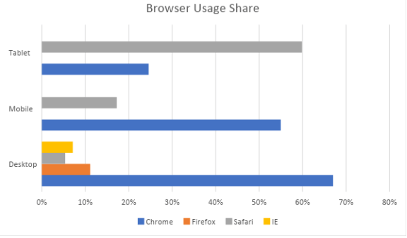
In terms of developer tools, Google Chrome is leading the market with almost 63% users in desktop, 55% in mobile and close to 58% in tablets. It’s the most popular browser among developers as well because of its wide range of debugging and development tools. To improve the speed, chrome developers recently made some changes that allows rendering of web pages in mobile devices operating under poor network coverage.

However, a drawback of chrome is that, the browser validates main resource only once during page load. Often developers or testers may face issues where code changes are not reflected. Plugins are available in the chrome web store that uses a cache-busting procedure. Using that, code changes can be viewed by just refreshing, without reloading the entire page.
Image orientation issues are another common problem in Chrome. Images that appear right side up in other browsers may be displayed upside down in chrome. This is not a bug. It happens only when the EXIF orientation of an image does not match the actual orientation. Processing the images on the server side will resolve this issue.
Safari
With a majority of desktop users preferring Windows, Safari covers only 3% of the usage share. However, because of the wide usage of iPhone and iPad, it covers 17% usage share in mobile devices and 35% in tablets and hence, an important browser to perform testing. However, desktop and mobile Safari should be treated as different browsers altogether, since iPads and iPhones are operated using touch and not click. Safari’s mobile version is also optimized to reduce load on the processor.
There is a built-in feature in Safari to prevent phishing. The drawback of this feature consists exclusion of metadata in files uploaded via browser. For example, if any photos are uploaded, GPS coordinates will be removed. There is no fix yet, to this bug, although missing coordinates can be replaced by the geolocation API.
In mobile browser, elements that don’t have a cursor style set by CSS, hover or click animations fail during rendering. To fix this, event listeners should be declared directly on the parent element instead of its child. Otherwise, buttons or list items that were supposed to be interactive on touch, will not work at all.

It does not matter how many test cases are performed on the browser. A bug may arise again when a new version of a browser is released. The best solution is to always keep an eye for new releases and run test cases on the application in a production environment.
Browser usage share figures obtained from – here


Author’s Profile
Arnab Roy Chowdhury
Arnab Roy Chowdhury is a UI developer by profession and a blogging enthusiast. He has been writing content for about 5 years and has strong expertise in technical blogs, travelogues, and content in the latest programming languages.
Blogs: 76
Got Questions? Drop them on LambdaTest Community. Visit now