 Test your AI Agents with the all-new Agent to Agent Testing
Platform.
Test your AI Agents with the all-new Agent to Agent Testing
Platform. 
How to Create a Website With Your Phone
Chidume Kenechukwu
Posted On: September 1, 2025
19 Min


Table of Contents
Learning how to create a website with your phone is easier than ever. Modern mobile apps and website builders give you everything you need to design, customize, and publish a professional-looking site without switching to a computer.
Whether you want to launch a personal blog, showcase a portfolio, or set up an online store, your smartphone can handle the entire process. With most Internet traffic now coming from mobile devices, building your site directly on your phone ensures it’s optimized for today’s users and accessible anytime, anywhere.
Overview
You can create a website directly from your phone using either a no-code website builder like Wix, Carrd, or Google Sites, or a mobile code editor like Acode to write HTML, CSS, and JavaScript.
Using a No-Code Builder (Beginner-Friendly):
- Choose a platform: Download the app or open the builder in your mobile browser.
- Select a template: Pick a mobile-responsive template suited to your site’s purpose.
- Customize content: Add text, images, videos, and interactive elements using the mobile editor.
- Publish your site: Follow the instructions to go live with a URL.
Using a Code Editor (More Control):
- Install a code editor: Apps like Acode (Android) or JotterPad (iOS).
- Write your website: Create HTML, CSS, and JavaScript files directly on your phone.
- Preview your site: Use the built-in preview or open it in your browser.
- Host online: Upload your files to GitHub Pages, Netlify, or another hosting service.
Quick Example – Responsive Navbar:
|
1 2 3 4 5 6 7 8 9 |
<nav class="navbar"> <div class="logo">MySite</div> <div class="hamburger" onclick="toggleMenu()">☰</div> <ul class="nav-links"> <li><a href="#">Home</a></li> <li><a href="#">About</a></li> <li><a href="#">Contact</a></li> </ul> </nav> |
Factors to Consider When Choosing a Builder:
- Define your website’s purpose: Decide on your site type, blog, portfolio, or online store.
- Choose a user-friendly builder: Pick a platform that’s easy to use on mobile.
- Select flexible templates: Use mobile-responsive designs you can customize.
- Check hosting and performance: Ensure fast load times and reliable hosting.
- Access customer support: Look for tutorials, FAQs, or live chat help.
Prerequisites to Create a Website on Your Phone
Before you learn how to create a website with your phone, it’s important to know the basic requirements. From a reliable smartphone and internet connection to a website builder and your content, these essentials will help you get started smoothly.
Using no-code or low-code tools can also help ensure your site functions properly across devices while you build it.
- Your Smartphone (or Tablet): Any modern Android or iOS device with a browser and app store access will do.
- A Stable Internet Connection: Needed to access website builders, upload content, and publish your site.
- A Mobile-Friendly Website Builder: Platforms like WordPress.com, Wix, Squarespace, and Google Sites offer mobile apps or optimized interfaces that let you build and manage websites directly from your phone.
- Your Content: Prepare your logo, text, photos, or videos to include on your site.
- An Email Address: Needed to create your account, log in, and manage your site.
- A Domain Name (Optional but Recommended): Buy a custom domain (like yoursite.com) for a more professional look. Many builders let you do this in-app.
- Payment Method (If opting for premium features): To unlock premium features or buy a domain, you’ll need a credit or debit card.
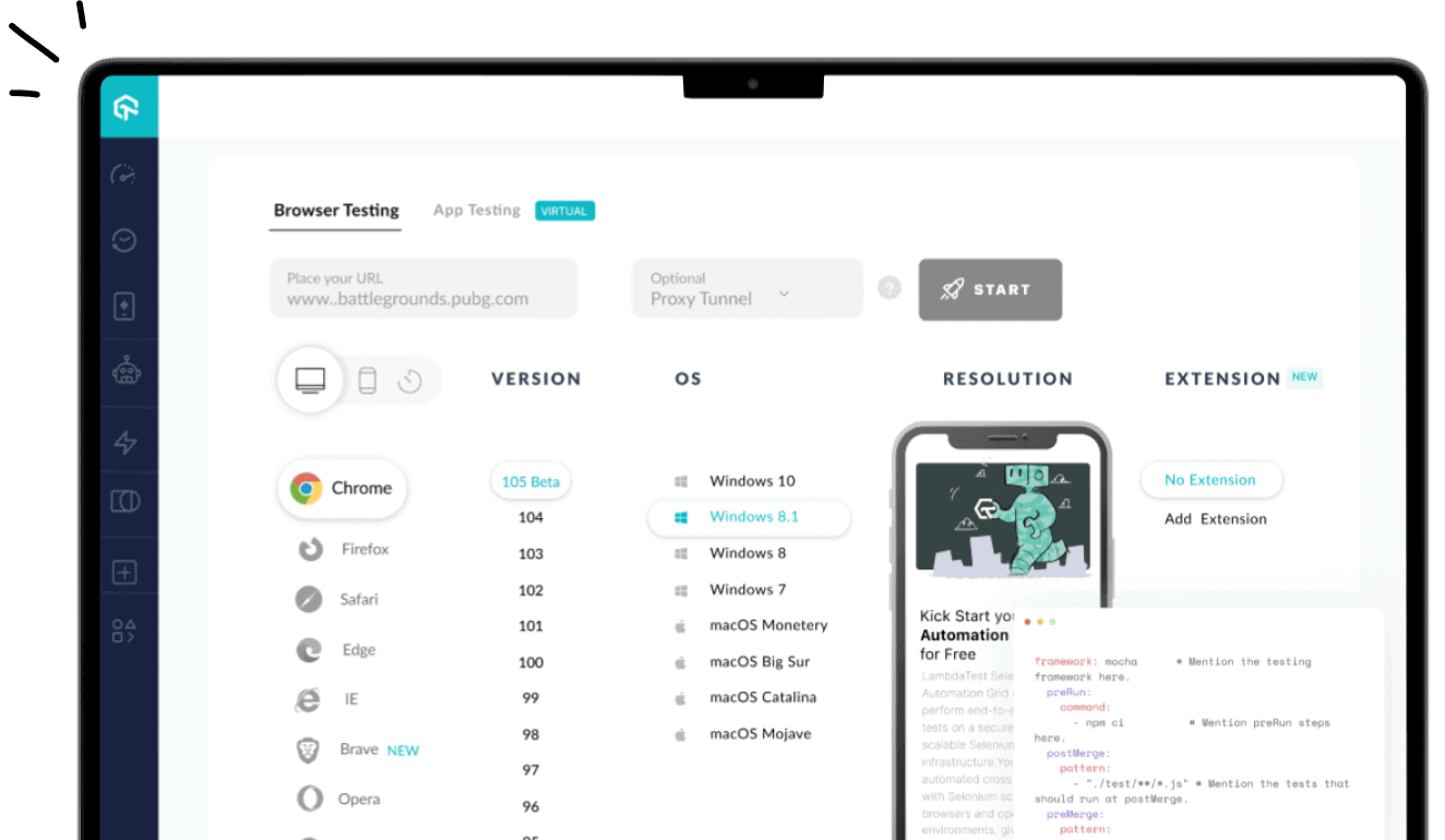
Build your mobile-friendly website and test its responsiveness across 53+ viewports simultaneously Try LT Browser now!
How to Build a Website Using Your Mobile Phone?
There are two main approaches when learning how to create a website with your phone: coding with an HTML editor for full control, or using a no-code website builder for speed and simplicity.
Both methods can help you launch a fully functional website directly from your smartphone.
- Using an HTML editor: for those who want full control over coding and customization.
- Using a no-code website builder: for those who prefer a fast, drag-and-drop experience.
Steps to Create a Website Using an HTML Editor
Several mobile apps and browser-based editors let you write and preview HTML, CSS, and JavaScript directly on your phone. This method gives you complete control over your website’s structure and design, though it requires some knowledge of web development.
Popular mobile HTML editors include Dcoder for Android and iOS, which supports multiple programming languages and comes with a built-in console. For Android users, AIDE Web offers a more advanced coding environment. iOS users can choose Juno or Textastic, both of which provide syntax highlighting and efficient file management.
To create a website using an HTML editor, follow the below given steps:
- Download and Install an HTML Editor App: Search for and install an HTML editor from your phone’s app store. For this example, we’ll use Acode, which supports HTML, CSS, and JavaScript in separate files.
- Open the App and Start a New File: Open Acode > tap the “+” icon > select New File > name it index.html.
- Write the Basic HTML Structure: Paste the following sample code to create a responsive navigation bar that works on both desktop and mobile:
123456789101112131415161718192021222324252627282930<!DOCTYPE html><html lang="en"><head><meta charset="UTF-8" /><meta name="viewport" content="width=device-width, initial-scale=1.0" /><title>Responsive Navbar</title><link rel="stylesheet" href="style.css" /></head><body><nav class="navbar"><div<div class="logo">MySite</div><div class="hamburger" onclick="toggleMenu()">☰</div><ul class="nav-links" id="navLinks"><li><a href="#">Home</a></li><li><a href="#">About</a></li><li class="dropdown"><a href="#">Services</a><ul class="dropdown-menu"><li><a href="#">Web Design</a></li><li><a href="#">SEO</a></li><li><a href="#">Hosting</a></li></ul></li><li><a href="#">Contact</a></li></ul></nav><script src="script.js"></script></body></html> - Create and Link a CSS File: Using the same process as in Step 3, create a new file, but this time, name it with a .css extension (e.g., style.css). This file will hold your website’s styling (colors, fonts, layout, etc.).
- Create and Link a JavaScript File: Create another file called script.js (or any name of your choice). This file will contain any interactive functionality for your website.
Result:
Tap the play icon in Acode to view it in the built-in browser, or select Open in browser to preview it in your phone’s default browser.
See the Pen
lambdatest by Chidume kenneth kenechukwu (@Neboljsa95)
on CodePen.
You can also preview your website on your phone’s default browser. Just tap the three vertical dots at the top right and select “Open in browser.”
Steps to Create a Website Using No-Code Builder
If you don’t want to write code, you can use no-code builders to quickly create a professional-looking site on your phone. These platforms use drag-and-drop editing, pre-designed templates, and built-in hosting.
For demonstration purposes, we will make use of Wix for building a website with no-code. To create a website using no-code builder follow the steps given below:
- Download the Website Builder App: Go to the Google Play Store or Apple App Store and search for the web builder. Download and install the app on your mobile device. As I mentioned earlier, for this example, we will use Wix Owner.
- Sign Up or Log In: Create a free account. If you already have an account, simply log in.
- Create a New Website: Tap “Create New Site” and choose the type of website you want to build, like a blog, business page, portfolio, or online store.
- Choose a Template: Browse through Wix’s collection of ready-made templates. Select one that fits your style or niche. Each template is fully customizable and optimized for mobile use.
- Customize Your Website: Use the drag-and-drop tools to edit text, upload images, add videos, adjust colors, and manage pages. You can personalize every detail to match your brand or personal taste.
- Preview Your Site: Before publishing, tap “Preview” to see how your website will appear on different screen sizes, especially on mobile.
- Publish and Go Live: Once you’re happy with how everything looks, tap “Publish.” Your site will go live instantly, and you’ll receive a link to share with others.
Result:

Why Testing on Mobile Devices Matters?
When learning how to create a website with your phone, not all issues are visible on your own device. Some problems only appear on different devices or screen sizes, which is why testing your website across multiple devices is essential for efficiency.
Common Mobile Display Issues:
- Unresponsive Layouts: Elements like text or images don’t resize properly.
- Overlapping Content: Text or images may overlap, and buttons might be too small to tap.
- Broken Navigation: Menus may not function properly or overflow on smaller screens.
These issues can affect your users’ experience and are often missed when testing on a single device.
Limitations of Manual Testing
While checking your site on your phone is a good start, it has its limits:
- Limited Device Coverage: You can only test on the device you own, so bugs on other devices may go unnoticed.
- Time-Consuming Multi-Device Testing: Testing across multiple physical devices is time-consuming and often impractical.
To overcome these challenges, tools like LT Browser from LambdaTest mentioned earlier are extremely helpful. LT Browser lets you preview your website on 53+ pre-installed viewports from iOS, Android phones, tablets, laptops, and desktops in both landscape and portrait modes.
It also provides dedicated Chrome DevTools for each viewport, generates Google Lighthouse reports to check SEO, accessibility, and performance, and allows you to record sessions or share responsive bug reports directly with your team.
This makes it easy to perform a mobile-friendly test, ensuring your website works flawlessly across all devices without needing to own them all.
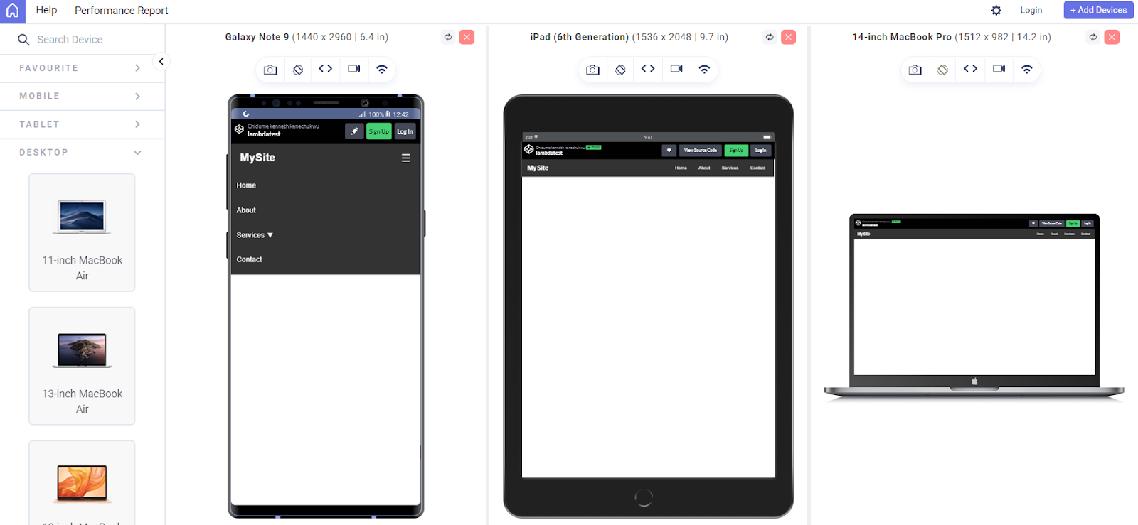
Using LT Browser, you can see this responsive navbar in action on multiple devices, mobile, tablet, and desktop, ensuring your website adapts perfectly to different screen sizes before publishing.
To try it out, click the download button below:

Top Builders for Creating a Website on Your Phone
When learning how to create a website with your phone, choosing the right website builder can make the process faster, easier, and more professional.
Here are some of the top builders to consider:
Wix
Wix is a popular website builder with a beginner-friendly drag-and-drop interface and robust mobile editing tools. It’s ideal for personal, business, and light eCommerce websites.
Features:
- Drag and Drop: Visual editor with no coding required.
- Templates: 900+ mobile-responsive designs.
- Mobile Editing: Manage your site via the Wix mobile app.
- SEO Tools: Built-in optimization for search engines.
- App Market: Add features like forms, bookings, or blogs.
- eCommerce & Blog: Integrated tools for selling and blogging.
Best For: Personal websites, portfolios, blogs, small business sites, and light eCommerce.
Shopify
Shopify is designed for eCommerce, allowing you to build online stores directly from your phone. It includes mobile management, sales features, and multi-channel support.
Features:
- eCommerce Builder: Full-featured online stores
- Mobile App: Manage your store and orders on the go
- Inventory & Payments: Track stock and accept payments (PayPal, Shopify Payments)
- Marketing Tools: Built-in SEO, email marketing, discount codes
- Multi-channel Sales: Sell on Instagram, Facebook, marketplaces, and more
Best For: Online stores, drop-shipping businesses, and product-based businesses.
Carrd
Carrd is a fast, simple, and mobile-friendly builder for one-page websites like personal bios, landing pages, or link-in-bio setups.
Features:
- Minimal Builder: Quick setup for single-page sites
- Responsive Templates: Clean, mobile-first designs
- Embedded Elements: Add forms, buttons, or videos
- Mobile Optimized: Lightweight and fast-loading on phones
Best For: Landing pages, personal profiles, portfolios, or Instagram link-in-bio pages.
Hostinger Website Builder (Zyro)
Zyro by Hostinger is an affordable web builder with built-in hosting, mobile optimization, and AI tools to speed up website creation.
Features:
- Drag-and-Drop Builder: Simple layout editor
- AI Tools: Logo maker, content generator, heatmaps
- Mobile Friendly: Optimized for all screen sizes
- Built-in Hosting: Hosting, SSL, and domain included
- eCommerce & Blog: Create stores or publish blog posts easily
Best For: Small business websites, personal websites, online stores.
Factors to Consider When Choosing a Website Builder
Choosing the right website builder is an important first step in creating your website, especially when you’re working from your phone.
Not all builders are created equal, and selecting one that suits your needs can save you time, stress, and even money.
Here are key factors to consider:
- Your Website’s Purpose: When choosing a website builder, consider your website’s purpose, ease of use, mobile editing support, and design flexibility. Look for mobile-responsive templates, fast performance, hosting options, and strong customer support.
- Ease of Use: Choose a web builder with a user-friendly interface that’s easy to use without coding.
- Mobile Editing Support: Choose a web builder that supports mobile editing, ideally with a dedicated app like Wix or Strikingly.
- Design Flexibility and Templates: Choose a web builder with mobile-responsive templates that adapt to screens and allow for design customization.
- Hosting and Domain: Most web builders offer free hosting and a subdomain. Check if they support custom domains and paid upgrade options.
- Performance and Speed: Choose a web builder known for fast, optimized websites. Good speed ensures a better user experience and SEO, even on slow mobile networks.
- Customer Support: As a beginner, you may run into questions or technical issues. A good web builder should offer strong customer support such as live chat, tutorials or FAQs, e.t.c.
Best Practices for Creating a Website on Your Phone
Learning how to create a website with your phone is convenient and empowering, but to get the best results, there are a few key practices to follow:
- Use a Responsive Builder or Code Editor: Choose tools designed for mobile use, like Acode for coding or Wix/Carrd for no-code options. These apps are optimized for smaller screens and let you easily preview how your site looks on mobile devices.
- Keep Your Design Simple and Clean: Go for a simple layout. Use minimal text, readable fonts, and tap-friendly buttons. Mobile users prefer quick navigation and clean layouts that load fast.
- Optimize Images and Media: Use compressed images to improve load times. Mobile apps and online tools like TinyPNG can reduce image sizes without losing quality. Always optimize before uploading to your site.
- Save and Back Up Your Work Regularly: Since mobile phones are more prone to interruptions (like calls or app crashes), make it a habit to save your work frequently or back it up to the cloud. Some editors or builders support autosave; enable it if available.
- Test Your Website on Multiple Devices: It’s essential to preview your website on different screen sizes and browsers.Since you can’t possibly own every device, you can also make use of cloud testing platforms as mentioned earlier like LT Browser by LambdaTest to quickly check how responsive your site looks on various mobile, tablet, laptop, and desktop viewports.
These tools can help spot layout issues, responsiveness problems, and performance gaps without needing multiple physical devices.
- Pay Attention to Performance: Keep animations, third-party scripts, and plugins minimal to maintain fast loading speeds. A lightweight site ensures a smoother browsing experience for mobile visitors.
Conclusion
Creating a website has traditionally required a desktop setup, which can be limiting for users without access to a computer. This blog demonstrated that it’s entirely possible to build a functional, professional-looking website by learning how to create a website with your phone.
Using mobile-friendly tools such as HTML editors like Acode, website builders, and no-code platforms like Wix, Shopify, Carrd, and Hostinger, you can design, customize, and launch a website directly from your smartphone.
This approach offers flexibility, speed, and convenience, allowing anyone to build an online presence from virtually anywhere. With the right tools, responsive design practices, and mobile testing solutions like LambdaTest, you can ensure your website is both effective and accessible across devices.
As a next step, explore each builder to find the one that fits your specific use case, and follow the best practices listed to maintain a high-performing website built for mobile phones.
Frequently Asked Questions (FAQs)
Can I build a full website using only my phone?
Yes! With modern mobile HTML editors like Acode or no-code platforms like Wix and Carrd, you can design, customize, and publish complete websites entirely from your smartphone. These tools allow you to manage pages, add content, and preview your site without needing a computer.
Which is better for beginners, coding with an editor or using a web builder?
For beginners, no-code builders like Wix or Hostinger Website Builder are easier to start with, offering drag-and-drop editing and ready-made templates. Code editors like Acode are better for those with coding experience who want full control over design, layout, and interactivity.
Are mobile website builders free?
Many mobile website builders offer free plans with limited templates, storage, and basic features. Platforms like Wix, Carrd, and Hostinger provide free versions, while paid plans unlock advanced features, custom domains, and more customization options.
How can I preview or test my website on different devices?
You can use tools like LambdaTest or LT Browser to simulate multiple devices and screen sizes at once. This ensures your site looks and functions correctly across mobiles, tablets, and desktops, helping identify layout or responsiveness issues before going live.
How do I test if my website is truly mobile-friendly?
You can use tools like LT Browser or Google Mobile-Friendly Test to check how your website looks on multiple screen sizes. These tools highlight layout issues, overlapping content, and unresponsive elements. They also provide actionable suggestions to improve performance and accessibility. Testing regularly ensures a smooth experience for mobile visitors.
What is mobile-first design, and why is it important?
Mobile-first design is the practice of designing your website starting with smaller screens and then scaling up for larger devices. This approach ensures your website prioritizes mobile users, who now account for the majority of web traffic. It also encourages cleaner layouts, faster load times, and better overall usability. Implementing mobile-first design makes your site more accessible and future-proof.
Can I test responsive layouts directly on my phone?
Yes, many website builders and mobile code editors allow you to preview your site in different screen sizes directly on your device. You can adjust text, images, and menus to ensure they display correctly on mobile and tablet screens. Combining mobile previews with cloud-based tools helps you catch issues that might appear only on other devices. This makes responsive testing faster and more efficient.
How do HTML, CSS, and JavaScript impact mobile responsiveness?
HTML defines the structure of your website, CSS handles styling and layout, and JavaScript adds interactivity. Properly coded HTML ensures content scales correctly, while responsive CSS rules allow elements to adapt to different screen sizes. JavaScript can enhance functionality without breaking layout, but it must be optimized for mobile. Together, they ensure a fully functional, mobile-friendly website.
Are there shortcuts for testing multiple devices without owning them?
Yes, cloud-based tools like LambdaTest allow you to simulate dozens of devices and screen sizes at once. This saves time compared to testing on physical devices and ensures your website performs consistently across platforms. These tools also offer features like performance insights, Lighthouse reports, and session recording for detailed debugging. Using them is essential for mobile-friendly testing at scale.
Author
Kenechukwu Chidume is a Frontend Web Developer and Community Contributor with 4 years of hands-on experience building responsive and scalable web applications using React, JavaScript, HTML, CSS, Next.js, Tailwind CSS, and TypeScript. He has completed his B.Sc. in Electronics and Computer Engineering. Beyond frontend expertise, he also works with Node.js and MongoDB, giving him experience across full-stack development. His projects include fintech dashboards and e-commerce platforms, where he has applied strong skills in API integration, authentication, and performance optimization.
Blogs: 1


