How To Make Responsive Images With CSS, HTML, WordPress & More!
Harish Rajora
Posted On: May 7, 2020
![]() 100466 Views
100466 Views
![]() 26 Min Read
26 Min Read
This article is a part of our Content Hub. For more in-depth resources, check out our content hub on Responsive Testing Tutorial.
Not more than a decade ago, no one talked about the responsiveness of a website. The only mantra was, “if it fits your system, well, it fits everyone else’s”. But today, every developer’s primary concern while developing a website is “responsiveness”. With the advancement in technology and a boom in mobile manufacturing, every client is asking the question, “Is my website responsive? Will it be accurate on mobiles and tablets where the majority of my audience is?”. This is why the process of responsive testing is getting more rigorous than ever.If you are into web development, I am sure you must have gotten such questions quite a few times.
TABLE OF CONTENT
- What is Website Responsiveness?
- What Are The Problems To Make Responsive Images In Websites?
- How To Make HTML Responsive Images?
- How To Make Responsive Images In CSS?
- How To Make Responsive Image Maps?
- Managing Responsiveness in Internet Explorer?
- How To Make Responsive Images In WordPress?
- How to Check For Responsiveness?
What is Website Responsiveness?
Responsiveness is the ability of a website to adjust itself according to the screen size, window or the de resolution. In 2019, the internet was accessed more from a mobile device than the desktops and laptops. As a web developer, you cannot ignore this stat. With 5 billion mobile devices active around the world, responsiveness has become a major requirement in the web development industry. So, the question is, how difficult is it to develop a responsive website or convert an existing one?
Responsiveness has been so popular that CSS has inbuilt query rules for converting a website into a self-adjusting one. We will talk about this in the later sections but the first thing to remember in your journey to make responsive images is, “You need to calculate the screen size to adjust your images according to that”. We use the “view-port meta tag” rule for this.
With this Responsive testing tutorial for beginners, you will learn how to perform Responsive Testing of your website on the LambdaTest platform.
The View-Port Meta Tag
View-port is the area which is visible to the user. So, logically we can construct that a view-port resembles the screen size on which the user is looking at the website. A view-port tag does the same job. It calculates the viewport of the screen and returns back the value by which we can adjust the elements of the website. A viewport meta tag looks as follows:
|
1 |
<meta name="viewport" content="width=device-width, initial-scale=1.0"> |
If you write this line on your page and run the page in the browser, you will see that the text is already responsive (maybe or maybe not). But even if this tag instructs the browser to consider the viewport adjustments, the job of a developer does not finish here. Creating a complete responsive website includes many elements like setting relative width for the container elements, browser compatibility testing, and putting up images that render according to the screen size. Out of all these elements, the most challenging one is images.
Can We Rely Completely On The View-Port Tag?
Definitely not! Relying just on the view-port tag is not enough for text and definitely out of the question for images. With some tweaked settings, the browser can deliver wrong view-port information to the web page and this can lead to abrupt behavior. It’s better to follow other rules in order to make responsive images.
Check Responsiveness Of Your Images On 50+ Mobile Views With LT Browser
How to Check For Responsiveness?
As a web developer I am sure you are confused about, ‘How will I check if my website is responsive enough and is working fine on all the devices?’ Or a question might be jogging in your head: what if my image map’s coordinates break on other devices? Don’t worry. I got these questions too when I started with the process to make responsive images design or maybe just building my first website.
Through my experience, I recommend going for a cloud-based cross browser testing to check the responsiveness of your image. Cross browser testing helps you test your website on hundreds and thousands of browsers that you would not be able to do manually. There are a ton of tools available online. You can opt for the LambdaTest cross browser testing platform especially for responsive design since it has a separate section for that.

The above screenshots are taken on LT Browser, a browser for responsive testing. LT browser is a mobile friendly tester that can ensure your website’s responsiveness on multiple devices simultaneously. You can choose from over 50 different devices, also with LT Browser you can test responsiveness on multiple devices simultaneously with the side by side view feature. You can see this in the above example as I’m comparing portrait mode in iPad Air with landscape mode in Galaxy phone. LT Browser can be used to perform screen resolution test and debug your website on both the android and iOS devices at the same time and you can even create your own custom device.
In this detailed walkthrough of LT Browser tutorial video, we will help you get started with LT Browser.
What Are The Problems To Make Responsive Images In Websites?
Images are an important element of websites. True to the saying, they do speak a thousand words and web developers have used this to their advantages since the beginning of the web development era. Today, it is very hard to find a website without an image (If there really exists one).
Developers try to use more and more images to attract the user and not bore him with long written content which is bound to increase the bounce rate of the website. But images pose a greater challenge than the written content when it comes to responsiveness. Images can be managed through the viewport tag that I mentioned above, but the problem is that the system or CSS, for that matter, does not know what type of image it is adjusting.
Let’s take an example of the following image:

The above image is taken from developers.google.com. Now, look at how the image has rendered to different screen sizes. On the desktop, it is what it was intended to be. The laptop is almost similar. In the tablet, it gets cropped out and in the mobile device, the image has only focussed on the main subject i.e. the person. This is not the work of just the viewport tag. If it had been just the tag with viewport, we would have got the full image even on the small screens leaving the main subject out of focus.
This might make us think, can we use some more CSS and JavaScript to battle our way out?
The answer is no! With CSS and JavaScript, you can load multiple copies of the image and let JS detect dynamically the size of the screen and load the appropriate image. The issue is due to the high size of an image, CSS developers have built CSS in a way that it loads the image before loading the complete document because it is obvious it will take more time. With our little adjustments, we will end uploading the original image as well as the desired cropped image resulting in slower website loading time and maybe frustrated users.
In order to further enunciate on how to make responsive images, I’ll go through the adjustments and techniques by which we can make responsive images in HTML, CSS, and WordPress.
How To Make HTML Responsive Images?
Adhering to the huge demand for responsiveness in the images, new and modified tags were introduced in HTML to directly solve this problem of adjusting the images according to the image size. In the broader view, there are two main challenges with the responsiveness of images:
- Images with different resolutions for different screens.
- Images with different sizes for different screens.
The Srcset Attribute And Resolution Switching For HTML Responsive Images
Before looking at the solution to make HTML responsive images, let’s clear out our problem statement. We need to find a way by which we can save the bandwidth of the network and load appropriate images according to the size of the screen. This is solved by our old pal tag used for placing images onto the websites.
The original img tag for what most of the people not familiar with responsive design use look like this:
|
1 |
<img loading="lazy" src=”url of image” alt= “alt text” /> |
In the above tag, src means the source of the image where we specify the image location. The alt attribute defines the alternate text which is displayed when the image is not loaded. This is known by everyone. To make this tag battle with responsive design, the following new attribute was added:
|
1 |
<img loading="lazy" srcset="boat-480.jpg 480w, boat-800.jpg 800w" sizes="(max-width: 600px) 480px, 800px" src="boat-800w.jpg" alt="Boat Landscape"> |
The srcset attribute is responsible for placing the correct image from multiple images available according to the screen size. The srcset contains multiple image URLs for multiple images saved on the server. When the resolution is calculated, the image with the closest width is selected. Needless to say, this involves saving multiple copies of the same image with different resolutions on to the server.
The first parameter is the name of the image, in the case of our example, it is boat-480.jpg. The name of the image is followed by the space and then we specify the image’s real resolution.
Notice that the size should be written in “w” format and not “px”.
Another attribute used here is sizes. Sizes attribute contains a media-query (which will be discussed in detail in the next section) and a resolution that should be chosen when the media set is true.
For example, in the above example (max-width: 600px) 480px means whenever a viewport has max-width 600px, go to the srcset and choose the image which is closest in resolution to 480px.

The srcset and size attributes are not supported in the Opera Mini browser and Internet explorer. So, if you load your web page in these browsers, they will ignore the srcset and size attribute and will just reference the src attribute normally and render the images specified in the src attribute.
We can also prefer writing the img tag in a slightly different way than we used above. Look at the following transformation to the above written < img > tag:
|
1 |
<img loading="lazy" srcset="boat-320w.jpg, boat-480w.jpg 1.5x, boat-640w.jpg 2x" src="boat-640w.jpg" alt="Boat Landscape"> |
Using this type of attribute is called resolution switching. Here, we do not specify the different sizes but the different resolutions of the image. So, for a greater resolution display, boat-640w.jpg 2x will be selected. Remember that the greater this number, the better is the resolution.
This method has been introduced for a fact that mobile users are not concerned with the resolution of the image. They are more concerned with the loading time of the website and they are the ones generally on a poor network. It is the desktop users that cannot adjust to the grainy image that appears on the website cover. Using the resolution switching method, we can save bandwidth and improve the website loading time. All in all, we make responsive images according to the screen size as well as resolution.
Picture Element and Art Direction
In the above situations, we tried to make responsive images according to the resolution of the display. There exists another problem though, let’s get back to the boat image we highlighted above.
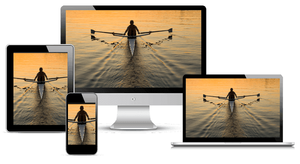
In this image, although the focus is on the main subject, we do not want the full image to be loaded on every device. This will unnecessarily load the network resulting in a slow website loading time on the mobile. A good solution to this is, why don’t we keep a cropped image already on the server with lesser size so that the devices which need them do not struggle over the network? We need to follow this strategy when we do not want our subject to be faded out on a smaller screen like in the following image:
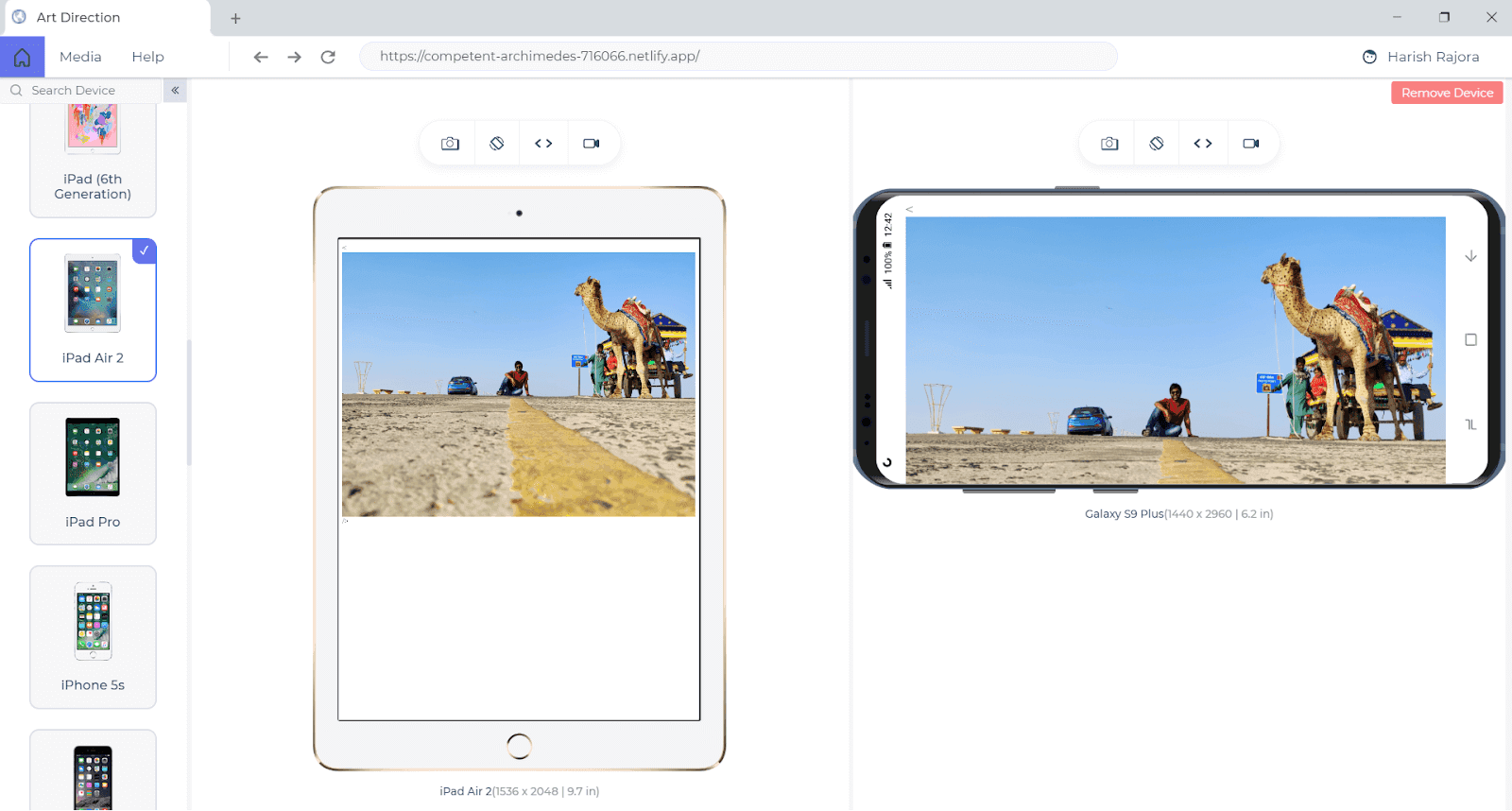
Which looks as following on the bigger screens (laptops and desktops):
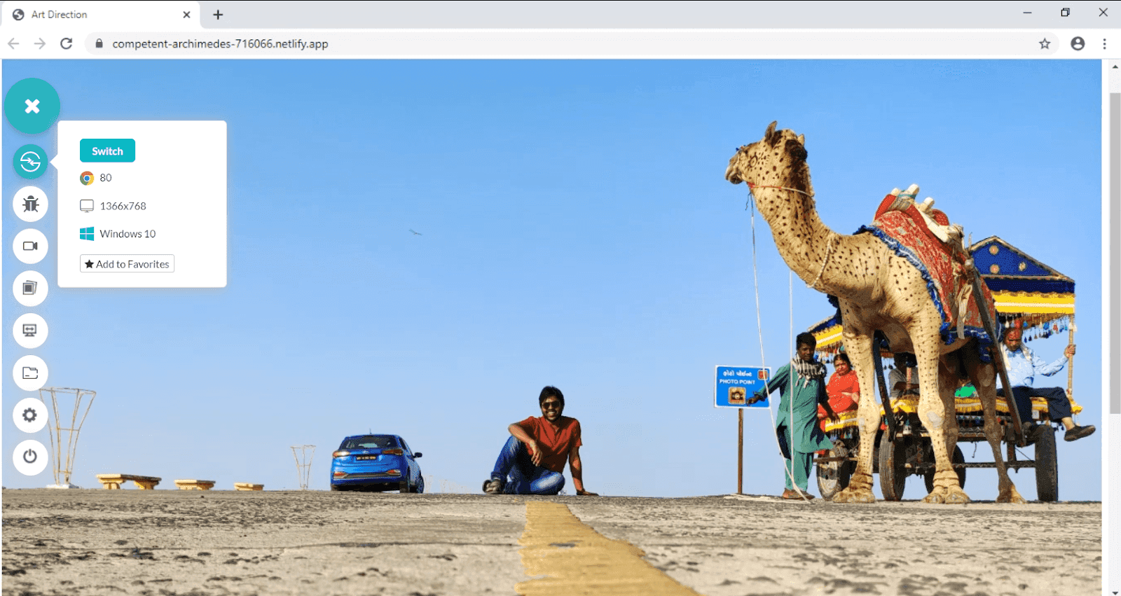
Which is perfect!! To display different images with different sizes on the appropriate screens we make use of the < picture > tag.
The above image is a simple tag with src and alt attributes. This can be modified to the following code with a picture element.
|
1 2 3 4 5 |
<picture> <source media = “(max-width: 799px)” srcset = “kutch-480.jpg”> <source media= “(min-width: 800px)” srcset = “kutch-800.jpg”> <img loading="lazy" src= “kutch.jpg” alt= “Rann Of Kutch Landscape” /> </picture> |
If you have worked in the web development before, you would notice that the picture element resembles the video tag here which also is a wrapper element containing multiple < source > tags.
In the above example, the source tag contains a media attribute that specifies at what maximum width the image on srcset should be selected by the browser. If my viewport is 800px, the second image will be selected. Through this method, we can put multiple cropped images on the server and let the browser select the most appropriate one.
It is important that you specify the < img > tag also in the picture element otherwise no image will be displayed on the screen.
If I run the same code on my image, I get the following output on the browser:
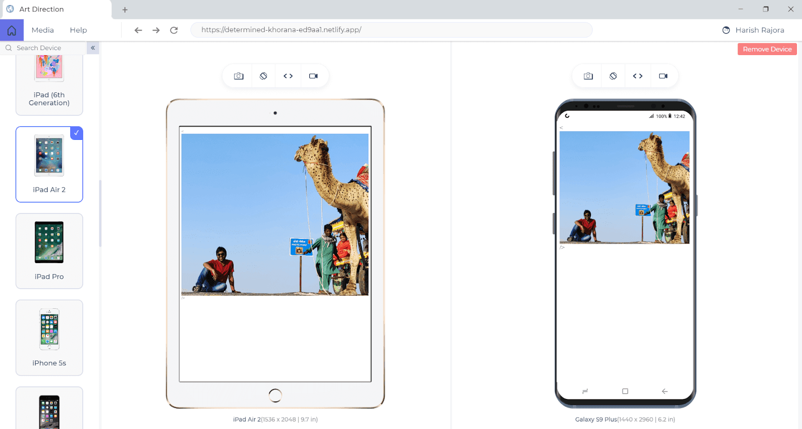
This time the subject is in focus because I cropped the photo and instructed the picture element to upload this photo on a smaller screen. You can see the difference between the photos now.
This situation or problem is called art direction where we need to have multiple cropped images for different screen sizes.
Unfortunately, picture elements cannot be used in internet explorer and opera mini browsers. These browsers will just render the < img > tag image and will ignore other elements.

Difference Between Resolution Switching and Art Direction
Both of these concepts look similar and confusing at first, I admit, but their difference is easy to figure out.
Resolution switching focuses on utilizing the bandwidth of the network by providing low-resolution images for the screens that are working on low resolutions. A mobile user does not really care about your high-resolution image, he can work his way out with low-resolution images too. Since mobile users often work on low bandwidth networks, it is important for us to display only what is necessary with appropriate resolutions.
Art direction focuses on the user experience by providing the same image by cropping in such a way that no matter on what size our user is, the subject of the image is visible in almost the same ratio. Unlike resolution switching which has the same image with different resolution, here we have multiple images placed on the server. A good example can be that while projecting your monitor display through a projector sometimes requires us to increase the font-size since it is not visible. But, that does not mean we need to adjust the resolution of the monitor. We work on the same resolution. A similar effect is seen here.
Guide on Creating Browser Compatible HTML and CSS
How To Make Responsive Images In CSS?
We have worked our way out by making HTML responsive images and modifying the tag to deliver the best experience to the end-user. In this section on how to make responsive images in CSS, I’ll explore some CSS elements which can help us in rendering the best image for the user.
Object-Fit and Object-Position Properties To Make Responsive Images In CSS
The first property that will help us in achieving this aim is object-fit property. This property specifies how the image should resize itself when it is rendered onto the different screen sizes. Using object-fit property we can define whether we want to stretch our image in case of bigger screen sizes or shrink it for smaller ones.
Object property is used along with the < img > tag:
|
1 |
<img loading="lazy" src = “abc.jpg” alt = “Text with ABC” style = “object-fit : cover” /> |
Setting object-fit property to “cover” will maintain the same aspect ratio but will cut the image’s boundaries to cover the image onto the screen.
The object-fit property has five values:
Fit: These values will stretch the image to fit into the content box and will not preserve the aspect ratio.
Contain: The contain value will increase the size of the image or decrease it preserving the aspect ratio.
Cover: This value fills the content box completely but preserves the aspect ratio by cropping out the image.
None: This value will ignore any adjustment and will render the original image.
Scale-down: This value will scale down the image upto a size that is between the size with value “none” and “contain”.
A simple example is shown below:
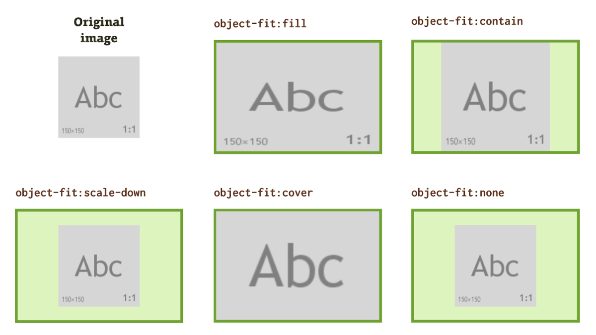
The object-fit is available in all the major browsers except Internet Explorer.

Another important property used in CSS to achieve responsiveness is object-position. This is used in addition to object-fit and often together. The object-position property, as the name suggests, defines the position of the image as to how much you want this image to be moved in position when rendered on to the browser.
The object-position property takes two values x and y which determines that the image should be placed x px from the left and y px from the top. For example:
|
1 |
<img loading="lazy" src = “ABC.jpg” alt = “The text ABC” style = “object-fit: cover; object-position: 0 5” /> |
Here, we want the image to be moved 0px from the left and 5px from the top.
Object-Position property is not available in the Internet Explorer and Opera Mini browser.

Media Queries To Make Responsive Images in CSS
Next on our list are the media queries that are also very popular in CSS culture. Media queries in CSS take a slightly different approach that we had in the HTML responsive images section. The web developers should remember that if we make responsive images through CSS media queries, we cannot fetch multiple images from the server. Whatever we do, we need to do at the client’s end i.e. on the browser. CSS does not handle any server related queries.
The CSS media query has the following syntax:
|
1 2 3 4 5 |
@media <parameter> (conditions) { // Code you want to be executed when this media query is true. } |
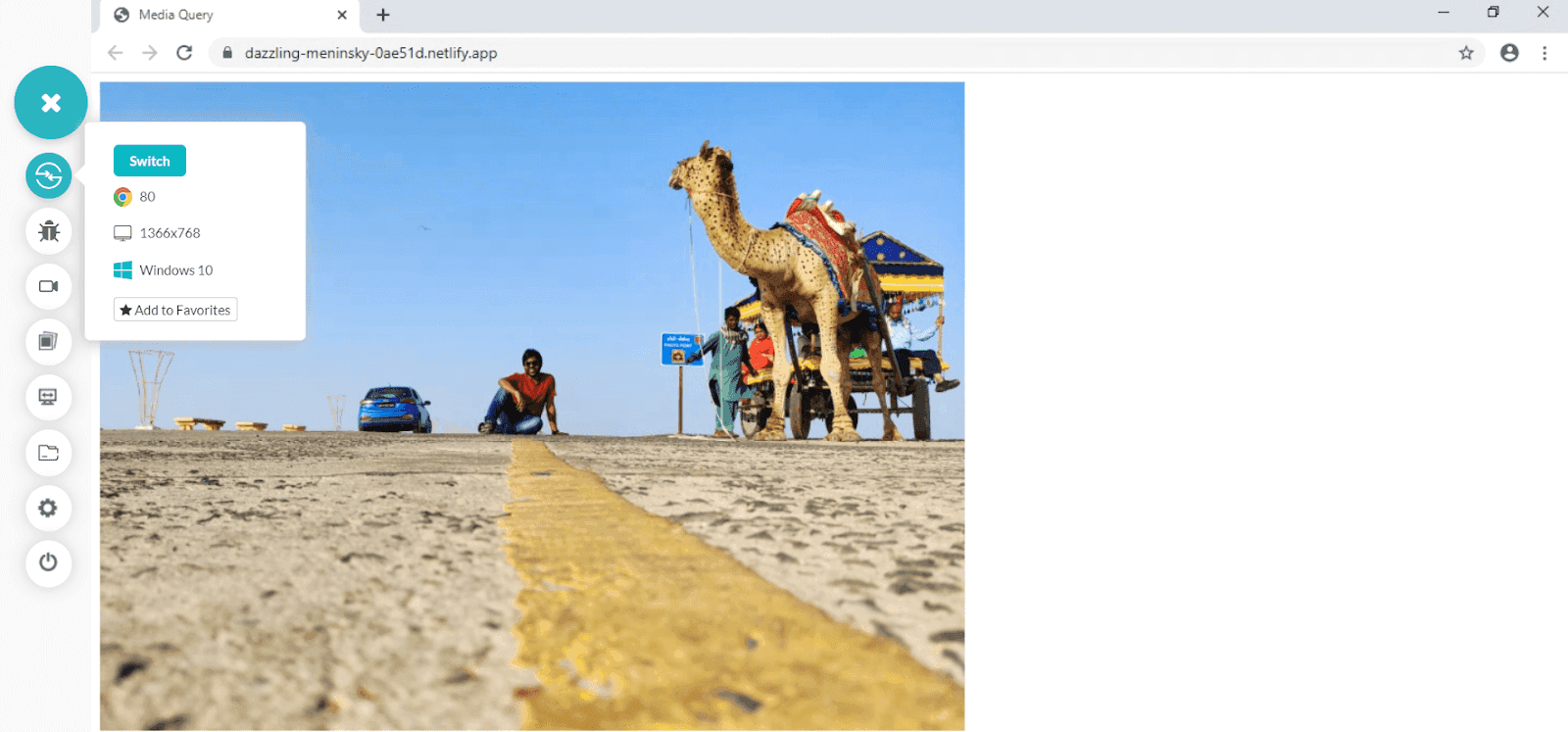
In the below example, we will change the image width by calculating the resolution of the screen.
In the above code, we are instructing the CSS to calculate the viewport of the screen (through the meta tag) and then according to the tag, adjust the image width. For a viewport of less than 799px, the image will be 300px wide and for anything above that, it will be 800px.
The image renders like below when I run it on LambdaTest platform (Google Chrome / Win 10)
When I run it on a mobile screen on the same platform, I expect this image to shrink to 300px.
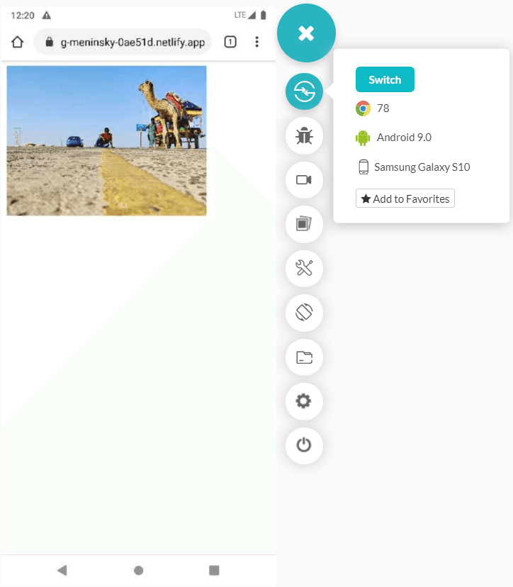
And yes, it gets renders as I intended. If I had not used the media query, I would have got the following image in the lower resolution device (using the following standard code):
|
1 |
<img loading="lazy" src="IMG_20191210_160206.jpg" alt="Rann_Of_Kutch" class="responsive" style = "width:800px"> |
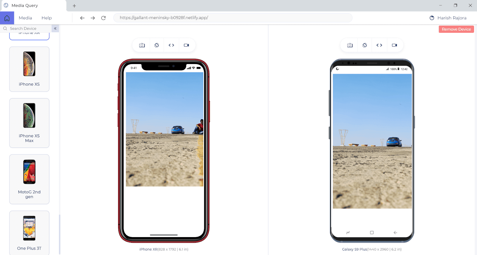
Using media queries like this, you can make responsive images for your website. Media queries are supported by every major browser’s every version (even Internet Explorer ).
Image-Set Property To Make Responsive Images In CSS RWD
Another way to make responsive images in CSS is by using the image-set property of CSS responsive web design. Image set property is similar to srcset property I mentioned above in the section above on HTML responsive images.
Similar to srcset, image-set calculates the resolution and renders the image best suited for the screen. So, the user can place multiple images and instruct CSS to load the suitable image.
Now you must be wondering that I mentioned above how CSS does not play with the server but only works at the client end. Well, do not get confused with the image-set property here. It may seem an alternative to srcset but using image-set is actually a load on the bandwidth. When you hit enter on that address bar, all the images will be fetched but only the appropriate ones will be loaded. That really does not sound like a win-win.
Maybe this is the reason that image-set is unable to gather a huge support from the browsers.
Image-set is not supported by the internet explorer, early versions of Edge, all versions of Firefox and Opera Mini browser.

The following is a code snippet for using the image-set property. In this code, we are changing the background image according to the resolution.
It is good to be aware of how to make responsive images in CSS but it is recommended that you use HTML responsive images properties as much as you can. They are efficient and user-friendly in view of the network.
How To Make Responsive Image Maps?
A responsive image map refers to an image in which different areas (or coordinates) of the image references different hyperlinks (or tooltip text or anything). Responsive image maps are generally used to create various hyperlinks on the part of the image but in practical scenarios, they can be used for literally anything you want.
The best example that I found in recent days is the Indian Government’s website on Covid-19 statistics.
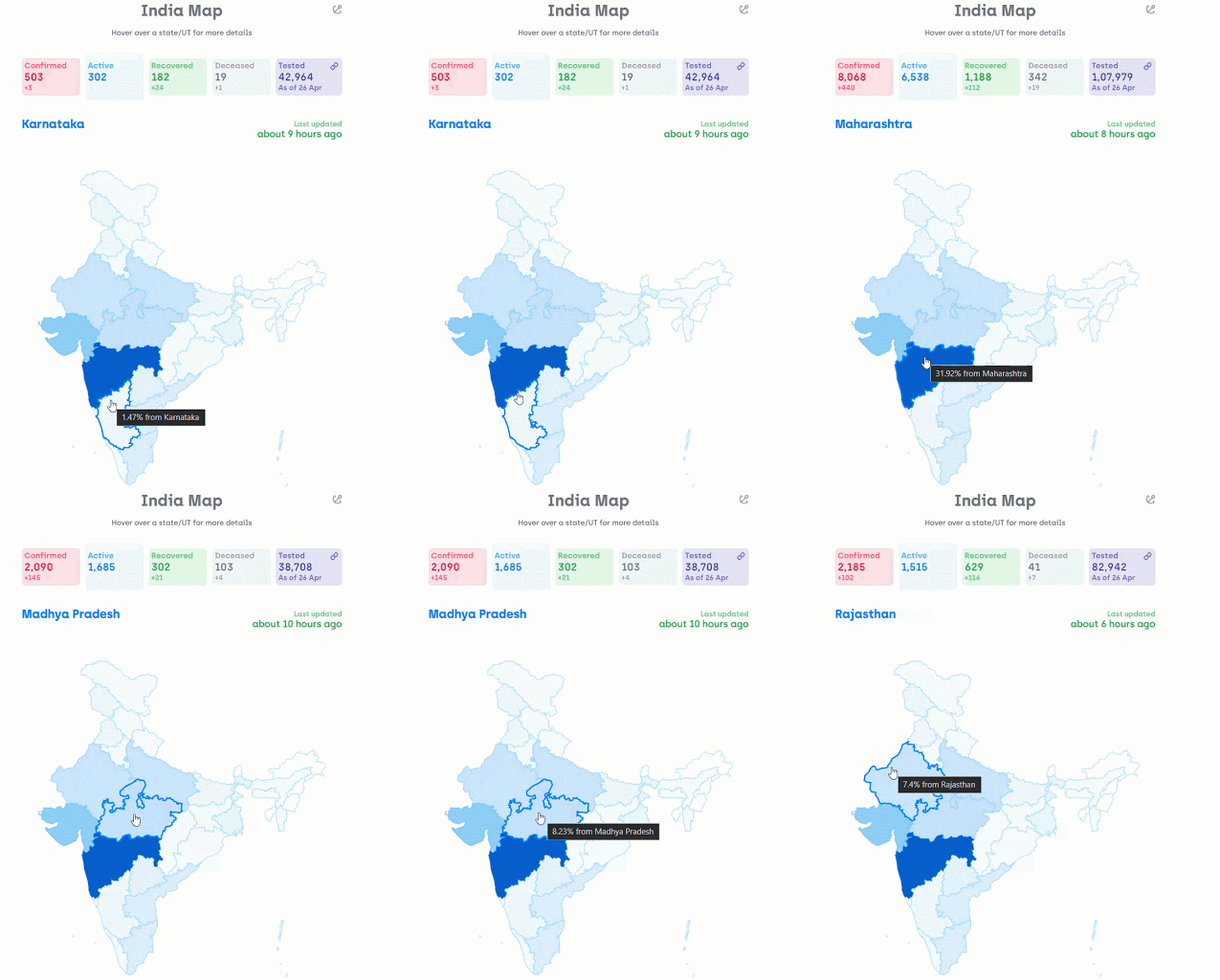
In the above picture, there is a single image of India and it’s different sections denoting different states of the country. Hovering over to different states gives the name, stats, and overall COVID-19 case % of that state.
Responsive Image maps are of extreme importance for a website because they deliver much more information than a static image or a lot of text and in most of cases, they are the core and integral part of the website as in the above case. Taking their importance into account, it is very important that there are responsive image maps on your website and they render in appropriate sizes.
The responsive image maps can be made in two ways:
- Using the Jquery Plugin
- Using conventional CSS methods
Making Responsive Image Maps By JQuery Plugin
Considering how responsive image maps can be of utmost importance, an open-source JQuery plugin is readily available on GitHub for this particular use that can be downloaded from here.
It is very easy to make a responsive images map with JQuery plugin.
- First, confirm that you have JQuery included in the HTML file (cdn or downloaded).
- In order to make a responsive image map by specifying the coordinates and the height-width of the image.
- Include the JQuery plugin file in the webpage that you downloaded from GitHub.
- $(document).ready(function(e) { $(‘img[usemap]’).rwdImageMaps(); });
- Add the following script block in your webpage:
And you are done with making a responsive image map for your website.
This is an easier and faster way to convert your image maps to responsive image maps. Another way is to use conventional HTML and CSS methods to percentage out everything on the image.
Managing Responsiveness in Internet Explorer?
It is not a surprise that a lot of the new web developers tend to ignore the internet explorer while developing their website. In our post about The Death Of Internet Explorer, we mentioned some of the wide areas where the internet explorer is still alive and is used every day by many people. If you are one of those web developers, who take into account these people then you have to think before developing your website.
Internet Explorer loses the support of many of the features of HTML responsive image and CSS because the browser is deprecated. If you want your responsive website to work on this browser, you have to go the old school way.
A better turnaround for this problem is you can use 100% width if you intend to show your image on the whole screen.
|
1 |
<img loading="lazy" src = “abc.jpeg” alt = “Responsive Demo” style = “width: 100%”> |
You can also use the width attribute value as “auto” as follows:
|
1 |
<img loading="lazy" src = “abc.jpeg” alt=”Responsive Demo” style = “width : auto”> |
This will also stretch the element to complete horizontal space.
So, you might be wondering what’s the difference? Well,width:100% and width: auto is the same if there are no container parent box or paddings and margins but if there are then width:100% is the 100% of that container. It means it will take only 100% space of the container and not include padding, margins, etc in that 100%.
Width: auto, on the other hand, does not consider any of those and will still stretch the image horizontally overlapping the margins, container boundaries, padding, etc.
It will be a lot clear from the following image:
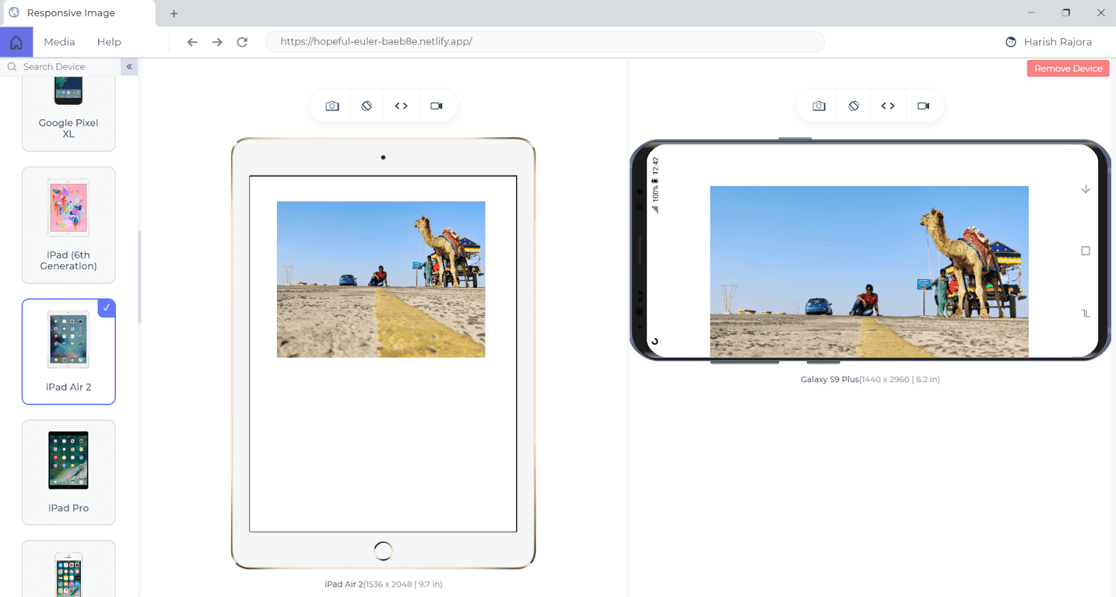
This image is for the width: 100% attribute:
You can see that the image respected the margins that were declared on the div block under which this image is wrapped.
The following image is for the width: auto (The code is the same as above except the width attribute has auto value now):
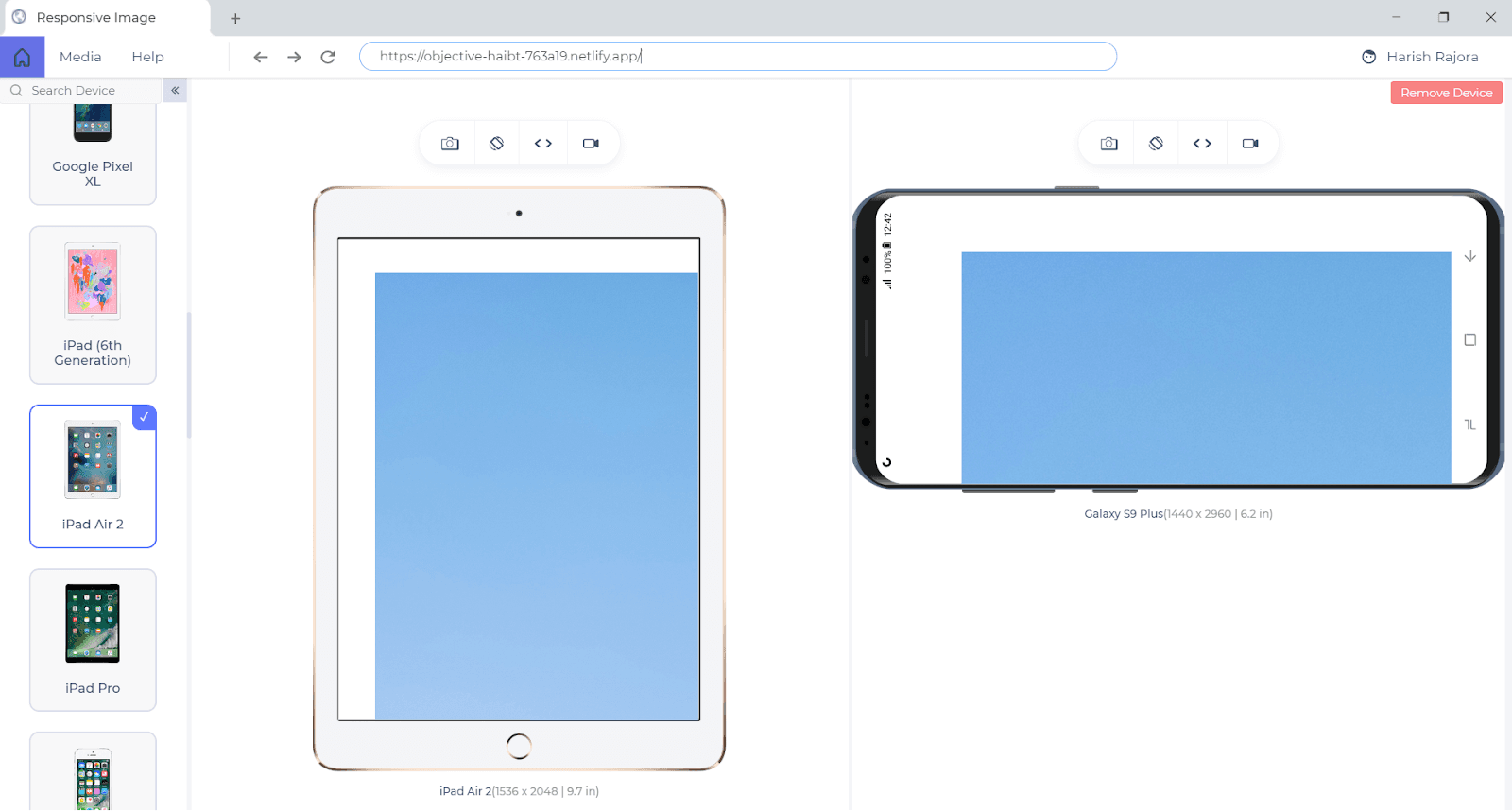
Look at how the image surpassed the margins and loaded as full giving a blow to the responsiveness of the website. So, although you need to use these turnarounds, use them wisely with appropriate image sizes and resolution and test them thoroughly beforehand.
Make Responsive Image Maps Using HTML and CSS
The problem with responsive image maps is that although we can make the image responsive by earlier devised methods, the coordinates do not move relatively.
So, on a normal desktop screen, if I have an image map with different areas having different meanings and I make this image responsive, the coordinates that specified the different areas of the image will still be in the same position as before. Definitely, they won’t be meaningful by then and may also be present in some areas outside the image map.
While performing the adjustments, we as a web developer, need to take care of this especially. This will require you to do the trial and error and perform educated guesses according to your own experience in HTML and CSS. I highly recommend using the Chrome Developer’s Tools inefficient ways to do the job easily and quickly.
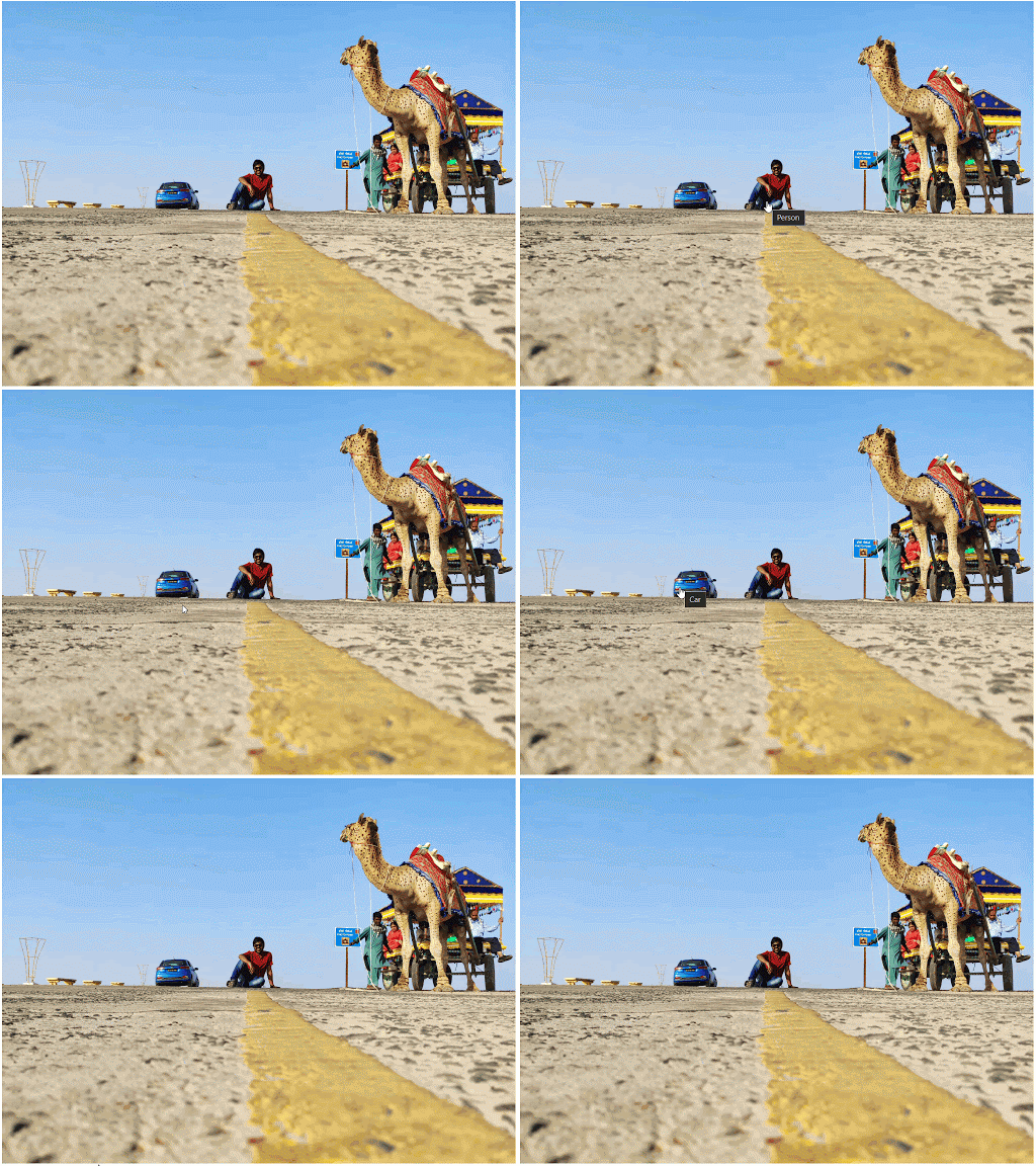
Sometimes you would see people blogging about image maps, not important other than for representing political maps which are used by a very low percentage of people. I believe that if you know web development well-enough, you can design and present innovative ways to use image maps. To support this, I will use a different example than a map below. In the below example, I will use the same image to give two separate links: One to the car and one to myself.
How To Make Responsive Images In WordPress?
Many people are now building their websites through the “Wordpress” way. It is easy and quick to set up although it has tons of limitations and can’t do all the magic that web developers can do. Anyways, WordPress is the most common CMS available and it contains a lot of images for your website. Since WordPress users do not deal with the coding part that often, it is not a good idea to tag different images with different styles as your admin may not understand any of the stuff.
To combat this situation, from version 4.4, WordPress has introduced the inbuilt responsiveness in the images. So, whenever the author of the website uploads the image, WordPress makes 2 more copies of the image and uploads them with the original (The number of copies can vary if your theme is adding additional images). These copies are of different sizes and resolutions for the different screens so that only appropriate images are loaded according to the resolution. Does this sentence click something? If you are thinking about the srcset attribute then you are right.
WordPress performs responsiveness on the website through the same srcset attribute that we talked about in the HTML responsive images section. As soon as you upload the image and place it on the website, it is placed with srcset tags of different resolutions. But WordPress does not change the aspect ratio of the image. No matter how many copies WordPress creates with whatever size and resolution, they will always be in the same aspect ratio.
Can We Change The Srcset Attribute For Responsive Images in WordPress?
You, as a developer, can always change the resolution by going into the HTML code and changing the target device resolution or the resolution of the images. Since WordPress is written in PHP, you need to know some basic PHP stuff.
As WordPress deals with the website, there can be a lot of situations where you might need to fetch the max-width of the images or calculating the size of images, etc. For such situations, WordPress provides the in-built functions listed below:
- wp_get_attachment_image_srcset() – A function to return the srcset attribute for image attachment
- wp_calculate_image_src() – Calculates the image sources to be included
- wp_get_attachment_image_sizes() – A function , which creates image’s sizes attribute value
- wp_calculate_image_sizes() – Creates the image’s sizes attribute
- fwp_image_add_srcset_and_sizes() – Adds srcset and sizes attributes to an existing img element. Used by wp_make_content_images_responsive().
With the help of these functions, you can set your own srcset attributes and sizes of the image and perform other necessary responsive processes. It is always nice to play around with the code as a web developer.
WordPress also attracts many developers to develop plugins and themes for the platform. Due to this reason, WordPress boasts a good number of plugins that help to make responsive images in WordPress for you without worrying about the code at all. You can search for them and load the ones you like.
Wrapping It Up!
Responsiveness tests have become a great deal in the field of web development due to the rise in mobile devices and other devices. A website has a lot of components though but an image is an integral part of it. Images deliver a lot of text with content and attract customers on the website. Bottom line, they need to be responsive.
Now you know different ways to make responsive images, you can write conventional HTML code with srcset attribute and picture element or you can go ahead with CSS media queries. No matter what website building platform you are using, the HTML and CSS processes will work on all of them. Those platforms may or may not have their own ways to deal with responsiveness. But whatever you choose, next time when you are building a website, make sure the images are adjusting to the screen size perfectly.
That was all for this article on how to make responsive images, I hope you now have the answers to your questions. In case you want to know more about how to make responsive images or any other browser compatibility testing question, do reach out through the comment section below. For those looking to dive deeper, resources like the “Top 90+ HTML Interview Questions and Answers” can be invaluable. Happy Testing!!! ?
Got Questions? Drop them on LambdaTest Community. Visit now


