 Test your AI Agents with the all-new Agent to Agent Testing
Platform.
Test your AI Agents with the all-new Agent to Agent Testing
Platform. 
Introducing LT Browser – A Dev-Friendly Browser For Mobile View Debugging
Harshit Paul
Posted On: June 3, 2020
8 Min


This article is a part of our Content Hub. For more in-depth resources, check out our content hub on Mobile Testing Tutorial.
We hope you & your loved ones are staying safe & strong as we fight the COVID-19 pandemic together. Today, we’re live with a developer-friendly browser that lets you develop & test responsive web applications in a trice. We’re calling it the LT Browser and we promise it’s going to be a game changer for your development & test cycles. How? We’ll find that out soon enough but before we do that, we would like to thank all our users who were involved with the beta testing of LT Browser. Thanks to you, we were able to gather constructive feedback with well-thought suggestions to help us improve the product before we went live.
LT Browser – A Game Changer For Developers
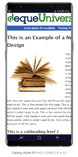
You may have heard “Content is King”, it is a quote that’s been trending from an essay written by Bill Gates in 1996. Now, if your website or web-application isn’t responsive then your content is failing for your users. Here is an example for a non-responsive website.
Obviously, your users aren’t going to be impressed if reading content becomes troublesome for them. Which is why businesses can’t afford to neglect responsive web design. However, developing a responsive web application can pose multiple challenges.
You would need a separate design for responsive web-application or website which justifies your content over a smaller viewport and screen resolution for mobile devices or tablets. Then developers will have to put up extra effort and testers will need a significant amount of time to evaluate mobile view of website across various devices. Some of your stakeholders might be even against the idea to begin with. Probably because they’re worried about the time & bandwidth that gets squeezed out to accomplish the task.
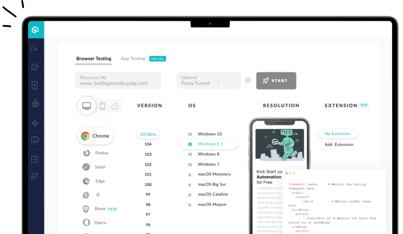
Being a cross browser testing cloud, we understand how pivotal it becomes for a business to express itself through a website, and not only over different browsers but for different devices too! We realize the challenges that revolve around the implementation of responsive web design and we wanted to help ease this burden for the developer community. Which is why we’re up with the first release of our developer-centric browser that can help you build responsive web applications much faster and test them across any mobile device.
The LT Browser is designed to help developers & testers interact with the mobile view of their websites across multiple sizes of mobiles & tablets. You can perform live-interactive testing to check responsive design of your web-application in a side-by-side view. You could record videos, capture screenshots, debug responsive bugs with developer tools and do a lot more.

In this detailed walkthrough of LT Browser tutorial video, we will help you get started with LT Browser.
How Does LT Browser Help Developers Check Responsive Design?
Here are some of the most astonishing features for the LT browser that can help your development workflows while ensuring a sturdy mobile view of your website.
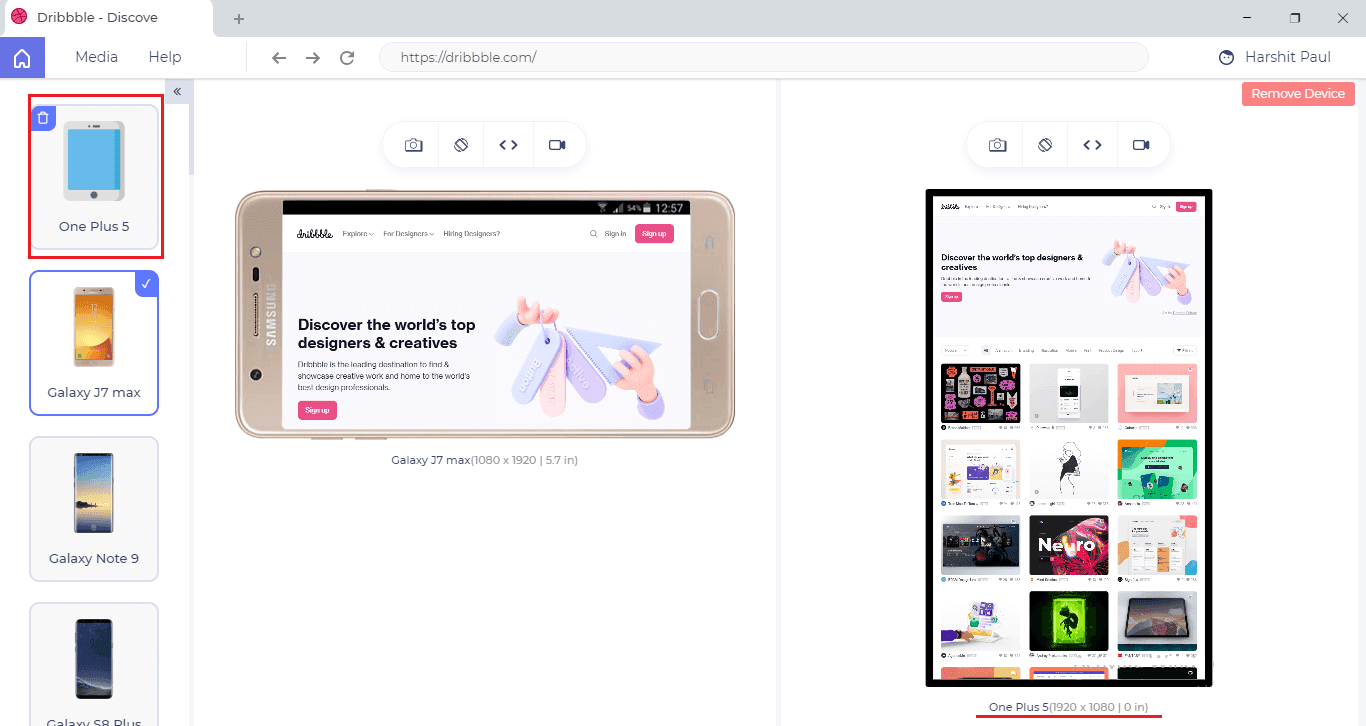
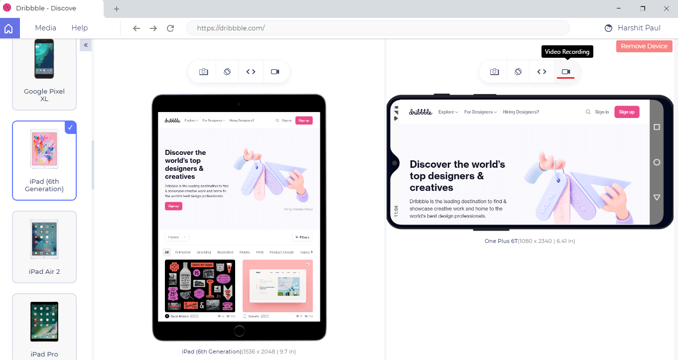
Check Responsive Design Simultaneously On Different Device Sizes In A Side By Side View
You can leverage the side-by-side view to compare the mobile view of your website across different mobiles & tablets. That way you’re able to view your website content over multiple view ports simultaneously.
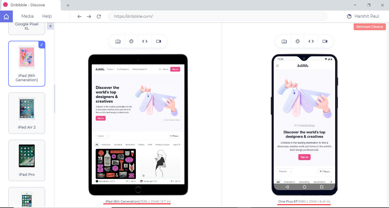
Mirrored Interactions To Help You Easily Compare Mobile View Of Website
When you are comparing a web application in a side-by-side view over different mobiles or tablets view, any action performed over one device profile will be mirrored across the other profiles too, in real time. Meaning your entire interaction with one mobile or tablet will get replicated over the other, be it navigations, clicks, scrolls etc.
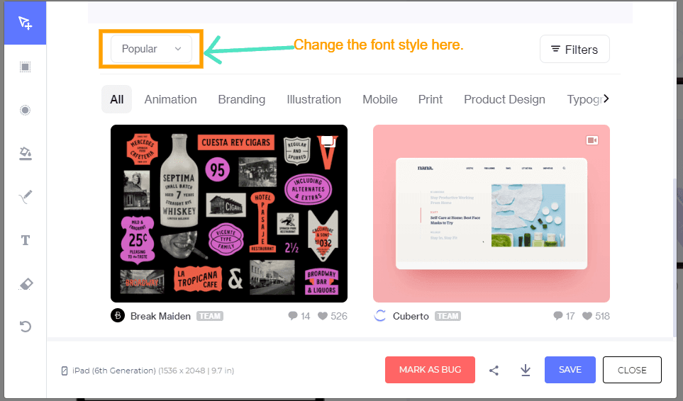
Develop Responsive Design For Any Mobile Device View
By default, we’ve kept the most trending mobile device view available in the LT Browser. However, if your preferred device isn’t mentioned in the list then you can quickly add it as a custom device.
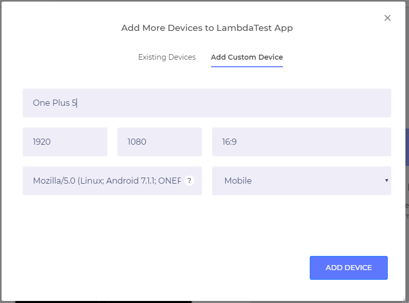
After filling the UA string and other mandatory details of the device, your custom devices will be added over the left panel.
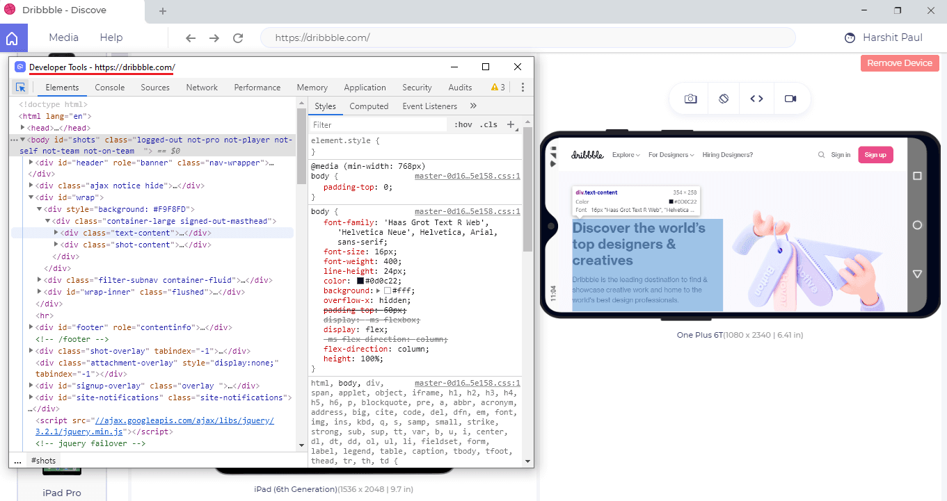
Hasten Your Debugging Process With Built-in Developer Tools
Watching your website work well across different mobile devices is cool but if it doesn’t then there is a call for debug. The LT Browser has built-in developer tools to help you quickly debug & get to the root cause for responsive issues. You could easily inspect elements and manipulate with DOM if you like.

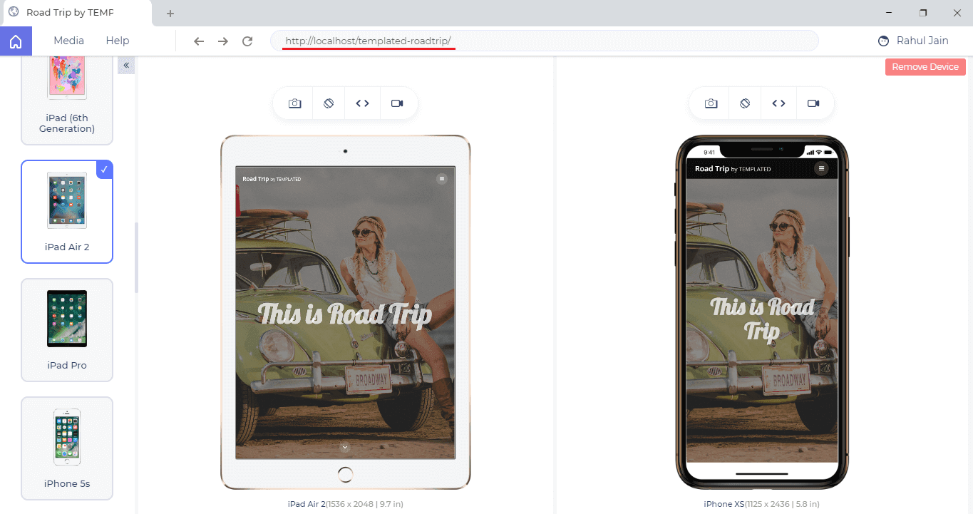
Check Responsiveness Of Your Locally Hosted Website
To evaluate responsiveness of your locally hosted website, you’d just need to type the localhost URL, just like you do it with your normal browser. Only here, the catch is you get to check your locally hosted website over a variety of mobile view ports simultaneously with mirrored interactions. 😉
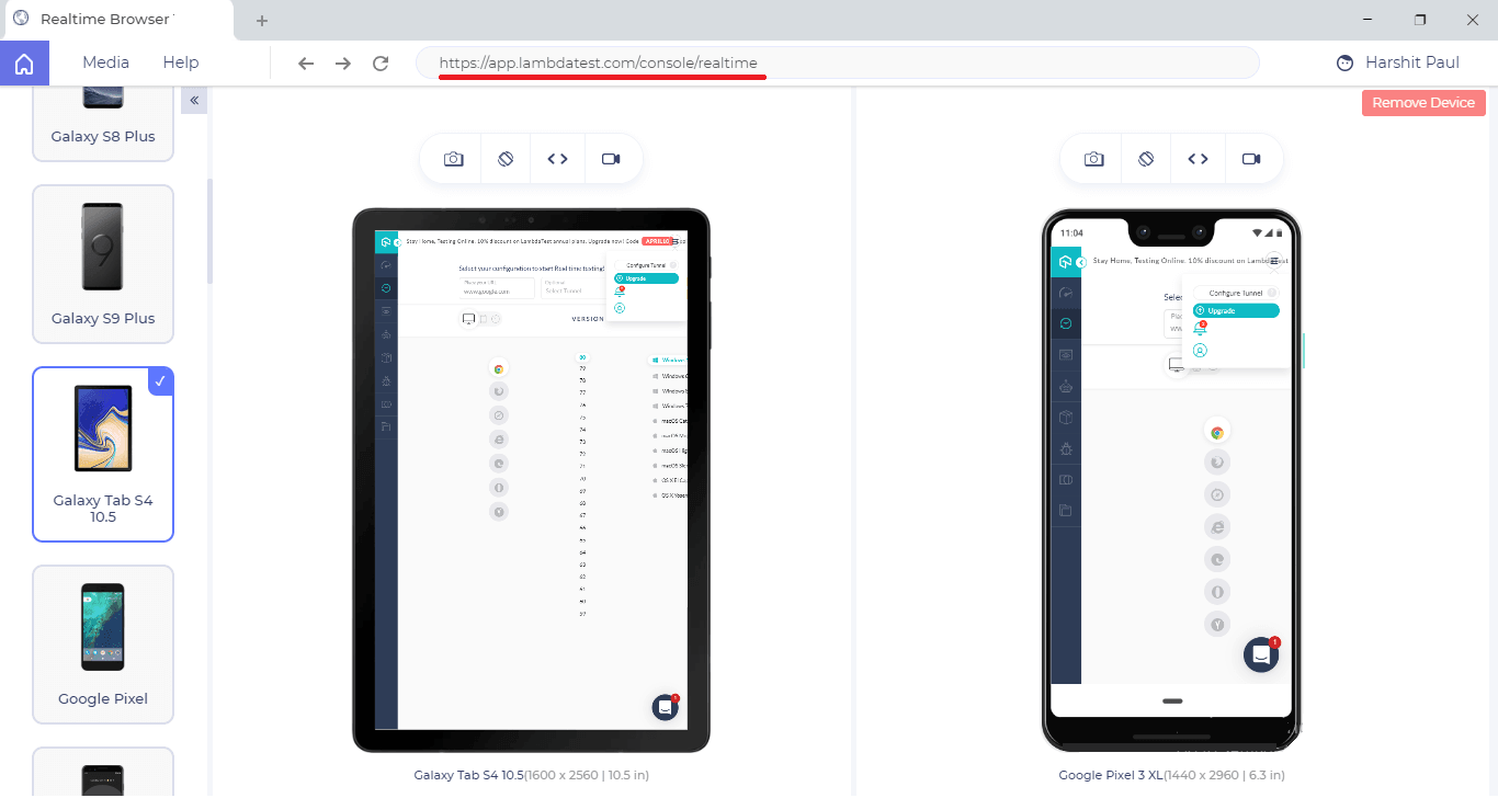
Ensure Responsive Web Design For Pages Behind Login
LT Browser aims at providing responsive testing along with live-interactive testing experience. You can simply load a website, login to the web-application and start testing your web pages that come after login.
Here is a screenshot of the LambdaTest web-application which is captured after logging in from the LambdaTest website.
Built-In Image Editor To Easily Highlight A Responsive Bug
LT Browser has a built-in Image editor which allows you to highlight bugs with markers of different colors & different shapes. You can also leave a comment over the image to help relay the bug or suggestions to your team.
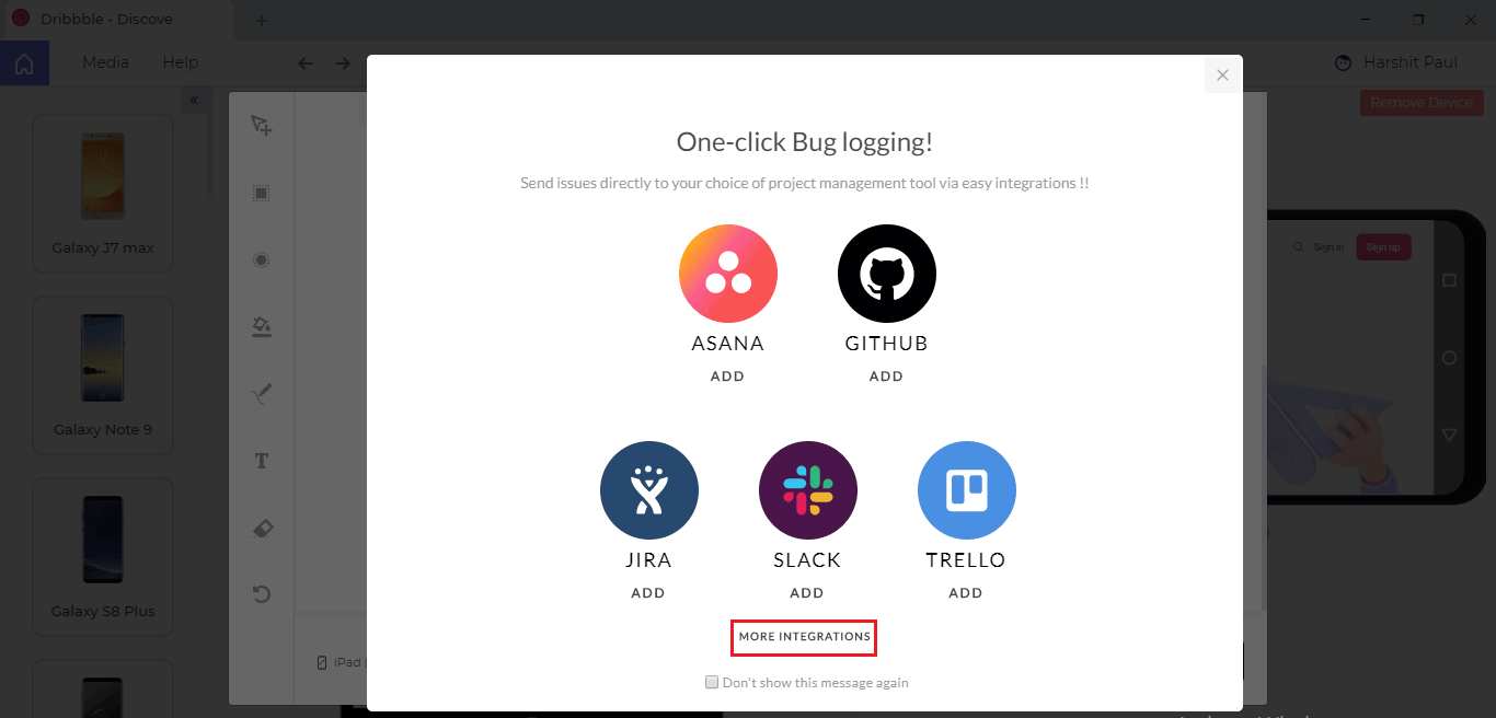
Share Responsive Bugs With Your Team In A Single Click
You can leverage LambdaTest integrations to your favourite project management tool for sharing bugs with your colleagues.
You can also generate a shareable URL, send the screenshot to multiple email IDs, or even download the screenshots in your PC or Laptop.
You Can Record A Video Of The Entire Test Session
Ever come across a scenario where a bug is too tough to reproduce without enough evidence in hand? Well, with LT browser you can record the entire testing performed over a tablet or mobile view. You can review these videos later with your team if you find anything peculiar over your responsive web application.
Built-In Media For Accessing Your Highlighted Screenshots & Recorded Videos
What makes LT Browser special is that you get to view all of your recorded videos and saved screenshots under the media tab.
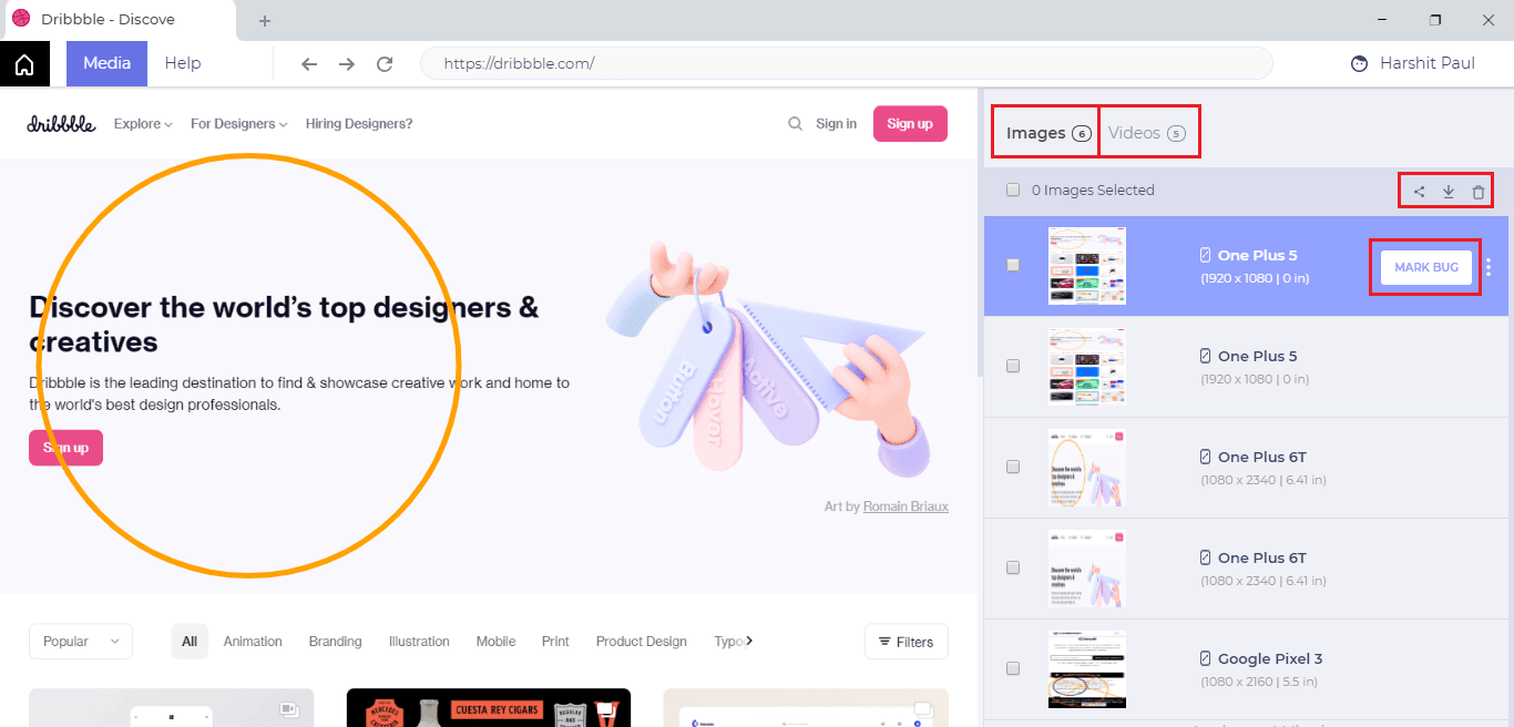
You can download, share or delete the saved images & recorded videos from Media as well.
Do You Like Hot Reloading?
If you’re a React fan then hot reloading has to be a favourite for you, right? Well, it’s our favourite too. Which is why we’ve made sure that the LT Browser supports hot reloading to help you see your changes instantly in real-time as you hit save in your code editor or IDE.
What Makes It Different Than Our Responsive Testing Feature?
If you’re a LambdaTest user then you might already be aware of our responsive testing feature that allows you to capture full page screenshots of your web-application or website across multiple devices for mobile & tablets. Prior to reading this article, you might be wondering what makes LT Browser different from our Responsive Testing feature? And that’s a brilliant question!
It is true that the ultimate purpose of LT Browser & our responsive testing feature is to help you deliver responsive web-applications to your customers. However, if you have read the product update so far then I am sure you’ll see the notable differences between LT Browser & Responsive testing.
If you’re not familiar with our Responsive testing feature, we suggest you read the below article.
Also Read: 9 Key Features Of Responsive Testing To Try On LambdaTest
With this Responsive testing tutorial for beginners, you will learn how to perform Responsive Testing of your website on the LambdaTest platform.
How Was That?
We hope you like our LT Browser application. As it has recently come out of Beta testing, we’d rely heavily on your suggestions & inputs around how we can make this work better for you. Feel free to share your thoughts around the LT Browser with us. You can drop us an email to support@lambdatest.com or you could let our experts know about it from the 24//7 customer chat support. Stay safe! 🙂
Author
Harshit Paul is the Director of Product Marketing at LambdaTest with over 7 years of experience in product and growth marketing. He also worked for 2 years as a certified Salesforce developer at Wipro Technologies. He has authored 80+ technical articles for LambdaTest, covering testing and automation. Harshit has led go-to-market campaigns, managed Google and Bing Ads with profitable ROAS, and hosted webinars on Software Testing, Automation Testing, Selenium, Browser Compatibility, DevOps, and Continuous Testing. He has also contributed across SEO, social media, performance marketing, partner marketing, and content strategy, while working on blogs, newsletters, web pages, certifications, case studies, and support documentation. Harshit graduated in Computer Programming from Vivekananda Institute of Professional Studies.
Blogs: 78


