Why Vertical Text Orientation Is A Nightmare For Cross Browser Compatibility?
Nikhil
Posted On: February 27, 2019
![]() 64446 Views
64446 Views
![]() 8 Min Read
8 Min Read
The necessity for vertical text-orientation might not seem evident at first and its use rather limited solely as a design aspect for web pages. However, many Asian languages like Mandarin or Japanese scripts can be written vertically, flowing from right to left or in case of Mongolian left to right. In such languages, even though the block-flow direction is sideways either left to right or right to left, letters or characters in a line flow vertically from top to bottom. Another common use of vertical text-orientation can be in table headers. This is where text-orientation property becomes indispensable.
Before diving in, let us understand what Vertical-text CSS mean. Vertical text in CSS is a design technique where text characters are oriented vertically, flowing from top to bottom, as opposed to the traditional horizontal flow from left to right. This shift in orientation offers a unique visual appeal, breaking the standard design norms and capturing the user’s attention.
CSS Text-Orientation
The method that we will focus upon in this blog is by the use of CSS text-orientation. ‘text-orientation’ is a CSS property that defines the orientation of characters within a line. Remember that text orientation needs to be used in conjunction with the writing-mode property. It can only be used when writing-mode is set to vertical(either vertical-rl or vertical-lr). It will not work if writing mode is set to horizontal(horizontal-tb).
Syntax:
text-orientation: mixed | upright | sideways;
By default, text-orientation is set to mix.
- Mixed: horizontal scripts will be rotated 90deg clockwise while vertical scripts remain unaffected.
- Upright: all characters will remain in upright orientation even if block-flow is vertical
- Sideways: All text(horizontal and vertical scripts) will be rotated sideways – 90deg clockwise.
Browser Support
Head over to caniuse and search for ‘CSS text-orientation’ to get an in-depth insight into which browsers and specific browser version supports this feature.
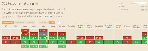
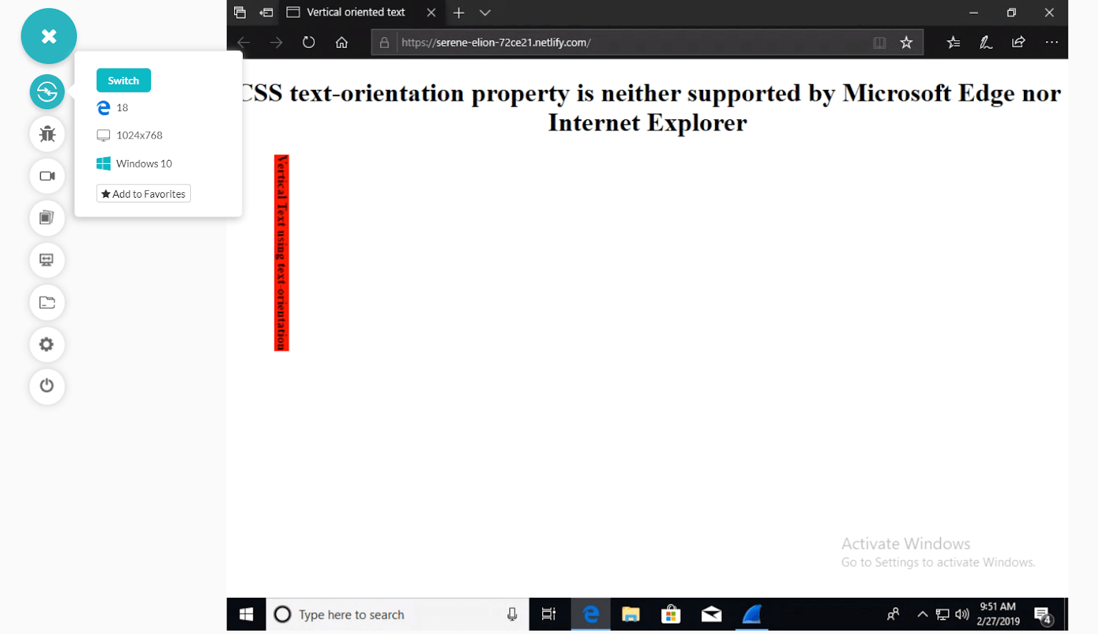
Remember that text-orientation in CSS3 is a relatively new feature and might undergo syntax changes and alterations in future. Although, it is supported by all the major browsers like Chrome, Firefox, Opera and Safari, the major exceptions are Microsoft Edge and Internet Explorer. It is prudent to use some kind of fallbacks for such unsupported browsers which will further ease our effort for cross browser testing.
You can also see CSS text-orientation in action as you head to performing cross browser testing for acknowledging the browser support for vertical text-orientation on LambdaTest Experiments. Not only does it displays a live example for this feature with code but also the list of all the major browsers which support and do not support the particular feature, it can also detect user’s current browser and operating system.
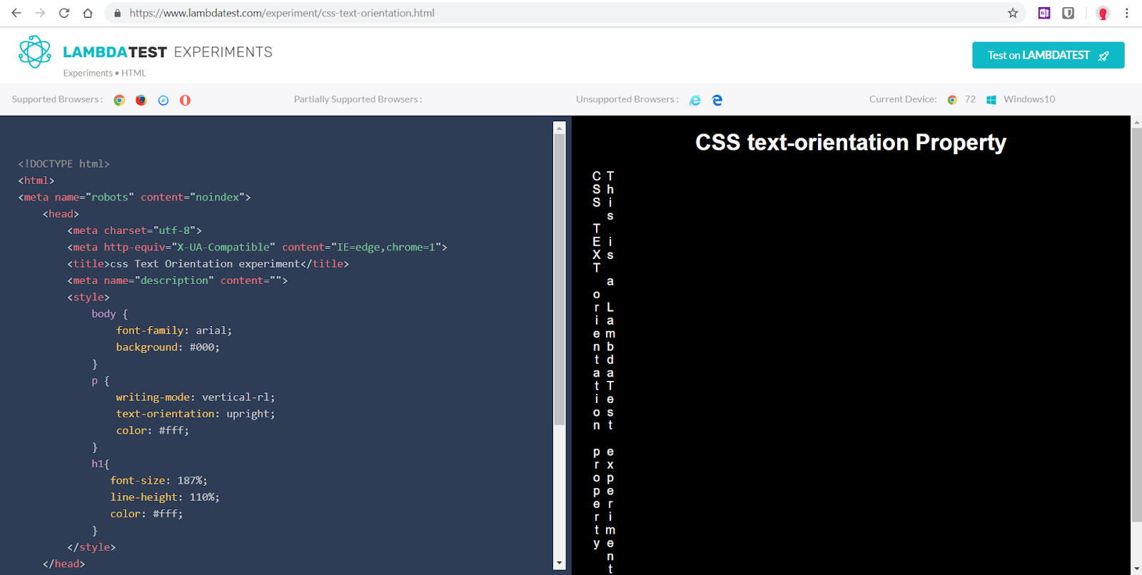
Before using text-orientation, we need to first look into the writing-mode property and understand the concepts of block-flow and inline-flow direction.
Writing Mode
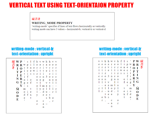
‘writing-mode’ property specifies if lines are set to horizontal or vertical text-orientation. Also, the direction in the text block progresses – left to right or right to left. Writing Mode can have 3 values – horizontal-tb, vertical-lr or vertical-rl.
writing-mode: horizontal-tb | vertical-rl | vertical-lr;
Note: There are 2 more experimental values which should not be used in production code.– ‘sideways-rl’ or ‘sideways-lr’. Also, old values like lr, lr-tb, tb, tb-rl, rl have been deprecated.
Writing-mode introduces 2 key concepts-
- Block flow Direction: Specifies the direction in which block-level boxes are stacked inside a container. It can either be top to bottom, left to right or right to left.
- Inline Flow Direction: Specifies the direction in which content flows inside the line of text, and where a new line starts. It can either be horizontal or vertical.
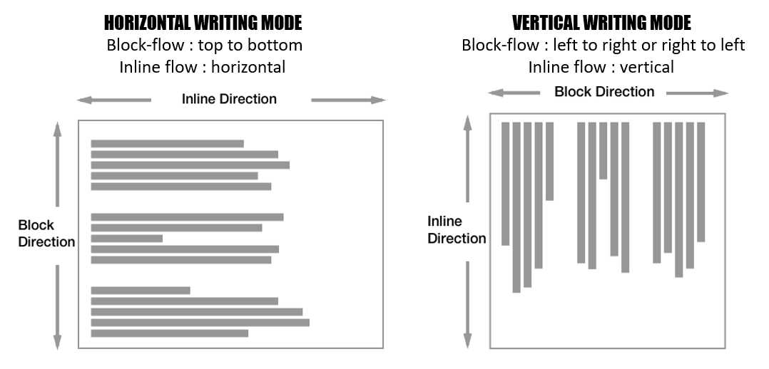
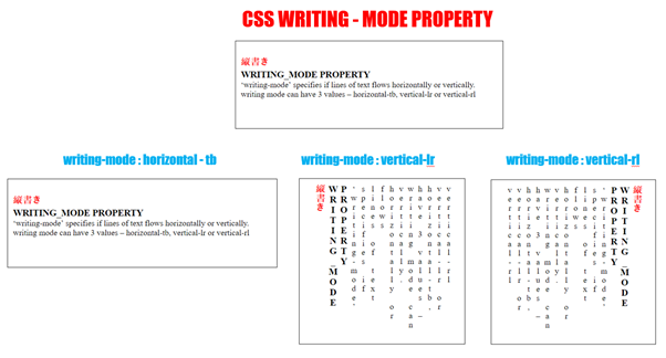
To achieve a vertical text orientation, set the writing mode property to vertical-lr(or vertical-rl) and set text-orientation to upright.
Wondering About LambdaTest?
LambdaTest is a cross browser testing cloud which helps you to perform browser compatibility testing in an effortless manner on over 3000+ browsers and browser versions. You can perform manual cross browser testing by directly interacting with real browsers through a VM hosted on their cloud servers. You could also perform automated cross browser testing using their Online Selenium Grid through a test automation framework of your choice.

Creating Vertical Text With “text-orientation” Property
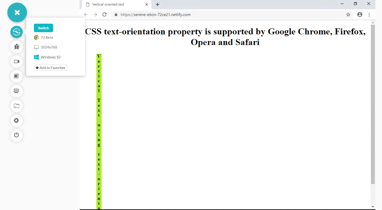
To create vertically oriented text, you need to set text-orientation in CSS to upright along with writing -mode set to vertical-lr. As we discussed earlier, CSS text-orientation will only function if the writing-mode property is set to vertical (either vertical-rl or vertical-lr) and not horizontal (horizontal-tb).
|
1 2 3 4 5 6 7 8 9 10 11 12 13 14 15 16 17 18 19 20 21 22 23 24 25 26 27 28 29 30 31 |
<!DOCTYPE html> <html lang="en"> <head> <meta charset="utf-8"> <meta http-equiv="X-UA-Compatible" content="IE=edge"> <meta name="viewport" content="width=device-width, initial-scale=1"> <title>Vertical oriented text</title> <style> .vertical-text { writing-mode: vertical-lr; text-orientation: upright; background-color:red; } @supports(text-orientation:upright){ .vertical-text{ background-color: greenyellow; } } </style> </head> <body> <h1>CSS text-orientation property is supported by Google Chrome, Firefox, Opera and Safari</h1> <span class="vertical-text"> Vertical Text using text-orientation </span> </body> </html> |
We can utilise LambdaTest as a cross browser testing tool to interact with your website live using their real-time testing feature. Real time testing would present your website on a VM hosted by LambdaTest cloud servers. You can also perform automated screenshot testing to capture multiple screenshots in one go of our webpage across different desktop and mobile browsers to fix browser compatibility issues. You can do all that on your locally hosted webpages using Lambda Tunnel which helps to establish an SSH(Secure Shell) connection between your machine to their cloud servers.
Alternative Methods To CSS Text-Orientation
1.Word Break
CSS ‘word-break’ property defines how a line break occurs whenever text reaches the end of the line and would overflow its container.
Syntax
word-break: normal|break-all|keep-all|break-word;
- normal: default rule for a line break.
- break-all: to avoid overflow from container word is broken at any letter.
- keep-all: same as normal but for Chinese, Japanese and Korean – do not use any word break.
- break-word: in absence of breakpoints in a line, work can be broken at any arbitrary point.
Browser Support

Unlike text-orientation, the word-break property is supported by all browsers including Microsoft Edge and all versions of Internet Explorer as well.
Creating Vertical Text With Word-Break Property
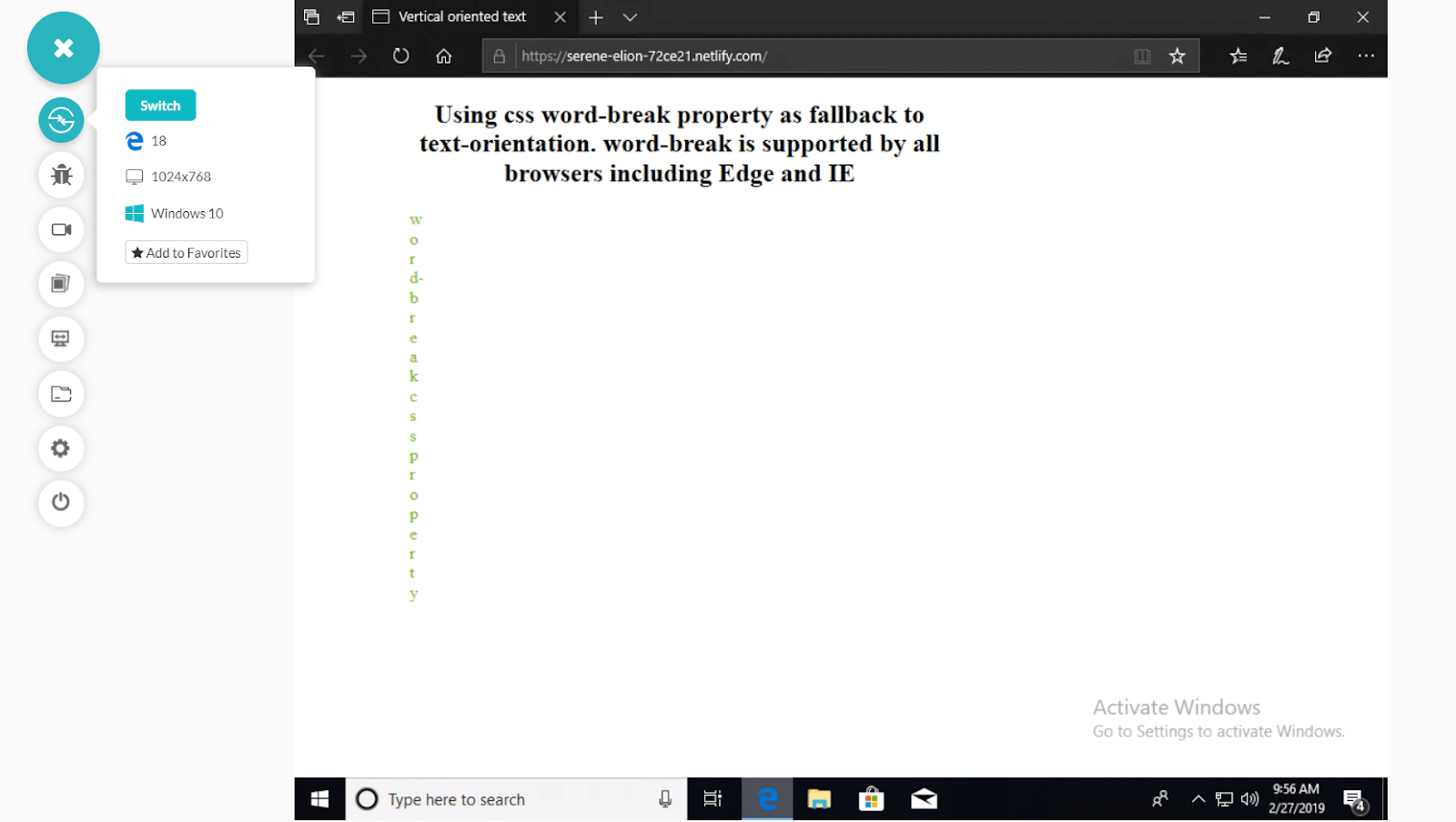
We can set the word-break property to break all value and reduce the width of the container to 0px. This would force all the words to be broken at every letter and appear in a vertical fashion. Also set white-space to pre-wrap to make sure white spaces(blank space) is visible so that the distinction between words can be made.
|
1 2 3 4 5 6 7 8 9 10 11 12 13 14 15 16 17 18 19 20 21 22 23 24 25 26 27 |
<!DOCTYPE html> <html lang="en"> <head> <meta charset="utf-8"> <meta http-equiv="X-UA-Compatible" content="IE=edge"> <meta name="viewport" content="width=device-width, initial-scale=1"> <title>Vertical oriented text</title> <style> h2 { margin-left: 10%; width: 50%; text-align: center; } .vertical-text { margin-left: 100px; width: 0px; word-break: break-all; white-space: pre-wrap; color: rgb(121, 202, 0); } </style> </head> <body> <h2>Using css word-break property as fallback to text-orientation. word-break is supported by all browsers including Edge and IE</h2> <p class="vertical-text">word-break css property </body> </html> |
2.Word-wrap/overflow-wrap
The CSS word-wrap forces allow long words to be broken and wrapped onto the next line to avoid overflow. The word-wrap property is now also reffered as overflow-wrap. All browser support the word-wrap syntax including Edge and IE while Chrome and opera support the new overflow-wrap syntax.
Syntax
word-wrap: normal|break-word|initial|inherit;
- normal: Break words only at normal separation points.
- break-word: Any word can be broken at an arbitrary point.
- Initial: Sets to a default value.
- Inherit: transfers this property from parent to a child element.
Browser Support
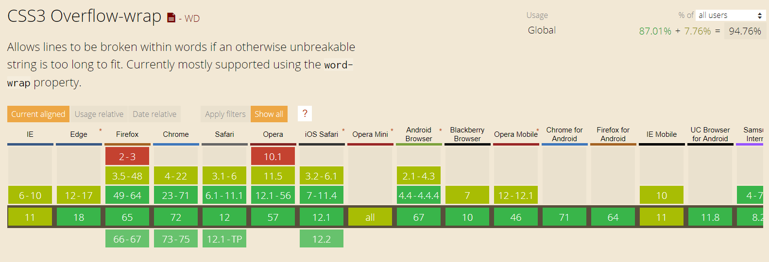
Just like word-break, word-wrap property is also supported by all browsers including Microsoft Edge and all versions of Internet Explorer as well.
Creating vertical text with word-wrap property
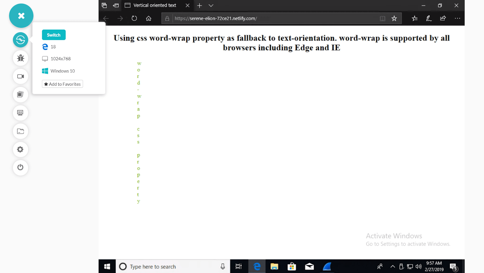
We can use the same strategy as we used in case of word-break property to reduce the width of the container to 0px and force every word to be broken at every letter and appear in a vertical orientation while each individual character remaining upright. Once again, set white-space to pre-wrap to make sure white spaces(blank space) is visible so that the distinction between words can be made.
|
1 2 3 4 5 6 7 8 9 10 11 12 13 14 15 16 17 18 19 20 21 22 23 24 25 26 |
<!DOCTYPE html> <html lang="en"> <head> <meta charset="utf-8"> <meta http-equiv="X-UA-Compatible" content="IE=edge"> <meta name="viewport" content="width=device-width, initial-scale=1"> <title>Vertical oriented text</title> <style> h2 { text-align: center; } .vertical-text { margin-left: 100px; width: 0px; word-wrap: break-word; white-space: pre-wrap; color: rgb(121, 202, 0); } </style> </head> <body> <h2>Using css word-wrap property as fallback to text-orientation. word-wrap is supported by all browsers including Edge and IE</h2> <p class="vertical-text">word-wrap css property </body> </html> |
3. < br > tag
The most primitive method to achieve vertical text orientation is by the use of break < br > tags. However, this method is not very practical and should not be used if the string of text is too long.
|
1 2 3 |
<p> V <br> E <br> R <br> T <br> I <br> C <br> A <br> L <br> <br> T <br> E <br> X <br> T </p> |
4. < span > wrapping
Another popular method is to wrap each letter of the text desired to be vertically orientated inside a span tag and using CSS to assign display: block to each span wrapper. Again just like using < br > tag, this method is not practical for large text strings.
|
1 2 3 4 5 6 7 8 9 10 11 12 13 14 15 16 17 18 19 |
<head> <style> p span { display: block; } </style> </head> <body> <p> <span> V </span> <span> E </span> <span> R </span> <span> T </span> <span> I </span> <span> C </span> <span> A </span> <span> L </span> </body> |
5. Using JavaScript
A much better approach is to use a single line of javascript code to dynamically add span wrapper around each letter of the concerned text that needs to vertically oriented rather than manually adding spans in HTML. The text is split into an array and each array element is wrapped around by span tag.
|
1 2 3 4 5 6 7 8 9 10 11 12 13 14 15 16 |
<head> <style> h1 span { display: block; } </style> </head> <body> <h1> VERTICAL </h1> <script> var text = document.getElementsByTagName('h1')[0]; text.innerHTML = '<span>' + text.innerHTML.split('').join('</span><span>') + '</span>'; </script> </body> |
Conclusion
Creating vertically oriented text has always been a challenge in CSS since time immemorial itself. No solution or fix could promise an immaculate result. However, the introduction of new CSS3 text-orientation property has completely solved that conundrum. A word of caution is appropriate for developers who are planning to deploy this feature in production version of their projects. text-orientation is relatively a new property and might undergo syntax change in future and developers shouldn’t forget to code necessary fallbacks for Microsoft Edge and Internet Explorer to ensure cross browser compatibility. If you have any other alternatives to text-orientation in mind, let me know in the comments below.
Got Questions? Drop them on LambdaTest Community. Visit now


