 TestMu Conference is Back! Future of Testing + AI
Mobile Friendly Test with LT Browser
Build world-class responsive mobile websites with our chromium-based browser
 Watch in Action


Device 1
- 1

iPhone 12 Pro
- 1

iPad Pro
×
Device 2
- 2
Google Pixel
- 2

1024X768
×
iPhone 12 pro(1170x2532)

Ipad pro(2048 x 2732)

Google Pixel (1080 x 1920)
Desktop 1024 x 768
Why my mobile website refused to connect? : Your website may not be supporting iframe but our Chromium-based LT Browser has the solution. Test your website across 50+ different device viewports to enjoy un-interrupted mobile web testing on 50+ device screens. Try LT Browser for free
You are about to download LT Browser for Linux
×Download Deb
64-bit version for Debian/Ubuntu
Download RPM
64-bit version for Fedora/openSUSE
By downloading and using LT Browser, I agree to the Privacy Policy and Terms.


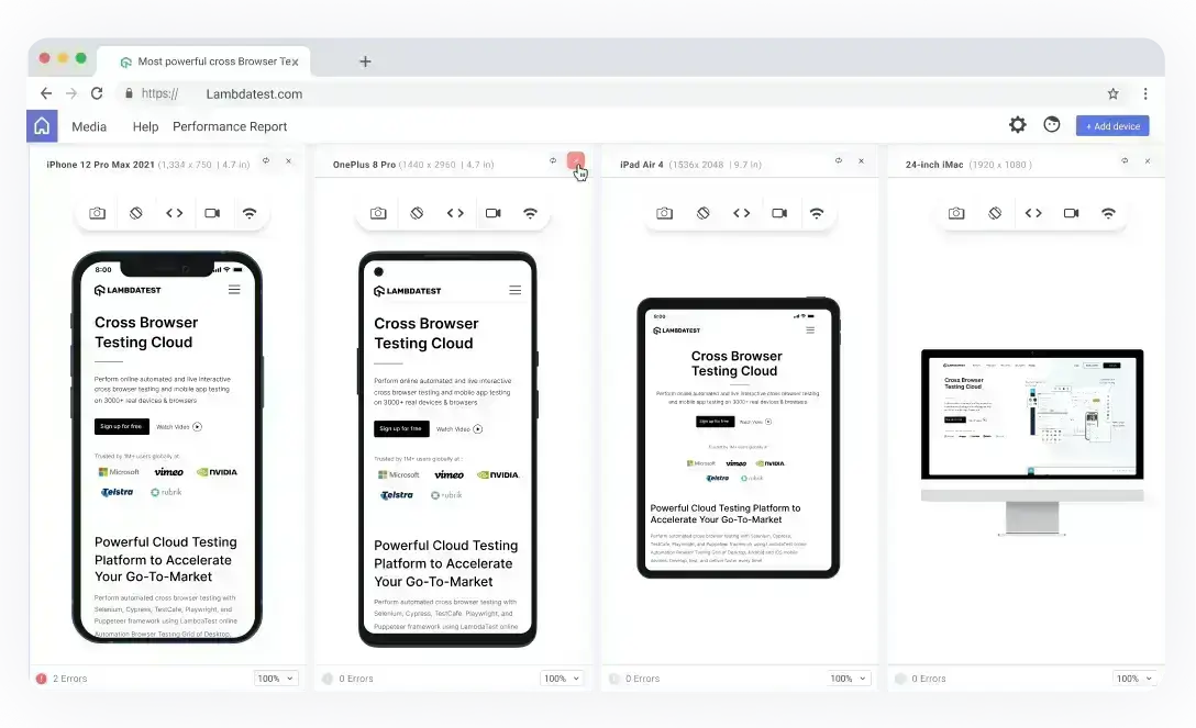
Interact and Test With Multiple Devices
With LT Browser, you get access to a plethora of devices to choose from. Unlike its predecessor, the latest version allows you to test mobile website usability by allowing you to interact and test with up to six devices simultaneously.
Chromium-Based LT Browser
Best Developer Browser to build and debug mobile websites
- Test With Multiple Devices
- Network Throttling
- Dedicated DevTools

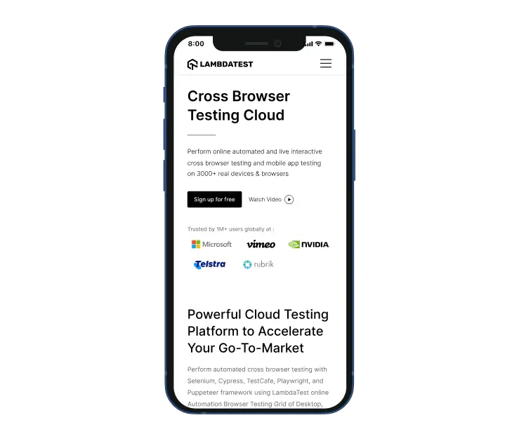
Check Mobile View Of Your Website
Test the mobile view of your website across 50+ device viewports with this mobile friendly test tool. Check the responsiveness on pre-installed Android and iOS viewports or custom mobile resolutions.
Check Responsive Design On Your Tablets
Ensure your website or web application's design on pre-installed iPad and Galaxy tablet viewports or custom tablet resolutions. You can also check the responsiveness in landscape and portrait modes with this developer-friendly browser.

Test On Different Laptop Viewports
Check your website's responsiveness on a plethora of pre-installed laptop viewports. You can also create custom laptop resolutions by mimicking your laptop's resolution.

Test On Different Desktop Sizes
Ensure that your website or web application renders as desired across a plethora of pre-installed desktop viewports. You can also check the responsiveness by creating custom desktop resolutions on LT Browser.

Dedicated DevTools for Different Viewports
Now fasten your debugging process with multiple dev tools. LT Browser offers you separate dev tools for every device to debug them simultaneously.

9 Things You Can Do With LT Browser

Native Chromium Engine
Use all Chrome browser features like settings and APIs, having better OS integration, accessing latest Chrome DevTools.

Multiple Device Viewports
Choose from a wide range of devices and effortlessly interact and test responsiveness across multiple device viewports.

Dedicated Chrome DevTools
Enhance your mobile view debugging with built-in Chrome dev tools for each device viewport, enabling faster debugging.

Multiple Recording Options
LT Browser lets you record the entire screen or a specific tab in tablet or mobile view and easily share it with your team.

Google Lighthouse Report
Get access to concise lighthouse report for viewing your website's key performance metrics, including accessibility score and SEO.

Hot Reloading Feature
LT Browser's user-friendly interface, quick documentation, and hot reloading ensure seamless code updates in device viewports.

Network Throttling
Ensure seamless user experience by checking your mobile view website's responsiveness on various network profiles.

Multiple Bug Reports
Create and share responsive bug reports seamlessly across preferred project management or messaging tools.

Test History
Developers using LT Browser access their test history for informed decisions and clear site cookies via Chrome settings.

Hot Reloading Support
LT Browser offers hot reloading to help you see the changes in real time. You can use navigation arrows, refresh the web page, and more. Whenever you hit save in your react code in your code editor or IDE, the local URL automatically reloads in the device viewports.

Is Responsiveness The Same as Mobile-Friendly?
When it comes to mobile friendly testing, responsive design and mobile-friendliness are related but different. Responsive design refers to a website design approach that adjusts a website's layout to the screen size of other devices, such as smartphones, tablets, and laptops. The website automatically changes its layout with a responsive design to provide an optimal viewing experience on different devices.
Mobile-friendliness, on the other hand, is a broader term that refers to the overall accessibility and usability of a website on mobile devices. In addition to having a responsive layout, a mobile-friendly website should have touch-friendly elements, legible font sizes, and fast page load times on mobile devices.
Responsive design is a crucial aspect of mobile-friendliness, but it's not the only factor. A website can have a responsive layout but still have other issues that negatively impact the mobile user experience. Therefore, it's essential to consider various factors to ensure your website is truly mobile-friendly.
How To Make Your Website Mobile-Friendly?
The widespread use of smartphones has made it imperative for web developers and designers to focus on creating a seamless user experience for mobile devices. A report from Statista indicates that as of 2022, there will be 6.64 billion smartphone users worldwide, which will rise to 7.5 billion by 2026. In the second quarter of 2022, mobile platforms account for 59% of overall web traffic, which is more than half of the global web traffic.
To make your website mobile-friendly, you can follow these steps:
- Create a Responsive Layout: Responsive web design allows a website to adapt to different screen sizes and display resolutions without any rendering issues. This makes it easier for mobile or desktop users to view your site, as the content is resized appropriately for each user's device.
- Optimize Website Speed: Speed is one of the most important factors in creating a positive first impression with website visitors. 47% of visitors will abandon a website if it takes more than 2 seconds to load, and even a 1-second delay in page response can hurt your conversion rates by 7%. Google considers high speed a positive ranking factor, so web developers must take all the necessary steps to increase site speed.
- Clean Web Design: To create a seamless user experience, prioritize a neat, minimalist design that makes navigation intuitive. Ensure your mobile test website is clear from having too many elements on one page since this can confuse users. Offer only the critical functions upfront since those are the ones users will actively look for.
- Craft Clear Content: The website can take a hit while performing mobile web design and content creation experiments. To ensure that your mobile-first web design approach is successful, make sure that the content on your website is readable on mobile screens and well-oriented.
What Does It Mean To Be Mobile-Friendly?
A mobile friendly test tool ensures a website is designed and optimized for mobile devices such as smartphones and tablets. A mobile friendly test website should provide an optimal viewing and user experience on smaller and touch screens without the need for horizontal scrolling or pinch-to-zoom.
To be considered mobile-friendly, a website should have the following characteristics:
- Responsive design: To ensure mobile friendly testing, the mobile test website layout should adjust to fit the screen size of different devices.
- Legible font sizes: Mobile test website text should be easily read on the user's device. The text should be responsive to the device size and resolution.
- Optimized navigation: Website buttons and links should be optimally large enough to be easily tapped with a finger.
- Fast load times: Due to shorter attention spans, website pages should load quickly on mobile devices, even with slow internet connections.
- Minimal pop-ups: Pop-ups can be difficult to close on mobile devices and negatively impact the user experience.
Why Mobile First Design Matters
Mobile-first design is essential because of the widespread reliance on mobile devices. It guarantees better user experiences, improves search engine rankings, and prepares websites for the future.
- Boosted Discoverability on SERPs: Google's algorithm prioritizes mobile-friendly sites, boosting discoverability on search engines (SERPs), crucial for business success.
- Growing Mobile Usage: The number of mobile users has surpassed desktop users globally. People are more likely to access the internet on a mobile device, making it crucial for websites to cater to this audience.
- Enhancing Online Presence Effectively: Mobile-first design helps businesses reach more clients and enhance their online presence effectively.
- Shifting Advertising Focus to Mobile: Businesses now invest more in mobile advertising than TV commercials, emphasizing the need for mobile-friendly websites.
- Performance Optimization: Designing for mobile first often leads to better performance. Mobile devices generally have less processing power and slower internet connections than desktops, so a mobile-first approach encourages developers to optimize for speed and efficiency.
Does Mobile Friendliness Affect SEO?
Yes, mobile friendliness can significantly affect the SEO of your website. As per HubSpot Blog Research 2021, 64% of SEO marketers say mobile optimization is an effective investment, and over half of marketers, at 50.3%, incorporate mobile optimization into their SEO tactics. They consider mobile optimization highly effective for achieving top search engine rankings. - a big deal considering that 64% of searches are done on a mobile device.
- Google's Mobile-Friendly Ranking: Google and other search engines have shifted to mobile-first indexing. This means that the mobile version of your website is primarily used for indexing and ranking.
- Consequences of Non-Optimization: Non-optimized websites for mobile devices may experience lower rankings and higher bounce rates.
- Page Speed: Mobile-friendly websites are typically optimized for faster loading times, which is a critical SEO factor. Search engines, particularly Google, prioritize sites that load quickly on mobile devices.
- Local Search: Mobile friendliness is especially important for local SEO. Users often search for local businesses and services on their mobile devices, and search engines prioritize mobile-friendly sites in these local search queries.


FAQs
What does a mobile friendly website mean?
A mobile-friendly website does not require zooming, scrolling, or resizing to view ; it preserves the look and feel of the website across all devices.
What is mobile friendly test?
Mobile friendly testing can be done with LambdaTest's free tool called the LT Browser. LT Browser allows you to test the responsiveness of your mobile website across 50+ device viewports. A site's mobile usability can be measured by its responsive behavior and compatibility with the website on given viewport and system environment. Google also provides a mobile-friendly test, but it cannot test mobile friendliness of the website. LT Browser, however, not only test the mobile friendliness of the website but allows you to build, test, and debug a mobile friendly website right from the same window.
Why mobile friendly test is important?
Making sure your website is “mobile-friendly” ensures that your visitors have a pleasing experience using their mobile devices to browse the content on your site. It also helps you with the relevant Google ranking factors so that your page comes up higher in search engine results.
How to perform mobile friendly test for my website?
LT Browser will help you test how your website appears across 50+ viewports, including all major mobile devices, tablets, and PCs. You can even create and save your own custom screen resolutions to verify how your site looks on any of device screens.
Why is it important to be mobile friendly?
To reach a wider audience, you need a mobile-friendly website. Responsive websites simplify online sharing, so your web visitors are likelier to share on their social platforms. Plus, Google displays mobile friendly as a ranking symbol on search results.
What does it mean to be mobile friendly?
A mobile friendly website can be easily accessed on various devices, including computers, tablets, and smartphones. In contrast to a traditional website, which often requires additional effort to access its content on smaller screens, a mobile-friendly website remains fully functional as its layout automatically adjusts to fit the screen size of any device being used.
What makes something mobile friendly?
Mobile-friendly websites display the same content to users on desktop computers and mobile devices but with a different layout optimized for small screens. While this allows mobile users to view, browse, and use the site, it can be challenging.
What is mobile testing with example?
Mobile testing is the process of testing applications for modern mobile devices to ensure that they function properly, are usable by users, perform well and meet specific requirements. This includes testing for native apps as well as web or hybrid apps.
What are the different types of mobile testing?
Mobile testing consists of the following types of testing: Functional testing, Usability testing, Compatibility testing, Performance testing, Security testing, Localization testing, Exploratory testing, and Interruption testing.
How do we do mobile testing?
Mobile testing is the process of testing websites and applications across different mobile devices to ensure consistency and performance. You can view your website across different mobile device viewports with the all-new LT Browser. You can even create custom viewports to ensure a seamless user experience.
How to make my website mobile friendly?
There are a few checkpoints everyone should consider for making a mobile friendly website.
- 1. Try not to be too distracting with pop ups
- 2. Choose a mobile friendly theme for website
- 3. Use easy to read font and font size 4. Avoid un-necessary links on webpage
- 5. Use light images , videos and CSS 6. Check your website's buttons to make sure they're easily accessible.
- 7. Test website regularly

1.2B+
Tests

2M+
Users

10000+
Enterprises

132
Countries
Elevate Testing Experience With LT Browser
Transform Mobile App Testing and Experience Innovation with LT Browser. Achieve Your Mobile Responsiveness Goals – Try LT Browser Today!
 Talk to us
You are about to download LT Browser for Linux
×Download Deb
64-bit version for Debian/Ubuntu
Download RPM
64-bit version for Fedora/openSUSE
By downloading and using LT Browser, I agree to the Privacy Policy and Terms.