 Test your AI Agents with the all-new Agent to Agent Testing Platform.Learn More
Power Your Software Testing with AI and Cloud
Supercharge QA with AI for Faster & Smarter Software Testing
CSS Device Adaptation
css-deviceadaptation is a CSS framework that overrides the viewport meta tag to allow websites to take advantage of responsive design. It also adds some cool new features including extend-to-zoom, which will set the viewport width to fit the content when you hold two fingers on the screen.
Last updated on : 2025-11-11
Browser Versions
 IE
IE
 Edge
Edge
 Firefox
 Chrome
 Safari
 Opera
Opera
 Fully Supported
 Partially
 No Support
Browser Compatibility
CSS Device Adaptation on IE is partially supported on 10-11, and not supported on 5.5-9 IE versions.
CSS Device Adaptation on Edge is partially supported on 12-18, and not supported on 79-142 Edge versions.
CSS Device Adaptation on Firefox is not supported on any Firefox versions.
CSS Device Adaptation on Chrome is not supported on any Chrome versions.
CSS Device Adaptation on Safari is not supported on any Safari versions.
CSS Device Adaptation on Opera is not supported on any Opera versions.
CSS Device Adaptation on Safari on iOS is not supported on any Safari on iOS versions.
CSS Device Adaptation on Android Browser is not supported on any Android Browser versions.
CSS Device Adaptation on Opera Mobile is partially supported on 11.5-12, and not supported on 10-80 Opera Mobile versions.
CSS Device Adaptation on Chrome for Android is not supported on any Chrome for Android versions.
CSS Device Adaptation on Firefox for Android is not supported on any Firefox for Android versions.
CSS Device Adaptation on Samsung Internet is not supported on any Samsung Internet versions.
Browser Support for CSS Device Adaptation
 CSS Device Adaptation on Chrome
 CSS Device Adaptation on Safari
 CSS Device Adaptation on Firefox
 CSS Device Adaptation on Internet Explorer
 CSS Device Adaptation on Opera
 CSS Device Adaptation on Edge
References
Data sourced from
Overall Browser Compatibility Score
Note:CSS Device Adaptation shows a browser compatibility score of 5. This is a collective score out of 100 to represent browser support of a web technology. The higher this score is, the greater is the browser compatibility. The browser compatibility score is not a 100% reflection for every browser and the web technology support. However, it does give you an estimate on how much you should rely on a particular web technology in terms of browser compatibility.
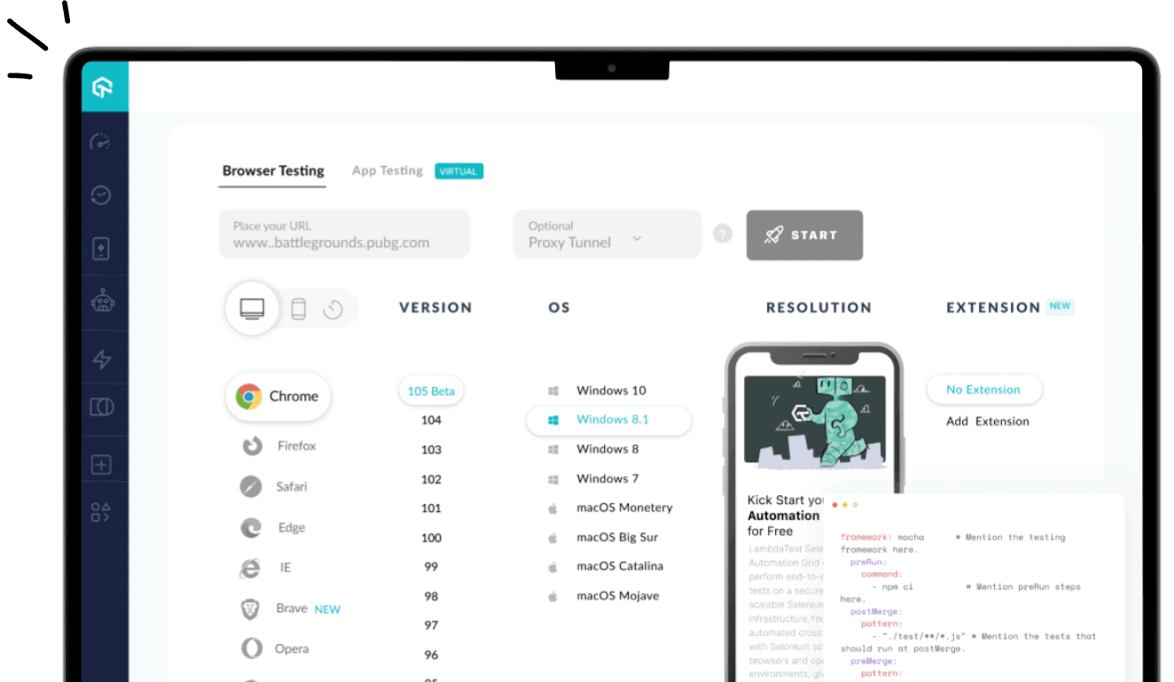
Test on 3000+ browsers for CSS Device Adaptation & more
Test your website for CSS Device Adaptation and other web technologies. Get 100 FREE automation test minutes!
Test Now
More Web Technologies
- CSS
- HTML 5
- SVG
- JS API
- Security
- JavaScript
- Other Web Technologies

Start your journey with LambdaTest
Get 100 minutes of automation test minutes FREE!!
Did you find this page helpful?