
19 Typography Skills That Transform Mobile Web Design
Arnab Roy Chowdhury
Posted On: November 27, 2018
 68303 Views
 8 Min Read
More than 90% of all the web information consists of text. Although designers spend a lot of time deciding the graphics, interface, and style of the page, an equal amount of time is required for choosing the perfect typography. When it comes to mobile devices testing and cross browser compatibility testing of typography, special attention needs to be paid. Testing typography comes with 2 major challenges – available space and typographic size. This article will relay 19 typography tips required for unlocking an impressive UI to your mobile web design with rich user experience.
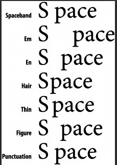
Give Some Space
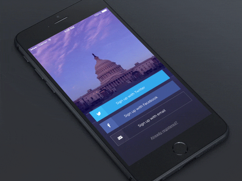
Mobile typography is not about arranging letters on the screen, it is about arranging them in a way that will make them readable to the users. Utilize white space properly and give adequate space between the letters, lines, and paragraphs so that the user can read the content properly without the need to zoom in.
Bonus Tip: Kerning
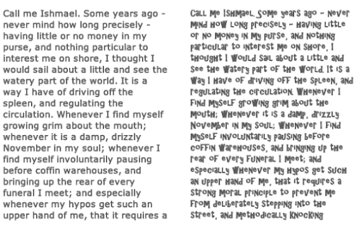
Kerning was not a part of this list until I came to understand how important it could be from a UI design perspective. So we know from the first tip that providing space is necessary, but Kerning takes it up a notch. Kerning is the art of adjusting the space provided between characters to make the content stand out, & easy to read at the same time. There are 3 types of kerning, one can opt to go for.
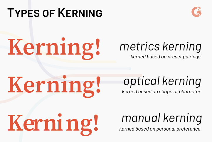
Although visible in the above image, there is a lot more to know about the difference between these various types of kerning. Curious? Read it from this blog, “Kerning: Don’t Cramp Your Style”.
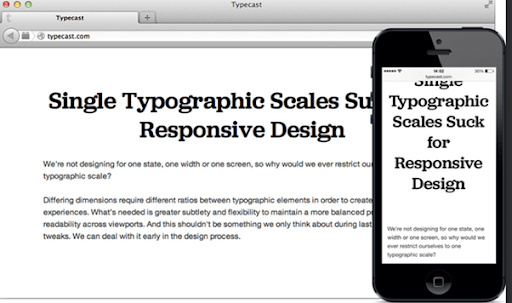
Responsive Web Design
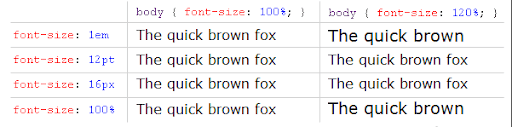
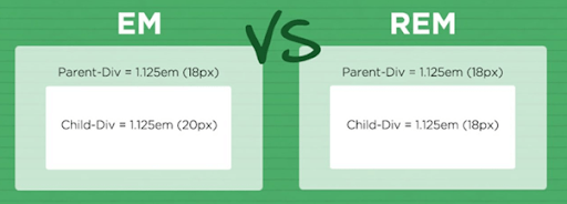
As mentioned earlier, pixels should be avoided during typography of mobile web. They have a fixed dimension standard. Use em or rem instead. They are based on percentage and scalable. When the content is viewed on a mobile device with different resolution, they adjust their size accordingly.
Remember, text content of your responsive web page should be scalable and adjust their size automatically according to screen width. You can use LambdaTest to perform your responsive testing. With a single click, you can check the Responsive Test of your site at over 50 mobile devices with different resolutions. You can utilise LT browser, a responsive design checker to ensure responsiveness of your mobile website.

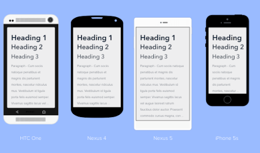
Appropriate Font Size
You can keep your desktop fonts at a size of 14px but when the same is done in mobile, it may result in smaller or larger content depending on the resolution of the device. Check the font-size across all resolution and use media queries so that the resultant typography of mobile web is readable across all handheld devices of different resolutions.

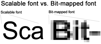
Use Proper Measuring Units
For the font-size of the mobile web, typography doesn’t use points (pt). Instead, use ems or rems. This is preferred by most designers since these units make the content scalable since they are based on percentage and not any static size.
Choose Contrasting Colors
Better contrast ensures better readability. While thinking about the color of mobile web typography think about the comparison between bright and dark. If the background of the page is dark colored, use bright colored fonts. For example white fonts on the black background and vice versa.
Ensure Better Readability
There are many free and exciting fonts available today, but if you are planning to use them in your content, you should check each and every alphabet to ensure that the font-family and size you are using makes those contents readable. There is no point in using those cool fonts if the reader cannot understand your content.
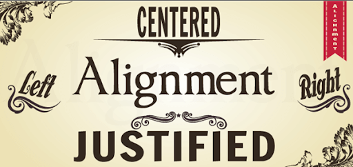
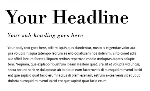
Align The Texts Properly
Alignment is an important factor when it comes to mobile web typography. The human brain likes to read the text in blocks in small screen. Usually, texts are left aligned which means, there is a ragged edge on the right side of the block. Adjust it properly and make sure if you are using ‘justified’ alignment, it does not result in a white space that is not consistent.
Set the Leading
Typography in mobile web demands consistent leading (the space between the lines). When it is too small, in a large content, the end of one line and beginning of next one is difficult to follow. If too large, it results in unnecessary whitespaces. Make sure not to interrupt the smooth flow of a line.

Finding Your Sweet Spot
All fonts have a sweet spot. The combination of font-size and leading where they ensure the best readability and less distortion caused by the default anti-aliasing of the browser. Experiment with the typeface you are using and find that sweet spot.
White Space Utilization
White spaces are often usable. In case of CTAs or clickable links, use white space so that they can be distinguished and clicked using the index or thumb. Since the user is not using a mouse like in a desktop, the thumb or index is considered to be the cursor, which is about a millimetre in thickness. Think about that and utilize whitespaces effectively.

Take The Screen Width Into Account
While designing the typography on the mobile web, you have to think about how people read texts. Usually, there are 2 kinds of width in a mobile device, vertical and horizontal. Hence, while designing the typography, take both the widths into consideration and set the alignment and spacing accordingly.
Make Your Typography Distinguishable
Typography of your mobile web page should have a distinct feature, either in appearance or in color or additional effects. Especially, in contents which you want the users to read, carefully choose typefaces for the headings that make them stand out from the rest.
Check Scaling And Proportions
Check the contents in different mobile devices of different resolutions. Also, zoom in and zoom out to ensure that your mobile web typography scales and fits the entire screen width. Responsiveness of your content is a must and you must test it and write media queries in case there is any disruption for any certain resolution.

Take Functionality Into Account
There are many text elements in a mobile website that allows the user to perform certain actions, like send a message or make a call. Typography of mobile web should be designed carefully to ensure that users understand that a specific text is actually a CTA or executes a certain functionality.
Is the Page Text-Heavy?
If your page is heavy in terms of text, like a blog or a news article, very little interaction is needed. The primary purpose of the user is to read, ensure that typography of mobile web is designed accordingly.
Is The Page Interaction-Heavy?
If your page involves more hover and clicks actions along with typing, editing etc, adjust your texts accordingly. Make sure the font size is no less than 18px so that users can understand that some action is supposed to happen once they click or hover on the text.
Pairing Multiple Fonts
While designing the typography of mobile web, you may combine different fonts for heading and paragraph, labels etc. But make sure that they match each other. Mixing Algerian for heading and comic sans MS for a paragraph is a bad idea.
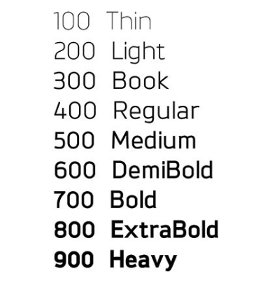
Font-Weight: Heavy Or Light?
Mobile fonts are relatively smaller when compared to desktops. Care must be taken to make them readable or clickable when they involve their functionality. The key to deciding the font-weight is experimenting. Although currently, bold and big typography for the mobile web is a trend, you should use multiple font weight and test the application across different resolutions to ensure there is no disruption anywhere.
Keep The Background In Mind
If the background is static and monochromatic, as mentioned earlier, you can use font-colors of the opposite contrast. But when a background is an image or a video, the ideal choice would be to experiment with different colors and check which one fits properly and makes the content readable.

Typography is a delicate craft. Designers often spend a lifetime in sharpening their typographic skills. With every new typeface bringing in a new challenge, we are sure the above mentioned mobile typography tips will be handy the next time you are designing a new mobile webpage. Also, keep in mind to perform cross-browser compatibility tests to ensure that the typefaces or styles you are using works properly in all browsers. LambdaTest can be used to perform cross-browser compatibility tests on more than 3000+ different browsers and their versions. Ensure that the typeface is supported on all the required browses and present your users the rich user experience they deserve.


Author’s Profile
Arnab Roy Chowdhury
Arnab Roy Chowdhury is a UI developer by profession and a blogging enthusiast. He has been writing content for about 5 years and has strong expertise in technical blogs, travelogues, and content in the latest programming languages.
Blogs: 76
Got Questions? Drop them on LambdaTest Community. Visit now