 Test your AI Agents with the all-new Agent to Agent Testing
Platform.
Test your AI Agents with the all-new Agent to Agent Testing
Platform. 
9 Mistakes To Avoid While Optimizing Your Site For Mobile Devices
Arnab Roy Chowdhury
Posted On: October 1, 2018
6 Min


This article is a part of our Content Hub. For more in-depth resources, check out our content hub on Mobile Testing Tutorial.
In the current age of digitalization, people are driven towards digital discovery through a mobile-first approach. Keeping that in mind, web developers from big enterprises as well as small businesses, make a note of optimizing a website as mobile-friendly as possible. It is important for a website to be optimized in such a manner that it gets rendered properly in various mobile devices. Even if you are creating a new website, instead of developing a separate one for mobile users it is ideal to create a responsive website that fits properly in all kinds of devices. In this article, we shall discuss the mistakes to avoid while optimizing your website for mobile devices.
TABLE OF CONTENTS
Use a Single Website
Often, site-owners tend to design a separate website for mobile devices instead of optimizing their existing website. This, however, creates confusion for both users as well as the owner. It is ideal to redesign your existing website using a dynamic layout that is rendered properly in both desktop and mobile devices. After all, a website with a uniform URL is easier and less expensive to maintain than having multiple.
Make Sure the Site is Scalable
Scalability is an important feature when it comes to a responsive website. While designing, you have to keep in mind that the screen of the mobile is smaller than a desktop. You need to check mobile view of website on different mobile devices and ensure the responsive web design. The elements should be arranged in a way that the user does not face any problem while exploring the site.
LT Browser is a mobile website testing tool designed to help you reliably test your website on different mobile resolutions. Using this new browser for developers, you can streamline user-interface and user-experience development by testing the placement of content and alignments, assess visually heavy websites on different screen resolutions, and generate your websites’ performance reports.

Size of Hyperlinks and Buttons
While designing the website, you should keep in mind that in desktop, the user uses the mouse pointer to click on buttons and links while in mobile they use their thumb or index finger which is much thicker. If the size of links and buttons are kept small, it will become difficult for the user to click on them for navigation or other purposes. Keep large-sized buttons and do proper usability testing to make sure that all the hyperlinks and buttons are easily clickable on the mobile screen.

Testing mobile friendliness
Google has developed a tool to test whether your website is mobile friendly or not. To check, you need to visit https://search.google.com/test/mobile-friendly and enter your site’s URL and hit the test button. The tool automatically checks whether your website satisfies all the guidelines required. It checks whether all the links and buttons are clickable, a text is readable and contents are adjustable in a way that users don’t have to zoom in to read. The changes you need to make are figured out and displayed after the test is executed.
Don’t Make it Monotonous
An average user takes about half a minute to decide whether the site is worth exploring or not. For increasing your site’s ranking in Google, add rich snippets, dynamic and unique content, images along with other media elements like animations and video. Making your site unique will help to increase it’s ranking in Google and attract more audience.
Media Elements Should be Playable
Often, it has been observed that videos or GIFs embedded in the content of a website are not playable on mobile devices. Contents that require Flash player or any other license are not supported on mobile. Media elements which are not playable are irritating for an end-user, as a result, they don’t think twice before switching on to another website. Once your website is developed, test it on real devices to make sure that all the media elements are working properly.
Avoid Lengthy Forms
Websites often contain lengthy registration forms. Those are easier to fill on a desktop but on mobile, a user needs to scroll a lot and while doing so, they may get confused or lose track. The frustration increases when something goes amiss and they have to scroll up again to correct it. Avoid these tedious jobs and provide easy forms that do not require that much information from the user. Making their job easier will increase your website’s mobile-friendliness.
Cross Browser Compatibility
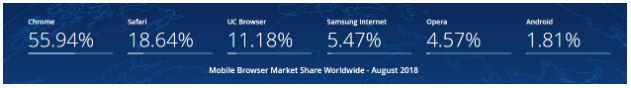
As per the above-stated statistics published by GS.statcounter, Chrome, Safari, UC Browser, Samsung Internet and Opera are the most used mobile browsers. You must ensure that all the features of your website work properly in those browsers and there are no breakage or rendering issues. Test your website runs seamlessly across all major browsers using cloud based testing platforms like Lambdatest to ensure that your site is cross browser compatible.
Take Feedback from Users
Include a Feedback section on your website where users can enter their suggestions regarding further optimization of your site on the mobile device and whether there is any need for improvement. Concentrate on each and every feedback and no matter how minor the issue is, fix it immediately. Usability testing is a key factor behind a website’s success. So, always pay heed to the suggestions provided by end users.
Apart from these, make sure that your site has a cool landing page with carousels and CTAs that makes a user curious enough to explore what is inside. That’s all from our side. Enjoy developing your site and make sure no such major mistake and you will soon notice a considerable growth in your site’s internet traffic.

Author
Arnab Roy Chowdhury is a UI developer by profession and a blogging enthusiast. He has been writing content for about 5 years and has strong expertise in technical blogs, travelogues, and content in the latest programming languages.
Blogs: 76


