23 Common Web Design Mistakes To Avoid In 2023
Mehul Gadhiya
Posted On: March 6, 2023
![]() 389565 Views
389565 Views
![]() 26 Min Read
26 Min Read
In today’s digital age, websites are crucial for any business and organization. As per siteefy, 252k websites are created every day, and 200+ million active websites right now.It shows how competitive this digital market is. And distinguishing your website between them is challenging.
There are several things to think about when developing a website. There are numerous considerations, ranging from the general appearance and feel of the site to the user experience and functionality. Nevertheless, even the most experienced web designers occasionally commit simple errors that reduce a website’s efficacy.
In this blog, we’ll look at the 23 most common web design mistakes professionals should take care of.
TABLE OF CONTENTS
What is Web Design, and Why is it Important?
Before we cover these common web design mistakes in detail, it is crucial to understand what web design is all about. Web design is a process of iteratively strategizing, conceptualizing, and delivering information and overall business functionality in an aesthetically appealing layout.
Visual components of web design encompass the text content, images, videos, colors, fonts, different elements and shapes like buttons, forms, and icons, the spacing between these elements, and the overall layout itself.
Design functionality comprises website speed, navigation, animation, user experience, user interaction, overall site’s tech architecture, SEO, cross-browser, cross-platform, cross-device design consistency, and responsiveness.
Here are some of the many benefits of web design to organizations:
- First Impressions: A website is frequently a potential customer’s first point of contact with a firm. A professionally designed website can provide an excellent first impression and build credibility and trust.
- Branding: The design of a website is an essential element of branding. A well-designed website may support brand identification, explain the brand’s values, and set the brand apart from rivals.
- Mobile Responsiveness: Web design is now much more crucial, given the popularity of mobile devices. A mobile-responsive website optimized for various screen sizes and devices can help you reach more people and enhance user experience.
- SEO: A website’s search engine optimization (SEO) and ability to rank in search engine results pages can be affected by web design. Improve visibility and traffic to the website with a well-designed, search-engine-optimized website.
Also, it’s important to consider the best web design trends while building them.
Now that we’ve covered web design and why it’s so important, it’s time to understand the common web design mistakes designers and developers must avoid in 2023.
23 Common Web Design Mistakes To Avoid
There are many web design mistakes that can negatively impact a website’s user experience, potentially leading to decreased traffic and lost revenue. The common mistakes that need to be avoided are slow page load time, poor mobile responsiveness, unclear navigation, overloaded content, no clear CTA, and other multimedia-related issues, etc. Therefore, it is essential to ensure a positive user experience and maximize the effectiveness of a website. Hence, avoiding these and other common web design mistakes becomes crucial by prioritizing usability principles over flashy features.
1. Poorly Configured Navigation Layout
Skipping the essential step of brainstorming, sitemap, and wireframing is the basis of several common web design mistakes. One of the prominent ones is the poorly configured menu and navigation layout. An improper navigational structure can drive away website visitors, as it’s a pain to scroll through randomly structured websites. Suppose you’re designing a website with loads of pages; then, it makes sense to group them into categories and arrange these categories hierarchically to enable users to navigate the website intuitively.
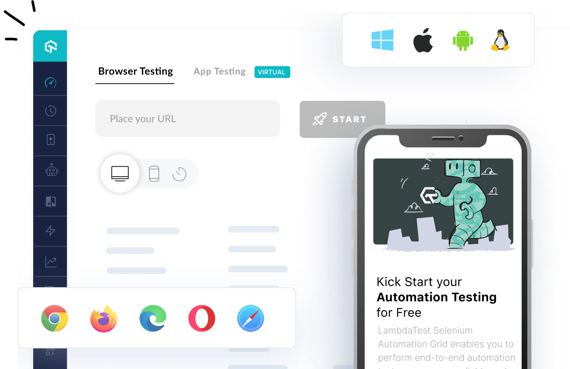
Moreover, navigation is not the same for every device. Though there are different ways to work with navigation, you must choose the right strategy. For example, while working with mobiles, you can choose a hamburger menu strategy, which works great for navigation on smaller screens. If you wish to compare your website’s navigation on mobile and tablets, you can use LT Browser 2.0 – a mobile-friendly test tool to test your responsive web designs.
LT Browser 2.0 is a dev-friendly browser to build, test, and debug mobile websites across 53+ pre-installed device viewports for mobile, tablets, laptops, and desktops. It provides other top-notch features to create alluring responsive designs like generating and downloading performance reports powered by Google Lighthouse, network throttling, comparing mobile view side-by-side, hot reloading, etc.

2. Bad Search
When website navigation is not able to give the expected result to the users, the search could be a savior. Those website searches which can’t handle typos, plural, hyphens, or another variant of query terms give unsatisfactory user experience.
Some of the negative impacts of bad searches include
- Frustrating User Experience:
If users cannot find what they are looking for, they may grow frustrated and abandon the website. This can result in a high bounce rate, which is bad for the website’s overall performance on Google ranking. - Poor Engagement: A bad search feature can also lead to decreased user engagement on a website. Users may spend less time on the site, read fewer pages, or never return, affecting the website’s stats and overall performance.
- Poor SEO: When ranking search results, search engines consider the quality of a website’s search function. A website’s search function might harm its search engine ranking, resulting in a loss in traffic and visibility.
- Reduced Conversions: When users cannot find the services or products they are looking for, conversions may suffer. This means that potential sales and money will be lost, which is bad for business.
Not all websites require search; however, major websites make these web design mistakes in search, which hamper the user experience. However, it can get resolved by improving the search algorithm and continuously testing the website’s search functionality. Additionally, you can add auto-complete and suggest options in the search bar so users can get fast and accurate results.
3. Not Prioritizing Accessibility
According to one report published by WHO, around 1.6 billion people live with special abilities, which is 16% of the world population. But most designers overlook this aspect while designing websites and user journeys. There are millions of people with different kinds of special abilities, and not taking these users in your design-thinking approach could be one of the major yet common website design mistakes. Here is an example of intuitive website design:

Text size, color contrasts, page titles, image alternate text, keyboard accessibility, moving and blinking contents like carousels, ads, auto-playing videos, scrolling news feeds, and tickers are crucial components of a website from the accessibility point of view.
A person with hypermetropia might want to zoom the content on small devices. A person with visual impairment may prefer speech to consume content rather than text. A user with an attention deficit may want to pause carousels and so on. A good web design takes all this into the picture to enhance website accessibility. Doing it wrong can lead to a bad user experience and hurt your business.
“If we consider a feature like Live Captions, which was created for people who are deaf, it also benefits other people without disabilities as they may use the feature in the case of bad internet connection or loud spaces like airports to take their calls.”
Nandita Gupta
Accessibility Program Manager, Microsoft
4. Not Adhering to a Website Security-first Approach
Though website security is much of a technical architecture-dependent aspect to an extent, it is also related to website design and user journeys. How designers depict the user journeys greatly influences how developers implement the designs. If website security is prioritized right from the design stage, many web design mistakes related to security can be avoided. For example, putting business-critical data behind authentication and payment walls.
Here are some common web design mistakes related to website security.
- Failure to utilize HTTPS: For the protection of sensitive data like login credentials and financial information, HTTPS, a technology for secure internet communication, is crucial. Without HTTPS, websites risk being hacked or having private data accessed by unauthorized persons.
- Weak password requirements: The website is exposed to attack since weak passwords are simple to hack. Strong passwords that combine upper- and lowercase letters, digits, and special characters should be required by web designers.
- Lack of user authentication: A website can be attacked by hostile users without user authentication. To ensure that only authorized users may access sensitive information, web designers should utilize strong user authentication systems, such as two-factor authentication.
- Lack of backup and recovery strategies: Website data may be lost due to hacking, hardware failure, or other unforeseen circumstances. To ensure that website data can be recovered in the case of a disaster, web designers should put backup and recovery procedures into place.
5. Non-Responsive Web Design
The design must be responsive and consistent across browsers and devices to offer an omnichannel experience. One of the big web design mistakes in website development is designing different user journeys and roadmaps for different platforms and devices. The priority should be to maintain as much consistency across devices as possible.
Some of the negative impacts of non-responsive design could be
- Higher maintenance costs: Keeping a separate mobile version of a website running can be costly and time-consuming. A responsive website, on the other hand, is meant to adapt to different screen sizes and devices, potentially lowering long-term maintenance expenses.
- Poor user experience: A non-responsive website might make it difficult for mobile users to use and interact with the site, resulting in a poor user experience. This might lead to a high bounce rate, and low engagement since users may exit the site searching for simpler alternatives.
- Reduced traffic: Because mobile devices are becoming more popular, a non-responsive website may not score well in mobile search results. Users are more likely to click on mobile-friendly sites that rank higher in search results, which may result in a decline in traffic to the site.
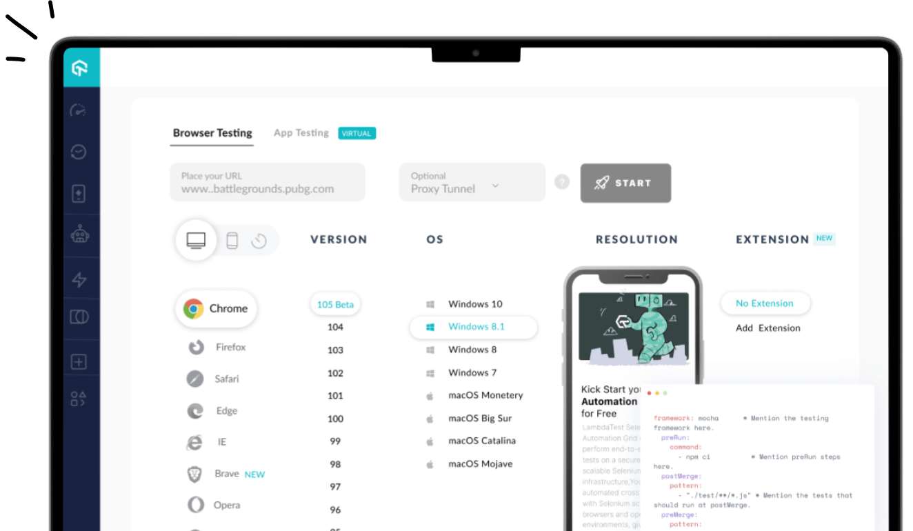
One of the most common website mistakes to avoid is poor responsiveness. It would be preferable if you could test the responsiveness before going live. Web design tools like LT Browser 2.0, makes it simple to create responsive websites.
6. Not Following a Design Thinking Approach
One of the most common web design mistakes that most designers make is that they don’t realize the importance of design thinking and drawing the layout on paper. Designers often tend to “assume things” about users rather than do extensive “user research” to understand user needs. But this is not the right way to go about web design.
The design thinking approach is a process that understands and identifies customer needs and motivations. It’s a mindset to empathize with the customers, detail their problems, and build solutions.
- Understanding the design thinking approach is the key to designing addictive user experiences. It places the user at the center of the problem-solving process, which aids in developing a thorough grasp of the user’s wants and needs.
- The design thinking approach enables designers to identify goals, and project scope, build business features, and understand user requirements. Technological capabilities, solution feasibility, and effectiveness.
- It helps designers gather data points to devise suitable sitemaps and wireframes before upgrading to designing software.
- It emphasizes the need for testing and iterating solutions based on user feedback. Designers can develop solutions and adjust based on user input by testing them early and regularly.
Remember – If you don’t understand your customers, you won’t be able to design good websites for them. So, be empathetic, and do user research to understand what your customers care about.
7. Not Prioritizing Grid and Columns
Using CSS tricks and techniques, designers can deliver a seamless user experience where content gets automatically segmented and aligned using rows and columns. Grid-template-columns, min-max, and autofit properties of CSS eliminate the need to use media query breakpoints, but using grid-template-areas does need to use breakpoints.
One CSS Grid-related web design mistake most designers tend to make is getting confused with CSS numbers. While designing for CSS frameworks like bootstrap, we count the number of columns in a row, usually 12, but in the grid system, we count lines or stacks. In the grid system, moving from lines 1 to 7 is akin to spanning 6 columns.
8. Not Using Trending Web Design Templates
Having trending web design impacts your business in multiple ways. As per one survey by a TOP Design firm, 50% of enterprises think web design is crucial for the overall business and brand reputation. In the modern era, everyone likes trending things, including modern web designs.
Here are some common web design mistakes related to trendy web templates:
- Using unsuitable templates: While trendy templates are eye-catching and visually appealing, they are not always the best option for your brand. It is critical to select a template that is consistent with your brand’s identity and values.
- Overuse of animations and effects: While some trendy templates include pre-built animations and effects that can be visually stunning, using them excessively can make your website appear cluttered and slow to load. These features should be used sparingly and strategically.
- Too much emphasis on appearance over functionality: Trendy templates can sometimes prioritize appearance over functionality, resulting in a website that looks great but is difficult to navigate and use. It is critical to strike a balance between aesthetics and functionality.
- Inadequate template customization: While templates can be a great starting point for your website design, it’s important to customize them sufficiently to make them unique to your brand. Failure to customize the template can result in a bland-looking website that lacks personality.
Those are some common web design mistakes designers should remember during web development. If you are looking for trending web design templates, read our blog to update your website according to current trends.
9. Not Optimizing The Website for Niche Keywords
SEO-specific and common website design mistakes include not using title & heading tags. Using descriptive page text won’t be as impactful as describing it in the title. Similarly, using larger fonts won’t be as impactful for SEO as using H1 and H2 tags.
Here are some common web design mistakes for SEO every web designer should avoid:
- Inadequate URL structure: URLs should be meaningful and brief. Incorporating keywords into the URL can aid with SEO. Long, convoluted, and non-descriptive URLs can harm SEO.
- Absence of heading tags: Heading tags (H1, H2, H3, etc.) help to organize and structure material. They also inform search engines about the page’s major subjects. Search engines may struggle interpreting the page’s content without adequate heading tags.
- Duplicate content: Duplicate material might harm your SEO ranking. It is critical to guarantee that the content on the website is unique and not plagiarized from other sources.
- AI-Generated content: As per Google’s Webmaster Guidelines, AI-generated content will be considered spam and can harm the website’s SEO ranking.
- Improper usage of meta tags: Meta tags, which include title tags and meta descriptions, are essential for SEO. They should be brief and descriptive, with essential keywords included.
10. Using an Inadequate Color Scheme
Inappropriate color scheme is one of the most underrated web design mistakes. Color schemes influence the emotions, attitudes, and behavior of the visitors. If you want to create a great first impression for your website, using the appropriate colors is crucial. Contrarily, employing colors that don’t compliment your message can backfire.
This image shows how users interpret color:
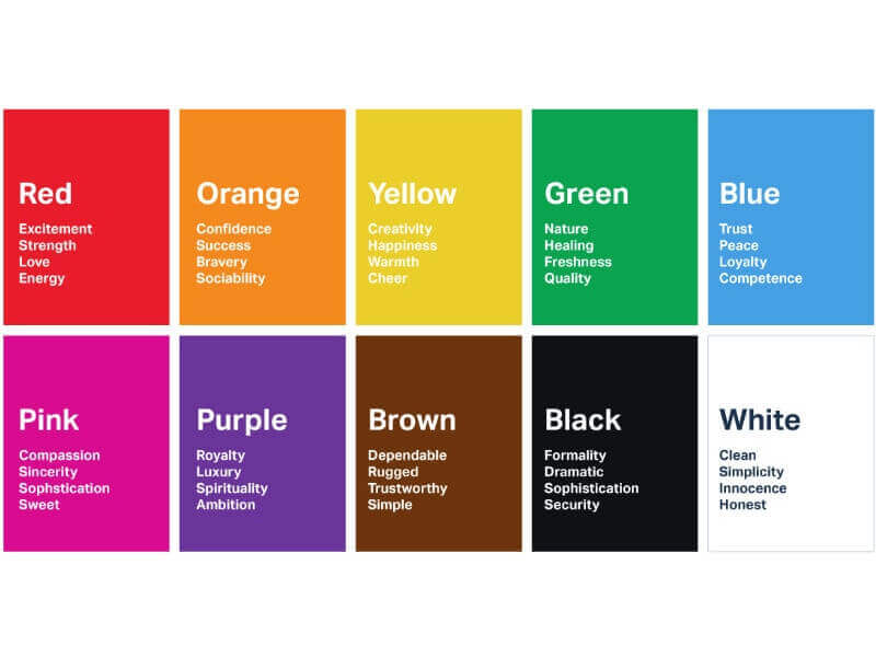
Here are some web design mistakes to avoid while choosing color schemes for your websites:
- Using excessive color: A website with excessive color may be overpowering and disturbing visitors. It’s crucial to select a small color scheme and apply it consistently throughout the website.
- Utilizing many variations of one color: Utilizing too many variations of the same hue might make a website appear dull, even when using only one color can be beneficial. Choosing complementary or contrasting hues is crucial to give the color scheme some diversity.
- Using trendy colors: While it may be alluring to do so, keep in mind that these hues may not be suitable for the audience or purpose of the website. It’s crucial to pick hues that are current and classic.
- Not testing the color scheme: To ensure it looks appealing and consistent across various devices and screen sizes, you should test it on several different types of real devices.
11. Non-Hierarchical Content
Another web design mistake that most designers must avoid is not strategizing the visual hierarchy of content, including CTAs. Well-devised user journeys can be efficiently implemented by designing efficient visual hierarchies. This can be achieved using appealing words, colors, images, and small animations. Spacing between these elements and their size can also be crucial in driving user engagement. Getting this wrong means less user interaction and can hurt your business’s profitability.
12. Content-Overloaded Webpage
Too little information and you risk not delivering the solution your user wants. Too much information and you may build a solution that is hard to understand, consume, or access. In their sheer desperation, designers can overwhelm the visitors with resources and deliver a highly cluttered website. Though successful, it has been highly popular since the early days. And maybe to maintain consistency for its users, they still haven’t changed the website design. But one should not make the same mistake.
Here are a few tips for organizing content on your website:
- Divide the overall website interface into different web pages like product listing, product information, user profiles, user interaction, etc.
- Divide each webpage interface constituent into reusable blocks and components.
- Each of these components should focus on delivering one functionality. For example, short user profiles, product descriptions, reviews, etc.
- Use these components to build the overall website. This approach ensures faster development and scalability of the web pages. Given below is an example of a cluttered and bad website design.

13. Unclear CTA
Not having a clear CTA is another common web design mistake. Websites are like marketing and sales funnel or pipeline. Your website visitor traverses within that funnel from the prospects’ stage to the converted clients’ stage. Not giving a clear “call to action” at the appropriate places may lead to not converting many hot prospects. Overdoing CTA may also lead to irritating prospects. You can learn the 18 most effective CTA design tips to boost your website’s conversion rate.
Also, check out our comprehensive guide that needs to be followed while designing your website. – 34 Step Website Design Checklist
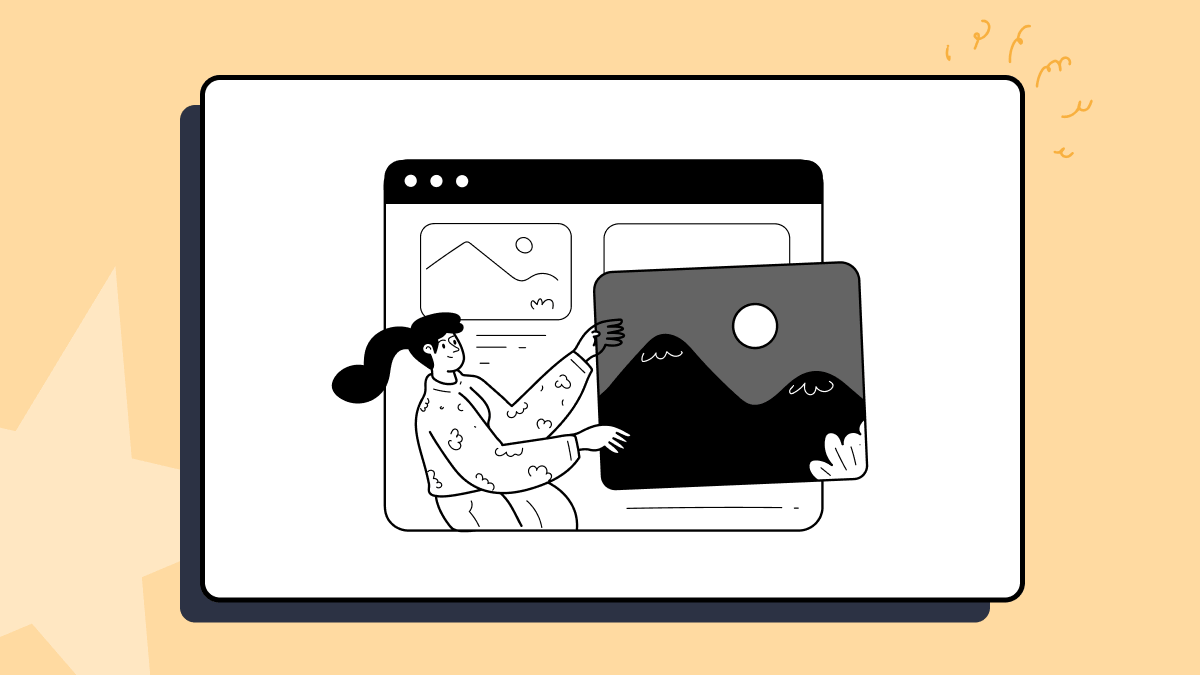
14. Poorly Designed or UnOptimized Images
We all know that images and graphics are a critical part of web design. When done well, images can clearly convey the message to the visitor. Done wrong, they can confuse the reader. Many businesses are still not paying attention to their images and are using low-quality and irrelevant images.
Don’t make this mistake, as low-quality images will muck up your website and turn off your visitors, hurting your conversions. Similarly, irrelevant images will only confuse your visitors, inducing them not to take the desired action. That being said, you should also not clutter your website with too many images, as they can take away the eyes from CTA, leading to a loss in conversions.
15. Ignoring Custom 404 Pages
Web design is not limited to developing layouts and user journeys. Wikipedia’s definition expands web design to incorporate content and SEO. From the SEO point-of-view, multiple common website design mistakes can be easily avoided.
The first SEO-critical web design mistake does not have a dedicated custom 404-page template. You can have a custom 404 page for your domain to present users with something relevant, or you may use 302 or 301 redirects to link to some other page on the web. Broken links on a website harm a business’s reputation. Users feel as if the website is a scam and the product/service won’t be of standard. Using 302 or 301 redirects, these broken links could be easily handled. For an external website with broken links, you must continuously test, identify, and replace such links.
16. Multimedia-Related Web Design Mistakes
We already highlighted how irritating autoplay videos are, especially with sound. Additionally, it makes websites pretty slow to load. It’s often better not to autoplay videos and wait for some sort of user activity to trigger playing such videos. For example, the user scrolls to a section on your page containing the video.
We also underlined how fast carousels could be a turn off too. Other than these, there are a few more multimedia-related web design mistakes that should be avoided.
- Massive web design mistakes do not optimize your website images. Big-size images make websites slow to load. If your website loads slowly, it can hurt your conversions terribly. Did you know 1 in 4 visitors would abandon a website that takes more than 3 seconds to load? Even search engines don’t like such websites. So, as a designer, using clear and optimized images is preferable. As a developer, the attempt should be to lazy load these images. The lazy loading of images makes websites faster to load.
- Avoid using cheap free stock images. Everyone has used them; everyone knows when you use one! It creates a cheap impression. So, if the free-stock image is not exactly spot-on, avoid using it.
- Use contextual icons esp, favicons. We understand it’s obvious, but a surprising number of designers don’t do this even in 2023. This helps in delivering the right message and boosts branding too.
- Do not use several font styles on the same web page. Not maintaining the font’s style consistency across the webpage is another common design mistake.
17. Not Building Websites for Multiple Languages
Today, it is possible to build websites in multiple languages and even add voice interface-based functionalities. But underestimating this capability as designers could lead to many major web design mistakes. If a business has customers in different countries, then to appeal better to target customers, websites can be developed in the native language.
To boost accessibility, a voice-based interface can be added to the website. A big chunk of google searches on phones is voice-based. Users are using voice technology to book cabs, hotels, etc. It would be a mistake not to count the voice and multilingual approach in the overall website design plan.
Considering the customers from different countries, you might be interested in performing Geolocation testing to ensure a consistent web experience across different geographies.
18. Not Utilizing Analytics
The design, like content, is a creative work that can be improved iteratively. Using sophisticated analytics tools, your website analytics administrator can give you data on how users navigate your website. Also, analytics and testing can help you discover broken links. Based on the analytics input, you can discover the user journey’s flaws. You can identify what’s working and needs improvements, which CTAs are getting clicked, and which needs upgrading.
19. Not Ensuring Cross Browser Compatibility
After completing the development phase successfully, keeping in mind all the website design problems and web design mistakes to avoid, we can proceed to the testing phase. Testing a website is an indispensable step as the world is filled with devices that are either different physically or from the inside. Cross browser testing, usability testing, and A/B testing are just a few to name, as different goals demand different testing types.
One of the most common website design mistakes that developers tend to commit is assuming that a redesigned website is perfect and not performing browser compatibility testing as rigorously as they should. They feel that since the redesigned website has similar functionalities to the previous one, rigorous rechecking of functionalities is meaningless.
This, albeit, is not a good approach and is an unforgivable blunder in the redesigning part. With this mentality, many things, such as cross browser compatibility, can go wrong.
Therefore, always test your website with an equal commitment to optimize and make it bug-free for your audiences, avoiding all related website design problems.
LambdaTest can help you identify and overcome such mistakes by allowing you to perform cross browser testing on over 3000+ real browsers, devices, and operating systems hosted on cloud servers.
20. Slow Web Page Loading
Page loading speed is a crucial metric for web design. Google also made it one of the key factors for SEO ranking. As per Neil Patel’s blog survey, 53% of users expected websites to get loaded in 3 seconds. Regardless of the device, browser, and operating system combinations used to view a website, it must be optimized for maximum speed.
Here are some common web design mistakes related to page loading that should be avoided:
- Not reducing the number of HTTP requests: Every file a website downloads from the server, including images, scripts, and stylesheets, lengthens the time it takes for a page to load. Utilizing a content delivery network, merging files, deleting pointless files, and minimizing the number of HTTP requests are all significant (CDN).
- Not minifying files: By reducing the size of files like HTML, CSS, and JavaScript, loading times can be sped up. Online developer tools like HTML Minify can remove the code’s extra characters and comments.
- Server performance issues: The server can be considered an engine of any webpage, and when the user opens the webpage on the browser, the browser demands data from the server to load on the screen. If a server is not performing well, it can slow the page loading speed.
21. Using Features That Don’t Convert
Another common web design mistake is inefficient features. No matter how visually stunning a feature may be, keep in mind that the effectiveness of your website should always come first. Some common inefficient features include
- Large image and video files
- Autoplay media,
- Complicated animations,
- Bloated code,
- Unresponsive web design
Because those inefficient features, such as large images and videos, directly impact page load speed and increase bounce rate. And because of the slow loading speed website’s SEO ranking is also getting hampered. All and all, Those features have a compounding effect, and they affect websites’ performance and user experience negatively.
“There have been countless research done to indicate that users do not often interact with carousels, particularly on mobile where the interaction cost is high.”
Lindsay Derby,
Senior Product Designer, HubSpot
22. Including Irrelevant Pop-ups
Pop-ups in the right place can be a great lead generation source. However, too many pop-ups can ruin the user experience because users need to close it every time while they are taking some crucial actions on web pages. Also, it clutters the website and makes navigation complicated.
Here are some common drawbacks of irrelevant pop-ups:
- Reduced engagement: Users are less likely to interact with or take the intended action from pop-ups that are not relevant to them. The effectiveness of the pop-up and the website may suffer as a result.
- Reduced trust: Pop-ups that are irrelevant or seem spammy may make visitors less inclined to trust a website and the brand it represents. Users can think the website is unprofessional or unreliable and be less likely to interact with the company.
- Impact on website metrics: Unwanted pop-ups can harm website KPIs, including bounce rate, time on site, and conversion rates. Users may swiftly abandon the website if they are immediately put off by irrelevant pop-ups, which will increase the bounce rate.
To resolve web design mistakes related to pop-ups, you can use analytics, A/B testing, and User feedback to know which pop-ups are most effective. And adding clear and concise messages in pop-ups will save users time, and they will respond faster.
23. Not Effectively Communicating Your Business Purpose
Before even starting web development, if you draft a clear business purpose and mission of the organization, 90% of web design mistakes will not even come into the picture at all. Are you developing an online store where customers may buy products from your business? Or does your website primarily serve to inform visitors about the services your team offers? Once you make sure about the business purpose, it makes you clear about web design, template, copy, content and required features you should include.
A clear business purpose has many advantages:
- Making strategic decisions: The basis for making strategic decisions can be a distinct company aim. Business leaders can use it to assess possibilities and rank projects aligned with the organization’s mission.
- Stakeholder alignment: The alignment of interests of multiple stakeholders, including partners, customers, owners, and staff, is another benefit of having a defined corporate mission. It aids in fostering a sense of purpose and mission alignment among employees.
- Marketing and Branding: A distinct business goal can aid branding and marketing initiatives. It aids in setting the organization apart from its rivals and conveying the value proposition to customers.
You can build a strong business purpose by identifying your mission and doing market research, which will help you see through from users’ perspectives and pain points.
Over To You!
A website could be your business’s most important asset, so you must make it flawless to create a great first impression. But to do that, you need to avoid these web design mistakes. Numerous common mistakes can impair your website’s usability, performance, and overall effectiveness, ranging from selecting the incorrect color scheme to overusing animations and effects.
Don’t worry. These common website design mistakes are relatively easy to avoid and fix. Identifying them is the hardest step. But now that you know these mistakes, you can easily avoid or fix them moving forward and create a user-friendly, aesthetically pleasing, and functional website. Always prioritize functionality and usability over aesthetics, and keep your target audience and website goals in mind.
So, are you making any of these web design mistakes? Is there any other common website design mistake that you want to add to this list? Please, chime in the comment section below!
Frequently Asked Questions (FAQs)
What is web design?
The website design presented on the Internet is referred to as web design. Rather than software development, it usually relates to the user experience components of website creation.
What are the three types of web design?
There are three types of web design: static, dynamic, or CMS, and e-Commerce.
What makes a bad web page design?
Bad website design includes a cluttered layout, a hidden navigation menu, a lack of color contrast, a non-responsive design, and inconsistent typefaces. Still, the main problem with poorly designed websites is a lack of user-centricity.
What are the seven principles of web design?
The design principles are the rules that a designer must follow to create an effective and appealing composition. Emphasis, Balance and Alignment, Contrast, Repetition, Proportion, Movement, and White Space are the basic design principles.


Author’s Profile
Mehul Gadhiya
Mehul works as a content writer and executive in digital marketing for LambdaTest. He has a Mechanical Engineering degree and a keen interest in emerging technology. He enjoys writing about a variety of subjects, including the latest technological advances.
Blogs: 7
Got Questions? Drop them on LambdaTest Community. Visit now