
CSS Grid: The Ultimate Guide for Web Designers and Developers
Tahera Alam
Posted On: October 17, 2022
 35661 Views
 32 Min Read
Ever since the Internet was invented, web developers have searched for the most efficient ways to display content on web browsers.
They made workarounds with CSS concepts like floats and table-based layouts that have been used for a long time. The downside is that neither is ideal since they were never designed to be used as layout tools.
The use of the HTML5 table element for laying out web pages has been deprecated. It means using this element for styling purposes is not only harmful to the architecture of your website, but it might also negatively impact your SEO score.
Flexbox is also a great tool for layout creation, but it was designed for layout in one dimension – either a row or a column. Because of its one-dimensional flow, the Flexbox is also not very suitable for creating complex layouts.
In a later section of the article on CSS Grid, you will see how Flexbox and CSS Grid vary from one another.
Layouts are important because they determine how your website looks across different devices. For example, creating responsive websites for different devices is integral to web design. To achieve such layouts, web developers had to rely on CSS hacks like floats, tables, positioning, etc. You can refer to this CSS cheat sheet to learn more about CSS tricks.
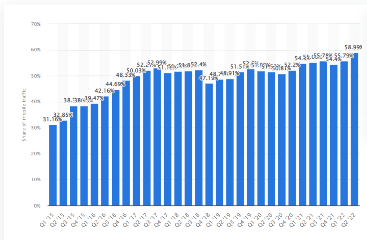
According to Statista, in the second quarter of 2022, mobile phones alone generated 58.99 percent of all website traffic. So we need a more flexible and ideal solution to lay out web pages. Thankfully, CSS Grid Layout is there for our rescue.
Grid is the first CSS module built to solve all the layout challenges web developers have faced. Because of its flexibility, CSS Grid allows you to create almost any type of layout that you might need.
CSS Grid lets you create two-dimensional flexible layouts with rows and columns.
With its different properties and layout concepts, CSS Grid may appear a little intimidating, but it is simple to implement. This blog on CSS Grid breaks down the CSS Grid into a few simple and powerful concepts that will change how you design layouts for the web forever.
Let’s dive right in!
TABLE OF CONTENTS
Grid Terminology
Before we go deeper into CSS Grid, let’s look at a few key grid terms you would come across throughout the blog. You can skip this section in case you already have a good grasp of these concepts.
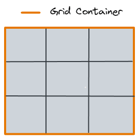
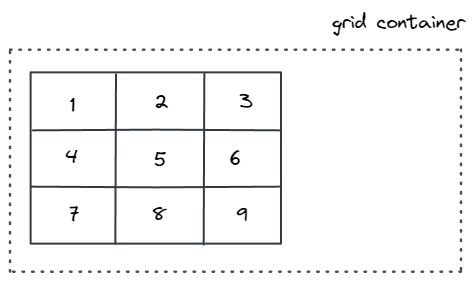
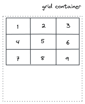
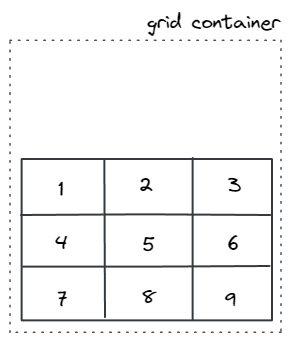
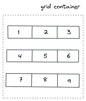
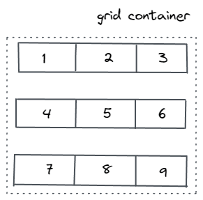
Grid Container
An HTML element becomes a grid container when its display property is set to grid or inline grid.
HTML:
|
1 2 3 4 5 |
<div class="container"> <div class="grid-item"></div> <div class="grid-item"></div> <div class="grid-item"></div> </div> |
CSS:
|
1 2 3 |
.container { display: grid; } |
Here, the element with the container class is a grid container.
Grid Items
A grid layout comprises a parent element called a grid container and one or more child elements. Child elements that are direct descendants of the grid container are called grid items.
CSS:
|
1 2 3 4 5 6 7 8 |
<div class="container"> <div class="item"></div> <div class="item"></div> <div class="item"> <p class="sub-item"></p> </div> <div class="item"></div> </div> |
In this example, grid items are those elements which have the class item in them. But the element with the class sub-item is not a grid item because it is not the direct descendent of the grid container.
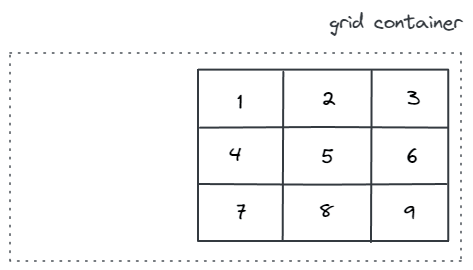
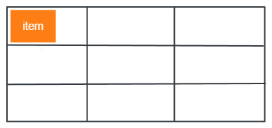
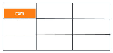
Grid Lines
Grid lines are the horizontal and vertical lines that make up the grid.
Starting at the grid container’s outermost edge, each grid line has a reference number that increments by 1 in the direction of the grid.
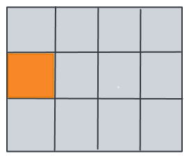
The lines between columns are called column lines, and the lines between rows are called row lines. You refer to line numbers when placing an item in a grid.
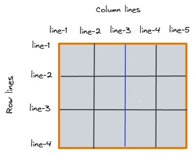
The highlighted blue line in this image is column line 3.
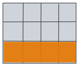
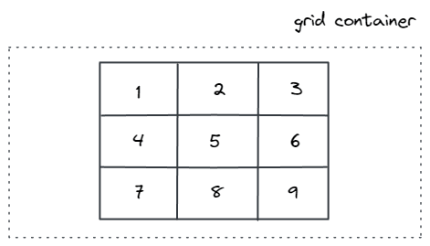
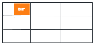
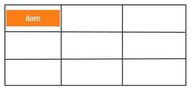
Grid Track
A grid track is a horizontal or vertical space between two grid lines. It is a term for columns or rows of the grid.
Here’s an example of the grid track between the third and fourth-row grid lines:
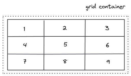
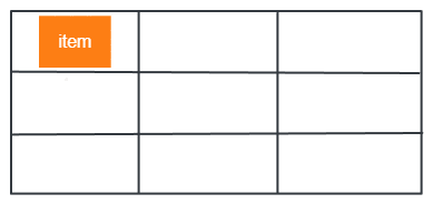
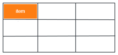
Grid Cell
A grid cell is a space between four grid lines – two adjacent rows and two adjacent column grid lines. It’s the smallest possible unit on the grid where you can place an item.
Here is an example of the grid cell between row grid lines 2 and 3 and column grid lines 1 and 2.
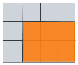
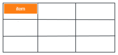
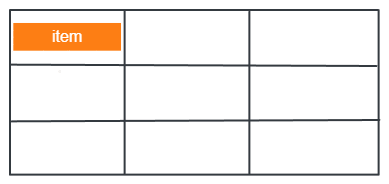
Grid Area
The grid area is the area on the grid surrounded by four grid lines. There could be several grid cells in it.
Here’s an example of a grid area between row grid lines 2 and 4, and column grid lines 2 and 5.
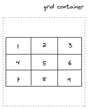
Grid Container
An HTML element becomes a grid container when its display property is set to grid or inline grid.
CSS:
|
1 2 3 4 5 6 7 8 |
<div class="container"> <div class="grid-item">1</div> <div class="grid-item">2</div> <div class="grid-item">3</div> <div class="grid-item">4</div> <div class="grid-item">5</div> <div class="grid-item">6</div> </div> |
CSS:
|
1 2 3 |
.container { display: grid; } |
Output:
See the Pen
Grid by Tahera Alam (@alam_tahera)
on CodePen.
Test CSS Grid compatibility across 3000+ browser environments. Try LambdaTest Now!
Properties for Grid Container
Grid container is the element where you define how you want your grid layout to look. CSS provides several properties for grid containers that allow you to define the layout.
Below we walk through each of these properties in simple terms:
display
The display property sets the element as a grid container. It has two values:
- display: grid
- display:inline-grid
The grid property makes the grid items block level, taking the entire width of the grid container.
The inline-grid makes grid items inline, while the grid makes the grid-items block level.
grid-template-columns
The grid-template-columns property defines the line name and column sizes of the grid container.
This property creates column tracks in the grid container for each specified value. The value of this property is a list separated by space where each value represents the column track width, and the space between them represents the grid line.
If you want your grid container to have 6 columns, specify the width of 6 columns. Or set the value to auto if you want all the columns to be the same width.
- track size: can be length (a non-negative length, giving the width of the column), percentage, or fraction of the available space in the grid container( using fr unit)
- line name: the name may be any valid string other than the reserved words span and auto. Lines may have multiple names separated by a space inside the square brackets. For example, [line-name-a line-name-b]
Values:
The fr unit lets you create flexible grid tracks. It means a fraction of the available space in the grid container.
For example, this will set the first item to one-third and the second item to two-third of the container’s width.
|
1 2 3 |
.container { grid-template-columns: 1fr 2fr; } |
The available space is calculated after all the non-flexible items if any. In the example below, the 100px is not included in the total free space available to the fr units.
|
1 2 3 |
.container { grid-template-columns: 100px 1fr 2fr; } |
An example of the grid-template-columns property is shown below:
HTML:
|
1 2 3 4 5 6 7 8 |
<div class="container"> <div class="grid-item">1</div> <div class="grid-item">2</div> <div class="grid-item">3</div> <div class="grid-item">4</div> <div class="grid-item">5</div> <div class="grid-item">6</div> </div> |
CSS:
|
1 2 3 4 5 6 7 8 9 10 11 12 13 |
container{ display:grid; grid-template-columns: [first] 1fr [line2] 2fr [line3] 3fr; background-color: #a2d2ff; padding: 30px; gap:10px; } .grid-item { background-color: #fefae0; text-align: center; font-size: 30px; padding: 15px; } |
Output:
See the Pen
grid-template-columns by Tahera Alam (@alam_tahera)
on CodePen.
In the above example, items 4, 5, and 6 are placed on a new row track because only 3 column track sizes were defined. Additionally, because they were positioned in column tracks 1, 2, and 3, their columns’ sizes are equal to 1, 2, and 3.
grid-template-rows
The grid-template-rows property creates row tracks in the grid container for each specified value. Like the grid-template-columns property, the value of grid-template-rows is also a space-separated list where each value defines the height of the specific row.
An example of the grid-template-rows property is shown below:
HTML:
|
1 2 3 4 5 6 |
<div class="container"> <div class="grid-item">1</div> <div class="grid-item">2</div> <div class="grid-item">3</div> <div class="grid-item">4</div> </div> |
CSS:
|
1 2 3 4 5 6 7 8 9 10 11 12 13 14 |
.container{ display:grid; grid-template-rows: 100px 200px; background-color: #a2d2ff; padding: 30px; gap:10px; } .grid-item { text-align:center; border: 1px solid rgba(17, 17, 17, 0.8); padding: 18px; font-size: 28px; background-color: rgba(255, 255, 255, 0.8); } |
Output:
See the Pen
Grid template rows by Tahera Alam (@alam_tahera)
on CodePen.
In the above example, we set row height to be 100px and 200px. So, the first and second-row tracks have a height of 100px and 200px. Because only 2-row tracks were defined, the heights of the 3rd and 4th-row tracks are defined by the contents of each.
minmax() function
The minmax() function defines the minimum and maximum size range of a grid row or a grid column. This function takes 2 parameters: the first is the minimum size, and the second is the maximum size of the track.
Let’s look at an example of minmax() function:
HTML:
|
1 2 3 4 5 6 7 8 |
<div class="container"> <div class="grid-item">1</div> <div class="grid-item">2</div> <div class="grid-item">3</div> <div class="grid-item">LambdaTest is a cross browser testing cloud platform. It is a browser & app testing cloud to perform both exploratory and automated testing across 3000+ different browsers, real devices and operating systems to perform both exploratory and automated testing across 3000+ different browsers, real devices and operating systems</div> <div class="grid-item">5</div> <div class="grid-item">6</div> </div> |
CSS:
|
1 2 3 4 5 6 7 8 |
.container{ display:grid; grid-template-rows:minmax(80px,auto); grid-template-columns: minmax(auto,50%) 1fr 2fr; background-color: #a2d2ff; padding: 30px; gap:10px; } |
Output:
See the Pen
minmax() function by Tahera Alam (@alam_tahera)
on CodePen.
Let’s analyze the above case:
The first row has a minimum height of 80px, but its maximum size is set to auto, which will allow the row track to increase its height based on the size of the content.
Similarly, the first column track is set to have a minimum height of auto and a maximum height of 50%, which ensures that the column track doesn’t go beyond 50% of the grid container. The second and third column track has a height of 1fr and 2fr, respectively.
This function is super useful when you want a strict minimum value and an open, flexible one.
repeat() function
The repeat() function sets the grid tracks to repeat according to the specified value. This allows many columns or rows with the same pattern to be written in a more compact form.
This is useful for a grid with many items of the same value.
The repeat()function takes two arguments:
- The first argument specifies the number of times tracks should repeat. It is defined with an integer value of 1 or more.
- The second argument specifies the size of the tracks.
Let’s look at an example of the repeat() function:
HTML:
|
1 2 3 4 5 6 7 8 |
<div class="container"> <div class="grid-item">1</div> <div class="grid-item">2</div> <div class="grid-item">3</div> <div class="grid-item">4</div> <div class="grid-item">5</div> <div class="grid-item">6</div> </div> |
CSS:
|
1 2 3 4 5 6 7 8 9 10 11 12 13 14 |
.container{ display:grid; grid-template-columns:repeat(3,1fr); background-color: #a2d2ff; padding: 30px; gap:10px; } .grid-item { text-align:center; border: 1px solid rgba(17, 17, 17,0.8); padding: 18px; font-size: 28px; background-color: rgba(255, 255, 255, 0.8); } |
Output:
See the Pen
repeat() function by Tahera Alam (@alam_tahera)
on CodePen.
In this example, we repeat 1fr 3 times for column tracks which create 3 column tracks of 1fr each.
fit-content() function
The fit-content() function takes just one parameter – the maximum value. When this property is set, a grid column or row will still take up as little space as necessary according to its content, but not more than the maximum value provided.
Let’s look at an example of the fit-content() function:
HTML:
|
1 2 3 4 5 |
<div class="container"> <div class="grid-item"></div> <div class="grid-item">LambdaTest is a cross browser testing cloud platform.It is a browser & app testing cloud to perform both exploratory and automated testing.</div> <div class="grid-item"></div> </div> |
CSS:
|
1 2 3 4 5 6 7 8 |
.container{ display: grid; grid-template-columns: auto fit-content(600px) auto; background-color: #a2d2ff; padding: 10px; gap:10px; height:500px; } |
Output:
See the Pen
fit-content by Tahera Alam (@alam_tahera)
on CodePen.
In this example, we have three columns, the first and third columns are set to auto. But the second column is set to fit the content to a max value of 600px.
The second column will take up the space based on its content, but it will not go beyond the max size of 600px.
min-content and max-content
The min-content and max-content are two special values that can be used in both CSS Grid and CSS in general.
The min-content specifies the element to take the minimum space needed for the content. Suppose for a line of text, this value will shrink the element to the minimum it could be without letting any of the words go beyond that shrunk size. This implies that text content would soft-wrap itself whenever possible, shrinking to the size of the longest word.
Let’s look at an example to better understand this:
HTML:
|
1 2 3 4 5 |
<div class="container"> <div class="grid-item"></div> <div class="grid-item">This is a line of text to demonstrate min-content.Notice how it's taking the length of the longest word.</div> <div class="grid-item"></div> </div |
CSS:
|
1 2 3 4 |
.container{ display: grid; grid-template-columns:auto min-content auto; } |
Output:
See the Pen
min-content by Tahera Alam (@alam_tahera)
on CodePen.
In this example, there are three columns. The second one is set to min-content, and the other two are set to auto. Because of this value, the second element takes the width of the longest word, making sure to take as little space as possible.
The max-content values take the maximum space needed for its content without adjusting any content.
Here’s an example of max-content:
HTML:
|
1 2 3 |
<div class="container"> <div class="grid-item"id="item2">This is a line of text to demonstrate max-content.</div> </div |
CSS:
|
1 2 3 4 |
.container{ display: grid; grid-template-columns:max-content; } |
Output:
See the Pen
max-content by Tahera Alam (@alam_tahera)
on CodePen.
auto-fill and auto-fit
The auto-fill property fills the row with as many columns as it can fit. Whenever a new column can fit, auto-fill creates implicit columns and fills it in the row because it’s trying to fill as many columns as it can fit in the row. If the new column is empty, it will still be allocated a space in the row.
The auto-fit expands the available columns to fit them into the entire available space of the container.
Consider this demo to understand the auto-fill and auto-fit properties:
In this example, the columns are defined using the repeat function. They have a minimum width of 150px and a max width of 1fr, which will share the total space equally between elements if available.
For the number of columns per row, we set it to auto-fit in the first grid, and in the second one, we set it to auto-fill.
|
1 2 3 4 5 6 |
#first-container{ grid-template-columns: repeat(auto-fill, minmax(150px, 1fr)); } #second-container{ grid-template-columns: repeat(auto-fit, minmax(150px, 1fr)); } |
Notice how both the properties are behaving exactly the same in the above image.
Here’s an important point for you to note: up to a certain width, auto-fill and auto-fit show the same result. But they are not behaving the same under the hood.
Output:
See the Pen
CSS Grid auto-fit property by Tahera Alam (@alam_tahera)
on CodePen.
| When extra space becomes available to the first container, which is set to auto-fill, it will add as many columns as it can and fill the row even if the columns are empty. But in the case of the second container with an auto-fit set, it will fill the extra space with the existing columns by expanding them. |
grid-template-areas
The grid-template-areas property defines the grid template by referencing the names of the grid areas specified with the grid-area property.
First, you name the items of the grid by the grid-area property, and then you reference those names in the grid-template-areas property.
In the grid-template-areas property, you repeat the grid area names, which causes that cell to span according to the repeated times.
Values:
- grid-area-name: the name of a grid area specified with the grid-area property.
- none – no grid areas are defined.
If this sounds confusing, do not worry. This is a very powerful property; the example below will clarify the concept.
HTML:
|
1 2 3 4 5 6 7 |
<div class="container"> <header>Header</header> <main>main</main> <nav>nav</nav> <aside>aside</aside> <footer>footer</footer> </div> |
CSS:
|
1 2 3 4 5 6 7 8 9 10 11 12 13 14 15 16 17 18 19 20 21 22 23 24 25 26 27 28 29 30 31 |
header{ grid-area: header; } nav{ grid-area: nav; } main{ grid-area: main; } aside{ grid-area: sidebar; } footer{ grid-area: footer; } header,footer,main,aside,nav{ background-color:#3a86ff; color:#fff; border: 1px solid #fff; padding:20px; } .container{ display: grid; grid-template-areas: 'header header header 'nav main sidebar' 'nav footer footer'; grid-template-columns: 1fr 3fr 1fr; grid-template-rows: 70px 2fr 50px; height: 100vh; } |
Output:
See the Pen
grid-template-areas by Tahera Alam (@alam_tahera)
on CodePen.
In this example, we create a grid layout that has 3-column tracks and 3-row tracks. The entire top row will consist of the header area. The middle row will consist of 1 nav area, 1 main area, and 1 sidebar area. The bottom row will consist of 1 nav area and 2 footer areas.
grid-gap(gutters)
The grid-gap property defines the gap size between the rows and columns in a grid layout. It is a shorthand property for the row-gap and column-gap.
If two values are specified, the first represents grid-row-gap, and the second represents grid-column-gap. If only one value is specified, both row-gap and column-gap get the same specified gap.
An example of a grid-gap property is shown below:
HTML:
|
1 2 3 4 5 6 7 8 |
<div class="container"> <div class="grid-item">1</div> <div class="grid-item">2</div> <div class="grid-item">3</div> <div class="grid-item">4</div> <div class="grid-item">5</div> <div class="grid-item">6</div> </div> |
CSS:
|
1 2 3 4 5 6 7 8 9 10 11 12 13 14 15 |
.container{ display:grid; /*grid-gap:10px 40px;*/ /*old*/ gap:10px 40px; /*standard*/ grid-template-columns:repeat(3,1fr); background-color: #a2d2ff; padding: 30px; } .grid-item { text-align:center; border: 1px solid rgba(17, 17, 17,0.8); padding: 18px; font-size: 28px; background-color: rgba(255, 255, 255, 0.8); } |
Output:
See the Pen
grid-gap by Tahera Alam (@alam_tahera)
on CodePen.
In the example, we set the row gap to 10px and column gap to 40px.
justify-items
The justify-items property is used to align the grid items along the row axis or inline axis.
Values:
- start: position grid items at the start of the row axis (row line number 1).
- end: position grid items at the end of the row axis.
- center: position grid items in the center of the row axis.
- stretch: stretch the grid items across the entire row axis. This is the default value.
Below are the examples of each value:
|
1 2 3 |
.container { justify-items: start; } |
|
1 2 3 |
container { justify-items: end; } |
|
1 2 3 |
.container { justify-items: center; } |
|
1 2 3 |
.container { justify-items: stretch; } |
align-items
The align-items property is used to align the grid items along the column axis or block axis.
Values:
- start: aligns grid items vertically to the start of the column cell.
- end: aligns grid items vertically to the end of the column cell.
- center: aligns grid items vertically at the center of the column cell.
- stretch: stretch the grid items across the entire column filling the whole cell’s height. This is the default value.
Below are the examples of each value:
|
1 2 3 |
.container { align-items: start; } |
|
1 2 3 |
.container { align-items: end; } |
|
1 2 3 |
.container { align-items: center; } |
|
1 2 3 |
.container { align-items: stretch; } |

place-items
The place-items property is a shorthand for justify-items and align-items properties. It means you can set both the justify-items and align-items properties in a single declaration.
Values:
- The first value sets justify-items, and the second value sets align-items. If there’s only one value, it is set as the value of both properties.
HTML:
|
1 2 3 |
<div class="container"> <div class="grid-item">Grid Item</div> </div> |
CSS:
|
1 2 3 4 5 6 7 8 9 10 11 |
container{ display:grid; place-items:center; background-color: #a2d2ff; padding: 60px; } .grid-item { background-color: #fefae0; font-size: 20px; padding: 15px; } |
Output:
See the Pen
place-items by Tahera Alam (@alam_tahera)
on CodePen.
In this example, the grid item is centered horizontally and vertically.
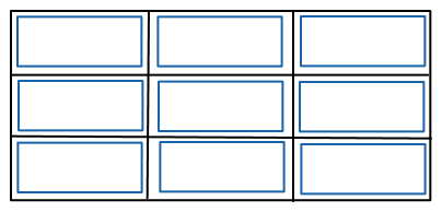
Justify-content
The justify-content property aligns the entire grid inside the container along the row(inline) axis.
It is important to note that for justify-content to work, the grid’s total width has to be less than the container’s width.
Suppose there is a box named box A, and you put another box named box B into it. To move box B inside box A, box B must be smaller than box A, right?
If it is not smaller, it will fill the box, and you can’t move it. It’s the same concept behind this.
Values:
- start: aligns the grid at the beginning of the grid container.
- end: aligns the grid at the end of the grid container.
- center: aligns the grid in the middle of the grid container.
- stretch: resizes the grid items to make the grid fill the entire width of the grid container.
- space – around: gives inner grid items equal space between them. The first and last items will be allocated half the space.
- space – between: gives grid items equal space between them.
- space – evenly: gives grid items equal space between and around them.
Let’s look at the examples of each value to understand them better:
|
1 2 3 |
.container { justify-content: start; } |
|
1 2 3 |
.container { justify-content: end; } |
|
1 2 3 |
.container { justify-content: center; } |
|
1 2 |
.container { justify-content: stretch; |
|
1 2 3 |
.container { justify-content: space-around; } |
|
1 2 3 |
.container { justify-content: space-between; } |
|
1 2 3 |
.container { justify-content: space-evenly; } |
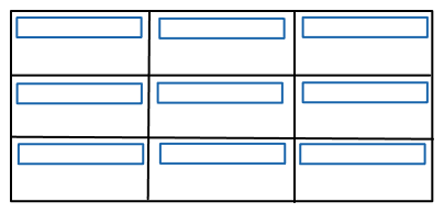
align-content
The align-content property is used to align the entire grid inside the container along the column(block) axis. This property is used to align the whole grid inside the container vertically.
Note that the grid’s total height has to be less than the height of the container for the align-content property to have any effect.
Values:
- start: aligns the rows at the beginning of the grid container.
- end: aligns the rows at the end of the grid container.
- center: aligns the rows in the middle of the grid container.
- stretch: resizes the grid items to make the grid fill the entire height of the grid container.
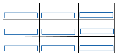
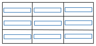
- space – around: gives rows an equal amount of space around them.
- space – between: gives rows equal space between them.
- space – evenly: gives rows equal space between and around them.
Let’s look at the examples of each value:
|
1 2 3 |
.container { align-content: start; } |
|
1 2 3 |
.container { align-content: end; } |
|
1 2 3 |
.container { align-content: center; } |
|
1 2 3 |
.container { align-content: stretch; } |
|
1 2 3 |
.container { align-content: space-around; } |
|
1 2 3 |
.container { align-content: space-evenly; } |
|
1 2 3 |
.container { align-content: space-between; } |
place-content
The place-content property is a shorthand for align-content and justify-content properties. It takes two values and sets both align-content and justify-content properties in a single declaration.
Values:
- The first value sets align-content, and the second value sets justify-content. If there’s only one value, it is set as the value of both properties.
HTML:
|
1 2 3 4 5 |
<div class="container"> <div class="grid-item">Grid Item</div> <div class="grid-item">Grid Item</div> <div class="grid-item">Grid Item</div> </div> |
CSS:
|
1 2 3 4 5 6 7 8 9 10 11 12 13 14 15 |
.container{ display:grid; place-content: center end; grid-template-columns: repeat(3,150px); background-color: #a2d2ff; padding: 60px; gap:30px; } .grid-item { text-align:center; border: 1px solid rgba(17, 17, 17,0.8); padding: 18px; font-size: 20px; background-color: rgba(255, 255, 255, 0.8); } |
Output:
See the Pen
place-content by Tahera Alam (@alam_tahera)
on CodePen.
In the example above, the place-content property has a value of center which positions grid items to the middle vertically and end positions grid items to the end of the grid container horizontally.
grid-auto-* (*-columns/rows/flow)
These properties let you define the implicit grid. Now, you might be wondering what an implicit grid track is.
Generally, we create a grid explicitly by creating columns and rows with the grid-template-columns and grid-template-rows properties.
When there is insufficient space for grid items in the explicit grid, an implicit grid is created to position those items outside the explicit grid. Those items are then automatically placed in the implicit grid.
This auto-placement is done by an algorithm named auto-placement algorithm.
The grid-auto-flow property controls how the algorithm places the items in the grid.
The values of the grid-auto-flow property are:
- row: places items row by row. This is the default.
- column: places items column by column.
- dense: sets the auto-placement algorithm to attempt to fill in holes earlier in the grid if smaller items come up later.
It is important to note that dense only changes the visual order of grid items. In turn, it might cause them to appear out of order which is bad for accessibility.
To specify the size of the implicit grid tracks, you use grid-auto-columns and grid-auto-rows properties.
Examples:
HTML:
|
1 2 3 4 5 6 |
<div class="container"> <div class="grid-item">1</div> <div class="grid-item">2</div> <div class="grid-item">3</div> <div class="grid-item">4</div> </div> |
CSS:
|
1 2 3 4 5 6 7 8 9 10 11 12 13 14 15 16 |
.container{ display:grid; grid-template-columns:80px 120px; grid-auto-flow:column; grid-auto-columns:1fr; background-color: #a2d2ff; padding: 30px; gap:10px; } .grid-item { text-align:center; border: 1px solid rgba(17, 17, 17,0.8); padding: 18px; font-size: 28px; background-color: rgba(255, 255, 255, 0.8); } |
Output:
See the Pen
grid-auto-columns by Tahera Alam (@alam_tahera)
on CodePen.
In this example, we have only defined the sizes of the first 2 column tracks as 80px and 120px wide. But we have 4 items. So an implicit grid gets created to place the 3rd and 4th items.
The grid-auto-flow property places the items column by column, and the grid-auto-columns property specifies the size of the column tracks, which is 1fr in this case.
HTML:
|
1 2 3 4 5 6 |
<div class="container"> <div class="grid-item">1</div> <div class="grid-item">2</div> <div class="grid-item">3</div> <div class="grid-item">4</div> </div> |
CSS:
|
1 2 3 4 5 6 7 8 9 10 11 12 13 14 15 16 |
.container{ display:grid; grid-template-rows:60px; grid-template-columns: repeat(2, 1fr); grid-auto-rows:120px; background-color: #a2d2ff; padding: 30px; gap:10px; } .grid-item { text-align:center; border: 1px solid rgba(17, 17, 17,0.8); padding: 18px; font-size: 28px; background-color: rgba(255, 255, 255, 0.8); } |
Output:
See the Pen
grid-auto-rows by Tahera Alam (@alam_tahera)
on CodePen.
In the example, we defined only one row track to be 60px. So, items 1 and 2 have a height of 60px. The second-row track is then auto-created to make space for items 3 and 4 in the implicit grid. So, the grid-auto-rows property specifies the height of row tracks is 120px in this case.
grid
The grid property is a shorthand for:
- grid-template-rows
- grid-template-columns
- grid-template-areas
- grid-auto-rows
- grid-auto-columns
- grid-auto-flow
Note that you can only specify the implicit or explicit grid properties in a single declaration.
Values:
- none: it is the default value. No specific size is mentioned for rows or columns.
- grid-template-rows / grid-template-columns: it is used to specify the size of the rows and columns.
- grid-template-areas: specifies the grid layout using named items.
- grid-template-rows / grid-auto-columns: specifies the size (height) of the rows and the auto size of the columns.
- grid-auto-rows / grid-template-columns: specifies the auto size of the rows and sets the grid-template-columns as specified.
- grid-template-rows / grid-auto-flow grid-auto-columns: specifies how to place items and auto-size rows and columns.
- grid-auto-flow grid-auto-rows / grid-template-columns: specifies how to place items and auto-size row and grid-template columns.
Examples:
|
1 2 3 4 |
.container { display: grid; grid: 120px auto 200px / repeat(2, 1fr) 150px; } |
The above example creates three explicit rows of 120px, auto, and 200px. Then using the repeat() function, it creates two columns of 1fr and one of 150px.
It’s equivalent to this longer version:
|
1 2 3 4 5 |
.container { display: grid; grid-template-rows: 100px auto 300px; grid-template-columns: repeat(2, 1fr) 100px; } |
The following two code blocks are same:
|
1 2 3 4 5 6 7 |
.container { grid: auto-flow / 100px 2fr; } .container { grid-auto-flow: row; grid-template-columns: 100px 2fr; } |
The following two code blocks are also same:
|
1 2 3 4 5 6 7 8 9 10 11 12 13 |
.container { grid: [row1-start] "header header header" 2fr [row1-end] [row2-start] "footer footer footer" 30px [row2-end] / auto 60px auto; } .container { grid-template-areas: "header header header" "footer footer footer"; grid-template-rows: [row1-start] 2fr [row1-end row2-start] 30px [row2-end]; grid-template-columns: auto 60px auto; } |
Properties for Grid Items
Similar to grid containers, CSS also provides a number of properties to work with grid items, which allow you to have more control over them.
Below we discuss these properties:
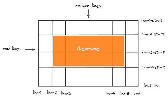
grid-row-* and grid-column-*
These properties determine the location of grid items by specifying where to start and where to end the item in grid lines. grid-row-start and grid-column-start specify the line where the item begins. Similarly, grid-row-end and grid-column-end specify the line where the item ends.
Values:
- line: takes a number to refer to a grid line or a name to refer to a named grid line.
- span: takes a number or a name. The item will span across the specified number of grid tracks when it takes a number. Whereas, in the case of name, the item will span across until it hits the line with the specified name.
- auto: specifies that the property does not do anything to the grid item’s placement, indicating auto-placement, an automatic span, or a default span of 1.
Example:
|
1 2 3 4 5 6 |
.item-one { grid-column-start: 2; grid-column-end: five; grid-row-start: row2-start; grid-row-end: 4; } |
|
1 2 3 4 5 6 |
.item-two { grid-column-start: 1; grid-column-end: span col5-start; grid-row-start: 1; grid-row-end: span 3; } |
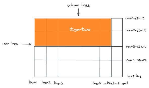
If grid-column-end or grid-row-end is not declared, the item will span 1 track by default.
Grid-column and grid-row
The grid-column property is a shorthand property for grid-column-start and grid-column-end.
The grid-row property is a shorthand property for grid-row-start and grid-row-end.
They accept all the values that longhand property accepts.
An example of a grid-column property is shown below:
HTML:
|
1 2 3 4 5 6 7 8 |
<div class="container"> <div class="grid-item"id="item-one">1</div> <div class="grid-item">2</div> <div class="grid-item">3</div> <div class="grid-item">4</div> <div class="grid-item">5</div> <div class="grid-item">6<div> </div> |
CSS:
|
1 2 3 4 5 6 7 8 9 10 11 12 13 14 15 16 17 |
.container{ display:grid; grid-template-columns: auto auto auto; background-color: #a2d2ff; padding: 30px; gap:10px; } .grid-item { text-align:center; border: 1px solid rgba(17, 17, 17,0.8); padding: 18px; font-size: 28px; background-color: rgba(255, 255, 255, 0.8); } #item-one{ grid-column:1/span 2; } |
Output:
See the Pen
grid-column by Tahera Alam (@alam_tahera)
on CodePen.
In the example, item one starts at column 1 and spans across column 2. As soon as it hits the end of column 2, it stops.
An example of the grid-row property is shown below:
|
1 2 3 4 5 6 7 8 |
<div class="container"> <div class="grid-item"id="item-one">1</div> <div class="grid-item">2</div> <div class="grid-item">3</div> <div class="grid-item">4</div> <div class="grid-item">5</div> <div class="grid-item">6<div> </div> |
CSS:
|
1 2 3 4 5 6 7 8 9 10 11 12 13 14 15 16 17 |
.container{ display:grid; grid-template-columns: auto auto auto; background-color: #a2d2ff; padding: 30px; gap:10px; } .grid-item { text-align:center; border: 1px solid rgba(17, 17, 17,0.8); padding: 18px; font-size: 28px; background-color: rgba(255, 255, 255, 0.8); } #item-one{ grid-row:1/3; } |
Output:
See the Pen
grid-row by Tahera Alam (@alam_tahera)
on CodePen.
In the example, item one starts at line 1, and as soon as it hits line 3, it ends.
In both properties, if the end is not defined, the item spans 1 track by default.
grid-area
The grid-area property assigns a name to a grid item which then can be referenced by the grid-template-areas property of the grid container.
This property can also be used as a shorthand property for
- grid-row-start
- grid-column-start
- grid-row-end
- grid-row-end
Values:
- name: a name of your choice.
- row-start / column-start / row-end / column-end: same values as the longhand property of each.
An example of a grid-area to assign a name is shown below:
HTML:
|
1 2 3 4 5 6 7 8 |
<div class="container"> <div class="grid-item"id="item-one">1</div> <div class="grid-item">2</div> <div class="grid-item">3</div> <div class="grid-item">4</div> <div class="grid-item">5</div> <div class="grid-item">6<div> </div> |
CSS:
|
1 2 3 4 5 6 7 8 9 10 11 12 13 14 15 16 17 18 19 |
.container{ display:grid; grid-template-areas: 'firstItem firstItem firstItem'; grid-template-columns: 1fr 1fr 1fr; background-color: #a2d2ff; padding: 30px; gap:10px; } .grid-item { text-align:center; border: 1px solid rgba(17, 17, 17,0.8); padding: 18px; font-size: 28px; background-color: rgba(255, 255, 255, 0.8); } #item-one{ grid-area:firstItem; } |
Output:
See the Pen
grid-area by Tahera Alam (@alam_tahera)
on CodePen.
In the example, item one is assigned a name with grid-area property. grid-template-areas in the grid container, then reference to the name. Referencing the name 3 times makes the item take 3 columns filling the entire track.
An example of a grid-area as the shorthand for grid-row-start, grid-column-start,grid-row-end, and grid-column-end is shown below:
HTML:
|
1 2 3 4 5 6 7 8 |
<div class="container"> <div class="grid-item"id="item-one">1</div> <div class="grid-item">2</div> <div class="grid-item">3</div> <div class="grid-item">4</div> <div class="grid-item">5</div> <div class="grid-item">6<div> </div> |
CSS:
|
1 2 3 4 5 6 7 8 9 10 11 12 13 14 15 16 17 |
.container{ display:grid; grid-template-columns: auto auto auto; background-color: #a2d2ff; padding: 30px; gap:10px; } .grid-item { text-align:center; border: 1px solid rgba(17, 17, 17,0.8); padding: 18px; font-size: 28px; background-color: rgba(255, 255, 255, 0.8); } #item-one{ grid-area: 2 / 1 / span 2 / span 2; } |
In the example, item one starts at row 2 and column 1. Then, it spans to row 2 and column 2.
justify-self
Each grid item has a cell of its own. By default, grid items get placed in their cell filling the entire width of the cell. The justify-self property aligns a grid item inside a cell along the row axis. A grid item located inside of a single cell is affected by this value.
Values:
- start: aligns the grid item at the start of the cell.
- end: aligns the grid items at the end of the cell.
- center: aligns the grid item in the center of the cell.
- stretch: stretch the grid item across the entire cell filling the entire width of the cell. This is the default value.
Below are the examples of each value:
|
1 2 3 |
.item { justify-self: start; } |
|
1 2 3 |
.item { justify-self: end; } |
|
1 2 3 |
.item { justify-self: center; } |
|
1 2 3 |
.item { justify-self: stretch; } |

align-self
The align-self property aligns a grid item inside a cell along the column axis. This value applies to the content inside a single grid item.
Values:
- start: aligns the grid item at the start of the cell.
- end: aligns the grid items at the end of the cell.
- center: aligns the grid item in the center of the cell.
- stretch: stretch the grid item across the entire cell filling the entire height of the cell. This is the default value.
Below are the examples of each value:
|
1 2 3 |
.item { align-self: start; } |
|
1 2 3 |
.item { align-self: end; } |
|
1 2 3 |
.item { align-self: center; } |
|
1 2 3 |
.item { align-self: stretch; } |
To apply this behavior to every single item in a grid, you can also use the align-items property on the grid container.
place-self
The place-self property lets you align an individual item in both the block(column) and inline(row) directions at once. It is a shorthand property for align-self and justify-self.
Values:
- The first value sets align-self, and the second value sets justify-self. If there’s only one value, it is set as the value of both properties.
- auto – sets the default alignment for the layout.
An example of this property is shown below:
|
1 2 3 |
.item { place-self: center stretch; } |
Subgrid
Subgrid is an extremely important addition to CSS Grid that allows your grid items to have a grid of their own and it inherits grid lines from the parent grid.
Below is an example of how to create a subgrid:
First, create a grid as usual.
|
1 2 3 4 5 6 |
<div class="main-grid-container"> <div class="grid-item"> <div class="subgrid-item"></div> <div class="subgrid-item"></div> </div> </div> |
|
1 2 3 |
.main-grid-container { display: grid; } |
Then, set a grid item to grid.
|
1 2 3 4 5 |
.grid-item { display: grid; grid-template-columns: subgrid; grid-template-rows: subgrid; } |
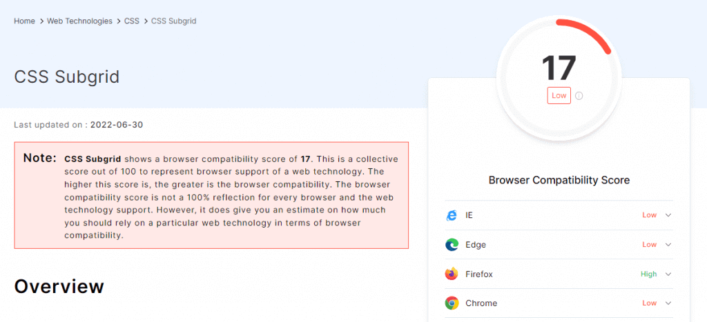
Although this is a handy feature, it is not widely supported by browsers yet.
Again, browsers are constantly changing, so maybe all browsers will support the subgrid soon.
The browser compatibility of CSS Subgrid is shown below:
Browser support for CSS Grid
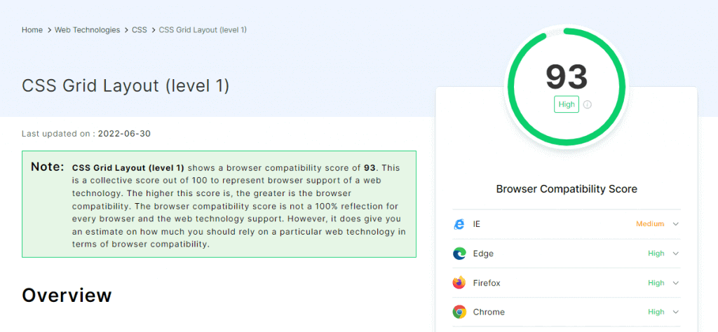
Until March 2017, browser support for CSS Grid was almost non-existent. But in March of 2017, the first time, a major specification like CSS Grid was shipped into at least 6 major browsers simultaneously for the first time.
Today, we have Grid Layout support in almost all major browsers. However, there are still very few outdated and non-supporting browsers. To support it in those browsers, refer to this resource.
While CSS Grid has been adopted by all modern browsers, it’s still important to check cross browser compatibility to make sure your website works seamlessly across different browsers.
Shown below is the cross browser compatibility of CSS Grid by LambdaTest Web technology compatibility generator. To know how your CSS grids are performing over different browsers and OS combinations, you can use LambdaTest cross browser testing platform to test your CSS Grids for compatibility on an online browser farm of 3000+ real browsers and OS combinations.
Is your CSS Grid responsive?
A responsive website is a website that adapts to different screen sizes and formats. This can be achieved in a number of ways, but one of the most popular is CSS Grid. It’s not just for mobile devices either; it can also be used for layouts on big screens like laptops and desktops.
Performing tests to check responsiveness can be time-consuming. However, tools like LT Browser makes it much easier. LT Browser by LambdaTest is a mobile-friendly test tool that comes with 50+ pre-installed viewports with multiple standard resolutions. Additionally, LT Browser offers sophisticated developer tools for testing.
You can also Subscribe to the LambdaTest YouTube Channel and stay updated with the latest tutorials around automated browser testing, Selenium testing, Cypress E2E testing, CI/CD, and more.
Below are some of the top-notch features of LT Browser that, as a developer, I love to have:
- Device sync feature to scroll on two devices simultaneously.
- Network throttling feature to test websites on different networks.
- Capturing full-page screenshots of the web page.
- Generating performance reports powered by Google Lighthouse.
- Video recording of a running test session, and much more.
Differences between Flexbox and CSS Grid Layout
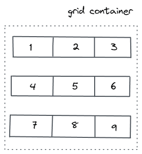
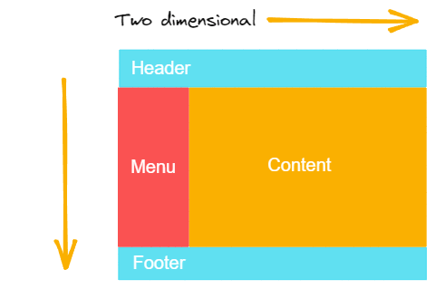
Flexbox is designed for one-dimensional layouts. It means Flexbox can either work on rows or columns at a time. But Grid is made for two-dimensional layouts which means it can work on both rows and columns.
Let’s look briefly at what CSS Grid allows you to do that Flexbox does not.
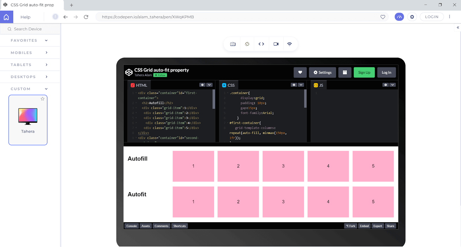
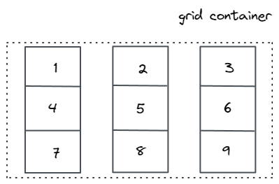
Below is an illustration of a possible CSS Grid layout:
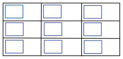
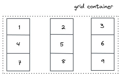
Now look at another illustration of a possible flexbox layout:
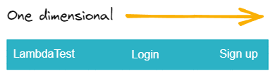
Flexbox allows you to achieve a layout that is one-dimensional – either horizontal or vertical. But a grid allows you to create complex layouts which are multi-dimensional, involving both horizontal and vertical flow.
In fact, flexbox is mostly used in combination with CSS Grid to create layouts.
Here are two instances of well-known websites that use CSS Grids and flexboxes and in their layouts:

Wrapping it up!
CSS Grid is the most important CSS module for creating modern web layouts. And now you know everything about it. Give yourself a pat on the back for making it to the end!
It’s time for you to go and create some amazing web pages!
Happy building!!
Frequently Asked Questions (FAQs)
What is CSS Grid used for?
CSS Grid is a new layout mechanism that enables us to create some very sophisticated layouts without the use of floats. You can use CSS Grid to create any type of layout you want, including horizontal and vertical grids, as well as multi-column grids, asymmetrical grids with unequal height and width columns, and much more. The possibilities are endless with CSS Grid.
Is CSS Grid better than Flexbox?
With Flexbox, you can get an entire layout working in minutes, and there are free tools that even help you visualize your layouts. The payoff for CSS Grid is that you can create infinitely more complex layouts than are possible with Flexbox—but the question is still up for debate about whether that’s worth the added complexity of learning a new layout tool.
Is CSS Grid better than bootstrap?
The CSS Grid and Bootstrap are two different systems for creating websites. CSS Grid is a new way to create layouts in CSS while Bootstrap is an older system that has been widely adopted by many sites due to its ease of use. Both systems have their own advantages. One of the most important aspects of a website is the layout. A great website design can attract users, but a bad or “ugly” design can drive people away. Good layouts make the site’s content easy to find, understand, and use. It is therefore very important to choose a good layout for your site.


Author’s Profile
Tahera Alam
Tahera is a front-end developer who loves developing seamless frontends and efficient backends. She has skills in React, JavaScript, Nextjs, Tailwind, MongoDB, Solidity, and more. She loves to learn new technologies and finds writing about them to be a great way to share knowledge with others. In her free time, she enjoys reading thrillers and engaging with the tech community on Twitter.
Blogs: 11
Got Questions? Drop them on LambdaTest Community. Visit now


