
An Interactive Guide To CSS Hover Effects
Ayush Thakur
Posted On: December 2, 2022
 40418 Views
 29 Min Read
Building a website is all about thinking about the user experience. Finally, it’s about giving guests an unforgettable experience so they’ll return. Adding some eye-catching text or picture animations to your site is one method to guarantee visitors have a good experience.
Adding animations to your website can make it more interesting and appealing to visitors. Not only will an animation make your website easier to use, but it will also make navigation simpler for users. By changing the text color, when someone moves their cursor over it, you can notify them which text is clickable and which is not.
Now, how can you transform the plain sailing text on a web page into appealing text? The answer to the question lies with CSS hover effects that are a curation of some stunning animation properties. These can be embedded into any text and provide an amazing look. These simple yet impressive animation properties work as a visual treat for the visitors and enhance the user experience positively.
You can loosely compare the impact of CSS hover effects to the animated banners you see outside shopping malls and outlets. Just like these blinking banners visually garners the attention of the intended audience, in the same way, the animated text benefits the website.
Not just adding to animation in text, CSS hover effects also come in handy when we need to add a drop-down for better navigation.
Does this mean the more the animation texts, the better the user experience? Well, maybe yes! But it’s also recommended not to add too much-animated text on the website; the proportion must be appropriate.
In this guide, we will explore advanced properties of CSS hover animations like background clipping, masks, and 3D, along with detailed examples.
So, let’s get started!
TABLE OF CONTENTS
What are CSS Hover Effects?
CSS hover effects let you add some amazing eye-catching animations to texts, images, and links, irrespective of the type, length, and position of the placeholder. You can add animation to different text types, from header text to paragraph text to link text.
It comes with endless possibilities for adding animations. You can customize the animation you want to add to the text, experiment with the text border and shadow, background color, font color, or any other text property, and alter it according to the animation you intend to add.
The principles of the adage “Too much anything is bad” also apply to hover effects. As per my experience, you should use CSS hover effects only to the extent that it does not stray the user’s attention! Extensive usage of hover effects might dampen the end-user experience!
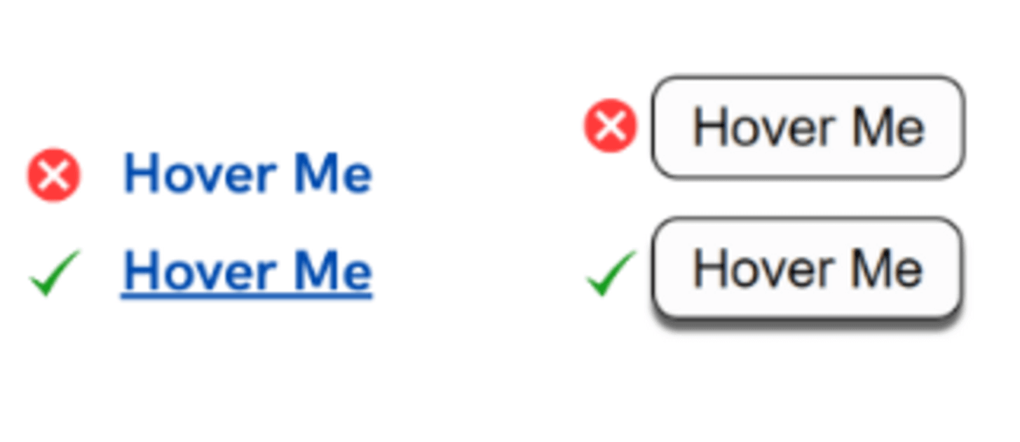
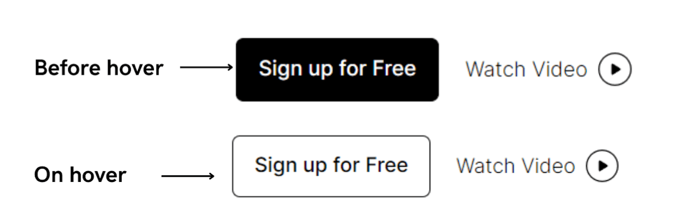
Unlike standard animations that start when the webpage loads, hover animations begin when the user moves the control over the animated text. In other words, the hover animations come into view when the user brings the cursor over the animated text; before that, it would look like standard text.
To add animations, CSS hover effects come with a pseudoclass named :hover that has to be assigned to the text. Post that, you need to add the animation properties to that pseudoclass.
The following screenshot shows the working of CSS hover functionality on the LambdaTest website.
In the example below, we have chalked out examples of the same texts with different CSS hover behavior. All four of these texts have different animations assigned in the hover pseudoclass.
|
1 2 3 4 5 6 7 8 9 10 11 12 13 14 15 16 17 18 19 20 21 22 23 24 25 26 27 28 29 30 31 32 33 34 35 |
style.css .container { font-size: 40px; width: 50%; text-align: center; padding-top: 10px; font-weight: bold; float: left; cursor: pointer; } .hover-1:hover { color: red; font-size: 30px; text-decoration: underline; text-decoration-style: dotted; transition: font-size 0.3s ease-out; } .hover-2:hover { color: #00ffff; text-decoration: underline; text-decoration-style: wavy; transition: color 0.5s ease-in; } .hover-3:hover { color: #25316d; background-color: #b1b2ff; border-radius: 20px; transition: all 0.5s ease-in; } .hover-4:hover { text-shadow: 2px 2px 8px #ff0000; border: 2px solid #a5f1e9; border-radius: 20px; color: #a5f1e9; transition: all 0.2s ease-in; } |
See the Pen
Untitled by Ayush Thakur (@tsayush)
on CodePen.
How to use CSS Hover?
CSS hover effect lets you alter the style of an HTML element when hovered over by a cursor or other pointing device, such as a touch screen. Many HTML elements, including text, photos, and buttons, can be given this effect.
- To create a CSS hover effect, you should first choose the HTML element to which you wish to apply the hover effect too. A CSS selector, such as “p” for a paragraph element or “.button” for a button element, can be used to accomplish the above.
- Next, define the CSS styles you want to use when the element hovers over. This includes altering the element’s border color, font size, background color, text color, or any other visual attribute. To get the desired effect, you can combine any CSS attribute and value.
- To apply the hover effect to the selected element, you need to use the :hover pseudo-class in your CSS code. The styles that should be used when the element hovers over are specified by this pseudo-class, which is added to the element’s selector.
- when the element hovers over, the CSS styles given for the:hover pseudo-class is applied, displaying and making it more interactive for the user.
Eventually, by enabling you to build dynamic visual effects that respond to user activities, employing CSS hover effects may add a lot of interactivity and engagement to a webpage.
What is the best CSS Hover Effect?
The ideal CSS hover effect largely depends on the specific design and context of the project. Still, the following examples of well-liked hover effects might be beneficial:
- Sliding highlight links: This effect slides a highlight bar or box over the link when it is hovered over, creating a dynamic and interactive visual effect. It can be used to highlight crucial navigational links or components.
- Links with text-swapping effects: When a link has hovered over, this effect changes one piece of text for another, producing an entertaining and captivating visual effect. It can be utilized to give the design personality and humor.
- CSS hover effects with transitions: This effect uses CSS transitions to seamlessly animate changes in the element’s appearance, such as changes to color, opacity, or border radius. It can be utilized to provide refined, subdued visual effects that give the design a sense of expertise.
- Image overlay hover effects: This effect provides a visual effect that draws attention to the image and stimulates user engagement by projecting text, buttons, or other items over an image when it hovers over. It can be used to display product photographs, make photo galleries, or even spice up the page’s visual appeal.
The best CSS hover effect for your project will ultimately depend on your design objectives and the particular project circumstances. While selecting a hover effect, it’s crucial to keep in mind the function and purpose of your design elements and the branding and target audience.
What are CSS Advanced Effects?
Now let’s understand the three CSS Advanced effects – Background Clipping, Masks, and 3D along with some detailed examples.
Background-Clip
First, let us take the case of animations with the background-clip property. As the name indicates, the background-clip property simply clips the background. CSS background-clip property allows us to set to what extent the background graphics will be applied.
To see the magic of the background-clip property, simply set the background property to a graphical element and assign the background-clip property to the area where you want to make the graphic element visible.
See the Pen
Untitled by Ayush Thakur (@tsayush)
on CodePen.
In the above snippet, you can notice that we have assigned a three-colored linear gradient to the background. To make it visible only inside the text and not on the main background, we have applied the background-clip property and assigned the text attribute to it.
We have fixed the font color of the text as transparent. It will generate a text of transparent color or a see-through text, which will ultimately make the assigned background graphics visible. If the font color is not assigned to transparent (#0000), then the text will be in default color (i.e., black), eventually hiding the background graphics.
Not just the text area, you can also assign the background effect to different portions of the background by using the collection of attributes that the background-clip property offers.
Attributes are mentioned below:
- text
- padding-box
- border-box
- content-box
Let’s see all these attributes in action with the help of an example
|
1 2 3 4 5 6 7 8 9 10 11 12 13 14 15 16 17 18 19 20 21 22 23 24 |
div { font-size: 70px; background: linear-gradient( 90deg, rgba(212, 2, 249, 1) 28%, rgba(250, 251, 61, 1) 53%, rgba(0, 212, 255, 1) 100% ); font-family: Arial, Helvetica, sans-serif; padding-bottom: 0.1em; cursor: pointer; color: transparent; margin-top: 20px; font-weight: bold; } body { display: grid; place-content: center; } .text { text-align: center; background-clip: text; -webkit-background-clip: text; } |
See the Pen
Untitled by Ayush Thakur (@tsayush)
on CodePen.
In the text attribute, the gradient is visible only on the text portion. On the border-box attribute, the gradient is extended to borders, and in the same way, the gradient is stretched to its respective portions in the content-box and padding-box attributes.
Now let us utilize these clipping properties and create some magical animations.
See the Pen
Untitled by Ayush Thakur (@tsayush)
on CodePen.
In the above snippet, as you hover over the text, you can see the smooth color shift in the text. Now let us look at what role background-clip property plays in creating this effect. We will proceed step-by-step.
|
1 2 3 4 5 6 |
.hover { color: #0000; background: radial-gradient(circle, rgba(212,2,249,1) 28%, rgba(250,251,61,1) 53%, rgba(0,212,255,1) 100%); transition: .4s; } |
Initially, we initiated the < h3 > tag, added an example text, and assigned some basic radial gradient styling as the background to this header tag. Also, as explained earlier in the CSS hover blog, we have assigned transparent as the font color to make the animation visible to us.
|
1 2 |
-webkit-background-clip: text; background-clip: text; |
Following the background styling, we added the position, size, and repeat attributes to the radiant-gradient property to improve the styling. In addition, the background-clip property has been added to the CSS styling assigned to the text property to get the gradient styling in the text.
|
1 2 3 |
.hover:hover { --c:100%; } |
To achieve the animation, we have converted the position attribute of the radial gradient from a static value to a dynamic value by creating CSS variables. Its value is set to 0%.
Afterward, to create the animation, hover pseudoclass is used to which we have assigned the defined variable to the value of 100%. So now, whenever the user hovers over the text, the value of the variable changes, and the animation becomes visible.
Let’s take it a step further and add a visually appealing underline that appears when you hover over the text.
See the Pen
Untitled by Ayush Thakur (@tsayush)
on CodePen.
In this animation, the user hovers the cursor over the text, along with the animation in the text, a beautiful line appears just below the text. The line also features a beautiful color gradient just like the text. You can do all of this with just two lines of code!
|
1 2 |
radial-gradient(circle, rgba(212, 2, 249,1) 28%, rgba(250, 251, 61, 1) 53%, rgba(0, 212, 255, 1) 100%) 0% 100%/var(--c, 0%) 0/1em no-repeat; |
After the previously defined gradient, we added a radial-gradient effect in the background property. This defined gradient will add the gradient to the bottom of the padding box. After that, we initialized a dynamic CSS variable in this gradient which will manipulate the size of the gradient. Now the only thing we need to update is the background-clip property.
In the background-clip property, we have added the padding-box property so that the background effect stays visible only in the padding area. And finally, the hover pseudoclass is there to change the variable’s value as we hover over it.
See the Pen
Untitled by Ayush Thakur (@tsayush)
on CodePen.
|
1 2 3 4 5 6 7 8 9 10 11 12 13 14 15 16 17 18 19 20 21 22 23 24 25 26 27 28 29 30 31 32 33 34 35 36 37 38 39 40 41 42 43 44 45 46 47 48 49 50 51 52 53 54 55 56 57 58 59 60 61 62 63 64 65 66 67 68 69 70 71 72 73 |
style.css body { height: 100vh; margin: 0; display: grid; grid-template-columns: auto auto; gap: 20px 50px; place-content: center; align-items: end; } h3 { font-family: system-ui, sans-serif; font-size: 4rem; margin: 0 auto; cursor: pointer; padding: 0 0.1em; } .hover-1 { --c: #1095c1; color: #0000; background: linear-gradient(var(--c) 50%, #000 0) 0% calc(100% - var(--_p, 0%)) / 100% 25%, linear-gradient(var(--c) 50%, #000 0) 0% calc(0% - var(--_c, 100%)) / 100% no-repeat; -webkit-background-clip: text; background-clip: text; transition: 0.3s; } .hover-1:hover { --_p: 100%; --_c: 0%; --_s: 0.3s; } .hover-2 { color: #0000; background: linear-gradient(90deg, white 50%, black 0) var(--_p, 100%) / 200%, linear-gradient(90deg, white 50%, black 0) var(--_c, 0%) / 200% no-repeat; -webkit-background-clip: text, padding-box; background-clip: text, padding-box; transition: 0.4s; } .hover-2:hover { --_p: 0%; --_c: 100%; } .hover-3 { --c: #1095c1; color: #0000; background: linear-gradient(white 50%, #000 0) 0% calc(100% - var(--_p, 0%)) / 100% 14%, linear-gradient(#adddd0 50%, #000 0) 0% calc(0% - var(--_c, 100%)) / 100% 25%; -webkit-background-clip: text, padding-box; background-clip: text, padding-box; transition: 0.5s; } .hover-3:hover { --_p: 100%; --_c: 0%; } .hover-4 { color: black; background: linear-gradient(90deg, red 50%, white 50%) var(--_p, 100%) / 200%, linear-gradient(90deg, white 50%, red 50%) var(--_c, 0%) / 200% no-repeat; -webkit-background-clip: text, padding-box; background-clip: text, padding-box; transition: 0.4s; } .hover-4:hover { --_p: 50%; --_c: 50%; color: #0000; } |
Mask
CSS Mask property makes two images overlap, where one image acts as a masking layer for another, thus clipping or removing the specific areas or parts of the secondary image. With the help of the Mask property, we can make an image work as a masking layer (alias luminance or alpha mask) for another image.
Creating a masking layer is not just limited to images, any graphical element, such as linear gradients, can be transformed into a masking layer. Under the mask property, there comes a bunch of other properties. These properties include:
- mask-clip
- mask-composite
- mask-image
- mask-mode
- mask-origin
- mask-position
- mask-repeat
- mask-side
These properties come in handy to take over other important aspects of the mask effects like position, repeatedness, size, and side, etc. Now we will talk about the most frequently used properties of mask property.
Mask-image
The mask-image property allows us to make an image or any graphical element behave as a masking layer for another graphic element.
Now let us see some working examples of Mask property.
See the Pen
Untitled by Ayush Thakur (@tsayush)
on CodePen.
In the above example, you can observe that we have edited Image 1 to look like the pattern of Image 2. Let’s look at how mask property helped us achieve this effect.
|
1 2 |
mask-image:url(https://d33wubrfki0l68.cloudfront.net/d319533ac3d22c3186498254e0caee871796a29e/d7ce9/images/css/masking/image-mask.png); -webkit-mask-image:url(https://d33wubrfki0l68.cloudfront.net/d319533ac3d22c3186498254e0caee871796a29e/d7ce9/images/css/masking/image-mask.png); |
You can notice in the CSS styles that we have used the mask-image property to make Image 2 behave as a masking layer for Image 1, and the final result is displayed in the Masked Image.
And if you think that the mask-image property is only limited to images. Then No! not just images; through mask properties, we can add many more effects to the image by using a wide range of graphical elements.
Let’s see a few of them in action.
See the Pen
Untitled by Ayush Thakur (@tsayush)
on CodePen.
In the above snippet, we have added a dissolving effect to an image, giving the illusion that the upper part of the image is gradually dissolving in the white background. Here we have used the linear gradient as the graphical element in the mask-image property to add that dissolving effect.
Similarly, you can imagine and create the image effect you want. You can take inspiration from some of the following fascinating image effects
|
1 2 3 4 5 6 |
<p class="codepen" data-height="300" data-default-tab="html,result" data-slug-hash="MWGvoqV" data-user="tsayush" style="height: 300px; box-sizing: border-box; display: flex; align-items: center; justify-content: center; border: 2px solid; margin: 1em 0; padding: 1em;"> <span>See the Pen <a href="https://codepen.io/tsayush/pen/MWGvoqV"> Untitled</a> by Ayush Thakur (<a href="https://codepen.io/tsayush">@tsayush</a>) on <a href="https://codepen.io">CodePen</a>.</span> </p> <script async src="https://cpwebassets.codepen.io/assets/embed/ei.js"></script> |
Mask-position
As the name defines, the mask-position property is used to assign the position of the masked graphical element. To set the position, you can use some predefined keywords with the mask-position property.
|
1 2 3 4 5 |
mask-position: top; mask-position: bottom; mask-position: left; mask-position: right; mask-position: center; |
Mask-position property also supports the numeric values in percentage or size units for assigning the position of the masked element.
|
1 2 3 4 5 |
mask-position: 20%; mask-position: 50px; mask-position: 10em 50em; mask-position: 20% 60%; mask-position: 10px 20em 30px 40em; |
Just like many other CSS styling properties, multiple values are also supported in the mask-position. In the case of 2 values, the first property is for the top and bottom positions, and the second value is for the left and right positions. In the case of 4 values, the values are for the top, right, bottom, and left positions, respectively.
Mask-size
The mask-size property is used to specify the size of the masked graphical element. The mask-size property also comes with some predefined keywords to alter the size of the mask element.
|
1 2 3 |
mask-size: cover; mask-size: contain; mask-size: auto; |
Like the mask-position property, the mask-size property also supports multiple numeric values where the 1st value is for the width and the second is for the height.
|
1 2 3 |
mask-size: 12px; mask-size: 30%; mask-size: 20px 30px; |
Let’s discuss how we can use the concepts of mask properties we have discussed till now to get some amazing animations with CSS hover effects. To better understand it, let’s create animation and analyze it side-by-side.
See the Pen
Untitled by Ayush Thakur (@tsayush)
on CodePen.
Here, you can notice that in the image, we have designed some beautiful effects in the form of white translucent vertical strips. If you are getting confused about how all this works, don’t worry, we will, step-by-side, line-by-line, discuss how the mask properties acted as a helping hand to get this effect.
The first step is to insert the image to add the animation over it. To give the user an incredible experience, we will add all the styling in the CSS hover pseudoclass. This will make the image look like an ordinary image at first, but as soon as the user moves the cursor over the image, beautiful animation comes into view, and the user experiences it.
|
1 2 3 4 5 |
-webkit-mask-image: linear-gradient(49deg, #000000 25%, rgba(0,0,0,0.2) 25%), linear-gradient(-49deg, #000000 25%, rgba(0,0,0,0.2) 25%), linear-gradient(49deg, rgba(0,0,0,0.2) 75%, #000000 75%), linear-gradient(-49deg, rgba(0,0,0,0.2) 75%, #000000 75%); |
The first mask property we assign in the CSS styling is the mask-image property. As discussed in this CSS hover blog, the mask-image property adds effects over the image by making an image or graphical element behave as a masking layer. We have allocated linear-gradient styling to the mask-image property, and in that gradient, attributes have been fixed to generate the gradient effect on the image.
|
1 |
-webkit-mask-size:30px 10px; |
The next thing that comes is to assign the size of the mask effects. For that, we have initialized the mask-size property, which will manipulate the size of the linear gradient we have assigned in the mask-image property. The first attribute defined in the mask-size property is the width, and the second is the height.
|
1 |
-webkit-mask-position: 0 0, 0 10px, 10px -10px, -10px 0px; |
Now, the only thing left to get the desired pattern is to assign the position to the mask-image property. To get the position, we used the mask-position property and set the position values for all four corners. For example, the first attribute of mask-position is the coordinates of the top-left corner; the second attribute is the coordinates of the top-right corner, and so on. And finally, after adding the mask-position property, we have got our desired pattern.
|
1 |
transition: all 2s ease-out; |
To give it a beautiful touch, we have added the transition property, which will slow down the speed of the animation and give it a smooth look. Our beautiful image animation is ready.
See the Pen
Untitled by Ayush Thakur (@tsayush)
on CodePen.
Above, we have attached a snippet containing some amazing image animations for you to take inspiration and create mind-blowing animations using your creativity.
Adding animations with the help of mask property is not just limited to images; you can also generate text animations.
Let’s create some text animations and understand if it’s working.
See the Pen
Untitled by Ayush Thakur (@tsayush)
on CodePen.
In the above snippet, we have designed a beautiful animation where the user hovers over the text, the color of the text gets changed, and an elegant pattern comes into view above, and below the text. Let’s understand how we created this animation.
Firstly, we added the text through the heading tag and assigned some basic line height and padding CSS styling to it.
|
1 2 3 4 5 6 7 8 9 |
background: conic-gradient(from 180deg at top,red 45deg,#0000 0) left 0 bottom .15em/calc(2*.15em) .15em repeat-x, conic-gradient(from 85deg at top,#1095c1 50deg,#0000 0) left .15em bottom 0/calc(2*.15em) .15em repeat-x, conic-gradient(from -45deg at bottom,red 45deg,#0000 0) left 0 top .15em/calc(2*.15em) .15em repeat-x, conic-gradient(from 45deg at bottom,#1095c1 145deg,#0000 0) left .15em top 0/calc(2*.15em) .15em repeat-x; |
Following that, we have assigned some gradient textures to the background. But to get the exact pattern shown in the final result, we have used the conical-gradient property. For both the above and below patterns, we have assigned different conic gradients alongside their respective attributes.
|
1 2 3 |
-webkit-mask: linear-gradient(#000 0 0) content-box, linear-gradient(#000 0 0) 0/var(--_p,0%) padding-box no-repeat; |
Now, to make the pattern visible, we first have to hide it. To hide the pattern, we have used the mask property, and the linear gradient property is used as an attribute. To target the particular areas to hide the pattern, content-box and padding-box attributes have been used in the linear gradient.
In addition, we have created a CSS variable and used it in the size attribute of the linear gradient and kept its default value to 0%. This will keep the position of that gradient effect at 0%.
Finally, we have added the CSS hover pseudoclass and assign the variable in it to the value of 100%. This will increase the value of p to 100%, increasing the gradient effect’s size and making the designed pattern visible.
See the Pen
Untitled by Ayush Thakur (@tsayush)
on CodePen.
|
1 2 3 4 5 6 7 8 9 10 11 12 13 14 15 16 17 18 19 20 21 22 23 24 25 26 27 28 29 30 31 32 33 34 35 36 37 38 39 40 41 42 43 44 45 46 47 48 49 50 51 52 53 54 55 56 57 58 59 60 61 62 63 64 65 66 67 68 69 70 71 72 73 74 75 76 77 78 79 80 81 82 83 84 85 86 87 88 89 90 91 92 93 94 95 96 97 98 99 100 101 |
body { height: 100vh; margin: 0; display: grid; grid-template-columns: auto auto; gap: 20px 50px; place-content: center; align-items: end; } h3 { font-family: system-ui, sans-serif; font-size: 4rem; margin: 0 auto; cursor: pointer; padding: 0 0.1em; } .hover-1 { line-height: 1.1em; padding: calc(2.1 * 0.15em); background: conic-gradient(from 180deg at top, red 45deg, #0000 0) left 0 bottom 0.15em/calc (2 * 0.15em) 0.15em repeat-x, conic-gradient(from 85deg at top, #1095c1 50deg, #0000 0) left 0.15em bottom 0 / calc(2 * 0.15em) 0.15em repeat-x, conic-gradient(from -45deg at bottom, red 45deg, #0000 0) left 0 top 0.15em/calc (2 * 0.15em) 0.15em repeat-x, conic-gradient(from 45deg at bottom, #1095c1 145deg, #0000 0) left 0.15em top 0 / calc(2 * 0.15em) 0.15em repeat-x; -webkit-mask: linear-gradient(#000 0 0) content-box, linear-gradient(#000 0 0) 0 / var(--_p, 0%) padding-box no-repeat; transition: 0.5s; } .hover-1:hover { --_p: 100%; color: #1095c1; } .hover-2 { line-height: 1.1em; padding: calc(2.1 * 0.15em); background: linear-gradient(to top, red, red) left 0 bottom 0em/calc (2 * 0.01em) 0.05em repeat-x, linear-gradient(to top, #1095c1, #1095c1) right 0em bottom 0% / calc(2 * 0.03em) 0.05em repeat-y, linear-gradient(to top, red, red) left 0 top 0.15em/calc (2 * 0.03em) 0.15em repeat-y, linear-gradient(to top, #1095c1, #1095c1) left 0.15em top 0% / calc(2 * 0.15em) 0.05em repeat-x; -webkit-mask: linear-gradient(#000 0 0) content-box, linear-gradient(#000 0 0) 0 / var(--_p, 0%) padding-box no-repeat; transition: 0.5s; } .hover-2:hover { --_p: 100%; color: #1095c1; } .hover-3 { line-height: 1.1em; padding: calc(2.1 * 0.15em); background: linear-gradient(to top, red, red) left 0 var(--a, bottom) 0em/calc (2 * 0.01em) 0.05em repeat-x, linear-gradient(to top, #1095c1, #1095c1) var(--b, right) 0em bottom 0% / calc(2 * 0.03em) 0.05em repeat-y, linear-gradient(to top, red, red) var(--c, left) 0 top 0.15em/calc (2 * 0.03em) 0.15em repeat-y, linear-gradient(to top, #1095c1, #1095c1) left 0.15em var(--d, top) 0% / calc(2 * 0.15em) 0.05em repeat-x; -webkit-mask: linear-gradient(#000 0 0) content-box, linear-gradient(#000 0 0) 0 / var(--_p, 100%) padding-box no-repeat; transition: 0.5s; } .hover-3:hover { --a: top; --b: left; --c: right; --d: bottom; --_p: 100%; color: #1095c1; } .hover-4 { line-height: 1.1em; padding: calc(2.1 * 0.15em); background: linear-gradient(to top, red, red) left 0 var(--a, bottom) var(--e, 0%) / calc(2 * 0.01em) 0.05em repeat-x, linear-gradient(to top, #1095c1, #1095c1) var(--b, right) var(--e, 0%) bottom 0% / calc(2 * 0.03em) 0.05em repeat-y, linear-gradient(to top, red, red) var(--c, left) var(--e, 0%) top 0.15em/calc (2 * 0.03em) 0.15em repeat-y, linear-gradient(to top, #1095c1, #1095c1) left 0.15em var(--d, top) var(--e, 0%) / calc(2 * 0.15em) 0.05em repeat-x; -webkit-mask: linear-gradient(#000 0 0) content-box, linear-gradient(#000 0 0) 0 / var(--_p, 100%) padding-box no-repeat; transition: 0.5s; } .hover-4:hover { --a: top; --b: left; --c: right; --d: bottom; --e: 40%; --_p: 100%; color: #1095c1; } |
Now we know how to create some awesome text animations using mask property. Using the mask concepts we have discussed, you can design various text animations to add to your website. You can see the above example to get some text animation inspiration.
3D
- Until now, we have been discussing the animation happening in the 2D (2-Dimensional) plane. We looked at the background clipping property and mask property, explored its concepts, and created beautiful text and image animations using these properties. But now we will take it a step further.
- Let’s understand how we can create some real-life text animations or should I say, ‘3-D’ animations using CSS properties.
- When it comes to 3D styling in CSS, the most frequently used CSS property is the transform property. The transform property allows us to perform various operations or actions on the elements. These operations can either be in the 2D plane or 3D. Below we have curated the operations available under the transform property:
- Rotate
- Scale
- Skew
- Translate
Let’s understand each of them in a short introduction and their working.
Rotate
As you can notice by the name, rotate property basically rotates the element with respect to the defined axis. If the user does not define any axis to rotate property, then by default, the rotate property rotates the element with respect to the initial position of the element.
Let’s see a snippet of it.
See the Pen
Untitled by Ayush Thakur (@tsayush)
on CodePen.
|
1 2 3 4 5 6 7 8 9 10 11 12 13 14 15 16 17 18 19 20 21 22 23 24 25 26 |
body { height: 100vh; margin: 0; display: grid; grid-template-columns: auto auto; gap: 20px 50px; place-content: center; align-items: end; } h3 { font-family: system-ui, sans-serif; font-size: 4rem; margin: 0 auto; cursor: pointer; padding: 0 0.1em; color: #c689c6; } .rotate1 { transform: rotate(180deg); } .rotate2 { transform: rotateX(180deg); } .rotate3 { transform: rotateY(180deg); } |
In this snippet, you can see the transformations in the text on providing different rotation attributes. For a better understanding, we have kept the degree of rotations the same in all cases so that the effect of different rotate properties could be easily seen and understood.
Scale
Scale property changes the scale size or, in other words, changes the element size for the defined axis. We can increase or decrease the element size using the scale property.
See the Pen
Untitled by Ayush Thakur (@tsayush)
on CodePen.
|
1 2 3 4 5 6 7 8 9 10 11 12 13 14 15 16 17 18 19 20 21 22 23 24 25 26 27 28 29 30 31 |
body { height: 100vh; margin: 0; display: grid; grid-template-columns: auto auto; gap: 20px 50px; place-content: center; align-items: end; } h3 { font-family: system-ui, sans-serif; font-size: 4rem; margin: 0 auto; cursor: pointer; padding: 0 0.1em; color: #c689c6; } .scale1 { transform: scale(2); padding-left: 200px; } .scale2 { transform: scaleX(2); } .scale3 { transform: scaleY(2); padding-left: 200px; } .scale4 { transform: scale(0.5); } |
Here, in the attached snippet, you can observe that the scale of the element is changing depending upon the axis and scale value assigned to them. The scale increases if the value exceeds one and decreases for values less than 1.
If the user does not assign any axis to the scale value, then by default, it takes both the axis and scales the element in the direction of both the x and y-axis.
Skew
Skew property simply skews the element in the assigned axis to the assigned degree. Just like the previous two properties, the skew property can also be assigned in either x-axis or y-axis, or you can assign the box axis together by passing two values in the skew property where 1st value will represent the angle with the x-axis, and 2nd value represents y-axis angle.
See the Pen
Untitled by Ayush Thakur (@tsayush)
on CodePen.
|
1 2 3 4 5 6 7 8 9 10 11 12 13 14 15 16 17 18 19 20 21 22 23 24 25 26 |
body { height: 100vh; margin: 0; display: grid; grid-template-columns: auto auto; gap: 20px 50px; place-content: center; align-items: end; } h3 { font-family: system-ui, sans-serif; font-size: 4rem; margin: 0 auto; cursor: pointer; padding: 0 0.1em; color: #c689c6; } .skew1 { transform: skewX(20deg); } .skew2 { transform: skewY(20deg); } .skew3 { transform: skew(10deg, 10deg); } |
Translate
Last but not the least, the translate property just translates the element in the defined axis. Rest all the working of the translate property is exactly the same as we have already discussed in the above properties.
Now comes the example part.
See the Pen
Untitled by Ayush Thakur (@tsayush)
on CodePen.
|
1 2 3 4 5 6 7 8 9 10 11 12 13 14 15 16 17 18 19 20 21 22 23 24 25 26 |
body { height: 100vh; margin: 0; display: grid; grid-template-columns: auto auto; gap: 20px 50px; place-content: center; align-items: end; } h3 { font-family: system-ui, sans-serif; font-size: 4rem; margin: 0 auto; cursor: pointer; padding: 0 0.1em; color: #c689c6; } .skew1 { transform: skewX(20deg); } .skew2 { transform: skewY(20deg); } .skew3 { transform: skew(10deg, 10deg); } |
Now let’s utilize what we have discussed so far about the transform property and create some beautiful animations.
See the Pen
Untitled by Ayush Thakur (@tsayush)
on CodePen.
In the above snippet, we have created a basic text animation where when the user hovers over the text, the text stretches along diagonally with the border of the text container.
Let’s understand how it’s working.
|
1 |
transform:skewX(var(--c,0deg)) scaleX(var(--d, 1)); |
To get this type of animation, we have used the skew and scale properties of the transform property and assigned them to the x-axis and y-axis respectively. We have created two CSS variables when assigning values, keeping a default value for those variables. In CSS hover pseudoclass, different values have been given to these variables.
This changes the variable values when the user hovers over the text, ultimately leading to an amazing animation.
See the Pen
Untitled by Ayush Thakur (@tsayush)
on CodePen.
In this same manner, you can add the transform animations to the images. Let’s create another text animation using the transform property.
See the Pen
Untitled by Ayush Thakur (@tsayush)
on CodePen.
Here, we have created a 3D text animation where one of the users hovers the cursor over the text, the text floats upwards, and a slight shadow appears around the text. To create, we added the text and assigned some basic CSS styling.
|
1 2 3 4 5 6 7 8 9 10 11 12 13 14 15 |
text-shadow: 2px 1px 1px #56caf1, 1px 2px 1px #56caf1, 1px 3px 1px #56caf1, 1px 4px 1px #56caf1, 1px 5px 1px #56caf1, 1px 6px 1px #56caf1, 1px 7px 1px #56caf1, 1px 8px 1px #56caf1, 1px 9px 1px #56caf1, 1px 10px 1px #56caf1, 1px 18px 6px rgba(86,202,241, 0.4), 1px 22px 10px rgba(86,202,241, 0.2), 1px 25px 35px rgba(86,202,241, 0.2), 1px 30px 60px rgba(86,202,241, 0.4); transform:translateY(-30px); |
Then in the CSS hover pseudoclass, we added the text-shadow property and assigned it the dimensions of the shadow we want over the text.
Test on the latest desktop and mobile browsers for CSS3 3D Transforms. Try LambdaTest Now!
CSS Hover Effects on Mobile
Till now, we have been talking about the CSS hover effects on desktop view. But things become slightly different when it comes to mobile views. On the desktop view, the visitor has the cursor, which (s)he can move over the animated element to witness the animation. But in the case of mobile view, the visitor does not have any cursor. Here, the finger touch does the work of the cursor. On mobile view, when the visitor touches the animated element, then the animation occurs.
You may think that CSS hover animation could be added to the desired element for mobile view through CSS media queries. You are correct, but there’s still a stumbling block left. When the visitor lifts his finger from the animated element, the element remains in its hover animation state. It kind of gets stuck to its animation state. The same problem occurs even when the user unintentionally taps on the animated element while scrolling or swiping through the screen.
To solve this problem, W3C designed a bunch of new CSS styling properties, which could help the developers increase the code’s effectiveness by identifying the type of screen the user is using. The CSS styling properties include hover, any-hover, pointer, and any-pointer. Through these properties, the developer can identify the pointer type and type of screen the user is browsing on and then make the required changes to make the hover animation work perfectly.
After assigning the CSS hover effects for different screen types, testing their responsiveness is crucial to check whether they work perfectly. This is where responsive testing tools like LT Browser comes in handy.
How to create a CSS Hover Effect Animation?
A CSS hover animation arises when a user hovers their cursor over an element with CSS, and the element responds by moving or displaying another animated effect. Hover animations effectively increase the interactivity of your website by highlighting important elements on a page.
CSS animation attributes are used to specify the series of animations that take place when an element hovers over to create a hover animation. The steps to create a basic CSS hover animation are as follows:
- Configure the animation property: Set the element’s initial CSS properties after defining it and specifying the element to which you wish to apply the hover animation. The element should then be given the
animationproperty, specifying the animation’s name, duration, timing function, delay, iteration count, direction, fill mode, and play state. - Specify the sub-properties for the animation property: You can define several sub-properties under the
animationproperty, includinganimation-name,animation-duration,animation-timing-function,animation-delay,animation-iteration-count,animation-direction,animation-fill-mode, andanimation-play-state. - The CSS Hover Animation sequence should be defined using keyframes: You can specify the progression of an animation over time using keyframes. You can specify the CSS attributes to animate at different points in time by using the
@keyframesrule to generate a collection of keyframes for the animation. - Utilize the CSS Hover Animation shorthand: You can condense all the sub-properties into a single line by using the
animationproperty’s shorthand version. Your code may become simpler and easy to comprehend as a result.
Thus, defining the initial state of the element, specifying the animation attributes, defining the keyframes for the animation, and applying the animation to the element using the shorthand animation property are the steps in generating a CSS hover effect animation.
How does LT Browser help you test the responsiveness of CSS Hover Effects?
Responsive web design is the latest craze in web development. With Google specifying responsive design whenever possible and multiple devices flooding the market, responsive design has become a priority.
Performing a responsiveness test is a challenging job. You need various devices, and acquiring them is often challenging and costly. Instead, you should use an intelligent solution to let you conduct the test without buying different devices. That’s when the LT Browser becomes a savior.
LT Brower is a complimentary tool offered by the LambdaTest platform. It is a mobile-friendly checker tool with 50+ pre-installed viewports for tablets, laptops, mobiles,and desktops. It helps you test websites across different viewports for Android, iOS, Windows, and macOS to check whether it works perfectly for every screen size.
To know more about LT Browser, watch the below tutorial
Subscribe to the LambdaTest YouTube Channel and get the latest tutorial around automation testing, Selenium, Cypress, and more.
Wrapping up
In this guide, we learned how to use CSS hover effects from their implementation to a responsive test. I hope you enjoyed the article and found it helpful. If you have encountered any interesting experiences with hovers in CSS, please share them in the comment section below.
Frequently Asked Questions (FAQs)
What is CSS hover?
CSS pseudo-class: hover indicates interacting with an element using a pointing device but not necessarily activate it. The user typically triggers it by hovering over an element with the cursor or mouse pointer.
What is the difference between mouseover and hover in CSS?
The hover() function is more high level – it’s built to call functions to handle both a mouseenter event and a mouseleave event. It’s very convenient for a UI element that has a hover and normal state (e.g. a button.) The mouseover() function specifically binds to the mouseover event.
How to control speed in CSS Hover?
To set the speed of the hover, use the transition-duration property. To set the hover, use the :hover selector.
How do you move elements on CSS hover?
You can add the move of an Element on Hover. Add or select an Element and go to the Property Panel. Click on the Hover link and then check the Hover checkbox. Set the values for the Move X, Y property.
How to add hover effect in CSS?
To add a hover effect in CSS, use the :hover pseudo-class selector followed by the desired CSS properties within curly braces. Example: .element:hover { /* CSS styles here */ }.
How to use hover in CSS?
The :hover pseudo-class selector is used in CSS to apply styles to an element when it is being hovered over by the user. This allows for interactive and visually appealing effects on elements.
How to remove the hover effect in CSS?
To remove the hover effect in CSS, either remove the corresponding :hover CSS styles or override them with different styles for the non-hovered state of the element.
What is hover in CSS?
In CSS, the :hover pseudo-class represents the state of an element when the user hovers over it with the mouse cursor. It is commonly used to apply visual changes or animations to enhance interactivity and user experience.
How to change hover color in CSS?
To change the hover color in CSS, target the element using the :hover pseudo-class and specify the desired CSS properties, such as color, to modify the color when the element is being hovered over by the user. Example: .element:hover { color: red; }.


Author’s Profile
Ayush Thakur
I’m a 22 year old Software Engineer. Completed my Btech in Information Technology field in 2021. I have a keen interest in Web Development field and currently learning and exploring the field of Frontend Web Development. Love to get my hands dirty on JavaScript And React. Also working as a Web Development Freelancer. Alongside, I’m also working as a Content Creator and I create content on Web Development niche to share my knowledge with others and help them in their tech journey. Also loves to write blogs and articles on tech niche. A huge lover of video games, read books in my spare time, and to maintain fitness, I play football and badminton.
Blogs: 6
Got Questions? Drop them on LambdaTest Community. Visit now


