
CSS Viewport Units: A Beginner’s Guide
Harish Rajora
Posted On: September 30, 2022
 28529 Views
 17 Min Read
“Anything can change because the smartphone revolution is still in the early stages.” – Tim Cook
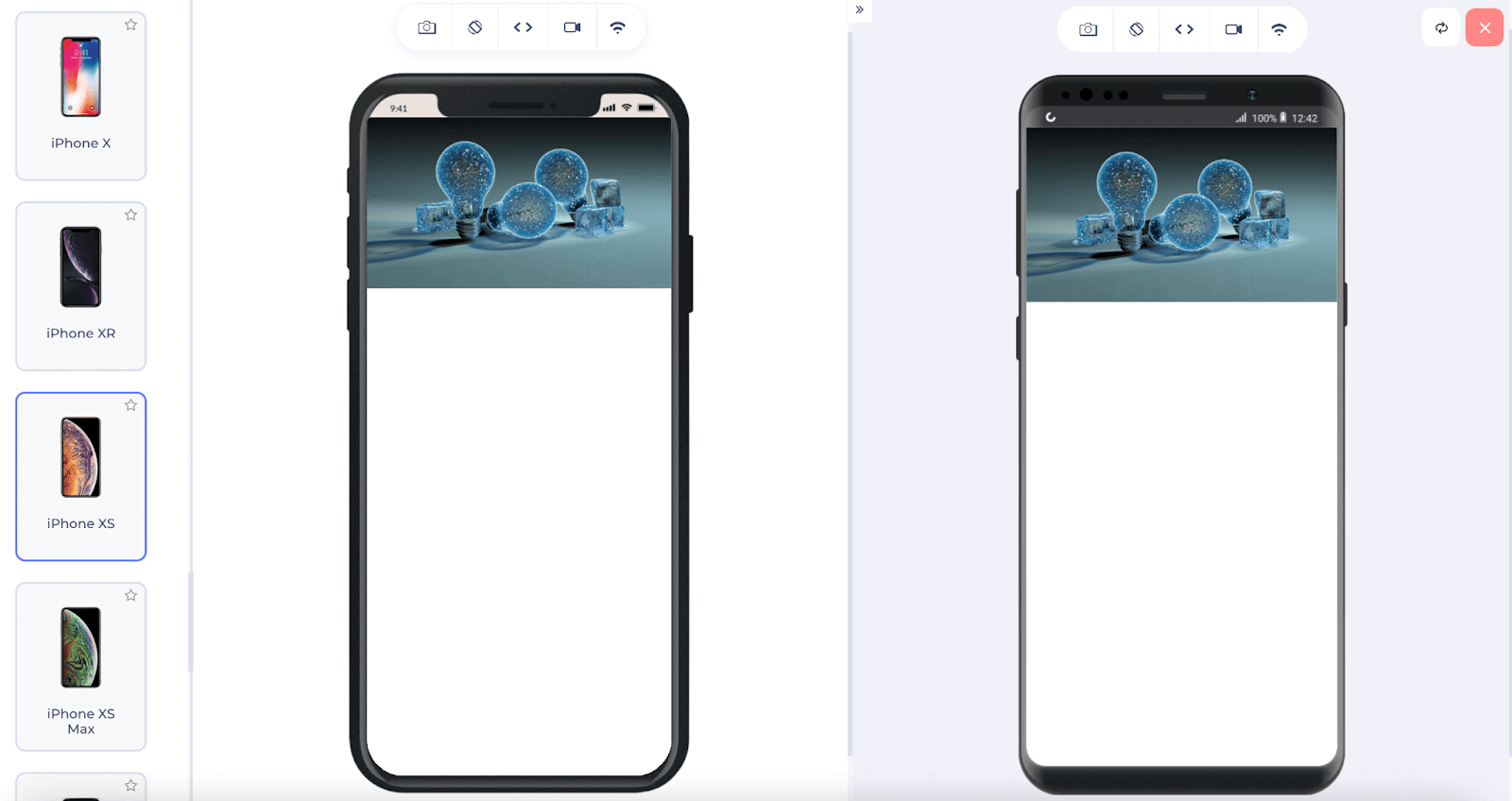
Tim Cook’s statement does not need any proof to be true today. To understand the smartphone revolution, we do not need to go back decades. Analyzing the previous five years of data gives a clear picture. And not only smartphones but everything in “the digital world” around us (or simply products that contain a screen) has also evolved. For instance, televisions come with a browser now and can open any website. E-book readers come in sizes that are neither equal to a tablet nor a mobile device. If we wish to open a website, the most common options look as follows:
In these represented devices, the content is the same, meaning the backend code is almost similar. What differs is the screen size and the representation of the website (front-end). The viewable area in which we see a web application is the viewport of the device and plays an important role in determining how our website will appear on the user’s device. This small metric is so important that CSS has included a bunch of new measurement units referring to the viewport.
In this article on CSS viewport units, let’s discuss various issues and their importance in web development. Moreover, we will look at the various measurement units available in CSS to render the website according to the CSS viewport units. But first, let’s briefly understand why the CSS viewport unit is so important.
If you are a beginner in CSS? The best CSS cheat sheet is available here.
TABLE OF CONTENTS
What is a viewport?
Before bringing the CSS viewport unit into the picture, let’s first understand what “viewport” means. A viewport is an area that is currently visible on the device. For example, since this line is visible to you currently as you are reading it, it falls in the viewport section. At the end of this page is the “Book A Demo” button, which might not be visible to you. Hence, it does not fall in the viewport as of now.
Does that imply that the viewport size is whatever our device’s screen size is currently? A short JavaScript code will allow us to verify that:
|
1 2 3 4 5 6 7 8 9 10 11 12 13 14 15 16 17 |
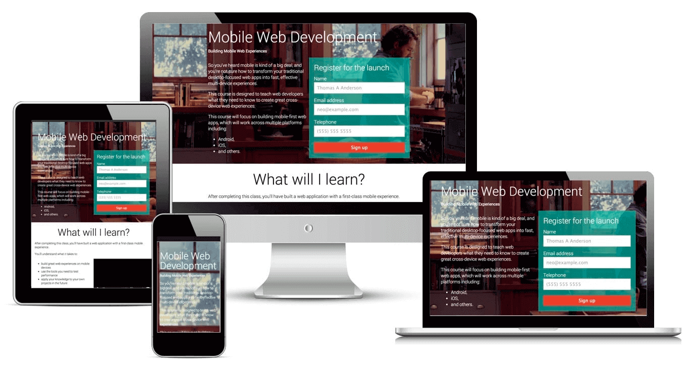
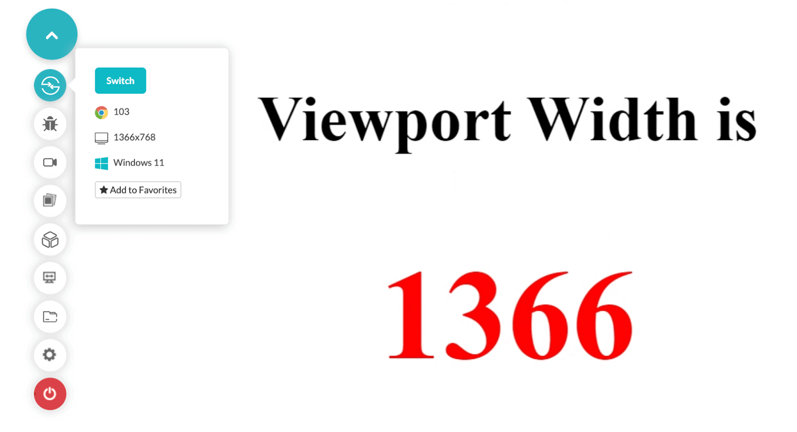
<!DOCTYPE HTML> <head> <title>Viewport Calculation</title> <script> window.onload = function() { var vp_width = window.innerWidth; document.getElementById("viewport_width").innerHTML = vp_width; }; </script> </head> <body> <br><br> <center> <h1> Viewport Width is <span><h1 id = "viewport_width" style = "color: red"></h1></span></h1> </center> </body> </html> |
Run this code on your desktop browser and you will see the following result:
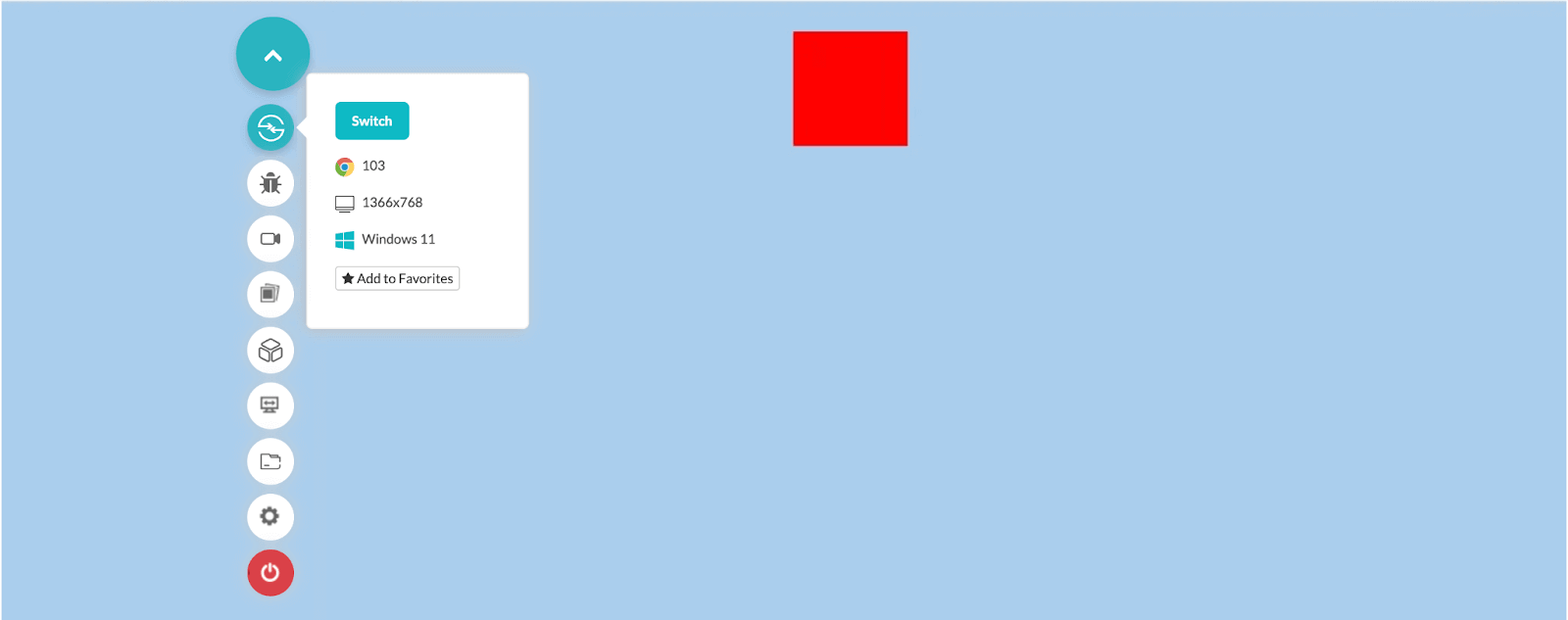
I have used the LambdaTest cloud platform to render this website on the device specification of my choice. As you may observe from the left tool panel, the screen resolution I selected before rendering the web page is 1366×768. The same number is represented on the web page.
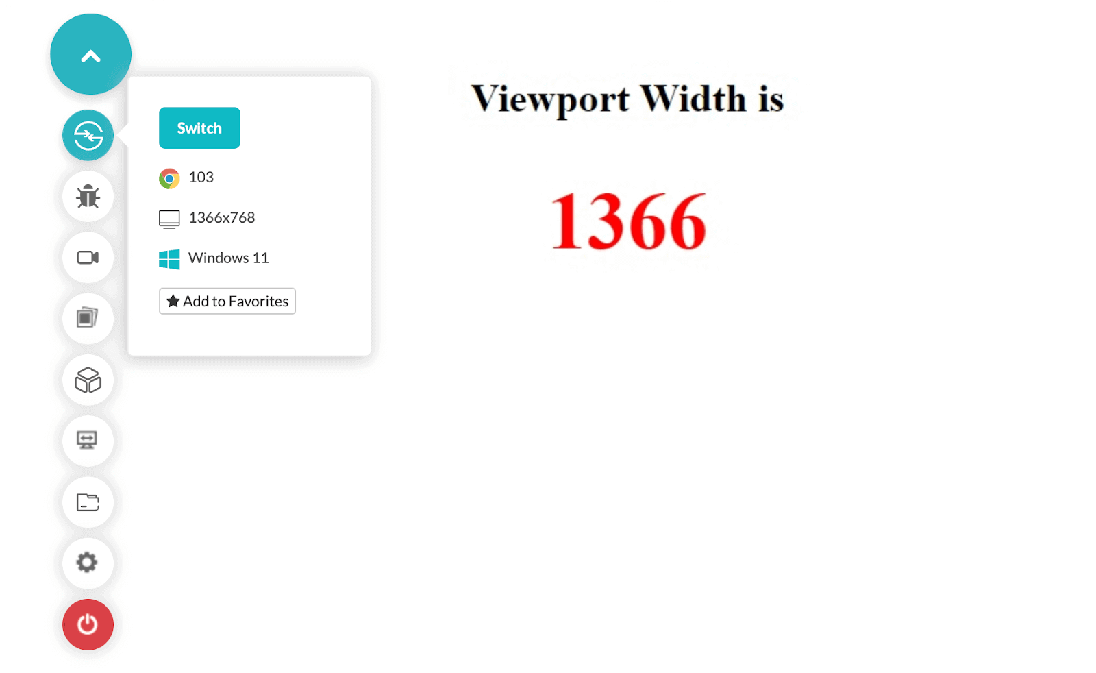
Scroll down the window and reload the page to check the new CSS viewport unit.
The CSS viewport unit number changed since a lesser amount of area was visible to the user. This demonstrates that when we talk about the CSS viewport unit, we generally talk about the website’s area that is visible to the user and not the screen’s width. This viewport is generally termed the “layout viewport”.
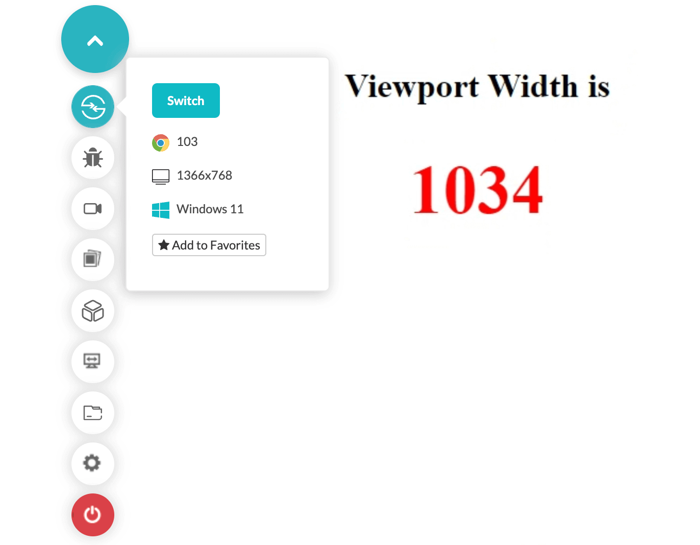
What would happen if we zoom this page by 250% above its original size? Can you guess the CSS viewport unit result then?
The CSS viewport unit changed without scrolling the window. Therefore, with this, we settle on two simple points when we talk about viewports:
- The screen width of the device does not mean that it is and will always remain the de facto viewport for our website.
- The browser width of the device does not mean that it is and will always remain the de facto viewport for our website.
If you observe the above code, you’ll notice that we took advantage of the following JS feature to render the web page:
window.innerHeight
Contrary to this, we also have
window.outerHeight
To understand its implementation, let’s rewrite the script tag in the below code as follows:
|
1 2 3 4 5 6 |
<script> window.onload = function() { var vp_width = window.outerWidth; document.getElementById("viewport_width").innerHTML = vp_width; }; </script> |
Now render this web page on your browser and magnify it to 250%. Observe the final result:
It still shows the same width as it would on 100%. This is because when we select windows.outerWidth, it considers the browser boundaries as well while considering the CSS viewport unit size. Since the browser screen remains constant when we zoom the web page, we get the same number.
With the introduction to both of these functions, we can remember that if we are dealing with the viewports as a developer or a tester, we are considering the innerWidth as it gives us an accurate idea.
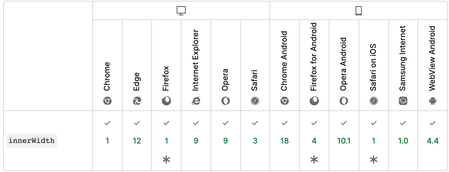
Browser compatibility of the window.innerWidth
The function window.innerWidth is supported in each browser from very early versions.
Common issues when viewport testing is ignored
In the initial days of web development, people were not concerned about the CSS viewport unit in their development cycle. The reason behind this was the standard screen size of the personal computers sold to the customers. But with the rise of mobile device responsive designs, developers are forced not just to see how their web page would look on different devices but how the web page would react with the user actions related to the viewport.
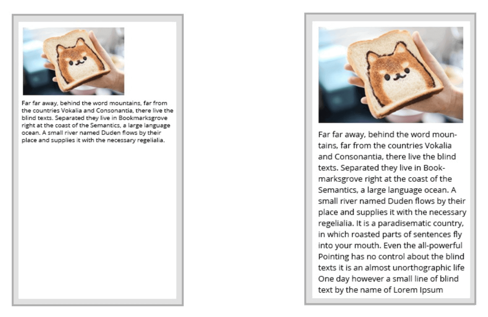
Fitting content according to the screen
Without any special attention to the CSS viewport unit, the website could look like the image represented on the left, whereas it should look like the image represented on the right:
This can be managed by adding just one meta line as follows:
|
1 |
<meta name="viewport" content="width=device-width, initial-scale=1.0"> |
However, this one line is not enough for each browser. It just takes care of scaling the elements according to the viewport width. The use cases discussed ahead might not be corrected by this.
Adjustments of images according to the screens
Background images can create design issues when we render the same web page on a device with different screens. For example, this image is displayed on a large screen laptop of 1366 width and looks perfect.
Whereas, if I render the same web page on a mobile device, I get the following result:
This is not the behavior we expected. The expected behavior is to cover the complete page with the image we see on the bigger screens.
Centering element problem
Centering an element on different browsers is another problem you might encounter if you have not tested your viewport-related issues. An element centered perfectly during development may lose its coordinates very easily on a smaller or larger device.
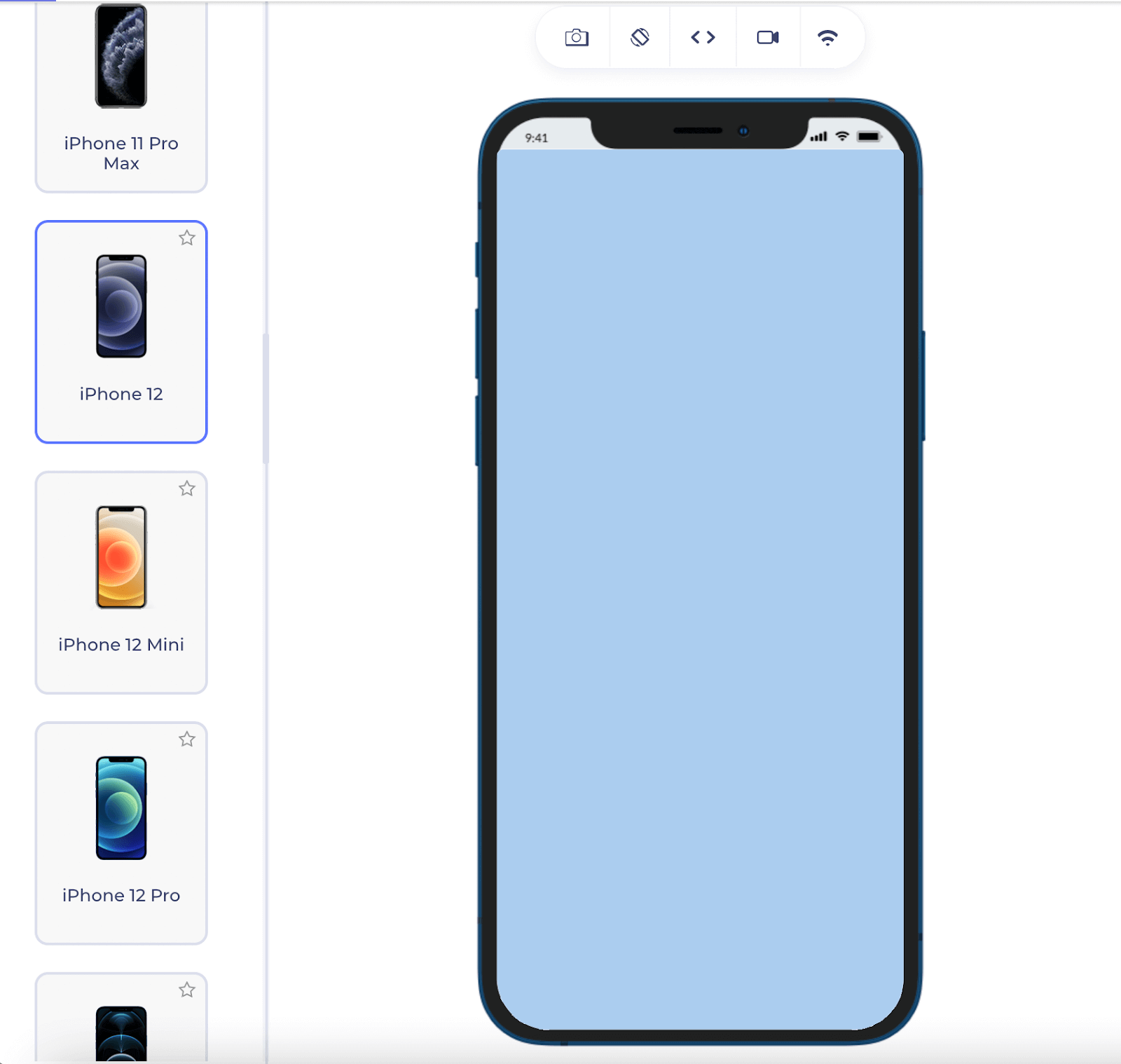
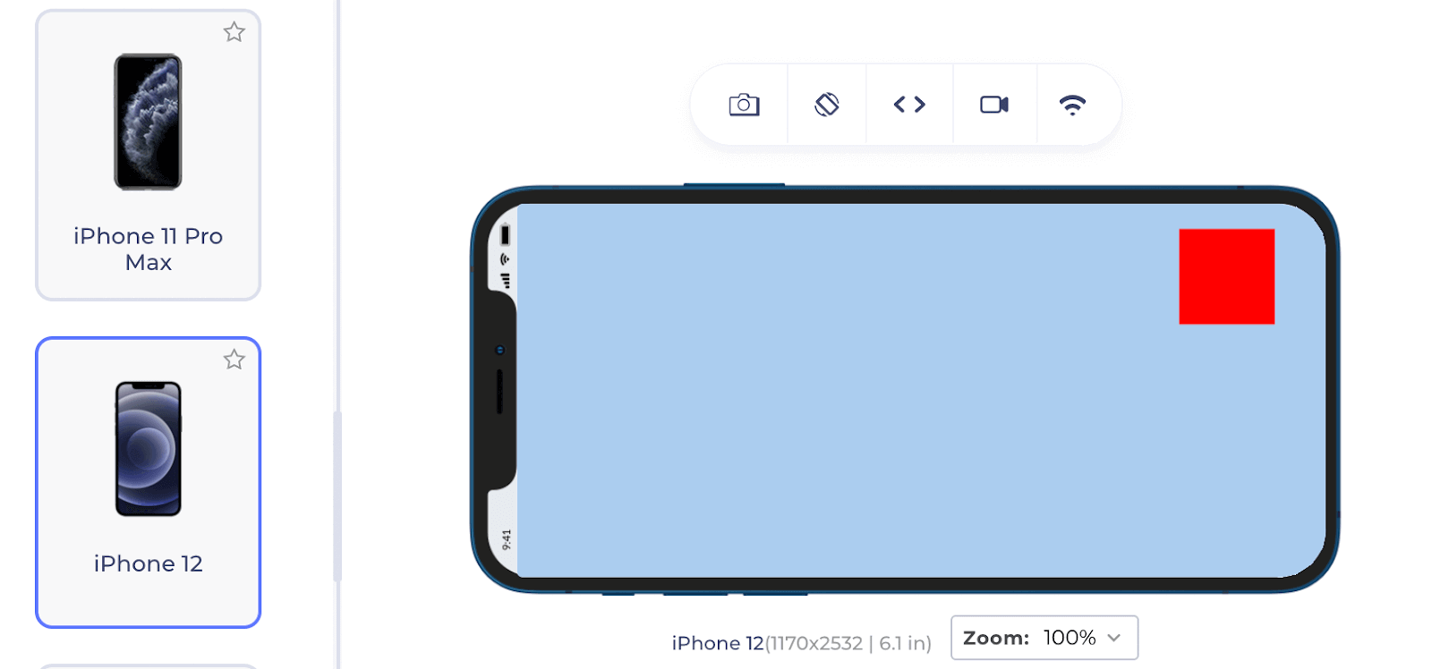
For instance, if I draw a small div box on a web page and center it, it looks alright:
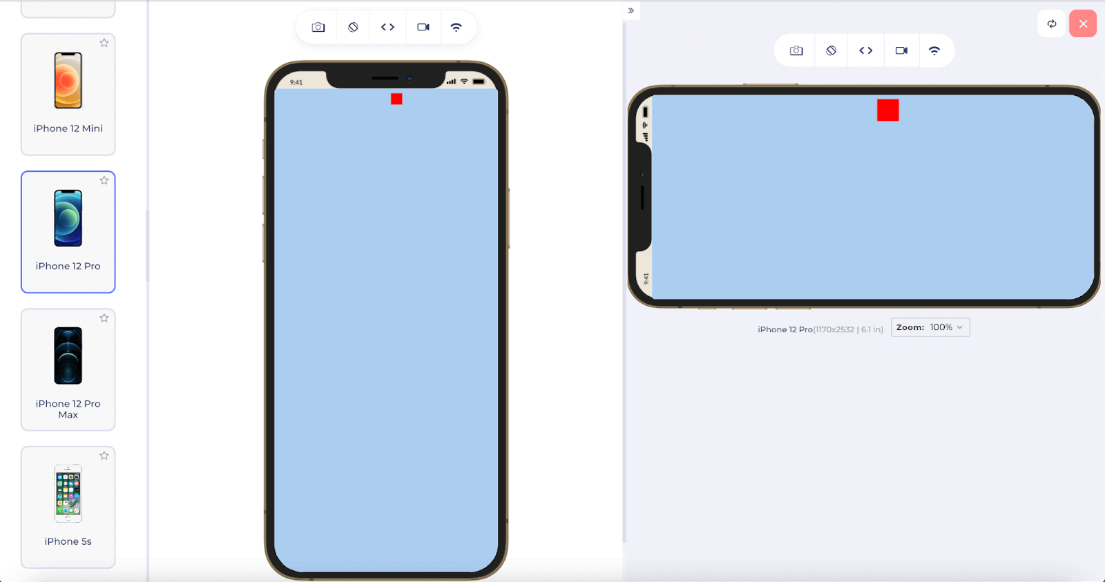
The same web page looks as follows on an iPhone12:
That’s right! It floats away from the viewport. If I rotate the screen using the “Rotate Screen” feature on the LT Browser, you can see the box but largely out of proportions:
There are a few arrangements that can keep the box inside the viewport, I agree, but the current focus is always to keep it in the center. Also, maybe we can rescale the box’s dimensions according to the viewport. This task needs CSS viewport unit testing explicitly.
Subscribe to our LambdaTest YouTube Channel and stay updated with the latest tutorial around Selenium testing, Cypress E2E testing, Playwright testing, and more.
Headline fit issue
It becomes difficult for developers to change the headlines in a web application that displays a lot of content, like this website. The issue is that when the web page is rendered on devices with smaller screens, the headline adjusts itself according to the viewport, and so does all the content beneath it.
For instance, the following is how a headline would look on a blog/newspaper web page:

Code used for this web page:
|
1 2 3 4 5 6 7 8 9 10 11 12 13 14 |
<!DOCTYPE HTML> <head> <title>Viewport Calculation</title> <style> #headline { font-size: 110px; } </style> </head> <body style="background-color: #abcdef;"> <br> <p id = "headline">This is my headline element</p> </body> </html> |
This would become as follows on iPhone XR and Samsung Galaxy S9+:
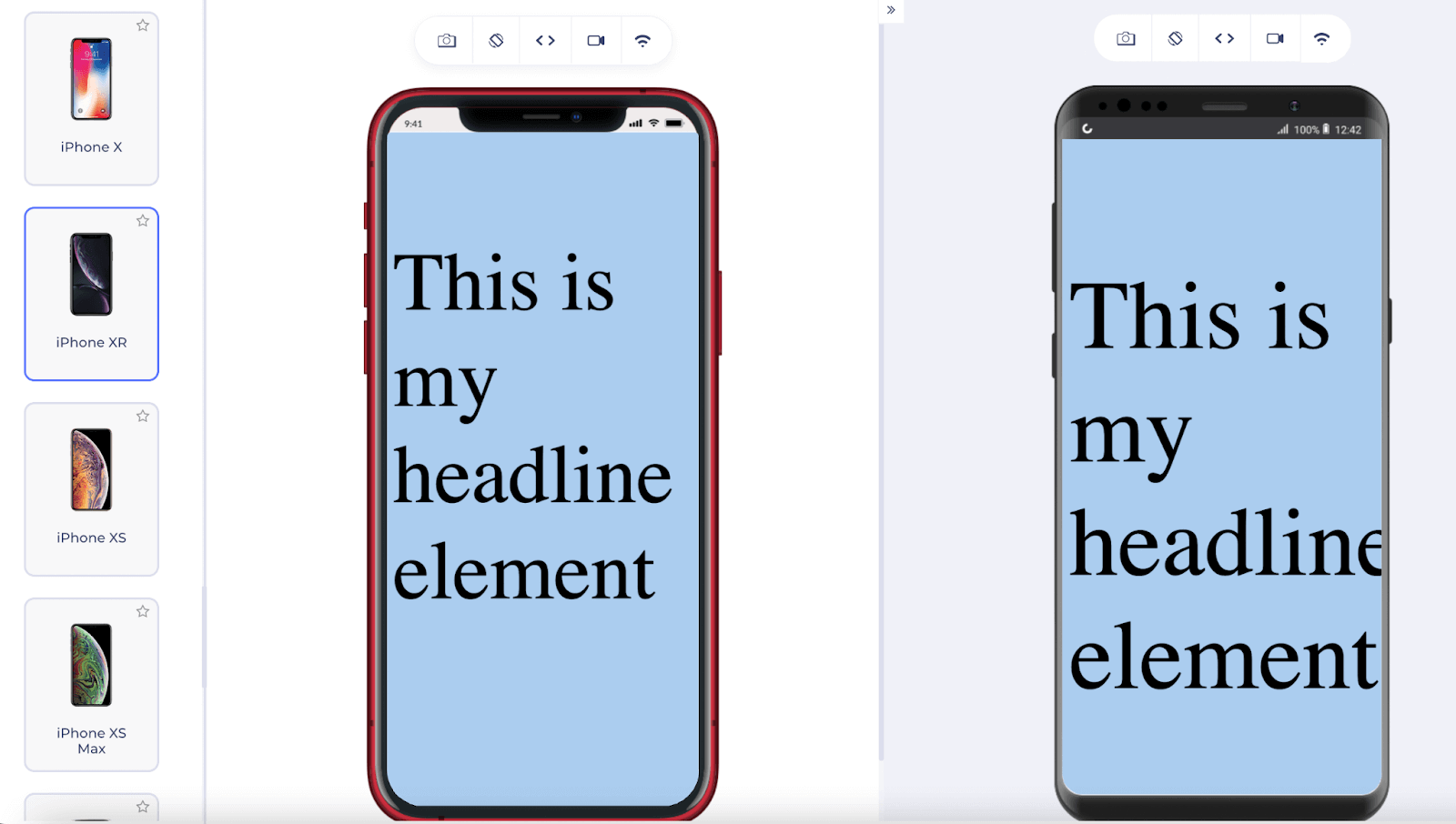
As a developer, I do not think any other developer would want such a render on a user’s phone. This becomes even worse for headlines that are longer.
Understanding viewport units
The issues discussed in the above section more or less concentrate on how elements resize wrongly when the viewport (or simply the device screen) has resized. This is not a rare problem, and millions of developers suffered from this when markets were flooded with devices that could fit in our hands. As a result, CSS viewport unit contributors and developers have incorporated a newer unit system for viewport-related things. These units are called viewport units and constitute the following:
- vw
- vh
- vmin
- vmax
VH – Viewport Height
The “vh” unit is called viewport height which refers to the height of the viewport. Here 1vh means 1% of the viewport height. Subsequently, nvh means n% of the viewport height.
With this information, we can make little adjustments to the headline element problem and present the headline to the user according to the device size. For a smaller screen, the headline font size should adjust automatically and give a similar feel.
Code Used:
|
1 2 3 4 5 6 7 8 9 10 11 12 13 14 15 16 17 18 19 20 21 |
<!DOCTYPE HTML> <head> <title>Viewport Calculation</title> <style> #headline { font-size: 5vh; } #headline_box { height: 50vh; width: 100vw; } </style> </head> <body style="background-color: #abcdef;"> <br> <div id = "heading_box"> <p id = "headline">This is my headline element. It is representing the headline for the day.</p> </div> </body> </html> |
Desktop render:
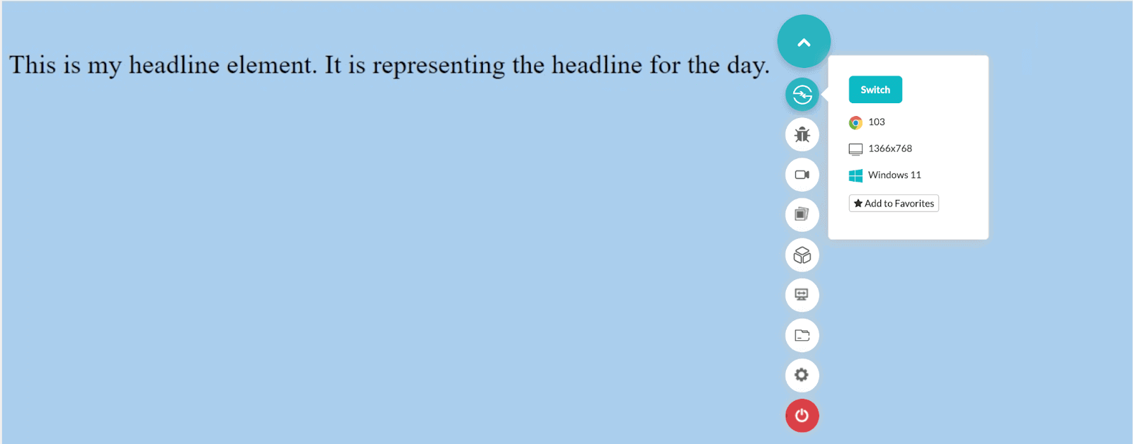
Mobile render:
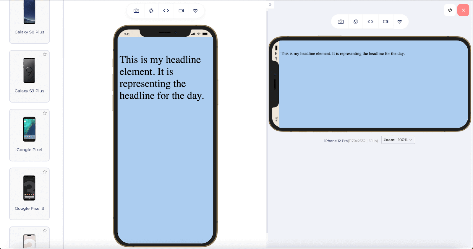
As seen, the font size adjusts automatically and looks perfect on the portrait as well as landscape elements on a mobile device.
In this unit, scrollbars are not assumed to exist and hence are excluded from the calculation.
VW – Viewport Width
A similar unit working on the other dimension is the viewport width, which is referred to as “vw”. Similar to vh, the unit vw refers to 1% of the viewport width. This means a value of 50vw would correspond to half of the screen’s width.
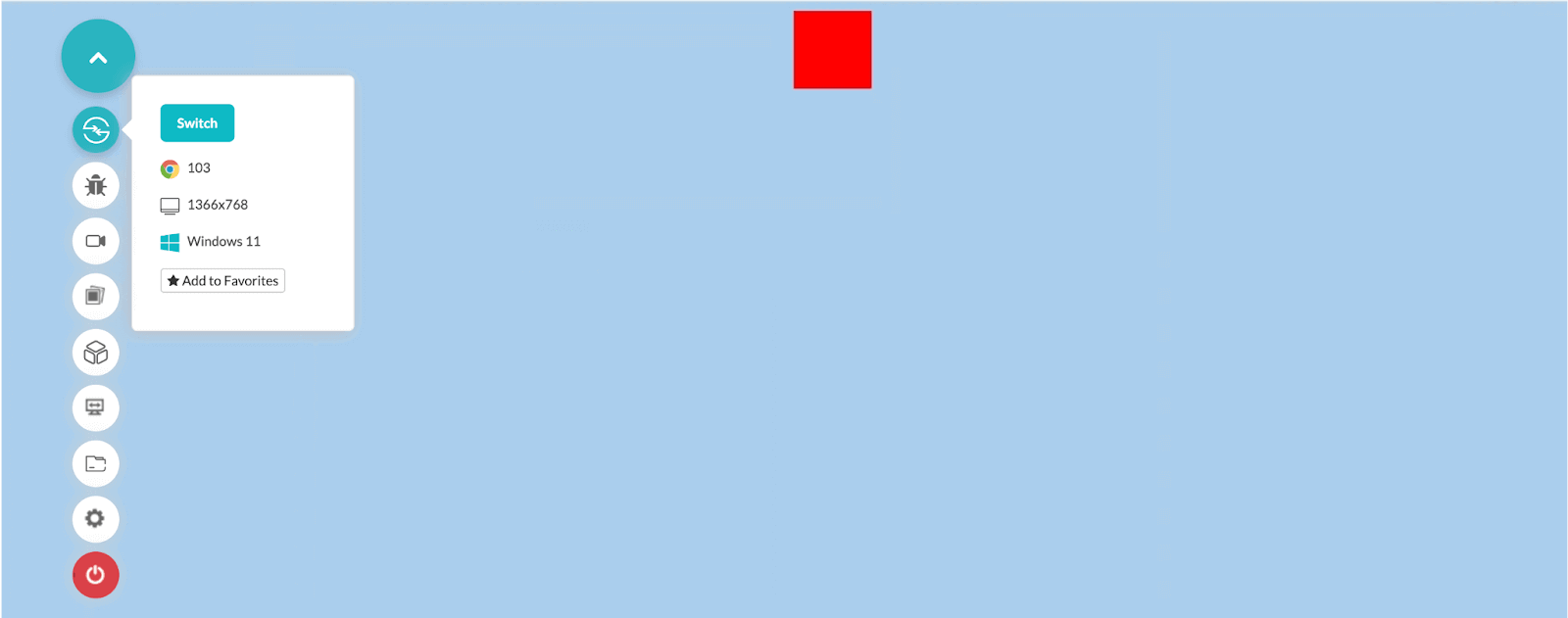
Using “vw” is a perfect use case when we need to center things along the line of another element. For example, in the issues discussed above, the centering of the circle issue can be resolved easily by using the vw viewport unit.
Code used:
|
1 2 3 4 5 6 7 8 9 10 11 12 13 14 15 16 17 18 |
<!DOCTYPE HTML> <head> <title>Viewport Calculation</title> <style> #centering_rectangle { margin-left: 50vw; background-color: red; width: 5vw; height: 5vw; } </style> </head> <body style="background-color: #abcdef"> <div id ="centering_rectangle"></div> </body> </html> |
Output on a bigger laptop screen:
On a mobile screen:
Notice the code used in this section also refers to the dimensions of the rectangle in terms of vw. This is because fixed dimensions may keep only the left margin in place, and the rectangle would not look as if in the center. If only one CSS viewport unit property (like the left margin here) is your design concern, then you can use any of the dimensions for that here.
VMIN – Viewport Minimum
The vmin unit refers to the “viewport minimum” concept. When we use the vmin unit, it checks out the absolute minimum number between the viewport height and viewport width. The final selected number is then applied to the element.
|
1 |
minimum(viewport height, viewport width) |
A value of 5 vmin would mean a minimum of 5 percent of the viewport width and 5 percent of the viewport height. Using vmin is handy when you have to make one element with reference to another. For example, in this image, the middle center is about the outer red-colored rectangle.
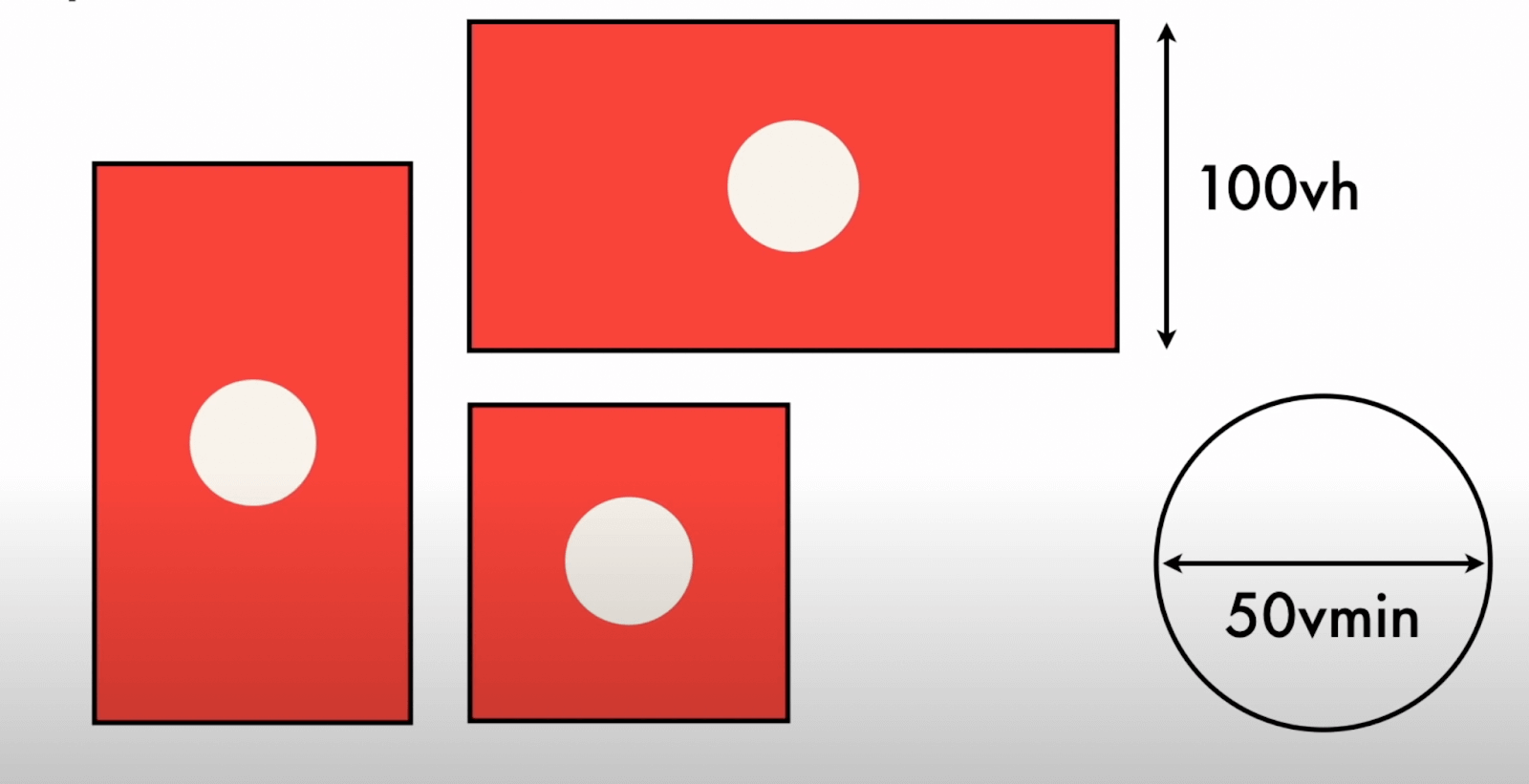
This image shows three rectangles, all in different shapes. Here, the first one is in portrait mode, so we need to consider the equal distance from the left and right, which is lesser than the top and bottom. If we take the radius according to the width, it will go out of proportion when landscape mode is enabled, as shown in the second rectangle.
The third rectangle is a square, so any of the vh or vw would have worked. But, vmin helps us cover all the cases here.
VMAX – Viewport Maximum
Opposite the vmin unit is the vmax unit corresponding to the viewport maximum. Here, the maximum viewport height and viewport width are considered the final metric for implementation.
|
1 |
maximum(viewport height, viewport width) |
If a developer writes 5vmax, then the final selected value is the maximum of 5 percent of the viewport width and 5 percent of the viewport height. This viewport unit comes in handy when we need a reference to the viewport height, such as headline font size. If the user rotates the screen and we want headlines to become a little bigger, we can apply font size in viewport height.
In web development, developers can also implement the calc() function and calculate the value depending on the situation. It can also be used along with the viewport units. A complete guide on the calc function can help you start on the same concept and determine the key differences and how to mix viewport with it for a better design in the elements.
Browser support for viewport units
Viewport units are a popular choice for developers and are supported in all the major browsers, including their mobile versions.
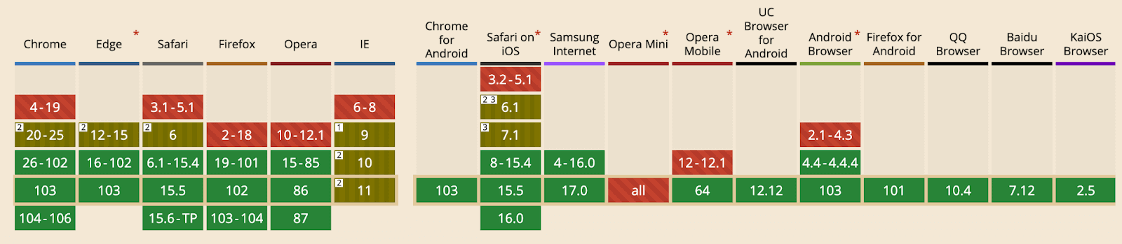
Its global usage stands at 98.18%.
Difference between percentages and CSS viewport units
A common question I often find on the community channels is the confusion between percentage units and viewport units. In simpler terms, is the following code:
|
1 |
height: 100%; |
And this code:
|
1 |
height: 100vh; |
Similar in their working? Since 100% does make it feel like 100% of the screen size, just like 100vh, this question is natural to pop up during web development. But before answering, let’s put these two units into practice with two different codes to understand.
The following code puts a background-image with 100%:
|
1 2 3 4 5 6 7 8 9 10 11 12 13 14 15 16 17 18 19 20 21 22 23 24 25 |
<!DOCTYPE HTML> <head> <title>Viewport Calculation</title> <style> #centering_rectangle { margin-left: 30vw; width: 25vw; height: 15vw; } #child_div { background-image: url('background-photo.jpeg'); width: 100%; height: 100%; background-size: cover; } </style> </head> <body style="background-color: #abcdef"> <div id = "centering_rectangle"> <div id = "child_div"> </div> </div> </body> </html> |
Result:

Code Run-through:
In the above code, we make a div box and define its height and width as 15vw and 25vw. Then we make another child div box and apply its background image with 100% width and 100% height.
Now let’s make a slight change in the div line and change the percentage values to vw and vh as follows:
|
1 2 3 4 5 6 |
#child_div { background-image: url('background-photo.jpeg'); width: 100vw; height: 100vh; background-size: cover; } |
You can keep all other elements the same as the above code.
Result:

This image extends to the right as well. So, with just a small unit change, we see a huge difference. The basic thing to note here is how the child div has perceived the values with respect to the parent div. When a unit is defined in percentage terms, it corresponds to the percentage value with respect to its parent element. If the parent div had not been present, 100% and 100vh would mean the same thing.
On the other hand, when we write the unit as viewport terms, it does not matter whether the element has a parent. The calculations are done on the viewport numbers, which are fixed, as we saw throughout the post. However, the starting position of the child div depends completely on its parent. Therefore we see the image started from the top-left element of the parent element.
Apart from the percentage terms, another rescaling feature that helps in responsive design is media queries. However, it would not be feasible to discuss them in detail in this post. Please refer to our complete guide on CSS media queries with examples for a better view.
Testing your viewport units on multiple browsers
In this post, I used different browsers to render the website in different situations to bring out a consistent output. However, all these browsers are not installed on my system, and it becomes tiresome when there are so many versions and browsers on the market. But as a developer, we can’t risk any of them and need to test them before releasing them to the end-user. This can be done with an online cross browser testing platform like LambdaTest.
We can conduct web testing on an online browser farm of more than 3000+ real browsers, operating systems, and devices, including smartphones, tablets, and desktops. This enables us to test a website’s responsiveness across many operating systems and browsers.
With Real-time testing, I get to select any of the browsers and versions on their infrastructure and render the website within seconds without installing anything. One browser and internet connection are enough when it comes to such platforms. To perform Real Time Testing, follow the below steps:
Step 1: Login to your LambdaTest account. Sign up for free if you don’t have an account.
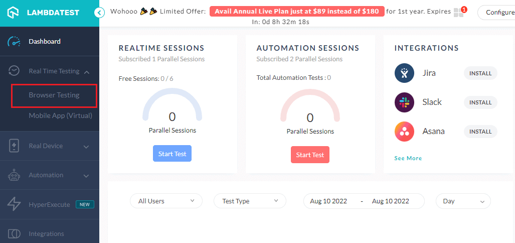
Step 2: Click the Real Time Testing > Browser Testing option from the left panel.
Step 3: Enter the URL you wish to render, choose Desktop/Mobile, select the browser, browser VERSION, OS, and RESOLUTION, and press START.
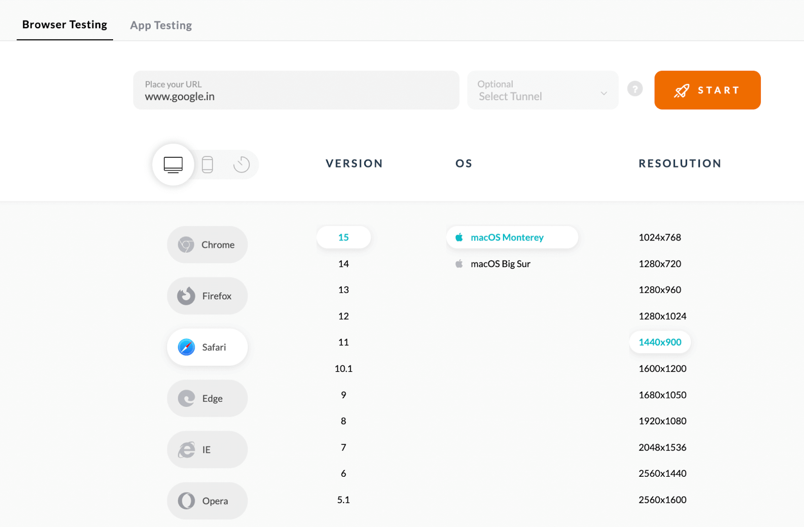
If your website is currently unpublished, you can use LambdaTest’s local tunnel feature to leverage their infrastructure connected to your local server.
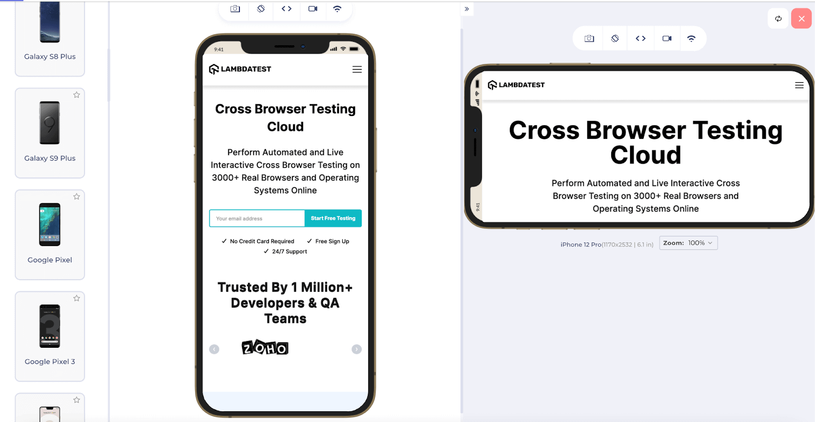
For your responsive testing needs, the LambdaTest platform also offers LT Browser, a mobile-friendly tester tool to test websites for responsiveness across different viewports for mobile, tablet, desktop, and laptops.
For any specific queries, you can contact the support section available 24×7.
Wrapping it up
The viewport of the device has started to play a mainstream role in website development as well as mobile manufacturing. With responsive design climbing the ranks of priority, observing the change with viewport is important. CSS developers and contributors have thought about it and finally considered that just the percentages and em notations are not enough. You may work around them, but it still becomes hard and not fail-proof in future mobile releases.
Viewport units are the way to go through when you only need to render your element according to viewport dimensions. These units are vh, vw, vmax and vmin. This post discussed their implementation, importance, and why viewport units are a better option to go. Moreover, we looked at the differences you may see when you mistakenly implement viewport units instead of percentages. With this small summary, I hope you can summarize all our implementations discussed above. For any comments or suggestions, do let us know in the comment section. Thank you for your time.
Frequently Asked Questions (FAQs)
What is 100vh in CSS?
It should work if you give the body element min-height: 100vh. The use of min-height rather than height will allow the body element to grow even further if necessary, but the usage of 100vh here ensures that the initial body height will consume 100% of the viewport height.
What is VW and VH in CSS?
The units that are permitted are:
- vw: viewport width in hundredths.
- vh: viewport height in hundredths.
- vmin: a tenth of the viewport’s width or height, whichever is smaller.
- vmax: a tenth of the viewport width or height, whichever is larger.
What is viewport meta?
The viewport meta element instructs the browser that the “Full Width” of the page should be taken into account as being the width of the screen. i.e., whether you are using a desktop or a mobile device, regardless of the width of the device, the webpage will adapt to the user’s device’s width.


Author’s Profile
Harish Rajora
I am a computer science engineer. I love to keep growing as the technological world grows. I feel there is no powerful tool than a computer to change the world in any way. Apart from my field of study, I like reading books a lot and write sometimes on https://www.themeaninglesslife.com .
Blogs: 103
Got Questions? Drop them on LambdaTest Community. Visit now


