
What Are Layouts In Android?: Everything You Need To Know
Tanay Kumar Deo
Posted On: November 23, 2023
 37439 Views
 17 Min Read
Mobile applications are increasing at a rapid rate. A report published on Statista shows that 255 Billion mobile apps were downloaded in 2022. With increased demand for mobile apps, the demand for mobile app developers is also growing.
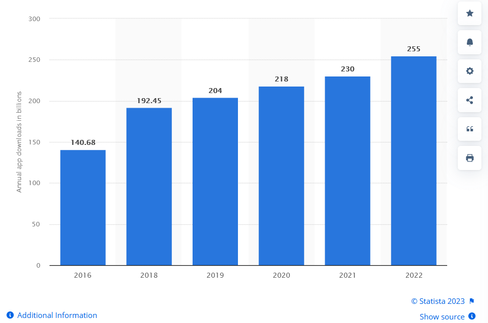
Number of mobile app downloads worldwide from 2016 to 2022
Since Android is one of the market leaders in the operating system space for mobile, this blog aims to discuss “Layouts in Android”. By the end of this blog, you can build simple and complex Android screens by yourself. We will cover various Views and ViewGroups along with appropriate examples to help you understand Layouts in Android.
TABLE OF CONTENTS
What are Layouts in Android?
Layout refers to the arrangement of user interface (UI) elements on the Android app’s screen, like buttons, texts, images, etc.
Layouts in Android are primarily used to define the UI and widgets that appear on the screen of an Android app. These layouts are very crucial in Android apps as they act as the bridge between the user’s actions and the app’s logic. As soon as the user interacts with any layouts in Android (e.g., Buttons, ImageViews, EditTexts, etc. ), the Java/Kotlin program detects these interactions using pre-defined methods like OnClick, OnDoubleClick, etc.
Layouts in Android are usually defined in two primary ways:
- Define UI elements in the respective layout XML file.
- Create elements directly in the Java/Kotlin file dynamically.
Generally, defining layouts in the respective XML file is a good practice. It is an officially recommended method as it helps us keep the UI and app’s logic separate and hence enhances the app’s Scalability. Android Studio offers a design editor for XML files where we can preview our design and edit them by drag and drop option. When we open any XML layout file, the design editor opens by default. Hence in this article, we will primarily use XML files for Layouts in Android.
 Note
NoteTest on 3000+ real devices for Android and iOS, including the latest iPhone 15. Try LambdaTest Today!
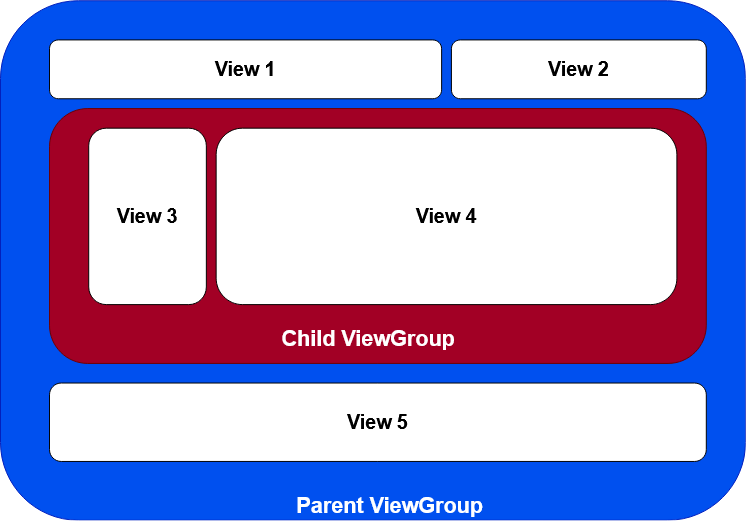
All elements in the layout are created using a hierarchy of View and ViewGroup objects. A View is used to create something the user can see and interact with. While a ViewGroup is an invisible container that contains and defines the layout structure for other View and ViewGroup objects. An example of such a hierarchy can be seen in the Image below.
View Layouts in Android
The View is a base class for all the UI elements in Android apps, and it is used to build interactive UI components such as TextView, EditText, Button, Checkbox, RadioButton, ImageButton, ProgressBar, and ImageView. It is also responsible for creating dynamic or static elements on the screen and event handling for interaction with the user.
There are many View Layouts in Android, but listed below are some commonly used View layouts to build UI elements.
TextView Layout in Android
In Android, TextView is a user interface element used to display and set the static and dynamic text on the user screen based on our requirements. The TextView element acts like label control, and it doesn’t allow users to edit the text.
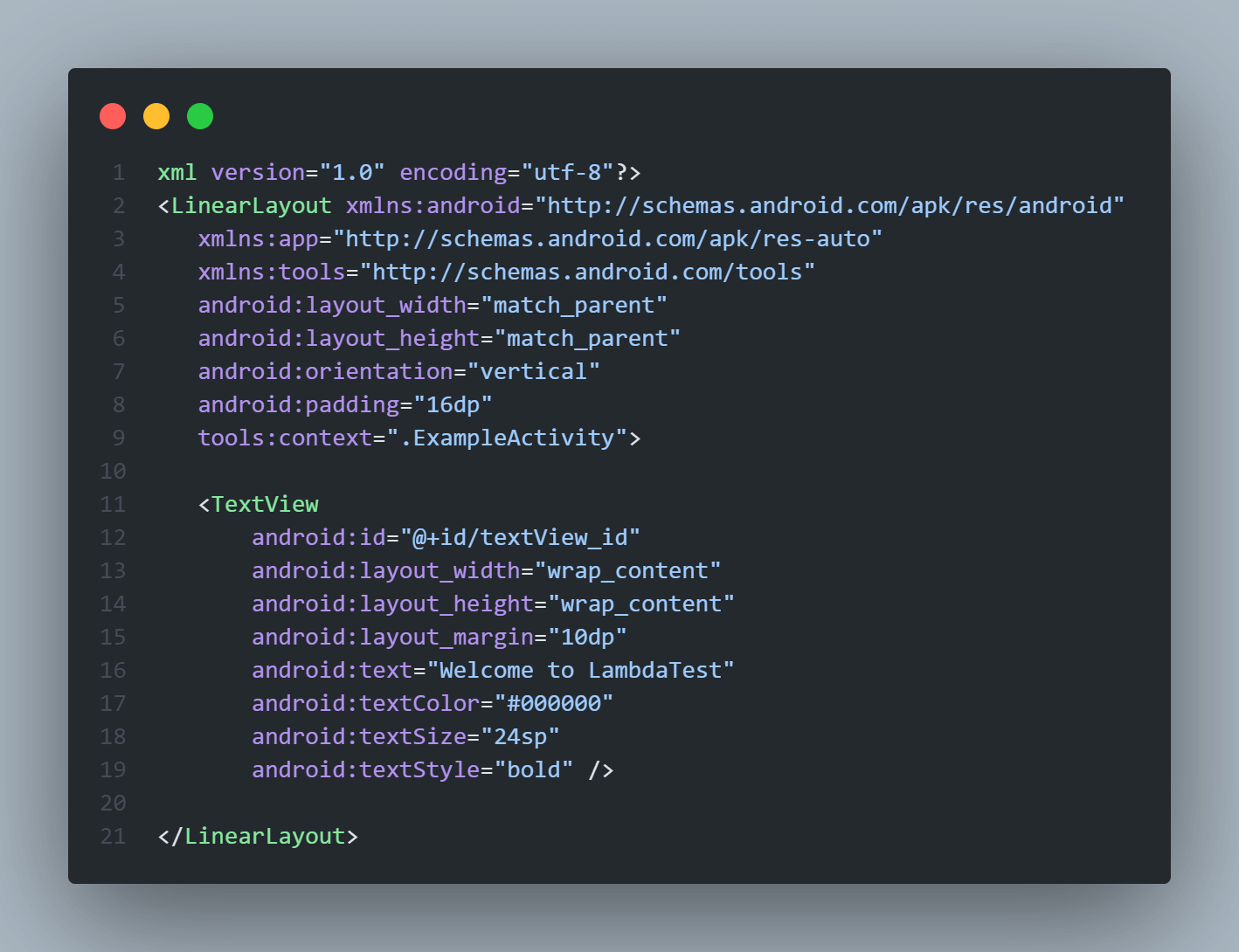
Create TextView in an XML layout file
|
1 2 3 4 5 6 7 8 9 10 11 12 13 14 15 16 17 18 19 20 21 22 23 |
<?xml version="1.0" encoding="utf-8"?> <LinearLayout xmlns:android="http://schemas.android.com/apk/res/android" xmlns:app="http://schemas.android.com/apk/res-auto" xmlns:tools="http://schemas.android.com/tools" android:layout_width="match_parent" android:layout_height="match_parent" android:orientation="vertical" android:padding="16dp" tools:context=".ExampleActivity"> <TextView android:id="@+id/textView_id" android:layout_width="wrap_content" android:layout_height="wrap_content" android:layout_margin="10dp" android:text="Welcome to LambdaTest" android:textColor="#000000" android:textSize="24sp" android:textStyle="bold" /> </LinearLayout> |
If you observe the above code carefully, you can see that we have used some attributes in this TextView element. These attributes are used to define the design and style of the layouts in Android and hence are important. Some of these attributes are common and can be applied in almost all the View elements in Android, while some are View specific.
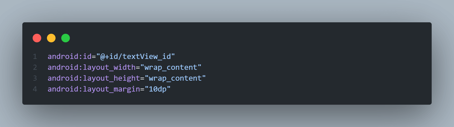
Some common attributes that apply to all the layouts are id (Used to assign a unique ID to the view which can be used later to access them, here ), layout_width (used to define the width of the view, here wrap_content means that width will be minimum to cover the whole content inside it), layout_height (used to define the height of the view), and layout_margin (used to leave margin on the view).
Attributes specific to TextView are text (used to define the text that will be shown on the UI), textColor (used to set the text color), textSize (defines the font size of the text to display), and textStyle (used to define the text style like bold or italic).

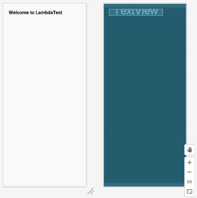
Emulator Output:
EditText Layout in Android
EditText is a user interface element that allows the user to input and modify text/numbers through it. It is an extended version of the TextView element with few additional features and is used to let users enter input values.
Create EditText in an XML layout file
|
1 2 3 4 5 6 7 8 9 10 11 12 13 14 15 16 17 18 19 20 |
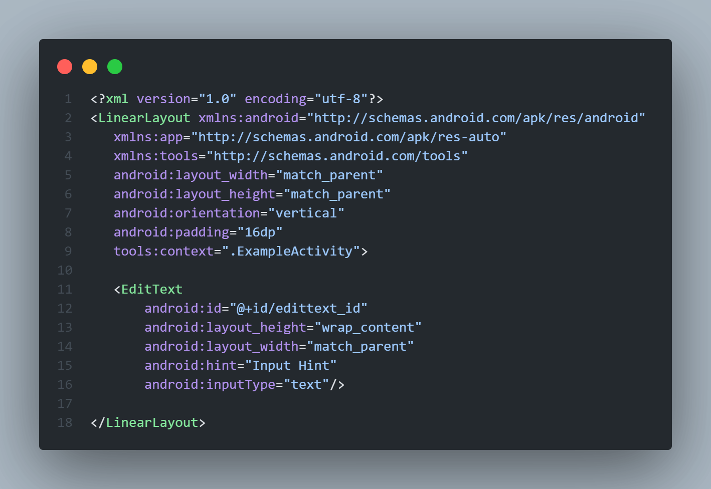
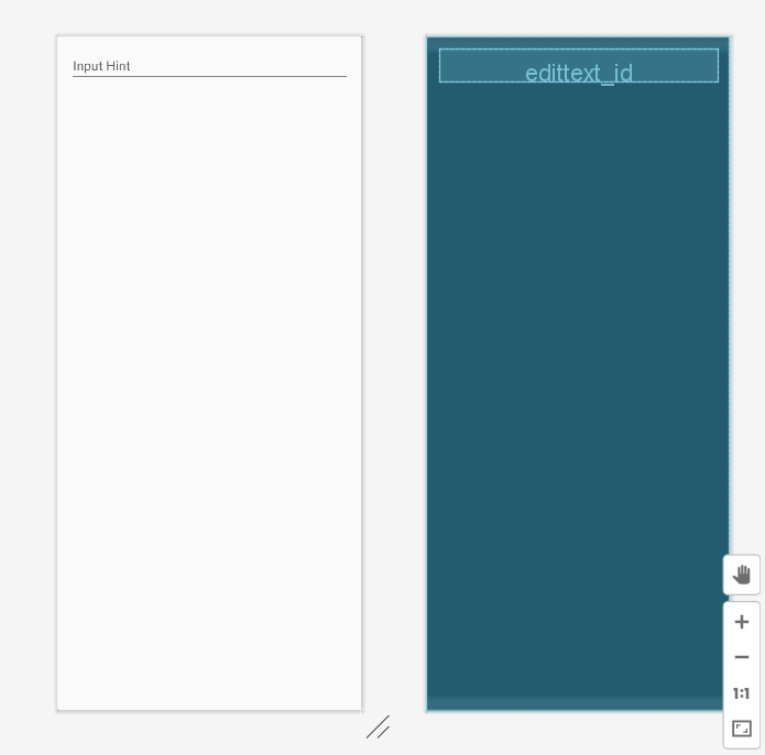
<?xml version="1.0" encoding="utf-8"?> <LinearLayout xmlns:android="http://schemas.android.com/apk/res/android" xmlns:app="http://schemas.android.com/apk/res-auto" xmlns:tools="http://schemas.android.com/tools" android:layout_width="match_parent" android:layout_height="match_parent" android:orientation="vertical" android:padding="16dp" tools:context=".ExampleActivity"> <EditText android:id="@+id/edittext_id" android:layout_height="wrap_content" android:layout_width="match_parent" android:hint="Input Hint" android:inputType="text"/> </LinearLayout> |
Attributes used in the above code for EditText are as:
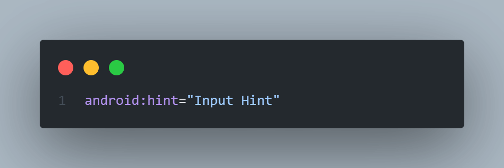
The hint attribute is used to set the hint text into the EditText field. This text will appear in the input box when it is empty.
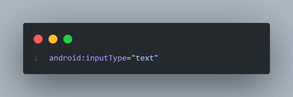
While using EditText control in our Android app, we must define the data type the text field can accept using the inputType attribute. For example, if our EditText should accept plain text, then we need to set the inputType attribute as “text”. In case it is used for a password, then we need to set the inputType as “textPassword”.
Emulator Output:
Button Layout in Android
The Button is a very crucial user interface element. It is used to perform an action whenever the user clicks or taps on it. Generally, Buttons in Android can contain text, icons, or both, or images and perform an action when the user touches it. Whenever the user clicks on any Button, the Button will call an on-click event.
Create a Button in an XML layout file
|
1 2 3 4 5 6 7 8 9 10 11 12 13 14 15 16 17 18 19 20 |
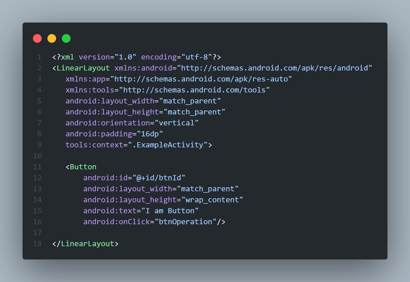
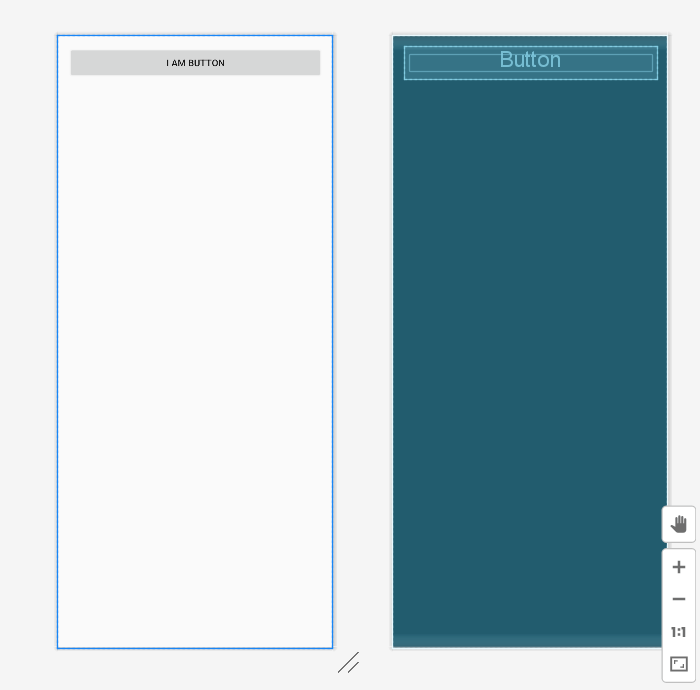
<?xml version="1.0" encoding="utf-8"?> <LinearLayout xmlns:android="http://schemas.android.com/apk/res/android" xmlns:app="http://schemas.android.com/apk/res-auto" xmlns:tools="http://schemas.android.com/tools" android:layout_width="match_parent" android:layout_height="match_parent" android:orientation="vertical" android:padding="16dp" tools:context=".ExampleActivity"> <Button android:id="@+id/btnId" android:layout_width="match_parent" android:layout_height="wrap_content" android:text="I am Button" android:onClick="btnOperation"/> </LinearLayout> |
Attributes used in the above code for the Button are as:
The text attribute is used to set the text on the button. This text will appear on the button.

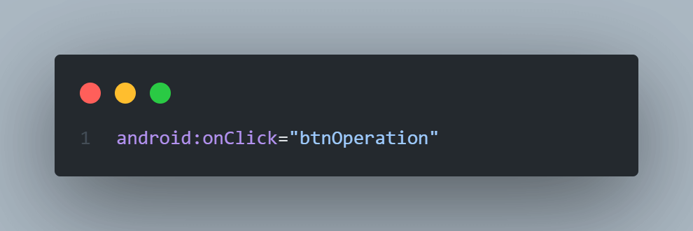
We can define the click event handler for the button by adding the onClick attribute to the < Button > object in our XML layout file.
Emulator Output:
CheckBox Layout in Android
A CheckBox is a two-state button that can be either unchecked (OFF) or checked (ON) and it permits users to toggle between the two states (OFF/ON) based on the requirements. Generally, we can use multiple CheckBox elements in an Android app to let users select multiple options from the set of values. By default, the Android CheckBox is always in the Unchecked (OFF) state.
Create a CheckBox in an XML layout file
|
1 2 3 4 5 6 7 8 9 10 11 12 13 14 15 16 17 18 19 20 |
<?xml version="1.0" encoding="utf-8"?> <LinearLayout xmlns:android="http://schemas.android.com/apk/res/android" xmlns:app="http://schemas.android.com/apk/res-auto" xmlns:tools="http://schemas.android.com/tools" android:layout_width="match_parent" android:layout_height="match_parent" android:orientation="vertical" android:padding="16dp" tools:context=".ExampleActivity"> <CheckBox android:id="@+id/chkBtnId" android:layout_width="wrap_content" android:layout_height="wrap_content" android:checked="true" android:text="LambaTest is Best" /> </LinearLayout> |
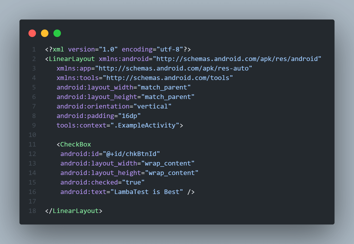
The checked attribute is used to change the state of CheckBox to ON / OFF, if we need to set android:checked = “true” then our CheckBox will be in an ON state, while android:checked = “false” will set our CheckBox to OFF state.
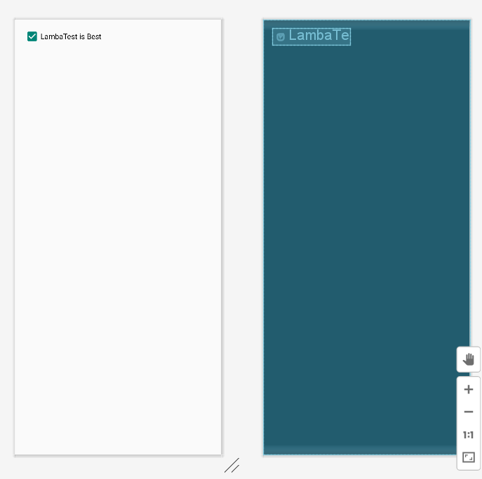
Emulator Output:
RadioButton Layout in Android
The RadioButton is also a two-state button that can have two states either unchecked or checked, just like the CheckBox element, except that it allows only one option to be selected from the group of options. In Android, the CheckBox element permits users to change the state of control to either unchecked or Checked, but the RadioButton can’t be unchecked once it is checked.
We can use RadioButtons inside a RadioGroup to combine various RadioButtons into one group, and it will make sure that users can select only one option from the group of multiple options.
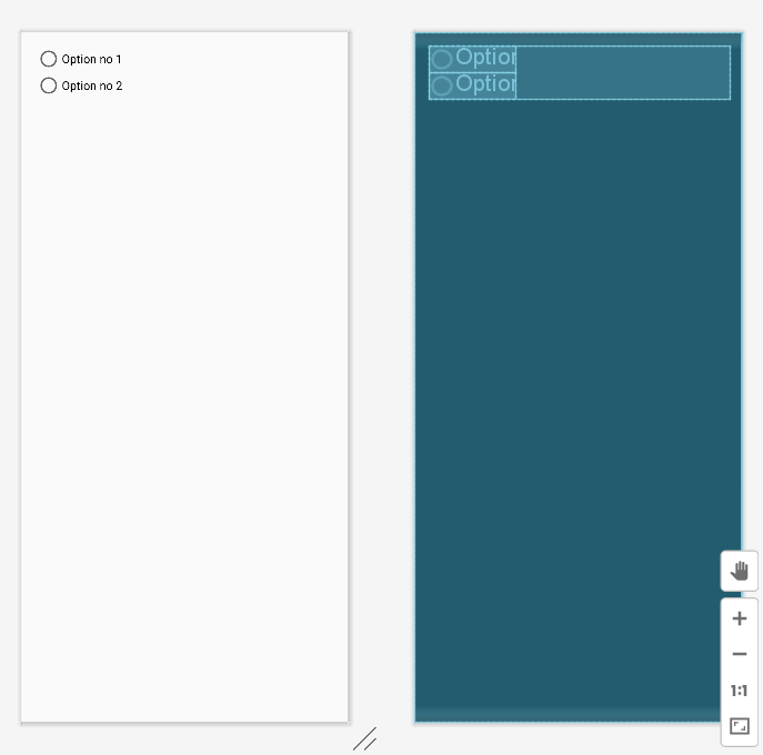
Create RadioButtons inside RadioGroup in an XML layout file
|
1 2 3 4 5 6 7 8 9 10 11 12 13 14 15 16 17 18 19 20 21 22 23 24 25 26 27 28 29 30 31 32 33 34 35 |
<?xml version="1.0" encoding="utf-8"?> <LinearLayout xmlns:android="http://schemas.android.com/apk/res/android" xmlns:app="http://schemas.android.com/apk/res-auto" xmlns:tools="http://schemas.android.com/tools" android:layout_width="match_parent" android:layout_height="match_parent" android:orientation="vertical" android:padding="16dp" tools:context=".ExampleActivity"> <RadioGroup android:id="@+id/radioGroup" android:layout_width="match_parent" android:layout_height="wrap_content" android:orientation="vertical"> <!-- Radio Button 1 --> <RadioButton android:id="@+id/radioBtn1" android:layout_width="wrap_content" android:layout_height="wrap_content" android:text="Option no 1"/> <!-- Radio Button 2 --> <RadioButton android:id="@+id/radioBtn2" android:layout_width="wrap_content" android:layout_height="wrap_content" android:text="Option no 2"/> </RadioGroup> </LinearLayout> |
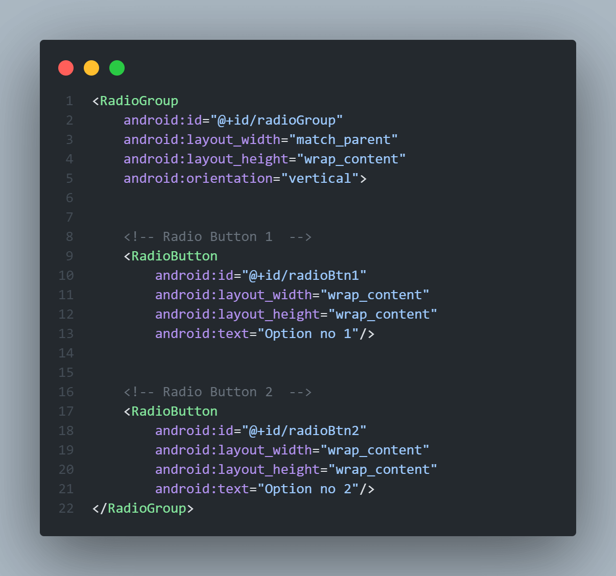
In the above code for RadioGroup layouts in Android, the orientation attribute is used to specify the direction in which RadioButtons inside it will align. It can have two values horizontal or vertical.
Emulator Output:
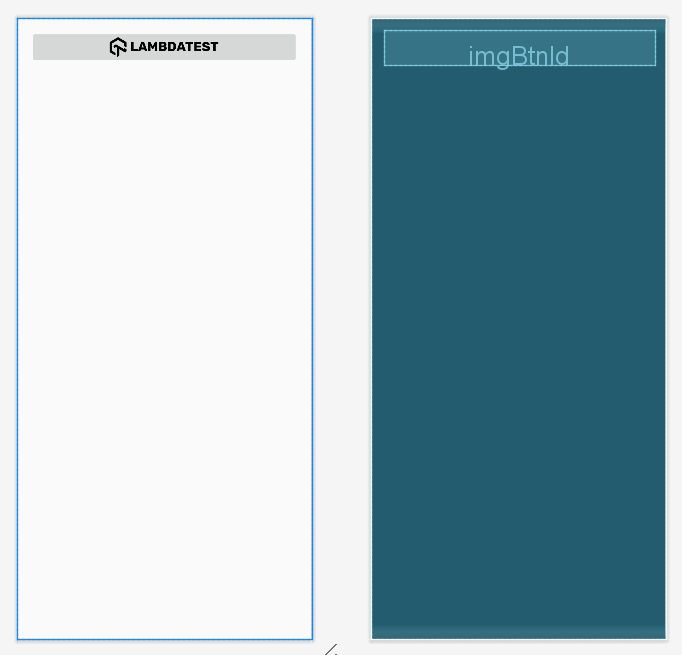
ImageButton Layout in Android
The ImageButton is a user interface control element that is used to create buttons with an image and to trigger pre-specified action when a user taps or clicks on it. By default, an ImageButton looks the same as a normal Button, but the only difference between them is that we can add any custom image or icon to the button instead of plain text.
Create ImageButton in an XML layout file
|
1 2 3 4 5 6 7 8 9 10 11 12 13 14 15 16 17 18 19 20 |
<?xml version="1.0" encoding="utf-8"?> <LinearLayout xmlns:android="http://schemas.android.com/apk/res/android" xmlns:app="http://schemas.android.com/apk/res-auto" xmlns:tools="http://schemas.android.com/tools" android:layout_width="match_parent" android:layout_height="match_parent" android:orientation="vertical" android:padding="16dp" tools:context=".ExampleActivity"> <ImageButton android:id="@+id/imgBtnId" android:layout_width="match_parent" android:layout_height="wrap_content" android:src="@drawable/custom_image" android:onClick="buttonClickOperation"/> </LinearLayout> |
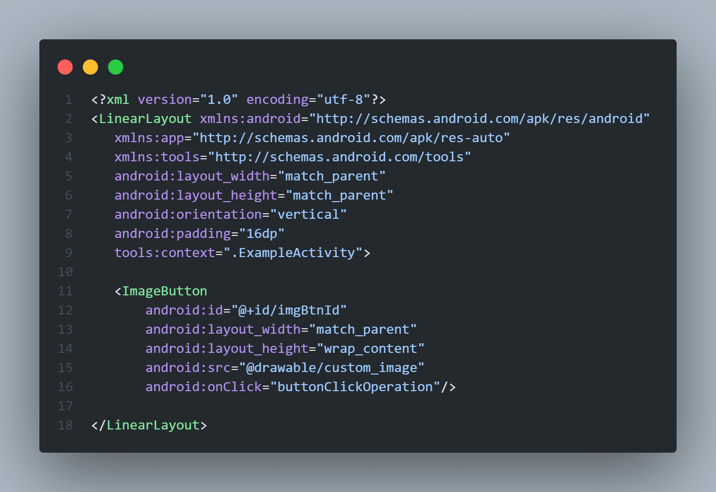
Here while specifying ImageButton layouts in Android, we must define the src attribute which is used to specify or indicate the source file of the Image to be displayed on the ImageButton. We pass the actual image file to the src attribute, generally stored in the drawable or asset directory of the Android project.
Emulator Output:
ProgressBar Layout in Android
The ProgressBar is the user interface element used to indicate users for any ongoing progress of an operation like fetching data, uploading, downloading a file, etc. Any app that runs any time-consuming progress must use ProgressBar to keep the users notified about the progress otherwise, users may think that the app is lagging and hence could quit the app.
Create ProgressBar in an XML layout file
|
1 2 3 4 5 6 7 8 9 10 11 12 13 14 15 16 17 18 19 20 21 22 |
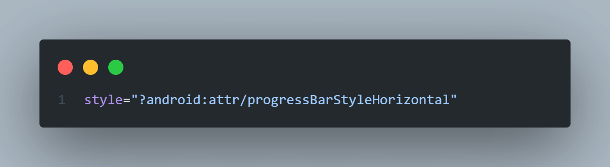
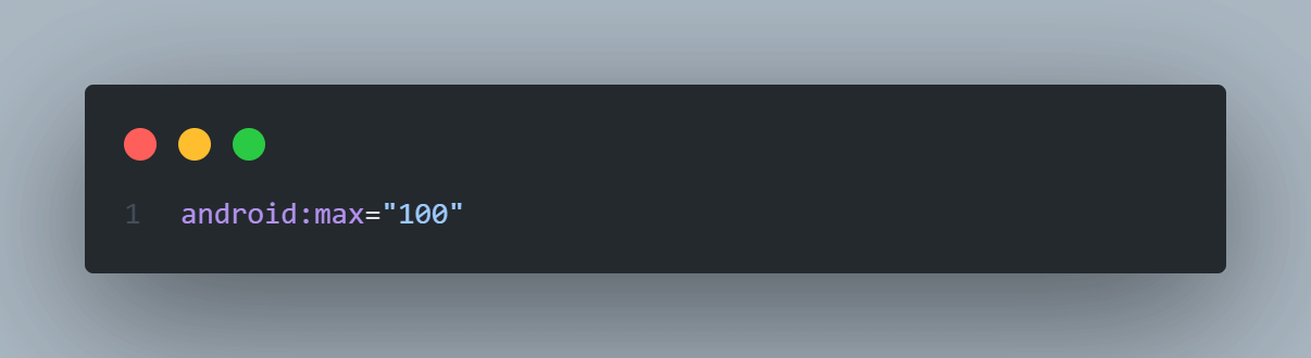
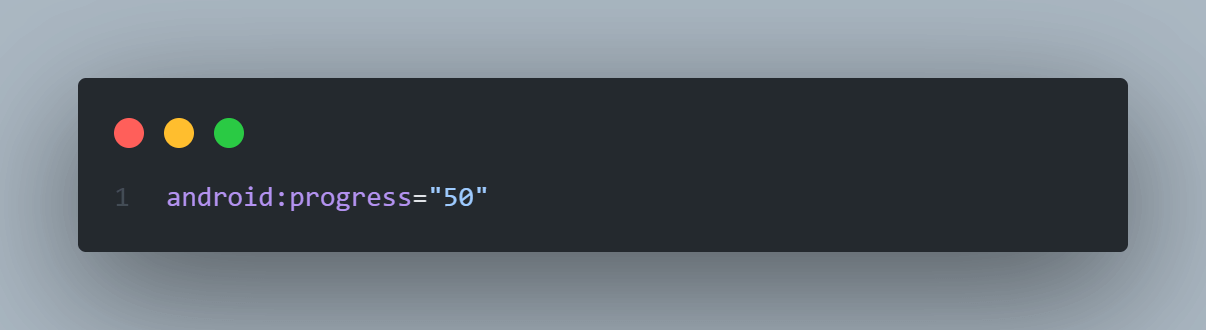
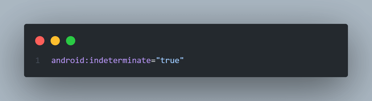
<?xml version="1.0" encoding="utf-8"?> <LinearLayout xmlns:android="http://schemas.android.com/apk/res/android" xmlns:app="http://schemas.android.com/apk/res-auto" xmlns:tools="http://schemas.android.com/tools" android:layout_width="match_parent" android:layout_height="match_parent" android:orientation="vertical" android:padding="16dp" tools:context=".ExampleActivity"> <ProgressBar android:id="@+id/progressBarId" style="?android:attr/progressBarStyleHorizontal" android:layout_width="match_parent" android:layout_height="wrap_content" android:max="100" android:indeterminate="true" android:progress="50" /> </LinearLayout> |
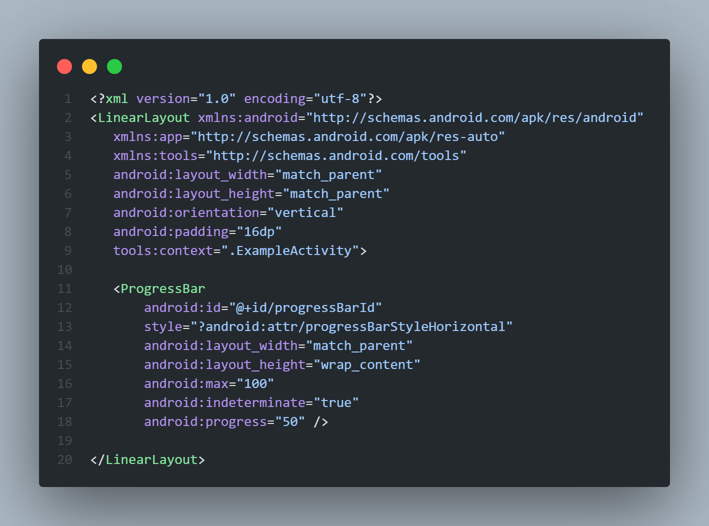
In the above code for creating ProgressBar, we used a few attributes that need to be understood to understand its behavior on UI.
The style attribute is mainly used to specify the layout design to be applied to the object. The value for this style attribute can be custom or system defined. Here we used ?android:attr/progressBarStyleHorizontal style which is specific to ProgressBar and it makes the ProgressBar horizontal, instead of the default style (circular).
The max attribute is used to define the maximum value for the ProgressBar. It must be an unsigned integer greater than equals to 1.
The progress attribute is used to set the progress completed at the instant. It can range from 0 to max.
The indeterminate attribute is used to enable/disable the indeterminate progress mode. By, default it has true value and is hence enabled. The Indeterminate progress mode in the ProgressBar is when we don’t know or specify how long a task will take or how much work has been done.
Emulator Output
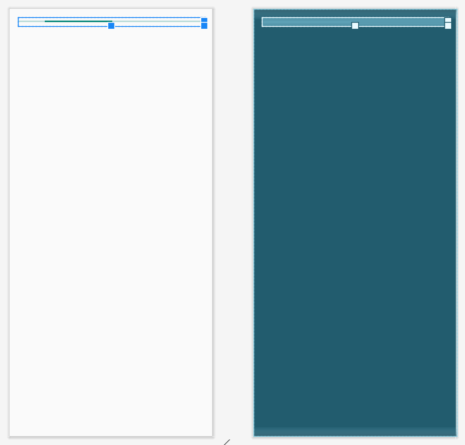
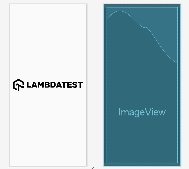
ImageView Layout in Android
The ImageView is a user interface control element that is used to display an image on the screen. While specifying ImageView layouts in Android, we must define the src attribute which is used to specify or indicate the source file of the Image to be displayed on the ImageButton.
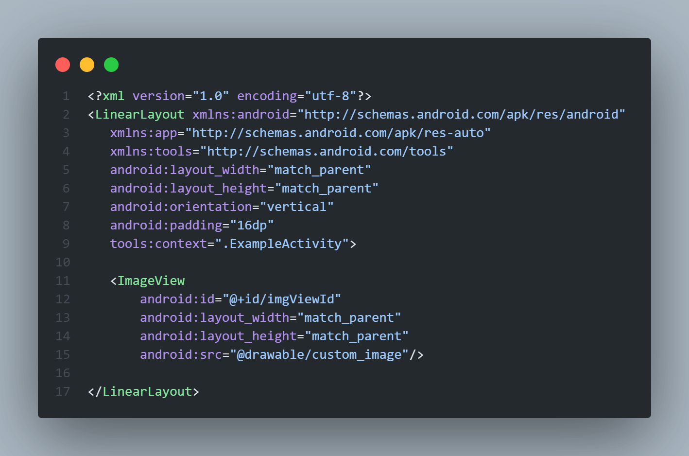
Create ImageView in an XML layout file
|
1 2 3 4 5 6 7 8 9 10 11 12 13 14 15 16 17 18 19 |
<?xml version="1.0" encoding="utf-8"?> <LinearLayout xmlns:android="http://schemas.android.com/apk/res/android" xmlns:app="http://schemas.android.com/apk/res-auto" xmlns:tools="http://schemas.android.com/tools" android:layout_width="match_parent" android:layout_height="match_parent" android:orientation="vertical" android:padding="16dp" tools:context=".ExampleActivity"> <ImageView android:id="@+id/imgViewId" android:layout_width="match_parent" android:layout_height="match_parent" android:src="@drawable/custom_image"/> </LinearLayout> |
Emulator Output:
ViewGroup Layouts in Android
The ViewGroup is a subclass of the View class and it acts as a base class for layouts and UI structure parameters. The ViewGroup provides us with an invisible container that can hold and arrange other Views and ViewGroups and define the main layout properties. For example, RelativeLayout is the ViewGroup that can contain other Views like Button, TextView, Images, other RelativeLayout, LinearLayout, etc.
Some common ViewGroup layouts in Android used to define the structure of screen UI are as follows:
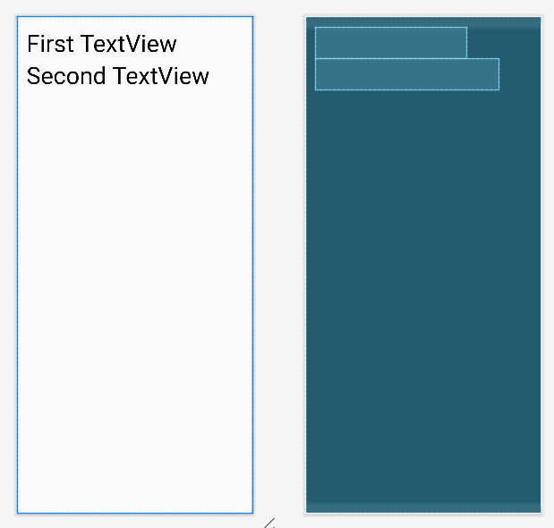
LinearLayout in Android
The LinearLayout is a ViewGroup subclass that is used to arrange all child View elements one by one in the form of a queue either in a Vertical or Horizontal direction based on the orientation attribute. A pictorial representation of LinearLayout in Android apps is shown in the image below.
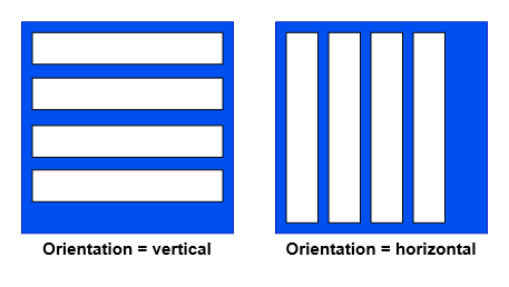
The above image clearly represents that in LinearLayout, if the orientation specified is horizontal, then the LinearLayout will have only one row of multiple columns otherwise, if the orientation is vertical, then it will have one column of multiple rows.
Create LinearLayout in an XML layout file
|
1 2 3 4 5 6 7 8 9 10 11 12 13 14 15 16 17 18 19 20 21 22 23 24 25 26 27 28 |
<?xml version="1.0" encoding="utf-8"?> <LinearLayout xmlns:android="http://schemas.android.com/apk/res/android" xmlns:app="http://schemas.android.com/apk/res-auto" xmlns:tools="http://schemas.android.com/tools" android:layout_width="match_parent" android:layout_height="match_parent" android:orientation="vertical" android:padding="16dp" tools:context=".ExampleActivity"> <TextView android:id="@+id/textView1" android:layout_width="wrap_content" android:layout_height="wrap_content" android:textColor="@color/black" android:textSize="40dp" android:text="First TextView" /> <TextView android:id="@+id/textView2" android:layout_width="wrap_content" android:layout_height="wrap_content" android:textColor="@color/black" android:textSize="40dp" android:text="Second TextView" /> </LinearLayout> |
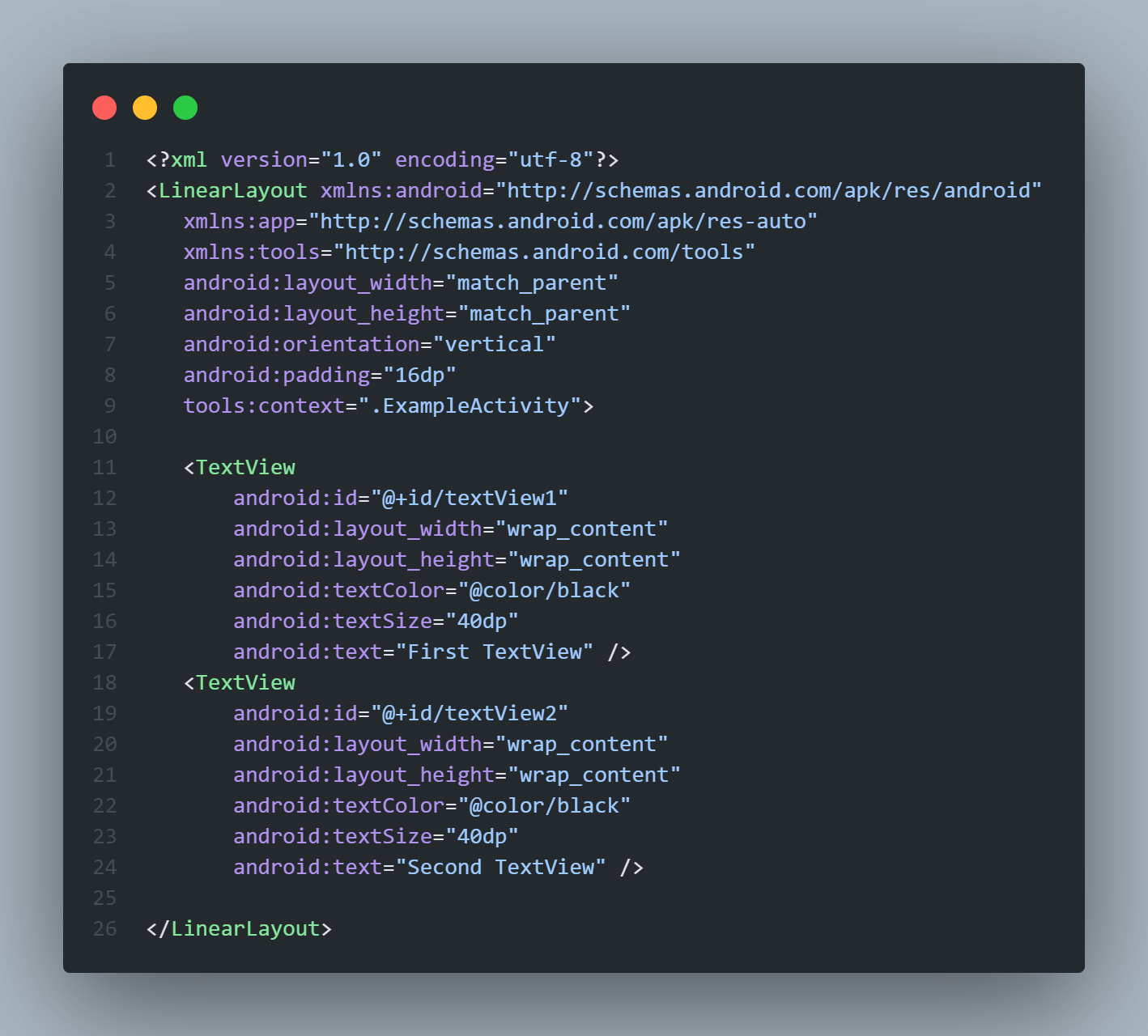
The above code will arrange the two TextViews in the vertical direction hence textview1 will come first in the list and below it will be textview2.
Emulator Output:
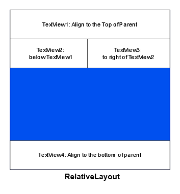
RelativeLayout in Android
As the name suggests, RelativeLayout ViewGroup is used to arrange the position of child Views relative to each other or relative to the parent. For example, here, we can arrange child View A to the left of child View B, and we may arrange View B to align the bottom of the parent.
RelativeLayouts in Android is mainly used to design complex layouts where the position of child View elements depends on other View’s position. A simple pictorial representation of Views inside a RelativeLayout is shown in the image below.
| Attribute | Description |
|---|---|
| layout_alignParentTop | If specified as “true”, the top edge of the View will align with the top edge of the parent layout. |
| layout_alignParentBottom | If specified as “true”, the bottom edge of the View will align with the bottom edge of the parent layout. |
| layout_alignParentLeft | If defined as “true”, the left edge of the View will align with the left edge of the parent layout. |
| layout_alignParentRight | If specified as “true”, the right edge of View will align with the right edge of the parent layout. |
| layout_alignParentStart | If defined as “true”, the start edge of the View will align with the starting edge of the parent layout. |
| layout_alignParentEnd | If specified as “true”, the ending edge of View will align with the ending edge of the parent layout. |
| layout_centerInParent | If defined as “true”, the View will align in the center of the parent layout. |
| layout_centerHorizontal | If specified as “true”, the View will align horizontally centered to the parent layout. |
| layout_centerVertical | If specified as “true”, the View will align vertically centered to the parent layout. |
| layout_above | It will align the View on the top of another View whose ID is provided. |
| layout_below | It will align the View to the bottom of another View whose ID is provided. |
| layout_toLeftOf | It will align the View to the left of the sibling View whose ID is provided. |
| layout_toRightOf | It will align the View to the right of the sibling View whose ID is provided. |
| layout_toStartOf | It will align the View to the start of the sibling View whose ID is provided. |
| layout_toEndOf | It will align the View to the end of the sibling View whose ID is provided. |
To achieve these multiple types of alignment in RelativeLayout we specify attributes to the child elements that define their position. These attributes are listed in the table below. We can use these attributes to form complex UI layouts in Android. Let’s consider an example of creating RelativeLayout.
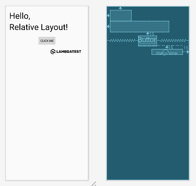
Create RelativeLayout in an XML layout file
|
1 2 3 4 5 6 7 8 9 10 11 12 13 14 15 16 17 18 19 20 21 22 23 24 25 26 27 28 29 30 31 32 33 34 35 36 37 38 39 40 41 42 43 44 45 46 47 48 49 50 51 52 53 54 55 56 57 58 |
<?xml version="1.0" encoding="utf-8"?> <RelativeLayout xmlns:android="http://schemas.android.com/apk/res/android" xmlns:app="http://schemas.android.com/apk/res-auto" xmlns:tools="http://schemas.android.com/tools" android:layout_width="match_parent" android:layout_height="match_parent" android:orientation="vertical" android:padding="16dp" tools:context=".ExampleActivity"> <!-- It will appear on the top left of the parent --> <TextView android:id="@+id/textView1" android:layout_width="wrap_content" android:layout_height="wrap_content" android:textColor="@color/black" android:textSize="40dp" android:text="Hello," android:layout_alignParentTop="true" android:layout_alignParentStart="true"/> <!-- It will appear on the bottom left of the parent --> <TextView android:id="@+id/textView2" android:layout_width="wrap_content" android:layout_height="wrap_content" android:textColor="@color/black" android:textSize="40dp" android:text="Relative Layout!" android:layout_below="@id/textView1" android:layout_alignParentStart="true"/> <!-- It will appear below textview2 but horizontally centered --> <Button android:id="@+id/button" android:layout_width="wrap_content" android:layout_height="wrap_content" android:text="Click Me" android:layout_below="@id/textView2" android:layout_centerHorizontal="true" android:layout_marginTop="16dp"/> <!-- It will appear at the end of the parent layout --> <ImageView android:id="@+id/imageView" android:layout_width="wrap_content" android:layout_height="wrap_content" android:src="@drawable/logo" android:layout_below="@id/button" android:layout_alignParentEnd="true" android:layout_marginTop="16dp" android:layout_marginEnd="16dp"/> </RelativeLayout> |
Emulator Output:
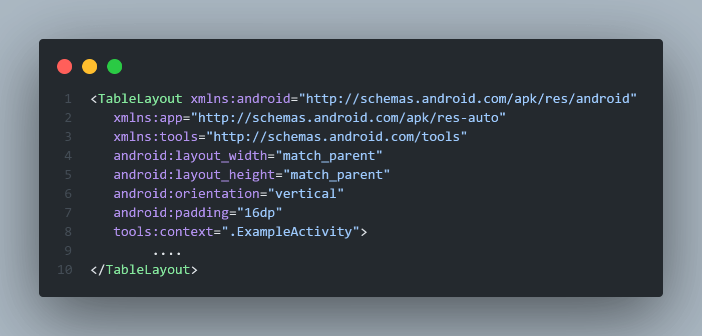
TableLayout in Android
TableLayout is a ViewGroup element that is used to arrange its child ViewElements in the form of a table with rows and columns. It will position its child View elements into columns and rows and not create any border lines for columns, rows, or cells.
Create TableLayout in an XML layout file
|
1 2 3 4 5 6 7 8 9 10 11 12 13 14 15 16 17 18 19 20 21 22 23 24 25 26 27 28 29 30 31 32 33 34 35 36 37 38 39 40 41 42 43 44 45 46 47 48 49 50 51 52 53 54 55 56 57 58 59 60 61 62 63 |
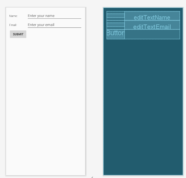
<?xml version="1.0" encoding="utf-8"?> <TableLayout xmlns:android="http://schemas.android.com/apk/res/android" xmlns:app="http://schemas.android.com/apk/res-auto" xmlns:tools="http://schemas.android.com/tools" android:layout_width="match_parent" android:layout_height="match_parent" android:orientation="vertical" android:padding="16dp" tools:context=".ExampleActivity"> <!-- Table Row 1 --> <TableRow> <!-- Table Cell 1 --> <TextView android:layout_width="wrap_content" android:layout_height="wrap_content" android:text="Name:" android:paddingEnd="8dp" /> <!-- Table Cell 2 --> <EditText android:id="@+id/editTextName" android:layout_width="0dp" android:layout_height="wrap_content" android:layout_weight="1" android:hint="Enter your name" /> </TableRow> <!-- Table Row 2 --> <TableRow> <!-- Table Cell 1 --> <TextView android:layout_width="wrap_content" android:layout_height="wrap_content" android:text="Email:" android:paddingEnd="8dp" /> <!-- Table Cell 2 --> <EditText android:id="@+id/editTextEmail" android:layout_width="0dp" android:layout_height="wrap_content" android:layout_weight="1" android:hint="Enter your email" /> </TableRow> <!-- Table Row 3 --> <TableRow> <!-- Table Cell 1 --> <Button android:layout_width="match_parent" android:layout_height="wrap_content" android:layout_span="2" android:text="Submit" /> </TableRow> </TableLayout> |
Code Breakdown:
The TableLayout is the parent layout that will form the table inside it.
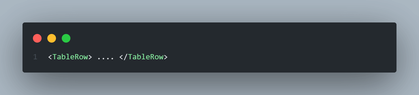
The TableRow View layouts in Android are used to define one row of the table. It contains table cells inside it.
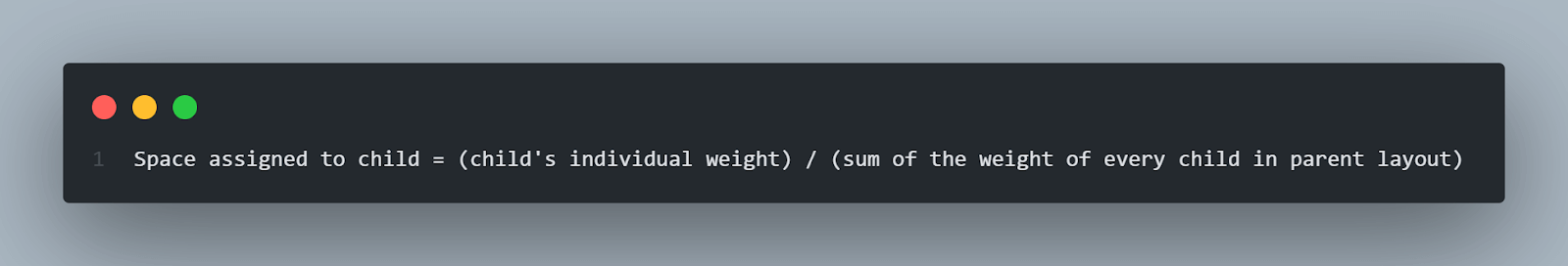
In all the table cell elements, we used the layout_weight property, which specifies how much space is allocated to that View in the parent layout. This space is calculated based on the below formulae.
Space assigned to child = (child’s individual weight) / (sum of the weight of every child in parent layout)
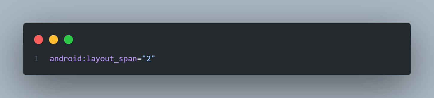
In the Button of the last TableRow, we used the layout_span attribute which simply means that a number of the specified cells will be merged and hence the view will take the width of the complete merged cell. Here we assigned layout_span = “2”, which means that two cells will be merged in the row.
Emulator Output:
ListView in Android
ListView in Android is a ViewGroup element that is used to display a scrollable list of other View or ViewGroups in multiple rows. The list items are automatically inserted into the ListView using an adapter Class.
Generally, this adapter class pulls data from the database or API in the form of an array or list and converts each item into a result view that’s placed into the ListView. This is very useful in making Android apps that are dynamic and progressive.
Android Adapter
The adapter in Android acts as a bridge between the data sources (database or API) and adapter Views like ListView, and Gridview to fill the data into View elements. This adapter holds the data in the form of an array or list, iterates through items in the data set, and generates the View for each item in the list.
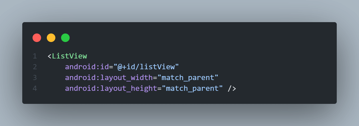
Create ListView in an XML layout file
|
1 2 3 4 |
<ListView android:id="@+id/listView" android:layout_width="match_parent" android:layout_height="match_parent" /> |
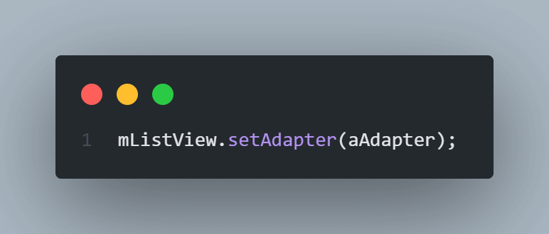
Assign Adapter and Data to the ListView
|
1 2 3 4 5 6 7 8 9 10 11 12 13 14 15 |
// Create Data array String[] users = { "JON DEO", "AHANA DEO", "Alavala Dasari", "Pravala Seh", "Mady Sail", "Hamsi Yemieni"}; // Declare a reference to the ListView in layout file ListView mListView = (ListView) findViewById(R.id.listView); // Define an ArrayAdapter to hold and display the data in the list view ArrayAdapter aAdapter = new ArrayAdapter(this, android.R.layout.simple_list_item_1, users); // Set the defined ArrayAdapter to the ListView mListView.setAdapter(aAdapter); |
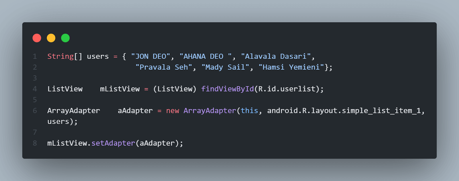
Code Breakdown:
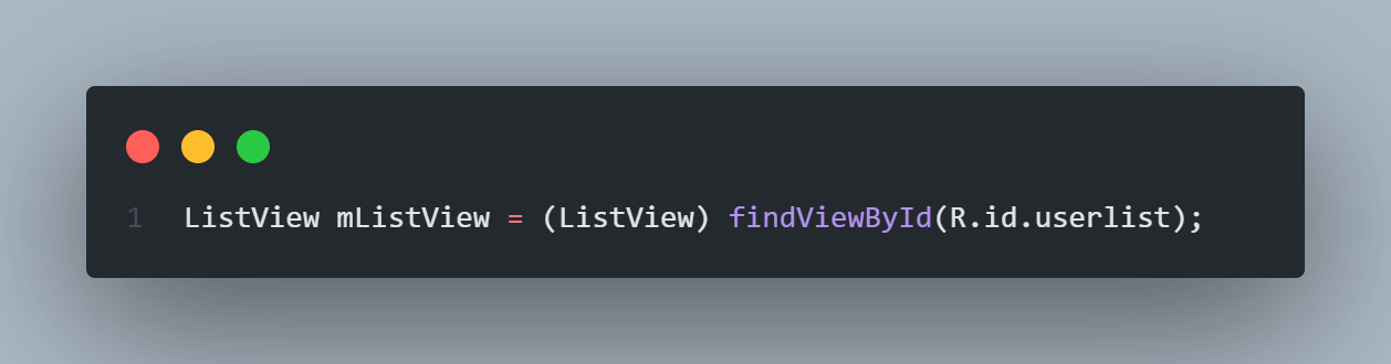
The findViewById() method is used to link the UI element in the XML file with the Java/Kotlin Class or Activity.
The ArrayAdapter() constructor is used to create an adapter that will assign the value of the users list to the ListView.
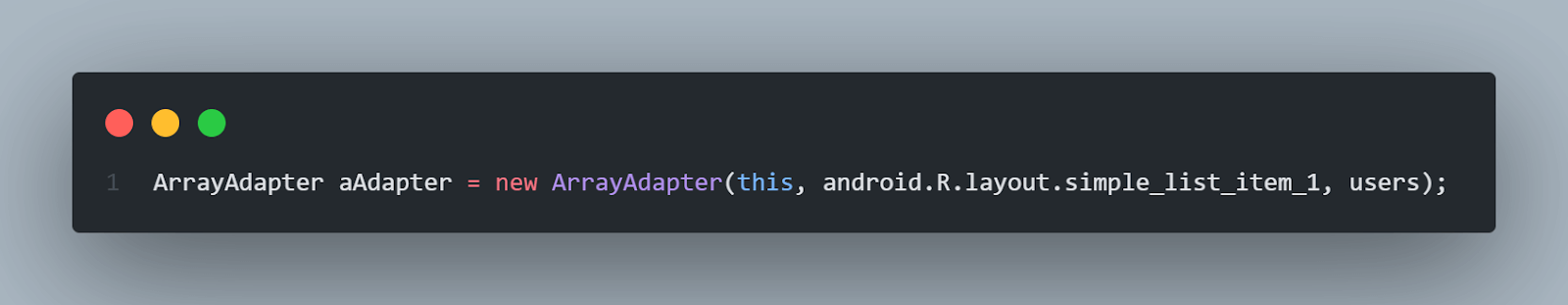
The setAdapter() method is used to assign an adapter to the ListView.
NoteTest on 3000+ real devices for Android and iOS, including the latest iPhone 15. Try LambdaTest Today!
How to Design Complex Layouts in Android?
Now that we have learned about some commonly used View and ViewGrop layouts in Android, it’s time to design some complex UI in Android. This example will give us an actual understanding of how to use these layouts in combination and how to listen to user events on these UI elements.
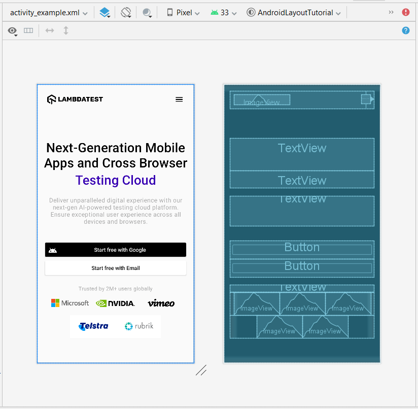
In this article, we will try to clone the homepage of the LambdaTest website using various View and ViewGroup elements.

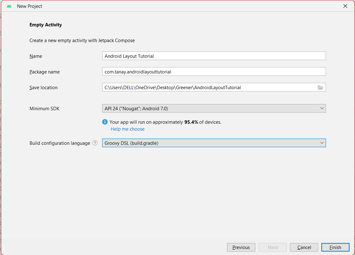
To proceed, let’s create an Android Project with no activity.
Next, we need to create an Empty View Activity with a layout file as shown in the image below. We will write our example in the layout file generated.
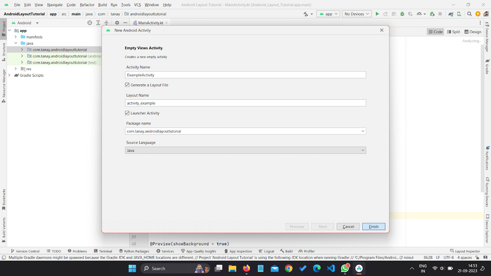
Before moving ahead please make sure you import all the necessary assets like logo images and icons into the Drawable resource director. Now let’s modify the activity layout file to write the code and achieve the desired design.
|
1 2 3 4 5 6 7 8 9 10 11 12 13 14 15 16 17 18 19 20 21 22 23 24 25 26 27 28 29 30 31 32 33 34 35 36 37 38 39 40 41 42 43 44 45 46 47 48 49 50 51 52 53 54 55 56 57 58 59 60 61 62 63 64 65 66 67 68 69 70 71 72 73 74 75 76 77 78 79 80 81 82 83 84 85 86 87 88 89 90 91 92 93 94 95 96 97 98 99 100 101 102 103 104 105 106 107 108 109 110 111 112 113 114 115 116 117 118 119 120 121 122 123 124 125 126 127 128 129 130 131 132 133 134 135 136 137 138 139 140 141 142 143 |
<?xml version="1.0" encoding="utf-8"?> <LinearLayout xmlns:android="http://schemas.android.com/apk/res/android" xmlns:app="http://schemas.android.com/apk/res-auto" xmlns:tools="http://schemas.android.com/tools" android:layout_width="match_parent" android:layout_height="match_parent" android:orientation="vertical" android:padding="16dp" tools:context=".ExampleActivity"> <!--RelativeLayot for header bar--> <RelativeLayout android:layout_width="match_parent" android:layout_height="wrap_content" android:padding="10dp"> <!-- Logo Image View--> <ImageView android:id="@+id/iv_logo" android:layout_width="wrap_content" android:layout_height="wrap_content" android:src="@drawable/logo"/> <!-- Hamburgur menu button as Image Button--> <ImageButton android:id="@+id/ib_primary_menu" android:layout_width="wrap_content" android:layout_height="wrap_content" android:src="@drawable/baseline_menu_24" android:background="null" android:layout_alignParentEnd="true" android:layout_centerVertical="true" /> </RelativeLayout> <!--Primary heading as TextView --> <TextView android:layout_width="match_parent" android:layout_height="wrap_content" android:textAlignment="center" android:layout_marginTop="80dp" android:text="Next-Generation Mobile Apps and Cross Browser" android:textColor="@color/black" android:textFontWeight="500" style="@style/TextAppearance.MaterialComponents.Headline4" /> <TextView android:layout_width="match_parent" android:layout_height="wrap_content" android:textAlignment="center" android:text="Testing Cloud" android:textColor="@color/purple_700" android:textFontWeight="500" style="@style/TextAppearance.MaterialComponents.Headline4" /> <!--Description Text --> <TextView android:layout_width="match_parent" android:layout_height="wrap_content" android:textAlignment="center" android:layout_marginTop="20dp" android:text="Deliver unparalleled digital experience with our next-gen AI-powered testing cloud platform. Ensure exceptional user experience across all devices and browsers." android:textColor="@android:color/darker_gray" android:textFontWeight="400" style="@style/TextAppearance.MaterialComponents.Body1" /> <!-- Google Login Button design--> <Button android:id="@+id/googleLogin" android:layout_width="match_parent" android:layout_height="wrap_content" android:layout_marginTop="40dp" android:text="Start free with Google" android:textAllCaps="false" android:textColor="@color/white" android:backgroundTint="@color/black" android:drawableStart="@drawable/ic_android_black_24dp" /> <!-- Email Login Button design--> <Button android:id="@+id/emailLogin" android:layout_width="match_parent" android:layout_height="wrap_content" android:text="Start free with Email" android:textAllCaps="false" android:textColor="@color/black" android:backgroundTint="@color/white" /> <!--Trust Label Description Text --> <TextView android:layout_width="match_parent" android:layout_height="wrap_content" android:textAlignment="center" android:layout_marginTop="20dp" android:text="Trusted by 2M+ users globally" android:textColor="@android:color/darker_gray" android:textFontWeight="400" style="@style/TextAppearance.MaterialComponents.Body2" /> <!--Company logo Grid Row 1--> <LinearLayout android:layout_width="match_parent" android:layout_height="wrap_content" android:gravity="center"> <ImageView android:layout_width="wrap_content" android:layout_height="wrap_content" android:src="@drawable/microsoft" /> <ImageView android:layout_width="wrap_content" android:layout_height="wrap_content" android:src="@drawable/nvidia" /> <ImageView android:layout_width="wrap_content" android:layout_height="wrap_content" android:src="@drawable/vimeo" /> </LinearLayout> <!--Company logo Grid Row 2--> <LinearLayout android:layout_width="match_parent" android:layout_height="wrap_content" android:gravity="center"> <ImageView android:layout_width="wrap_content" android:layout_height="wrap_content" android:src="@drawable/telstra" /> <ImageView android:layout_width="wrap_content" android:layout_height="wrap_content" android:src="@drawable/rubrik" /> </LinearLayout> </LinearLayout> |
This code will produce a design that is very close to our desired design as shown in the image below.
Conclusion
Layouts in Android are an essential component for UI interface design in Android apps. It provides ways for end users to interact with the application. This article covered the basics of View and ViewGroup elements in detail, along with their relative attributes. In the end, we successfully designed a complex layout in Android.
However, it is always important to test all these layouts in Android must be properly tested using testing tools like LambdaTest. It allows mobile UI testing on a variety of genuine devices, including different brands and several versions of Android OS on emulators.
Frequently Asked Questions (FAQs)
What is a layout in Android?
Layouts in Android are primarily used to define the user interface (UI), and widgets that appear on the screen of an Android app. These layouts are very crucial in Android apps as they act as the bridge between the user’s actions and the app’s logic.
How to add an image to the Android Studio layout?
The ImageView is a user interface control element that is used to display an image on the screen. While specifying ImageView layouts in Android, we must define the src attribute which is used to specify or indicate the source file of the Image to be displayed on the ImageButton.
How to open Layout Editor in Android Studio?
The Layout Editor in Android Studio enables us to quickly build View and ViewGroup layouts by dragging UI elements into a design editor instead of writing custom layout XML. To open Layout Editor, we simply need to open any layout XML file, and the Design Editor will also open by default.


Author’s Profile
Tanay Kumar Deo
Tanay kumar deo is a skilled software developer, Upcoming SDET at GlobalLogic (A Hitachi group company). With expertise in Android and web development, he is always eager to expand his skill set and take on new challenges. Whether developing software or sharing his knowledge with others, he is driven by a desire to make a positive impact on the world around him. In addition to his technical abilities, Tanay also possesses excellent blogging and writing skills, which allow him to effectively communicate his ideas and insights to a wider audience.
Blogs: 16
Got Questions? Drop them on LambdaTest Community. Visit now


