
How To Use CSS Spacing: Getting Started Guide
Aakash Rao
Posted On: February 6, 2023
 49573 Views
 24 Min Read
Suppose you are accessing the blog to read about how to add internal spacing with CSS. The first thing you will note about the page is the layout and the structure, which helps and navigates us with the blog to make it easy to access.
Have you ever wondered what will be the effect if the spacing or white space between elements, text, images, etc., is removed? The answer to this might depend on the layout’s overall structure, but it will become nearly tricky for the users to skim throughout the web page.
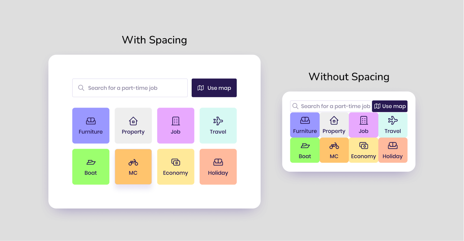
One of the main aspects of web accessibility is spacing, which plays a significant role in improving the user experience and helps to decide the relation between each block and element of the page.
In this detailed tutorial, we will explore CSS Spacing, its importance, and the different types of spacing provided by CSS. We will also deep dive into the nitty-gritty details of spacing between various page components. The blog wouldn’t be complete without some practical examples. 🙂
So, without waiting for further ado, let’s jump right into it.
TABLE OF CONTENTS
- What is CSS Spacing?
- Benefits of adding CSS Spacing to elements
- Types of CSS Spacing
- The concept of CSS Box Model
- Spacing in CSS Flexbox
- Spacing in CSS Grid
- Advantages of using Gap over Margin
- Spacing with Text
- The concept of margin collapsing in CSS
- Techniques for adding spacing between elements
- Practical Examples and Use Cases of CSS Spacing
- Frequently Asked Questions (FAQs)
What is CSS Spacing?
Before learning about CSS Spacing, let’s first try to understand the actual meaning of Spacing. The term ‘Spacing’ refers to the amount of space or white space added between elements to add an optical adjustment. This changes the visual density of a line, text, or element.
It helps us provide a consistent break and gives a perfect balance to the eyes to read and understand the difference between certain blocks or a portion of the page.
We can find the spacing between different text, paragraphs, layouts, images, and several other components in every website or web app, whether an eCommerce business, SaaS business or a simple portfolio website. It provides a consistent look if the spacing is used properly and correctly.
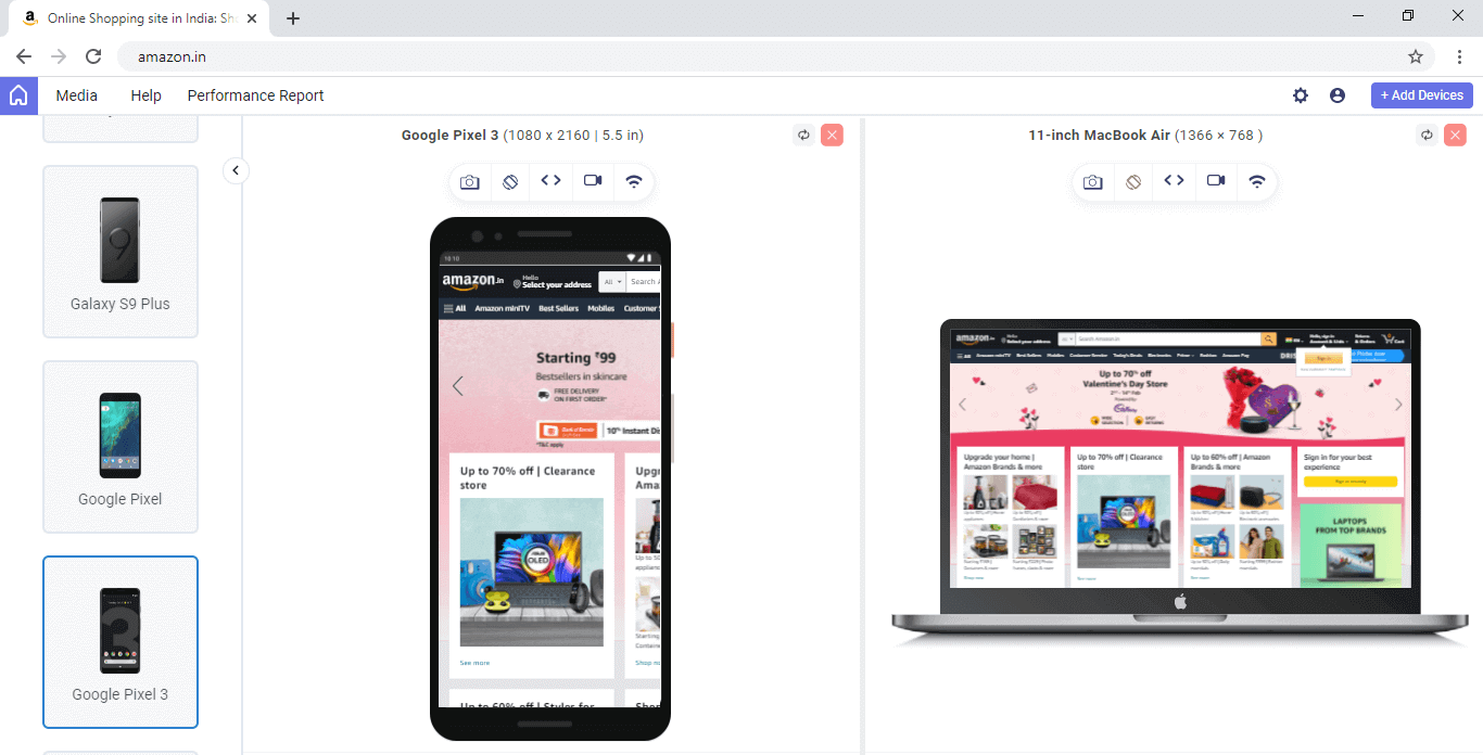
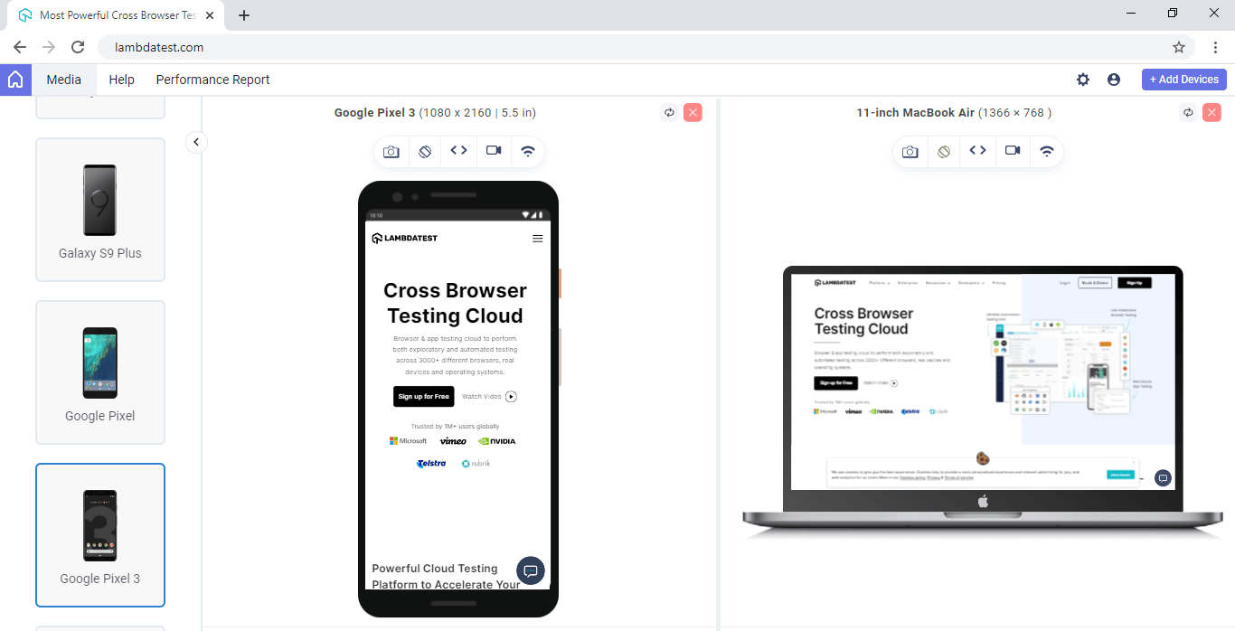
Let’s try to analyze some popular websites, and web apps transiting various industries and find examples of spacing with desktop and mobile views.
Example 1 – Amazon (eCommerce)
Example 2 – LambdaTest (Software-As-A-Service)
Example 3 – Google Workspace (Work management tools)

Example 4 – eBay (eCommerce Platform)
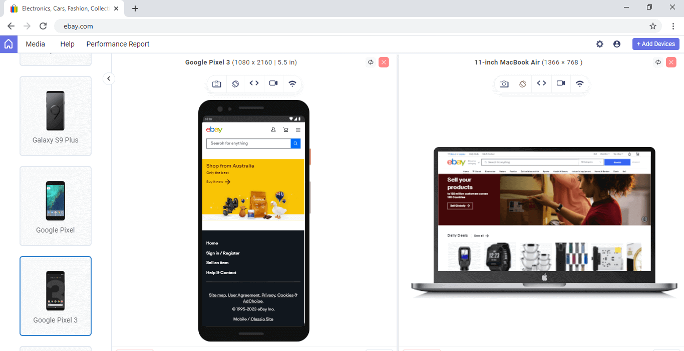
The above desktop and mobile views for different websites have been captured from LT Browser – a Chromium-based dev-friendly browser.
LT Browser is a mobile-friendly test tool that allows you to perform responsive testing and ensure your website’s compatibility across multiple device viewports. With LT Browser, you can test your website’s responsiveness on over 50 pre-installed device viewports, including mobile phones, tablets, laptops, and desktops.

From the above examples, we can find the consistent spacing between different elements and sections of the pages that helps us to navigate it quickly and make it easier to understand and access the information.
The term ‘CSS Spacing’ can be used to describe spacing in CSS on the stylesheet. With the help of CSS, we can control the spacing between several letters, words, paragraphs, images, and layouts to provide a good user experience.
CSS allows us to add custom spacing between different UI (User Interface) components on the web page using its different properties. But before we move on, let’s try to understand the benefits of spacing or white space from the perspective of web accessibility.
Benefits of adding CSS Spacing to elements
CSS Spacing is an important consideration when it comes to web accessibility, as it can impact the way that people with impairments use and interact with a website. It provides many benefits with web accessibility, including
- Improved Readability: By adding extra space between lines of text or around blocks of text, it makes it easier for people with visual impairments to read the content on a website.
- Easier Navigation: When buttons and other interactive elements are spaced appropriately, it makes it easier for people with motor impairments to click tap them accurately.
- Enhanced Usability: Using appropriate spacing can make it easier for people with cognitive impairments to understand and use a website.
- Better Comprehension: Spacing helps to create a visual separation between different elements on a webpage, making it easier for people to understand and process the information on a website.
So, it is evident how CSS Spacing plays a crucial role in the web page’s interface. Let’s now try to understand the different types of CSS Spacing.
Types of CSS Spacing
Spacing or white space in CSS can be termed into different types depending on the place we are trying to determine. Mainly we can define CSS Spacing into two types.
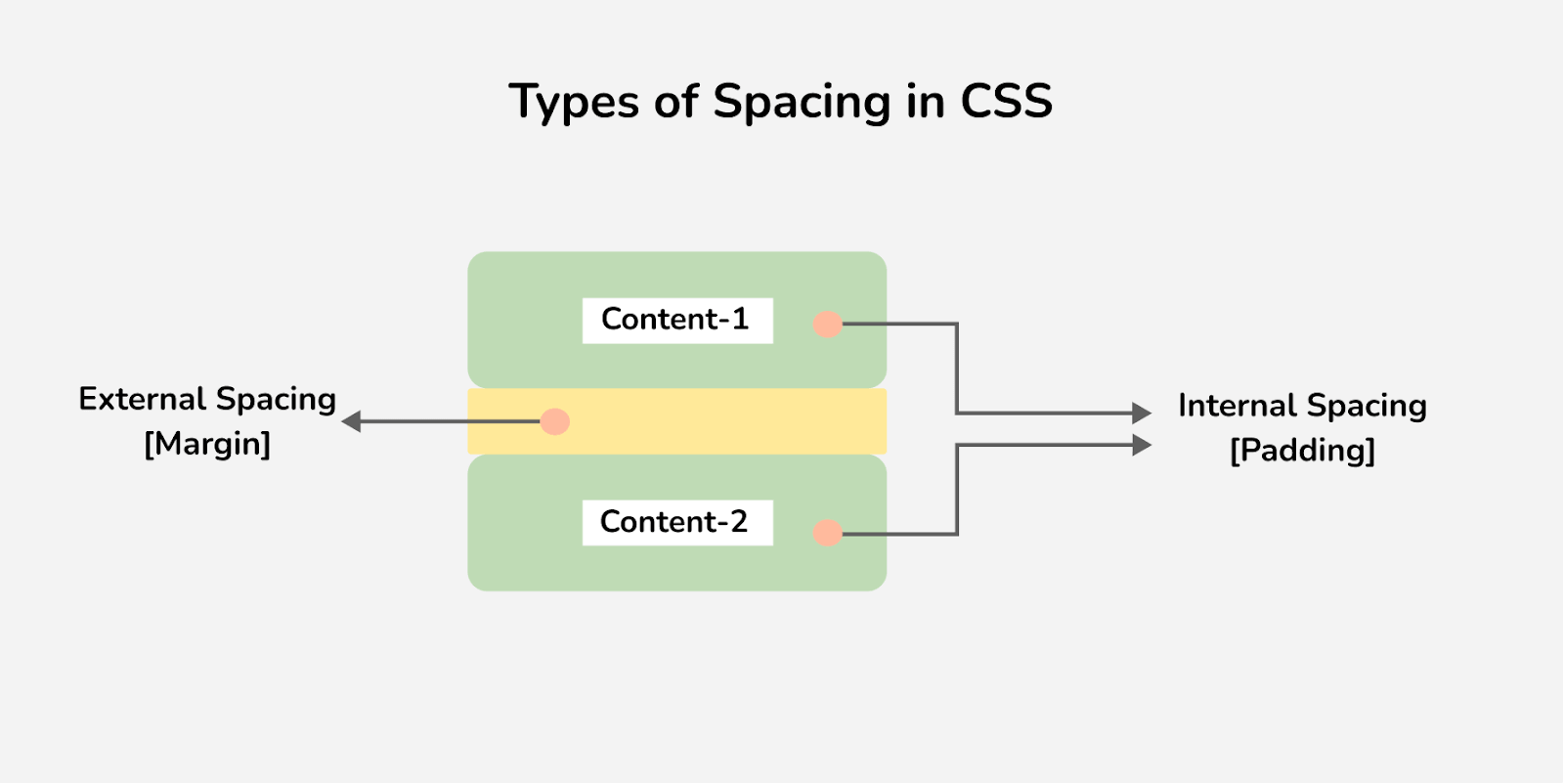
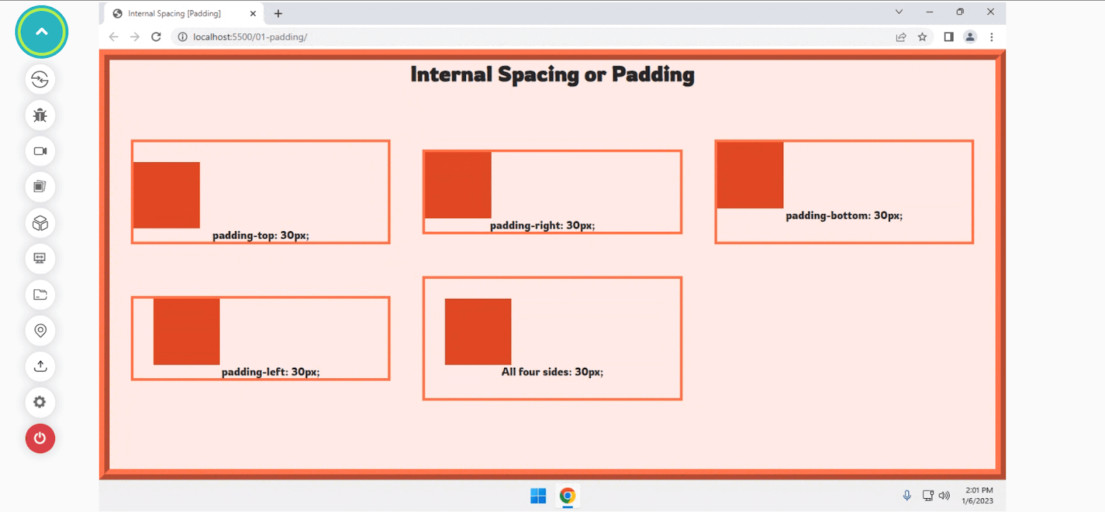
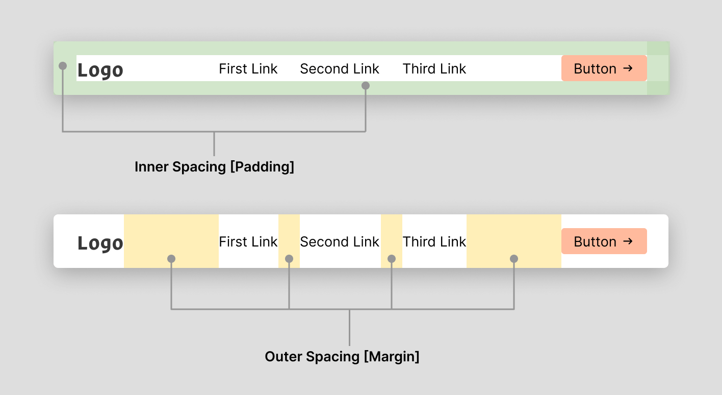
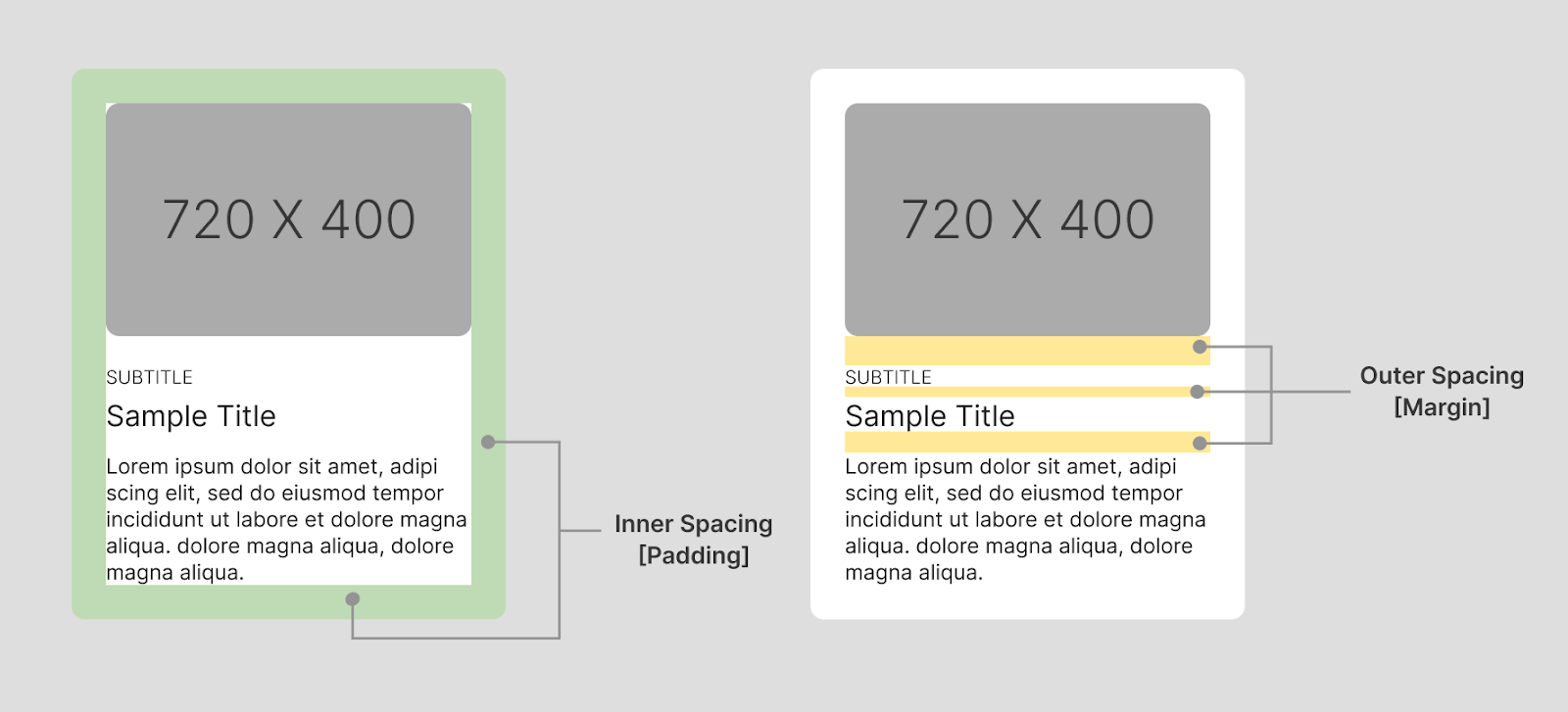
Internal Spacing [Padding]
Internal Spacing, also referred to as inner spacing or CSS Padding, is used to create space around an element’s content, which usually lies inside the border of an element. In simple terms, it is the space between the element’s content and the border. With the padding property in CSS, we can define the internal spacing for the elements.
CSS provides complete control to define padding for each side of an element in the (top, right, bottom & left directions) which gives us the flexibility to generate unique internal spacing as per developer preference. The internal spacing can be specified by defining the < length > or giving it a < percentage > value.
We can define individual padding between the border and the element with properties.
- padding-top: Padding for the top side.
- padding-right: Padding for the right side.
- padding-bottom: Padding for the bottom side.
- padding-left: Padding for the left side of the element.
CSS also provides a shorthand to create internal spacing for all four sides at once, using the padding property. It lets us define padding for each side at once. The shorthand can accept one, two, three, or four values. Negative values for the internal spacing or padding in CSS are considered invalid and do not affect the element.
If only one value is specified, it gets applied to all four sides for the spacing of the element. If two values are specified, the first value gets involved for the top & bottom, while the second is to the right & left sides of an element.
If three values are specified, the first gets applied to the top, the second to the right & left, and the third to the bottom. If all four values are defined inside the padding shorthand property, it applies clockwise in the top-right-bottom-left directions.
Let’s try understanding the padding behavior on all four sides with a quick example.
Code:
Output:
See the Pen
Internal Spacing [Padding] by Aakash Rao (@aakash_codes)
on CodePen.
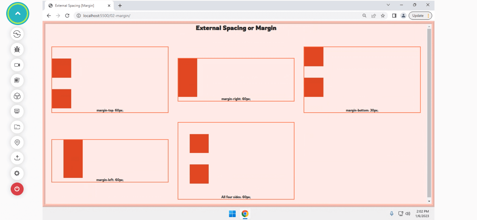
External Spacing [Margin]
External spacing, also called outer spacing or CSS Margin between elements, is used to create space between one or more elements. It allows the creation of a visual hierarchy and makes the user better understand the pattern and the content in an effortless way.
CSS allows us to create outer spacing using the margin property. It lets us create a gap between a group of elements, generally the space outside the border of an element. Similar to the padding property, we can define the margin for all four sides.
You can create CSS Margin using the following properties:
- margin-top: Defines the margin area on the top of an element.
- margin-right: Defines the margin area on the right of the element.
- margin-left: Defines the margin area on the left of the element.
- margin-bottom: Defines the margin area on the bottom of the element.
Let’s try understanding the behavior of margin on all four sides with a quick example.
Code:
Output:
See the Pen
External Spacing [Margin] by Aakash Rao (@aakash_codes)
on CodePen.
By far, we understand the types of CSS Spacing; let’s take a deeper look at CSS Spacing with the CSS Box Model, which plays an essential role in CSS and overall web page structure.
The concept of CSS Box Model
In CSS, all elements are considered as a box. While laying out the structure of a web page on the browser with the browser rendering engine, a rectangular box for every HTML element is created following the CSS Box Model.
The term Box Model denotes a model in which every element is considered a box that wraps around every HTML element and the actual content when it comes to the layout and design. Every box contains a margin area, a border, a padding area, and the content.
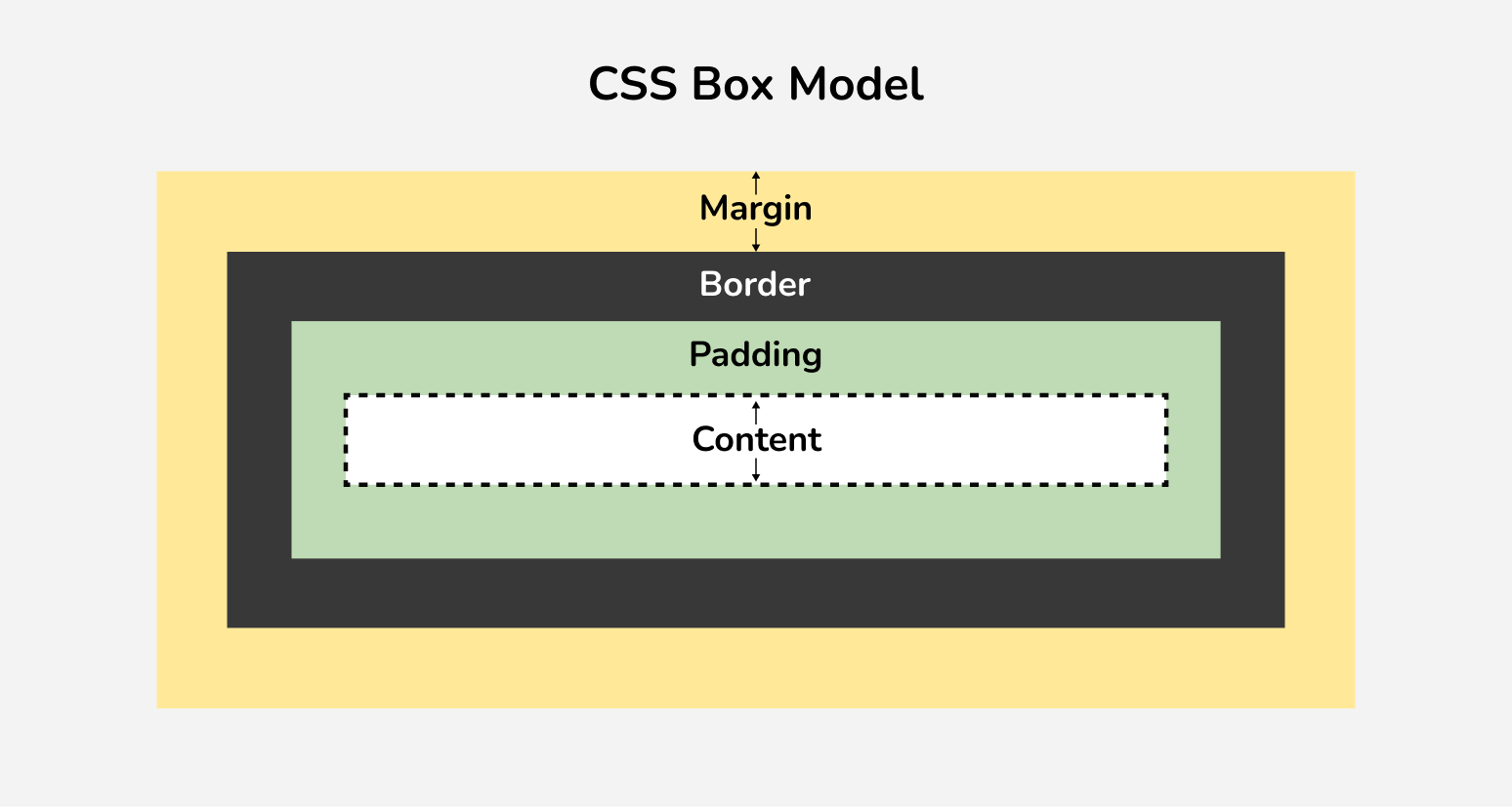
- Margin area: The margin area or the empty area outside the borders is used to separate an element from its neighboring element.
- Border area: A border area is an area for the border that goes around the padding and the content.
- Padding area: The padding area is the internal spacing of an element that is used to add some space between the content and its border.
- Content area: The content area is where the actual content, such as text or an image, often appears with the background-color, width, and height.
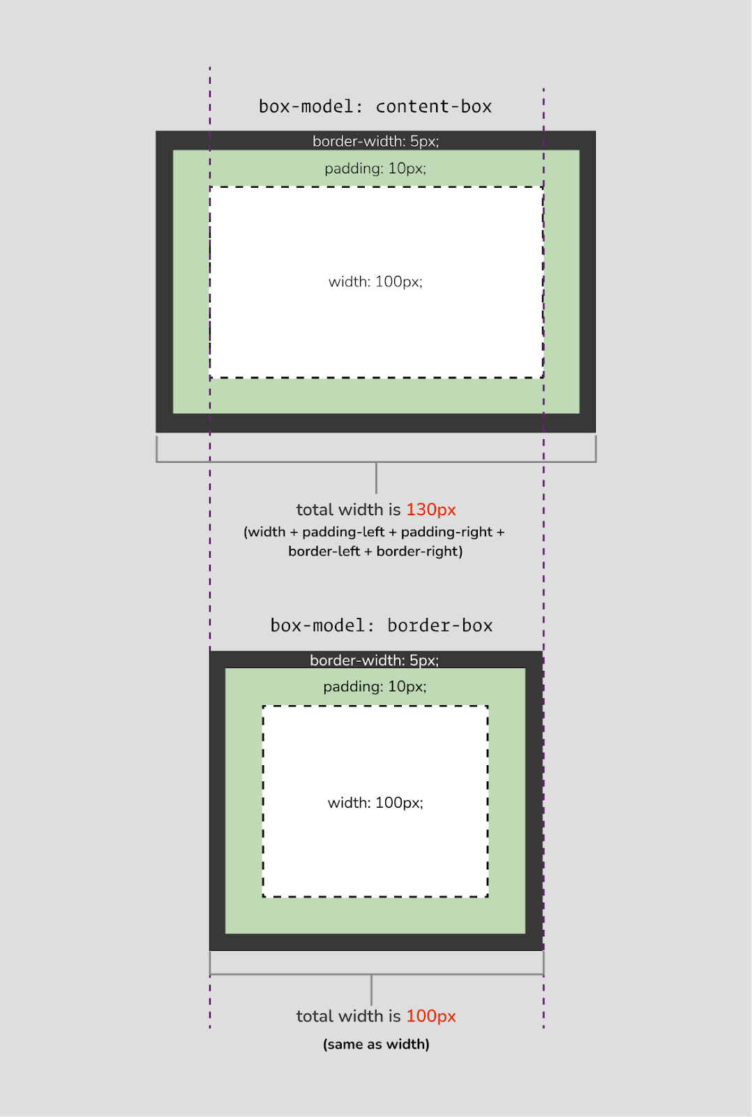
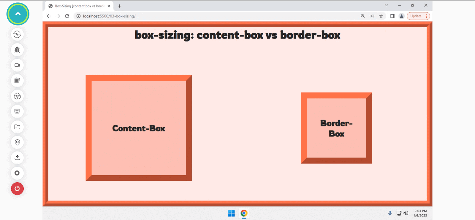
Typically, the padding and the border-width are explicitly added with the content width for the calculation of the total width of an element if the box-sizing property is set to content-box (default).
But CSS allows us to change this behavior by setting the box-sizing property to border-box. With this, the padding and border-width get added implicitly to the element’s total width, which gives us the flexibility to define the total width by just setting up the width property without worrying about the padding and border-width.
Let’s try implementing it with CSS and analyze the behavior with a quick example.
Code:
Output:
See the Pen
Box-Sizing [content box vs border-box] by Aakash Rao (@aakash_codes)
on CodePen.
Now that we know how box-model plays a crucial role in the internal spacing of an element, let’s try to understand how spacing works with CSS Flexbox & Grid layouts as they both allow developers to easily create flexible and responsive layouts for websites and web applications.
Test your CSS Grid Layouts across 3000+ real browser environments. Try LambdaTest Now!
Spacing in CSS Flexbox
As we know, CSS Flexbox is a one-dimensional layout module that allows one to create layouts and arrange elements in a row or a column direction. It is one of the simplest methods to create layouts with CSS.
However, spacing works in the same manner for CSS Flexbox. But Flexbox provides a better way for outer-spacing or to add gutters (gaps) between the rows and columns of elements using the gap property.
Gap: It is a shorthand property of row-gap and column-gap that can be applied for both CSS Grid and Flexbox to add the outer-spacing or gutters between elements.
Let’s implement it with an example and understand the difference between the normal margin and the Flexbox gap property.
Code:
Output:
See the Pen
Flexbox Gap vs Flexbox Margin Layout by Aakash Rao (@aakash_codes)
on CodePen.
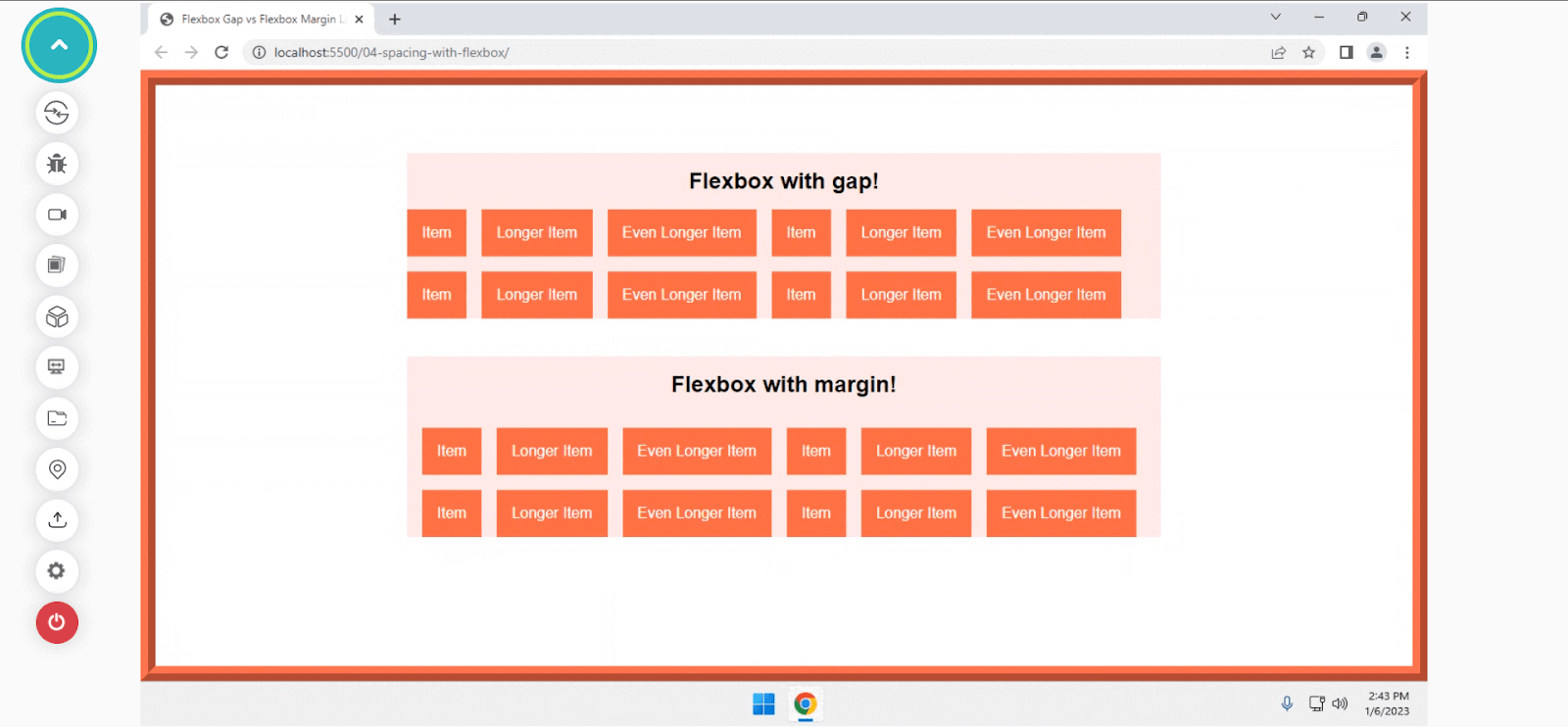
In this example, we saw how the gap property creates a flexible space between elements and allows us to maintain the overall architecture of the code to be much cleaner and simpler.
Now that we know how spacing works with Flexbox, let’s move forward to understand how it operates with CSS Grid.
Spacing in CSS Grid
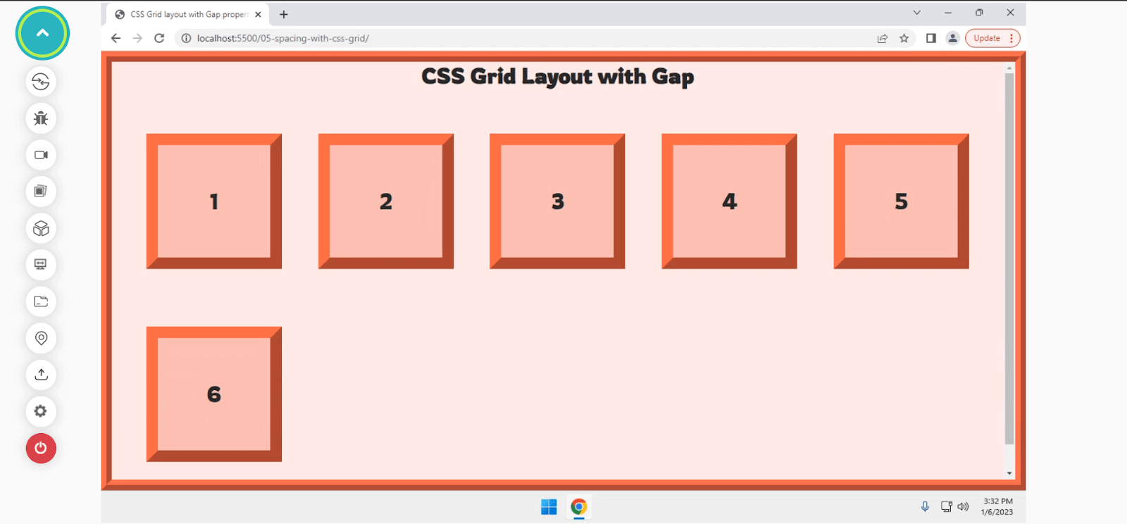
CSS Grid is one of the most powerful methods after Flexbox, allowing us to create modern and responsive layouts. It is a two-dimensional layout module that will enable us to create and arrange elements with rows and columns.
In CSS Grid, the gap property works similarly to Flexbox to create a gutter between the tracks for rows and columns. In earlier days, the grid-gap property was used for creating gutter spacing. But now, for simplicity, the gap property is preferred over the grid-gap for Flexbox & Grid.
Grid-gap: A shorthand property for grid-row-gap and grid-column-gap is used with CSS Grid to create gaps or gutters between tracks of rows and columns.
Let’s have a quick look with an example to see how the gap property works in CSS Grid.
Code:
Output:
See the Pen
grid layout with gap property by Aakash Rao (@aakash_codes)
on CodePen.
Advantages of using Gap over Margin
Although the margin property is used to add space between elements which looks similar to adding gutters (gaps) between elements using the gap property, there are a few advantages that gap property provides over margin:
- Concise and easier to read
- Responsiveness
- Reusability and browser support
The gap property makes the overall architecture of the code to be cleaner and simpler. It allows us to set the space (gap) between elements in a Grid and Flexbox more easily and consistently. This can be especially helpful when we have more elements in the layout.
It brings responsive design out of the box and works fine without making us write any negative margins or media queries for switching margin-left to margin-top when it comes to changing the flex-direction of items inside a flex container.
It makes the components and layout completely reusable. Hence, it becomes easier to extend and maintain the same. It is now supported by all modern browsers, which allows us to reuse the components without worrying about browser compatibility.
By now, we have learned how CSS Spacing works with Flexbox & Grid with the gap property. Let’s analyze how spacing works between different elements and text.
Spacing with Text
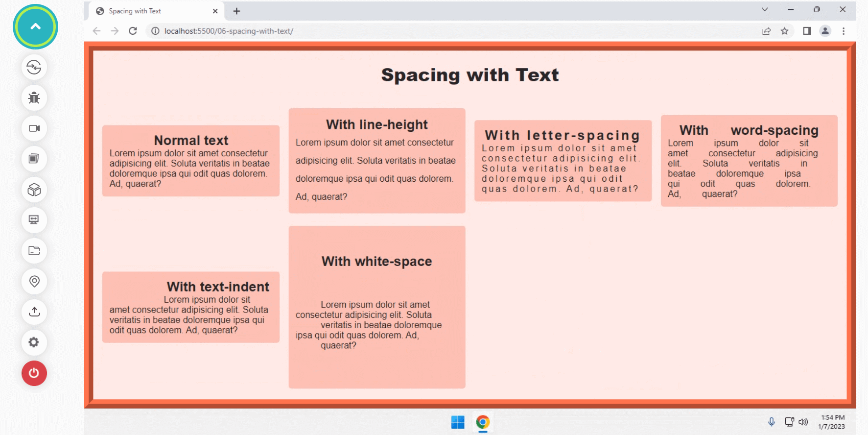
Spacing with text differs from layouts and web page elements. When it comes to text, we can mainly consider adding spacing between different letters, words, paragraphs, and columns of text. CSS allows us to add spacing between different letters and words using different properties such as line-height, letter-spacing, word-spacing, text-indent, and white-space.
- line-height: It allows us to set the height or distance between lines of text. Its values can be either a
< number >(unitless), a< length >with a unit like px, em, or it can be a< percentage >value. - letter-spacing: It allows us to add horizontal space between text characters. The positive values make the character move apart from each other, while the negative value brings them close together.
- word-spacing: It allows us to define the spacing between words and extend the space between different words by the length specified.
- text-indent: This property sets the length for the empty that is put before the lines of text and allows to change indentation, which changes the empty space of the first line.
- white-space: It allows us to specify how the white-space inside an element is handled. It can be used to set whether and how white-space is collapsed and whether lines are allowed to wrap soft-wrap prospects.
Let’s try to understand each of the properties in action with an example.
Code:
Output:
See the Pen
Spacing with Text by Aakash Rao (@aakash_codes)
on CodePen.
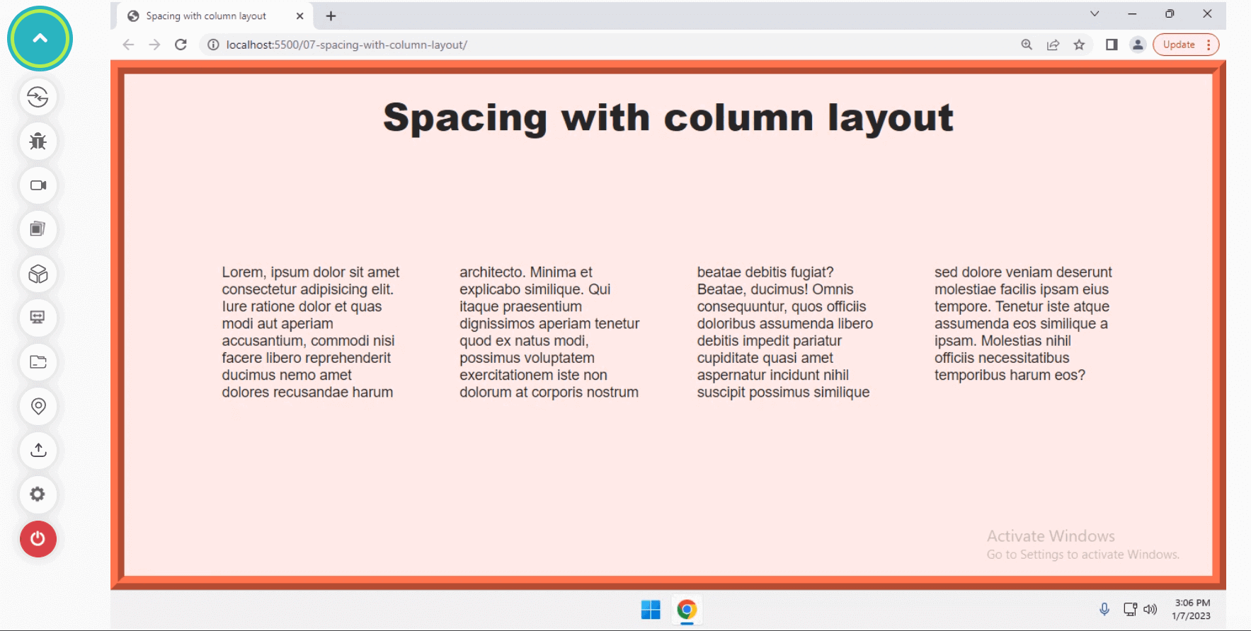
So far, we have covered how spacing works with text characters and paragraphs. Let’s try to analyze how it works with columns of text. In CSS, we can create columns of text using the column property.
Column: It is a shorthand property of column-width and column-count, allowing us to define the number and width of columns.
To set a gap or a space between a number of columns created, we can privilege the column-gap property to define the gutter or gap between each column. Let’s quickly see it in action with a quick example.
Code:
Output:
See the Pen
Spacing with Column Layout by Aakash Rao (@aakash_codes)
on CodePen.
We’ve already learned how spacing works with different layouts, elements, and text on a web page. Let’s now quickly look at margin collapsing and try to understand how it works with CSS Grid and Flexbox.
The concept of margin collapsing in CSS
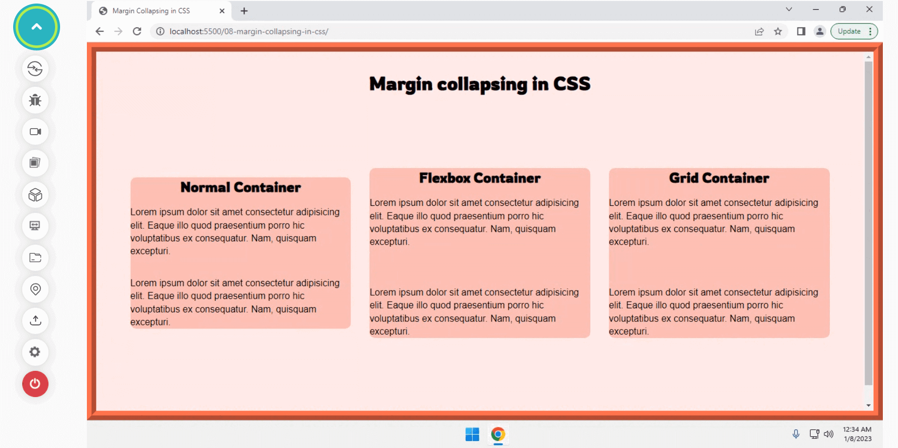
Margin collapsing happens between the two elements when a margin is defined at the top and bottom direction. It results in a single margin equal to the largest margin of the two margins of the elements.
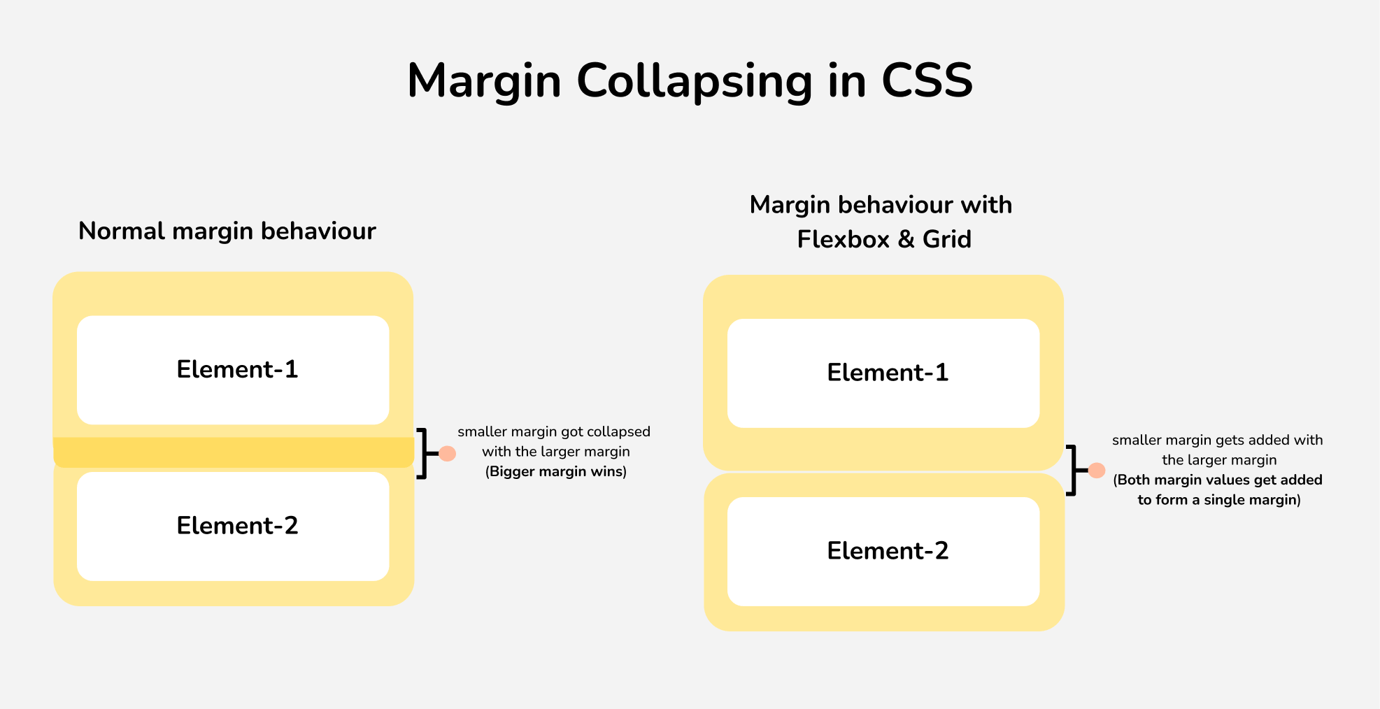
However, margin collapsing happens differently when it comes to CSS Flexbox & Grid layouts. Both margins get added, and the total margin gets applied between the two elements inside the Flexbox and Grid. Let’s try to visualize and understand margin collapsing and its unique behavior for Flexbox and Grid layouts with an example.
Code:
Output:
See the Pen
Margin Collapsing in CSS by Aakash Rao (@aakash_codes)
on CodePen.
So far, we understand how spacing works with different layouts and text and how the behavior of margin collapse changes with Flexbox and Grid layouts. Let’s move forward to our final topic to understand different techniques for adding spacing between elements.
Techniques for adding spacing between elements
So far, we have understood how spacing works with different layouts and elements of the web page in the browser. Let’s now see the different scenarios where different techniques are needed with CSS to add and apply spacing to the page’s interface.
Using abstracted components
Consider a scenario of using a design system or a framework that contains many components. It is not logical to apply spacing directly to add a custom spacing according to the needs. To solve this issue, we make use of abstracted components.
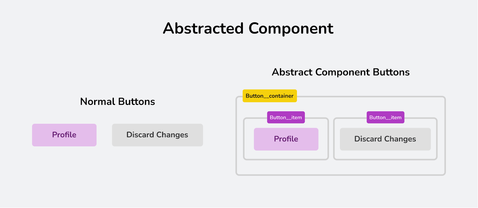
Abstracted components are a technique that groups low-level related constants of a planning problem into more abstract entities or shorter components. In simple terms, it refers to the idea of grouping features connected through static relationships into more abstract units. In simple terms, we add a wrapper, and each element should now be wrapped in its own element.
Let’s try to understand this behavior with a quick example.
Code:
Output:
See the Pen
Example of Abstracted component by Aakash Rao (@aakash_codes)
on CodePen.
Utilizing this technique makes it simple to add spacing without disturbing the overall layout while using a framework. Now that we know how to apply abstract components, let’s try to analyze another useful technique for adding spacing between elements using spacer components.
Using Spacer components
Consider a scenario of using a component-based framework, e.g., React, which contains many components. Adding margin to a component’s top level is not good because it breaks the isolation of components.
The margin breaks the component encapsulation. A well-constructed component shouldn’t have any external effects. Margin makes reusability difficult. It affects not only the component itself but also the other components (e.g., it pushes off another element/component sitting right next to it).
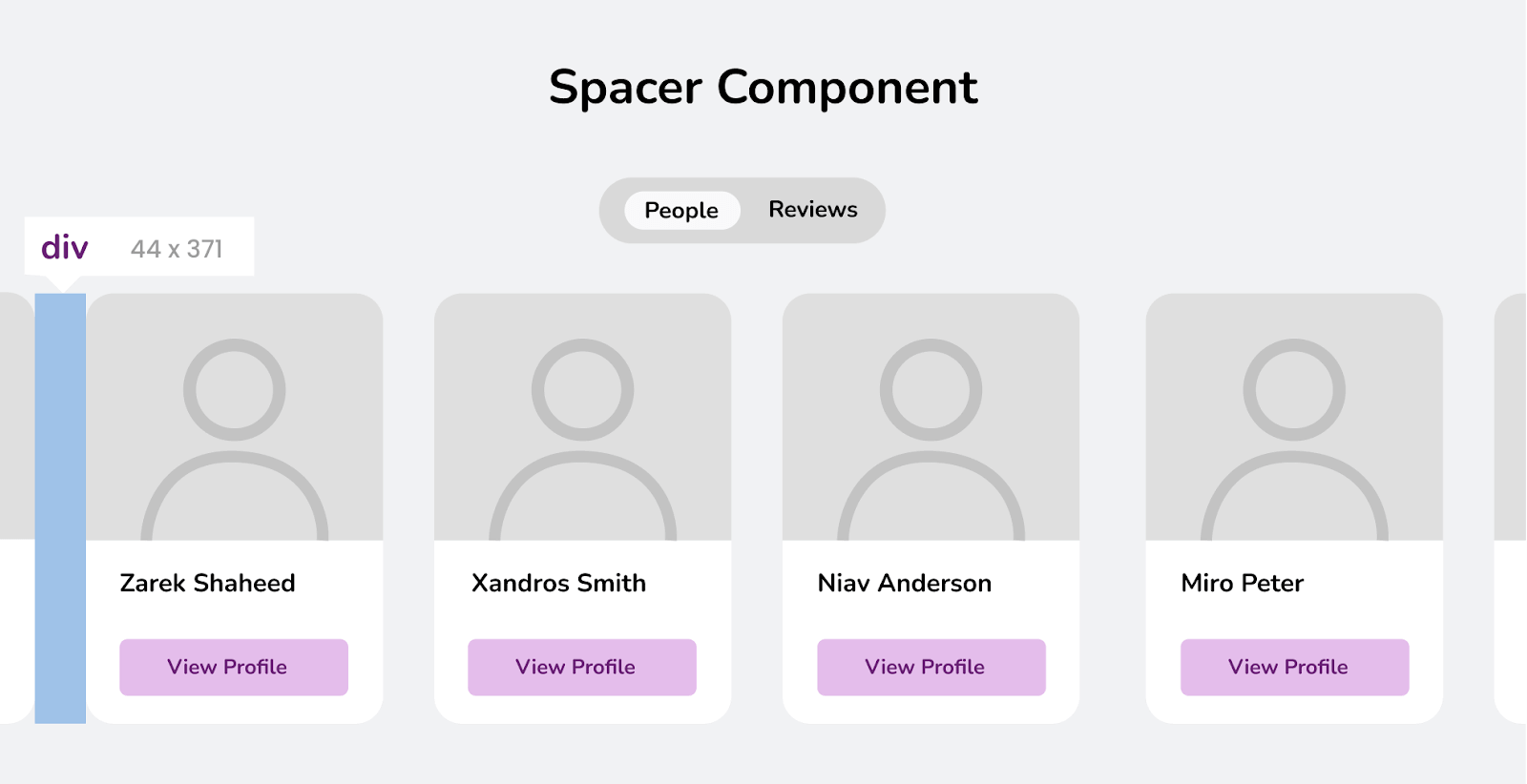
To solve this issue, we use spacer components or elements to add spacing between elements, and the simple idea is to use a component (blank < div >) to add additional white space between two elements in an interface.
We can customize it later by using different properties for its size and direction. Let’s try to understand this behavior with an example.
Code:
Output:
See the Pen
Example of Spacer component by Aakash Rao (@aakash_codes)
on CodePen.
By far, it’s evitable to say that spacer components provide developers with a convenient way to add spacing while working with a large design system or framework. Let’s try to understand how to add dynamic spacing using math functions in CSS.
Using Math functions
For adding dynamic margins, padding, or creating gutters (gaps) between elements, CSS allows us to use some of its math functions which include:
- max(): The max() function in CSS is used to set the maximum of the value given to that function. It takes two comma-separated values and returns the largest value among the specified values.
- min(): The min() function takes two comma-separated values and returns the minimum extracted value passed to that function.
- clamp(): The clamp() function in CSS is used to apply a middle value from a range of values specified. The function accepts three parameters: a minimum value, a preferred value, and a maximum value. The minimum and maximum values only get applied when they are smaller or greater than the preferred value.
Let’s try applying these functions to add a margin to an element with an example.
Code:
Output:
See the Pen
Using min(), max() & clamp() functions by Aakash Rao (@aakash_codes)
on CodePen.
Practical Examples and Use Cases of CSS Spacing
Now that we’ve learned all the various techniques and rules of adding spacing to different elements, layouts, and text. Let’s try to apply all the knowledge with some practical examples:
Header Component
In the example of a header component, we have different sample elements, which include: a logo, links, and a button for login or signup. To create a nice visual hierarchy of the component, we use the margin and padding, which helps us to differentiate each individual element and its importance.
See the Pen
Header component example by Aakash Rao (@aakash_codes)
on CodePen.
Card Component
Card is a very commonly used component in web pages to display information and also plays a major role as a call to action to the users. It’s important to showcase it properly to make it easy to read and understand by adding appropriate margins and padding. This helps us to create a pleasant user experience and highlight all the important features.
See the Pen
Card Component Example by Aakash Rao (@aakash_codes)
on CodePen.
Feedback Component
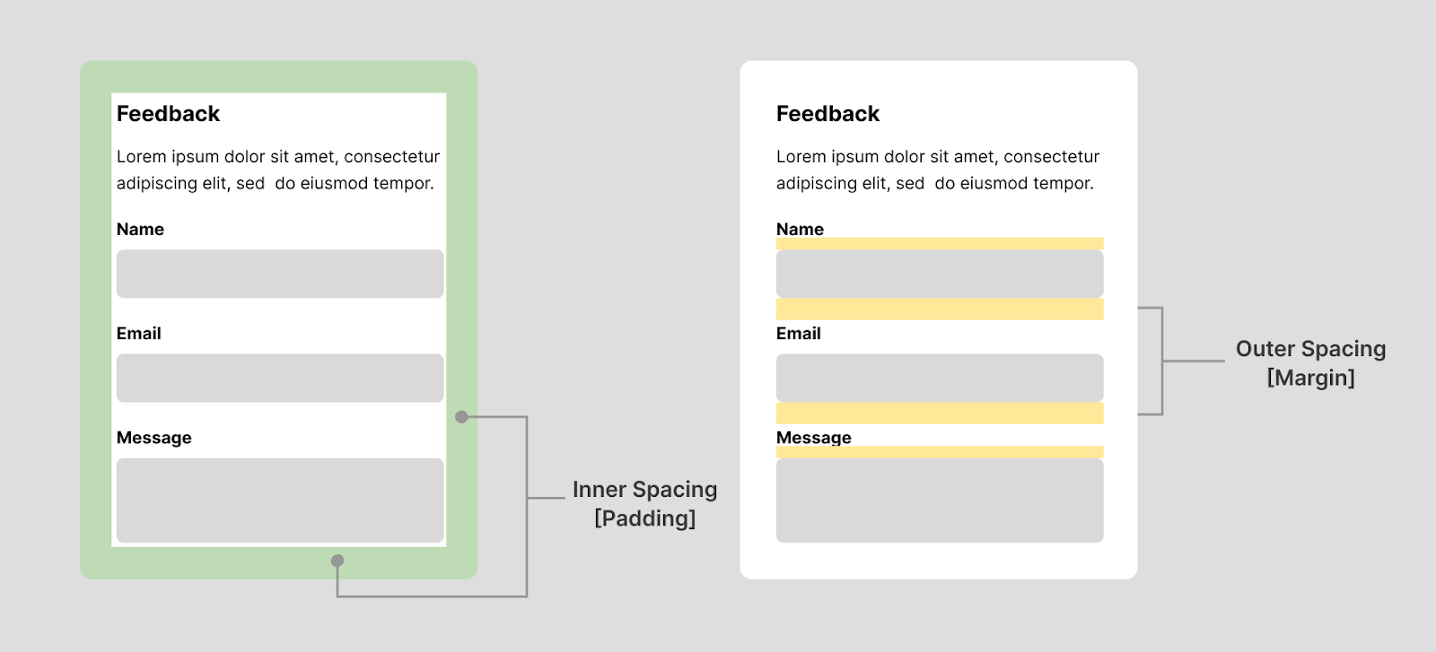
Another great example to showcase the importance of spacing would be the between the inputs commonly used in components like feedback, contact-us, or login/sign-up to receive and collect messages or information from users.
Providing proper internal and outer spacing between each of the inputs creates a nice visual hierarchy to better retain the details of each of the user inputs and increase the visual experience.
See the Pen
Feedback Component Example by Aakash Rao (@aakash_codes)
on CodePen.
Wrapping up
By far, we’ve learned everything about CSS Spacing and how internal, and outer spacing plays a big role in the layout’s overall look and structure. Spacing or white space has a lot of power, and it provides us with the simplicity to provide a better user experience for our users.
In this detailed guide to CSS Spacing, we learned how to create internal spacing with padding using different techniques or properties offered by CSS. Also, we’ve compared different layouts to get a clear picture of how spacing can break or make the layout.
Frequently Asked Questions (FAQs)
What is Internal Spacing?
Internal Spacing, also known as Padding in CSS, is used to create space around an element’s content, which usually lies inside the border of an element. It is the space between the element’s content and the border. With the padding property, we can define the internal spacing for an element.
Why do we need CSS Spacing?
CSS Spacing in terms of Padding and margin within the content helps us to create a nice visual hierarchy and makes the page easier to read. It simplifies the interactions between users and the web page by reducing the unnecessary clutter of information and helps retain the information properly and in a simpler manner.
What is the difference between Internal and External Spacing?
Internal Spacing, also referred to as Inner Spacing or Padding, is used to create space around an element’s content, which lies inside the border of an element. On the other hand, External Spacing or Outer Spacing or margin is used to create space between elements to create a visual hierarchy and make the user understand the pattern and the content effortlessly.
Why use Gap property over Margin?
The gap property makes the overall architecture of the code to be cleaner and simpler. It also brings responsive design out of the box: and works fine without making us write any negative margins or media queries for switching margin-left to margin-top when it comes to changing the flex-direction of items inside a flex container.
The gap makes our component and layout completely reusable and easier to extend and maintain and is now supported by both Grid and Flexbox on all browsers, which allows us to reuse the components without worrying about browser compatibility.
Why use Spacer Components?
While working with component-based frameworks, e.g., React, that contain many components, adding a margin to a component’s top level can break the isolation of components.
A well-constructed component shouldn’t have any external effects. Margin makes reusability difficult. It affects not only the component but also the other components To solve this issue, we use spacer components. The simple idea is to use a component (blank < div >) to add additional white space between two elements in an interface.


Author’s Profile
Aakash Rao
I am a Frontend Developer and Technical Writer based out of India who loves to create and share knowledge on Twitter with the community. I am a community guy who loves to connect and interact with fellow developers and enthusiasts. Alongside, I love to listen to podcasts and read books with a keen passion to explore other fields such as Graphic design & VFX.
Blogs: 6
Got Questions? Drop them on LambdaTest Community. Visit now


