How To Use CSS Breakpoints For Responsive Design
Nimritee
Posted On: July 20, 2021
![]() 228143 Views
228143 Views
![]() 18 Min Read
18 Min Read
Today’s potential customers are smart, sophisticated, and time-starved and they want their requirements to be addressed instantly. Therefore, an ultimate user experience is crucial to the success and survival of organizations that aim to enhance their user’s engagement. The goal would be to convert these visitors into customers which would eventually add to the revenue of the organization.
A website (or app) that adheres to the fundamentals of responsive web design offers an amazing experience across various device viewports (or screen sizes) is part of the ideal online user journey. A responsive site design should prioritize easy navigation, dynamic and legible information, and other elements. A smooth user experience across various device viewport widths may be difficult given the wide variety of devices on the market. In order to implement responsive design for websites (and web applications), CSS responsive breakpoints can be crucial.
CSS responsive breakpoints are quite useful for creating a responsive web design, as it offers an awesome user experience on different screen sizes. This is realized by splitting the design into a smaller version(s) of the website based on the device’s screen size.

In this blog, we deep dive into breakpoints CSS and how it can be used to build responsive designs. The end result – website (or web app) with a top-notch user experience across different device viewports.
Let’s get started!
New to CSS Selectors? Check out this Ultimate CSS Selector cheat sheet to boost your web designing career.
TABLE OF CONTENT
What Are CSS Breakpoints?
CSS breakpoints are the points added in the code, the website content responds to these points depending on the device screen size. This helps in displaying an ideal layout to the end-user. CSS responsive breakpoints are used along with media query due to which it is also known as CSS media query breakpoints.
In other terms, best CSS media query breakpoints are the pixel values that a developer can specify in the breakpoints CSS code. An adjustment is made to give a pleasant user experience when a responsive website encounters such pixel values.
Read: How To Use CSS Media Queries For Responsive Design?
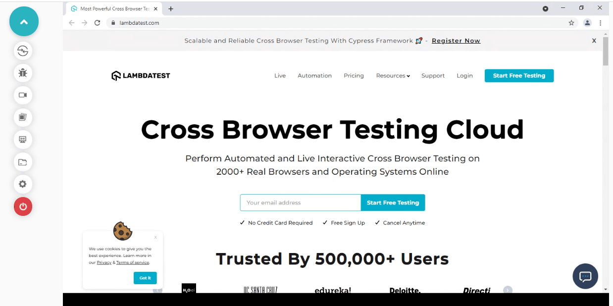
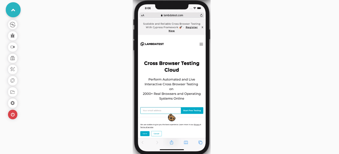
Let’s view the LambdaTest website on different device viewports to understand the basic essentials of CSS responsive breakpoints.
Desktop View
When we view the website on a simple desktop screen, the entire navigation menu is visible at the top of the page.
Mobile View
When the same website is viewed on a mobile device, the navigation bar appears like a hamburger menu on the top right corner of the screen. This is because the website is viewed on a device with a smaller display size.
It’s important to develop a mobile website that functions seamlessly across all devices, screen sizes, and resolutions. However, developers must bear in mind that 55% of all web traffic came through mobile phones. Therefore, after incorporating CSS responsive breakpoints in your websites, you need to test mobile view of website to ensure that your websites are well-optimized to run on different mobile device viewports.
Read More: How To Get Started With Mobile Website Testing In 2021?
LT Browser – a mobile friendly checker tool that allows you to test mobile view of website across multiple device viewports, including mobiles, tablets, desktops, and laptops. LT Browser comes with numerous features for developers to perform mobile testing and make their entire web dev process even smoother.
Some of the amazing features that LT Browser offers are:
- Provide a wide range of 50+ pre-installed device viewports to test on.
- Get Google lighthouse performance reports of websites. Based on the performance metrics, you can create a mobile-optimized web experience for the users.
- Network throttling feature to test websites on various network conditions.
- Sync Devices feature to test on multiple device viewports simultaneously.
- Mouse pointer to mimic the real device touch behavior on the viewports.
To delve deeper into the features of LT Browser, read our blog on the best features of LT Browser – a browser for developers!
You can also go through our LT Browser tutorial to easily kick start your mobile web testing.
How To Set A CSS Breakpoint?
The most challenging part is to select the best media query CSS breakpoints. There are no standard rules or syntax since different frameworks use different breakpoints.
Here are the two approaches to apply breakpoints CSS:
- Device-based breakpoints css
- Content-based breakpoints css
Device-Based Breakpoints CSS
Media query CSS breakpoints can be selected based on the device on which the website is being rendered. However, this is not a preferred approach since new devices are released frequently, and keeping up with new ones requires substantial effort.
Moreover, when a new device launches in the market, developers need to add a new breakpoint to the newly launched screen resolution. Applying the same breakpoint repeatedly to every device can turn out to be a cumbersome activity.
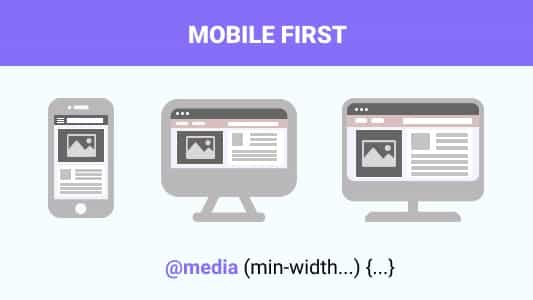
Depending on your website’s intent and the target audience, you can cover at least all the popular devices and subsequently apply breakpoints to them. As per a survey, close to 50 percent of web traffic originates from mobile devices. Therefore mobile first web design has become an absolute necessity in today’s time where mobile devices have become an indispensable part of our lives!
With this Responsive testing tutorial for beginners, you will learn how to perform Responsive Testing of your website on the LambdaTest platform.
Here are examples of a few device-specific CSS media query breakpoints.

For iPhone 12 Mini
|
1 2 3 4 5 6 7 |
/* ----------- iPhone 12 Mini ----------- */ /* 2340x1080 pixels at 476ppi */ @media only screen and (device-width: 360px) and (device-height: 780px) and (-webkit-device-pixel-ratio: 3) { } |
For iPhone 12, 12 Pro
|
1 2 3 4 5 6 7 |
/* ----------- iPhone 12, 12 Pro ----------- */ /* 2532x1170 pixels at 460ppi */ @media only screen and (device-width: 390px) and (device-height: 844px) and (-webkit-device-pixel-ratio: 3) { } |
For iPhone 11
|
1 2 3 4 5 6 |
/* ----------- iPhone 11 ----------- */ /* 1792x828px at 326ppi */ @media only screen and (device-width: 414px) and (device-height: 896px) and (-webkit-device-pixel-ratio: 2) { } |
For OnePlus 6
|
1 2 3 4 |
/* ----------- OnePlus 6 ----------- */ @media only screen and (min-width: 412px) and (max-width: 869px) {} |
You can also set the breakpoints for common device groups instead of specific devices.
|
1 2 3 4 5 6 7 8 9 10 11 12 13 14 |
/* For extremely small screen devices (595px and below) */ @media only screen and (max-width: 595px) {...} /* Small screen devices (600px and above) */ @media only screen and (min-width: 600px) {...} /* Medium screen devices (768px and above) */ @media only screen and (min-width: 768px) {...} /* Big screen devices (889px and above) */ @media only screen and (min-width: 889px) {...} /* Extra big screen devices (1200px and above) */ @media only screen and (min-width: 1200px) {...} |
Content-Based Breakpoints CSS
Instead of using device-based breakpoints, it’s better to use the website content for covering more scenarios in order to apply CSS media query breakpoints. In this approach, we simply set a breakpoint at each point where the content layout is misaligned. This method greatly simplifies the implementation along with easing the management of media queries.
As shown in the below example, on minimizing the screen size; the content begins to distort which in turn hampers the readability. To avoid this scenario, we insert CSS media query breakpoints to improve the readability aspects of the content.
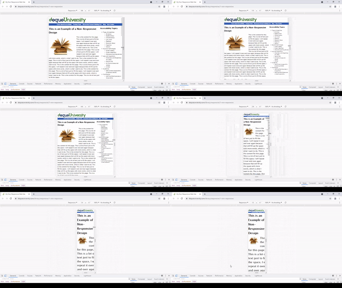
Here are the content-based breakpoints for different screen sizes.
For Resolutions 768px And Above
|
1 2 3 |
@media only screen (min-width: 768px){ ... } |
For Resolutions Between 768px And 960px
Note: We can also set a range with breakpoints, hence the CSS will only be applied to those specific ranges.
|
1 2 3 |
@media only screen and (min-width: 845px) and (max-width: 911px){ ... } |
Using min-width And max-width For CSS Responsive Breakpoints
You can add breakpoints CSS using min-width, max-width, or even a combination of both.
When designing the layout with a mobile-first approach in mind, it is recommended to use min-width breakpoints. By default, we would be setting the styles for small screen devices and later add & adjust for bigger screens.
Likewise, if we are designing our layout for large-screen devices, we should use max-width breakpoints. By default, we would be setting the styles for big-screen devices and later add & adjust for smaller screens.
Should You Use Pixels, Ems, Or Percentages In Breakpoints?
When defining things such as margins, padding, and font sizes, we mostly use pixels, but they are absolute units which means that they are not affected by any other factor in breakpoints CSS.
In comparison, the relative units ems and percentages get their final size based on multiple factors like the parent element’s font size or the root font size in the browser. As a result, using ems or percentages will significantly reduce the need for media-query-specific classes and make the website more responsive and easier to manage.
What Breakpoints Should You Use?
We need not create multiple CSS media query breakpoints for every device width. This approach was used earlier for creating a responsive website when there were fewer devices in the market.
You can make the process of building a website much easier if you know which CSS media breakpoints to use. Several CSS media breakpoints will likely work for most websites, including popular devices and content types.
Here are the most popular frameworks – Foundation, Bootstrap, and Bulma.
- Foundation – 40em and 64em
- Bootstrap – 576px, 768px, 992px, and 1200px
- Bulma – 768px, 769px, 1024px, 1216px, and 1408px
The most common screen resolution in 2022, as per the Worldwide Screen Resolution Stats from Sept 2021 to Sept 2022, is 1920×1080, accounting for 9.94% of devices. The second most common resolution is 1366×768, making up 6.22% of devices.
Mobile-first design is currently considered the industry standard and is widely used by brands that want to be on the cutting edge of responsive website design. Therefore, employing these breakpoints will result in higher degrees of responsiveness for websites.
With many devices rolling out, it’s impractical to cover all the new devices for applying CSS responsive breakpoints. Rather, try to choose breakpoints based on the web design and target devices that are extensively used by the audience in the target markets.
Some common Breakpoints For Responsive Design are:
- 1920×1080
- 1366×768
- 1536×864
- 1280×720
- 1440×900
- 1600×900
Using the CSS breakpoints mentioned above, you can create a simplified and manageable responsive website.
Also Read: The Ultimate Guide To Building A Mobile Friendly Website
For example, consider the LambdaTest website; the automation testing page has two content boxes aligned horizontally when viewed on a desktop. The same is piled to one column on mobile and tablet devices.
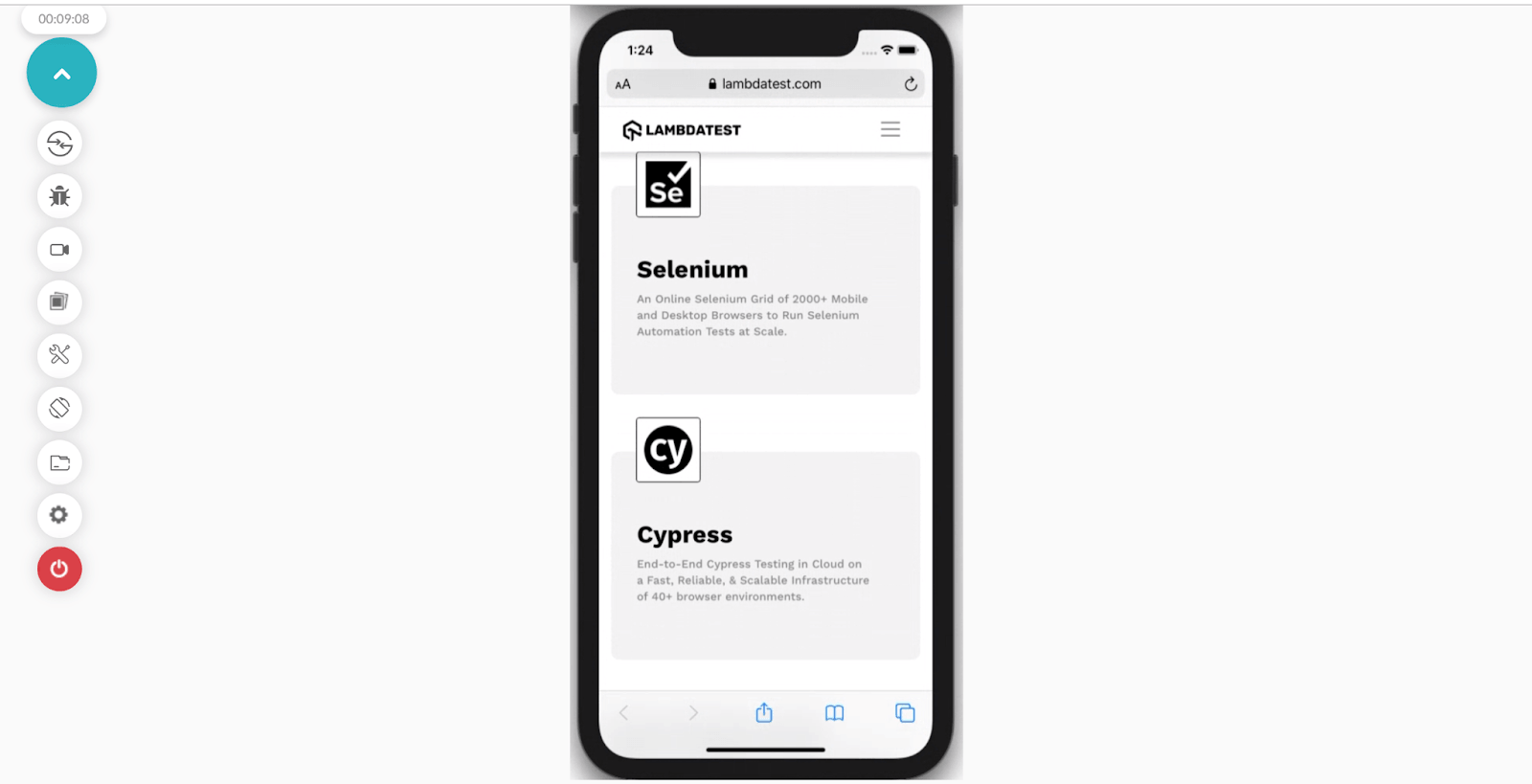
Mobile design with one column
Beginning with mobile widths and scaling up, selecting the viewport width at which we want the design to change to two columns. So, how do you test the responsiveness of your website on different devices and viewports? This is where LT Browser – a free-to-use mobile-friendly test tool for responsive test, can be leveraged for ensuring that your website (or web app) scores well on all the aspects related to website’s responsiveness.
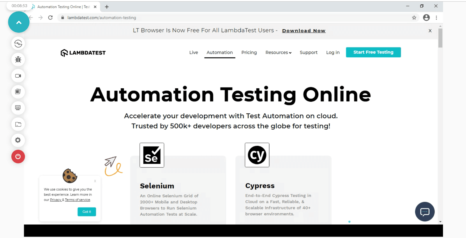
Desktop design with two columns
We can start with 3 to 4 breakpoints covering all screen sizes; from small screens to big screens; and set the breakpoints at 42em, 60em, and 81em. The mobile phones will fall under the 768px category, and tablets will approximately fall above 768px. So basically, all the small screen devices mostly fall between 480px to 1024px whereas the large screen devices will fall above 1201px.
This method lets you incorporate all devices within these ranges of viewport widths.
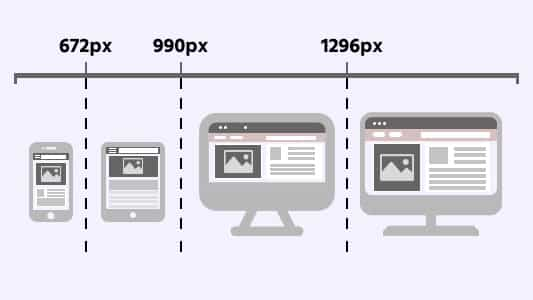
Operating with a small range of breakpoints will help us maintain the responsiveness of the styles in a consistent manner.
Best Practices For Adding CSS Breakpoints For Responsive Design
- Use minify HTML, CSS, and JavaScript to improve page load time by optimizing your code (including deleting spaces, commas, and other redundant characters).
- Designing for the smaller screen (mobile phones) is more complicated than the larger screens (desktops). Hence, it is better to set the priorities right from the word go!
- It is easier to simplify the mobile view of a website in comparison to its desktop view. When a design is being prepared, a mobile view of the website should be kept in mind. Designers first address the most important objects and then make few additions for the desktop view.
- The amount of implementation decreases significantly since the block-level elements (e.g. heading, div, or section) will directly expand to 100%. Therefore, most of the content will automatically fit into the mobile view of the website.
- Designers and developers must prioritize the features based on the type and form factor of the mobile device. For example, prioritization has to be made between voice commands and keyboard/touchpad commands.
Wrapping Up
Adding correct CSS responsive breakpoints takes immense time and effort. Therefore after implementing CSS media query breakpoints, it is essential to perform responsive testing websites to check how your website looks and behaves across various screen sizes. In addition, you can keep a web design checklist in hand while developing websites with CSS breakpoints.
In this post, we have learned how to use CSS breakpoints for responsive design to help developers reduce their pain points while debugging a website. Along with responsive testing, you can also leverage LambdaTest – a cross browser testing platform to test the browser compatibility of websites with CSS breakpoints across 3000+ real browsers and operating systems online.
If you’ve your own experience with CSS breakpoints, please share them in the comment section below.
Happy Designing!
Frequently Asked Questions
What are the types of CSS breakpoints?
CSS breakpoints are of two types – device-based and content-based breakpoints. In device-based breakpoints you can select media query breakpoints based on the device on which the website is being rendered whereas in content-based breakpoints you can select the best CSS media query breakpoints based on website’s content.
What are common breakpoints?
Common breakpoints are 320px — 480px for mobile devices, 481px — 768px for iPads & tablets, 769px — 1024px for small screens like laptop, 1025px — 1200px for large screens like Desktops, and 1201px and above for extra large screens like TV.
What are media query breakpoints?
You can view every website on a variety of devices with various screen sizes and resolutions. The website’s content responds to these points and adapts itself to the screen size to display an ideal layout. CSS breakpoints are implemented with media queries therefore they are also know as media query breakpoints.
How do you change the breakpoint in CSS?
The most common method for setting CSS breakpoints is using max-width or min-width. Beginners should note that min-width is used to set breakpoints for mobile devices, while max-width is used to set breakpoints for larger screens. In your code, you need to begin by indicating the properties for smaller screens and then setting the styles for the bigger ones.
What is CSS breakpoint for mobile?
A CSS breakpoint for mobile typically refers to the point at which the layout of a website or application changes to better fit the screen of a mobile device. This is often done using CSS media queries.
There is no specific CSS breakpoint for mobile, as the size of mobile devices can vary widely. However, a common approach is to use a breakpoint around 768 pixels wide, which is the width of many small tablets and larger smartphones when in portrait mode. This breakpoint can be used to change the layout of the website or application to fit better a smaller screen, such as by adjusting font sizes, reorganizing content, or hiding particular elements.
What are breakpoints in CSS?
CSS breakpoints are specific points or ranges of screen widths where the layout and styling of a webpage can be adjusted. They allow for responsive design by targeting different devices and screen sizes to ensure optimal display and user experience.
How to override bootstrap CSS breakpoints?
To override Bootstrap CSS breakpoints, define custom media queries in your CSS file with modified min-width values corresponding to the desired breakpoints, and apply your custom styles within those media queries.
How many CSS breakpoints can you have?
CSS breakpoints are not limited to a specific number, you can add as many breakpoints as you like. Depending on the needs of the project, you can define as many breakpoints as necessary to accommodate different screen sizes and adjust the layout and styles accordingly.
How to add breakpoints to CSS?
To add breakpoints to CSS, use media queries with min-width or max-width to target specific screen sizes. With a mobile-first approach, start by styling for small-screen devices and gradually add and adjust styles for larger screens.
How to use CSS breakpoints?
To use CSS breakpoints, you can define them using media queries with specific screen widths or other criteria. Within each breakpoint, you can apply different CSS rules to adapt the layout and styling for different devices or screen sizes.
What is a breakpoint range?
A breakpoint range refers to specific widths or heights in web design where a website’s layout adjusts for optimal viewing. Common breakpoints range from 320px to 1024px, but they can also consider height, orientation, or screen resolution. They can be customized to fit a webpage’s needs.
Got Questions? Drop them on LambdaTest Community. Visit now


