How To Test Mobile Websites On Different Network Conditions?
Ritesh Shetty
Posted On: January 18, 2021
![]() 86744 Views
86744 Views
![]() 8 Min Read
8 Min Read
This article is a part of our Content Hub. For more in-depth resources, check out our content hub on Mobile Testing Tutorial.
Today everyone is on the internet! As per HootSuite, 321 million users added in 2020 itself, taking the total number of internet users close to 4.4 billion. Now this is almost 60% of the global population that uses the internet. Most of these people use mobile to access the internet, and this number is expected to grow.
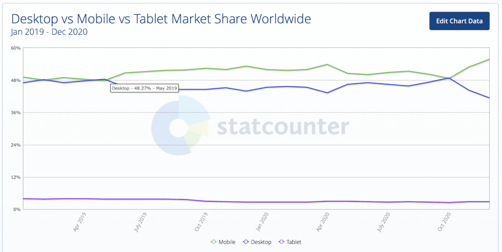
Even in the past couple years, the desktop traffic continues to dip, & mobile continues to spike. Thanks to high speed mobile networks that have enabled people to search and gain any information in seconds.
According to CNBC, almost three-quarters (72.6 percent) of internet users will access the web solely via their smartphones by 2025, equivalent to nearly 3.7 billion people, making it absolutely crucial to optimize your website for responsive web design.
Earlier, we published an article which talks about the importance of mobile-first design in 2021 and how businesses are already taking progressive steps towards optimizing their mobile website experience. But what needs to be the focal point is having a clear responsive web design checklist in place in place to ensure a seamless user experience. A critical part of that experience is speed.
Do you know you’ll lose out a lot on traffic and sales if your site loads slowly? According to Google, even a 1-second delay in mobile load time can impact conversions up to 20%. Making it crucial for your business success, and in some cases survival, that your website loads faster on mobile.
When testing your mobile website speed, you have to keep in mind that monitoring your website performance on a high-speed internet connection will not provide you accurate results. Why? Because mobile is a different story – it’s not like a desktop on which people usually access the internet on a high-speed connection.
In fact, on mobiles, slow phone data and internet speed are common, especially when people are on the go. This makes it extremely important for you to monitor and test your websites on different network conditions to analyze your website performance. Testing on variable speeds helps you analyze and provide a good user experience on mobile. It will also help you improve your search engine rankings – as search engines prefer websites that load quickly.
Check LT Browser: Next-Gen Browser To Build, Test & Debug Mobile Websites
Wondering how to test your mobile websites on different networks? Well, the solution is by simulating. With network simulation, you can test how your website behaves on different networks and ensure your website is optimized when accessed on such networks. Network Simulation makes it easier to test and monitor your mobile website and helps you provide a seamless experience to your mobile users.
Why Mobile Experience Is Crucial For Your Business Success And What Are The Roadblocks?
80% of shoppers used a mobile phone inside a physical store to either look up product reviews, compare prices, or find alternative store locations. As discussed above, mobile users have been dominating internet usage, and every business needs to understand how mobile website experience can be the crux of their conversion funnel. In fact, user experience testing is one of the most crucial testing aspects that a brand should adopt.

The reason being a seamless user experience is the primary factor for users while making a purchase. Here are some common complaints of mobile website users:
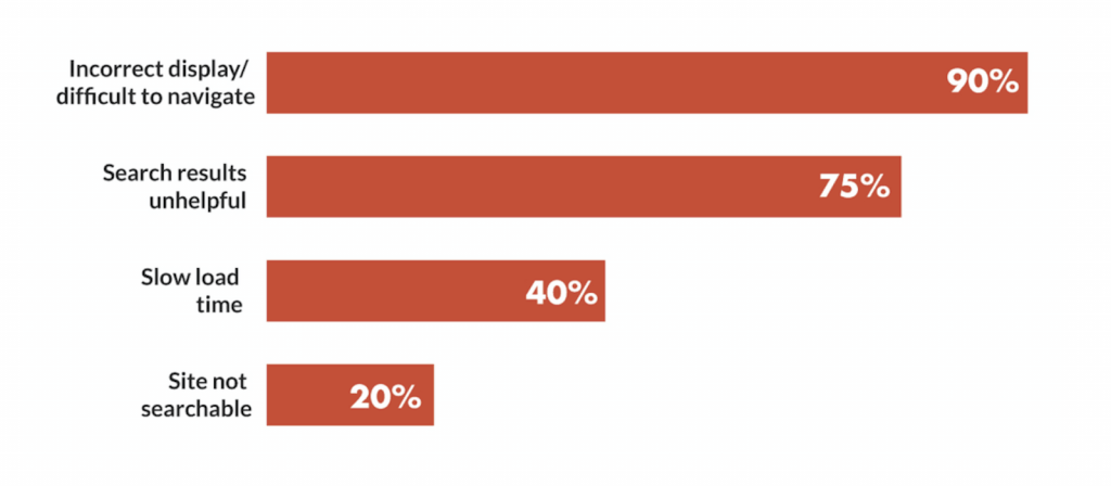
Historically, the roadblock for the mobile experience was devices, heavy design elements, but what underlines the issue is network conditions. Mobile networks are better when they are under ambient coverage locations, which is a limiting factor. A slower network causes latency and might not render the website to the user leading to higher bounce rates.
According to McKinsey’s report, 61% may not visit the site they had a problem accessing, and 40% might switch to competitors. Though page speed is just one of the many factors that affect rankings, it is an important one. Test website on mobile for FREE!!
Watch this video to learn about network interception using bidirectional APIs in Selenium 4.
How LT Browser Can Help in Solving This Problem?
LT Browser is the best browser for developers that will help you instantly view, build, and debug your mobile website on 50+ mobile, tablet, and even desktop device resolutions. Simulating network conditions is one of the core features of LT Browser that makes it easier for the developers and designer to test the website at the initial stages.
At a click of a button, you can test your website on different network speeds and see how your website looks or behaves at variable speeds. With LT Browser, you can perform a usability test on slow networks and debug on the go. Let’s see how you can leverage the LT Browser for network throttling.
I tested an e-commerce store, Wayfair, using the LT Browser to simulate on different networks for mobile.
Lets analyze how Wayfair’s website performs over a slow 3G network.
First, I logged in to LT Browser, searched for wayfair on Google and changed my mobile network. To do that, I had to click on the network throttling feature and select either a Fast 3G network, a slow 3G network or an offline mode. For this demonstration, I selected the Slow3G option.
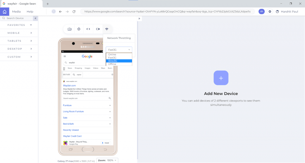
After selecting the Slow3G option from network throttling, I then clicked on the debug icon and opened the in-built developer tools. Next, heading to the Performance tab and clicking on the record button to start a new recording.
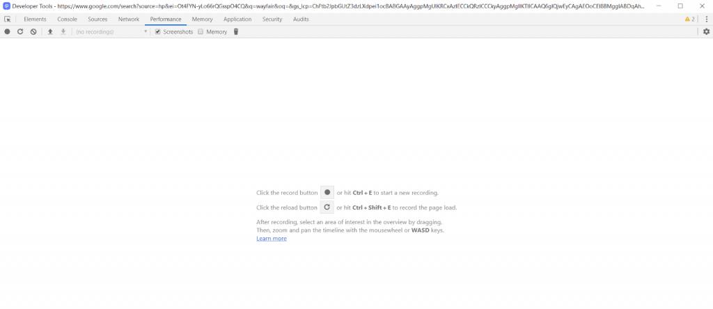
Guess what?
Wayfair’s website over a slow 3G network took roughly 30,000 milliseconds over a slow 3G network. That is half a minute!!
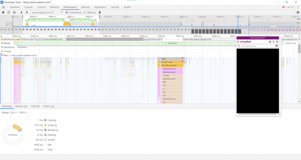
The website fails to load properly till 30,000 milliseconds over a slow 3G network. That is half a minute!!
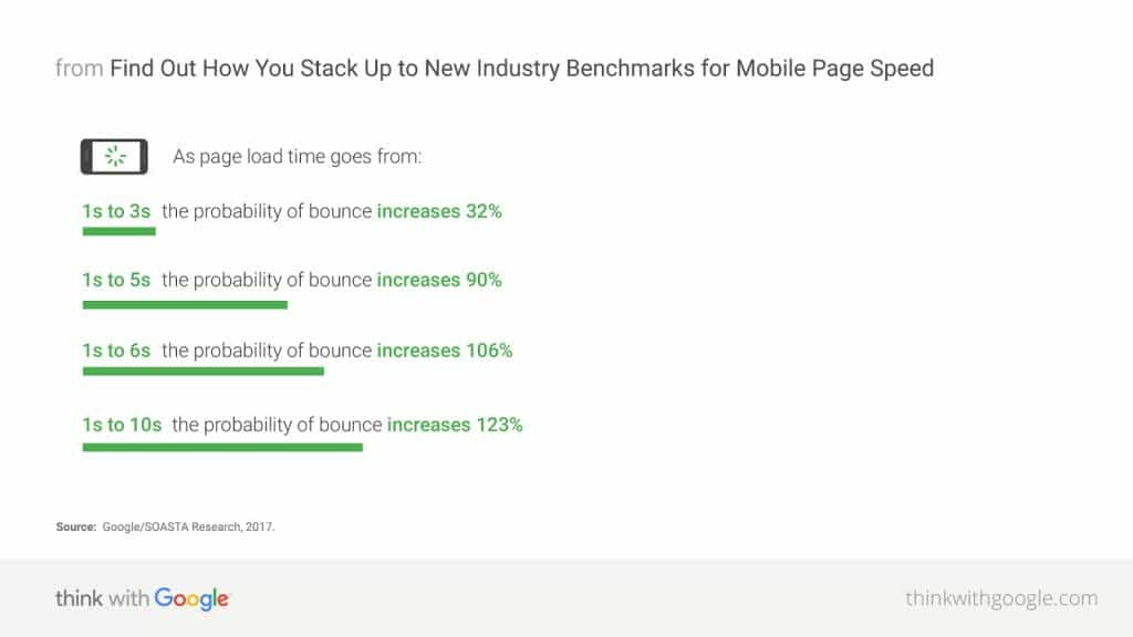
The longer it takes for your website to load, the higher bounce rate you are bound to witness. As per Google, the bounce rate spikes drastically for mobile websites after 3 seconds.
How To Improve Mobile View of Websites With LT Browser?
If you are a developer, you can use the LT Browser network throttling mobile website test to plan in advance on how to project a webpage if there is a network loss or a slow network speed. You can check how your web design test behaves on different network conditions and develop optimized designs for the future.
But that’s not all, to improvise your overall page speed you can generate performance reports using in-built Lighthouse Integration. You can analyse best practices, SEO score, accessibility and more to ensure your website’s performance ain’t impacting the user experience and SERP.
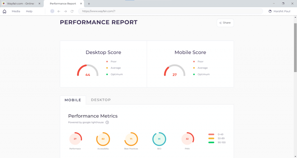
This is the performance report of Wayfair over a Fast3G network.
Similarly, developers can test at the early stage of development, ensuring optimal usage of
- packages or scripts
- removing unnecessary CSS
- minifying the CSS or javascript before pushing it live.
- Create responsive images.
LT Browser is also packed with rich features to help you with mobile view of website:
- Compare the mobile view of website in two device resolutions in a side by side view.
- Generates an error report to help you debug any issue while rendering a website.
- Third party integrations to help you capture screenshots of bugs, highlight and share it with your colleagues.
- Video recording of your test sessions.
- Capture full page screenshots of your website.
- Built-in media to save all your screenshots and video recordings to access them anytime.
- Enable mouse pointer for touch screen scroll experience.
- Hot reloading to help you perform responsive testing of locally hosted websites.
To know more about responsive testing from LambdaTest, please have a look at the detailed video below:
Wrapping up:
In this fast-paced online world, customers are acquired or lost in seconds – especially on mobile as these customers are time-starved. For businesses wanting to convert these users into revenue, it is crucial to provide them a seamless experience. If they find your website easy to navigate on fluctuating networks, the tendency to stay back on the website is higher. So it is crucial for your business success and, in many cases, survival to ensure your website is adaptive from the user point of view and ensure it’s accessible across variable network speeds.
With LT Browser, you can check your website on different network speeds and connections. Not just network throttling, but LT Browser comprises features that would help you enhance your overall mobile website developing and testing experience.
Got Questions? Drop them on LambdaTest Community. Visit now


