
11 Lifesaving HTML/CSS Tricks For Every Developer in 2024
Harish Rajora
Posted On: March 26, 2024
 145559 Views
 16 Min Read
Modern web development is dynamic. You can create a Hello World web page that runs in your favorite browser using less than five tags. It’s exciting and inspiring to see quick results and fast execution of the code we learned a few hours ago. However, as simple as it appears and feels at first, modern web design and development require a great deal of patience and skillful coding to flourish. A relatively minor flaw can cause your elements to float at random positions. Applying CSS tricks is one of the easiest ways to spruce up your web design and eliminate UI glitches.
While designing a web app, designers and developers must keep in mind cross browser compatibility issues, and the myriad of different screens present today. Unfortunately, all this is hard to catch up with for a beginner.
If the code becomes more extensive, it starts to create a lot of dependencies. In addition, such codes are hard to debug and only increase costs and time for the organization or individuals. In such scenarios, CSS tricks can do wonders for you as it helps to improve the overall appearance, interactive features, and accessibility of a web page or website.
This article lists down the 11 lifesaving CSS tricks for you to keep in mind while writing a web code. These tricks will help you create dependable websites and improve the user experience.
New to CSS Selectors? Check out this Ultimate CSS Selector cheat sheet to boost your web designing career.
Let’s begin with the top CSS tricks!
TABLE OF CONTENTS
- Club elements with the same styles
- Use percentages instead of absolute numbers
- ::before and ::after content
- position: absolute CSS
- Force CSS through !important
- Make use of variables
- Curving text along image boundary
- Explore the power of conical gradients
- Learn Selectors
- Bring better usability with :visited and :link
- Styling the first letter
- Testing browser compatibility of your CSS
- What are your personal CSS tricks?
Club elements with the same styles
We’ll start with one of the primary and most used CSS tricks while developing web code. Many times your elements may have the same stylings in the CSS.
For example, shown below is the snapshot of the Pizza Hut website.
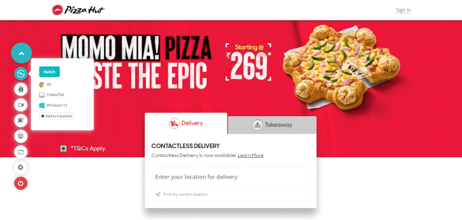
It has two elements in the center – Delivery and Takeaway. These are two separate “div” boxes. You can right-click on any of them and inspect to know their classes.
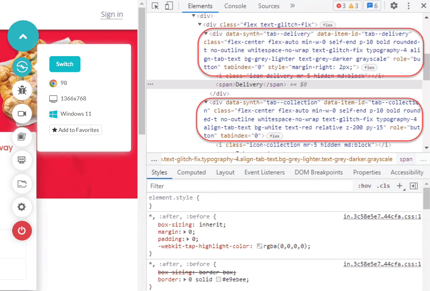
These “divs” have many things in common, especially their styling – the font, font size, backgrounds, font color, and many more. But they differ in their implementation because they are two separate elements as far as web dev is concerned. If you select one, a few things happen in the background and change, but the styling remains the same.
For such elements where a lot of styling has to be the same, combining them into a single snippet is better.
Let’s assume the two classes: “tab-delivery” and “tab-takeaway.”
The CSS code for the two classes, “tab-delivery” and “tab-takeaway,” is below.
|
1 2 3 4 5 6 7 8 9 10 11 12 13 14 |
<style> .tab-delivery { font-size: 16px; font-family: "Times New Roman", Times, serif; background-color: white; } .tab-takeaway { font-size: 16px; font-family: "Times New Roman", Times, serif; background-color: white; } </style> |
The combined CSS code for the two classes, “tab-delivery” and “tab-takeaway,” is below.
|
1 2 3 4 5 6 7 8 |
<style> .tab-delivery, .tab-takeaway { font-size: 16px; font-family: "Times New Roman", Times, serif; background-color: white; } </style> |
The main benefit of writing CSS code in the combined form is implementing the DRY methodology in our code. So in the future, if someone suggests a change in font color, you don’t have to find the classes and font color of all the elements in thousands of lines of CSS. Instead, just one edit, and you are good to go.
Test your HTML and CSS websites across 3000+ real environments. Try LambdaTest Now!
Use percentages instead of absolute numbers
As a beginner, one of your first concerns will be positioning your elements on the web page. Since most websites start by defining the width of elements in pixel numbers, it is often inevitable to begin placing these numbers in your code.
|
1 2 3 4 5 6 7 8 9 10 11 12 13 14 15 16 17 18 19 |
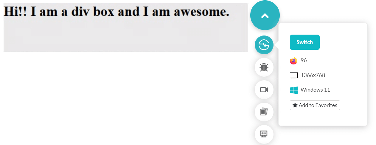
<!DOCTYPE html> <html lang="en" dir="ltr"> <head> <meta charset="utf-8"> <title>Absolute Numbers</title> </head> <style> div { background-color: #e7e7e7; width:500px; height: 100px; font-weight: bold; font-size: 28px; } </style> <body> <div> Hi!! I am a div box and I am awesome. </div> </body> </html> |
The above code creates a 100-pixel wide element with the applied background color on the web page.
However, there is a flaw with this approach. This works well since you developed it as per your screen and tested it.
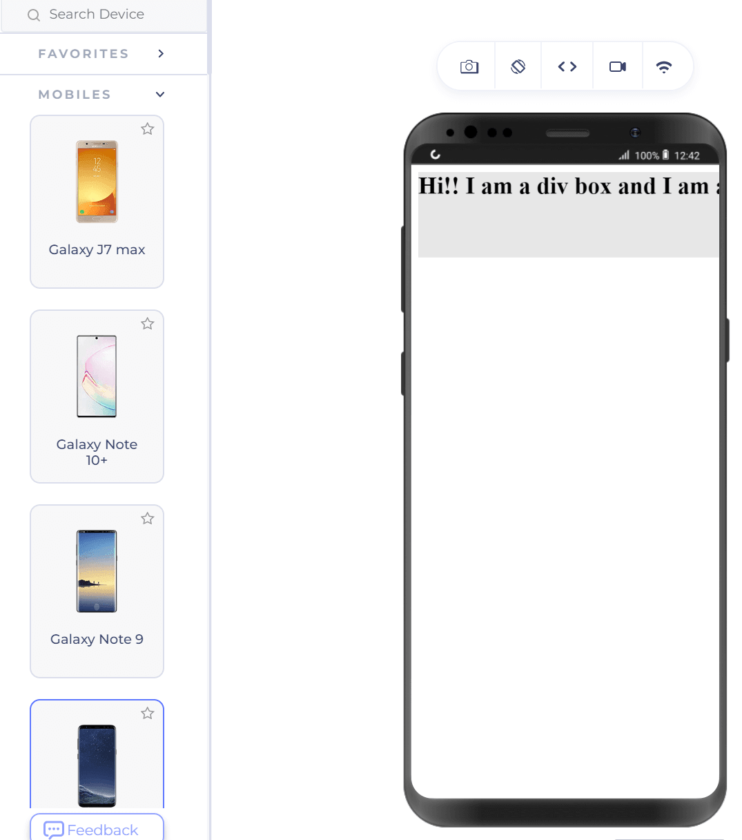
What if I now display the same web page on a mobile device?
Our box did not render entirely on the mobile device as it did on the desktop where we tested it.
Also, when we render the web page on a tablet, such as the iPad Pro, as shown below, the div box is half the size of the screen.
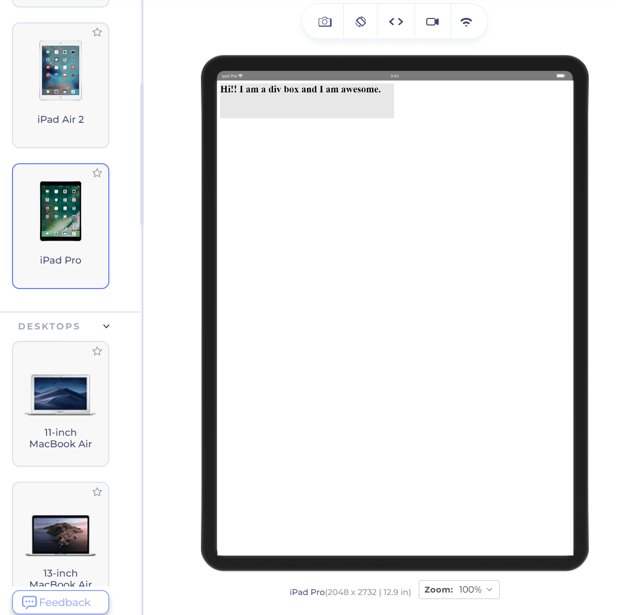
It would be less than ⅓ of the screen on a desktop (depending on the resolution). This problem is easy to identify as only one element is located here. However, developing a complete web page on your desktop and checking many elements will surprise you.
The CSS tricks to avoiding such surprises are using percentage values instead of absolute numbers. For the same code, let’s change the width from 500px to 30% as follows:
|
1 |
width:30%; |
The desktop representation of the div remains the same. But notice how it changes on the same mobile device selected as shown above.
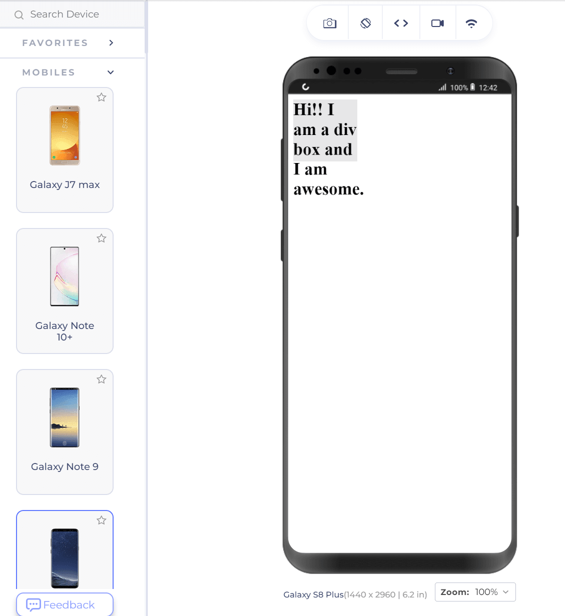
Except for the ugly part of text-overflow in the above screenshot, notice that the div box still covers 30% of the device width. This is extremely helpful in resolving browser compatibility issues and developing a consistent website.
For example, you might have a standard font size for the H2 element throughout the page or even the website. To avoid repetitive code, we utilize CSS and apply the style in a single place. However, developers are hardly pleased with a single element. They come up with
::before and ::after content
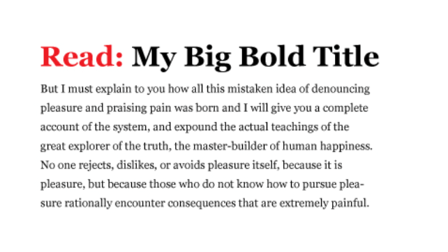
Many of the elements on your website will be redundant. For example, you might have a standard font size for the H2 element throughout the page or even the website. To avoid repetitive code, we utilize CSS and apply the style in a single place. However, developers are hardly pleased with a single element. They come up with creative methods to make each element stand out. This results in unique designs, as shown below.
Another example of such a design is shown below.
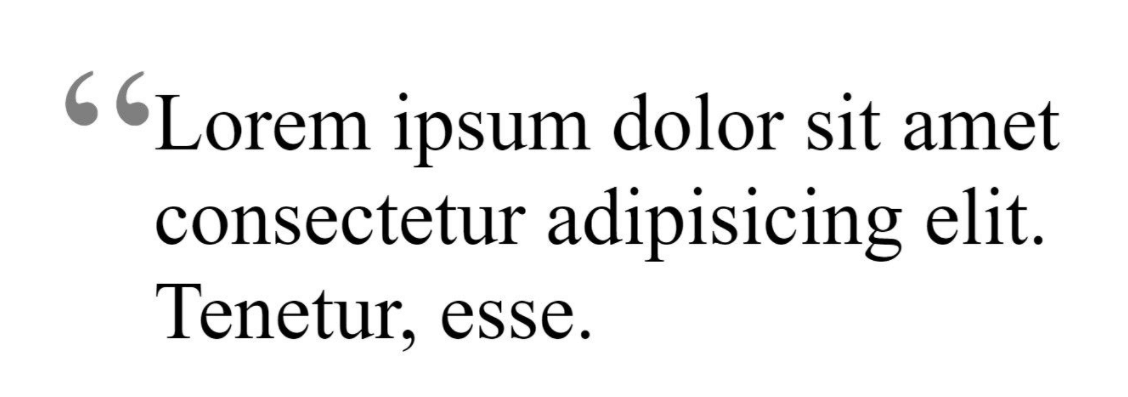
Hard coding these styling elements (read and stylish quotes) repeatedly on each element is not a good practice. Even if someone wants to change the color of the quotes, it is tough to make the changes on hundreds of quotes you already designed.
Putting something before or after any element in HTML is taken care of by :: before and ::after pseudo-elements of CSS.
Let’s say I want to put the location in front of all the news headlines and a “read more” text after the content. I can proceed in the following direction:
|
1 2 3 4 5 6 7 8 9 10 11 12 13 14 15 16 17 18 19 20 21 22 23 24 25 26 27 28 29 30 31 32 33 34 35 |
<!DOCTYPE html> <html lang="en" dir="ltr"> <head> <meta charset="utf-8"> <title>Absolute Numbers</title> </head> <style> #texas::before { content: "texas"; font-size: 12px; color: orange; } #washington::before { content: "washington"; font-size: 12px; color: orange; } .news::after { content : "Read More..."; color: red; } </style> <body> <h2 id="texas">XYZ to hold a new event in texas </h2> <p class="news"> Lorem ipsum dolor sit amet, consectetur adipisicing elit, sed do eiusmod tempor incididunt ut labore et dolore magna aliqua.</p> <h2 id="washington">XYZ to hold a new event in texas </h2> <p class="news"> Lorem ipsum dolor sit amet, consectetur adipisicing elit, sed do eiusmod tempor incididunt ut labore et dolore magna aliqua.</p> </body> </html> |
The output, when rendered on the LambdaTest platform on a VM, looks as follows:
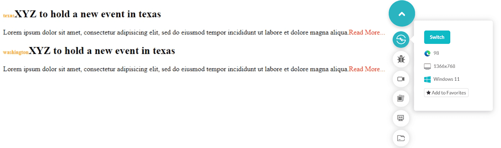
Notice how the location appears “before” the main heading and a “Read More…” sign “after” it. As I have done above, you can also style these components with the font size and color properties.
position: absolute CSS
CSS position property comes of great use while positioning the elements on the web page. It comes with static, CSS position sticky, absolute, relative, and fixed options. These values serve different purposes in defining the location of an element. Among them, position value absolute is something whose expertise will help you a lot in your web development career. It gives you more control over the elements and takes them out of the document’s normal flow.
An element with the position set as absolute can be positioned at a fixed location for all the situations you encounter in cross browser testing. However, the element will take the position relative to the first ancestor with the property set as absolute or relative. If no such element exists, the position takes reference from the root element, i.e., HTML.
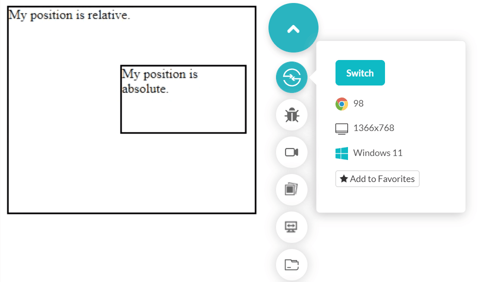
The following code places two div boxes with one as position: absolute.
|
1 2 3 4 5 6 7 8 9 10 11 12 13 14 15 16 17 18 19 20 21 22 23 24 25 26 27 28 29 30 31 32 33 34 |
<!DOCTYPE html> <html lang="en" dir="ltr"> <head> <meta charset="utf-8"> <title>Position Absolute</title> </head> <style> div.relative { position: relative; width: 300px; height: 250px; border: 2px solid #000000; } div.absolute { position: absolute; top: 70px; right: 10px; width: 150px; height: 80px; border: 2px solid #000000; } </style> <body> <div class = "relative">My position is relative. <div class = "absolute">My position is absolute.</div> </div> </body> </html> |
The output is rendered as follows.
Output on mobile.
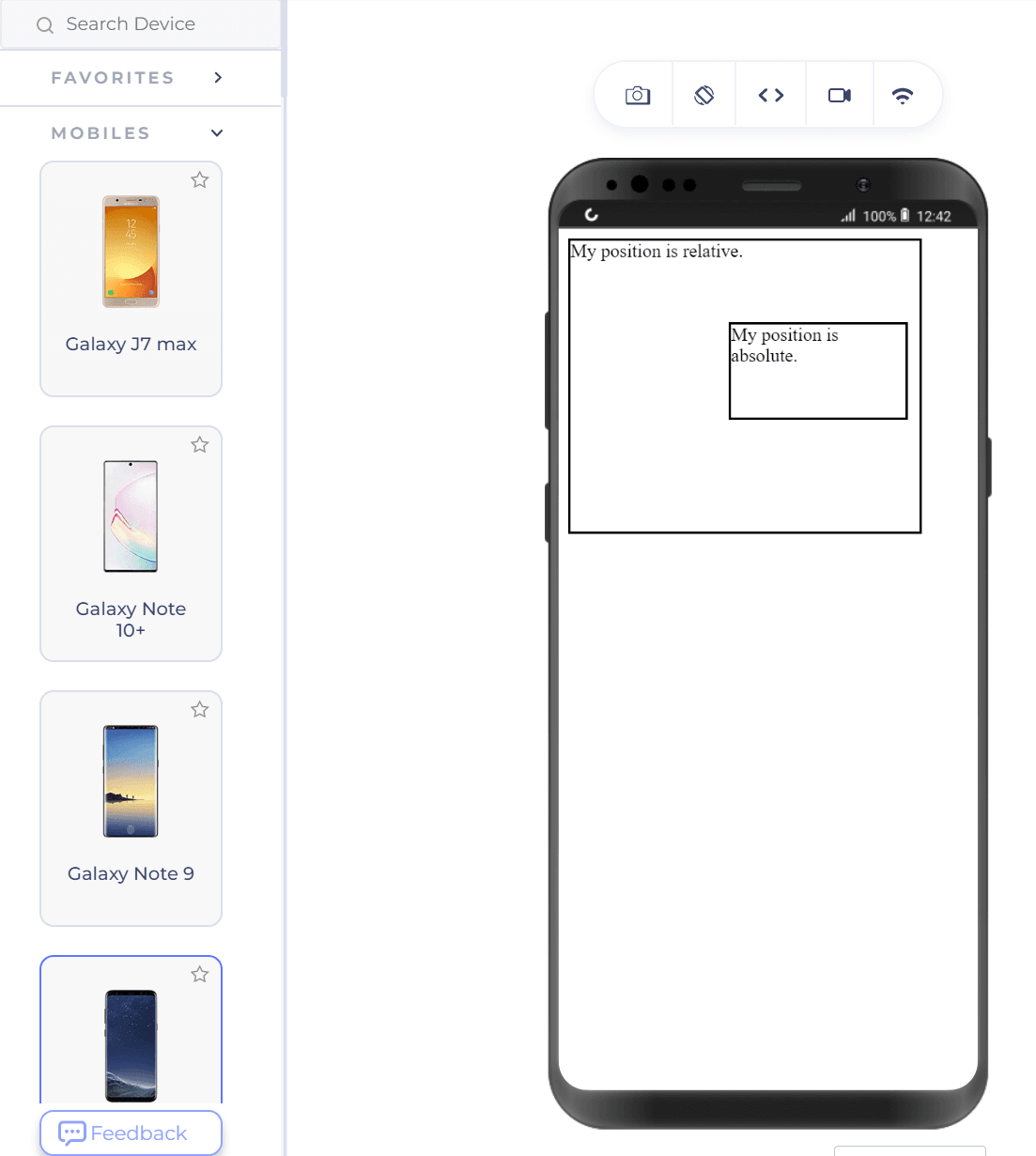
One important thing to remember is that the element with the position as absolute does not affect the other elements. It also does not affect any other element, which can create design issues later if you are not careful.
Force CSS through !important
Sometimes you may encounter a need to implement one or two properties differently to a couple of sections on the web page. However, since these new sections contain most of the properties consistent with other sections (that have all the properties), copying the CSS with just a couple of changes can increase repetitiveness. Hence, we forcefully apply CSS with the keyword !important.
The following code writes five headings in H2, with the fourth one being different in color due to forceful CSS.
|
1 2 3 4 5 6 7 8 9 10 11 12 13 14 15 16 17 18 19 20 21 22 23 24 25 26 27 |
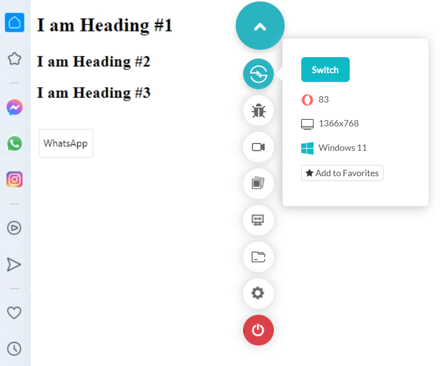
<!DOCTYPE html> <html lang="en" dir="ltr"> <head> <meta charset="utf-8"> <title>Position Absolute</title> </head> <style> h2 { color: #0d23e0; } .special { color: #d90d2f !important; } </style> <body> <h2> I am Heading #1 </h2> <h2> I am Heading #2 </h2> <h2> I am Heading #3 </h2> <h2 class = "special"> I am Heading #4 </h2> <h2> I am Heading #5 </h2> </body> </html> |
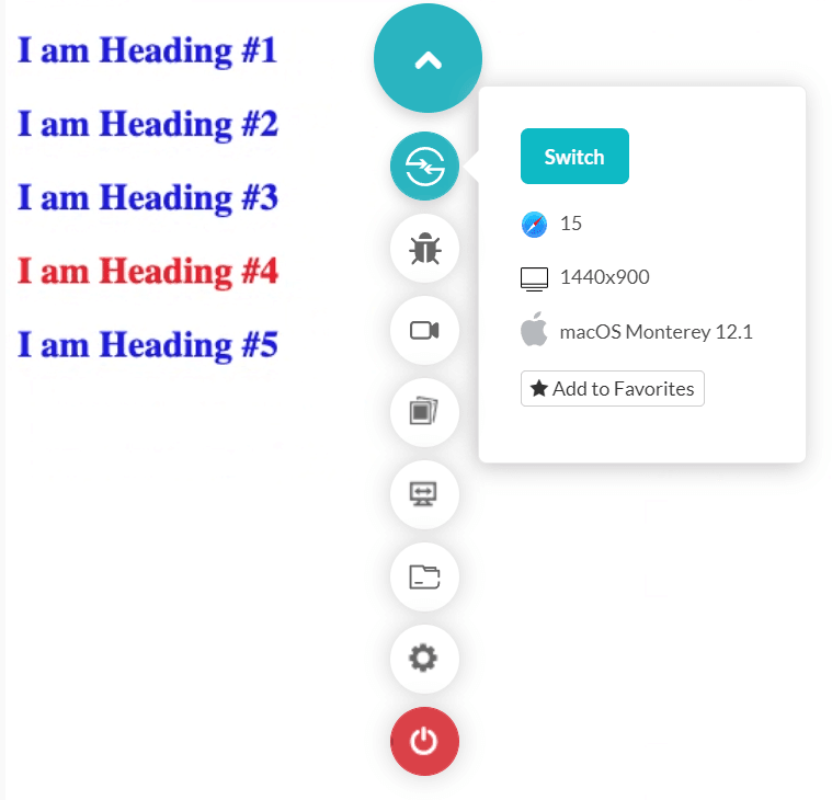
The fourth line is also rendered blue on the page if you remove the special code containing the !important keyword.
It is recommended not to use this property much in the CSS code you write. As a beginner, it might tempt you to quickly force a few properties when things are not going as you are expecting them. This approach can create issues later, and the code will become hard to debug.
Apply the “important” keyword only when indispensable, and you know the complete flow.
Make use of variables
Variables, best defined as CSS variables, reduce the same value across the website on different occasions. You can use it in cases opposite to using the !important keyword.
For example, we use !important when only a couple of properties need to be changed. At the same time, we use variables when only a couple properties are the same (font-size or color) and others differ according to their section. This is not a hard and fast rule but a good way to remember. So consider yourself applying 20px everywhere across the website for different sections as a font-size.
A change in this value can increase the maintenance and debugging cost and waste a lot of time. So instead, we can just declare a variable with a value of 20px and use that variable everywhere. Then, next time any changes occur, we can change the variable value, and all our changes will be reciprocated throughout the page.
The following HTML code implements the same use case as discussed above,
|
1 2 3 4 5 6 7 8 9 10 11 12 13 14 15 16 17 18 19 20 21 22 23 24 25 26 |
<!DOCTYPE html> <html lang="en" dir="ltr"> <head> <meta charset="utf-8"> <title>Position Absolute</title> </head> <style> :root { --my_font: 20px; } .class1 { font-size: var(--my_font); } .class2 { font-size: var(--my_font); } </style> <body> <h2> I am Heading #1 </h2> <h2 class = "class1"> I am Heading #2 </h2> <h2 class = "class2"> I am Heading #3 </h2> </body> </html> |
CSS variables are an extremely efficient method to make your code more maintainable.
Curving text along image boundary
Different design approaches focus on space management on the web page. I often see one such requirement is placing an image with text around it. This gives a similar effect as shown in newspaper content. It is also used to give an attractive feel to the web page while not focusing much on the image. In a sense, the image is often not too relevant. As a beginner or experienced web developer, this becomes quite challenging if you start to code with text wrap and positioning elements (if that’s possible!).
One of the CSS tricks is to use the shape-outside property of CSS. It defines a shape and adjusts content adjacent to that image. If you target a rectangular image, you may easily do that with other properties. For circles and ellipses especially, shape-outside is a savior.
|
1 2 3 4 5 6 7 8 9 10 11 12 13 14 15 16 17 18 19 20 21 22 |
<!DOCTYPE html> <html lang="en" dir="ltr"> <head> <meta charset="utf-8"> <title>Position Absolute</title> </head> <style> .curved_text { float:left; shape-outside: circle(50%); width: 200px; height: 200px; } </style> <body> <div class = "curved_text"></div> <p> <!-- Place content here → </p> </body> </html> |
Output
You can place any circular image like a balloon and curve the content around it. This CSS trick will surely help you build a solid design in a couple of lines of CSS codes in your next project.
Explore the power of conical gradients
CSS Gradients are a powerful way to visualize more than one color on the screen. It creates a smooth transition between colors that gives a unique design to the element and eventually to your website. With linear gradients and radial gradients in place for some time, you will find only these two at most places on the internet. CSS Image values and replaced content module level 4 describes another functional gradient – the conical gradient.
The conical gradient in CSS rotates the color transitions from the circle’s center. Conical gradient color ends at the circle’s boundary rather than radiating from the center with different radii.
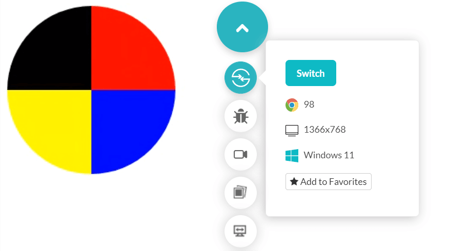
Pie charts are an excellent example of conical gradients.
The following simple code divides a circle into four segments resembling a pie chart:
|
1 2 3 4 5 6 7 8 9 10 11 12 13 14 15 16 17 18 19 |
<!DOCTYPE html> <html lang="en" dir="ltr"> <head> <meta charset="utf-8"> <title>Conical Gradient</title> </head> <style> .conic-grad { background: conic-gradient(red 25%, blue 0 50%, yellow 0 75%, black 0); width: 200px; height: 200px; border-radius: 50%; } </style> <body> <div class = "conic-grad"></div> </body> </html> |
Output
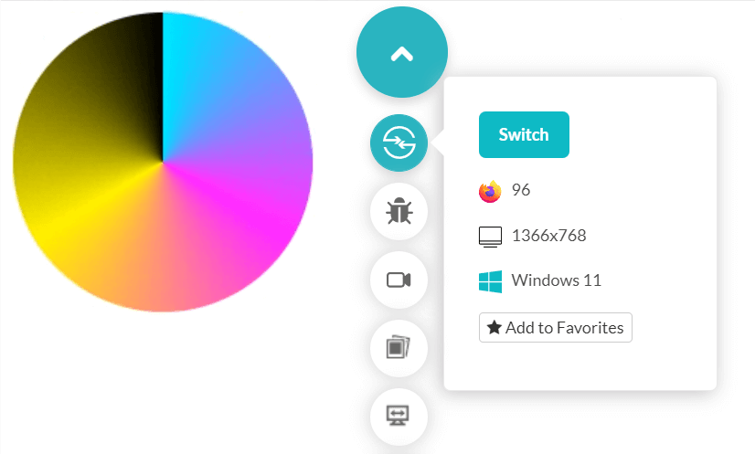
However, this is just a simple demonstration of conical gradients. They can also create a beautiful transition with just a single line of code as follows:
|
1 |
background: conic-gradient(cyan, magenta, yellow, black); |
Output
Learn Selectors
After working on multiple web apps and related technologies, one of my recommendations as a web developer is to learn selectors. Selectors are a great way to apply CSS stylings only when certain conditions (or relationships) are met. Although you can use it to select any element on the web page (like every p tag), the relationship selection makes it a beneficial and trendy feature.
Selectors such as “+,” “>,” and “~” are the main focus of this section. However, if you are looking for all the information on CSS Selectors, you can read this complete guide.
The “+” selector is called the adjacent sibling selector. If a + b is written as a rule, then only the first b that appears after the closing of a tag is considered.
|
1 2 3 4 5 6 7 8 9 10 11 12 13 14 15 16 17 18 19 20 21 22 |
<!DOCTYPE html> <html lang="en" dir="ltr"> <head> <meta charset="utf-8"> <title>Adjacent selector</title> </head> <style> div + h3 { color: red; } </style> <body> <div> <h3>I am not adjacent</h3> <h3>Me neither</h3> </div> <h3>I am adjacent</h3> </body> </html> |
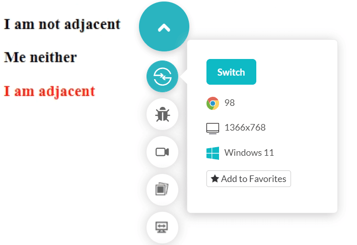
While “+” selects only the adjacent selector, “~” selects all the siblings. The selector “>” is called the child selector and selects all the children. So a > b will select all the b that are the children of a. Using selectors gives you control over the elements with logic according to the relationship between them. Once you get the hang of them, you will notice how much time they save.
Bring better usability with :visited and :link
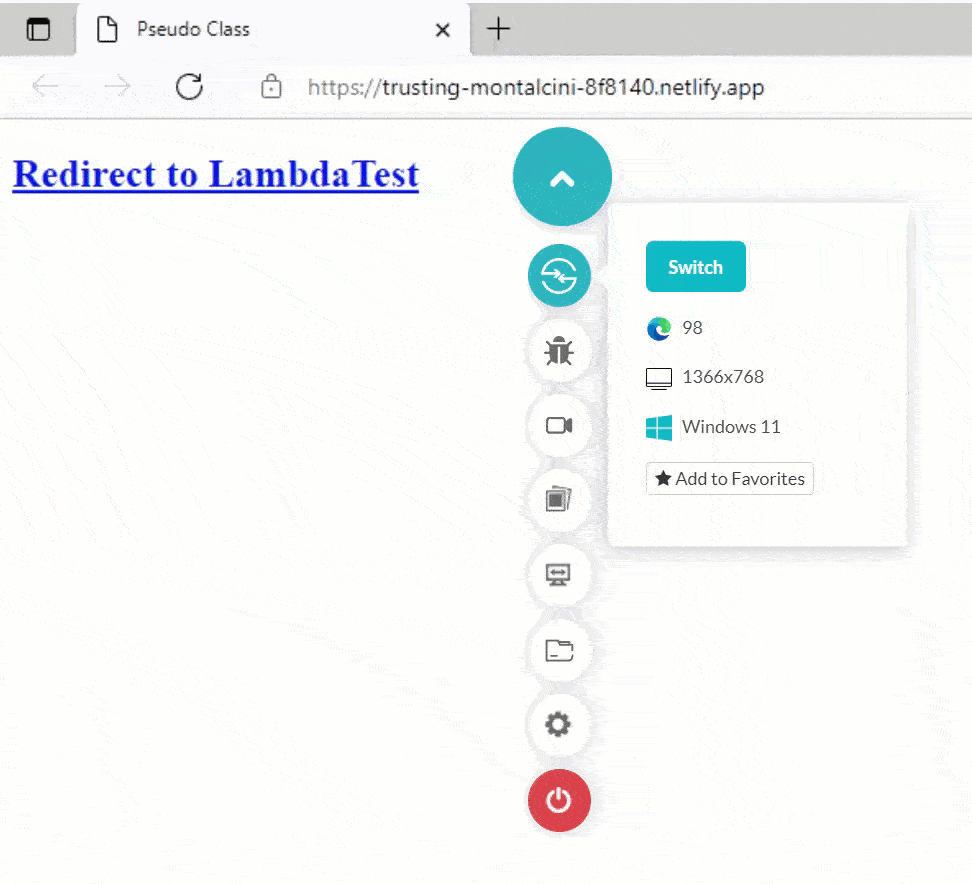
As a web developer, you need to keep usability in mind. It should be one of the topmost priorities as the user experience is the one thing that will keep your business and website going. One troubling usability issue is when there is no trace of what links clicked on the web page. This can confuse the user and may click the same link twice (maybe after some days). Google itself applies purple color to all the links that the user has opened to save his time and enhance the experience. A similar thing is required for web design and is achieved using :visited and :link pseudo-classes.
The :link pseudo-class styling is applied to the unvisited href (links), and the :visited pseudo-class is applied to the visited href (links).
The following code demonstrates the same.
|
1 2 3 4 5 6 7 8 9 10 11 12 13 14 15 16 17 18 19 20 |
<!DOCTYPE html> <html lang="en" dir="ltr"> <head> <meta charset="utf-8"> <title>Pseudo Class</title> </head> <style> a:visited{ color: red; } a:link{ color:blue; } </style> <body> <h2><a href= "https://www.lambdatest.com">Redirect to LambdaTest</a></h2> </body> </html> |
Styling the first letter
Since CSS becomes so efficient and fabulous with every new update, let’s share one more simple CSS tricks for web developers.
While writing a new headline or starting a new paragraph or any content, if that matters, web developers design the first letter of the sentence uniquely. It is a bit of trouble accomplishing this with multiple span elements and making styles for the leftmost element differently. But you could do all this with just one pseudo-element.
The ::first-letter pseudo-element introduced by CSS takes only the first letter of the target (or selected) element and applies the CSS. Since it is a different pseudo-element, we do not need to make multiple elements or separate CSS code separately.
The following code applies larger font size, more font-weight, and red color to the first element of each paragraph on the web page.
|
1 2 3 4 5 6 7 8 9 10 11 12 13 14 15 16 17 18 19 20 21 22 23 24 25 26 27 28 29 30 31 32 |
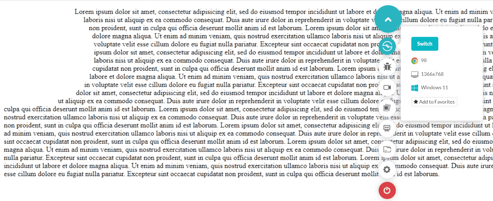
<!DOCTYPE html> <html lang="en" dir="ltr"> <head> <meta charset="utf-8"> <title>Pseudo Class</title> </head> <style> p::first-letter { color: red; font-weight: bold; font-size:29px; } .news_box { width: 40%; height: 30%; text-align: justify; } </style> <body> <center> <div class="news_box"> <h2> Can cross-browser testing solve your browser testing problems?</h2> <p> Your content </p> </div> </center> </body> </html> |
Output
Testing browser compatibility of your CSS
In software development, cross browser compatibility is vital, as every website should work perfectly with multiple OS platforms and browsers. However, while implementing CSS properties features, you may encounter a scenario where most browsers do not support HTML/CSS features like audio and video, CSS Grid, CSS Flexbox, etc. The same applies to the Internet Explorer browser as it does not support CSS Selectors, CSS Namespaces, etc. Other common issues can be cross-device compatibility, glitches in web page alignment, JavaScript implementation variations, and so on.
After implementing the above CSS properties) in websites, you must perform cross browser testing to ensure it works flawlessly across various browsers, devices, and operating systems. You can opt for a cloud-based testing platform like LambdaTest.
It is an AI-powered test orchestration and execution platform that offers an online browser farm of 3000+ real browsers and operating systems combinations to test your websites (and web apps) for HTML/CSS issues and identify what features don’t work on which browsers fix them instantly.
Check out the video tutorial on real-time mobile browser testing.
Subscribe to the LambdaTest YouTube Channel and stay updated with the latest tutorial around web testing, responsive testing, and more.
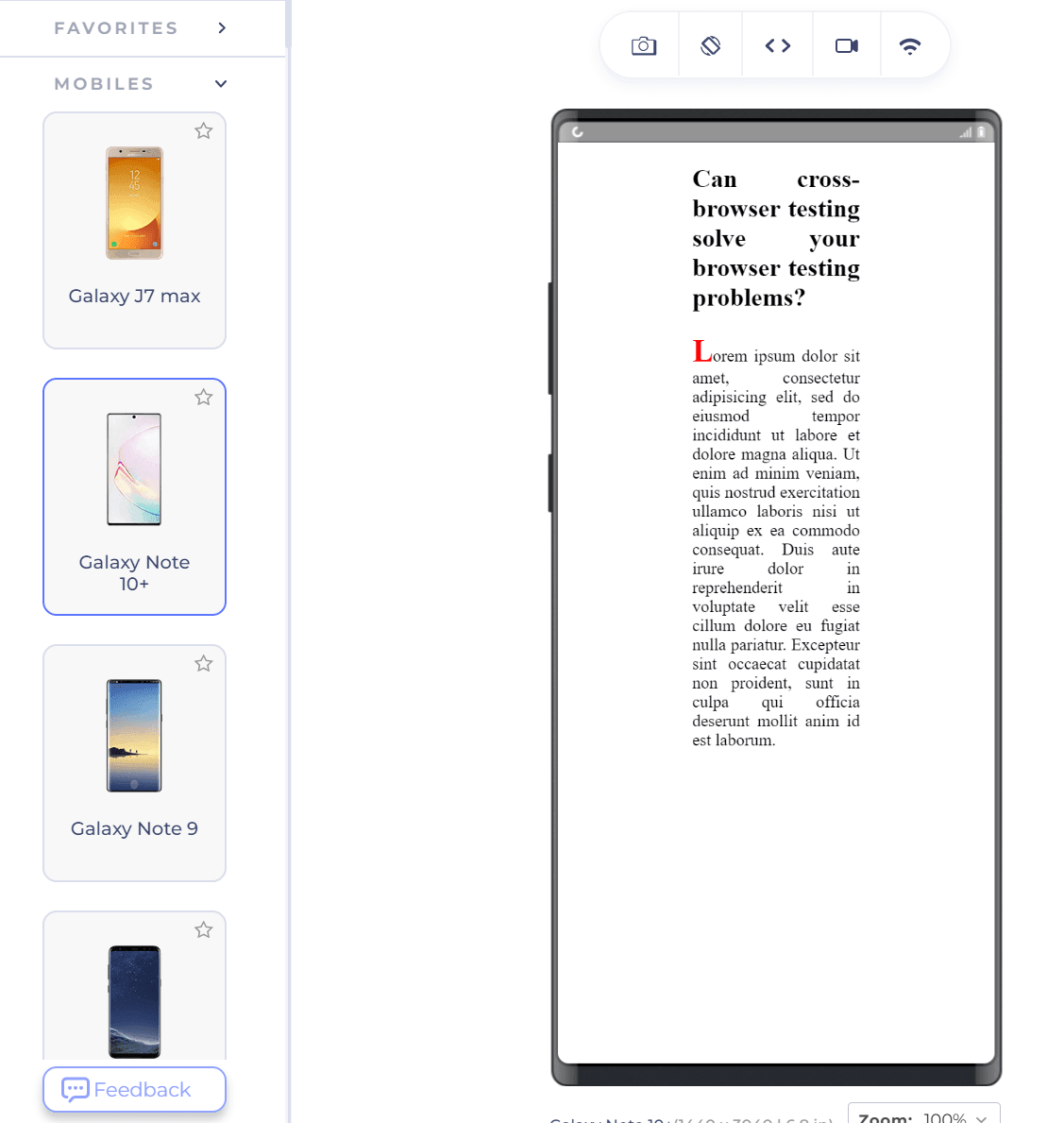
You can also render projects on LambdaTest real device cloud to test on mobile devices and verify how they perform in real-user conditions. LambdaTest also provides testing websites on Android emulators and iOS simulators.
In addition to browser testing of CSS, you can leverage LT Browser offered by LambdaTest platform for running mobile responsive test of CSS on different pre-built viewports like Mobile, Tablet, Desktop, and Laptop. For more details, you can refer to our blog on the features of LT Browser for developers.
What are your personal CSS tricks?
From styling an element to animations and transitions, CSS gives a complete package for the developer. However, like every other programming language out there, you can accomplish all the tasks through CSS by learning only simple stuff.
For example, you can copy-paste font size to multiple elements and make it work. In this post, we discussed 11 CSS tricks that can make your work more accessible than ever. It will not do something unique like a new property but will shrink tens and twenty lines into one straightforward CSS code.
For those looking to dive deeper, resources like the “Top 90+ HTML Interview Questions and Answers” can be invaluable. I am sure you must have come across a few hacks and tricks yourself. So let’s hear them out in the comment section with the CSS tricks you liked the most from this post.
Frequently Asked Questions (FAQs)
What are CSS tricks?
CSS tricks contribute to the advancement of what CSS can do. Applying CSS tricks is one of the easiest ways to spruce up your web design and eliminate UI glitches.
How do I get better at CSS?
To improve your CSS expertise, study CSS, shun libraries, learn to debug your code, analyze other people’s code, carefully name your classes, and practice.
How can I learn CSS fast?
The easiest method to learn CSS is to ensure that you are familiar with HTML5 and the web foundations. CSS and the sophisticated CSS3 techniques will come far more effortlessly after you master these critical elements and skills.


Author’s Profile
Harish Rajora
I am a computer science engineer. I love to keep growing as the technological world grows. I feel there is no powerful tool than a computer to change the world in any way. Apart from my field of study, I like reading books a lot and write sometimes on https://www.themeaninglesslife.com .
Blogs: 103
Got Questions? Drop them on LambdaTest Community. Visit now


