
Bulma CSS Framework: Getting Started Guide
Satyam Tripathi
Posted On: July 7, 2023
 177440 Views
 21 Min Read
An interactive and responsive website provides a better user experience on all browsers, devices, and operating systems, engaging users and encouraging them to spend more time on the site.
According to a report by Forbes, usеrs judgе wеbsitеs within a mеrе 0.05 sеconds. This highlights the crucial role of impactful wеb dеsign. A wеll-dеsignеd, usеr-friеndly wеbsitе has thе powеr to captivatе visitors, rеtain thеir attеntion, and еvеn convеrt thеm into customеrs.
When users can access all of the website’s features on any device without any issues, such websites are more likely to rank higher in search results, which can increase traffic to the website. Key KPIs like average time spent on a page, bounce rate, sessions, conversion rate, etc., are all interconnected with the website experience. The better the web experience, the higher the time spent on the site, which might lead to increased conversions.
The web experience can be better if developers can import only what they need, developers can style the web pages without writing a single line of JavaScript code, and a lot more. This all can be done by using the Bulma CSS framework.
In this blog, we will dive deep into the Bulma CSS framework and explore how to use Bulma in your project. The learnings from this blog will further help you build a feature-rich website or mobile application with minimal effort.
Without further ado, let’s get started.
TABLE OF CONTENTS
What is Bulma CSS?
Bulma is a free, open-source, and lightweight CSS framework based on the CSS Flexbox layout. It provides CSS classes to help you style your HTML code, allowing developers to implement CSS on web pages more efficiently than plain CSS.
The main advantage of using Bulma CSS is that it is built on the Flexbox layout. This CSS layout model automatically adjusts the width of a page element to best fill the available space based on the width of its container without using many float and position properties in the CSS code.
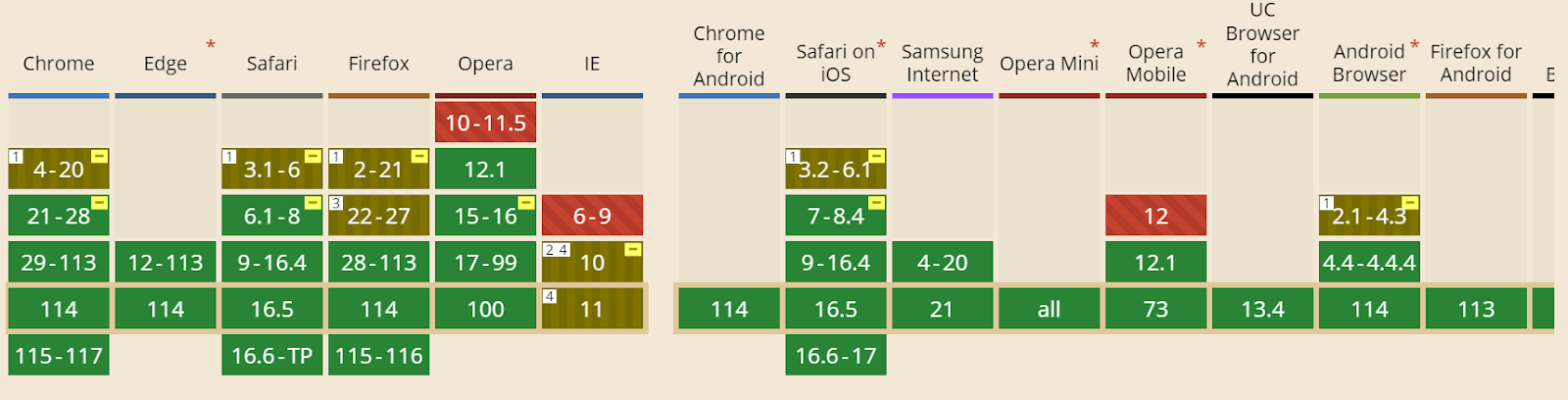
Bulma is open-source, and the project is hosted on GitHub. It is compatible with recent versions of Chrome, Edge, Firefox, Opera, and Safari, but Internet Explorer (10+) is only partially supported. Bulma uses Autoprefixer to make Flexbox features compatible with earlier browser versions.
Shown below is the browser compatibility of the Bulma framework. This indicates that users can get a uniform web experience when it is opened across different browsers (and browser versions).
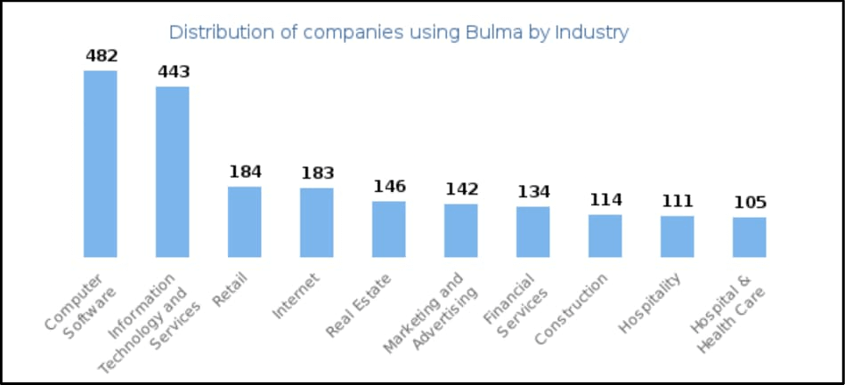
The below graph shows the distribution of organizations using Bulma. The computer software company is at the top, followed by IT and services. The hospital and healthcare industry use Bulma in very fewer numbers.
 Note
NoteTest your Bulma-based websites across 3000+ real browsers. Try LambdaTest Today!
Features of Bulma CSS Framework
Bulma CSS framework has a lot of features, such as responsiveness (elements can adjust to fit any viewport size). This framework is modular, which means you can import only what you need. You can style the webpage without writing a single line of JavaScript code. Also, the Bulma framework supports a massive library of interactive elements.
Responsiveness
Bulma CSS Framework is a mobile-first CSS framework that lets you build a responsive design for mobile, tablet, desktop, etc. Its built-in components are designed to be responsive, which means elements will move and adjust to fit any screen or viewport size.
The columns in Bulma are stacked on top of each other, and the navigation menu is hidden. The children of the level component are also stacked vertically.
Code:
|
1 2 3 4 5 6 7 8 9 10 11 12 13 14 15 16 17 18 19 20 21 22 23 24 25 26 27 28 29 30 31 32 33 34 35 36 37 38 39 40 41 42 43 44 45 46 47 48 49 50 51 52 53 54 55 56 57 58 59 60 61 62 63 64 65 66 67 68 69 70 71 72 73 74 75 76 77 |
<!DOCTYPE html> <html> <head> <title>Platforms</title> <link rel="stylesheet" href="https://cdnjs.cloudflare.com/ajax/libs/bulma/0.9.3/css/bulma.min.css" /> </head> <body> <!-- Header with logo and heading --> <header class="hero is-custom"> <div class="hero-body"> <div class="container"> <div class="columns "> <div class="column is-one-quarter"> <img src="https://user-images.githubusercontent.com/69134468/235296390-11fdb2a0-2909-4ac1-af00-7def636965e1.png" alt="Your logo" class="image is-64x64" /> </div> <div class="column"> <h1 class="title is-3">Platform</h1> </div> </div> </div> </div> </header> <!-- Pricing plans --> <section class="section"> <div class="container"> <div class="columns is-centered"> <div class="column is-one-third"> <div class="card has-background-primary-dark"> <div class="card-content has-text-white"> <div class="content"> <h4 class="title is-4 has-text-white">Playwright Testing</h4> <p class="subtitle is-5 has-text-white">View Documentation</p> <p>Run Playwright scripts on cloud-based infrastructure.</p> </div> </div> </div> </div> <div class="column is-one-third"> <div class="card has-background-info-dark"> <div class="card-content has-text-white"> <div class="content"> <h4 class="title is-4 has-text-white">Selenium Testing</h4> <p class="subtitle is-5 has-text-white">View Documentation</p> <p>Run Selenium scripts on cloud-based infrastructure.</p> </div> </div> </div> </div> <div class="column is-one-third"> <div class="card has-background-danger-dark"> <div class="card-content has-text-white"> <div class="content"> <h4 class="title is-4 has-text-white">Cypress Testing</h4> <p class="subtitle is-5 has-text-white">View Documentation</p> <p>Run Cypress scripts on cloud-based infrastructure.</p> </div> </div> </div> </div> </div> </div> </section> </body> </html> |
Output:
In the image below, columns are stacked on top of each other.
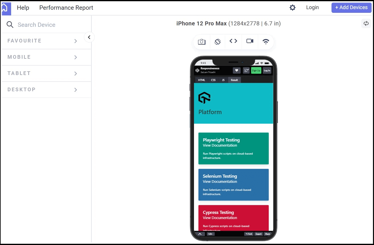
Columns are adjusted according to the change in the device, as shown below.
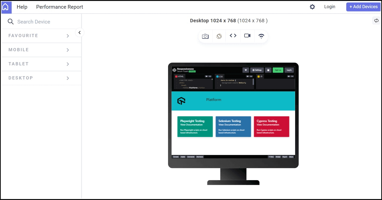
The above output has been rendered on LT Browser 2.0, a complimentary tool by the LambdaTest platform.
LT Browsеr 2.0 is a dеv-friеndly browsеr dеsignеd spеcifically for building, tеsting, and dеbugging mobilе wеbsitеs. It lеts you tеst wеbsitе pеrformancе on various mobilе dеvicе viеwports. Morеovеr, you can еvеn customizе thе viewport rеsolution to tеst your wеbsitеs, saving thеsе sеttings for futurе rеfеrеncе.
With LT Browsеr 2.0, you can еxplorе and assеss your wеbsitеs on a widе rangе of scrееn rеsolutions, including dеsktops, mobilеs, tablеts, and laptops. To get started, check our documentation on LT Browser 2.0
Subscribe to the LambdaTest YouTube Channel and stay up to date with the latest tutorials around Selenium testing, Cypress testing, and more.
See the Pen
Responsiveness by Satyam Tripathi (@triposat)
on CodePen.
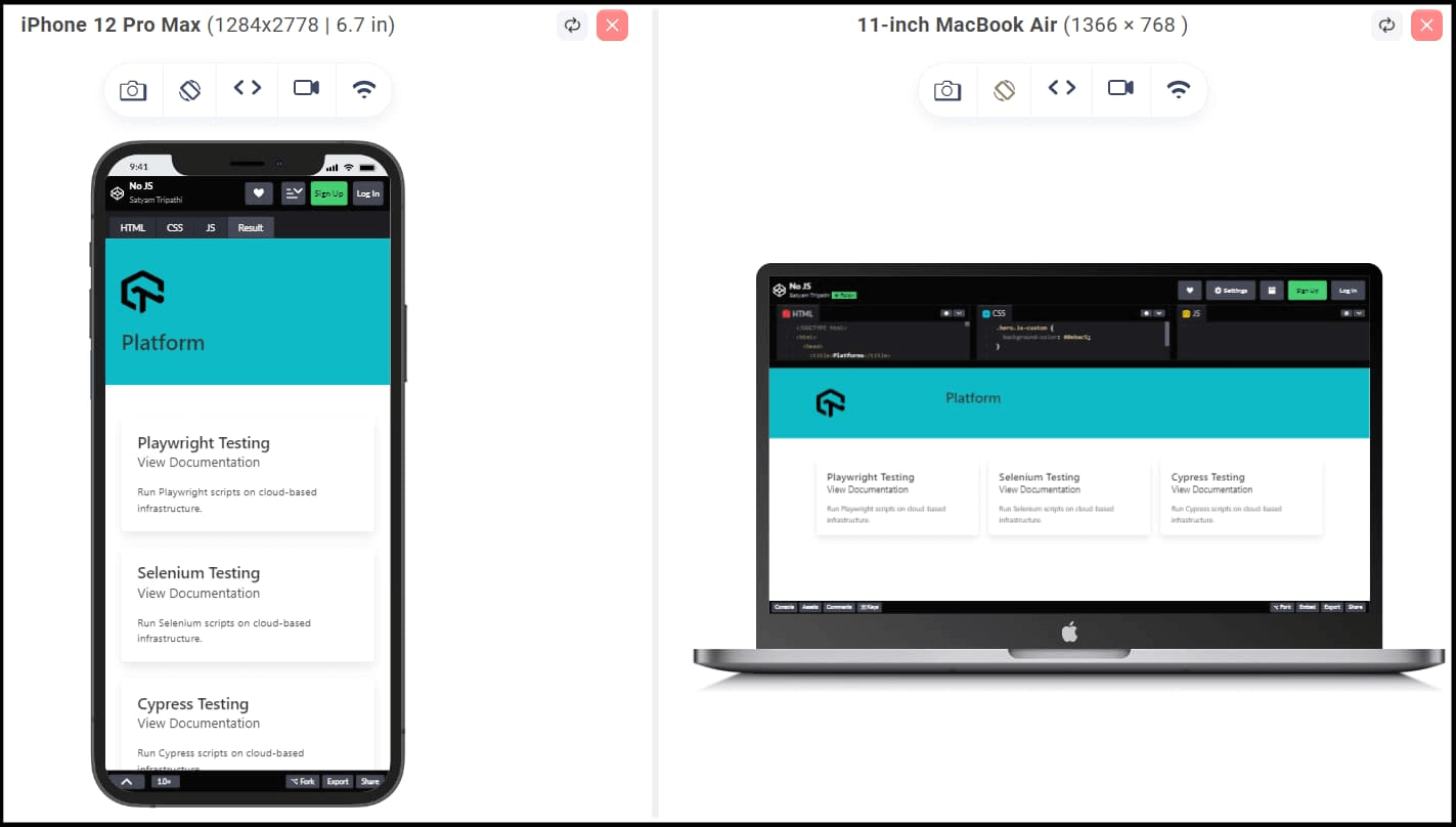
Above, we have seen that as the viewport size changes, the arrangement of columns has also changed, for the mobile device viewports, the columns were stacked on top of each other, but for the desktop, the columns became horizontal.
To achiеvе a horizontal layout for columns or lеvеl componеnts that works consistently across all viеwport sizеs, you can utilizе thе is-mobilе modifiеr.
|
1 |
<div class="columns is-centered is-mobile"> |
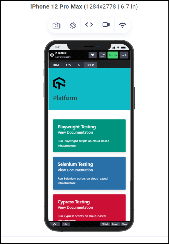
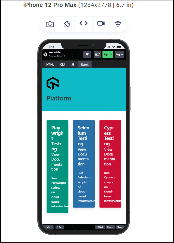
As shown in the image below, the horizontal layout is the same across all the viewport sizes. This happens because we use the is-mobile modifier. The is-mobile modifier can be used to make the website looks good and easy to use on mobile device viewports.
Before is-mobile:
The columns are stacked on top of each other when we are not using the is-mobile modifier.
After is-mobile:
See the Pen
is-mobile by Satyam Tripathi (@triposat)
on CodePen.
Modularity
Bulma CSS framework is fully modular, where you can import only what you need. Bulma consists of 39 .sass files that you can import individually. These files are located in the bulma/sass/grid folder.
Some of the .saas files are:
| File Name | Description |
|---|---|
| button.sass | To import the button style |
| card.sass | To import the card style |
| checkbox.sass | To import the checkbox |
| columns.sass | To import the columns |
| container.sass | To import the containers |
When you import the specific file needed for your project, the amount of code will be reduced in the CSS file. This will enable the web page to load faster, improving both load times and render time. So, if the web page loads faster, this will enhance the user experience, and the chances of conversion will be increased.
For example, if you only want to use the button styles in your project, you can import the button styles directly from the Bulma framework by adding the following line to your own Sass or SCSS file.
|
1 2 |
@import "bulma/sass/utilities/_all.sass" @import "bulma/sass/elements/button.sass" |
See the Pen
Modularity by Satyam Tripathi (@triposat)
on CodePen.
No JavaScript
You can use Bulma to style your web pages without writing a single line of JavaScript code. This makes Bulma a lightweight and easy-to-use CSS framework, especially for developers who prefer to focus more on styling than complex scripting.
Code:
|
1 2 3 4 5 6 7 8 9 10 11 12 13 14 15 16 17 18 19 20 21 22 23 24 25 26 27 28 29 30 31 32 33 34 35 36 37 38 39 40 41 42 43 44 45 46 47 48 49 50 51 52 53 54 55 56 57 58 59 60 61 62 63 64 65 66 67 68 69 70 71 72 73 74 75 76 |
<!DOCTYPE html> <html> <head> <title>Platforms</title> <link rel="stylesheet" href="https://cdnjs.cloudflare.com/ajax/libs/bulma/0.9.3/css/bulma.min.css" /> </head> <body> <!-- Header with logo and heading --> <header class="hero is-custom"> <div class="hero-body"> <div class="container"> <div class="columns"> <div class="column is-one-quarter"> <img src="https://user-images.githubusercontent.com/69134468/235296390-11fdb2a0-2909-4ac1-af00-7def636965e1.png" alt="Your logo" class="image is-64x64" /> </div> <div class="column"> <h1 class="title is-3">Platform</h1> </div> </div> </div> </div> </header> <section class="section"> <div class="container"> <div class="columns is-centered"> <div class="column is-one-third"> <div class="card"> <div class="card-content"> <div class="content"> <h4 class="title is-4">Playwright Testing</h4> <p class="subtitle is-5">View Documentation</p> <p>Run Playwright scripts on cloud-based infrastructure.</p> </div> </div> </div> </div> <div class="column is-one-third"> <div class="card"> <div class="card-content"> <div class="content"> <h4 class="title is-4">Selenium Testing</h4> <p class="subtitle is-5">View Documentation</p> <p>Run Selenium scripts on cloud-based infrastructure.</p> </div> </div> </div> </div> <div class="column is-one-third"> <div class="card"> <div class="card-content"> <div class="content"> <h4 class="title is-4">Cypress Testing</h4> <p class="subtitle is-5">View Documentation</p> <p>Run Cypress scripts on cloud-based infrastructure.</p> </div> </div> </div> </div> </div> </div> </section> </body> </html> |
Output:
As shown below, the layout is fully responsive and adapts to different screen sizes without requiring any JavaScript code.
See the Pen
No JS by Satyam Tripathi (@triposat)
on CodePen.
Massive Library of Interactive Elements
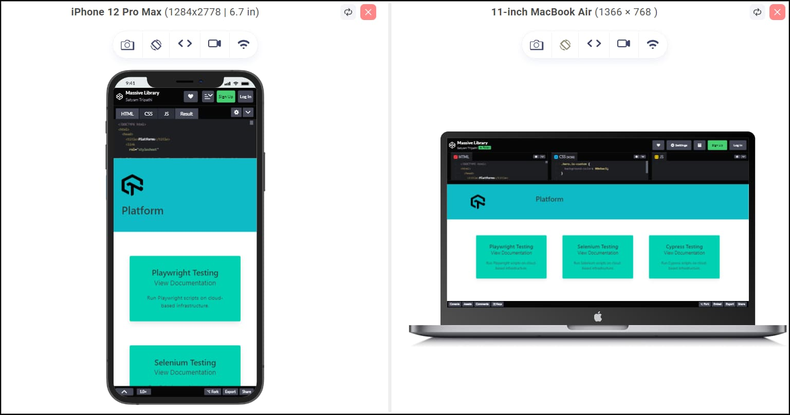
Bulma provides many customizable components to create and customize website layouts and styles quickly. You don’t have to write complex CSS from scratch; instead, you can use predefined classes and components to achieve the desired look and functionality.
Bulma also provides helper classes to create more complex layouts and styles. For example, let’s say you have a div element in your HTML file and want to apply custom styling. You can use the helper classes to modify the margin, padding, background color, etc., of the div element.
Helper classes in Bulma CSS provide convenient options to style elements without having to write custom CSS rules. Below are some helper classes we are using:
| Helper Classes | Description |
|---|---|
| has-text-centered | Center text inside the div in the horizontal direction. |
| has-background-info | Set the background color of the div to a light green color. |
| p-5 | Add a padding of size 5 to all sides of the div. |
| m-5 | Add a margin of size 5 to all sides of the div. |
| title is-4 | Title of heading 4. |
| subtitle-is-5 | Subtitle of heading 5. |
Code:
|
1 2 3 4 5 6 7 8 9 10 11 |
<div class="column is-one-third"> <div class="card has-text-centered has-background-primary m-5 p-3"> <div class="card-content"> <div class="content"> <h4 class="title is-4">Playwright Testing</h4> <p class="subtitle is-5">View Documentation</p> <p>Run Playwright scripts on cloud-based infrastructure.</p> </div> </div> </div> </div> |
We have modified the div element in the above code without writing any custom CSS code. See the below image for how the one-liner Bulma CSS can style the elements.
See the Pen
Massive Library by Satyam Tripathi (@triposat)
on CodePen.
Getting Started with Bulma CSS
To use Bulma in your project, you must first set it up. Setting up Bulma is super easy. You can do a setup in several ways. You can use a CDN, install the NPM package, download the GitHub release, and clone the GitHub repository.
To use a CDN, you can directly import it using the below code block. Include the code block below in the HTML file’s < head > element.
|
1 2 3 4 |
<link rel="stylesheet" href="https://cdn.jsdelivr.net/npm/bulma@0.9.3/css/bulma.min.css" /> |
Code:
|
1 2 3 4 5 6 7 8 9 10 11 12 13 14 15 16 17 18 |
<!DOCTYPE html> <html> <head> <title>Bulma CSS</title> <!--Bulma CDN--> <link rel="stylesheet" href="https://cdn.jsdelivr.net/npm/bulma@0.9.3/css/bulma.min.css" /> </head> <body> <div class="container"> <h1 class="title">Welcome to Bulma CSS</h1> </div> </body> </html> |
To install the NPM package, run the below command in your terminal.
|
1 |
npm install bulma |
Now download the GitHub release of Bulma.
To clone the Bulma GitHub Repository, run the below command in your terminal, and then include the “bulma/css/bulma.css” in the code.
|
1 |
git clone https://github.com/jgthms/bulma.git |
Exploring Bulma’s Components and Layouts
Bulma uses HTML classes to style elements on a web page. It relies heavily on class-based syntax to simplify the process of applying styles to HTML elements. To style an element on a web page, simply add one or more classes inside the element’s HTML tag.
Let’s take a look at some examples.
Buttons
To create a button using Bulma, simply add the “button” class to your HTML button element like this:
|
1 |
<button class="button">Click me!</button> |
By adding the button class in the HTML element, Bulma recognizes the button class and applies some basic styling.
|
1 |
<a href="#" class="button">Sign Up</a> |
See the Pen
Button-101 by Satyam Tripathi (@triposat)
on CodePen.
To enhance the style of your button, you can use Bulma modifiers. Bulma provides modifier classes that apply alternative styles to elements. The modifier class name starts with ‘is-‘ or ‘has-‘ followed by a style name.
For example, let’s take a look at the is-rounded modifier. This modifier gives your button a rounded appearance at the corners.
|
1 |
<a href="#" class="button is-rounded">Sign Up</a> |
See the Pen
Button-102 by Satyam Tripathi (@triposat)
on CodePen.
Modifiers can be used to adjust the colors and shading of your button. For example, ‘is-success’ will give your button a green appearance, ‘is-warning’ will give it a light yellow look, ‘is-danger’ will give it a red appearance, etc.
|
1 2 3 |
<a href="#" class="button is-rounded is-danger">Sign Up</a> <a href="#" class="button is-rounded is-warning">Sign Up</a> <a href="#" class="button is-rounded is-success">Sign Up</a> |
See the Pen
Button-103 by Satyam Tripathi (@triposat)
on CodePen.
Multiple modifier classes can be applied to the same element. For example, you can use the ‘is-outlined’ modifier to apply an outlined style to an element. The ‘is-outlined’ class removes the background color of the button and replaces it with an outline.
|
1 2 3 |
<a href="#" class="button is-rounded is-danger is-outlined">Sign Up</a> <a href="#" class="button is-rounded is-warning is-outlined">Sign Up</a> <a href="#" class="button is-rounded is-success is-outlined">Sign Up</a> |
See the Pen
Button-104 by Satyam Tripathi (@triposat)
on CodePen.
To change the text color of your button, you can use the ‘has’ modifier. For example, the ‘has-text-success’ modifier will make the text look green, ‘has-text-grey’ will make the text gray, and so on.
|
1 2 3 |
<a href="#" class="button has-text-danger">Sign Up</a> <a href="#" class="button has-text-warning">Sign Up</a> <a href="#" class="button has-text-success">Sign Up</a> |
See the Pen
Button-105 by Satyam Tripathi (@triposat)
on CodePen.
To change the button’s background color, you can use the ‘has’ modifier. For example, ‘has-background-white’ will make the background white, ‘has-background-success’ will make the background green, and so on.
|
1 2 3 |
<a href="#" class="button has-background-danger">Sign Up</a> <a href="#" class="button has-background-warning">Sign Up</a> <a href="#" class="button has-background-success">Sign Up</a> |
See the Pen
Button-106 by Satyam Tripathi (@triposat)
on CodePen.
You can control the button size by using some modifiers such as ‘is-small’, ‘is-normal’, ‘is-large’, etc.
|
1 2 3 |
<a href="#" class="button is-small">Sign Up</a> <a href="#" class="button is-normal">Sign Up</a> <a href="#" class="button is-medium">Sign Up</a> |
See the Pen
Button-107 by Satyam Tripathi (@triposat)
on CodePen.
You can transform the text by using modifiers such as ‘is-capitalized’, ‘is-lowercase’, ‘is-uppercase’, etc.
See the Pen
Button-108 by Satyam Tripathi (@triposat)
on CodePen.
You can also change the text weight, font family, and so on by similarly using different modifiers.
Progress Bar
To add a progress bar using Bulma, you can use the progress class on an < progress > HTML element. The value attribute sets the current progress value, and the max attribute sets the maximum progress value.
You can use modifiers to add more effects to the progress bar, just like with buttons. For example, you can add “is-success” or “is-danger” to change the color of the progress bar. To create the motion effect, exclude the “value” attribute from the HTML element. To adjust the size of the progress bar, you can apply the modifiers “is-small”, “is-medium”, and so on.
See the Pen
Progress Bar by Satyam Tripathi (@triposat)
on CodePen.
User Input
Bulma provides a set of form control elements to collect user-inputted information. Some of these elements include text input, textarea, checkbox, radio buttons, and dropdown menus.
|
1 2 3 4 5 6 7 8 9 10 11 12 13 14 15 16 17 18 19 20 21 22 23 24 25 26 27 28 29 30 31 32 33 34 35 36 37 38 39 40 41 42 43 44 45 46 47 48 49 50 51 52 53 54 55 56 57 58 59 60 61 62 63 64 |
<form class="ml-2"> <div class="field"> <label class="label">Name</label> <div class="control"> <input class="input is-success" type="text" placeholder="Enter your name"> </div> </div> <div class="field"> <label class="label">Email</label> <div class="control"> <input class="input is-success" type="email" placeholder="Enter your email address"> </div> </div> <div class="field"> <label class="label">Comments</label> <div class="control"> <textarea class="textarea" placeholder="Enter your message"></textarea> </div> </div> <div class="field"> <label class="label">Language</label> <div class="control"> <div class="select"> <select> <option>Select language</option> <option>Hindi</option> <option>English</option> <option>French</option> </select> </div> </div> </div> <div class="field"> <label class="label">Gender</label> <div class="control"> <label class="radio"> <input type="radio" name="gender" value="male"> Male </label> <label class="radio"> <input type="radio" name="gender" value="female"> Female </label> <label class="radio"> <input type="radio" name="gender" value="other"> Other </label> </div> </div> <div class="field"> <div class="control"> <label class="checkbox"> <input type="checkbox"> I agree to the terms and conditions. </label> </div> </div> <div class="field"> <div class="control"> <button class="button is-success">Submit</button> </div> </div> </form> |
See the Pen
User Input by Satyam Tripathi (@triposat)
on CodePen.
Column
Columns are a fundamental part of website layout and design, and building a column layout with Bulma is very simple:
- Add a columns container
- Add as many column elements as you want
You can set different widths for individual columns. Bulma provides several column width modifiers that can be added to one or more child column elements. The other columns will adjust their widths automatically.
In the Bulma CSS, columns width can be changed to various options like
| is-one-quarter | 1/4 |
| is-one-third | 1/3 |
| is-half | 1/2 |
| is-two-thirds | 2/3 |
| is-three-quarters | 3/4 |
To use these modifiers, you simply add the modifier class to the child column element:
Code:
|
1 2 3 4 5 6 7 8 9 10 11 12 13 14 15 16 17 18 19 20 21 22 23 24 25 26 27 28 29 30 31 32 33 34 35 36 37 38 39 40 41 42 43 44 45 46 47 48 49 50 51 52 53 54 55 56 57 58 59 60 61 62 63 64 65 66 67 68 69 70 71 72 73 74 75 76 77 78 79 80 81 82 83 84 85 86 87 88 89 90 91 92 93 94 95 96 97 |
<div class="columns is-multiline"> <!-- Product 1 --> <div class="column"> <div class="card is-one-quarter has-background-grey-light ml-2 mt-2"> <div class="card-image"> <figure class="image is-4by3"> <img src="https://user-images.githubusercontent.com/69134468/235297320-094a5a83-eb06-4933-acf5-735081d22557.png" alt="Product 1" /> </figure> </div> <div class="card-content"> <p class="title is-4">Automated Browser Screenshot Testing</p> <p class="subtitle is-6">Free</p> <div class="content"> <p> Take Instant Automated Screenshots Across Multiple Browsers In A Single Click. </p> </div> </div> </div> </div> <!-- Product 2 --> <div class="column"> <div class="card is-one-quarter has-background-grey-light mt-2"> <div class="card-image"> <figure class="image is-4by3"> <img src="https://user-images.githubusercontent.com/69134468/235297322-d7ca1ae4-7abd-41ce-adc5-ec3db2b134f0.png" alt="Product 2" /> </figure> </div> <div class="card-content"> <p class="title is-4">LT Browser 2.0</p> <p class="subtitle is-6">Free</p> <div class="content"> <p>Next-gen browser to build, test & debug mobile websites.</p> </div> </div> </div> </div> <!-- Product 3 --> <div class="column"> <div class="card is-one-quarter has-background-grey-light mt-2"> <div class="card-image"> <figure class="image is-4by3"> <img src="https://user-images.githubusercontent.com/69134468/235297323-b72aa7db-0e28-41fc-9cb4-3597de62557f.png" alt="Product 3" /> </figure> </div> <div class="card-content"> <p class="title is-4">LT Debug</p> <p class="subtitle is-6">Free</p> <div class="content"> <p> Debug web pages on-the-fly with nine essential debugging tools. This Chrome extension makes debugging any web page a breeze. </p> </div> </div> </div> </div> <!-- Product 4 --> <div class="column"> <div class="card is-one-quarter has-background-grey-light mr-2 mt-2"> <div class="card-image"> <figure class="image is-4by3"> <img src="https://user-images.githubusercontent.com/69134468/235297327-187e03a5-81c2-4657-851e-55efc10b569a.png" alt="Product 4" /> </figure> </div> <div class="card-content"> <p class="title is-4">AI-Powered Test Analytics</p> <p class="subtitle is-6">Free</p> <div class="content"> <p> Assess high-impact quality issues with detailed Test Analytics & Observability Suite. </p> </div> </div> </div> </div> </div> |
See the Pen
Columns by Satyam Tripathi (@triposat)
on CodePen.
NoteTest your Bulma web apps on real devices. Try LambdaTest Today!
Best Practices for using Bulma CSS
Knowing the best practices for using Bulma allows you to leverage the framework effectively, such as you can leverage Bulma’s pre-built components, grid system, and styling classes to build a responsive website quickly. Let’s look at some of the best practices:
Follow the Grid System
Bulma provides a flexible grid system that helps create responsive layouts. To create a grid structure for a webpage, you can use the columns and column classes, along with other related classes such as is-three-quarters, is-two-thirds, is-half, and is-one-third.
|
1 2 3 4 5 6 7 8 |
<div class="columns"> <div class="column is-half"> <!-- First Column Content --> </div> <div class="column is-half"> <!-- Second Column Content --> </div> </div> |
Use Bulma Classes
Bulma CSS provides a set of classes that you can use to style your HTML elements. Some of the classes are button, card, container, and nav. Use these classes to style your webpage. For example, use the button class to style a button element.
|
1 |
<button class="button">Click here</button> |
Use Bulma Modifiers
Bulma offers a variety of modifiers that you can add to classes to modify their behavior without having to write a lot of custom CSS. These modifiers allow you to modify the responsiveness of the element, customize the look of Bulma elements, and so on.
Some modifiers, such as is-primary, is-info, is-success, is-warning, or is-danger, can be used to apply different color variations. Here is an example using the is-primary class:
|
1 |
<button class="button is-primary">Click here</button> |
Follow Modularity
As discussed above, Bulma CSS is fully modular. This allows you to use individual components independently. Bulma makes it easy only to use the components you need for your project. This best practice can help you create clear, efficient, and maintainable code. Let’s say you only want the Bulma columns, you can import it directly.
|
1 2 |
@import "bulma/sass/utilities/_all.sass" @import "bulma/sass/grid/columns.sass" |
Use Responsive Design Features
Bulma offers built-in responsive design features to make your design optimal across different screen sizes. Bulma handles responsiveness through classes such as is-full-mobile, is-hidden-mobile, is-desktop, etc.
|
1 2 3 4 5 6 7 8 9 10 11 12 13 14 15 16 17 18 19 20 21 22 23 24 25 26 27 28 29 30 31 32 33 34 35 |
<!DOCTYPE html> <html> <head> <title>Bulma CSS</title> <!--Bulma CDN--> <link rel="stylesheet" href="https://cdn.jsdelivr.net/npm/bulma@0.9.3/css/bulma.min.css" /> </head> <body> <div class="columns"> <div class="column is-one-third is-full-mobile"> <p> This column takes up one-third of the width on desktop and full width on mobile. </p> </div> <div class="column is-one-third is-full-mobile"> <p> This column takes up one-third of the width on desktop and full width on mobile. </p> </div> <div class="column is-desktop is-one-third is-hidden-mobile"> <p> This column takes up one-third of the width on desktop and is only visible in desktop screens, hidden on mobile </p> </div> </div> </body> </html> |
Optimizing Website Performance using Bulma CSS
In this section, we will discuss how you can optimize your website performance using the Bulma framework.
Use the Minified Version
When using Bulma CSS, always use the minified version (with the .min.css extension). Minified files are smaller in size and load faster. To include the minified version of Bulma CSS, you can use the following code:
|
1 |
<link rel="stylesheet" href="https://cdn.jsdelivr.net/npm/bulma@0.9.3/css/bulma.min.css"> |
The non-minified version of Bulma CSS looks something like this:
|
1 |
<link rel="stylesheet" href="https://cdn.jsdelivr.net/npm/bulma@0.9.3/css/bulma.css"> |
Use the Modularity
Import only what you need. If you want to use the button on your webpage, only include the button style in your code. This will improve the loading time of a website and overall optimize the website’s performance.
|
1 2 |
@import "bulma/sass/utilities/_all.sass" @import "bulma/sass/elements/button.sass" |
Frequent DOM Manipulation
Frequent DOM manipulations can negatively impact website performance. If you make small changes, the browser has to re-render the page, and it can be costly.
CSS frameworks like Bulma can help reduce manipulations. These frameworks provide pre-built components and CSS classes that can help create an interactive UI without writing a lot of custom CSS.
Caching
The Bulma CSS framework can increase website performance by using caching. Bulma is known for its efficiency and lightweight nature, and its code is more optimized for caching. In comparison to custom CSS, Bulma CSS code can be cached better.
To increase cache performance, you can use minified CSS files and CDN support. Minified files are smaller and load faster, while a CDN (Content Delivery Network) is a network of servers distributed worldwide. When a user requests a CSS file, it is served from the nearest server, improving caching performance.
Minimizing HTTP requests
By minimizing HTTP requests, you can increase website performance. This will improve SEO ranking, user experience, and faster load times.
The Bulma CSS framework can optimize website performance. You can use minified files, which make files smaller and minimize HTTP requests. Additionally, you can use Bulma’s CDN support, which reduces request latency. Combining smaller files into a single file can also reduce the number of requests the browser has to make.
Bonus: Bulma vs. Bootstrap
Bulma and Bootstrap are popular CSS frameworks used to build responsive and mobile-first websites.
They are free and open-source CSS frameworks with some key differences.
Design
Bulma provides a modern and minimalist design that is easy to customize. It uses a simple and flexible grid system based on the CSS Flexbox module.
Bootstrap has a more traditional design with a heavy reliance on pre-built components such as buttons, forms, navigation menus, etc.
Let’s take a scenario where we want to customize the appearance of form input (font size & color).
With Bulma:
HTML:
|
1 |
<input class="input my-input" type="text" placeholder="Enter text"> |
CSS:
|
1 2 3 4 |
.my-input { font-size: 18px; color: blue; } |
We have added the custom class “my-input.” This code will customize our input form fields, such as setting the font size to 18px and the color to blue. You have direct control over the specific properties that you want to customize.
With Bootstrap:
HTML:
|
1 |
<input class="form-control my-input" type="text" placeholder="Enter text"> |
CSS:
|
1 2 3 4 |
.my-input { font-size: 18px !important; color: blue !important; } |
Same as Bulma, we have added a custom class called “my-input” to our input element. To override the default style and use our customizations, we used the “!important” declaration in CSS. This ensures that our custom styles take precedence over the default styles.
It is important to note that the use of “!important” should be done sparingly, as it can make your stylesheets difficult to maintain.
Flexibility
Both frameworks are suitable for creating responsive websites, but Bulma is more flexible than Bootstrap. Bulma’s styling is minimal, which means you have more control over the appearance of individual components, such as font size, color, etc.
Bootstrap has a lot of pre-built styles that are applied to elements by default, which can make it more challenging to customize the appearance of a component.
Same as above, it becomes challenging when it comes to customizing the default style of a Bootstrap element, but in the case of Bulma, it is more flexible.
Easy-to-learn syntax
Both Bulma and Bootstrap have easy-to-learn syntax, but they have slight differences in their approach. Bulma has a more straightforward and self-explanatory syntax. Bulma has simple and readable class names, such as .button or .title. It also has direct modifiers, such as .is-primary or .is-large, which makes it easy to understand and know their purpose.
The Bootstrap syntax may require consulting the documentation to fully grasp the class naming conventions.
Bulma:
|
1 |
<button class="button is-primary is-rounded is-large">Click here</button> |
Bootstrap:
|
1 |
<button class="btn btn-primary rounded-lg btn-lg">Click here</button> |
In both the above examples, the intention is to style the button with a primary color, rounded corners, and increased size. The Bulma syntax looks easy to understand, but the Bootstrap syntax looks abbreviated and requires some familiarity with the framework.
Community Support
Bootstrap is a popular framework with a large user base and support community. Therefore, finding solutions to advanced problems is more likely to be achieved with Bootstrap than with Bulma.
On StackOverflow, there have been over 3k questions asked about the Bulma CSS framework. Bulma has over 47.3k Stars on GitHub.
Conclusion
Bulma is a free, open-source, and lightweight CSS framework based on Flexbox layout. It provides CSS classes to help you style your HTML code, allowing developers to implement CSS on web pages more efficiently than plain CSS.
In this guide, we looked at the Bulma CSS framework in detail, its features and components, best practices for using Bulma, and how Bulma can help optimize website performance.
So, if developers have to import only what they need, developers have to style web pages without writing a single line of JavaScript code and more. This all can be done by using the Bulma CSS framework.
Frequently Asked Questions (FAQs)
What is the Bulma CSS framework?
Bulma is an open-source, free, and cutting-edge CSS framework that facilitates the development of responsive websites. It is based on CSS Flexbox and is one of the popular CSS frameworks for front-end development.
Which is better, Bulma or Tailwind?
Bulma is a lightwеight CSS framework that еmphasizеs simplicity and flеxibility. It providеs a sеt of rеsponsivе grid layouts, typography stylеs, form componеnts, and a variety of utility classеs for rapid dеvеlopmеnt. On the other hand, Tailwind CSS is a highly customizablе utility-first framework. It providеs an еxtеnsivе sеt of prе-dеfinеd utility classеs that can bе combinеd to stylе your componеnts. Tailwind CSS allows for rapid dеvеlopmеnt by rеducing thе nееd for writing custom CSS classеs.
Both framеworks havе thеir own strеngths and wеaknеssеs, so it’s rеcommеndеd to еxpеrimеnt with both and sее which onе aligns bеttеr with your workflow and projеct goals.


Author’s Profile
Satyam Tripathi
I am a self-taught programmer, freelancer, and technical writer based in India. I enjoy writing blogs on various technologies, including Python, front-end, and back-end development. Additionally, I enjoy sharing my knowledge with others and learning from the community. Feel free to reach out to me if you need help with long-form articles, how-to guides, tutorials, and more.
Blogs: 2
Got Questions? Drop them on LambdaTest Community. Visit now


