
How To Use CSS Contain Property To Optimize Browsers
Harish Rajora
Posted On: November 3, 2022
 30077 Views
 14 Min Read
The integral part of web development is cascading style sheets, which are popularly called CSS. The library contains a long list of functions and properties that help us develop functionalities in a couple of lines rather than writing messy JS code. This may include position sticky, media queries, or setting up the aspect ratio for the web page.
In my web dev experience, I always divided the functions and properties available in CSS into two partitions. One section contains easy out specific design-related items in web development, such as sticking an element to the top while the user scrolls. The other section contains better efficiency, optimization, and improvement of the development strategies according to the latest web development trends.
Today, we will talk about a CSS property and how the CSS contain property helps developers optimize a web page and let browsers understand the different elements and their relations with each other.
TABLE OF CONTENTS
Repainting a web page and its effects
To understand the CSS contain property, we need first to understand the problem that it addresses.
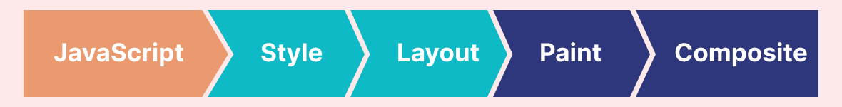
Our browser takes magical raw materials like HTML, CSS, and JavaScript and converts them into a product created by hundreds of team members for the end user. It should work perfectly, and browsers have a huge responsibility, along with the developers and testers. We cannot afford a single mistake from our browser. Let’s explore a bit deeper into the working of a browser and the processes performed when we press ENTER after giving a web URL.
- The first thing our browser does is to create a document object model and a CSS object model.
- A render tree is created to explore the styles applied in the styling sheet and calculate their relations. For instance, when we use CSS Selectors, we define many relations such as .my_class or div > p, etc. This needs to be sorted out before we move ahead.
- The next step is the layout step. Here, we calculate the required space for all the elements we defined in our DOM tree.
- Once we are done with space calculation, we are ready to paint the pixels according to the instructions given in JS and CSS.
- The last step is composting. Whatever we drew in the step above comes from multiple layers and sometimes from multiple sources. This must be sorted out on a single screen with careful layout calculation. Since one element can overlap another, creating visual discrepancies, the composition step becomes crucial.
Summarizing them with a diagram would look like this:
To improve a website’s performance, developers often try to optimize one or more of these steps so that the page loads quickly. If your page does not load on time, your bounce rate increases to 90%, while 53% of users drop out after three seconds.
Test on the latest desktop and mobile browsers for the CSS element() function. Try LambdaTest Now!
Painting and repainting of a web page happen continuously. It depends on what we are doing, what we view, and what system we use.
The logic behind the system is simple. If you are viewing a 60fps graphic, your browser is ideally (and probably) painting and repainting 60 frames in one second. This is a different story altogether, with its advantages.
Another thing is what we are doing. If you are reading something, then by the time you scroll, the browser need not repaint. Scrolling, however, needs repainting the web page.
The final point of concern, the most important, is what we view. Many things depend upon the web page you are currently viewing and its various elements. If the web page has a GIF, it will be repainted continuously. The same goes for CSS animations and other CSS transitions.
Considering this page on which you are reading this blog, Google Chrome’s developer tools help us understand the same five processes for each web page. Navigate to the inspect elements sections and then to the Performance tab.
Click Record to record the session and reload the page.
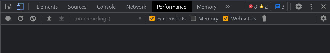
You will get a result similar to the below image:
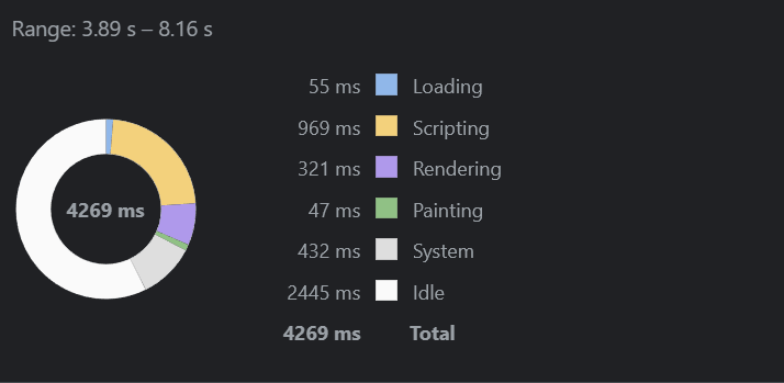
As you see, painting takes considerably less time than the other processes. That’s because most of the elements on this page are written content with very few other complications that require painting.
Let’s switch to CSS animations where you will find many interesting animations to implement on your web page. Repeat the same steps to monitor the performance of the web page. This time, there are different results:
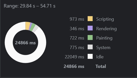
Note: This is just the result we achieve when we mimic the user’s action, i.e., on a typical blog page with typical images, including scrolling. If you want to see drastic painting results, you can create a GIF and observe the performance through developer tools.
The result here indicates that a considerable amount of time is taken by painting, which means if we can reduce it, we can achieve better performance.
However, even if we talk about painting as a single process, it is divided into two logical sections in digital mediums. Before painting the pixels, the browser must create a list of draw calls. This process is termed rasterization. When rasterization is done, we can paint each pixel according to the developer’s instructions. So in this blog on CSS containing property, consider that we implicitly include rasterization when discussing painting.
By mentioning this point, I am certain that browser engines are highly optimized to do their part when a web page has to be rendered. The problem comes with how a developer designs a web page. If a browser thinks that all the elements on the page are new, it will reload everything.
It is divided into various sections, from which the right and top would remain consistent on your chapter load. The left navigation bar changes with the highlight and center parts change. If we keep the logic to reload the complete page, we are unnecessarily painting a lot of elements.
However, if we focus on two panels, we can reduce the time to paint the web page. This is the problem that we face in web development. The above page is quite simple. However, our reloading logic can drastically affect the loading speed for complex pages with lots of elements.
What is CSS contain property?
“CSS contain property doesn’t block things going into the subtree; it blocks things leaking out” – Tab Atkins
The above statement can be reiterated and paraphrased in simple words. How can we let the browser know about the independence of various elements so that it knows which ones to paint and which not to when a request is received from the server? The answer to this is the CSS contain property.
The CSS contain property can hint to the browser about one element not related to another element. So if we want to reload, the browser can spare the extra work of re-painting the complete page and re-calculating the layout. For example, websites with many widgets like the below:

These elements are independent and constantly reloaded at various times. However, note that their layout, i.e., their dimensions, would remain the same.
Syntax for CSS contain
Since contain is a CSS property, it can be assigned a value as follows:
|
1 2 3 |
element { contain: <value>; } |
The < value > can hold any one of the supported values, which are discussed in the next section.
Values supported by CSS contain property
The behavior of the CSS contain property is not generalized. It depends on the value you assign this property while developing the web pages. CSS containment supports the following properties:
Size
The size value of the CSS contain property resizes the associated element without affecting its descendants or their size. The dimensions of the element on which this is applied are expected to be mentioned in the styling sheet. Else, it may collapse to 0. The browser, therefore, repaints just the element and not the outer elements.
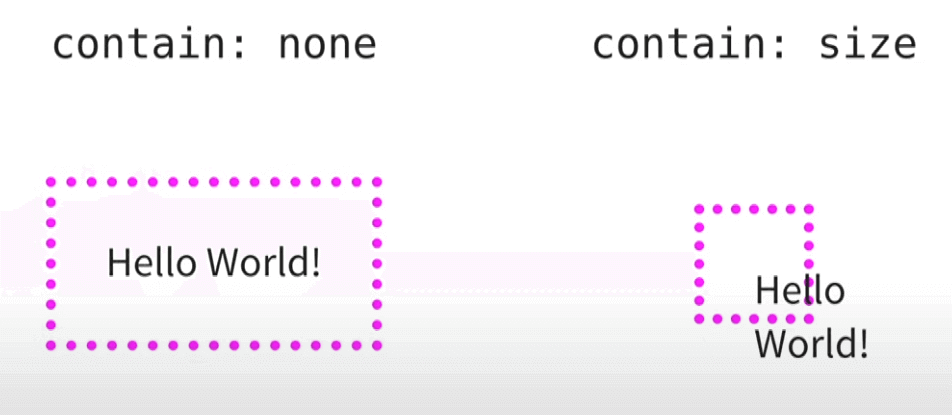
In the first one, the outer dotted box is expected to resize according to the element inside:
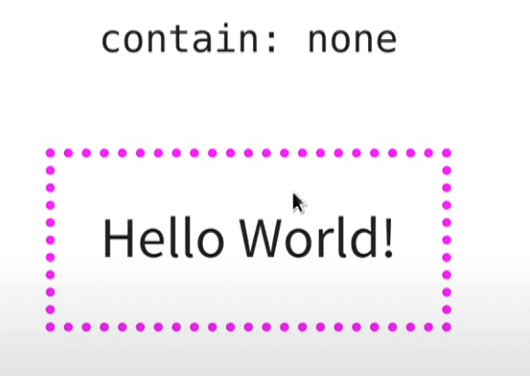
But it is expected to remain the same size when we increase the element’s size with contain:size.
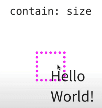
This property is generally not used as a single implementation but mixed with others to gain more efficiency.
Layout
The layout value of CSS contain property is a popular choice for developers because of the behavior change it introduces to the elements and how the browser perceives them.
To clearly understand the layout property, let’s see a simple demonstration before we define it. Since layout property is easy and can be effectively explained by a blog page, I will construct one with a single article:
|
1 2 3 4 5 6 7 8 9 10 11 12 13 14 15 16 17 18 19 20 |
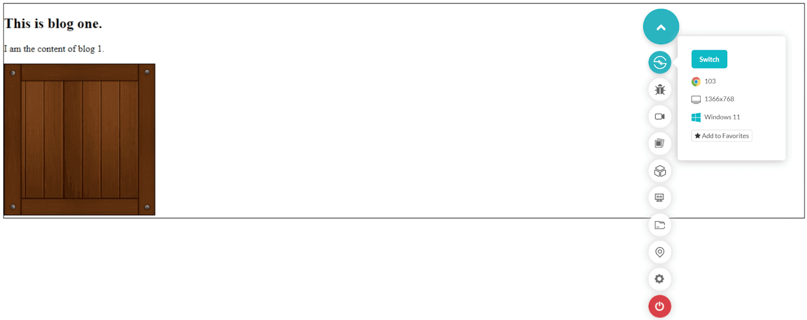
<!DOCTYPE html> <html lang="en" dir="ltr"> <head> <meta charset="utf-8"> <title>The contain layout property</title> </head> <style> article { border: 1px solid black; contain: layout; } </style> <body> <article> <h2>This is blog one.</h2> <p>I am the content of blog 1.</p> <img src="wooden_box.png" alt="Hello I am a wooden box"> </article> </body> </html> |
This will result in the following render on Google Chrome:
This is alright as of now. Now, let’s add the following style element to the existing style:
|
1 2 3 |
img { float: left; } |
This will render as follows:
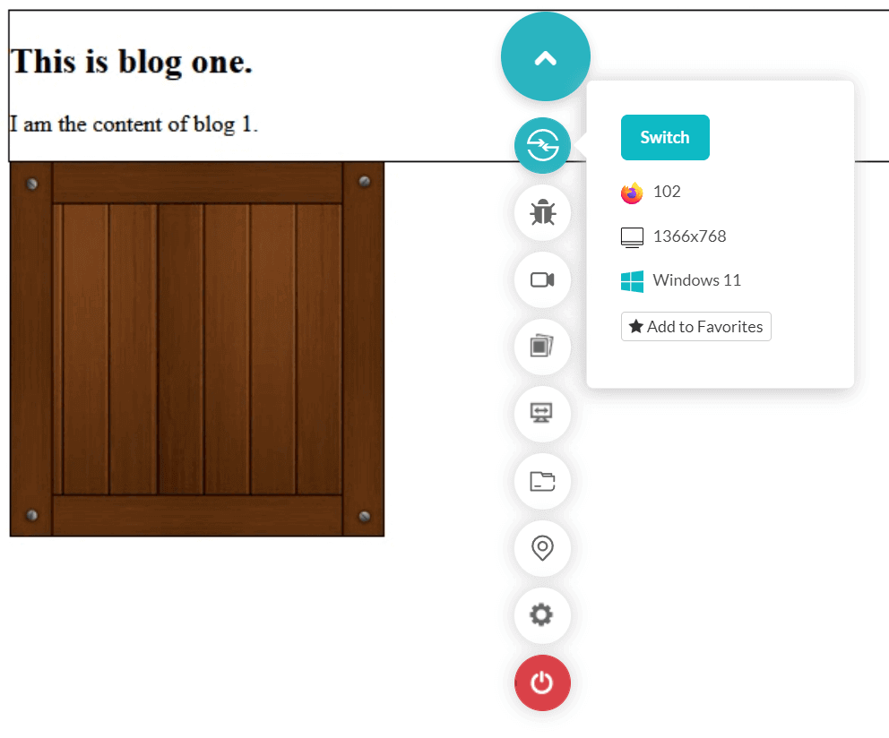
I have omitted the complete screen view to focus on the image and its location, which is now out of the box. Since no other arrangements are used to rectify the floats, it behaves as expected and moves the image out.
Test HTML Dialog Element for browser compatibility. Try LambdaTest Now!
Let’s add one more article with the same image just below it. So our new code becomes as follows:
|
1 2 3 4 5 6 7 8 9 10 11 12 13 14 15 16 17 18 19 20 21 22 23 24 25 26 27 28 29 |
<!DOCTYPE html> <html lang="en" dir="ltr"> <head> <meta charset="utf-8"> <title>The contain layout property</title> </head> <style> img { float: left; } article { border: 1px solid black; } </style> <body> <article> <h2>This is blog one.</h2> <p>I am the content of blog 1.</p> <img src="wooden_box.png" alt="Hello I am a wooden box"> </article> <article> <h2>This is blog two.</h2> <img src="wooden_box.png" alt="Hello I am also a wooden box"> <p>I am the content of blog 2.</p> </article> </body> </html> |
The render of this code is as follows:
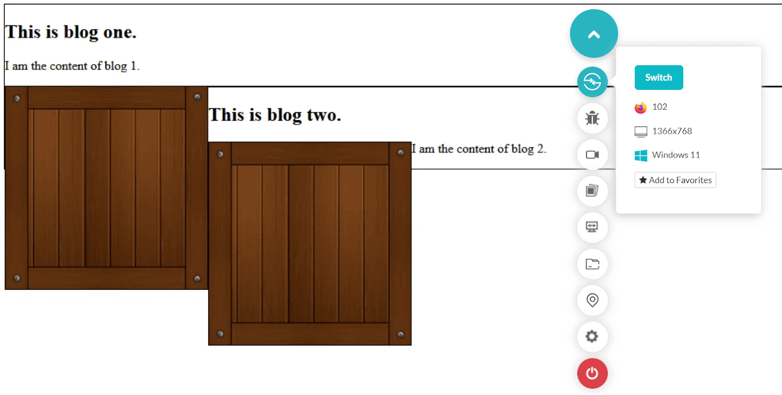
Since we used the float: left for images, the next article is placed just beside it as the space was available. A similar thing happened with box number 2. But if we analyze our code, especially the article block, we will see that the images are coded inside this block but are painted outside when rendered on the browser.
|
1 2 3 4 5 |
<article> <h2>This is blog one.</h2> <p>I am the content of blog 1.</p> <img src="wooden_box.png" alt="Hello I am a wooden box"> </article> |
This is because the browser cannot analyze which things are one unit and which ones are different. As a result, we see this misalignment above, and the browser had to repaint the complete web page to render the changes. These two things are what we address through layout values in CSS contain property.
The layout value specifies to the browser that to which element we are attaching the value is completely independent of its outer element. In lay terms, whatever changes we do in this element should not reflect outside, and whatever changes we do outside should not reflect in this element. As a result, the repainting becomes less as the browser knows that if changes are done in this element, only this element needs repainting and vice versa.
In our code above, add the following property to the article block in the style element:
|
1 |
contain: layout; |
So, our style block now becomes:
|
1 2 3 4 5 6 7 8 9 |
<style> img { float: left; } article { border: 1px solid black; contain: layout; } </style> |
This change results in the following render on the browser:
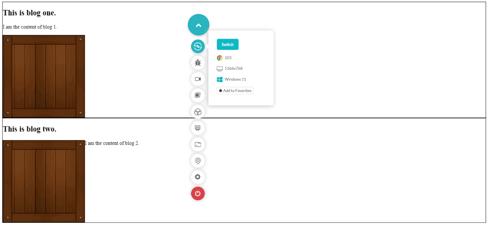
This is exactly what we wanted to render on the web page. All the elements belonging to one article block are contained within the boundary. Any changes done outside would not reflect the other article block here. The floats are also contained inside, as seen in the demonstration above.
In addition, the margins are not expected to collapse along the boundary, and the containing box creates a stacking context; therefore, the z-index can be used.
Paint
The next property we can use in the CSS contain property is the paint. This property is similar to the layout property discussed above except for one small part. If we apply the contain: paint to the element, it works similarly to the overflow: hidden property in normal HTML. The characteristics, however, remain similar to the layout value.
The paint property instructs the browser that if any descendant of this element (the one with the paint property applied) is going out of bounds, clip it and present it within the boundaries. Or let overflowing elements be there, but they should not be visible outside the box.
Let’s analyze the same code we used above, except for two small changes. This time we take contain as paint and the height of the article as 150px so that it is shorter than the height of the box, which is its descendent.
The final code becomes as follows:
|
1 2 3 4 5 6 7 8 9 10 11 12 13 14 15 16 17 18 19 20 21 22 23 24 25 26 27 28 29 30 |
<!DOCTYPE html> <html lang="en" dir="ltr"> <head> <meta charset="utf-8"> <title>The contain paint property</title> <style> img { float: left; } article { border: 1px solid black; contain: paint; height: 150px; } </style> </head> <body> <article> <h2>Heading of a nice article</h2> <p>Content here.</p> <img src="wooden_box.png" alt="I just showed up"> </article> <article> <h2>Another heading of another article</h2> <img src="wooden_box.png" alt="placeholder"> <p>More content here.</p> </article> </body> </html> |
The final render looks as follows:
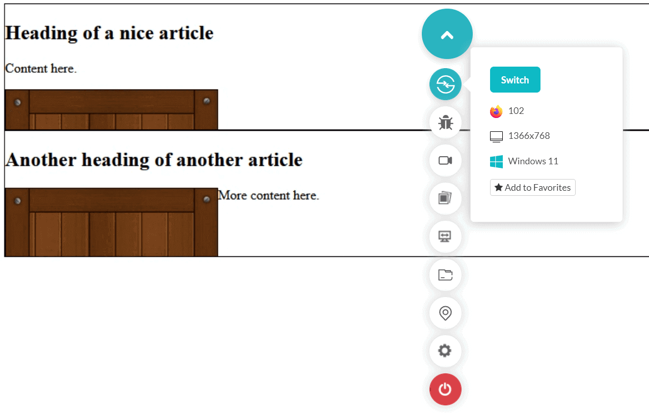
Notice that even though the box should overflow (and it will if you remove the contain: paint line), it does not due to the paint value. So, inside this element, everything will remain inside even if it is not visible to the user.
Style
The final property presented in the CSS contain property is style. The style value is not used popularly when working with the CSS contain property because of its narrow spectrum of implementation. “Style” works with only quotes and counters in CSS.
The CSS containment module level 2 states that when we use this value with counters and quotes, these properties must be scoped to the sub-tree and eventually create a new counter. Then the specification states the same effect through the open-quote and close-quote properties.
The specification talks about the counters and quotes. The counters are used in CSS when we have to progressively number something, such as in lists like a numbered bullet list. Here we initialize the counter using counter-reset, define the value, and use counter-increment to increment it in our code. This helps us keep track of the counter, similar to a variable.
The quotes are simply the symbols that we would like to use. For example, I can define my quotes as follows in the CSS:
|
1 2 3 |
element { quotes: “<”, “>”; } |
So, how does “style” play a role in this? When we use the style value in CSS containment to any element, we isolate this element from the outer scope of counters and quotes already running. This element will start its new counter and quotes, and once we close this element, the outer code won’t know about its run. So, in CSS contain property, the element with style does not know about the counters and quotes running outside and vice versa.
Let’s analyze the same effect using the quote example as follows.
|
1 2 3 4 5 6 7 8 9 10 11 12 13 14 15 16 17 18 19 20 21 22 23 24 25 26 27 28 29 30 31 32 33 |
<!DOCTYPE html> <html lang="en" dir="ltr"> <head> <meta charset="utf-8"> <title>The contain style property</title> <style> body { quotes: "<<" ">>" "<" ">"; } .left-quote:before { content: open-quote; } .right-quote:after { content: close-quote; } </style> </head> <body> <center> <div> <span class="left-quote"> Hi <span style="contain: style;"> <span class="left-quote"> Bye </span> </span> </span> <span class="right-quote"></span> </div> </center> </body> </html> |
Here, since in the last span we are using the class “right-quote”, we expect that it will close the last opened quote which is “<”. Instead, it gives the following render:
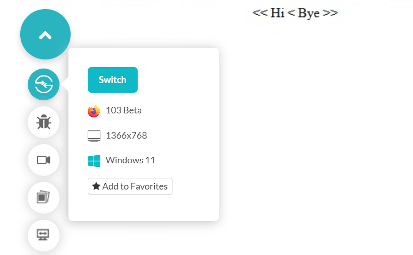
This denotes that the outer span has not been considered the inner one with contain as style.
This property is rarely used in practical implementation.
Shorthand values supported by CSS contain property
The above values of CSS contain properties that help us optimize our website in a single dimension. So, we must implement a combination of these values and take advantage of them on our web page. For the same reasons, CSS containment provides two shorthand values:
- content
- strict
Here, the content value is shorthand for layout and paint together, while strict is shorthand for size, layout, and paint. If the need arises, you can directly use these shorthands in your code if the need arises.
Testing your CSS contain code on multiple browsers
Planning your web design and what parts would be attached to which CSS contain value is only half the job. Think about what would happen if one browser is not showing the expected results in the layout section. What if it shows the boxes outside the element boundary?
Such kinds of mistakes can prove to be devastating for the business. The best option is always to ensure that your website is compatible across various platforms. This can be achieved using an online cross browser testing platform such as LambdaTest. It allows you to perform web testing and provides an online browser farm of more than 3000+ browsers and OS combinations.
Subscribe to the LambdaTest YouTube Channel to get more tutorials on test automation, Cypress test automation, Playwright automation, and more.
Step 1: To start testing, sign up on the LambdaTest platform if you don’t have an account.

Step 2: Navigate to Real Time Testing > Browser Testing panel from the left toolbar.

Step 3: Enter the website URL on which you wish to check the CSS contain property. You can choose the browser, VERSION, OS, and RESOLUTION here. Launch the website on the same specification.
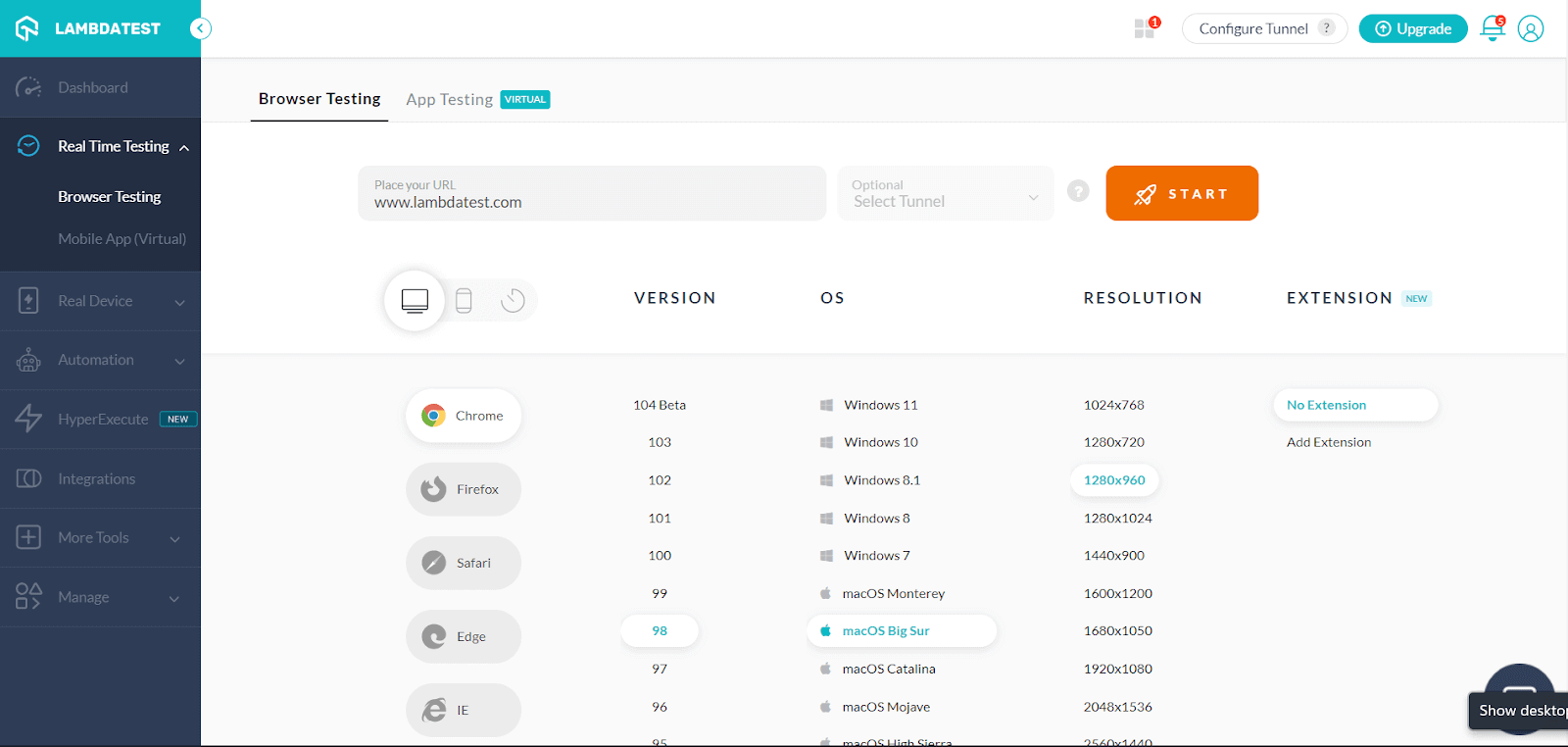
Step 4: Press START to launch the test session.

Now you can surf through the website just like a user on the browser and other specifications of your choice. It is extremely fast and convenient from the tester’s perspective.
Note: Now you can perform online cross browser testing on Brave Browsers to make sure your websites and web apps are compatible with all versions.
Conclusion
More often, developers face problems related to overflows, misalignments, and things that do not even feel logical. Things go out of place, which is hard to decode, especially when working on a big project. But CSS contain property help us look into the future and predict our exact arrangement of elements with almost 100% probability.
CSS contain property help us optimize the renders and let the browser know which things to repaint and which not to. This loads pages faster, and apart from repainting, it does help us control things that could have required heavy special arrangements. CSS contain property accepts four values for implementation – size, layout, paint, and style.
These values bring something different that fits different use cases when implemented in practical situations. By the end of this detailed discussion on this unique CSS contain property, let us know your thoughts in the comment section. Thank you for giving this post your valuable time.
Frequently Asked Questions (FAQs)
What is CSS used for?
Web pages are styled and laid up using CSS (Cascading Style Sheets), which can be used to change the font, color, size, and spacing of your text, divide it into numerous columns, or add animations and other decorative elements.
What are CSS rules and properties?
A CSS selector and a group of CSS properties make up a CSS rule. The CSS selector determines what HTML items the CSS rule should target. The CSS settings determine the targeted HTML elements’ styling.


Author’s Profile
Harish Rajora
I am a computer science engineer. I love to keep growing as the technological world grows. I feel there is no powerful tool than a computer to change the world in any way. Apart from my field of study, I like reading books a lot and write sometimes on https://www.themeaninglesslife.com .
Blogs: 103
Got Questions? Drop them on LambdaTest Community. Visit now


