 Testμ is Live: Join 35+ Sessions & Workshops from 60+ Speakers, Participate & Win $10,000

A Beginner’s Guide To Styling CSS Forms
Alex Anie
Posted On: August 3, 2022
 28810 Views
 18 Min Read
To put in a simple term, an HTML or web forms are mostly referred to as web elements that are designed to enable users to put in their information, which may include their names, age, gender, or credit card number, etc., which is then sent to a server for processing.
Web forms are very useful and are now a very important aspect of web development. Imagine having to travel to a foreign country just to fill out a form because you want to apply for a course in their university.
Since every modern university has a website with a form, students can sit in the comfort of their homes and apply within their convenient time, saving them the time to visit the school in person. Then the school collects this information to decide if the candidate is qualified to study at their university.
Web forms are not limited to schools only, businesses such as Banks, E-Commerce, to mention a few, use web forms to collect information from their customers. This helps them decide how to serve the needs of their customers better.
This is exactly what web forms are designed to do – to collect information for processing.
In this tutorial on CSS Forms, we will take a closer look at how to style forms with CSS and much more.
TABLE OF CONTENTS
- Prerequisites for styling CSS Forms
- How to style common form elements with CSS?
- Appling universal selector
- Applying viewport width (vw) and viewport height (vh)
- Applying hero image
- Centering the form with Flexbox
- Styling the form element
- Styling form logo
- Styling site caption
- Styling the input tag
- Styling forget password
- Style the form button
- Styling the signup option
- Testing CSS Forms with LT Browser
- Frequently Asked Questions (FAQs)
Prerequisites for styling CSS Forms
By the end of this tutorial on CSS Forms, you would be in a position to build a form in HTML that is styled using CSS. However, a basic knowledge of HTML and CSS is required to understand this blog on CSS Forms better.
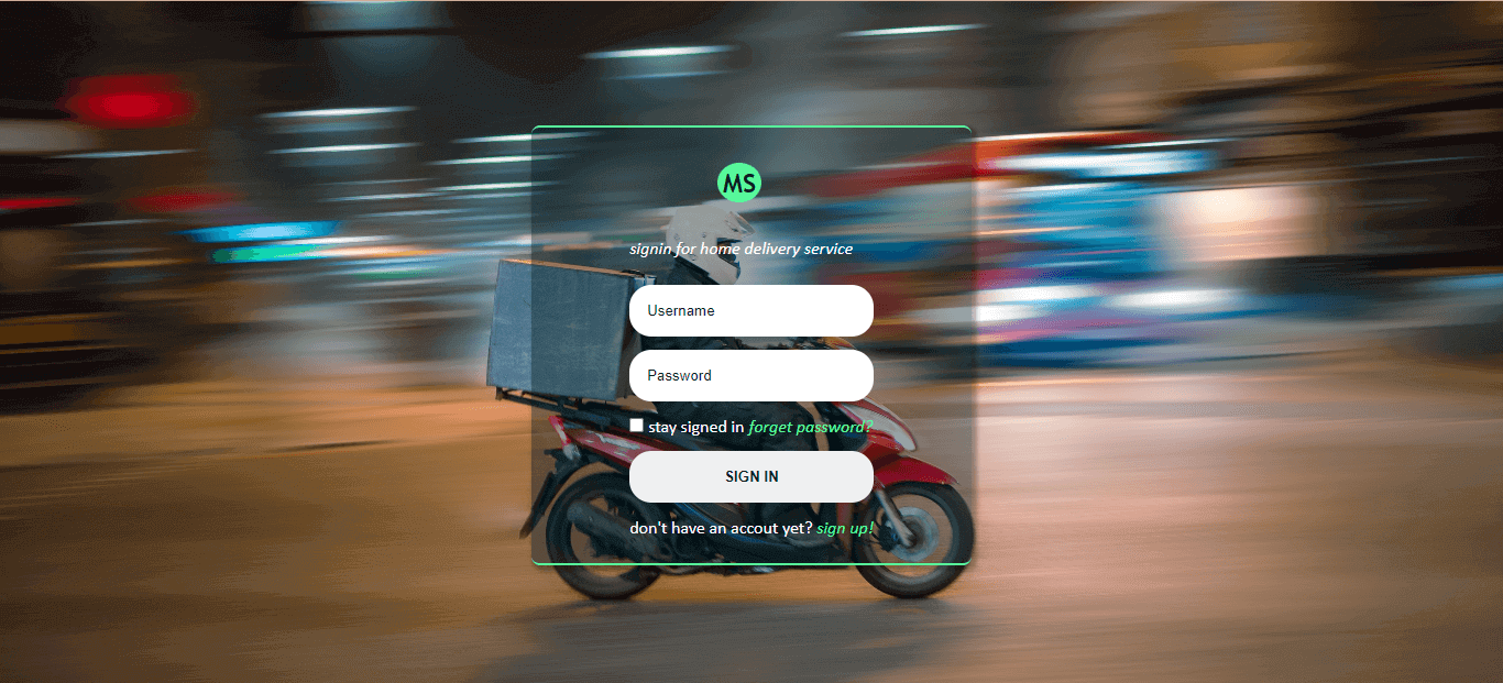
Here is a sample of the finished project of what we’ll be building.
Here is the link to CodePen for this styling CSS Form project’s source code.
See the Pen
How to style forms with CSS: A beginner’s guide by Ocxigin (@ocxigin)
on CodePen.
Creating the HTML boilerplates
Let’s start by creating the website boilerplates (that is, the HTML code structure for the website). This contains the head and body tags, as seen below.
After creating our HTML boilerplate, now save it as an index.html file, am using VS Code but you can use any IDE of your choice.
Hey here’s a quick free tool called rem-to-px-converter & px-to-rem-converter that will help you convert CSS unit REM values & pixels.
Creating the necessary HTML tags
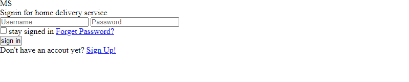
Now, let’s create the necessary HTML tags for our styling CSS Forms project.
From the code sample above, let’s look at what each tag is supposed to do based on the class names assigned to them.
- site__container: This class is assigned to a div tag that wraps around every other tag within our HTML tags.
- hero__images: This class is assigned to the main tag. This tag is where our hero image will be assigned using CSS.
- card__wrapper: This class is assigned to another main tag nested inside the hero__image tag. This tag wraps around all tags that make up our web form.
- card__forms: This class is assigned to the section tag, which is the main tag for our web form
- Items__wrapper: This tag wraps around the div, input, button, and link tags which are items within the web form.
- site__logo: This is the site logo.
- sign__caption: This tag helps to inform the user why they should sign up/sign in using the web form.
- user_id: This wraps around the input tag where the user has to enter their username and password.
- checkbox__wrapper: This wraps around the input, a (anchor), and labels tag. Here we ask the user if they would like their user id to be saved so that they don’t have to retype them later when they visit the site by clicking the checkbox. We also ask if they have a forgotten password that needs to be recovered.
- btn__wrapper: This wraps around the main button of the form. This is the button the user clicks on that helps them sign in to the site.
- signup__option: This tag wraps around the paragraph tag and a link tag. Here we provide an option for new users who don’t have an account to signup.
Now that we have the HTML boilerplate setup, save it and run it on your favorite browser. The code in this CSS Forms tutorial is run using Google Chrome.
Brower Output:
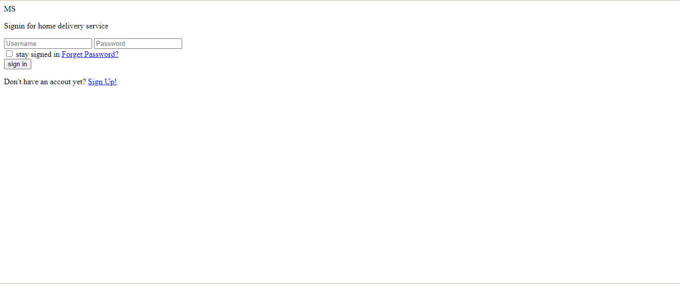
Your code should look like this. You will notice how plain and simple the website is from our browser output. This is because we have not added the CSS yet. In the next section of this tutorial on CSS Forms, we’ll talk about this.
How to style common form elements with CSS?
Form elements are some of the most common elements on a website. Every site must have these elements, from login forms to search boxes and buttons, to be functional. These elements are sometimes overlooked in design and styling, which may cause them to blend into each other, making your site’s UI look dull. A good way to avoid this is by using CSS to change the appearance of form elements such as text fields and buttons.
Here’s how you can style common CSS Form elements:
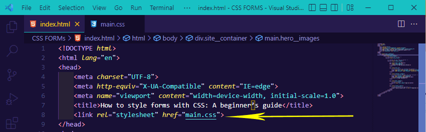
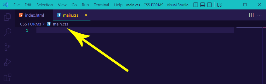
- In your Visual Studio Code, create a new file and name it main.css. This is going to be the CSS file. Notice from our HTML file that in the head tag, we have a link tag that points to main.css. This link tag helps us link together both the HTML and CSS files. Any changes to the HTML will affect the CSS file & vice versa.
- Let’s add the relevant CSS code in main.css so that we can style the boring page that we earlier created using HTML.
- Your editor should open as thus. Now let’s write some CSS.
Appling universal selector
Universal selector is a CSS concept that lets you define styles once and reuse them across the entire website. It means that you need to define only that “one thing” once, and then you can use it on other pages. This saves us a lot of time and makes the code more maintainable.
Type and run the code below for your CSS Forms project:
|
1 2 3 4 5 |
*, *::after, *::before { padding: 0; margin: 0; box-sizing: border-box; } |
Browser Output:
From the CSS code above, we use a CSS universal selector to target all the elements on the webpage. We added a padding 0px, margin 0px and box-sizing of the border-box. This helps to remove all the white spaces on the webpage so that we don’t have unnecessary white spaces interfering when styling CSS Forms.
Applying viewport width (vw) and viewport height (vh)
Applying viewport width (vw) and viewport height (vh) are new properties available in CSS3 and have quite a few uses. By default, the vw unit is equal to 1% of the containing element’s width. The same goes for vh. Using these properties, you can do some cool things with your website.
|
1 2 3 4 |
.site__container { width: 100vw; height: 100vh; } |
We target a div tag with a class of .site__container and we assign a width and height of 100vw and 100vh to both respectively. This helps to size our webpage’s viewport to take the browser’s full width and height.
You will not see any effect when you refresh your browser since other HTML tags have not been given specific sizing or styling.
Test browser compatibility of your CSS Forms. Try LambdaTest Now!
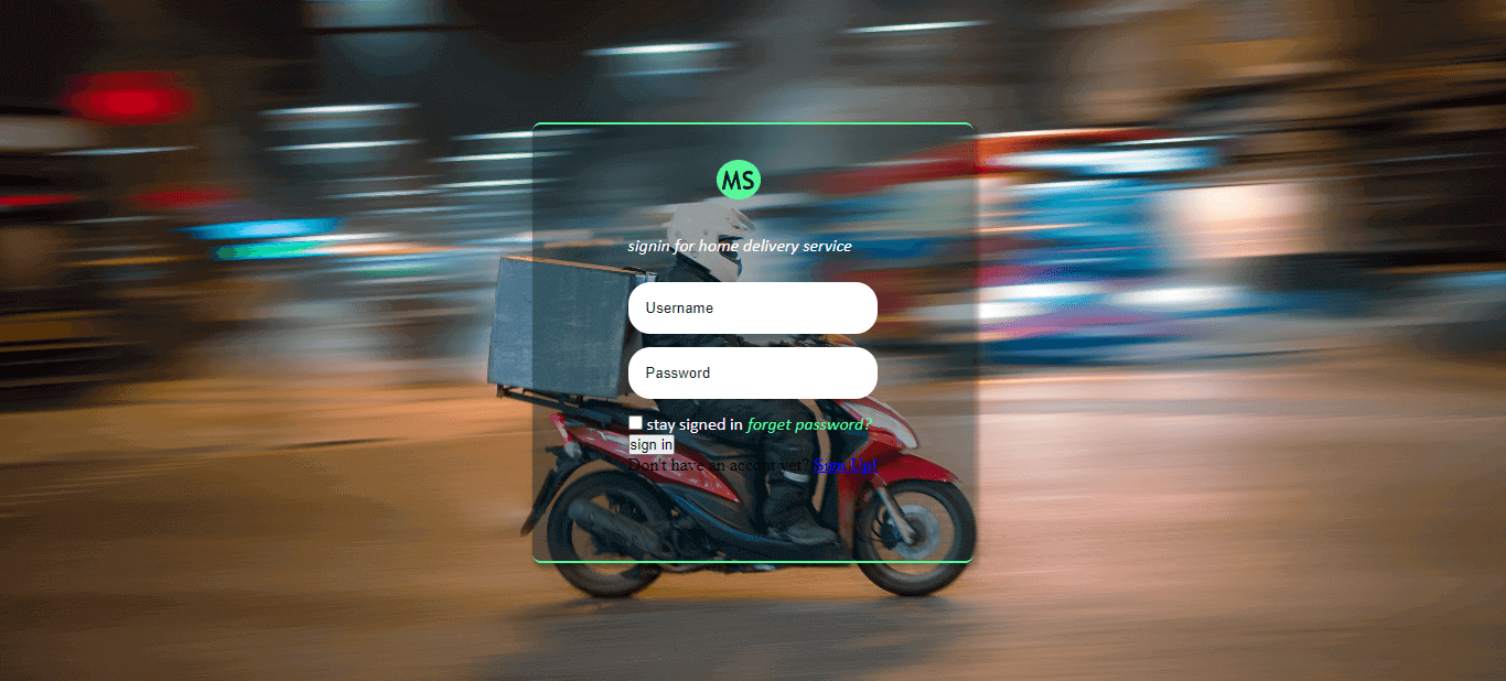
Applying hero image
The hero image is a common element in blog design. It’s a large, eye-catching image that spans the full width of the page and often a bit of the page’s height. It is usually used to draw initial attention to an article or page and as an anchor point for future articles or pages within that site section. A hero image can also highlight content such as images, videos, or other interactive elements by making it the central point of focus on the page.
|
1 2 3 4 5 6 7 |
.hero__images { height: 100%; background-image: url("./delivery-man.jpg"); background-repeat: no-repeat; background-size: cover; background-position: center; } |
Browser Output:

From the CSS code above, we assigned a height of 100% to the class of hero__images. This helps the hero__images class to inherit the same height value set to the direct parent, which is 100vh. This helps the background image used to occupy the browser viewport, and then we set a background-image. You can download the image here.
We also added a background-repeat of no-repeat to prevent it from repeating, a background-size of cover, which helps to set the image to cover the entire viewport, and a background-position of center, which helps to center the image within the viewport or container.
Centering the form with Flexbox
Centering the form with CSS Flexbox is easy. The only problem is that it requires you to wrap the form in a parent container with a specified width, which is a bit of a pain. Thankfully, there’s a better solution that works in all browsers. You’ll need three elements:
- The actual form.
- A wrapper element (parent).
- An element for the actual content (child).
We’ll use CSS Flexbox to center the web form to the browser center. Type and run the code below.
|
1 2 3 4 5 6 |
.card__wrapper { height: 100%; display: flex; justify-content: center; align-items: center; } |
Browser Output:

In the section of styling CSS Forms tutorial, we target the card__wrapper class, we set a height of 100%, a display of flex, justify-content of center, and align-items of center. This helps to position the form to the center horizontally and vertically while styling CSS Forms.
Styling the form element
The HTML for a typical form consists of various input elements, each representing a different type of data. In CSS, you can style the input element in various ways to create distinction among them.
Here we apply styling to the CSS Form and add a specific width and height.
|
1 2 3 4 5 6 7 8 9 10 11 |
.card__forms { display: flex; justify-content: center; width: 400px; height: 400px; background-color: rgb(1, 32, 32, 0.4); border-radius: 0.5rem; box-shadow: 3.5px 3.5px 4px 2px rgba(0, 0, 0, 0.3); border-top: 2px solid rgb(89, 250, 156); border-bottom: 2px solid rgb(89, 250, 156); } |
Browser Output:

We target the class of card__form, apply a display of flex, justify-content of center, width, and height of 400px across, to give it a defined size, background-color of rgb(1, 32, 32, 0.4). The last two integers of 0.4 are transparent values as they represent the opacity of the 0.4 value. We also added a border-radius of 0.5em, box-shadow, border-top, and border-bottom of 2px solid rgb(89, 250, 156). This creates the solid lime color you can see at the top and bottom of our CSS Form.
Styling form logo
Many websites use the form logo to style the input field and submit button in a form. The first reason is that the form is consistent with the overall design. The second reason is that it makes it easier to differentiate between a regular input field and a submit button since the color is used for the submit button.
Here we apply styling to the logo on the form element.
|
1 2 3 4 5 6 7 8 9 10 11 12 13 |
.site__logo { width: 40px; padding: 4px; margin: 2.0rem 5rem; text-align: center; border-radius: 50%; font-size: x-large; font-weight: bolder; font-family: 'Trebuchet MS', sans-serif; background-color: rgb(89, 250, 156); color: rgb(1, 32, 32); cursor: default; } |
Browser Output:

We targeted the site__logo class and we added a width of 40px, padding of 4px, margin of 2.0rem and 5rem for top and bottom respectively (to add extra white space).
We also apply text-align to center (to center the logo), border-radius of 50% (to make the logo round), font-size of x-large, font-weight of bolder, and font-family of ‘Trebuchet MS‘.
And a background-color of rgb(89, 250, 156), color of rgb(1, 32, 32) and cursor of default.
Styling site caption
The site caption is a little bit of text that appears at the top of every page on your website. This can be any text you want. It is typically used to identify who created the site and possibly provide legal information about the site’s content.
By styling this text, we can make it stand out more or appear in multiple places on a page.
Here we apply styling to the caption on the CSS Form.
|
1 2 3 4 5 6 7 |
.sign__caption p { color: white; font-family: calibri; font-style: italic; text-transform: lowercase; margin-bottom: 1.5rem; } |
Browser Output:

We selected the sign__caption class and targeted the p tag inside it. We apply a text color of white, font-family of calibri, font-style of italic, text-transform to lowercase, and margin-bottom of 0.5rem (to apply extra white space at the bottom).
Styling the input tag
The input tag comes with a few styles by default. It has the look of a text field, and it’s a good idea to use the default styling for the most part. The default styling provides enough contrast between elements so that users can easily read and understand what they’re filling in.
Here we apply styling to the input tag on CSS Form, where users can enter their information.
|
1 2 3 4 5 6 7 8 9 10 11 12 13 14 15 16 17 18 |
.user_id input { width: 100%; display: block; outline: none; border: 0; padding: 1rem; border-radius: 20px; margin: 0.8rem 0; color: rgb(1, 32, 32); } .user_id input::placeholder{ color: rgb(1, 32, 32); } .user_id input:active { outline: 2px solid rgb(89, 250, 156); } |
Browser Output:

We apply the following values from the code sample above to the input tag nested inside the user id class.
- width: of 100% (so that our input tag takes in a full size within the container).
- display: of a block (so the tag can be centered properly).
- outline: of none (to remove the outline around the input tag when we click on it).
- border: to 0px (to remove the gray border around the input tag).
- padding: of 1rem (to add more space within the tag input tag to give room for user’s input such as usernames and passwords).
- border-radius: of 20px (to give it a rounded curve at the edge).
- margin: of 0.8rem 0 (0.8rem added extra space at the top and bottom while the 0 means no space should be added to the left and right of the input tag).
- color: of rgb(1, 32, 32).
For the placeholder, we added a text color of rgb(1, 32, 32), which is responsible for the Username and Password text. And for the active state, we added an outline color of 2px solid rgb(89, 250, 156).
You will see the outline color when you click on the input field of CSS Form.
Styling forget password
It is necessary to style the password field and its labels in the forgot-password form. You may require to use for this purpose a combination of standard CSS properties and some custom properties.
Here, we apply styling to the label and a tag, providing two options for users who want their account to remain signed in and for users who forgot their password to recover it.
|
1 2 3 4 5 6 7 8 9 10 11 12 13 14 15 16 17 18 19 20 21 |
.checkbox__wrapper label { color: white; font-family: calibri; text-transform: lowercase; } .checkbox__wrapper a { color: rgb(89, 250, 156); font-family: calibri; text-transform: lowercase; text-decoration: none; font-style: italic; } .checkbox__wrapper a:hover { color: rgb(255, 255, 255); font-family: calibri; text-transform: lowercase; text-decoration: none; font-style: normal; } |
Browser Output:
In this tutorial section on CSS Forms, we targeted the label tag nested inside the .checkbox__wrapper class and applied the following styling to it.
- color: of white, a font-family of calibri
- text-transform: of lowercase, while on the anchor tag, we applied a
- color: of rgb(89, 250, 156),
- text-decoration: to none (to remove the default blue line on the anchor tag)
- font-style to italic to differentiate it from the label text.
Since the anchor tag is a link that is meant to send a request, we decided to add a hover state, which is something to notify the user that this is a clickable link.
On hover state, we added a text color of rgb(255, 255, 255) on hover, and the font-style is set to normal to restore it.
Style the form button
The form button is the first thing a user will see on your website. A nice button can make a good impression, but a bad one can leave a user with a bad taste in their mouth before they even get to read any content.
Here we apply styling to the button tag on CSS Form. This button enables the user to sign into the website.
|
1 2 3 4 5 6 7 8 9 10 11 12 13 14 15 16 17 |
.btn__wrapper button { width: 100%; border: none; padding: 1rem; border-radius: 20px; text-transform: uppercase; font-weight: bolder; margin: 0.8rem 0; color: rgb(1, 32, 32); } .btn__wrapper button:hover { background-color: rgb(89, 250, 156); color: white; transition: all 0.5s ease-in-out; cursor: pointer; } |
Browser Output:

In this section of this tutorial on CSS Forms, we targeted the button tag nested in the btn__wrapper class, and we applied:
- width: of 100% to make it have a full width within the container.
- border: is set to none to remove the gray border around the button.
- padding: of 1rem to add space between the “SIGN IN” text and the button tag.
- border-radius: of 20px to apply a round corner style to the border.
- text-transform: is set to uppercase to capitalize the text.
- font-weight: is set to bolder to make text bold.
- margin: is set to 0.8rem at the top and bottom to give white space around the object, while 0 at the left and right.
- color of rgb(1, 32, 32).
On hover, we set the background-color to rgb(89, 250, 156), text color to white to create a kind of invert effect when we hover over it, a transition of all 0.5s ease-in-out, and a cursor of a pointer.
To see these changes, move your mouse pointer to hover on the button.
Styling the signup option
The actual signup option is styled to look like a button. The design of the button is simple and recognizable so that users will know what it does. The input size for the email address is a bit smaller than usual to ensure that the user doesn’t have to scroll up and down every time they want to add an email address.
Here we apply styling to the p and a tag, where we provide options for users who don’t have an account yet but would want to sign up.
|
1 2 3 4 5 6 7 8 9 10 11 12 13 14 15 16 17 18 19 20 |
.signup__option p { color: white; font-family: calibri; text-transform: lowercase; } .signup__option a { color: rgb(89, 250, 156); font-family: calibri; text-transform: lowercase; text-decoration: none; font-style: italic; } .signup__option a:hover { color: rgb(255, 255, 255); font-family: calibri; text-transform: lowercase; text-decoration: none; font-style: normal; } |
Browser Output:

From the browser output, you will notice that the “stay signed in / forgot password” and “don’t have an account yet? / sign up!” looks the same. Well, you guessed it right!
We have to copy the CSS styles for the label tag of the checkbox__wrapper class and paste it on .signup__option a and then copy the styles on forget password and paste it on the sign up class.
Now we should have the same effect.
Here is the link to the finished project on styling CSS Forms.
See the Pen
How to style forms with CSS: A beginner’s guide by Ocxigin (@ocxigin)
on CodePen.
Test your sign-ups forms on 3000+ real devices. Try LambdaTest Now!
Do you want to brush up on your CSS properties? Check out our CSS Cheat Sheet Tutorial.
Testing CSS Forms with LT Browser
Now that we have completed our project on styling CSS Forms, it’s usually a best practice to test our website or web app before deployment (before we upload it to a server).
Using cross browser testing tools such as LambdaTest enables us to perform web testing on an online browser farm of 3000+ real browsers, operating systems and devices ranging from mobile, tablets, and desktops. This helps us test website for responsiveness on different operating systems across multiple browsers.
You can also Subscribe to the LambdaTest YouTube Channel and stay updated with the latest tutorials around automated browser testing, Selenium automation, Cypress automation, CI/CD, and more.
LambdaTest’s mobile-friendly testing tool saves you time and money. LT Browser comes with 50+ pre-installed mobile-friendly viewports and advanced developer tools for creating a mobile app.
Follow the below steps to launch LT Browser for responsive testing.
- Firstly, launch LT Browser.
- This will open the LT Browser home page, where you have a list of different operating systems pre-installed devices to choose from.
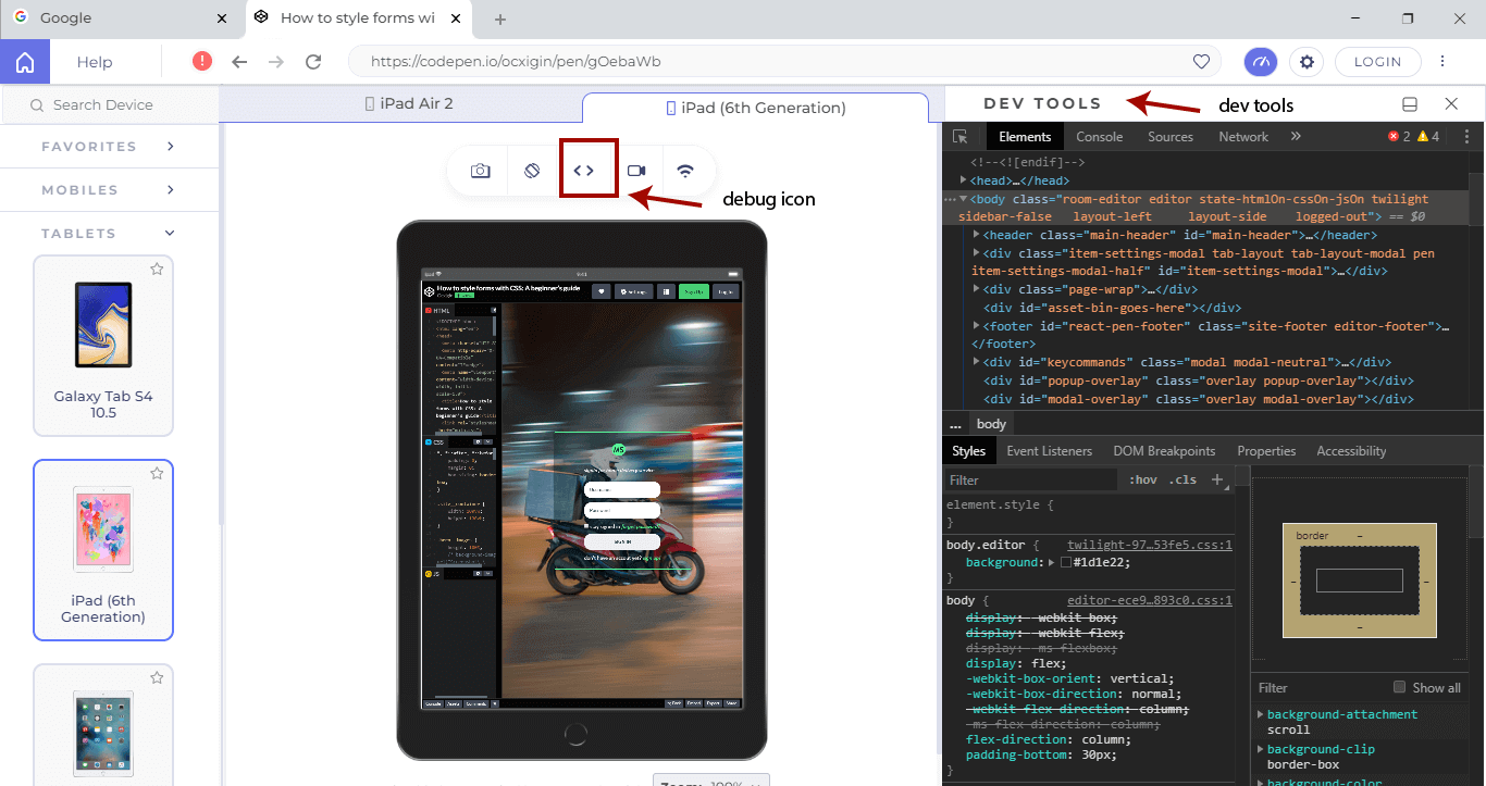
- While your LT Browser remains open, copy and paste this link (https://codepen.io/ocxigin/pen/gOebaWb) from the code pen address bar and paste it on the LT Browser address bar and then click on the refresh icon to reload the page.
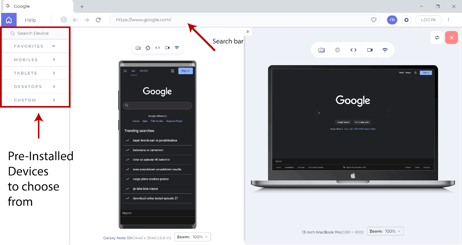

From the code output from LT Browser, you’ll notice how each device you choose affects how the web form is structured and laid out.
LT Browser does much more than that. We can also perform debugging by launching the Dev tools, which can be accessed by clicking the debug icon above the device preview tab.
For a better understanding of how your site scales on multiple browsers across multiple operating systems, use the pre-installed devices available on your home screen, select and see how your website performs on these devices.
Summary
You have learned how to style forms using CSS. You also learned how to center items using Flexbox, using transition on buttons, apply background images and how to cross text your website or web app using LambdaTest.
Alright! We’ve come to the end of this tutorial.
Thanks for taking your time to read this article to completion. Feel free to ask questions.
#Cheers
Frequently Asked Questions (FAQs)
Why is CSS forms important?
CSS (Cascading Style Sheets) allows us to style the input fields by applying some CSS properties – like giving background colors, adjusting its height and width, adding margin and padding, etc.


Author’s Profile
Alex Anie
A Front End Technical Writer. I write blogs on Front End Technologies, such as HTML, CSS, JavaScript. When I am not coding, I enjoy watching tutorials and listening to twitter spaces. I live in Lagos, Nigeria
Blogs: 16
Got Questions? Drop them on LambdaTest Community. Visit now