
A Comprehensive Guide To CSS Logical Properties
Tahera Alam
Posted On: July 13, 2023
 158761 Views
 27 Min Read
In our increasingly diverse online world, developing websites that cater to different languages and audiences is crucial. In today’s era, a one-size-fits-all approach is no longer sufficient.
CSS – the style language of the web was developed with the English language in mind, and English is written from left to right. But, that’s not the case with all languages. Different languages have different writing directions. Arabic, for example, is written from right to left. Similarly, languages like Japanese and Chinese are written vertically.
The issue arises when our websites need to be localized or cater to multilingual audiences. Conventional CSS properties are based on the physical dimension of the viewport.
We define styles using properties like left, right, top, and bottom. So, when the writing direction changes, they no longer meet our needs.
To fix this problem, we can either manually adjust our styles for different directions or create separate stylesheets for each direction. If you are wondering what’s the problem with this approach, let me give you an example.
Suppose you have an image and some text. You want the image on the left side and the text on the right.
You can use float:left on the image, and it will work. But, when the direction changes from Left-to-Right (LTR) to Right-to-Left (RTL), you will need to change this float:left to float:right because now our text flows from right to left and we wanted the image to be on the left side.
This means we need to adjust our styles for different languages and directions, and there’s no way we can reuse them.
CSS logical properties provide an alternative approach by allowing us to write styles that adapt based on the logical flow of a document rather than its physical dimension. This means you can apply a float right to the image in a default LTR language like English; however, when that direction changes to RTL, this floating will automatically adjust and act as a float left.
This revolutionary flexibility in styling approach allows us to create adaptive designs that automatically adjust based on the user’s language, reading direction, and layout preferences, thereby eliminating manual adjustments.
In this blog, we look at how you can leverage CSS logical properties to create designs that flawlessly adapt across different writing directions. By the end of this blog, you will have a strong understanding of CSS logical properties and be able to craft designs that seamlessly adjust to various writing modes and directions without requiring manual adjustments.
So, let’s dive right in!
TABLE OF CONTENTS
- Why do we need CSS Logical Properties?
- Block and Inline Dimension
- CSS Logical Properties for Floating and Positioning
- CSS Logical Properties for Margins, Borders, and Paddings
- CSS Logical Properties for Sizing
- Browser Support for CSS Logical Properties
- Advantages of using CSS Logical Properties
- Wrap it up!
- Frequently Asked Questions (FAQs)
Why do we need CSS Logical Properties?
Before we dive into CSS logical properties, let’s take a step back to understand why we even need logical properties. This will help you better grasp the problem that CSS logical properties are meant to solve.
The problem with traditional CSS properties is that they are based on the physical directions of the viewport. For instance, in CSS, we typically describe boxes by specifying their width, and height, and position them using the top and left attributes. This works well in the case of LTR languages like English, but when the writing direction changes(such as in RTL languages), these properties fail to adapt to that content flow.
Let’s look at a simple example to understand this scenario:
See the Pen
multi-direction layout problem demo by Tahera Alam (@alam_tahera)
on CodePen.
In this example, we have two cards that contain an avatar and some text. The first card follows the LTR direction, and the second card follows the RTL direction. Notice the margin between the avatar and the text. For the first card, the margin is on the right of the avatar. So, for the second card, this margin should be flipped to the left.
With conventional CSS properties, we can do this:
|
1 2 3 4 5 6 7 8 9 |
.avatar { margin-right: 1rem; } .rtl .avatar { margin-right: 0; margin-left: 1rem; } |
In the second card’s avatar, we first set margin-right to 0 since it’s not needed there and then added margin-left to have a margin between the avatar and the text, just like the first card. With this, the second card’s avatar also has a margin, but instead of being on the right side like the first card, it is on the left side because we have an RTL direction here.
It’s fine in our case but imagine doing that for a large-scale project! It would be nearly impossible to tweak every property to adapt to different writing directions.
That’s where CSS logical properties come in. CSS logical properties provide a way to write styles that adapt automatically based on the writing mode of the content. For example, to achieve the above scenario where our margin adapts based on the writing direction, we can use the following CSS logical properties:
|
1 2 3 |
.avatar { margin-inline-end: 1rem; } |
We just set this property on the avatar, and it sets the margin right when the direction is LTR and the margin-left when the direction is RTL. This means our margin adapts based on the direction. Isn’t it incredibly powerful?
Let’s now look at another example where we utilize CSS logical properties in a grid-based layout:
HTML:
|
1 2 3 4 5 6 7 8 9 10 11 12 13 14 15 16 17 18 19 20 21 22 23 24 25 26 27 28 29 30 31 32 33 |
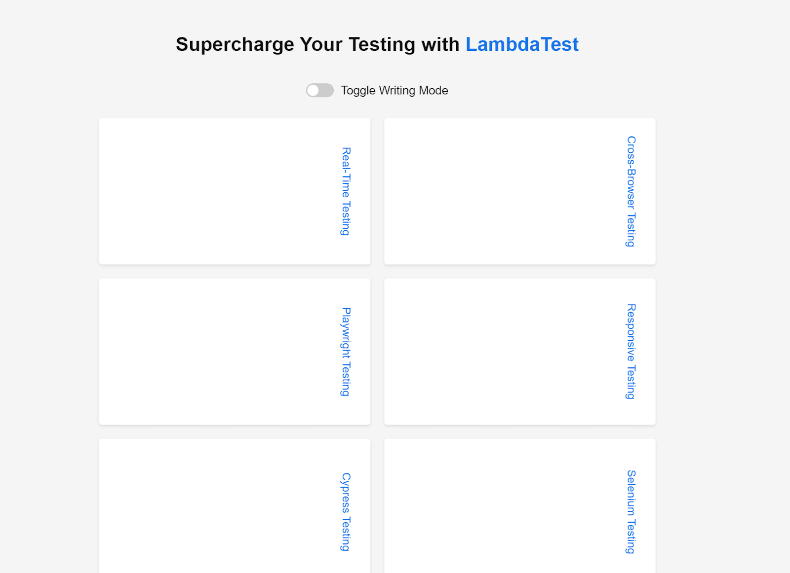
<div class="container"> <h1> Supercharge Your Testing with <a href="https://www.lambdatest.com/">LambdaTest</a> </h1> <div class="toggle-container"> <input type="checkbox" id="toggleButton" class="toggle-input" /> <label for="toggleButton" class="toggle-label"></label> <div class="toggle-text">Toggle Writing Mode</div> </div> <div class="grid"> <a href="https://www.lambdatest.com/cross-browser-testing" class="item" >Cross-Browser Testing</a > <a href="https://www.lambdatest.com/responsive-testing" class="item" >Responsive Testing</a > <a href="https://www.lambdatest.com/selenium-testing" class="item" >Selenium Testing</a > <a href="https://www.lambdatest.com/real-time-testing" class="item" >Real-Time Testing</a > <a href="https://www.lambdatest.com/playwright-testing" class="item" >Playwright Testing</a > <a href="https://www.lambdatest.com/cypress-testing" class="item" >Cypress Testing</a > </div> </div> |
CSS:
|
1 2 3 4 5 6 7 8 9 10 11 12 13 14 15 16 17 18 19 20 21 22 23 24 25 26 27 28 29 30 31 32 33 34 35 36 37 38 39 40 41 42 43 44 45 46 47 48 49 50 51 52 53 54 55 56 57 58 59 60 61 62 63 64 65 66 67 68 69 70 71 72 73 74 75 76 77 78 79 80 81 82 83 84 85 86 87 88 89 90 91 92 93 94 95 96 97 98 99 |
body { font-family: Arial, sans-serif; margin: 0; padding: 0; box-sizing: border-box; background-color: #f5f5f5; } .container{ margin: 0 auto; padding: 30px; text-align: center; } h1 { font-size: 28px; color: #111; margin-bottom: 40px; } a { color: #1a73e8; text-decoration: none; } .grid { display: grid; grid-template-columns: repeat(3, 1fr); grid-gap: 20px; width: 800px; margin: 0 auto; writing-mode: horizontal-tb; } .toggle-container { display: flex; align-items: center; justify-content: center; margin-bottom: 30px; } .toggle-input { display: none; } .toggle-label { display: inline-block; width: 40px; height: 20px; border-radius: 10px; background-color: #ccc; position: relative; cursor: pointer; } .toggle-label:before { content: ""; position: absolute; top: 2px; left: 2px; width: 16px; height: 16px; border-radius: 50%; background-color: #fff; transition: transform 0.3s ease; } .toggle-input:checked + .toggle-label { background-color: #1a73e8; } .toggle-input:checked + .toggle-label:before { transform: translateX(20px); } .toggle-text { margin-left: 10px; font-size: 17px; color: #111; } .item { background-color: #fff; border-radius: 4px; padding: 25px; text-align: center; box-shadow: 0 2px 4px rgba(0, 0, 0, 0.1); font-size: 16px; transition: background-color 0.3s ease; } .item:hover { background-color: #f5f5f5; } |
Output:
See the Pen
writing-mode by Tahera Alam (@alam_tahera)
on CodePen.
In this example, we have a grid container with the class .grid. The container has a width of 800px. When the writing mode property is set to horizontal-tb, the grid layout appears as expected. The grid items are arranged in three columns.
However, when you toggle the writing mode button to vertical-rl, the grid layout gets affected. While the grid items still maintain their alignment, the appearance of the grid changes. This issue arises from the container’s width, which remains fixed at 800 pixels and fails to adapt to the vertical flow of content. As a result, the grid appears misaligned within the vertical writing mode.
To address this issue, instead of using width on the .grid container, we can use the inline-size property:
|
1 2 3 |
.grid { inline-size: 800px; } |
This ensures that the container’s width adjusts dynamically based on the content flow, allowing the grid to adapt correctly to the vertical writing mode.
These examples should give you a clear understanding of the importance of CSS logical properties.
Additionally, here are a few leading names in the industry that leverage CSS logical properties to make their designs more flexible and adaptable across different languages and writing directions:
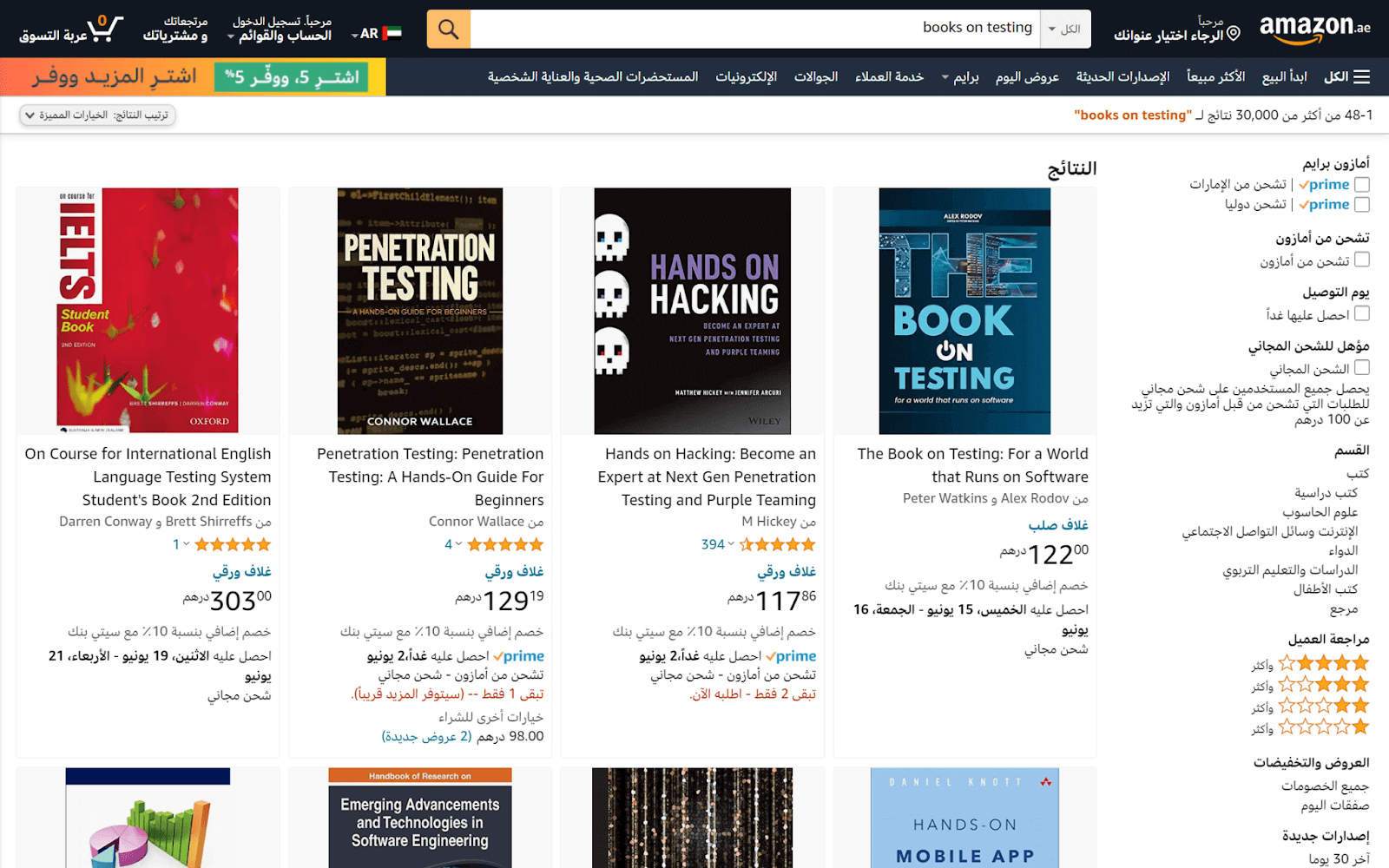
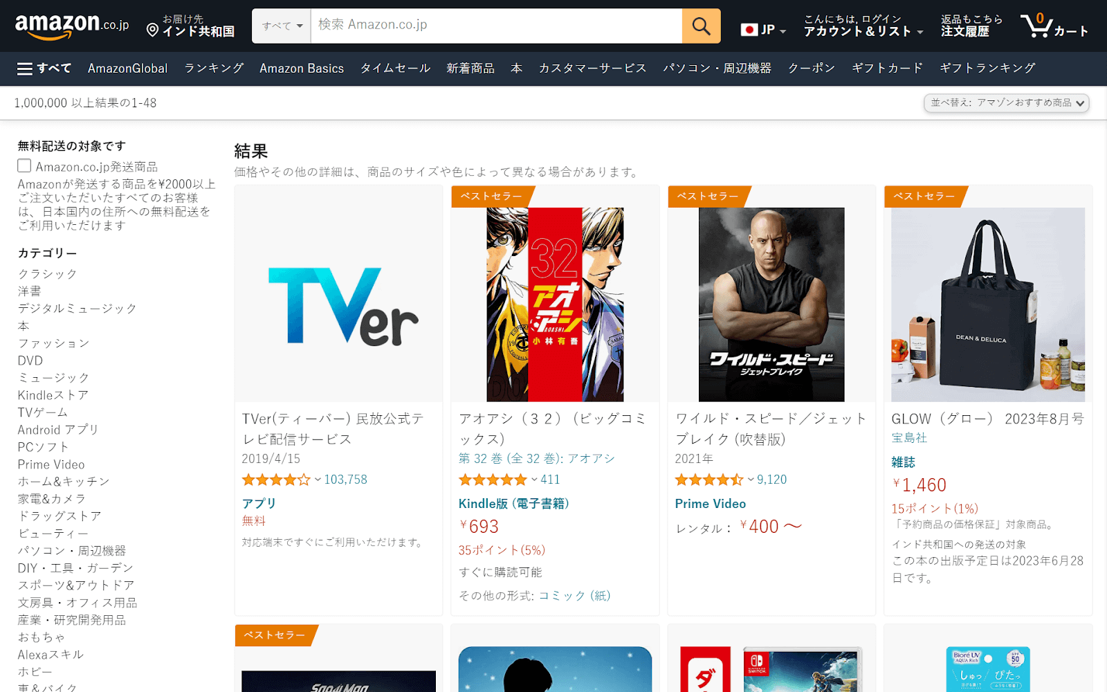
Amazon
This multinational eCommerce company demonstrates its commitment to catering to a global audience by offering localized versions of its website in various languages.
Here are two prominent examples showcasing Amazon’s commitment to serving diverse markets:
- Amazon Arabic
- Amazon Japanese
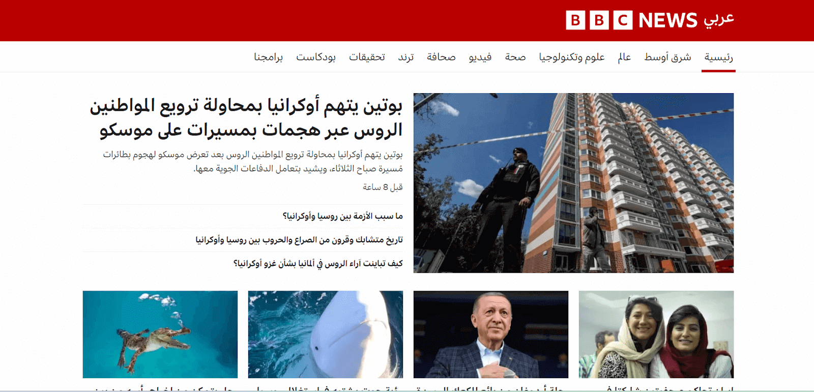
BBC
This international media organization strives to bridge linguistic and cultural gaps by offering tailored experiences to its global audience.
Below is an illustration of BBC Arabic:
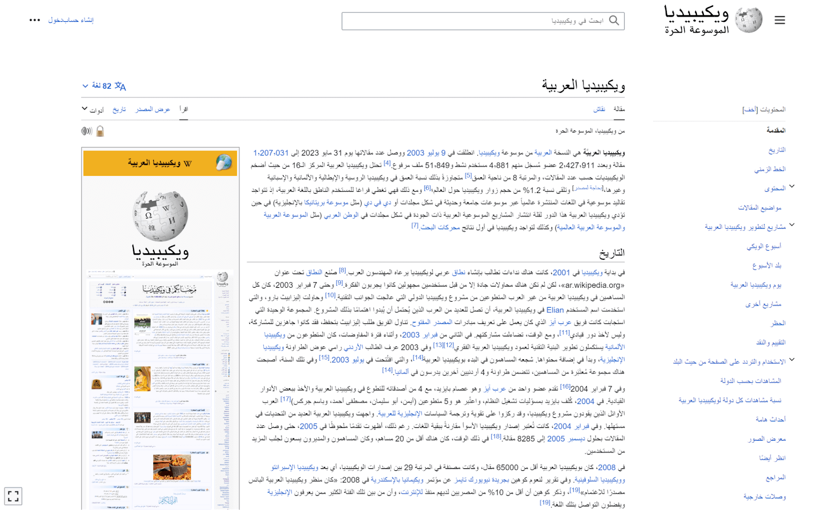
Wikipedia
This collaborative online encyclopedia’s dedication to inclusivity is evident through its localized versions in different languages.
One such version is Wikipedia Arabic:
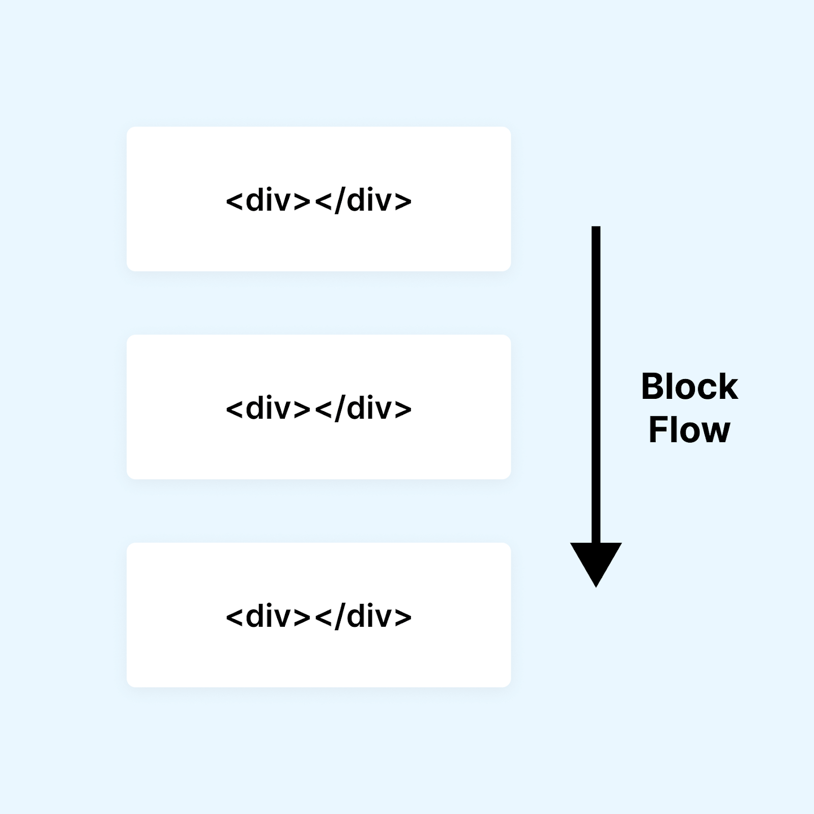
Block and Inline Dimension
We now know that CSS logical properties are based on a flow-relative approach rather than the physical direction. Block and inline dimensions are the building blocks of this flow-relative approach. Let’s explore what they mean.
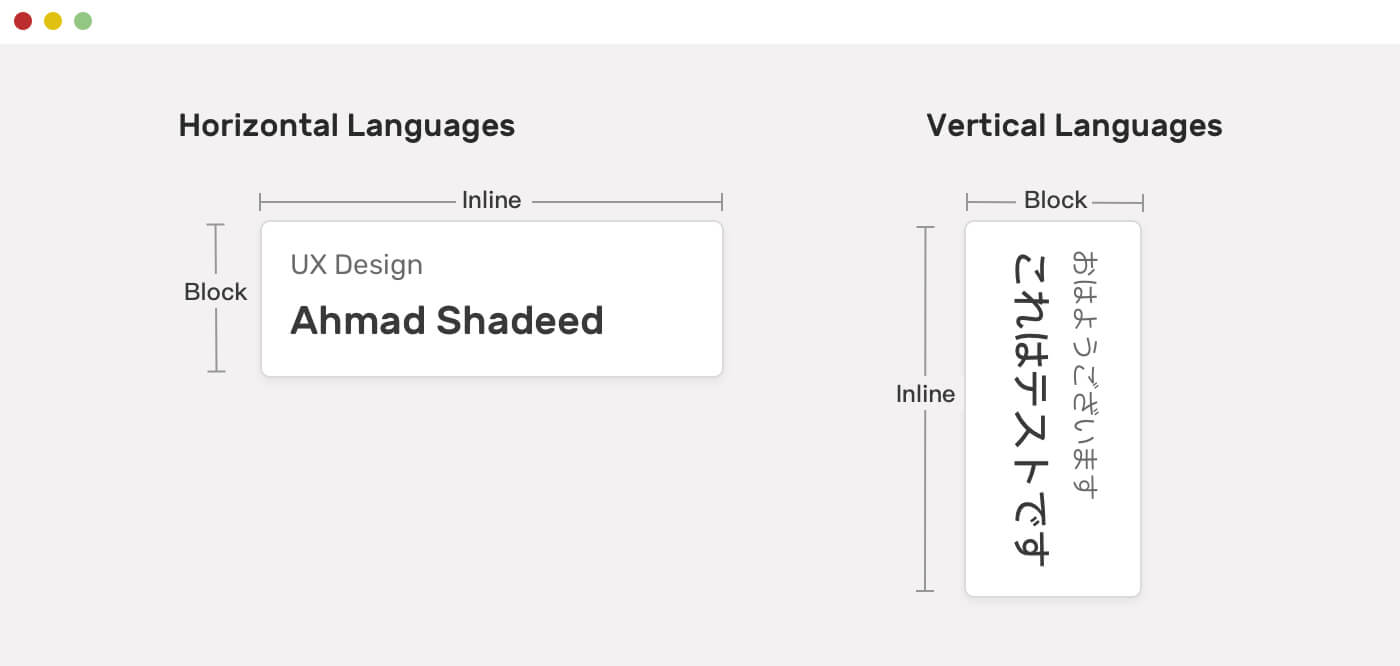
Block dimension is the dimension in which blocks of content are placed. You can think of the block dimension as the direction in which blocks, such as paragraphs, display one after the other. In an English document, the block flow is top-to-bottom.
The inline dimension refers to how the text flows in a sentence. For instance, the inline dimension is horizontal in English or Arabic documents with horizontal text flow.
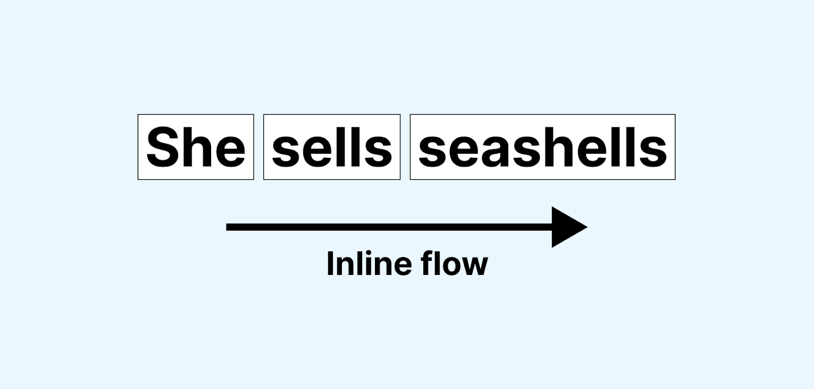
Note that the meaning of inline and block can change depending on the writing mode. For languages like English, the inline is the horizontal dimension, whereas the block is the vertical one. For languages like Japanese, the inline is the vertical dimension, and the block is the horizontal one.
Below is a visualization of the block and inline dimensions in horizontal and vertical writing modes:
The key idea behind inline and block dimensions is that instead of focusing on the element’s physical directions, you need to consider them as either inline or block.
To illustrate this, let’s consider the common practice of centering an element using margin-right and margin-left:
|
1 2 3 4 |
.element { margin-left: auto; margin-right: auto; } |
Instead of focusing on the individual right and left margins; we can achieve the same result with a single line of code using the margin-inline logical property. This property sets both the margin-left and margin-right simultaneously:
|
1 2 3 |
.element { margin-inline: auto; } |
Output:
See the Pen
margin-inline demo by Tahera Alam (@alam_tahera)
on CodePen.
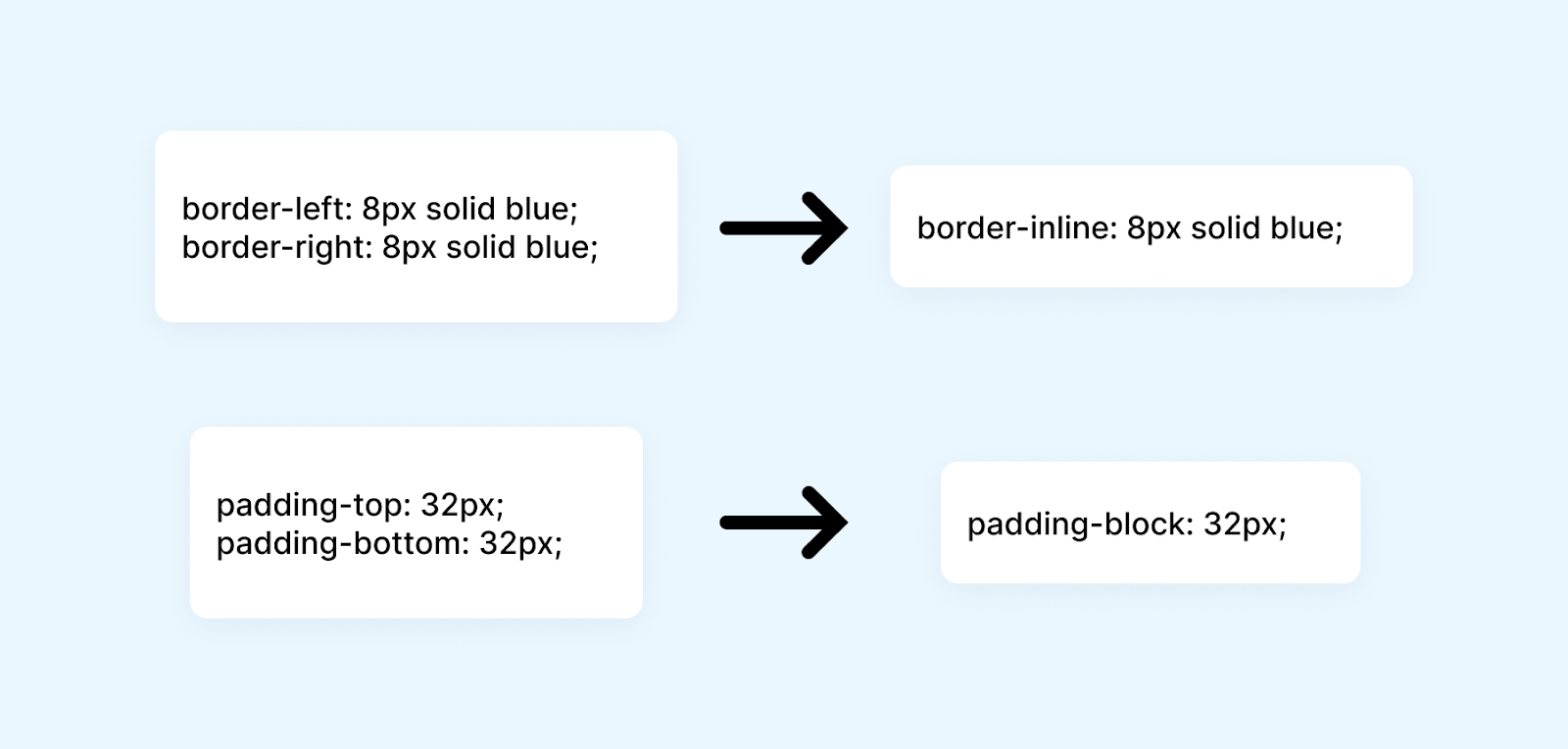
Similarly, the margin-block property sets both margin-top and margin-bottom. In addition, CSS logical properties provide us with similar shorthands for controlling borders and paddings.
For instance, if you have a design that requires borders only on the sides, you can use the border-inline property instead of individually specifying each physical direction. This allows for a more efficient approach to styling.
Below is a visualization that shows physical border and padding properties along with their logical shorthand alternative:
CSS Logical Properties for Floating and Positioning
Floating and positioning are commonly used techniques in web design to control the layout. Traditionally, CSS has relied on physical properties, such as float and clear, based on the direction of the writing mode (e.g., left-to-right or right-to-left).
The CSS logical properties aim to provide a more flexible and intuitive approach to element positioning by decoupling them from the specific writing direction.
The specification for CSS logical properties introduces a set of properties that can be used to control the floating and positioning of elements.
The below table shows these logical properties along with their corresponding physical properties:
| Category | Logical Property | Physical Property |
|---|---|---|
| Floating and Clearing | float: inline-start | float: left |
| float: inline-end | float: right | |
| clear: inline-start | clear: left | |
| clear: inline-end | clear: right | |
| Insets | inset-inline-start | left |
| inset-inline-end | right | |
| inset-block-start | top | |
| inset-block-end | bottom | |
| Text Alignment | text-align: start | text-align: left |
| text-align: end | text-align: right |
In addition to these CSS logical properties, the specification also introduces some additional shorthand properties that leverage the ability to address block and inline dimensions.
These shorthand properties provide convenient ways to simultaneously set values for both the inline and block dimensions, except for the inset property, which has a physical mapping for multi-value settings.
Below are these additional shorthand properties:
| Shorthand Property | Description |
|---|---|
| inset-inline | Sets values for both inset-inline-start and inset-inline-end properties simultaneously, addressing the inline dimension. |
| inset-block | Sets values for both inset-block-start and inset-block-end properties simultaneously, addressing the block dimension. |
| inset | Sets values for all four inset properties (inset-inline-start, inset-inline-end, inset-block-start, and inset-block-end) simultaneously, with a physical mapping when using multiple values. |
Now, let’s look at some practical examples of using these CSS logical properties to ensure you have a solid understanding.
Example of float and clear
You might be wondering about the relevance of using the float property in 2023. However, when we encounter a situation where we need some text to wrap around a shape, the good old float remains the best approach.
In this example, we have two cards. To wrap our text around the image, we can do the following:
|
1 2 3 4 |
img { float: left; margin-right: 20px; } |
We floated the image to the left and added a margin-right. But this will work only for the LTR layout card. To make this work in the RTL card, we will need to adjust it like this:
|
1 2 3 4 5 |
html[dir="rtl"] img { float: right; margin-right: 0; margin-left: 20px; } |
Here, we floated the image to the right because our layout is right-to-left. We then set margin-right to 0 and added margin-left of 20px.
Here’s how we can achieve the same using float:inline-start and margin-inline-end CSS logical properties, and it will work irrespective of our writing direction:
|
1 2 3 4 |
img { float: inline-start; margin-inline-end: 20px; } |
In the case of an LTR direction, inline-start floats the image to the left, and in the case of an RTL direction, it floats the image to the right. In the case of LTR, margin-inline-end adds a margin to the right; in the case of RTL, it adds a margin to the left.
This dynamic behavior of CSS logical properties demonstrates its flexibility, which is fascinating.
Example of CSS Logical Properties for positioned layout
In web development, positioning elements are crucial for creating visually appealing and user-friendly interfaces. One common use case of positioning is the creation of a floating sidebar that remains fixed in a specific position as the user scrolls through a webpage.
Traditionally, we have used properties like top, right, bottom, and left to achieve this effect. These properties allow us to position an element relative to its containing block and control its placement on the screen. However, with the introduction of CSS logical properties, we now have additional options for positioning elements based on text flow in different writing modes.
Let’s look at an example where we utilize the CSS logical properties inset-block-start and inset-inline-end to create a floating sidebar that adapts based on the direction.
HTML:
|
1 2 3 4 5 6 7 8 9 10 11 12 13 14 15 16 17 18 19 20 21 22 23 24 25 26 27 28 29 30 31 32 33 34 35 36 37 38 39 40 41 42 43 44 45 46 47 48 49 50 51 52 53 54 55 56 57 58 59 60 61 62 63 64 65 66 67 68 69 70 71 72 73 74 75 76 77 78 79 80 81 82 83 84 85 86 87 88 89 90 91 92 93 94 95 96 97 98 99 100 101 102 103 104 105 106 107 108 109 110 111 |
<div class="sidebar"> <div class="product"> <img src="https://www.lambdatest.com/resources/images/hyperexecute/hyperlogo.svg" alt="" class="logo" /> </div> <div class="links"> <h2>Why HyperExecute?</h2> <ul> <li>Ai-powered workflows</li> <li>Dependency caching</li> <li>Customizable test environments</li> <li>Automatic tunnel management</li> </ul> </div> </div> <main> <h1> Ai-powered blazing fast <br /> end-to-end test orchestration cloud </h1> <p class="info-text">upto <span>70% faster</span> than any cloud grid.</p> <div class="buttons"> <a href="https://hyperexecute.lambdatest.com/quickstart?origin=try-now" class="button" id="tryNow" target="_blank" >Try it now</a > <a href="https://www.lambdatest.com/demo?type=Hyperexecute" class="button" id="bookDemo" target="_blank" >Book a demo</a > </div> <h2 class="features">Features you must know about</h2> <div class="cards-container"> <div class="card"> <div class="heading">Runs on Linux containers, macOS and Windows</div> <p> HyperExecute platform comes with feature-packed hosted runners for every major OS including Windows, MacOS, and Linux containers. The runners come with pre-installed support for all major programming languages and frameworks including Java, Node.js, Python, PHP, GO, C#, Rust, and Ruby. </p> <a href="https://hyperexecute.lambdatest.com/hyperexecute" class="button" target="_blank" >Try it now</a > </div> <div class="card"> <div class="heading">AI-Powered Test Orchestration</div> <p> Through a simple YAML file, HyperExecute allows you to group and distribute tests intelligently across runner environments. The AI-powered test orchestration takes into account past test run data, and automatically reorders the test runs to surface failures faster and cuts down developer feedback time. </p> <a href="https://hyperexecute.lambdatest.com/hyperexecute" class="button" target="_blank" >Try it now</a > </div> <div class="card"> <div class="heading">Real Time Console and Execution Logs</div> <p> In legacy test clouds you get separate terminal and test execution logs, stitching them together is an ETL nightmare. With HyperExecute, you get a single automation dashboard view with both terminal logs of test commands and complete test execution logs. All test execution logs like terminal logs, test run video, network log, commands, exceptions, and more, all available in a single intuitive dashboard. </p> <a href="https://hyperexecute.lambdatest.com/hyperexecute" class="button" target="_blank" >Try it now</a > </div> <div class="card"> <div class="heading">Automatic report generation</div> <p> With all test execution data available in a single place, HyperExecute enables developers and testers to truly analyze the quality of their builds on a single platform through AI-powered automatic reports generated for each build run. Eliminate the need of gathering data from multiple sources and building extensive reporting frameworks. </p> <a href="https://hyperexecute.lambdatest.com/hyperexecute" class="button" target="_blank" >Try it now</a > </div> </div> </main> |
CSS:
|
1 2 3 4 5 6 7 8 9 10 11 12 13 14 15 16 17 18 19 20 21 22 23 24 25 26 27 28 29 30 31 32 33 34 35 36 37 38 39 40 41 42 43 44 45 46 47 48 49 50 51 52 53 54 55 56 57 58 59 60 61 62 63 64 65 66 67 68 69 70 71 72 73 74 75 76 77 78 79 80 81 82 83 84 85 86 87 88 89 90 91 92 93 94 95 96 97 98 99 100 101 102 103 104 105 106 107 108 109 110 111 112 113 114 115 116 117 118 119 120 121 122 123 124 125 126 127 128 129 130 131 132 133 134 135 136 137 138 139 140 141 142 143 144 145 146 147 148 149 150 151 152 153 154 155 156 157 158 159 160 161 162 163 164 165 166 167 168 169 170 171 172 173 174 |
body { writing-mode: horizontal-tb !important; writing-mode: vertical-rl; background-color: #05010c; color: #ffffff; margin: 0; padding: 0; font-family: Arial, sans-serif; } .sidebar { block-size: 100%; /* Equivalent to height in vertical direction */ inline-size: 30%; /* Equivalent to width in vertical direction */ position: fixed; inset-block-start: 0; inset-inline-start: 0; background-color: #0e1117; overflow-y: auto; } .product { margin-inline: 20px; margin-block: 30px; } .logo { max-width: 200px; height: auto; } a { text-decoration: none; color: inherit; } .links { margin: 20px; } h2 { font-size: 20px; margin-block-end: 30px; color: #ffffff; } ul { list-style-type: none; padding: 0; margin: 0; } li { display: flex; align-items: center; margin-block-end: 20px; color: #ffffff; cursor: pointer; } main { margin-inline-start: 30%; padding: 30px; padding-top: 40px; } h1 { font-size: 38px; margin-bottom: 20px; line-height: 1.3; } .info-text { font-size: 20px; margin-bottom: 30px; } span { background: -webkit-linear-gradient(left, #ff10bc, #ffb501); -webkit-background-clip: text; background-clip: text; -webkit-text-fill-color: transparent; font-weight: 600; font-size: 30px; letter-spacing: 1px; } .button { padding: 10px 18px; width: auto; font-size: 16px; background-color: #0dbcc4; color: #ffffff; border: none; border-radius: 4px; cursor: pointer; font-weight: 600; text-align: center; } .buttons { display: flex; gap: 12px; flex-direction: row; } @media only screen and (max-height: 468px) and (writing-mode: vertical-rl) { .buttons { flex-direction: column; } } #tryNow { background-color: #ffffff; color: #0e1117; padding: 12px 18px; } #bookDemo { background-color: transparent; border: 1px solid #aaa; padding: 12px 18px; } .features { font-size: 28px; margin-bottom: 30px; } .cards-container { display: grid; grid-template-columns: repeat(2, 1fr); grid-gap: 30px; } .card { padding: 20px; background-color: #0e1117; color: #ffffff; display: flex; flex-direction: column; border-radius: 4px; justify-content: space-between; transition: transform 0.2s ease; box-shadow: 0 4px 6px rgba(0, 0, 0, 0.1); } .card:hover { transform: scale(1.03); box-shadow: 0 8px 12px rgba(0, 0, 0, 0.15); cursor: pointer; } .heading { font-size: 20px; font-weight: bold; margin-bottom: 10px; line-height: 1.5; color: #a0a0a0; } .card p { margin-bottom: 20px; line-height: 1.5; color: #a0a0a0; } |
See the Pen
inset properties demo by Tahera Alam (@alam_tahera)
on CodePen.
In the above example, we have a sidebar and a main section. The sidebar remains fixed on the left side of the screen as the user scrolls through the main content. We utilized the logical properties inset-block-start and inset-inline-end to create this sidebar.
The inset-block-start property positions the sidebar relative to the top edge of its containing block, while the inset-inline-end property positions it relative to the right edge.
If we change the writing-mode property of the body to vertical-rl by uncommenting the following line, the floating sidebar will adapt to the new text flow direction and position itself to the vertical left making our layout responsive.
|
1 2 3 |
body { writing-mode: horizontal-tb !important; } |
To ensure responsive design for any layout, you can refer to the detailed tutorial on Responsive Design that covers the basics of designing responsive layouts.
In addition to designing a responsive layout, it’s crucial to conduct responsiveness tests on various viewports. To simplify this process, you can take advantage of LT Browser 2.0, offered by LambdaTest. This dev-friendly tool provides over 50 pre-installed viewports with different screen resolutions, allowing you to test your website’s responsiveness effortlessly. Additionally, LT Browser 2.0 offers a range of advanced developer tools that you can utilize.
For more information about LT Browser 2.0, we have an informative tutorial available. Feel free to explore the following tutorial, which provides detailed insights into LT Browser 2.0 and its features.
Subscribe to the LambdaTest YouTube Channel and stay updated with the latest tutorials around Selenium testing, Playwright testing, and more.
Example of CSS Logical Properties for text-align
When it comes to aligning text in CSS, logical values are available that take text direction inot account. Instead of relying on the traditional left and right values, we can leverage the more versatile start and end values. Let’s see an example to understand how these logical values work for text alignment.
HTML:
|
1 2 3 4 5 6 7 8 9 10 11 12 13 14 15 16 17 18 19 20 21 22 23 |
<div class="toggle-container"> <input type="checkbox" id="toggleButton" class="toggle-input" /> <label for="toggleButton" class="toggle-label"></label> <div class="toggle-text">Toggle the direction</div> </div> <div class="container"> <div class="block block1"> <h3>Block 1</h3> <p> This block uses <code>text-align: right;</code> to align text to the physical right. </p> </div> <div class="block block2"> <h3>Block 2</h3> <p> This block uses <code>text-align: end;</code> which aligns the text to the logical right based on the text direction. </p> </div> </div> |
CSS:
|
1 2 3 4 5 6 7 8 9 10 11 12 13 14 15 16 17 18 19 20 21 22 23 24 25 26 27 28 |
body { font-family: Arial, Sans-serif; } .container { display: flex; justify-content: center; gap: 30px; } .block { direction: ltr /change it to *rtl*/; width: 300px; height: 150px; background-color: #f2f2f2; border: 1px solid #ccc; padding: 20px; } .block1 { text-align: right; } .block2 { text-align: end; } |
See the Pen
text-align logical properties demo by Tahera Alam (@alam_tahera)
on CodePen.
In the above example, we have two text blocks. In the first block, we align the text to the right using the property text-align: right, while in the second block, we use text-align: end, to do the same. By default, when the text direction is set to left-to-right (ltr), both blocks appear aligned to the right.
However, things get interesting when we toggle the text direction from LTR to RTL in the .block class. Despite this change, the alignment of the first block remains consistent and stays on the right side, which is its logical end in the RTL direction. On the other hand, the second block adapts to the logical end and aligns itself to the left side, according to the LTR direction.
CSS Logical Properties for Margins, Borders, and Paddings
Margins, borders, and paddings are some of the first concepts we learn in CSS. They have the highest significance when it comes to creating well-designed layouts.
The CSS logical properties specification introduces a set of properties dedicated to margins, borders, and paddings, allowing us to create flexible layouts that adapt to different directions. The specification also defines how logical values are mapped to their corresponding physical values.
Assuming a horizontal-tb writing mode from left to right, the CSS logical properties margin-inline-start is equivalent to margin-left because the inline direction runs horizontally from left to right.
However, it’s important to note that the mappings change depending on the writing mode and text direction. If the writing mode remains horizontal-tb, but the text direction changes to right-to-left, margin-inline-start would be equivalent to margin-right because now the inline direction runs horizontally but from right to left.
In a vertical writing mode, margin-inline-start would be equivalent to using margin-top.
Here is a table illustrating the mappings between CSS logical properties and their corresponding physical properties in a horizontal-tb writing mode with an LTR direction:
| Logical Property | Physical Property |
|---|---|
| border-block-end | border-bottom |
| border-block-end-color | border-bottom-color |
| border-block-end-style | border-bottom-style |
| border-block-end-width | border-bottom-width |
| border-block-start | border-top |
| border-block-start-color | border-top-color |
| border-block-start-style | border-top-style |
| border-block-start-width | border-top-width |
| border-inline-end | border-right |
| border-inline-end-color | border-right-color |
| border-inline-end-style | border-right-style |
| border-inline-end-width | border-right-width |
| border-inline-start | border-left |
| border-inline-start-color | border-left-color |
| border-inline-start-style | border-left-style |
| border-inline-start-width | border-left-width |
| border-start-start-radius | border-top-left-radius |
| border-end-start-radius | border-bottom-left-radius |
| border-start-end-radius | border-top-right-radius |
| border-end-end-radius | border-bottom-right-radius |
| margin-block-end | margin-bottom |
| margin-block-start | margin-top |
| margin-inline-end | margin-right |
| margin-inline-start | margin-left |
| padding-block-end | padding-bottom |
| padding-block-start | padding-top |
| padding-inline-end | padding-right |
| padding-inline-start | padding-left |
Additionally, some shorthand properties target both blocks or both inline edges of the box simultaneously. These shorthands have no physical equivalent:
| Property | Description |
|---|---|
| border-block | Sets border-color, border-style, and border-width for both block borders. |
| border-block-color | Sets border-color for both block borders. |
| border-block-style | Sets border-style for both block borders. |
| border-block-width | Sets border-width for both block borders. |
| border-inline | Sets border-color, border-style, and border-width for both inline borders. |
| border-inline-color | Sets border-color for both inline borders. |
| border-inline-style | Sets border-style for both inline borders. |
| border-inline-width | Sets border-width for both inline borders. |
| margin-block | Sets all block margins. |
| margin-inline | Sets all inline margins. |
| padding-block | Sets block padding. |
| padding-inline | Sets inline padding. |
Now that we are familiar with the CSS logical properties of margins, borders, and paddings, let’s apply some of them to a few practical examples.
Example of margin
Let’s look at an example where we utilize the CSS logical properties to set flow relative margin, which adapts based on the writing direction.
HTML:
|
1 2 3 4 5 6 7 8 9 10 11 12 13 14 15 16 17 18 19 20 21 22 23 24 25 26 27 28 29 30 31 |
<p class="direction-text">Left to Right (LTR)</p> <div class="card"> <div class="avatar"> <video src="https://www.lambdatest.com/resources/images/hyperexecute/1stanimation.webm" autoplay loop ></video> </div> <div class="content"> <h2>HyperExecute</h2> <p>HyperExecute is an AI-powered blazing fast end-to-end test orchestration cloud.</p> </div> </div> <p class="direction-text">Right to Left (RTL)</p> <div class="card rtl"> <div class="avatar"> <video src="https://www.lambdatest.com/resources/images/hyperexecute/1stanimation.webm" autoplay loop ></video> </div> <div class="content"> <h2>HyperExecute</h2> <p>HyperExecute هو سحابة لتنظيم الاختبارات من البداية إلى النهاية ، وهو مدعوم بالذكاء الاصطناعي ويتميز بسرعة فائقة. </p> </div> </div> |
CSS:
|
1 2 3 4 5 6 7 8 9 10 11 12 13 14 15 16 17 18 19 20 21 22 23 24 25 26 27 28 29 30 31 32 33 34 35 36 37 38 39 40 41 42 43 44 45 46 47 48 49 50 51 52 53 54 55 56 57 58 59 60 61 |
body { font-family: Arial, sans-serif; background-color: #f1f1f1; } .direction-text { text-align: center; } .card { display: flex; align-items: center; background-color: #fff; border-radius: 8px; box-shadow: 0 2px 4px rgba(0, 0, 0, 0.1); padding: 20px; margin: 20px auto; max-width: 500px; } .rtl { direction: rtl; } .avatar { margin-inline-end: 1rem; width: 80px; height: 80px; border-radius: 50%; background-color: lightblue; overflow: hidden; } .avatar video { width: 100%; height: 100%; object-fit: cover; } .content { flex: 1; } h2 { font-size: 24px; margin-bottom: 10px; } p { font-size: 16px; color: #666; line-height: 1.4; } |
See the Pen
margin-inline-end demo by Tahera Alam (@alam_tahera)
on CodePen.
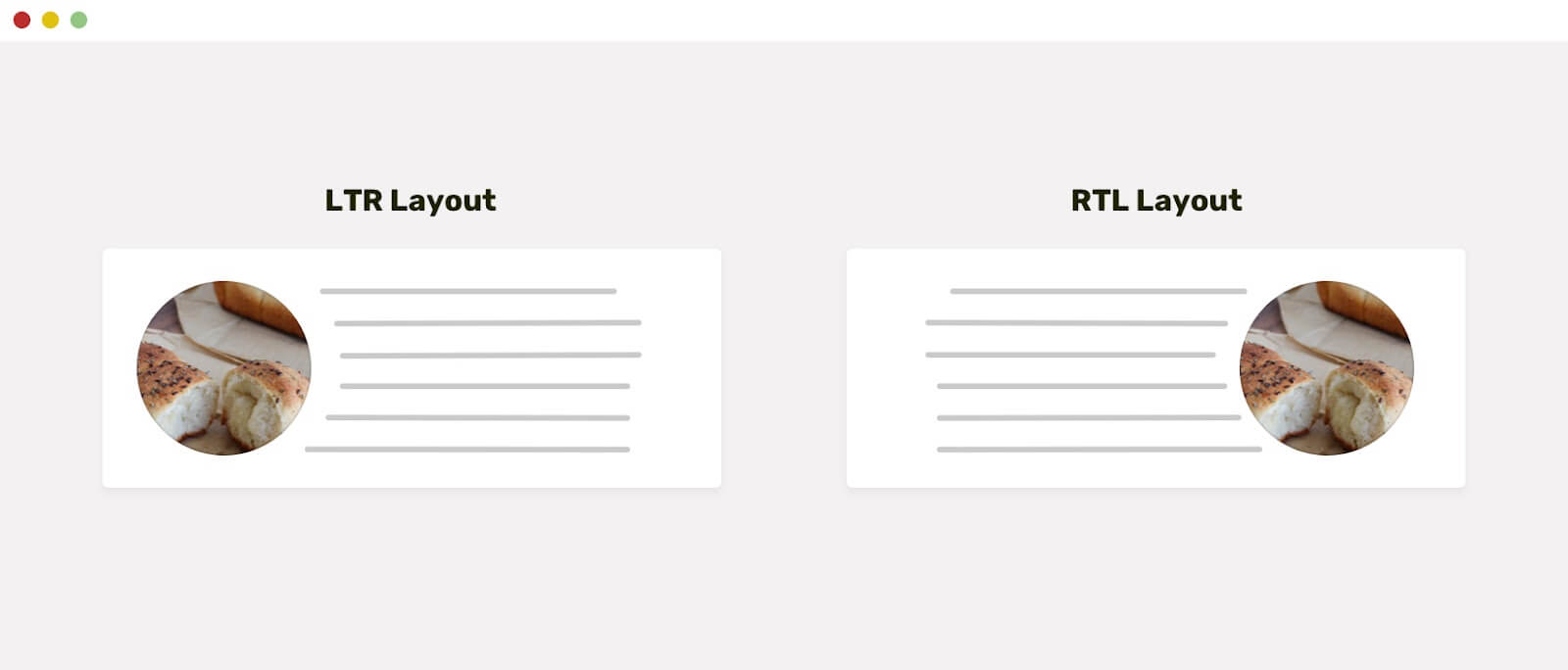
In the above example, we have two cards with an avatar and some text. For the first card, which has an LTR direction, the margin between the avatar and the text should be on the right of the avatar. While for the second card, which has an RTL direction, this margin should be on the left.
To achieve this, we used the margin-inline-end property to set a 1rem margin between the avatar and text, which effectively adapts to writing directions. For the LTR direction card, margin-inline-end acts as margin-right and sets the margin on the right side of the avatar; for the RTL direction card, it acts as margin-left and sets the margin on the left side of the avatar.
Example of border
Let’s look at an example of a logical border property that caters to different writing directions:
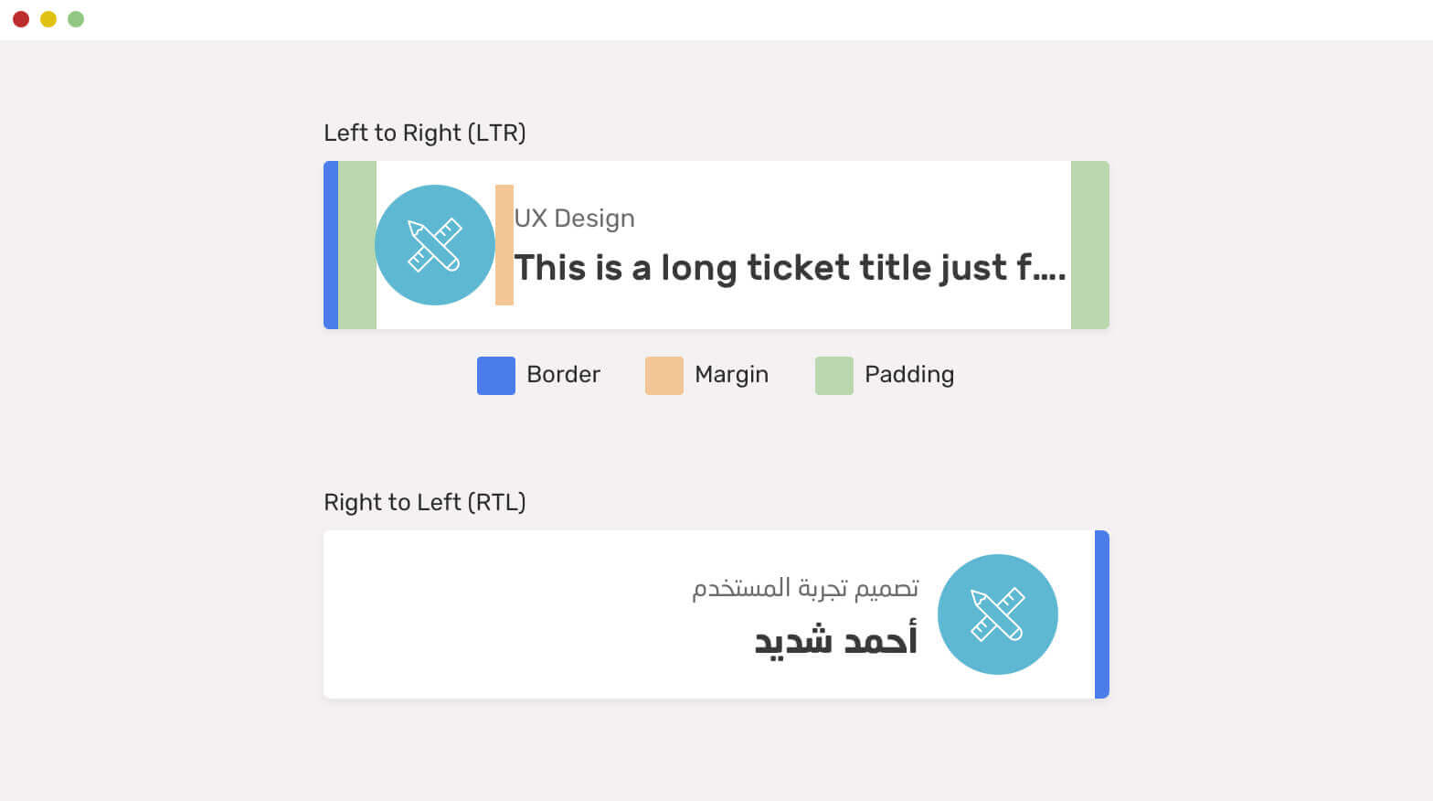
In the above illustration, we have a left border on both cards, as highlighted in blue. To achieve this with conventional CSS properties, we would do the following:
For the LTR card:
|
1 2 3 |
.card { border-left: 6px solid blue; } |
For the RTL card:
|
1 2 3 4 |
html[dir="rtl"] .card { border-left: 0; border-right: 6px solid blue; } |
For the RTL card, we set the border left to 0 and applied a border right of 6px solid blue.
To achieve the same without requiring any manual adjustments, we can utilize the border-inline-start logical property. This will set the border left in the LTR direction and the border right in the RTL direction.
|
1 2 3 |
.card { border-inline-start: 6px solid blue; } |
Using logical properties not only streamlines our CSS but also improves efficiency in managing styles across various writing directions.
Example of padding
Below is an example that utilizes logical padding to cater to different writing directions:
In this example, we have two cards: the first one with a left-to-right (LTR) direction and the second one with a right-to-left (RTL) direction.
In the LTR direction card, we highlighted the right and left padding, which is set to 3rem and 1rem, respectively(this padding variation is for easier visualization only. It’s not recommended to use inconsistent padding.). For the second card, which has a right-to-left direction, the padding needs to be flipped to 3rem on the left and 1rem on the right.
Let’s see how we would manage this without CSS logical properties:
For the LTR card:
|
1 2 3 4 |
.card { padding-left: 3rem; padding-right: 1rem; } |
For the RTL card:
|
1 2 3 4 |
html[dir="rtl"] .card { padding-right: 3rem; padding-left: 1rem; } |
We are manually tweaking padding for the RTL card which is not feasible especially when we have a large set of styles. Let’s now achieve the same more effectively using CSS logical properties:
|
1 2 3 4 |
.card { padding-inline-start: 3rem; padding-inline-end: 1rem; } |
Just these two lines, and our right and left padding will adjust based on the writing direction! Isn’t it powerful?
CSS Logical Properties for Sizing
Sizing is an important aspect of web design. It allows us to determine the dimensions and proportions of elements on a webpage. Conventionally, in CSS, we use properties like width and height to define an element’s size. However, with logical properties for sizing, we now have a more flexible and contextual approach.
The below table shows these CSS logical properties alongside corresponding physical properties. It’s important to note that the mappings between logical and physical properties depend on the writing mode. For instance, in a horizontal writing mode like English or Arabic, the logical property inline-size sets the width of an element.
Similarly, the block-size property sets the height.
On the other hand, if you were in a vertical writing mode, the CSS logical properties inline-size would be mapped to the physical property height. And the block-size property would be equal to the width.
| Logical Property | Physical Property |
|---|---|
| inline-size | width |
| block-size | height |
| min-inline-size | min-width |
| min-block-size | min-height |
| max-inline-size | max-width |
| max-block-size | max-height |
Example of width:
Here’s an example that showcases how inline-width and block-width behave in case of different writing directions:
HTML:
|
1 2 3 4 5 6 7 8 9 10 11 12 13 |
<div class="toggle-container"> <input type="checkbox" id="toggleButton" class="toggle-input" /> <label for="toggleButton" class="toggle-label"></label> <div class="toggle-text">Toggle Writing Mode</div> </div> <div class="container"> <div class="card"> <p> This card uses the logical property <code>inline-size</code> and block-size</code> to define its size. </p> </div> </div> |
CSS:
|
1 2 3 4 5 6 7 8 9 10 11 12 13 14 15 16 17 18 19 20 21 22 23 24 25 26 27 28 29 30 31 32 33 34 35 36 37 38 39 40 41 42 43 44 45 46 47 48 49 50 51 52 53 54 55 56 57 58 59 60 61 62 63 64 65 66 67 68 69 70 71 72 |
body { font-family: Arial, sans-serif; } .container { display: flex; justify-content: center; margin: 0 auto; writing-mode: horizontal-tb; } .card { border: 1px solid #ccc; padding: 20px; inline-size: 300px; block-size: 200px; background-color: #fff; border-radius: 8px; box-shadow: 0 2px 6px rgba(0, 0, 0, 0.1); } .card p { font-size: 16px; line-height: 1.5; margin-bottom: 0; } .toggle-container { display: flex; align-items: center; justify-content: center; margin: 30px; } .toggle-input { display: none; } .toggle-label { display: inline-block; width: 40px; height: 20px; border-radius: 10px; background-color: #ccc; position: relative; cursor: pointer; } .toggle-label:before { content: ""; position: absolute; top: 2px; left: 2px; width: 16px; height: 16px; border-radius: 50%; background-color: #fff; transition: transform 0.3s ease; } .toggle-input:checked + .toggle-label { background-color: #1a73e8; } .toggle-input:checked + .toggle-label:before { transform: translateX(20px); } .toggle-text { margin-left: 10px; font-size: 20px; font-weight: bold; } |
See the Pen
logical-width demo by Tahera Alam (@alam_tahera)
on CodePen.
In this example, we defined the size of the .card element using inline-size and block-size logical properties. Initially, when the writing direction is horizontal, the inline-size property sets the width to 300px, and block-size sets the height to 100px.
When we toggle the writing mode and change the direction to vertical, it behaves oppositely. The inline-size property now sets the height to 300px, and the block-size sets the width to 200px.
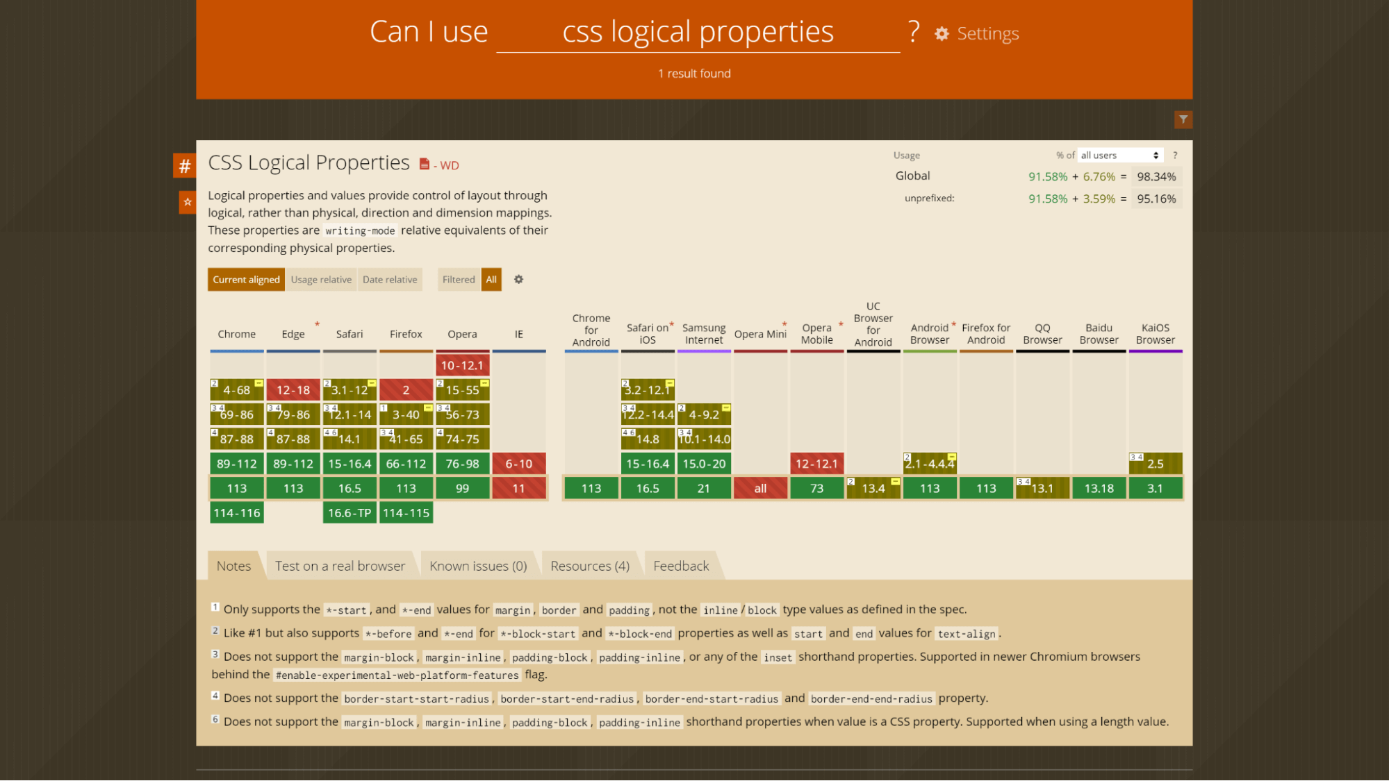
Browser Support for CSS Logical Properties
One of the key factors to consider when working with CSS is browser compatibility. Testing browser compatibility of the CSS properties helps ensure a consistent experience of our website across different platforms.
To test browser compatibility and to know how your CSS properties would behave in real-world browser environments, you can use LambdaTest, a unified digital experience testing platform that allows you to test your website on an online browser farm of 3000+ real browsers and operating systems.
By utilizing LambdaTest, you can identify any compatibility issues and make the necessary adjustments to ensure your CSS properties function smoothly across multiple browsers. Now, to talk about the support for CSS logical properties, fortunately, its support has significantly improved across major modern browsers.
Today, all leading browsers, like Google Chrome, Mozilla Firefox, Microsoft Edge, Apple Safari, etc., have varying support for CSS logical properties.
Let’s look at the support provided by some of these browsers in detail.
Support on Chrome
In Chrome versions 4 to 68, CSS logical properties are supported partially with the prefix -webkit-. This support includes -before and -end values for -block-start and -block-end properties and start and end values for text-align, margin, border, and padding properties.
|
1 2 3 |
.element { -webkit-text-align: start; } |
Moving on to 69 to 86 versions of Chrome, there is a lack of support for properties like margin-block, margin-inline, padding-block, padding-inline, and all the inset shorthand properties.
Furthermore, Chrome versions 69 to 86 do not support border-start-start-radius, border-start-end-radius, border-end-start-radius, and border-end-end-radius properties.
Similarly, Chrome versions 87 to 88 also lack support for the border-start-start-radius, border-start-end-radius, border-end-start-radius, and border-end-end-radius properties.
Fortunately, starting from version 89, Chrome offers full support for all these properties, resolving the earlier limitations.
Support on Edge
In Edge versions 79 to 86, there is no support for margin-block, margin-inline, padding-block, padding-inline, or any of the inset shorthand properties. However, like in newer Chromium browsers, these properties can be enabled in newer versions of Edge by using the #enable-experimental-web-platform-features flag.
Furthermore, in Edge versions 79 to 86, the properties border-start-start-radius, border-start-end-radius, border-end-start-radius, and border-end-end-radius are not supported. However, starting from version 99, Edge offers full support for CSS logical properties, including these border-radius properties.
Support on Firefox
In Firefox versions 41 to 65, there is no support for properties such as margin-block, margin-inline, padding-block, padding-inline, or any of the inset shorthand properties. But you can support these properties in newer Chromium browsers by enabling the #enable-experimental-web-platform-features flag.
Additionally, in Firefox versions 41 to 65, border-start-start-radius, border-start-end-radius, border-end-start-radius, and border-end-end-radius properties are not supported.
However, starting from version 66, Firefox provides full support for all CSS logical properties.
Now that we have explored the browser compatibility of logical properties across some major browsers, you can check out the rest in the below illustration that shows a detailed overview of its support across all relevant browsers versions:
By utilizing LambdaTest’s Real Time Browser Testing functionality, you can conduct cross browser testing of the websites for CSS logical properties on various combinations of browsers and operating systems.
For further details, please refer to the documentation on Real Time Browser Testing.
Advantages of using CSS Logical Properties
When styling our web pages, CSS logical properties provide us with a powerful and flexible approach. They offer a range of advantages that make our lives as developers easier and more efficient. In this section, we’ll explore some of the key benefits of using logical properties.
Adaptability and Flexibility
With CSS logical properties, we can create layouts that adapt seamlessly to different writing modes and language directions. Instead of relying on specific directions like left or right, we can use properties such as start and end to ensure consistent alignment regardless of the text direction.
This flexibility significantly enhances the accessibility and user experience of the websites.
Improved Localization Experience
CSS logical properties can be instrumental in accelerating the development (particularly content) of websites with a global audience. Using logical properties, we can empower websites to be easily localized for various languages and regions.
Since logical properties adjust automatically based on the text direction, we no longer need to modify our stylesheets when translating content into languages that read RTL or any other direction. This saves time and effort, making localization a smoother process.
Reduced Maintenance Efforts
One of the significant advantages of using CSS logical properties is the reduction in maintenance efforts. We can streamline our CSS code and minimize redundancy by utilizing CSS logical properties. Instead of duplicating styles for each text direction, we can consolidate them into a single rule, making maintenance and updates much more efficient.
When a change or update is required, we only need to modify the CSS logical properties, and the styles will automatically adapt to different text directions. This simplifies the maintenance process, as we no longer have to update multiple instances of physical properties.
Instead, by utilizing CSS logical properties, we can achieve results across multiple writing modes with fewer lines of code, reducing potential errors and easing future maintenance.
Consistency in styling
We can use CSS logical properties to maintain consistency across different languages and writing directions. For instance, instead of relying on physical properties such as border-left and border-right to create borders on specific sides of an element, we can use CSS logical properties like border-start and border-end. This approach ensures consistent border styling across different text directions.
Using CSS logical properties, you can ensure that spacing, alignment, and positioning remain consistent, regardless of the text direction.
Wrap it up!
As we strive to make internet and web browsing an inclusive place, logical properties play a pivotal role in letting us achieve that. By writing styles that can adapt to diverse languages and their requirements, we can ensure that our users worldwide have a seamless experience catered to their linguistic needs.
In this blog, we learned CSS logical properties in detail, including exploring practical examples of their needs. We looked at physical alternatives of floating and positioning, margins and paddings, borders and sizings which are fundamental aspects of CSS. We learned how logical properties revolutionize the way these properties work by providing powerful alternatives that adapt to different writing modes and directions.
We also covered some significant advantages of using logical properties, followed by ensuring their compatibility across browsers. I hope this blog has given you a thorough understanding of CSS logical properties.
It’s time for you to make powerful websites that can adapt to different directions without any manual adjustments!
Until next time, happy building!
Frequently Asked Questions (FAQs)
What are the logical properties of CSS?
Logical properties define direction‐relative equivalents of their corresponding physical properties.
Why use CSS logical properties?
Code can be made more legible and understandable using CSS logical properties. For instance, based on the direction of the content, we can utilize logical values like inline-size and block size to establish the size of elements rather than using physical properties like width and height.
What are CSS properties with examples?
A CSS property assigns a style or behavior to an HTML element. Examples include color, border, margin, font-style, and transform.


Author’s Profile
Tahera Alam
Tahera is a front-end developer who loves developing seamless frontends and efficient backends. She has skills in React, JavaScript, Nextjs, Tailwind, MongoDB, Solidity, and more. She loves to learn new technologies and finds writing about them to be a great way to share knowledge with others. In her free time, she enjoys reading thrillers and engaging with the tech community on Twitter.
Blogs: 11
Got Questions? Drop them on LambdaTest Community. Visit now


