
Hands-On Guide to CSS radial-gradient() Function
Ayush Thakur
Posted On: April 29, 2024
 125096 Views
 25 Min Read
In Cascading Style Sheets (CSS), there are a variety of background styling properties that developers leverage to customize the background of web page elements. One of the most practiced background styling properties is the CSS radial-gradient() function.
The CSS radial-gradient() function is a styling property that allows you to create a gradient pattern using multiple colors and use that pattern to style the background. A radial gradient pattern on the web page acts as a styling element and offers a range of benefits. One of the primary benefits of integrating a CSS radial-gradient() function is to captivate the users.
In this blog post, we will explore the CSS radial-gradient() function, its family members, and the application of radial gradients in modern-day applications, accompanied by examples.
What is the CSS radial-gradient() Function?
When it comes to creating visually appealing and aesthetically pleasing background patterns while simultaneously maintaining the simplicity of the background, the CSS radial-gradient() function has been a trendy option for web developers.
Many big brands like Spotify use a combination of multiple radial gradients in their websites to engage with users and draw their attention.

Brands cleverly use the CSS radial-gradient() function not just for looks but to strategically guide the attention of visitors to key products, making their websites more engaging. It also leaves a lasting impression on visitors, making them remember the brand and logo. Using these gradients, brands can easily create eye-catching color schemes, helping them stand out online.
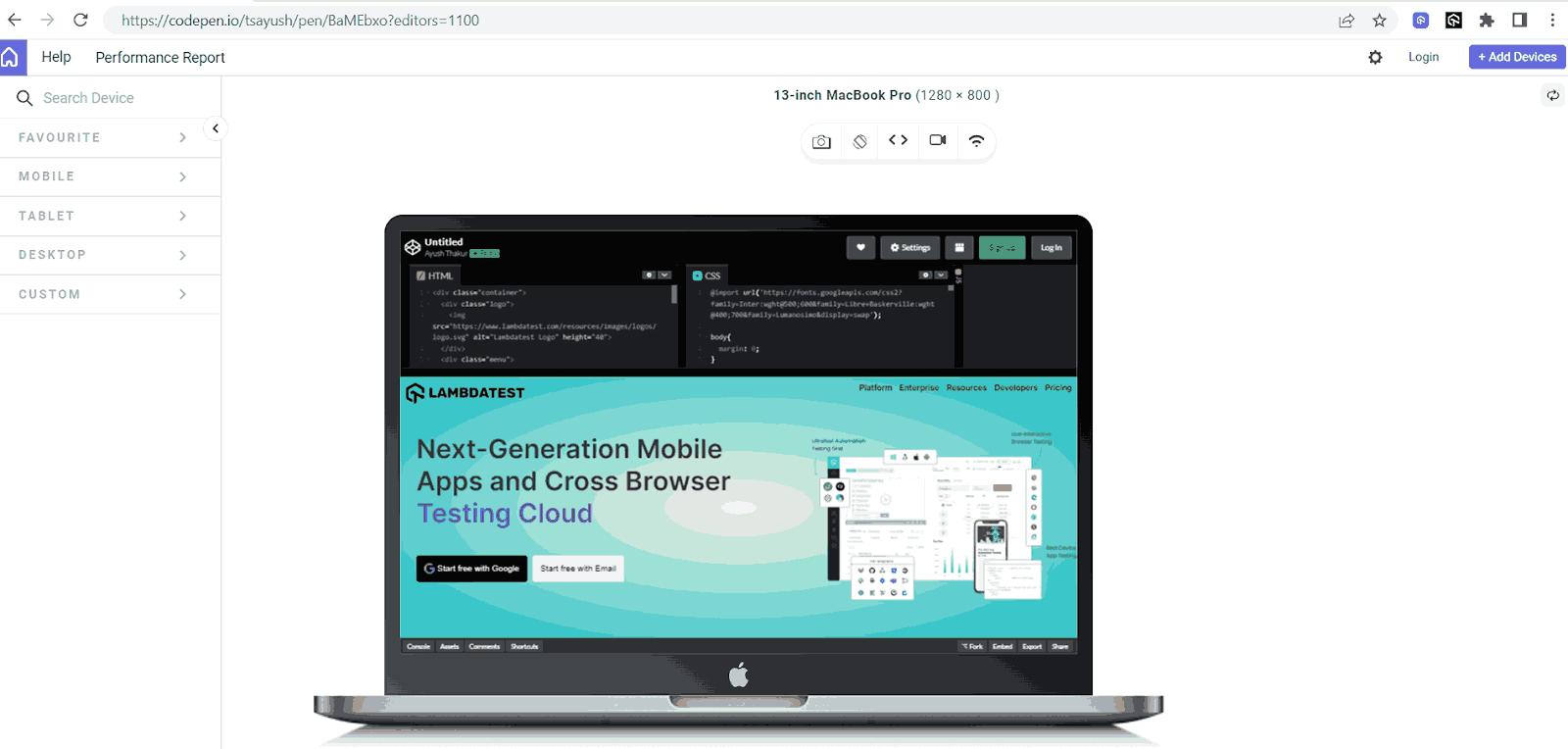
The CSS radial-gradient() function generates an image featuring a transitioning effect between 2 or more 2 colors emerging from the origin. The generated image works as a background for the web page elements. For instance, consider the following image demonstrating the use of the radial-gradient() function:
See the Pen
Untitled by Ayush Thakur (@tsayush)
on CodePen.
HTML:
|
1 2 3 4 5 6 7 8 9 10 11 12 13 14 15 16 17 18 19 20 21 22 23 24 |
<div class="container"> <div class="logo"> <img src="https://www.lambdatest.com/resources/images/logos/logo.svg" alt="Lambdatest Logo" height="40"> </div> <div class="menu"> <!-- Add your menu items here --> <a href="#">Platform</a> <a href="#">Enterprise</a> <a href="#">Resources</a> <a href="#">Developers</a> <a href="#">Pricing</a> </div> <div class="content"> <p>Next-Generation Mobile <br/> Apps and Cross Browser <br/><span>Testing Cloud</span> </p> <div class="button-container"> <button class="button btn1"> <img class="google-logo" src="https://www.freepnglogos.com/uploads/google-logo-png/google-logo-png-google-icon-logo-png-transparent-svg-vector-bie-supply-14.png" alt="Google Logo">Start free with Google</button> <button class="button btn2">Start free with Email</button> </div> </div> <div class="right-image"> <img src="https://www.lambdatest.com/resources/images/main/home_banner.webp" alt="logo" /> </div> </div> |
CSS:
|
1 2 3 4 5 6 7 8 9 10 11 12 13 14 15 16 17 18 19 20 21 22 23 24 25 26 27 28 29 30 31 32 33 34 35 36 37 38 39 40 41 42 43 44 45 46 47 48 49 50 51 52 53 54 55 56 57 58 59 60 61 62 63 64 65 66 67 68 69 70 71 72 73 74 75 76 77 78 79 80 81 82 83 84 85 86 87 88 89 90 91 92 93 94 95 96 97 98 99 100 101 102 103 104 105 106 107 108 109 110 111 112 113 114 115 116 117 118 119 120 121 122 123 124 125 126 127 128 129 130 131 132 133 134 135 136 137 138 139 140 141 142 143 144 |
@import url('https://fonts.googleapis.com/css2?family=Inter:wght@500;600&family=Libre+Baskerville:wght@400;700&family=Lumanosimo&display=swap'); body{ margin: 0; } .container { position: relative; background: radial-gradient( #F9F9E0, #0FBAC5); height:100vh; } .logo { margin-right: 20px; padding-left: 10px; padding-top: 10px; } .menu { position: absolute; top: 0; right: 0; padding: 10px; } .menu a { color: black; font-family: Inter,Arial,sans-serif; text-decoration: none; font-weight:bold; margin-left: 10px; font-size: 15px; position: relative; overflow: hidden; } .menu a::before { content: ""; position: absolute; bottom: 0; left: 50%; transform: translateX(-50%); height: 2px; width: 0; background-color: #392467; transition: width 0.3s ease-in-out; } .menu a:hover::before { width: 100%; } .content { margin: 0; display: block; text-align: left; padding-left: 30px; color: #333; font-family: Inter,Arial,sans-serif; } .content p{ font-size: 50px; font-weight:bold; } span{ font-size: 50px; color: #6C22A6; font-weight:bold; line-height:20px; } .button-container { display: flex; } .button { border-radius: 5px; margin-right: 10px; padding: 15px; color: white; border: none; text-align: center; text-decoration: none; display: inline-flex; align-items: center; font-size: 16px; } .btn1{ color:white; background-color:black; } .btn1:hover{ color:black; background-color:white; } .btn2{ color:black; } .btn2:hover{ color:white; background-color:black; } .google-logo { width: 20px; margin-right: 5px; } .right-image { position: absolute; top: 0; right: 0; margin-top:100px; } .right-image img{ width:40%; float: right; } |
Output:

In this example, we have used the radial-gradiant() function in the background property. In the radial-gradient() function, we have initialized 2 colors in hex value format – #F9F9E0, #0FBAC5 – to generate the pattern.
|
1 |
background: radial-gradient( #F9F9E0, #0FBAC5); |
The output shows that the first color (#F9F9E0) originates from the center of the page, forming a circular pattern. As this circle expands towards the element’s border, the primary color gradually transforms into the secondary color (in this case, #0FBAC5), creating a blending effect of colors.
Radial gradients give you the freedom to use a pair of any colors that you wish for. Let’s check out the example below.
See the Pen
Untitled by Ayush Thakur (@tsayush)
on CodePen.
CSS:
|
1 2 3 4 5 |
.container { position: relative; background: radial-gradient( #EEEDEB, #0FBAC5); height:100vh; } |
In this example, we have used a different set of colors (#EEEDEB, #0FBAC5) to get a whole new output.
To create a more precise and accurate pattern, the radial-gradient() function allows you to specify the exact percentage of each color shade you want in the pattern as another attribute. This gives us the power to control the space or region assigned to each color in the background pattern.
See the Pen
Untitled by Ayush Thakur (@tsayush)
on CodePen.
|
1 |
background: radial-gradient( #F9F9E0 50%, #0FBAC5); |
In this example, we have specified 50% for the #F9F9E0 color. The 50% signifies that the transition will occur from the center to the outer color at 50% of the radius. The other color automatically takes up the remaining space.
In the above two examples, we used a set or pair of two colors to generate a radial gradient effect. However, the CSS radial-gradient() function is not restricted to just two colors. It comes with the flexibility to use three or even more than three colors, enabling the creation of mesmerizing background patterns.
See the Pen
Untitled by Ayush Thakur (@tsayush)
on CodePen.
|
1 |
background: radial-gradient( #F9F9E0, #0FBAC5, #0B60B0); |
In this example, we have specified three colors of hex values in the radial-gradient() function, and the result is this beautiful background pattern, as shown in the output image.
Specifying the percentage for each color to represent the covered space works flawlessly, even with three or more colors.
Although the most commonly practiced color format in the radial-gradient() function is hex value format, the radial-gradient() function comes with the support of other CSS color functions, including RGB/RGBA value, name of the colors, HSL/HSLA value, CMYK value, and HSV value. You can use any color function mentioned here to specify your desired color in the radial-gradient() function.
|
1 2 3 4 5 6 7 8 |
background: radial-gradient(#f9f9e0, #0fbac5); /* Hexadecimal RGB */ background: radial-gradient(rgb(249, 249, 224), rgb(15, 186, 197)); /* RGB */ background: radial-gradient(hsl(60, 64%, 92%), hsl(184, 86%, 41%)); /* HSL */ background: radial-gradient( cmyk(0%, 0%, 10%, 2%), cmyk(92%, 6%, 0%, 23%) ); /* CMYK */ background: radial-gradient(hsv(60, 10%, 98%), hsv(184, 92%, 77%)); /* HSV */ |
Using RGBA and HSLA formats to specify colors offers an additional advantage over other color formats. The last value in these formats allows the developers to control the opacity of the color in the radial pattern.
Now you’ve got the hang of the CSS gradient-function(), let’s start playing around with the shape of the gradients to customize them. After that, we will figure out how to position the gradients within your elements to help you create more interesting and flexible backgrounds by combining them with other CSS background properties.
 Note
NoteTest your CSS Radial Gradient Effects on Real Device Cloud. Try LambdaTest Today!
Shape
In the examples discussed above, you may have noticed that whenever we use the radial-gradient() function, it generates an elliptical pattern of the primary color at the precise center, i.e., the origin of the entire element. This is because the radial-gradient() function defaults to creating an elliptical pattern at the center of the element, subsequently producing a transitioning effect. But you can alter this default nature to suit your requirements.
CSS radial-gradient() function gives us 2 different shape options: Ellipse and Circle.
Ellipse is the default shape in the radial-gradient() function, and it hardly makes any difference whether we specify an ellipse shape or not.
To create a circular pattern or form a circle shape we can designate the circle keyword as the primary attribute and the desired colors as additional attributes in the radial-gradient() function. The circle keyword instructs the radial-gradient() function that the user desires a circular pattern, thus forming a circular radial pattern.
See the Pen
Untitled by Ayush Thakur (@tsayush)
on CodePen.
|
1 |
background: radial-gradient(circle, #F9F9E0, #0FBAC5); |
Output:
In this example, you can observe a circular pattern of primary color forming in the exact center of the element. As the circular pattern expands, the primary color transitions into another defined color.
As the radial-gradient() function is designed explicitly for creating radial patterns, the circle and ellipse are the only two possible shapes available for use in the radial-gradient() function.
Position
Not just the shape, the radial-gradient() function also gives the freedom to decide the positioning of the origin of the pattern. The default origin is the vertical and horizontal center of the element, but you can change it to meet our requirements.
The radial-gradient() function comes with 4 in-built keywords that target 4 different positions on the element. You can use these keywords and incorporate them in the radial-gradient() function to give the pattern the exact position that matches your needs.
These 4 positioning keywords are:
- closest-side: The gradient shape ends where it touches the edge of the box nearest to the shape’s center in the case of a circular pattern or where it touches both the horizontal and vertical sides closest to the shape’s center in the case of an elliptical pattern.
- farthest-side: Similar to the closest-side, but the size of the gradient shape is adjusted to ensure its edge touches the box farthest from its center.
- closest-corner: The size of the gradient shape is adjusted to precisely touch the corner of the box nearest to its center.
- farthest-corner: Similar to closest-corner, but the size of the gradient shape is adjusted to precisely touch the corner of the box farthest from its center.
Apart from these 4 positions, the radial-gradient() function also comes with two other positioning keywords – top and bottom.
As the name suggests, the top keyword positions the origin of the radial pattern at the exact center on the top edge of the element, while the bottom keyword does the exact opposite by positioning the pattern’s origin at the exact center on the bottom side of the element.
See the Pen
Untitled by Ayush Thakur (@tsayush)
on CodePen.
|
1 2 3 4 5 6 7 |
.container1{ background: radial-gradient(circle at top, #F9F9E0, #0FBAC5); } .container2{ background: radial-gradient(circle at bottom, #F9F9E0, #0FBAC5); } |
In the output results, you can observe that when using the top keyword, the origin of the radial pattern has shifted to the center of the top edge of the element.
And in the case of the bottom keyword, the origin of the radial pattern has displaced itself to the center of the bottom edge of the element.
You can employ these positioning keywords to indicate the placement of the background pattern. However, all these six positioning keywords come with a drawback. They are restricted to their positions and do not provide the flexibility to precisely position the background according to our preferences.
The CSS radial-gradient() function also lets you accurately position the radial pattern by specifying the exact coordinates for the origin of the pattern. These coordinates can be defined as the first attributes in the radial-gradient() function, representing the distance of the pattern’s origin from the left and top sides of the element, respectively.
See the Pen
Untitled by Ayush Thakur (@tsayush)
on CodePen.
|
1 |
background: radial-gradient( circle at 50px 50px, #F9F9E0, #0FBAC5); |
In this example, we have assigned 50px 50px coordinates with the circle shape in the radial-gradient() function. The initial 50px denotes the distance between the pattern’s origin and the left edge, while the subsequent 50px signifies the distance between the pattern’s origin and the top edge. This has resulted in the left positioning of the radial pattern, as you can observe in the final output.
This coordinate positioning approach works with both the shapes: Ellipse and Circle.
See the Pen
Untitled by Ayush Thakur (@tsayush)
on CodePen.
|
1 |
background: radial-gradient( ellipse at 50px 50px, #F9F9E0, #0FBAC5); |
In the above examples, we have specified the coordinates in pixel units, but that’s not the only way to do it. These positioning coordinates can also be specified in percentage format, where the percentage value is calculated based on the entire length of the element, i.e., 100% represents the entire length of the element.
See the Pen
Untitled by Ayush Thakur (@tsayush)
on CodePen.
|
1 |
background: radial-gradient( circle at 70% 90%, #F9F9E0, #0FBAC5); |
In the final output, we can observe that the 70% and 90% coordinates have shifted the radial pattern’s center at a distance of 70% (of the total length of the element) from the left side and 90% (of the total height of the height) from the top side.
The radial-gradient() function also allows you to create visually pleasing radial patterns by specifying the pattern’s position as a combination of a positioning keyword and manually specified coordinates.
See the Pen
Untitled by Ayush Thakur (@tsayush)
on CodePen.
|
1 |
background: radial-gradient(farthest-side at 50px 50px, #F9F9E0, #0FBAC5); |
The combination of automatically generated positioning keywords and manually specified ones simplifies the precise control of the radial pattern and the corresponding coverage area.
Keep in mind that you need to specify the size of the shape relative to the shape defined in the CSS radial-gradient() function.
If you specify the ending shape as a circle, you can set the size explicitly using a length value (like pixels). For example, radial-gradient(circle at center, #F9F9E0 10%, #FFC0D9) starts with a color at the center and smoothly transitions to another color, with the circle having a radius of 10%.
If you specify the ending shape as an ellipse, you can set the size using two values: one for the horizontal radius and the other for the vertical radius. These values can be given as either lengths (like pixels) or percentages. For instance, radial-gradient(ellipse 50px 30px, #F9F9E0 10%, #FFC0D9) creates an elliptical gradient with a horizontal radius of 50 pixels and a vertical radius of 30 pixels.
When the user does not specify any desired shape, the CSS radial-gradient() function automatically recognizes the shape by the number of sizing values the user mentions. One sizing value will form a circle, and two sizing values will form an ellipse.
CSS radial-gradient() Function With Other Background Properties
The radial-gradient() function serves as a background pattern generator, and when combined with other background properties, it can produce mesmerizing background effects.
For instance, a background with a radial-gradient() function assigned to it can be used along with the background-clip property to create visual effects in some specific parts of the elements.
See the Pen
Untitled by Ayush Thakur (@tsayush)
on CodePen.
|
1 2 3 4 5 6 7 8 9 |
span { font-size: 50px; font-weight: bold; line-height: 20px; color: transparent; background: radial-gradient(#2b56f3, #a505d8); -webkit-background-clip: text; background-clip: text; } |
In this example, we used a single radial-gradient() function to define the background of the entire container element. Additionally, a separate radial-gradient() function was explicitly employed for the span tag within the same element to style the text.
The CSS radial-gradient() function applied to the container element creates a consistent radial pattern as the background. When using the radial-gradient() function for the span tag, we have incorporated it with the background-clip and -webkit-background-clip properties, assigning the text attribute to it.
This particular property combination clips the radial pattern from the background, causing it to manifest exclusively within the text content. Consequently, this approach yields a visually appealing radial gradient embedded within the text content.
Since the background-clip property comes with a collection of attributes, including content-box, text, padding-box, and much more, therefore, you can assign any of these attributes to the background-clip property and combine it with your desired radial pattern to create some eye-pleasing designs.
See the Pen
Untitled by Ayush Thakur (@tsayush)
on CodePen.
HTML:
|
1 2 3 4 5 6 7 8 9 10 11 12 13 14 15 16 17 18 19 20 21 22 23 24 25 26 27 28 29 30 31 32 33 34 35 36 37 38 39 40 41 42 |
<h1 class="section">Pricing</h1> <div class="container"> <div class="box"> <h3>Free</h3> <div class="box-details">1 Automation Testing</div> <div class="box-details">10 screenshots per month</div> <div class="box-details">No access to Testing Environment</div> <button class="btn">Get started</button> </div> <div class="box"> <h3 class="pricing-heading"> Basic<br /> <span class="pricing">5$/month</span> </h3> <div class="box-details">5 Automation Testing</div> <div class="box-details">100 screenshots per month</div> <div class="box-details">No access to Testing Environment</div> <button class="btn">Get started</button> </div> <div class="box pro"> <p>Best Seller</p> <h3 class="pricing-heading"> Pro<br /> <span class="pricing">15$/month</span> </h3> <div class="box-details">20 Automation Testing</div> <div class="box-details">300 screenshots per month</div> <div class="box-details">Access to Testing Environment</div> <button class="btn">Get started</button> </div> <div class="box"> <h3 class="pricing-heading"> Enterprise<br /> <span class="pricing">20$/month</span> </h3> <div class="box-details">50 Automation Testing</div> <div class="box-details">500 screenshots per month</div> <div class="box-details">Access to Testing Environment</div> <div class="box-details">Contact Sales</div> <button class="btn">Get started</button> </div> </div> |
CSS:
|
1 2 3 4 5 6 7 8 9 10 11 12 13 14 15 16 17 18 19 20 21 22 23 24 25 26 27 28 29 30 31 32 33 34 35 36 37 38 39 40 41 42 43 44 45 46 47 48 49 50 51 52 53 54 55 56 57 58 59 60 61 62 63 64 65 66 67 68 69 70 71 72 73 74 75 76 77 78 79 80 81 82 83 84 85 86 87 88 89 90 91 92 93 94 95 96 97 98 99 100 101 102 103 104 105 106 107 108 109 110 111 112 113 114 115 116 117 118 119 120 121 122 123 124 125 126 127 128 129 130 131 132 133 134 135 136 137 138 139 140 141 142 143 144 145 146 147 148 149 150 151 152 153 154 155 156 157 158 159 160 161 162 163 164 165 166 167 168 169 170 171 172 173 |
*{ font-family: Arial, sans-serif; } h1{ font-size:50px; } p{ background-color:red; float:left; margin:0; padding:4px; margin-left:-10px; border-top-right-radius: 10px; color:white; border-bottom-right-radius: 10px; } h3{ font-size:50px; } .pricing-heading{ padding-top:40px; margin:0 } .container { display: grid; grid-template-columns: repeat(1, 1fr); gap: 10px; } .box-details{ padding-top:20px; font-weight:bold; } .btn{ margin-top:30px; padding:5px; font-size:20px; padding-left:30px; padding-right:30px; border-radius:5px; background-color:black; color:white; } .pricing{ font-decoration:none; font-size:20px; margin:0; } .btn:hover{ background-color:white; color:black; } .section{ text-align:center; } .box { background-color: #EEF5FF; border: 1px solid #ddd; padding: 10px; border-radius: 5px; text-align:center; height:400px; } @media only screen and (min-width: 480px) { .container { grid-template-columns: repeat(4, 1fr); } .pro{ border: 2px solid red; background:radial-gradient(circle at 50px 50px,#FFCAD4, #EEF5FF); } *{ font-family: Arial, sans-serif; } h1{ font-size:50px; } p{ background-color:red; float:left; margin:0; padding:4px; margin-left:-10px; border-top-right-radius: 10px; color:white; border-bottom-right-radius: 10px; } h3{ font-size:50px; } .pricing-heading{ padding-top:40px; margin:0 } .container { display: grid; grid-template-columns: repeat(1, 1fr); gap: 10px; } .box-details{ padding-top:20px; font-weight:bold; } .btn{ margin-top:30px; padding:5px; font-size:20px; padding-left:30px; padding-right:30px; border-radius:5px; background-color:black; color:white; } .pricing{ font-decoration:none; font-size:20px; margin:0; } .btn:hover{ background-color:white; color:black; } .section{ text-align:center; } .box { background-color: #EEF5FF; border: 1px solid #ddd; padding: 10px; border-radius: 5px; text-align:center; height:400px; } @media only screen and (min-width: 480px) { .container { grid-template-columns: repeat(4, 1fr); } .pro{ border: 2px solid red; background:radial-gradient(circle at 50px 50px,#FFCAD4, #EEF5FF); } |
Output:
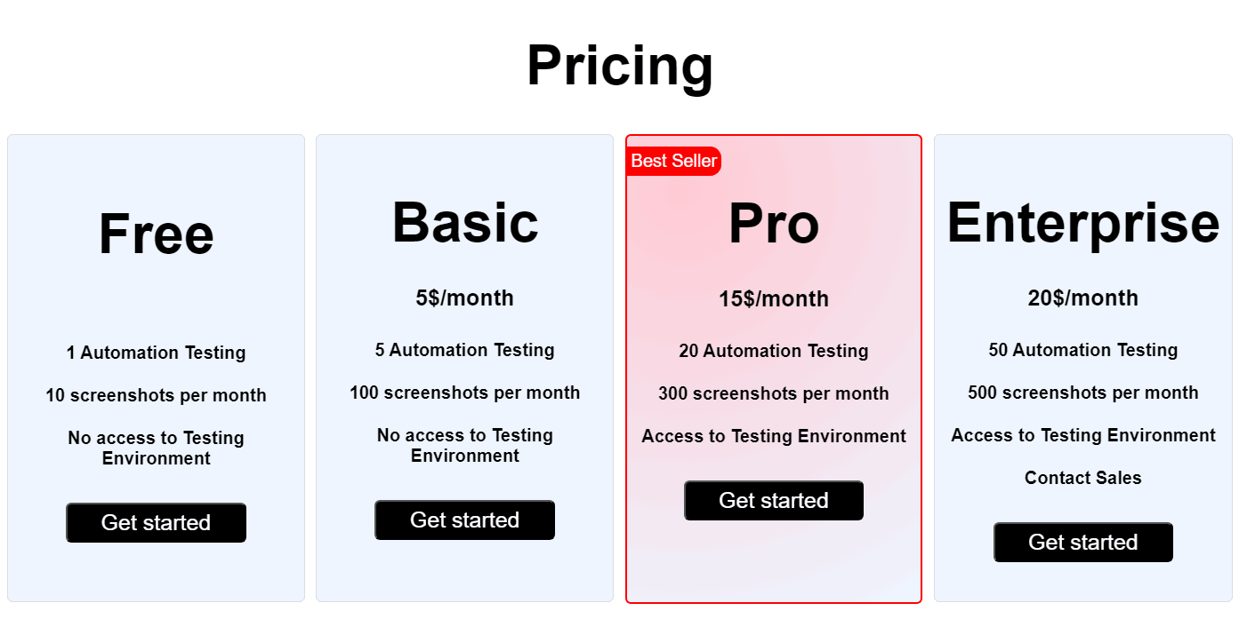
In this example, the SaaS platform strategically employs the CSS radial-gradient() function within the Pro plan, distinguishing it with a unique visual appeal that captivates visitors’ full attention, setting it apart from other subscription tiers.
As discussed earlier in this blog, the radial-gradient() function allows you to specify the exact position from where you want the radial pattern to originate. The position of the origin can be specified by using some pre-defined positioning keywords or manually defining coordinates.
This feature unlocks multiple ways to generate some dynamic radial patterns that change their position with respect to the user’s actions on the interface.
Let’s take a look at some dynamic radial patterns.
Dynamic Radial Patterns
One of the most practiced dynamic radial patterns is the one where the pattern changes its position following the coordinates of the cursor’s current position. So, as the user moves the cursor on the interface, the radial pattern also changes its position.
See the Pen
Untitled by Ayush Thakur (@tsayush)
on CodePen.
HTML:
|
1 2 |
<div class="container" id="dynamic-gradient"> </div> |
CSS:
|
1 2 3 4 5 6 7 8 |
#dynamic-gradient { width: 100vw; height: 70vh; position: absolute; top: 0; left: 0; background: radial-gradient(circle at center, #f9f9e0 20px, #0fbac5 40px); } |
In this example, to achieve that moving radial pattern effect, we have created an ID named dynamic-gradient and assigned it to the container div. To add the dynamic effect, we have used JavaScript.
JavaScript:
|
1 2 3 4 5 6 |
document.addEventListener('mousemove', (event) => { const dynamicGradient = document.getElementById('dynamic-gradient'); const x = event.clientX; const y = event.clientY; dynamicGradient.style.background = `radial-gradient(circle at ${x}px ${y}px, #F9F9E0 20px, #0FBAC5 400px)`; }); |
To capture the mouse movement action, we used the addEventListener function. In the first parameter, we specified ‘mousemove‘ as the keyword. In the second parameter, we used an arrow function with the event as a parameter.
Inside that function, three variables, namely dynamicGradient, x, and y, store the dynamic-gradient element, horizontal cursor coordinates, and vertical cursor coordinates, respectively. These coordinates are then passed to the radial-gradient() function to create the radial pattern.
This results in an eye-treating dynamic position-changing radial pattern.
The radial-gradient() function, when coupled with the CSS animation property, opens up the possibility of creating a dynamically evolving pattern that seamlessly transitions over time. This duo creates a dynamic visual experience that enhances your modern web designs with depth and movement.
Let’s generate a similar piece of radial pattern:
See the Pen
Untitled by Ayush Thakur (@tsayush)
on CodePen.
|
1 2 3 4 5 6 7 8 9 10 11 12 13 14 15 16 17 18 19 |
body { background: radial-gradient(circle at top left, #ee7752, #e73c7e, #23a6d5, #23d5ab); background-size: 400% 400%; animation: gradient 15s ease infinite; height: 100vh; } @keyframes gradient { 0% { background-position: 0% 50%; } 50% { background-position: 100% 50%; } 100% { background-position: 0% 50%; } } |
In this code, we have coupled up the radial-gradient() function with the animation property. In the radial-gradient() function, we have created a simple radial pattern using some color and a circle shape. In the animation property, we have specified the required details to make the radial pattern change its colors infinite times.
The gradient is the name of the animation, 15s is the time (15 seconds) taken by the animation to complete one cycle, ease specifies the time pace of the whole animation cycle, and infinite specifies that the animation should repeat indefinitely.
The radial-gradient() function provides multiple ways to customize various adjustments and parameters of the radial pattern, opening the doors to generate unlimited patterns. Additionally, the radial-gradient() function is fully compatible with most background properties. Thus, it can be combined with other background properties to give rise to visually appealing background patterns.
With just a touch of creativity, you have the power to generate an array of limitless, non-repeating background patterns that can elevate the visual appeal of your designs.
Until now, we have exclusively employed a singular CSS radial-gradient() function to create a pattern within a particular element. However, it’s worth noting that the radial-gradient() function doesn’t restrict us to utilizing only a single instance within an element; we have the flexibility to incorporate multiple CSS radial-gradient() functions.
We can use two radial-gradient() functions in a single background property to create two different radial patterns targeting two different areas of an element.
Let’s take a look at its working with the help of an example:
See the Pen
Untitled by Ayush Thakur (@tsayush)
on CodePen.
|
1 2 3 4 5 6 |
.container { position: relative; background: radial-gradient(circle at 30% 30%, #0ebac5, #2c3e50), radial-gradient(circle at 70% 70%, #0ebac5, #2980b9, #0ebac5); height: 100vh; } |
In this output, we have specified a combination of two CSS radial-gradient() functions in the background property. For the first gradient, we have specified 30% and 30% as the coordinates of the origin for the radial pattern. In the second gradient, we have specified 70% and 70% as the coordinates of the origin for the radial pattern. This has resulted in the following radial pattern that you can observe in the final results.
Using two multiple radial-gradient() functions makes it possible to create repetitive background patterns that are not only interesting but also have a professional appearance. Let’s create a polka dot background pattern using two CSS radial-gradient() functions:
See the Pen
Untitled by Ayush Thakur (@tsayush)
on CodePen.
|
1 2 3 4 5 6 |
body { background-image: radial-gradient(closest-side at 25% 25%,#c39f76 80%,#0000 81%), radial-gradient(closest-side at 75% 75%,#c39f76 80%,#0000 81%); background-size: 100px 100px; } |
Output:
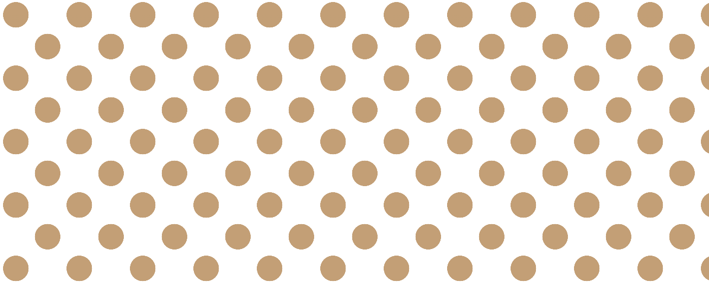
To create this pattern, we repeated two radial gradients across the background for a striking effect. In this case, we used the background-image property, specifying two radial-gradient() functions.
For the first function, we positioned the radial pattern at 25% horizontally and vertically from the closest side, with 80% of the pattern in #c39f76 and the rest in white.
Similarly, the second function was positioned at 75% horizontally and vertically. This is a basic demonstration of using multiple CSS radial-gradient() functions. You can experiment further, combining multiple functions to create unique radial patterns that suit your vision.
Moving on from the radial-gradient() function, let’s explore its counterpart, the repeating-radial-gradient() function, which offers even more possibilities for background design.
Let’s discuss the repeating-radial-gradient() function and understand its working with the help of some examples.
Repeating Radial Patterns
The repeating-radial-function() is a CSS function that generates a background pattern consisting of radial gradient patterns repeating themselves to the end of the element. In other words, the repeating-radial-gradient() function creates repetitive radial patterns originating from the origin.
It works much like the CSS radial-gradient() function, utilizing the same set of arguments. The key distinction lies in its continuous repetition of the radial pattern in all the directions, effectively spanning and covering the entire container.
As mentioned, the repeating-radial-gradient() accepts the same arguments as the CSS radial-gradient() function. This means we can specify the exact group of shape, size, and color pairs we want in the radial pattern.
See the Pen
Untitled by Ayush Thakur (@tsayush)
on CodePen.
|
1 2 3 4 5 6 7 8 9 10 11 |
.container { position: relative; background: repeating-radial-gradient( circle at 10% 10%, rgba(234, 234, 234, 0.5), rgba(234, 234, 234, 0.5) 5%, rgba(14, 186, 197, 0.2) 5%, rgba(14, 186, 197, 0.2) 10% ); height: 100vh; } |
In this example, we have used the repeating-radial-gradient() function to create this concentric circle kind of pattern that you can observe in the final output.
To create this pattern, we’ve specified the desired colors twice in the repeating-radial-gradient() function, with 5% and 10% to set the starting and ending points of the colors. The origin is set at 10% vertically and horizontally to start the pattern from the top left corner of the container. We’ve used the rgba format to control the opacity of each color in the repeating-radial-gradient() function.
We have kept the opacity at 0.5 and 0.2 for each color, respectively. This has given rise to the exquisite concentric circle background pattern.
In a repeating-radial-gradient(), the last color ring seamlessly transitions into the first one, producing a continuous visual effect. Given its similarity to the CSS radial-gradient() function, repeating-radial-gradient() offers limitless potential for crafting captivating radial patterns and background animations.
See the Pen
Untitled by Ayush Thakur (@tsayush)
on CodePen.
HTML:
|
1 2 |
</div class=”container” id=”dynamic-gradient”> </div> |
CSS:
|
1 2 3 4 5 |
.container { position: relative; background: radial-gradient( circle at 50px 50px, #F9F9E0, #0FBAC5); height:100vh; } |
JavaScript:
|
1 2 3 4 5 6 |
document.addEventListener('mousemove', (event) => { const dynamicGradient = document.getElementById('dynamic-gradient'); const x = event.clientX; const y = event.clientY; dynamicGradient.style.background = `repeating-radial-gradient(circle at ${x}px ${y}px, #F9F9E0, #0FBAC5, #F9F9E0)`; }); |
In an earlier section of this blog, we showcased a dynamic radial gradient example. We’re employing a similar concept in this example, but here, we are using the repeating-radial-gradient() pattern to achieve the dynamic effect.
In this example, we capture the cursor’s horizontal and vertical coordinates to position the origin of the repeating radial pattern. As the cursor moves, its changing coordinates shift the radial pattern’s position accordingly.
Like the CSS radial-gradient() function, repeating-radial–gradient() function can also be paired with the animation property. This combination allows us to create some mind-blowing animations.
See the Pen
Untitled by Ayush Thakur (@tsayush)
on CodePen.
HTML:
|
1 2 3 4 |
<div class="gradient_1"></div> <div class="gradient_2"></div> <div class="gradient_3"></div> <div class="gradient_4"></div> |
CSS:
|
1 2 3 4 5 6 7 8 9 10 11 12 13 14 15 16 17 18 19 20 21 22 23 24 25 26 27 28 29 30 31 32 33 34 35 36 37 38 39 40 41 42 43 44 45 46 47 48 49 50 51 |
@keyframes animazione { 0% { background-size: 100%; } 100% { background-size:400%; } } .gradient_1, .gradient_2, .gradient_3, .gradient_4 { width:100%; margin-top:10px; height:25vh; animation: animazione 6s ease-in-out infinite alternate; } .gradient_1 { background:repeating-radial-gradient( circle at top left, #ffff00, #ffa500, #ff0000, #4b0082, #000000 50%, #ffff00 55% ); } .gradient_2 { background:repeating-radial-gradient( circle, #56CFD5, #0FBBC3 30px ); } .gradient_3 { background: repeating-radial-gradient( circle at bottom center, #56CFD5 49%, grey 50% ); } .gradient_4 { background: repeating-radial-gradient( circle at 100%, #333, #333 10px, #eee 10px, #eee 20px); } |
In this example, we created multiple animations using the repeating-radial-gradient() function and different animation attributes to run the radial gradient animation infinitely.
Similarly, you can explore various attributes, unleashing your creativity to craft fresh and captivating background animations for elements on your web page.
Browser Compatibility of CSS Gradients
CSS gradients are compatible with most of the popular browsers used across the globe, including Google Chrome, Mozilla Firefox, Opera Mini, Apple Safari, and Microsoft Edge.
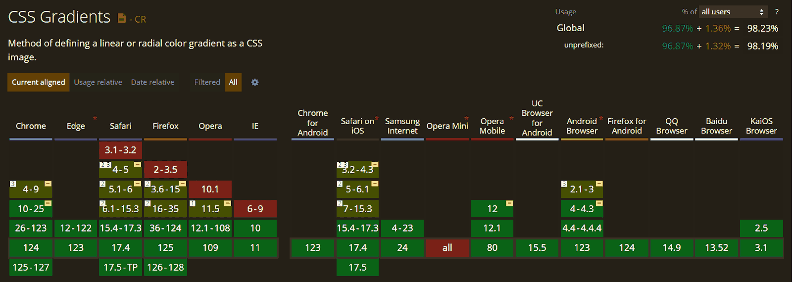
The above image illustrates the compatibility of CSS radial gradients with various browser versions.
The newer version of the browsers comes with the full support of the CSS radial-gradient() function. However, older versions of browsers may exhibit some form of incompatibility or even total incompatibility with CSS radial gradients.
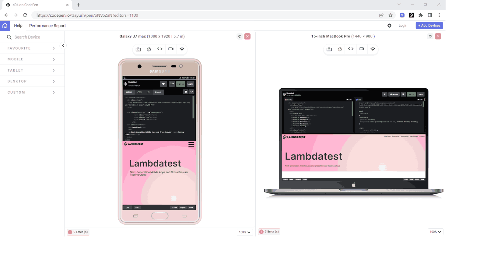
AI-powered test orchestration and execution platforms like LambdaTest lets you test CSS radiant gradient effects on a remote test lab of 3000+ real web browsers, devices, and platforms. With LambdaTest, you can perform cross browser testing and cross device testing at scale on the legacy and latest browsers, devices, and operating systems.
Best Practices for Using CSS Radial Gradients
Creating a beautiful and eye-catching radial pattern for the background of the web page works as a styling element and enhances the overall user experience on the positive side.
Let’s take a look at some accessibility challenges associated with the CSS radial gradients and what are the best practices to avoid them.
- Understanding the syntax: As discussed in this blog, the CSS radial gradient effect has a specific syntax for its usage. To employ the radial-gradient() function, developers must use that exact syntax correctly to ensure that the radial gradient displays its intended effect.
- Fallback: In the context of CSS styling, fallback refers to the alternate or backup styling specified to the elements. This backup styling comes in handy when the specified prior CSS styling is not supported in the browser.
- Responsive design: Creating a responsive design ensures that your web page automatically adjusts to the screen size of the user’s device to browse the web page.
- Performance considerations: In the context of CSS radial gradients, performance considerations count in multiple playful factors that could potentially affect the overall loading speed and responsiveness of the web page.
- Complexity: Integrating a radial gradient with multiple pairs of color stops and larger sizes may increase the loading time of the web page, eventually ruining the user experience.
- Device compatibility: Devices with outdated and legacy hardware components may struggle to smoothly run complex radial gradients, leading to improper or partial radial patterns. Opting for simple designs is the preferred choice for better performance across various devices.
- High number of elements: If there are multiple elements on your web page integrated with highly complex radial gradients, it will make the entire web page heavy, ultimately resulting in increased loading time. Optimize the design to strike a balance between visual appeal and performance.
- Browser compatibility: Browser compatibility assesses how well a web feature functions across different browser versions.
The syntax of a CSS radial-gradient() function involves specifying the shape of the desired radial gradient pattern, its positioning, and the pair of colors. It is crucial to maintain this specific order of attributes to achieve the expected results. Any mistake in this order can result in the CSS radial gradient effect displaying in an unexpected manner.
Fallback ensures the graceful degradation of the design of a CSS styling property, such as radial-gradient(), which is not supported by the respective browser version.
|
1 2 3 4 |
.element { background: #3498db; /* Fallback for non-supported browsers */ background: radial-gradient(circle at center, #ffcc00, #ff6600); } |
In this example, if the browser cannot use the radial-gradient() function for the background property, it will fallback to the previously specified background property, which is paired with the #3498db color. Google Chrome 9.0 and older versions may not fully support the CSS radial-gradient() function. Consequently, they might display the fallback background color (#3498db).
While using the CSS radial gradients for web page styling, it is extremely important to consider the responsiveness factor. When applying the radial gradients effect, using the percentage notations to specify the numeric attributes is the best and most advisable practice. You can also use CSS media queries to specify stylings targeting multiple screen widths.
To perform the responsive testing, you can use a mobile site tester like LT Browser.
LT Browser is a mobile-friendly testing tool allowing developers to test, debug, and build their websites across 50+ device viewports of different devices having both Android and iOS viewports.
To get additional details about LT Browser for web device testing, refer to the video tutorial.
Subscribe to our LambdaTest YouTube Channel for the latest updates on tutorials around mobile app testing, real device cloud, and more.
Let’s throw some light on these factors:
Developers must ensure CSS radial gradient compatibility across all browsers by considering syntax, color stops, shape, size, fallbacks, layering, blend modes, responsive design, and performance for a consistent user experience.
Let’s Recap!
At the end, let’s recap what we discussed in this blog. We discussed the CSS radial-gradient() function and how it gives us some eye-catching background patterns.
We delved into topics such as attributes that CSS radial gradients effect demands, like shape and position, dynamic radial patterns, repeating-radial-gradient() function, browser compatibility of CSS gradients, and best practices. We also looked at some real-life examples to understand the behavior of radial gradient patterns on changing attributes.
If you are starting your CSS journey, then this blog might be a very helpful resource for you.
Frequently Asked Questions (FAQs)
What is a radial gradient in CSS?
Radial gradient in CSS creates a smooth color transition radiating from a center point. Imagine circles with different colored borders blending into each other.
How to position a radial gradient in CSS?
To position a radial gradient, use the background-position property along with the radial-gradient() function. You can specify keywords like center or exact pixel values.
How to make a repeating radial gradient in CSS?
Repeating radial gradients aren’t directly supported in CSS. But, you can achieve a similar effect by using multiple background images with radial gradients positioned closely together.


Author’s Profile
Ayush Thakur
I’m a 22 year old Software Engineer. Completed my Btech in Information Technology field in 2021. I have a keen interest in Web Development field and currently learning and exploring the field of Frontend Web Development. Love to get my hands dirty on JavaScript And React. Also working as a Web Development Freelancer. Alongside, I’m also working as a Content Creator and I create content on Web Development niche to share my knowledge with others and help them in their tech journey. Also loves to write blogs and articles on tech niche. A huge lover of video games, read books in my spare time, and to maintain fitness, I play football and badminton.
Blogs: 6
Got Questions? Drop them on LambdaTest Community. Visit now


