How To Make A Responsive Background Image Using CSS?
Harish Rajora
Posted On: May 13, 2021
![]() 74652 Views
74652 Views
![]() 18 Min Read
18 Min Read
Over the years working with web development technologies, I have seen responsiveness, CSS, and browser compatibility testing have become the clear winners of discussions. For someone who is just beginning their journey with web development, “responsiveness” is considered a synonym for web development with every line of code directed towards it.
Google trends show that the term “responsiveness” is so popular that it keeps touching the number 100 frequently.

Achieving the responsiveness of the written content is not that hard. A meta tag works most of the time with every device. For font sizes and font-weight on smaller screens, media queries work flawlessly too.
The problem comes with the images on a web page when it comes to developing a responsive website. Images are stubborn! They don’t like to adjust themselves to the screen sizes so quickly and require a lot of work from our side.
In the post about how to make responsive images on a website, I mentioned different ways to make images responsive such as picture element, srcset and media queries.
Well that article focused on responsive images within the content. However a special case does arise for the images on a web page- the background image and this post is dedicated to guide you on how to make a responsive background image using CSS.
Further, we will look at how background image trends have changed over time and why it is essential to learn about the responsiveness of background images. Also, we shall see how we can make a normal background image to a responsive background image with CSS for all our users operating on a wide range of devices.
TABLE OF CONTENT
- Why are background images important?
- How responsiveness affects the background image?
- How to make a responsive background image using CSS?
- Background-Image Property in CSS
- Background Size Property In CSS
- Background Position in CSS
- Background Repeat in CSS
- Background Attachment in CSS
- What about Media Queries?
Why are background images important?
Background images have become a part of the current trend in web development. Honestly, they do look good and create an impact on the user. Consider these two images of two different websites where both of them are selling hats:


Which one is more attractive? Even though they both have very little difference (leaving aside content and focussing on only images). Although both the websites are good, the upper one does impact the user (well, at least on me!).
Therefore, it is always good to have a background image on our website to make a memorable impact. Well, you can see many websites already using a background image as a part of their web design strategy. But the problem is, where there is an image, there is the risk of multi device view and cross browser compatibility issues.
How responsiveness affects the background image?
Now that we have decided that we will be going ahead with the background image on our web page, the next question is, do we still need to work on background image responsiveness? The answer is hidden on the following two images:
The website of Seed Heritage looks as follows on a normal desktop screen (notice the shop now button):

And when we test the website on mobile screen using LT Browser you can see the result below

Notice how the CTA changes its position and the image responds to the smaller screen by itself. If I copy the image and construct a non-responsive web page out of it (to demonstrate a non-responsive website), the output would be the following:
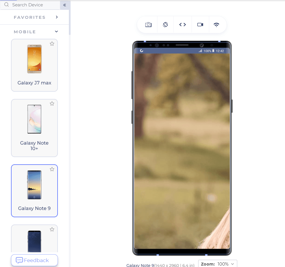
As a web developer, dealing with this can be a real challenge. That’s why having a responsive background image is crucial. It eliminates the need for extensive redesigns and enhances the overall user experience. So, how can CSS assist in creating responsive background images? Let’s dive in
But before we go further, the tool I have used to perform website tests across different mobile devices is LT Browser. A developer-friendly browser that helps in responsive testing and development on 50+ device screen resolutions instantly. You can perform mobile website tests on LT Browser using features like side-by-side view, scroll sync, instant debugging, network simulation and more.
How to make a responsive background image using CSS?
The responsive background image on the web page is essential for the business. Considering how more than 50% of traffic is coming through smaller screens, ensuring responsive elements have become our priority.
You’d be surprised how difficult it is to relinquish a cell phone – Adrien Brody.
The fact is, sooner or later, you will come back to redesigning your website with the mobile device being the focus of development. In this section, we shall see how we can do that with ease. But before starting our journey to transform the background image, let’s brief ourselves on what a background image is in web development.
Read Mobile-First Web Design: Why You Should Make It A Priority In 2021?
Background-Image Property in CSS
The background-image property is used in CSS to apply an image in the background of the web page. The background image starts from the top left of the web page when placed without any external property. Also, always remember that the resolution of the image matters a lot in the background image. For instance, notice the following image on a bigger screen:

In the above image, the screen resolution is 1366 x 768 while the image resolution is 3840x 2200 pixels. Hence, the result is out of proportion. Let’s cut down the image resolution to 640×480 pixels and render it again on a 1366×768 pixel screen. The result is as follows:

The image repeats itself because the image is not wide and long enough. At this point, we can establish a few goals with our motive of placing a background image.
First, we cannot keep on changing the image resolution for the different devices. The above problem seems to resolve on a 640×480 device which is perfect for the above image:
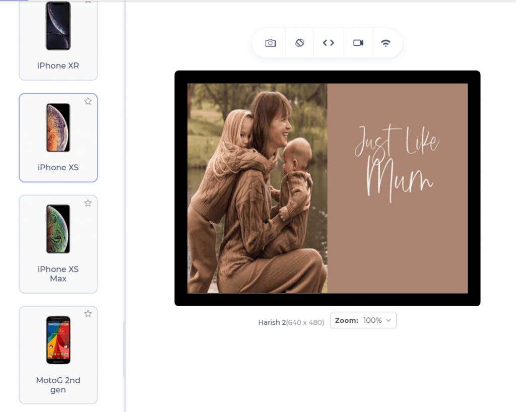
Secondly, we need something that fixes the image at a certain point. Since we know the image starts from the top left end of the screen, fixing it somewhere with respect to that point of reference would ensure that we don’t have to move the image a lot. To master these techniques, we need to go through a few background image properties in CSS.
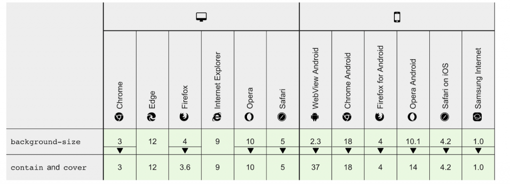
Before that, let’s also evaluate the browser compatibility for background image properties across different browsers.

Background Size Property In CSS
The first property we need to look through is the “background-size” property in CSS. The background-size property is made specifically for the background images and determines what the image’s size should be.
The background-size property in CSS takes absolute values, percentage values and certain keyword values as part of the input. The keyword values associated with the “background-size” is as follows:
- contain: Resize the image making sure the image is completely visible at all times.
- cover: Resize the image to cover the entire screen from corner to corner. Low-resolution images might stretch a bit to adjust.
- initial: Default value is set as the background-size value.
- inherit: Inherit the value from the parent.
There is also an “auto” value and absolute values of which we currently have no use in this post. So, guess which value would save us from resizing on different screens?
Give yourself a shoulder tap if you thought about “cover”.
The “cover” value in “background-image property1” will help us cover the entire screen. None of the other values would do so until the resolution matches for the screen and image. But there is a problem with the value “cover”. CSS cuts down the image if the resolutions are not perfect while it attempts to cover the whole screen. Look at the following example in the same reference:

In its attempt to cover the whole screen, the image is getting cut from the bottom. The image will cut down even more on a smaller resolution device than what we get with 1366×768 resolution. We don’t want that! The better option is to combine more properties with the background-size property to tackle this problem.
Let’s evaluate browser compatibility for background-size property across different browsers.
Background Position in CSS
Another property that will help us create a responsive background image in CSS is the “background-position” property.
The background image is set according to the top left corner of the screen. With “background-position”, we can change that reference point to whatever we need including absolute values or percentages.
The background-position property takes the following values:
- left top
- left center
- left bottom
- right top
- right center
- right bottom
- center top
- center center
- center bottom
- initial
- inherit
Apart from this, you can also take the values as a percentage (x% y%) denoting the percentage coordinate with respect to the default position (top left).
The first percentage value corresponds to the horizontal shift while the second to the vertical shift.
Anyways, coming back to the responsiveness of background-image, we need something to center the image so that the position is fixed at the centre while background size is the cover i.e. the whole screen. Let’s add background-position to our already existing code which now looks like the following:
|
1 2 3 4 5 6 7 8 9 |
<!DOCTYPE html> <html lang="en" dir="ltr"> <head> <meta charset="utf-8"> <title> Background Image</title> </head> <body style="background-image: url(seed_heritage_homepage.jpg); background-size: cover; background-position: center center"> </body> </html> |
Output:

Note that you can also use only one “center” instead of “center center” as the default value for any absent value is “center”.
So, it looks like our image crashed and the logic was not correct. Believe it or not, we are actually in the right direction. Our image now covers the full screen which we wanted and is positioned at the centre. But the problem is that it has started to repeat itself and when repetitions start to happen, we call for another CSS property called background-repeat.
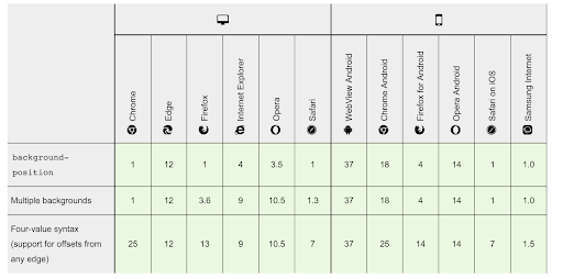
Evaluating browser compatibility for background-position property across different browsers
Background Repeat in CSS
The background-repeat property in CSS is quite vocal by its name. With this property, we decide what we should do when the background starts to repeat itself as in the above image.
As a default value, the background is repeated both horizontally and vertically on the screen. We can manipulate that in any way we want. The following values are satisfied into the background-repeat property:
- repeat: The default value of repeating the image both vertically and horizontally.
- repeat-x : Only horizontal repetition allowed.
- repeat-y: Only vertical repetition allowed.
- space: The last image is not clipped out but the white space is adjusted accordingly.
- round: The background image is stretched or shrunk to fill the gaps.
- no-repeat: The image is not repeated and only a single image is visible.
- initial: Default value is set.
- inherit: Inherit the value from the parent.
As per our recent situation (the last section), it is very easy to figure out what option we would be going for. Since our background was repetitive and we don’t want that, we will go for the “no-repeat” option. Let’s see how will our image look like with just a single image:
|
1 2 3 4 5 6 7 8 9 |
<!DOCTYPE html> <html lang="en" dir="ltr"> <head> <meta charset="utf-8"> <title> Background Image</title> </head> <body style="background-image: url(seed_heritage_homepage.jpg); background-size: cover; background-position: center center; background-repeat: no-repeat"> </body> </html> |
Output:

Alright! We have a lot of progress now. We have set the cover, the centre and the single non-repeating image on the background. But still, this is unsatisfactory. We have got everything till now except that the image is not fixed according to the device’s viewport. For this, we will introduce you to one and final CSS property called background-attachment.
Before that, let’s evaluate browser compatibility for background-position property across different browsers.
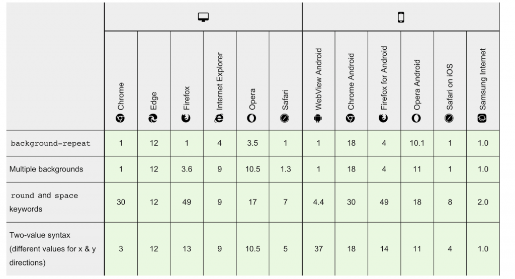
Background Attachment in CSS
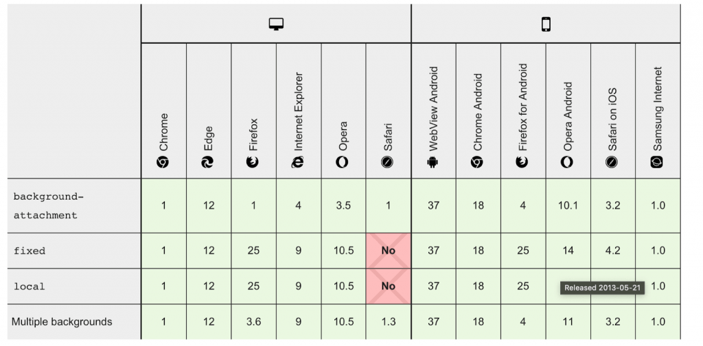
The “background-attachment” property in CSS attaches the background image according to the viewport of the device. This property can take the following values:
- local: The background image will scroll with the element.
- fixed: The background image will be fixed according to the viewport of the device. The image will not scroll even if the content on the image is scrollable.
- scroll: This is the default value where the background image scrolls with the page.
- initial: The default value is set.
- inherit: The parent element property is inherited.
As far as creating a responsive background image using CSS is considered, we will go through with the “fixed” value since we want our image to be fixed with respect to the viewport. Also, there is an added advantage with the “fixed” value. If the content is placed on the image (which it usually is), the content can scroll while the image will be fixed. This will work perfectly with our aim of creating a responsive background image.
Let’s add this property to our already existing code to check the difference:
|
1 |
<body style="background-image: url(seed_heritage_homepage.jpg); background-size: cover; background-position: center center; background-repeat: no-repeat; background-attachment: fixed"> |
Output:

We get the image just perfect on our viewport.
But the job is not done yet. Is it responsive now? Or are we just getting an image fixed to a 1366×768 screen?
Let’s find out by changing the background image’s resolution.
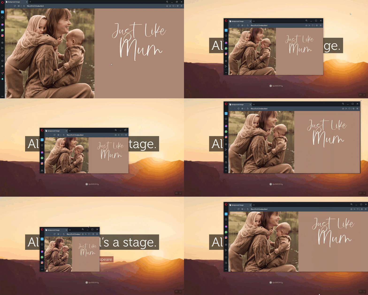
Voila! We have our background image adapting to the viewport, fixed to the screen and responsive in nature. This way by knowing a few background properties in CSS, we can create a responsive background image using CSS. I wonder if you thought there will be another section coming for responsiveness! 😛
Evaluating browser compatibility for background-attachment across different browsers.
What about Media Queries?
The above steps will construct a background image with ease, but can we optimize our solution by using the media queries here? In the post about using CSS media queries for responsive design, we focussed on how important it is to use media queries to save some bandwidth.
Combine it with the responsive images using CSS techniques, and we have a simple solution here. Why not use media queries for smaller screens and save something too precious for our users; the network bandwidth!
Network issues are very common in small screen devices. We never know what device our user would be using to view our website. Also, we never know if the user is on a slow network or not. Using 3840×2200 pixel images can cost us on this part as high-quality images can be very expensive network wise. They may go in the range of 7 to 10 MB. We cannot render such a high-quality image on a slow network which can take more than 5 seconds.
Read How To Test Mobile Websites On Different Network Conditions?
Using media queries we can detect a smaller device and ask our server to render the low-quality image on the device. Low-quality images on a smaller screen do not look “low-quality” and the user does not even care about the quality on smaller devices. So, why not save some time and make our website load faster with just a single line media query?
The following media query will take care of the devices having screen size equal to or less than 780px:
|
1 2 3 4 |
@media only screen and (max-width:780-px) { <body style="background-image: url(seed_heritage_homepage_low.jpg); background-size: cover; background-position: center center; background-repeat: no-repeat; background-attachment: fixed"> } |
Here, the image URL is changed to a low-quality image. You can fix the maximum viewport size to anything you want.
With this Responsive testing tutorial for beginners, you will learn how to perform Responsive Testing of your website on the LambdaTest platform.
Conclusion

Majority of website designs and redesigns are taking place with the inclusion of background images. They are so common you don’t even need to work hard to find a website that has one. An important website trend is to build mobile optimized websites that include responsive images as well. This post was dedicated to combining the art of responsive design with background images on a web page.
Throughout this post, we introduced a few properties in CSS and how they are important in building a responsive background image using CSS. In addition, we also evaluated browser compatibility for every property that can be used to create a responsive background image using CSS. You can also easily test your websites and validate different css properties for your targeted browsers by performing cross browser testing on cloud, faster and easier!
As a web developer, I sincerely believe that this is the easiest and quickest approach in building up a responsive background image using CSS. I hope this post will help you in your next venture in website design and will guide you in adding responsive background images on the web page.
Frequently Asked Questions (FAQs)
How to center a background image in css?
To center a background image in CSS, use “background-position: center center;” within your element’s CSS rules. This aligns the background image both horizontally and vertically at the center of the container.
How do I center my image in CSS?
To center an image in CSS, apply “display: block; margin: 0 auto;” to the image. This horizontally centers it within its container. For vertical and horizontal centering, use “display: flex; align-items: center; justify-content: center;” on the container.
How to Vertically & Horizontally Center an Image in HTML & CSS
To center an image both vertically and horizontally in HTML & CSS, target the div in your CSS. Inside its curly brackets, apply “display: flex;” and set “align-items: center; justify-content: center;” to center the image vertically and horizontally within the div.
How do I center an image in text CSS?
To center an image within text using CSS, employ the “display: block; margin: 0 auto;” combination on the image. This centers the image horizontally while maintaining its inline flow within text content.
How to Center an Image Using Text Align: Center
To center an image using “text-align: center,” apply the “text-align: center;” property to the parent element. Wrap the
|
1 |
<img> |
in a block-level element like a
|
1 |
<div> |
for effective centering.
How do I center an image in CSS responsive?
To center an image in CSS responsive , apply “text-align: center;” to the container. Ensure the image max-width is 100% and max-height is slightly less than the column, like “max-height: 100px;” for better results.
Got Questions? Drop them on LambdaTest Community. Visit now


